
Step 1 of 8
Choose a Reliable System Font Stack
Define an inherited system font stack that remains usable across computers through ordered local fallbacks.

Learning path · Level 2 · Tutorial 3
Create a readable text hierarchy using locally available fonts, suitable length units, and predictable line spacing.
 Choose a Reliable System Font Stack
Define an inherited system font stack that remains usable across computers through ordered local fallbacks. 1 min
Choose a Reliable System Font Stack
Define an inherited system font stack that remains usable across computers through ordered local fallbacks. 1 min
 Understand px and rem
Calculate rem-based font sizes and distinguish CSS pixels from root-relative sizing. 2 min
Understand px and rem
Calculate rem-based font sizes and distinguish CSS pixels from root-relative sizing. 2 min
 Trace em Through Nested Text
Trace `em` font sizes through nested text and distinguish their parent-based reference from `rem` and `px`. 2 min
Trace em Through Nested Text
Trace `em` font sizes through nested text and distinguish their parent-based reference from `rem` and `px`. 2 min
 Build a Clear Text Hierarchy
Style the Neighborhood Reading Club content with a compact hierarchy of headings, paragraphs, and inline emphasis. 2 min
Build a Clear Text Hierarchy
Style the Neighborhood Reading Club content with a compact hierarchy of headings, paragraphs, and inline emphasis. 2 min
 Make Line Spacing Predictable
Use unitless line-height so text at different computed font sizes keeps proportional line spacing. 2 min
Make Line Spacing Predictable
Use unitless line-height so text at different computed font sizes keeps proportional line spacing. 2 min
 Align Prose and Keep Links Recognizable
Choose a readable alignment for prose and preserve a familiar underline on text links. 1 min
Align Prose and Keep Links Recognizable
Choose a readable alignment for prose and preserve a familiar underline on text links. 1 min
 Match Controls to the Page Typography
Make native form controls share the surrounding page typography with a focused inheritance rule. 1 min
Match Controls to the Page Typography
Make native form controls share the surrounding page typography with a focused inheritance rule. 1 min
 Apply and Check Your Text Styles
Finish and inspect a readable local page while preserving its semantic HTML and native controls. 2 min
Apply and Check Your Text Styles
Finish and inspect a readable local page while preserving its semantic HTML and native controls. 2 min
Step 1 of 8
Define an inherited system font stack that remains usable across computers through ordered local fallbacks.
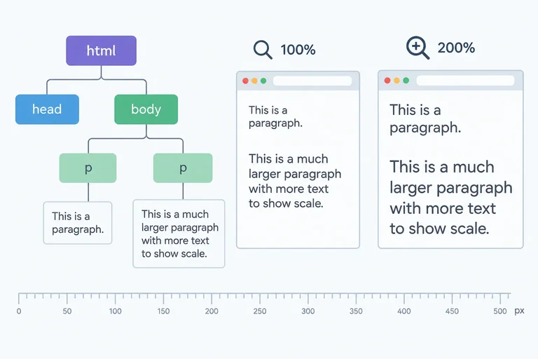
A font stack is an ordered list in font-family. The browser reads the list from left to right and uses the first family it can use.
Start with system-ui. It requests the operating system’s interface font, without downloading a font file. Then list locally available named families. End with a generic family, which gives the browser a final category to choose from.
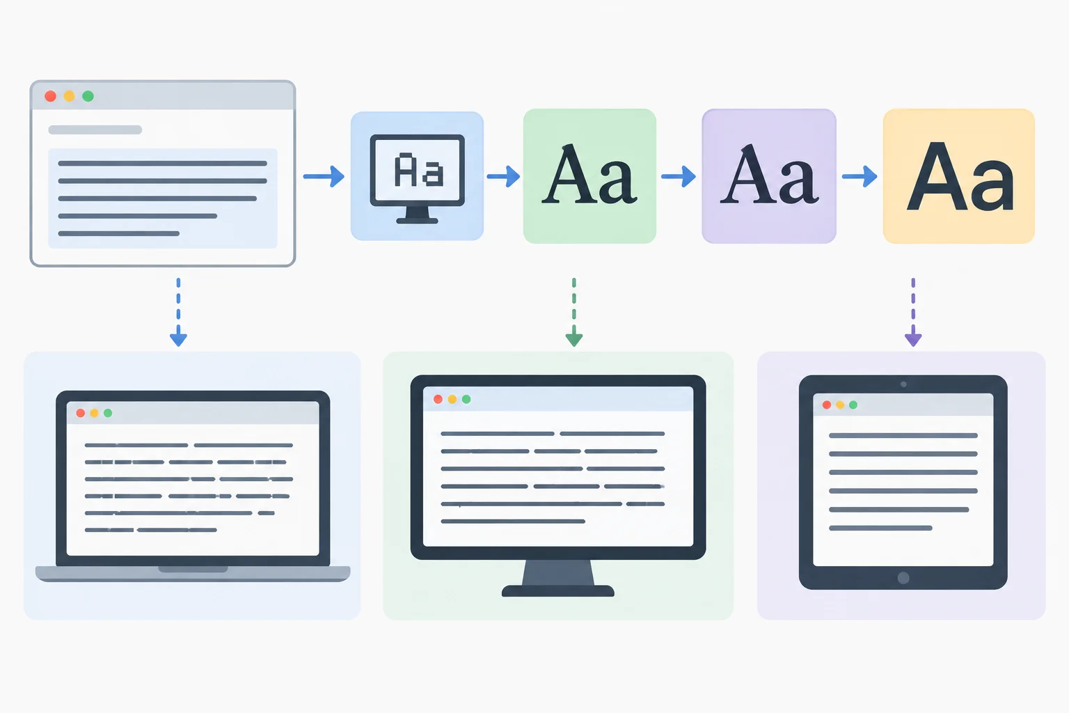
The browser uses the first usable choice in the ordered stack. Different platforms can resolve the same stack differently.
A font-family declaration can be set on body to establish an inherited default for ordinary page text. The browser tries system-ui first, then the named families in order, and finally the generic sans-serif family.
This is an illustrative CSS rule. You will create the local Neighborhood Reading Club files and apply the full typography rules later in the tutorial.
Illustrative CSS: this rule shows the required stack but is not a local editing task yet.
body {
  font-family: system-ui, "Segoe UI", Arial, sans-serif;
}
Tip
The stack is reliable because it describes acceptable local alternatives rather than requiring one identical font file. The exact letter shapes can vary by operating system, but the browser can still select an available interface-oriented sans-serif font.
Why can the same font stack produce slightly different text appearances on two computers?
Complete the font-family declaration with the required ordered fallback list.
body {
  font-family: system-ui, , , ;
}
Step 2 of 8
Calculate rem-based font sizes and distinguish CSS pixels from root-relative sizing.
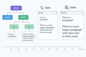
font-size sets the size used to render text. A value such as 16px uses CSS pixels—not a guaranteed count of physical pixels on a screen.
A rem is relative to the root element’s computed font size. The root element is html. For calculations in this tutorial, assume its computed font size is 16px:
1rem = 16px1.5rem = 24pxA rem value does not use an ordinary parent element as its reference.
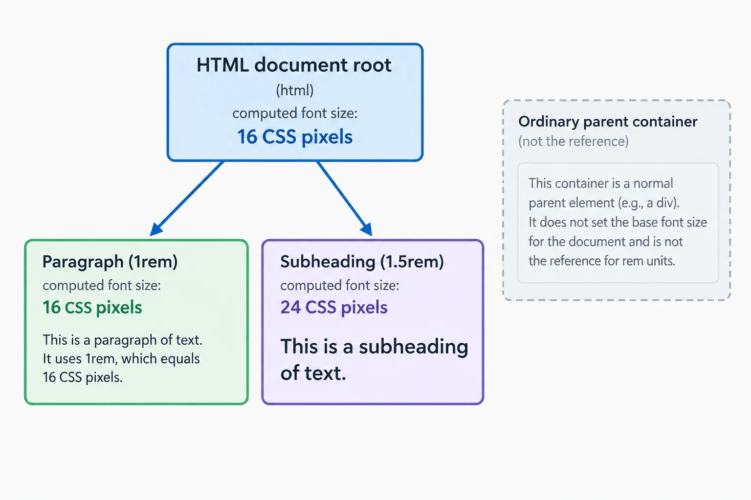
For rem font sizes, calculate from the root element’s computed font size.
Browsers commonly begin with a root element computed font size of 16px, but a browser setting, user preference, or other CSS can make it different. Relative units do not require you to force a root size in your stylesheet.
If the root element’s computed font size were 20px, then 1rem would be 20px and 1.5rem would be 30px. Calculate from the actual or explicitly assumed root size.
Each calculation uses the root element’s computed font size as its reference.
| Root computed font size | Specified size | Rendered size |
|---|---|---|
| 16px | 1rem | 16px |
| 16px | 1.5rem | 24px |
| 20px | 1rem | 20px |
| 20px | 1.5rem | 30px |
This is an illustrative declaration only. Do not add it to local files yet; the complete Neighborhood Reading Club HTML arrives in a later step.
h2 {
  font-size: 1.5rem;
}
Tip
Browser page zoom enlarges text sized in both px and rem. A CSS pixel is not a promise that text will remain physically fixed when someone zooms the page.
Complete this calculation-only CSS exercise. It is not a local editing task.
/* The root element’s computed font size is 20 CSS pixels. */
h2 {
  font-size: ;
}

/* A root font size is not always . */
/* Page zoom can enlarge text using  too. */
Step 3 of 8
Trace em font sizes through nested text and distinguish their parent-based reference from rem and px.
When em is used in font-size, it is relative to the parent element’s computed font size. It does not look directly at the root element.
By contrast, rem uses the root element’s computed font size, while px specifies a CSS pixel length. This distinction matters when text is nested: each em font size can become the reference for its child.
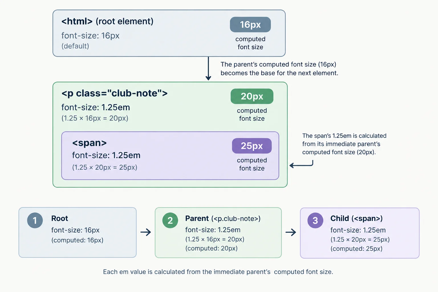
For font-size, each em value uses its parent element’s computed font size.
Tip
For a property other than font-size, an em length normally uses the element’s own computed font size instead. You will use a concrete example when exploring line-height later; for now, trace only font-size.
Suppose the parent element of .club-note has a computed font size of 16px. The first multiplier produces 20px. The nested span then uses .club-note’s computed 20px, not the root element’s 16px, so it becomes 25px.
<p class="club-note">
  Bring a book you enjoyed.
  <span>Guests are welcome.</span>
</p>.club-note {
font-size: 1.25em;
}
.club-note span {
font-size: 1.25em;
}Each row uses the computed result from the preceding level.
| Element | Declaration | Reference | Computed font size |
|---|---|---|---|
| .club-note | 1.25em | Parent: 16px | 20px |
| .club-note span | 1.25em | Parent: 20px | 25px |
For font-size, match each declaration to the reference it uses.
Tap an item and then its matching pair.
Complete the calculated font sizes in this nested em example. The parent element of .club-note has a computed font size of 16px.
.club-note {
  font-size: 1.25em; /* 1.25 × 16px =  */
}

.club-note span {
  font-size: 1.25em; /* 1.25 × parent computed font size =  */
}
Step 4 of 8
Style the Neighborhood Reading Club content with a compact hierarchy of headings, paragraphs, and inline emphasis.
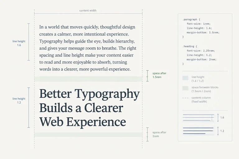
A readable page lets people scan its structure before reading every word. Use a small, consistent set of sizes: the h1 is the strongest signal, the h2 introduces the next topic, and paragraphs carry the ordinary reading text.
CSS changes presentation, not meaning. Keep the existing h1, h2, p, and inline em elements in the HTML. The em remains semantic emphasis even when CSS gives it an italic appearance.
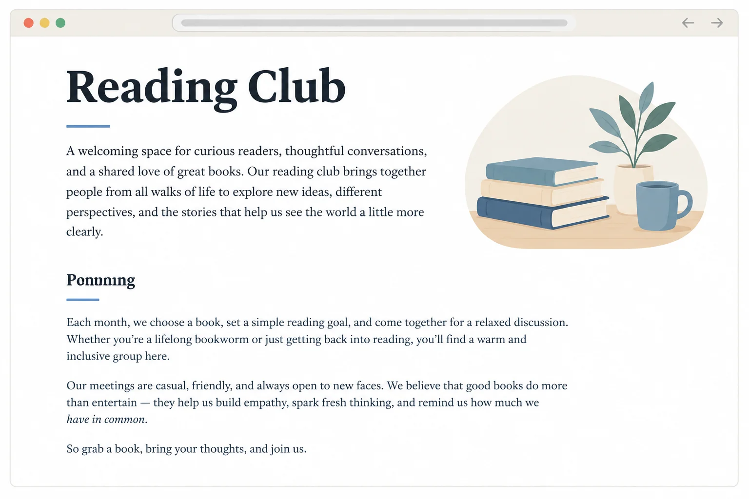
Large bold text signals the page title; a smaller bold heading introduces a section; regular text supports reading; italic text marks inline emphasis.
Set the ordinary text defaults on body. Paragraphs inherit these values unless a more specific rule changes them. Then give both headings a stronger shared weight, make the h1 larger than the h2, and style the existing inline em element.
font-weight: 400; is normal weight, while font-weight: 700; requests a bold weight. font-style: italic; requests italic presentation. The exact shape of a requested weight or style can differ when the available font faces differ across computers.
Illustrative CSS only: study these hierarchy rules now. You will apply the complete stylesheet to local files later in the tutorial.
body {
  font-size: 1rem;
  font-weight: 400;
}

h1,
h2 {
  font-weight: 700;
}

h1 {
  font-size: 2rem;
}

h2 {
  font-size: 1.5rem;
}

em {
  font-style: italic;
}
Tip
With the assumed root element computed font size of 16px, 2rem calculates to 32px and 1.5rem calculates to 24px. The body value of 1rem calculates to 16px. These are presentation choices; they do not change the heading levels or create semantic emphasis.
Complete the declarations that establish the body, heading, and inline-emphasis hierarchy for the reading-club page.
Complete the missing values.
body {
  font-size: ;
  font-weight: ;
}

h1,
h2 {
  font-weight: ;
}

h1 {
  font-size: ;
}

h2 {
  font-size: ;
}

em {
  font-style: ;
}Which change improves visual hierarchy without replacing meaningful HTML elements?
Step 5 of 8
Use unitless line-height so text at different computed font sizes keeps proportional line spacing.
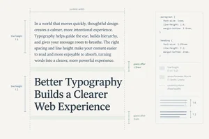
line-height controls the height of line boxes: the vertical space used when successive lines of the same text wrap. It does not set the gap between separate paragraphs.
For readable prose, a unitless value such as 1.5 is a useful starting point. Check the rendered result because the chosen font can affect how the spacing feels.
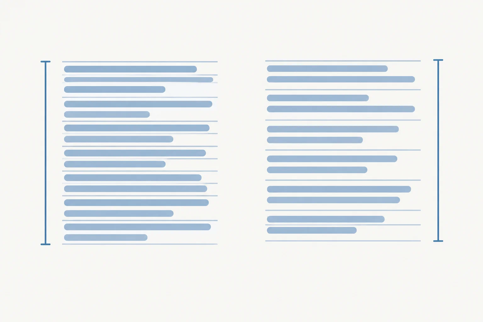
Line-height affects the space occupied by successive wrapped lines within the same block of text.
Illustrative CSS only: this rule will be part of the complete local stylesheet later in the tutorial.
body {
  line-height: 1.5;
}A unitless line-height is a multiplier, not a length. A parent element with a computed font size of 16px and line-height: 1.5; creates 24px line boxes.
The number 1.5 is inherited as a number. Therefore, a descendant with a computed font size of 32px calculates its own line height: 32px × 1.5 = 48px.
The inherited number lets every element calculate a line box from its own computed font size.
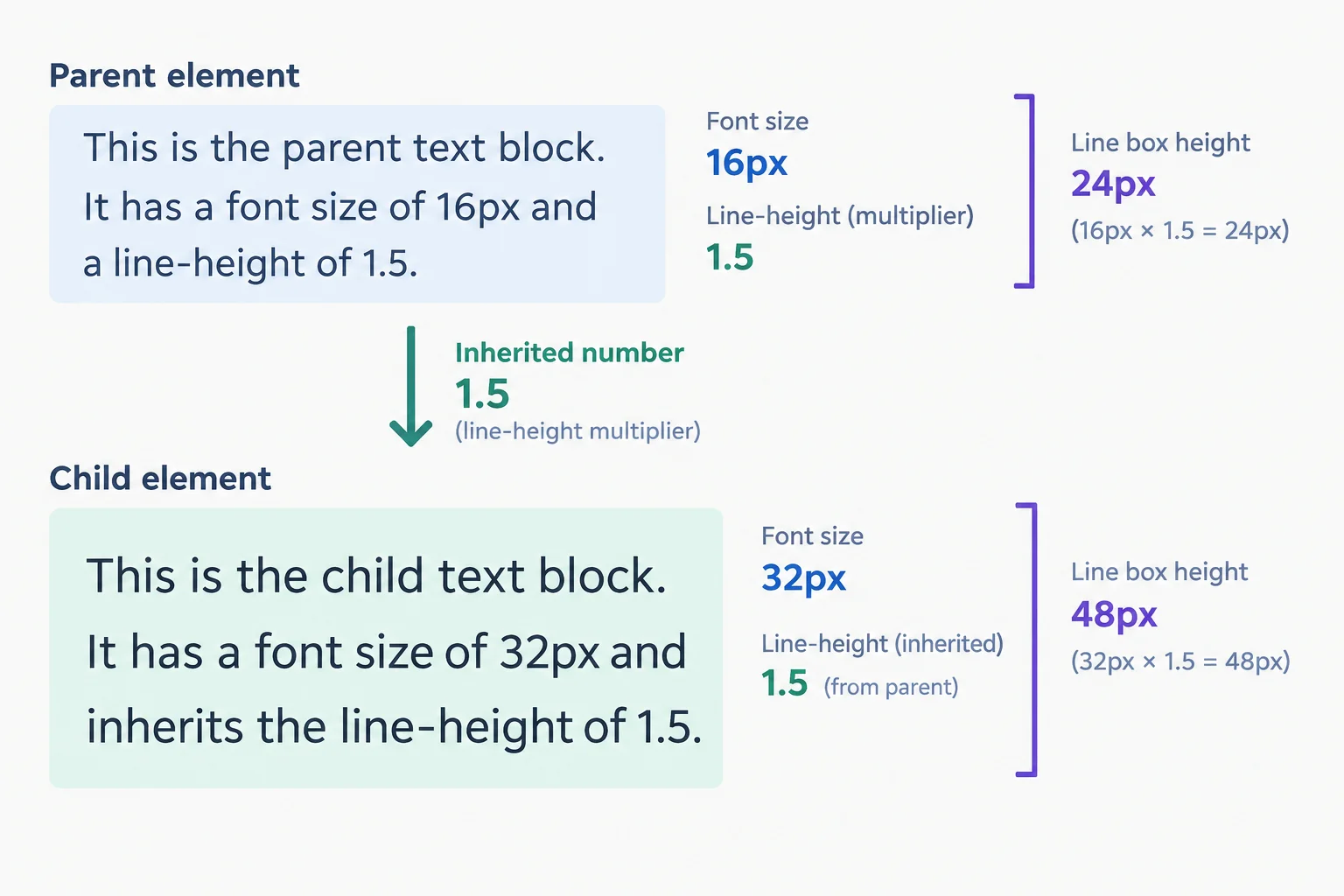
A unitless line-height stays proportional because each element calculates from its own computed font size.
A fixed length behaves differently. With line-height: 24px;, a child inherits the computed 24px length. With line-height: 1.5em;, the em first uses the parent element's own computed font size: on a 16px parent, it becomes 24px. That computed length is then inherited.
Neither form passes a multiplier to a larger child. Use a unitless line-height when descendants should keep proportional line spacing.
Compare what a child with a computed font size of 32px receives from a parent whose computed font size is 16px.
| Parent declaration | Parent line box | Child inherits | Child line box |
|---|---|---|---|
| line-height: 1.5; | 24px | number 1.5 | 48px |
| line-height: 24px; | 24px | length 24px | 24px |
| line-height: 1.5em; | 24px | length 24px | 24px |
Illustrative CSS only: the final page will use a comfortable multiplier for prose and a tighter explicit multiplier for headings.
body {
  line-height: 1.5;
}

h1,
h2 {
  line-height: 1.2;
}Assume the root element has a computed font size of 16px. .reading-note previously used line-height: 24px;. Replace that fixed value with a unitless value that preserves the parent's line box. Then complete the descendant's line height and identify what the fixed alternatives pass on.
.reading-note {
  font-size: 1rem;
  line-height: ;
}

.reading-note span {
  font-size: 2rem;
  /* inherited line height:  */
}

/* A 24px or 1.5em value on the parent passes a computed . */
Step 6 of 8
Choose a readable alignment for prose and preserve a familiar underline on text links.
text-align aligns inline content—such as the lines of a paragraph—inside its container. It does not move or center the container itself.
For the English prose in Neighborhood Reading Club, start places lines against the left edge. The uneven right edge gives the eye a stable place to begin each new line.
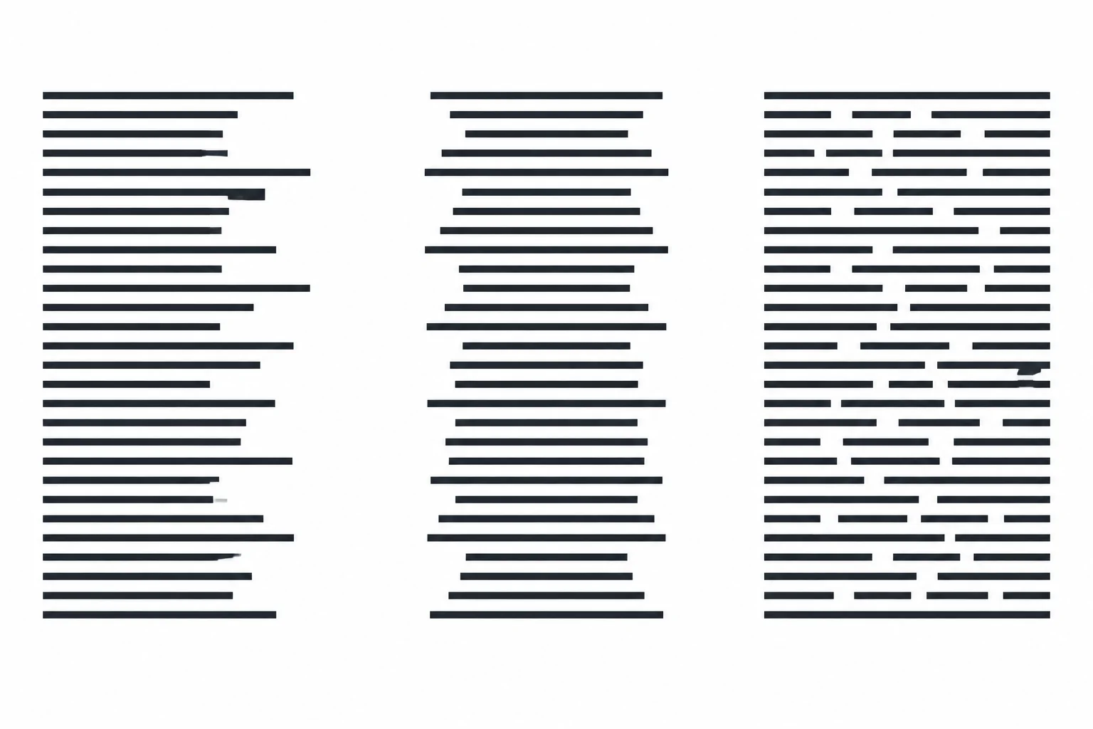
For English prose, start alignment creates the stable reading edge in the first block. Centering or stretching long lines can make scanning less comfortable.
Illustrative CSS only: the final local stylesheet will place this declaration on body so ordinary prose inherits it.
body {
  text-align: start;
}A text link should remain easy to recognize within a paragraph. An underline is a familiar visual cue, while the anchor element and its href keep the link’s existing semantics.
Use text-decoration to add the visual treatment. It does not turn a non-link into a link or change where an existing same-page link goes.
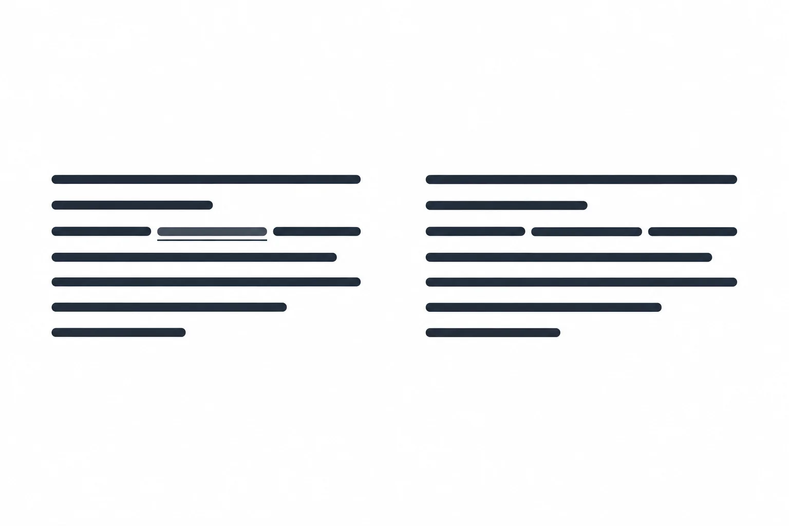
An underline helps an inline text link stand out from the surrounding prose without changing the HTML link.
Illustrative CSS only: this is the link rule used in the final local stylesheet.
a {
  text-decoration: underline;
}
Tip
Avoid centering prose merely to make a page look decorative. text-align: start; is logical alignment: in this English example, the start edge is the left edge.
For a long English paragraph, choose the treatment that supports comfortable scanning.
Complete the declarations for readable English prose and recognizable text links.
body {
  text-align: ;
}

a {
  text-decoration: ;
}
Step 7 of 8
Make native form controls share the surrounding page typography with a focused inheritance rule.
Native form controls can use browser-provided typography instead of the font settings inherited by ordinary page text. As a result, the labeled input and the Join the club button may look like they use a different typeface or size than the surrounding Neighborhood Reading Club content.
This is normal browser behavior, and it can vary by browser and operating system.
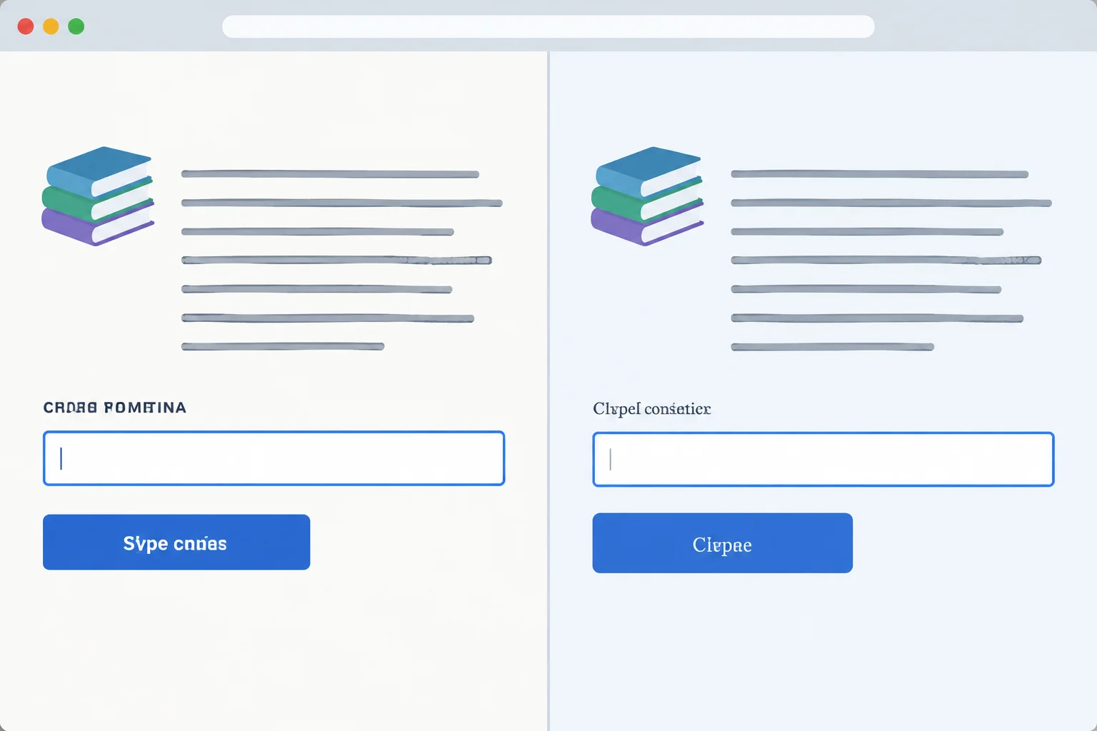
Matching a control’s typography does not mean removing its native border, focus indicator, or behavior.
Use font: inherit; on a control to inherit its parent element’s font settings: family, size, weight, style, and unitless line-height.
A selector list lets one rule cover common controls. This is an illustrative rule for now; you will add it to the complete local stylesheet in the next step. It changes typography only. Do not add rules that remove native control appearance or keyboard focus indicators.
Illustrative CSS only: this rule will be included in the complete local stylesheet in the next step.
input,
button,
select,
textarea {
  font: inherit;
}
Tip
The body font settings remain the source of the typography. Controls can still have platform-specific borders, shapes, and other native rendering after they inherit the font.
Which approach makes native controls match the surrounding typography while preserving their native appearance and focus behavior?
Complete the shared control rule. It should match the parent typography without removing native control appearance or focus behavior.
input,
button,
select,
textarea {
  font: ;
}
Step 8 of 8
Finish and inspect a readable local page while preserving its semantic HTML and native controls.
You have built each typography choice separately. Now combine them on one local page and inspect the result.
A readable result has a clear heading hierarchy, comfortable prose, an italic inline emphasis, an underlined text link, and controls whose text belongs visually with the page. Keep the semantic HTML and native controls: CSS changes presentation, not their meaning.
Because system-ui selects a platform interface font, exact letter shapes and native control details can differ on your computer.
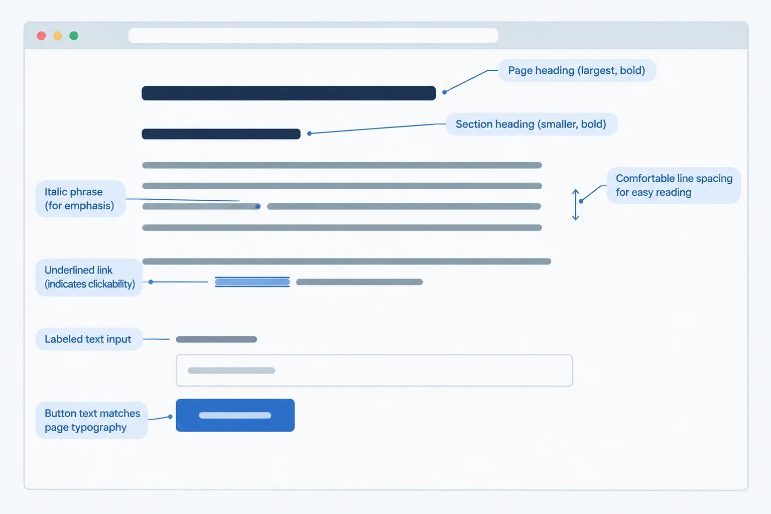
Use this as a visual target: hierarchy, line spacing, link recognition, and control typography should be easy to notice.
On your computer, create or open a folder containing index.html and styles.css. Save this complete HTML in index.html. It connects the local stylesheet and preserves meaningful headings, emphasis, a same-page link, and native form controls.
<!doctype html>
<html lang="en">
<head>
  <meta charset="utf-8">
  <title>Neighborhood Reading Club</title>
  <link rel="stylesheet" href="styles.css">
</head>
<body>
  <main>
    <h1>Neighborhood Reading Club</h1>
    <p>Our <em>friendly</em> club reads one book each month. <a href="#join">Jump to membership</a>.</p>

    <section id="join">
      <h2>Next meeting</h2>
      <p>Bring a book suggestion and meet your neighbors.</p>
      <label for="member-name">Your name</label>
      <input id="member-name" name="member-name" type="text">
      <button type="button">Join the club</button>
    </section>
  </main>
</body>
</html>Browser result after the completed styles.css is saved: A large bold “Neighborhood Reading Club” heading appears above readable start-aligned prose. “Next meeting” is a smaller bold heading. The emphasized word is italic, the same-page link is underlined, and the input and button text use the page typography.
After you add the completed stylesheet later in this step and refresh the file, use the browser result below as the expected visual result.
Create styles.css in the same folder. Begin with this selector structure, then complete the declarations from the earlier steps. Do not add layout or element-spacing rules; this practice focuses only on typography.
body {
  /* Add the shared font family, body size and weight, line-height, and prose alignment. */
}

h1,
h2 {
  /* Add the shared heading weight and line-height. */
}

h1 {
  /* Add the h1 size. */
}

h2 {
  /* Add the h2 size. */
}

em {
  /* Add the inline emphasis style. */
}

a {
  /* Add the recognizable link decoration. */
}

input,
button {
  /* Make each control use its parent's font settings. */
}Browser result with this starter alone: The page renders using browser defaults. Heading sizes, link appearance, and native control typography may not form the intended consistent text system yet.
With only this starter, the browser uses its default text presentation. Complete the declarations and then compare your local result with the reference stylesheet.
Complete the essential declarations for ordinary page text and the two controls.
body {
  font-family: ;
  font-size: ;
  font-weight: ;
  line-height: ;
  text-align: ;
}

input,
button {
  font: ;
}After attempting the starter stylesheet, compare it with this complete reference. The HTML stays unchanged. For interpreting the rem values, assume the root element has a computed font size of 16px; this stylesheet does not force a root size.
body {
  font-family: system-ui, "Segoe UI", Arial, sans-serif;
  font-size: 1rem;
  font-weight: 400;
  line-height: 1.5;
  text-align: start;
}

h1,
h2 {
  font-weight: 700;
  line-height: 1.2;
}

h1 {
  font-size: 2rem;
}

h2 {
  font-size: 1.5rem;
}

em {
  font-style: italic;
}

a {
  text-decoration: underline;
}

input,
button {
  font: inherit;
}Browser result after saving styles.css and refreshing index.html: “Neighborhood Reading Club” is the largest, bold heading. “Next meeting” is a smaller bold heading. Body text is 1rem with comfortable proportional line spacing and start alignment. The emphasized word is italic, the same-page link is underlined, and the input and button text matches the surrounding page typography.
Native control borders, shapes, and exact font letterforms can vary by browser and operating system. Check the typography relationships rather than requiring an identical screenshot.
Save the reference or correct your own stylesheet to match it, then refresh index.html in your browser. Check the relationships shown in the visual target, not pixel-perfect platform rendering.
On your computer, complete or correct styles.css, save it, and refresh index.html. In one to three sentences, report one typography improvement you observe and name the CSS choice that produced it.
Write at least 80 characters (0/80).
Summary
body provides an inherited default while allowing platform-specific rendering.h1, and h2 without changing semantic HTML.font: inherit; on controls support readable, recognizable text.Congratulations! You completed: Style Readable Text with CSS
Thousands of online courses in video, ebooks and audiobooks.
To test your knowledge during online courses
Generated directly from your cell phone's photo gallery and sent to your email

Download our app via QR Code or the links below:.



Carry knowledge in your pocket.
Download the Cursa app.
There are hundreds of free courses available, with a free certificate of completion that is saved in your mobile image gallery.
Download the app to access the Course Completion Certificate for Free.


+ 10 million
students

Free and Valid
Certificate

60 thousand free
exercises

4.8/5 rating in
app stores

Free courses in
video and ebooks