
Step 1 of 8
Extract a Component Around One Responsibility
Extract a focused workshop function component in the same file while preserving the page’s semantic HTML structure.

Learning path · Level 9 · Tutorial 2
Extract reusable components with explicit prop contracts and compose them into an interface while preserving semantic structure.

 Extract a Component Around One Responsibility
Extract a focused workshop function component in the same file while preserving the page’s semantic HTML structure. 2 min
Extract a Component Around One Responsibility
Extract a focused workshop function component in the same file while preserving the page’s semantic HTML structure. 2 min
 Define Required Prop Contracts
Declare required typed props and pass valid values to explicit WorkshopCard component instances. 2 min
Define Required Prop Contracts
Declare required typed props and pass valid values to explicit WorkshopCard component instances. 2 min
 Pass Expressions and Structured Values
Pass strings, numeric expressions, and typed presenter objects to WorkshopCard component instances. 2 min
Pass Expressions and Structured Values
Pass strings, numeric expressions, and typed presenter objects to WorkshopCard component instances. 2 min
 Destructure Props and Set Optional Defaults
Give an optional venue prop a parameter default while preserving the required WorkshopCard inputs. 2 min
Destructure Props and Set Optional Defaults
Give an optional venue prop a parameter default while preserving the required WorkshopCard inputs. 2 min
 Keep Component Inputs Unchanged
Recognize prop mutation and replace it with a non-mutating presentation calculation. 2 min
Keep Component Inputs Unchanged
Recognize prop mutation and replace it with a non-mutating presentation calculation. 2 min
 Compose Components Across Files
Move the reusable WorkshopCard into its own module, then import and compose explicit instances without changing its prop contract or semantic output. 2 min
Compose Components Across Files
Move the reusable WorkshopCard into its own module, then import and compose explicit instances without changing its prop contract or semantic output. 2 min
 Accept Nested Content with Typed Children
Create a typed section wrapper that receives caller-supplied nested JSX through `children` while preserving the Workshop Board’s semantic structure. 2 min
Accept Nested Content with Typed Children
Create a typed section wrapper that receives caller-supplied nested JSX through `children` while preserving the Workshop Board’s semantic structure. 2 min
 Build and Check the Composed Interface
Assemble and verify a semantic Workshop Board with imported components, typed inputs, an optional default, and nested children. 2 min
Build and Check the Composed Interface
Assemble and verify a semantic Workshop Board with imported components, typed inputs, an optional default, and nested children. 2 min
Step 1 of 8
Extract a focused workshop function component in the same file while preserving the page’s semantic HTML structure.
A component boundary should represent one reusable interface responsibility. Here, one workshop presentation becomes a WorkshopCard function component. Keep the page shell in App; do not create a component for every HTML element.
At this stage, the workshop content is still fixed. The extraction changes where the markup lives, not what semantic HTML the browser receives.
The workshop article begins inside App.tsx.
export default function App() {
  return (
    <main>
      <h1>Workshop Board</h1>
      <section>
        <h2>Upcoming workshops</h2>
        <article>
          <h3>Semantic HTML</h3>
        </article>
      </section>
    </main>
  );
}Move only the workshop-presenting markup into the function component, still in src/App.tsx. Replace the original article with its component element.
function WorkshopCard() {
  return (
    <article>
      <h3>Semantic HTML</h3>
    </article>
  );
}

export default function App() {
  return (
    <main>
      <h1>Workshop Board</h1>
      <section>
        <h2>Upcoming workshops</h2>
        <WorkshopCard />
      </section>
    </main>
  );
}The component tree describes which function component renders another. The HTML tree describes the elements those components return.
App renders WorkshopCard, but the browser does not receive a <WorkshopCard> HTML element. It receives the article and h3 returned by that function component.
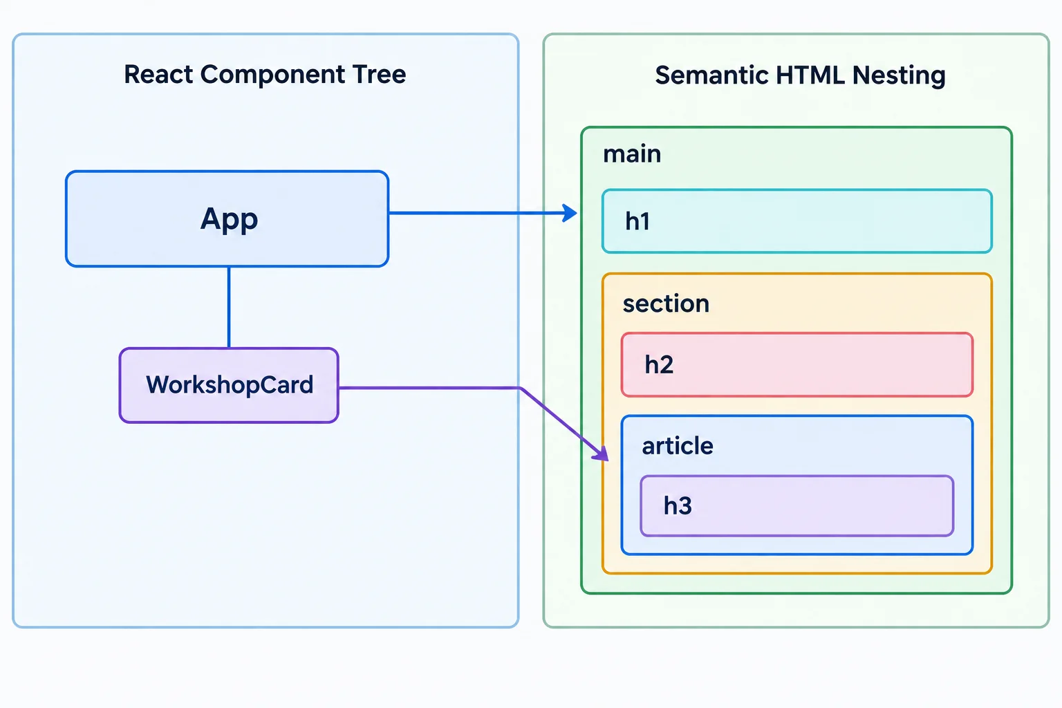
Components organize rendering responsibilities; semantic elements organize the document structure.
Tip
Preserve the semantic roles during extraction: App keeps the page-level main and h1, while WorkshopCard returns the workshop-level article and h3.
Match each item to its responsibility.
Tap an item and then its matching pair.
Complete the JSX replacement for the extracted workshop markup. Do not add an HTML wrapper.
function WorkshopCard() {
  return (
    <article>
      <h3>Semantic HTML</h3>
    </article>
  );
}

export default function App() {
  return (
    <main>
      <h1>Workshop Board</h1>
      <section>
        <h2>Upcoming workshops</h2>

      </section>
    </main>
  );
}
Step 2 of 8
Declare required typed props and pass valid values to explicit WorkshopCard component instances.
A prop contract names the inputs a function component requires from its caller. It lets TypeScript check each component instance before the app runs.
For WorkshopCard, require a workshop title and its duration in minutes. The component receives those values through one props object, then renders them in its existing semantic elements.
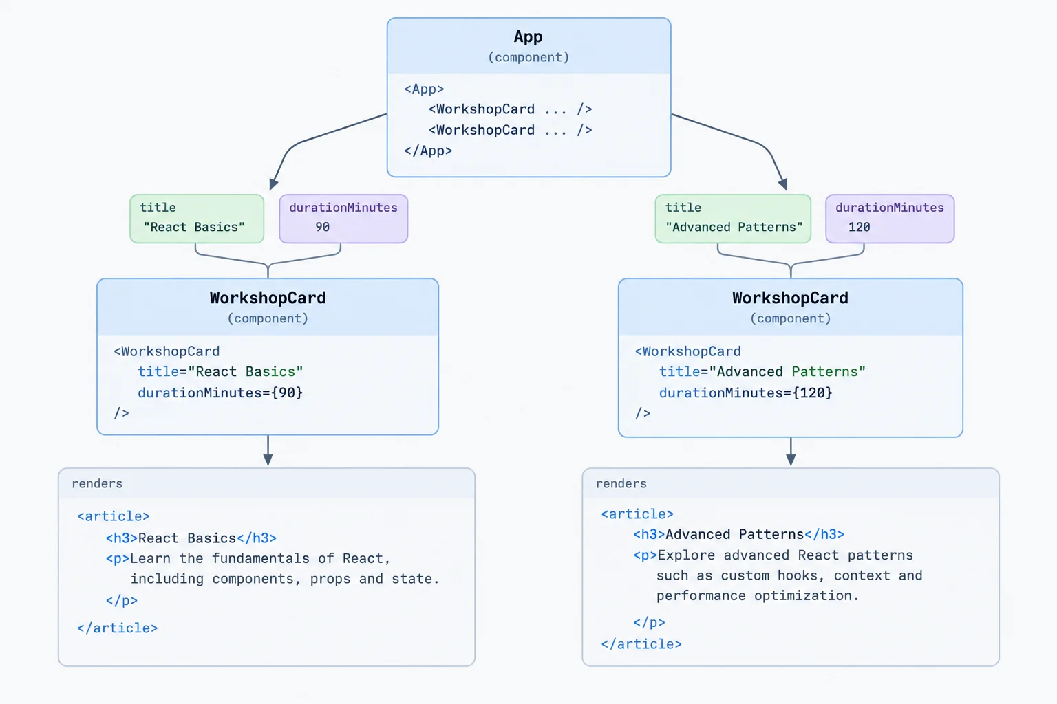
The prop contract is the checked boundary between the caller and each component instance.
In src/App.tsx, add a named type alias above the existing function component. Annotate the props parameter with that alias. Inside JSX, read values from props with dot notation.
type WorkshopCardProps = {
  title: string;
  durationMinutes: number;
};

function WorkshopCard(props: WorkshopCardProps) {
  return (
    <article>
      <h3>{props.title}</h3>
      <p>{props.durationMinutes} minutes</p>
    </article>
  );
}A quoted JSX attribute is a string literal. A number is a JavaScript expression, so put it in braces. Supply both required props to every explicit WorkshopCard component instance.
export default function App() {
  return (
    <main>
      <h1>Workshop Board</h1>
      <section>
        <h2>Upcoming workshops</h2>
        <WorkshopCard title="Semantic HTML" durationMinutes={45} />
        <WorkshopCard title="Responsive CSS" durationMinutes={60} />
      </section>
    </main>
  );
}
Tip
TypeScript reports a missing required prop when a call leaves out title or durationMinutes. It reports an incompatible value when a prop has the wrong type, such as a quoted duration.
These checks happen while TypeScript analyzes your code. A prop type is not runtime validation for data that could arrive from outside your app.
Complete the prop contract and the two valid component calls. Then classify the diagnostic for the final call.
type WorkshopCardProps = {
  title: ;
  durationMinutes: ;
};

function WorkshopCard(props: WorkshopCardProps) {
  return (
    <article>
      <h3>{props.title}</h3>
      <p>{props.durationMinutes} minutes</p>
    </article>
  );
}

export default function App() {
  return (
    <main>
      <h1>Workshop Board</h1>
      <section>
        <h2>Upcoming workshops</h2>
        <WorkshopCard  />
        <WorkshopCard  />
        <WorkshopCard title="Responsive CSS" durationMinutes="60" />
      </section>
    </main>
  );
}

// The final call fails because it has an .
Step 3 of 8
Pass strings, numeric expressions, and typed presenter objects to WorkshopCard component instances.
JSX uses two forms for prop values:
title="Semantic HTML".Braces evaluate JavaScript. This preserves a number as a number and passes the value stored in a variable instead of its variable name.
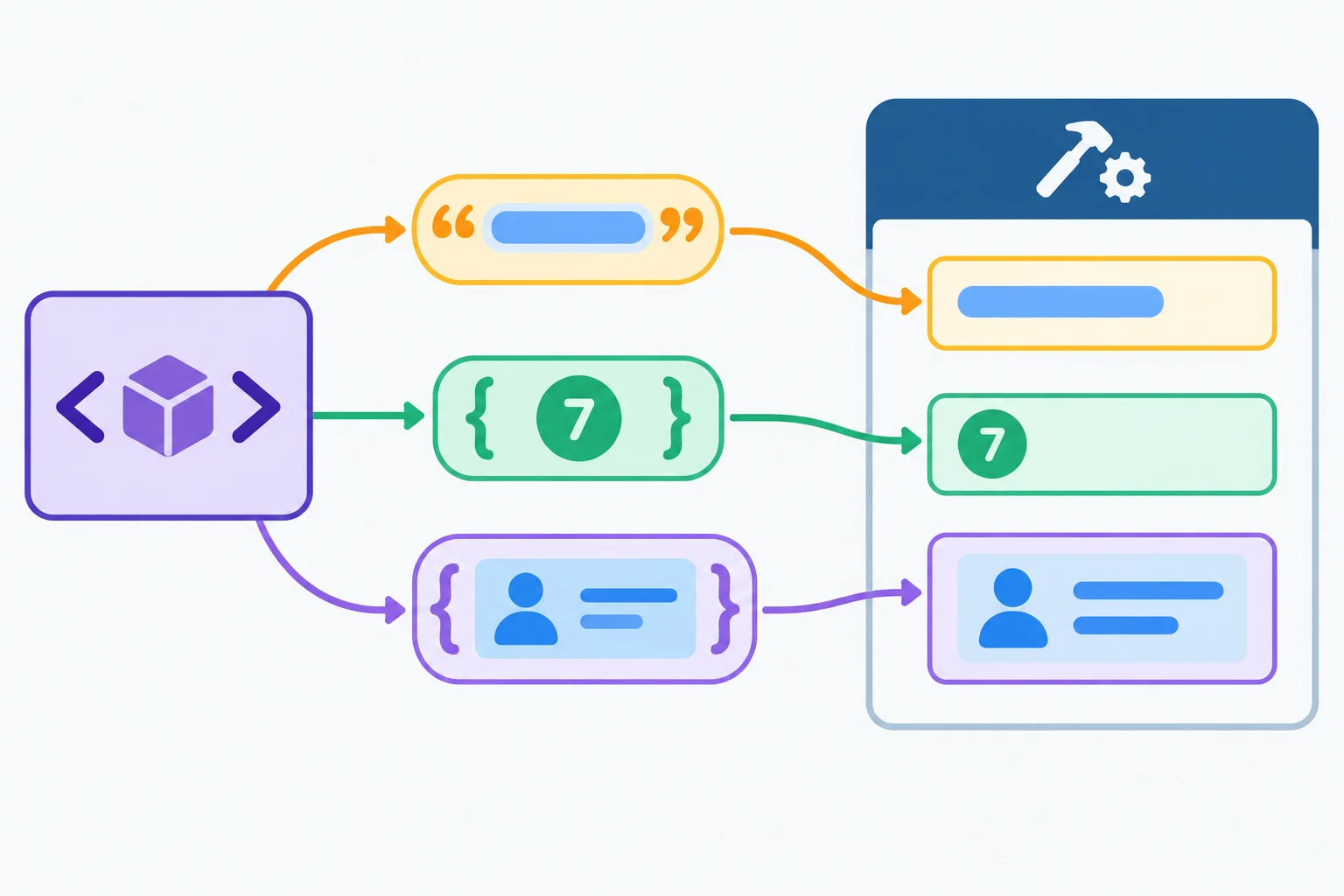
Quoted attributes carry literal strings. Curly braces pass JavaScript expressions, including numeric values and object variables.
Use the syntax that preserves each value's type.
| Value kind | JSX prop syntax |
|---|---|
| Literal string | title="Semantic HTML" |
| Number expression | durationMinutes={45} |
| Named object expression | presenter={htmlPresenter} |
A presenter has related fields, so pass one structured value instead of separate presenterName and presenterRole props. The Presenter prop contract specifies the object's required shape.
Inside the function component, read fields through props.presenter. At the call site, htmlPresenter and cssPresenter are values that follow Presenter.
An inline object expression such as presenter={{ name: "Ada Brooks", role: "Accessibility educator" }} is equivalent. This Workshop Board uses named presenter objects so each component instance is easier to scan.
Add the structured presenter input while preserving the existing semantic page shell.
type Presenter = {
  name: string;
  role: string;
};

type WorkshopCardProps = {
  title: string;
  durationMinutes: number;
  presenter: Presenter;
};

function WorkshopCard(props: WorkshopCardProps) {
  return (
    <article>
      <h3>{props.title}</h3>
      <p>{props.durationMinutes} minutes</p>
      <p>{props.presenter.name}</p>
      <p>{props.presenter.role}</p>
    </article>
  );
}

const htmlPresenter: Presenter = {
  name: "Ada Brooks",
  role: "Accessibility educator",
};

const cssPresenter: Presenter = {
  name: "Leo Chen",
  role: "Front-end educator",
};

export default function App() {
  return (
    <main>
      <h1>Workshop Board</h1>
      <section>
        <h2>Upcoming workshops</h2>
        <WorkshopCard
          title="Semantic HTML"
          durationMinutes={45}
          presenter={htmlPresenter}
        />
        <WorkshopCard
          title="Responsive CSS"
          durationMinutes={60}
          presenter={cssPresenter}
        />
      </section>
    </main>
  );
}Match each value kind to the JSX prop syntax that passes it correctly.
Tap an item and then its matching pair.
Complete the Semantic HTML WorkshopCard component instance. Pass its title, numeric duration, and the named presenter object.
<WorkshopCard


/>
Step 4 of 8
Give an optional venue prop a parameter default while preserving the required WorkshopCard inputs.
WorkshopCard still receives one object that follows its prop contract. Destructuring lets the function component name the individual inputs directly in its parameter.
Keep the annotation: : WorkshopCardProps remains the contract for the whole props object. Add venue?: string to make only venue optional; title, durationMinutes, and presenter stay required.
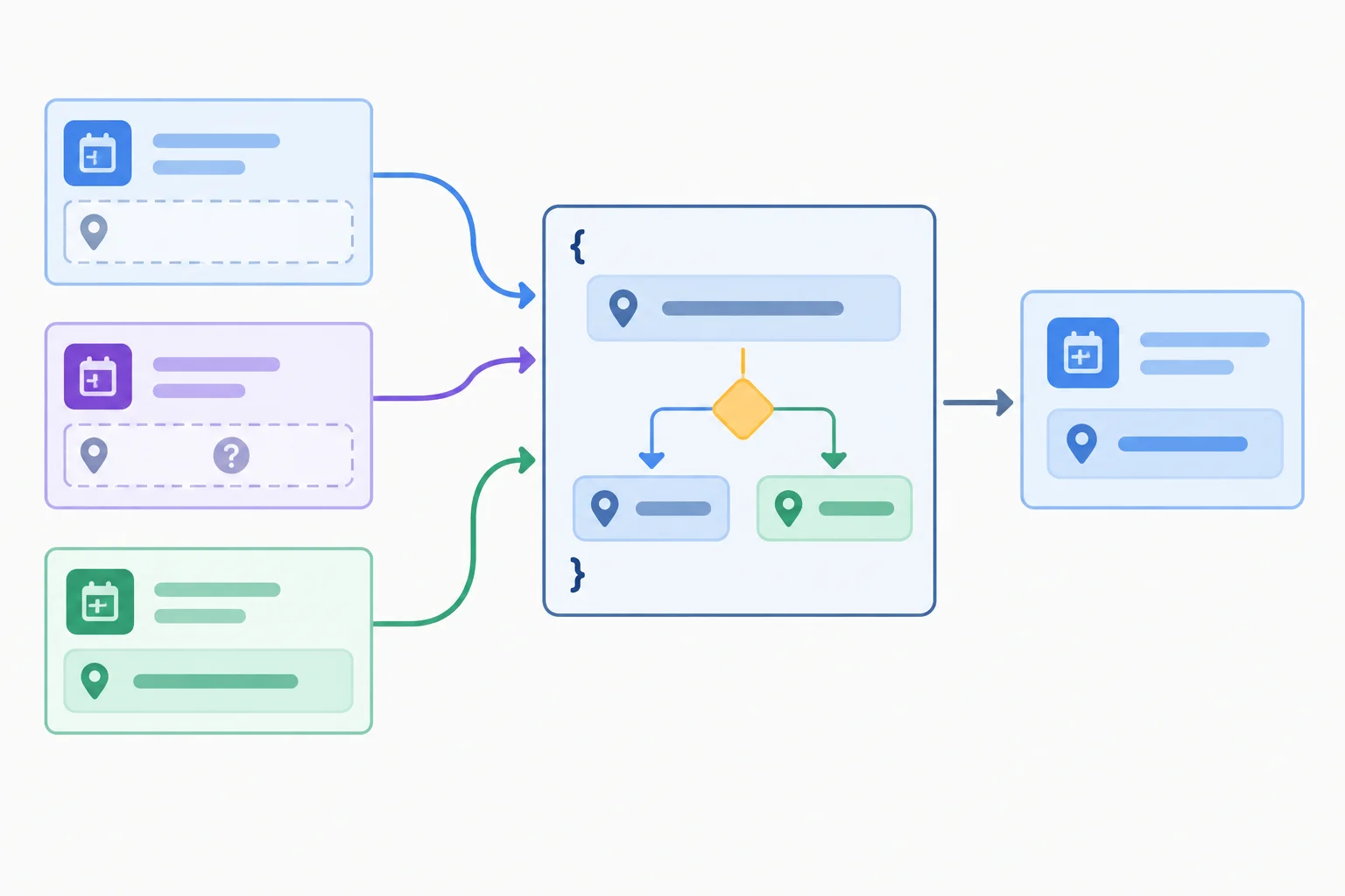
A parameter default is chosen before the component renders its venue paragraph.
Add the optional property and destructure every value that the component displays.
type Presenter = {
  name: string;
  role: string;
};

type WorkshopCardProps = {
  title: string;
  durationMinutes: number;
  presenter: Presenter;
  venue?: string;
};

export function WorkshopCard(
  { title, durationMinutes, presenter, venue = "Online" }: WorkshopCardProps
) {
  return (
    <article>
      <h3>{title}</h3>
      <p>{durationMinutes} minutes</p>
      <p>{presenter.name}</p>
      <p>{venue}</p>
    </article>
  );
}The ? changes the contract only for venue. The default after venue = handles the cases in which that prop has no value for the component to use.
A supplied string is not replaced. This makes the component predictable while retaining strict checks for its required workshop information.
Compare what the caller passes with the value rendered by <p>{venue}</p>.
| Caller input | Rendered venue |
|---|---|
| No venue prop | Online |
| venue={undefined} | Online |
| venue="Room 2" | Room 2 |
Tip
A default value is a presentation choice inside WorkshopCard; it does not make title, durationMinutes, or presenter optional. TypeScript can still report a missing required prop at a component instance.
Complete the optional venue declaration and parameter default. Then predict the displayed venue for each caller input.
type Presenter = {
  name: string;
  role: string;
};

type WorkshopCardProps = {
  title: string;
  durationMinutes: number;
  presenter: Presenter;
  venue: string;
};

export function WorkshopCard(
  { title, durationMinutes, presenter, venue  "Online" }: WorkshopCardProps
) {
  return <p>{venue}</p>;
}

// Omitted venue displays:
// venue={undefined} displays:
// venue="Room 2" displays: 
Step 5 of 8
Recognize prop mutation and replace it with a non-mutating presentation calculation.
A function component receives props from its caller. Treat every prop as read-only, including an object such as presenter.
Passing htmlPresenter into a component—or destructuring presenter from props—does not make a copy. Both names can refer to the same object. Therefore, assigning to presenter.name inside WorkshopCard would also change data that belongs to the caller.
A normal TypeScript prop contract checks the expected shape of values, but it does not freeze an object at runtime or make nested properties immutable.
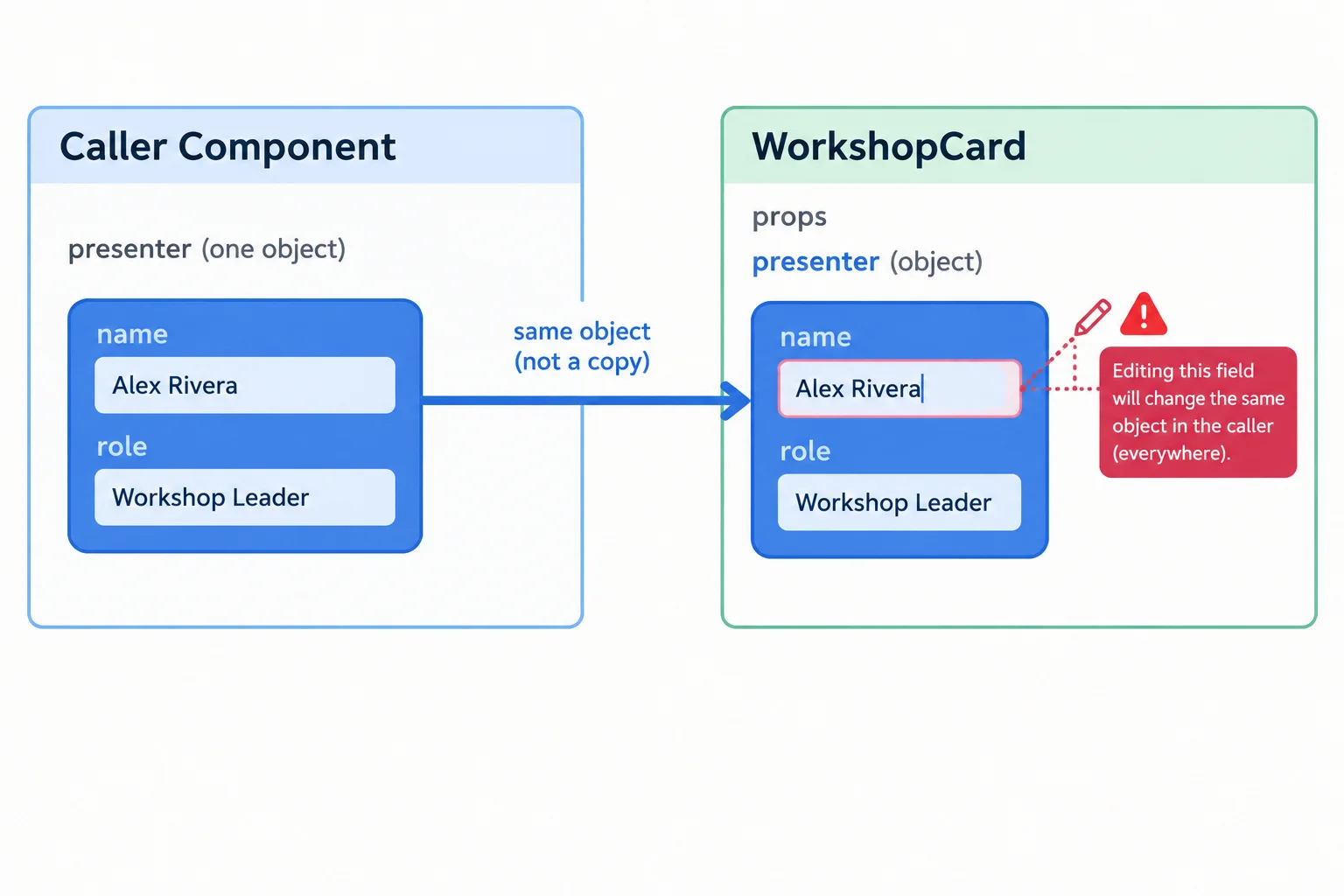
Destructuring changes how you name an input; it does not create a new presenter object.
Instead of changing an input, calculate a value for this render and store it in a local constant. String methods such as toUpperCase() return a new string; they do not assign back into presenter.name.
The component can render displayName while the caller's presenter object remains unchanged.
export function WorkshopCard({
  title,
  durationMinutes,
  presenter,
  venue = "Online"
}: WorkshopCardProps) {
  const displayName = presenter.name.toUpperCase();

  return (
    <article>
      <h3>{title}</h3>
      <p>{durationMinutes} minutes</p>
      <p>{displayName}</p>
      <p>{presenter.role}</p>
      <p>{venue}</p>
    </article>
  );
}
Tip
A local constant is for presentation in the current render. It is different from assigning to a prop or to a nested property such as presenter.name.
Which line mutates the object supplied through presenter?
Choose the assignment that changes caller-owned data.
Complete the local display calculation. It must create an uppercase string without changing the supplied presenter object.
export function WorkshopCard({
  title,
  presenter
}: WorkshopCardProps) {
  const displayName = presenter.name.();

  return (
    <article>
      <h3>{title}</h3>
      <p>{displayName}</p>
    </article>
  );
}
Step 6 of 8
Move the reusable WorkshopCard into its own module, then import and compose explicit instances without changing its prop contract or semantic output.
WorkshopCard has one reusable presentation responsibility: show one workshop. Move that function component and the type aliases it uses into src/components/WorkshopCard.tsx.
App remains the composition boundary. It supplies workshop data and places two explicit component instances inside the existing page shell. Moving code changes the file dependency, not the prop contract or semantic HTML returned by each function component.
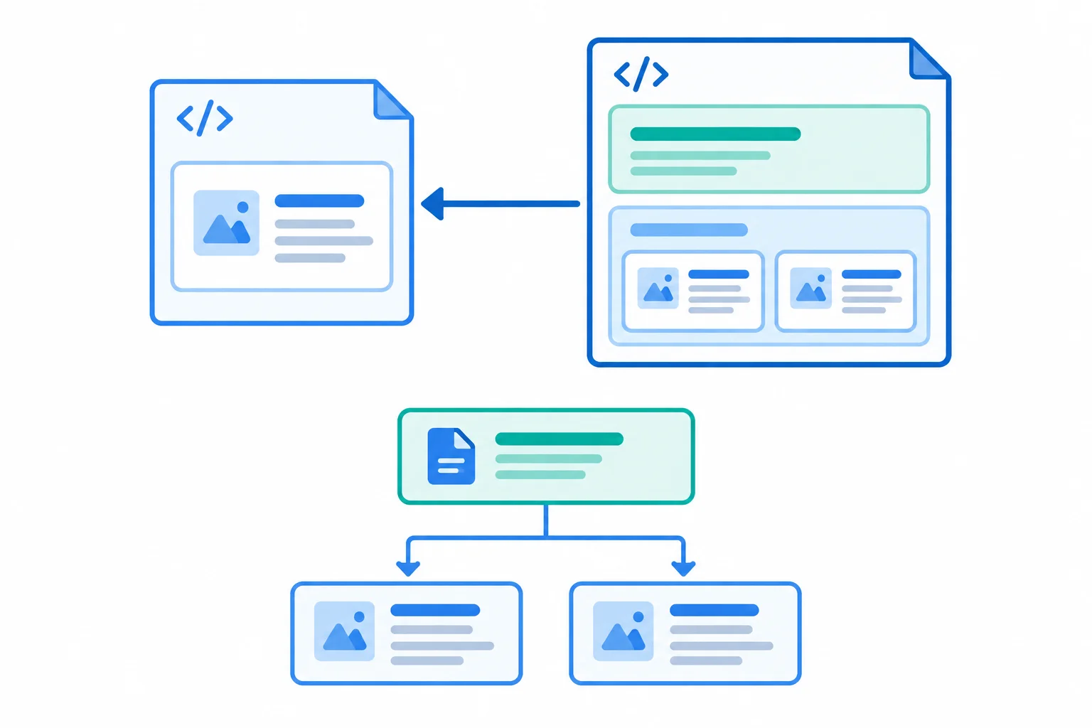
The dependency arrow goes from App.tsx to WorkshopCard.tsx: App imports and depends on the card module. Separately, the component tree shows App rendering two card instances.
Copy the established prop contract and function component into its own module. WorkshopCard still owns its article, h3, and workshop metadata. Extracting a module does not require making a separate function component for every HTML element.
Move the reusable card and its supporting type aliases into this module.
export type Presenter = {
  name: string;
  role: string;
};

type WorkshopCardProps = {
  title: string;
  durationMinutes: number;
  presenter: Presenter;
  venue?: string;
};

export function WorkshopCard({
  title,
  durationMinutes,
  presenter,
  venue = "Online",
}: WorkshopCardProps) {
  const displayName = presenter.name.toUpperCase();

  return (
    <article>
      <h3>{title}</h3>
      <p>{durationMinutes} minutes</p>
      <p>{displayName}</p>
      <p>{presenter.role}</p>
      <p>{venue}</p>
    </article>
  );
}In App, import the named function component. App owns the page-level main, its h1, the existing section, and the two different sets of input values. It does not need to know how WorkshopCard lays out those values.
Import the reusable function component and compose two explicit instances.
import { WorkshopCard } from "./components/WorkshopCard.tsx";

const htmlPresenter = {
  name: "Ada Brooks",
  role: "Accessibility educator",
};

const cssPresenter = {
  name: "Leo Chen",
  role: "Front-end educator",
};

export default function App() {
  return (
    <main>
      <h1>Workshop Board</h1>
      <section>
        <h2>Upcoming workshops</h2>
        <WorkshopCard
          title="Semantic HTML"
          durationMinutes={45}
          presenter={htmlPresenter}
        />
        <WorkshopCard
          title="Responsive CSS"
          durationMinutes={60}
          presenter={cssPresenter}
          venue="Room 2"
        />
      </section>
    </main>
  );
}Match each item to the responsibility it owns.
Tap an item and then its matching pair.
Complete only the named export and the matching import. The prop contract, semantic card markup, and valid component instances are already established.
// src/components/WorkshopCard.tsx
type Presenter = {
  name: string;
  role: string;
};

type WorkshopCardProps = {
  title: string;
  durationMinutes: number;
  presenter: Presenter;
  venue?: string;
};

 function WorkshopCard({ title, durationMinutes, presenter, venue = "Online" }: WorkshopCardProps) {
  const displayName = presenter.name.toUpperCase();

  return (
    <article>
      <h3>{title}</h3>
      <p>{durationMinutes} minutes</p>
      <p>{displayName}</p>
      <p>{presenter.role}</p>
      <p>{venue}</p>
    </article>
  );
}

// src/App.tsx


const htmlPresenter = {
  name: "Ada Brooks",
  role: "Accessibility educator",
};

const cssPresenter = {
  name: "Leo Chen",
  role: "Front-end educator",
};

export default function App() {
  return (
    <main>
      <h1>Workshop Board</h1>
      <section>
        <h2>Upcoming workshops</h2>
        <WorkshopCard title="Semantic HTML" durationMinutes={45} presenter={htmlPresenter} />
        <WorkshopCard title="Responsive CSS" durationMinutes={60} presenter={cssPresenter} venue="Room 2" />
      </section>
    </main>
  );
}
Step 7 of 8
Create a typed section wrapper that receives caller-supplied nested JSX through children while preserving the Workshop Board’s semantic structure.
WorkshopSection is a function component with one presentation responsibility: it owns the section shell. It renders a section and its h2, but it does not decide which workshop cards belong inside.
App still owns the page shell (main and h1) and supplies the workshop card elements. Those nested elements arrive at WorkshopSection through the special children prop.
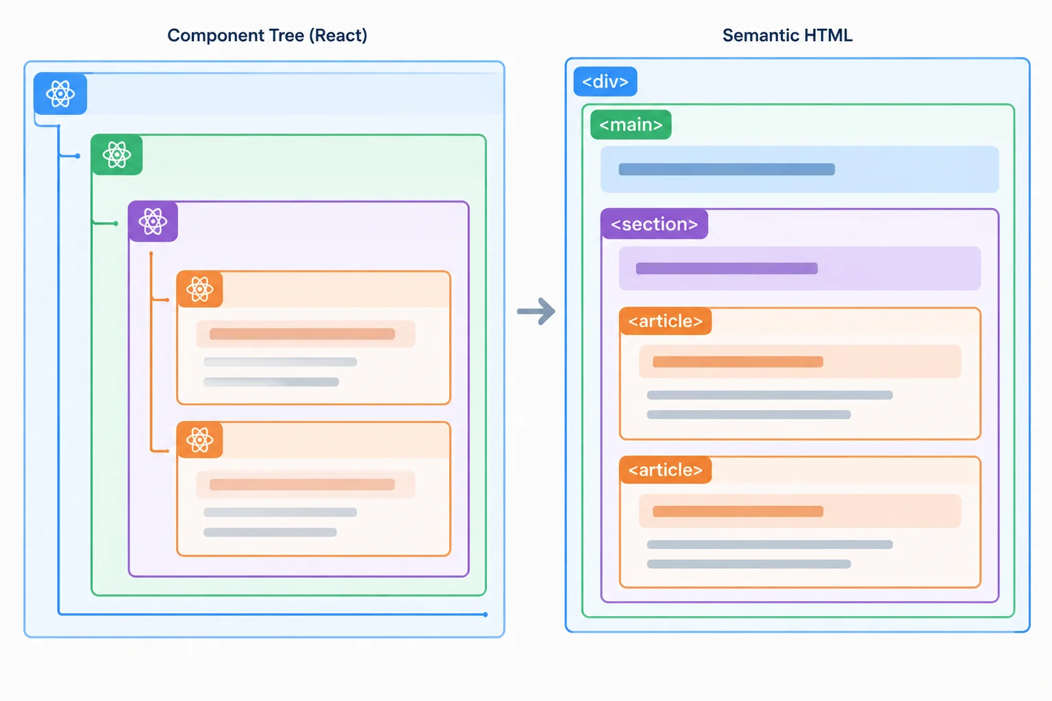
The wrapper supplies the section structure; the caller supplies the card elements nested inside it.
Warning
ReactNode describes renderable React content, so it is appropriate for children. It does not make every possible child meaningful or semantically valid. The caller must still place content that makes sense after the section heading—for this interface, workshop article elements.
Create WorkshopSection as a named export. import type communicates that ReactNode is used only for type checking, not as a runtime value.
import type { ReactNode } from "react";

type WorkshopSectionProps = {
  title: string;
  children: ReactNode;
};

export function WorkshopSection({
  title,
  children,
}: WorkshopSectionProps) {
  return (
    <section>
      <h2>{title}</h2>
      {children}
    </section>
  );
}Import the wrapper into App and put the two explicit WorkshopCard component instances between its opening and closing tags. That nested JSX becomes the wrapper's children.
import { WorkshopCard } from "./components/WorkshopCard.tsx";
import { WorkshopSection } from "./components/WorkshopSection.tsx";

const htmlPresenter = {
  name: "Ada Brooks",
  role: "Accessibility educator",
};

const cssPresenter = {
  name: "Leo Chen",
  role: "Front-end educator",
};

export default function App() {
  return (
    <main>
      <h1>Workshop Board</h1>
      <WorkshopSection title="Upcoming workshops">
        <WorkshopCard
          title="Semantic HTML"
          durationMinutes={45}
          presenter={htmlPresenter}
        />
        <WorkshopCard
          title="Responsive CSS"
          durationMinutes={60}
          presenter={cssPresenter}
          venue="Room 2"
        />
      </WorkshopSection>
    </main>
  );
}Complete the type-only import, the children prop contract, and the JSX expression that places received nested content after the heading.
import type { ReactNode } from "";

type WorkshopSectionProps = {
  title: string;
  children: ;
};

export function WorkshopSection({
  title,
  children,
}: WorkshopSectionProps) {
  return (
    <section>
      <h2>{title}</h2>

    </section>
  );
}Which composition preserves the intended main → section → article structure and heading relationships?

Step 8 of 8
Assemble and verify a semantic Workshop Board with imported components, typed inputs, an optional default, and nested children.
You now have the established prop contracts and component responsibilities. This final assembly connects them without adding abstractions: App owns the page-level shell and workshop data, WorkshopSection owns the section and its heading, and each WorkshopCard owns one workshop article.
Use this element hierarchy as your browser-check reference after running the app.

Expected element ownership: App renders main and h1; WorkshopSection renders section and h2; WorkshopCard renders article and h3.
Tip
The two cards are explicit component instances, not a generated list. Their data remains with App, while the function components present the inputs they receive.
Create or replace src/components/WorkshopCard.tsx. The local displayName is derived for presentation; it does not assign to presenter.name.
export type Presenter = {
  name: string;
  role: string;
};

type WorkshopCardProps = {
  title: string;
  durationMinutes: number;
  presenter: Presenter;
  venue?: string;
};

export function WorkshopCard({
  title,
  durationMinutes,
  presenter,
  venue = "Online",
}: WorkshopCardProps) {
  const displayName = presenter.name.toUpperCase();

  return (
    <article>
      <h3>{title}</h3>
      <p>{durationMinutes} minutes</p>
      <p>{displayName}</p>
      <p>{presenter.role}</p>
      <p>{venue}</p>
    </article>
  );
}Create or replace src/components/WorkshopSection.tsx. Its children are caller-supplied JSX placed after the section heading.
import type { ReactNode } from "react";

type WorkshopSectionProps = {
  title: string;
  children: ReactNode;
};

export function WorkshopSection({
  title,
  children,
}: WorkshopSectionProps) {
  return (
    <section>
      <h2>{title}</h2>
      {children}
    </section>
  );
}Replace src/App.tsx with this complete composition. App owns the named presenter objects and passes them as typed inputs to the imported component instances.
import {
  WorkshopCard,
  type Presenter,
} from "./components/WorkshopCard.tsx";
import { WorkshopSection } from "./components/WorkshopSection.tsx";

const htmlPresenter: Presenter = {
  name: "Ada Brooks",
  role: "Accessibility educator",
};

const cssPresenter: Presenter = {
  name: "Leo Chen",
  role: "Front-end educator",
};

export default function App() {
  return (
    <main>
      <h1>Workshop Board</h1>
      <WorkshopSection title="Upcoming workshops">
        <WorkshopCard
          title="Semantic HTML"
          durationMinutes={45}
          presenter={htmlPresenter}
        />
        <WorkshopCard
          title="Responsive CSS"
          durationMinutes={60}
          presenter={cssPresenter}
          venue="Room 2"
        />
      </WorkshopSection>
    </main>
  );
}Verify that your entry file imports the default App export. Replace src/main.tsx if its App import does not match this file.
import { StrictMode } from "react";
import { createRoot } from "react-dom/client";
import App from "./App.tsx";

createRoot(document.getElementById("root")!).render(
  <StrictMode>
    <App />
  </StrictMode>,
);From the project folder, run the type check and then start the local development server. Open the Local URL shown by Vite in your browser.
npx tsc --noEmit
npm run dev> project@0.0.0 dev > vite VITE v6.0.0 ready in 180 ms ➜ Local: http://localhost:5173/ ➜ press h + enter to show help
`npx tsc --noEmit` succeeds with no diagnostics, so it produces no text before the npm command begins. The package name, Vite version, and Local port can vary; use the Local URL printed by your own server.
Compare the browser with the completed source: the page has Workshop Board as its h1 and Upcoming workshops as its h2. Semantic HTML shows 45 minutes and the default venue; Responsive CSS shows 60 minutes and its supplied venue. Each article has its own h3 and presenter metadata.
Summary
Use the local type check and browser output as evidence for your final report.
Run the provided source locally before answering. In one short report, state whether TypeScript completed without diagnostics; identify each rendered workshop with its duration, venue, presenter name, and presenter role; describe the observed h1 → h2 → h3 hierarchy; and briefly explain why neither function component needs to modify its inputs.
Write at least 220 characters (0/220).
Congratulations! You completed: Compose Interfaces with Typed Props
Thousands of online courses in video, ebooks and audiobooks.
To test your knowledge during online courses
Generated directly from your cell phone's photo gallery and sent to your email

Download our app via QR Code or the links below:.



Carry knowledge in your pocket.
Download the Cursa app.
There are hundreds of free courses available, with a free certificate of completion that is saved in your mobile image gallery.
Download the app to access the Course Completion Certificate for Free.


+ 10 million
students

Free and Valid
Certificate

60 thousand free
exercises

4.8/5 rating in
app stores

Free courses in
video and ebooks