Step 1 of 7
Understand What a Transition Changes
Learn what a CSS transition adds to an existing interface state change.

Learning path · Level 2 · Tutorial 7
Add restrained transitions to interface state changes and provide a reduced-motion alternative that preserves immediate, usable feedback.
 Understand What a Transition Changes
Learn what a CSS transition adds to an existing interface state change. 1 min
Understand What a Transition Changes
Learn what a CSS transition adds to an existing interface state change. 1 min
 Set and Scope a Short Transition
Add a deliberately scoped background-color transition to the workshop link using longhands and equivalent shorthand. 2 min
Set and Scope a Short Transition
Add a deliberately scoped background-color transition to the workshop link using longhands and equivalent shorthand. 2 min
 Add a Small Transform Without Shifting Layout
Apply a small transform to the link label while keeping the link target and surrounding normal-flow content stable. 2 min
Add a Small Transform Without Shifting Layout
Apply a small transform to the link label while keeping the link target and surrounding normal-flow content stable. 2 min
 Keep Feedback Immediate and the Target Stable
Evaluate restrained motion so a control keeps immediate feedback and a stable target. 2 min
Keep Feedback Immediate and the Target Stable
Evaluate restrained motion so a control keeps immediate feedback and a stable target. 2 min
 Respect the Reduced-Motion Preference
Add a preference-based CSS override that removes nonessential label motion while preserving immediate hover and keyboard-focus feedback. 2 min
Respect the Reduced-Motion Preference
Add a preference-based CSS override that removes nonessential label motion while preserving immediate hover and keyboard-focus feedback. 2 min
 Compare Both Motion Modes Locally
Verify the workshop link locally under default and reduced-motion preferences, using pointer and keyboard checks. 2 min
Compare Both Motion Modes Locally
Verify the workshop link locally under default and reduced-motion preferences, using pointer and keyboard checks. 2 min
 Apply and Review Accessible Transitions
Complete and verify a restrained CSS transition treatment that preserves usable feedback for pointer, keyboard, and reduced-motion preferences. 2 min
Apply and Review Accessible Transitions
Complete and verify a restrained CSS transition treatment that preserves usable feedback for pointer, keyboard, and reduced-motion preferences. 2 min
Step 1 of 7
Learn what a CSS transition adds to an existing interface state change.
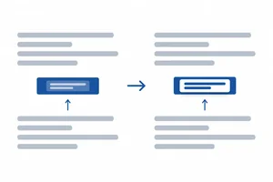
A transition changes how a supported property moves from one value to another after an existing state change begins. It does not create hover, keyboard focus, or any other interaction state.
For example, an existing hover rule can choose a darker background. Without a transition, the color changes immediately. With a transition, the browser displays in-between color values briefly before reaching that same darker background.
The interaction still works either way: the state selects the final appearance; the transition only affects the visual journey.
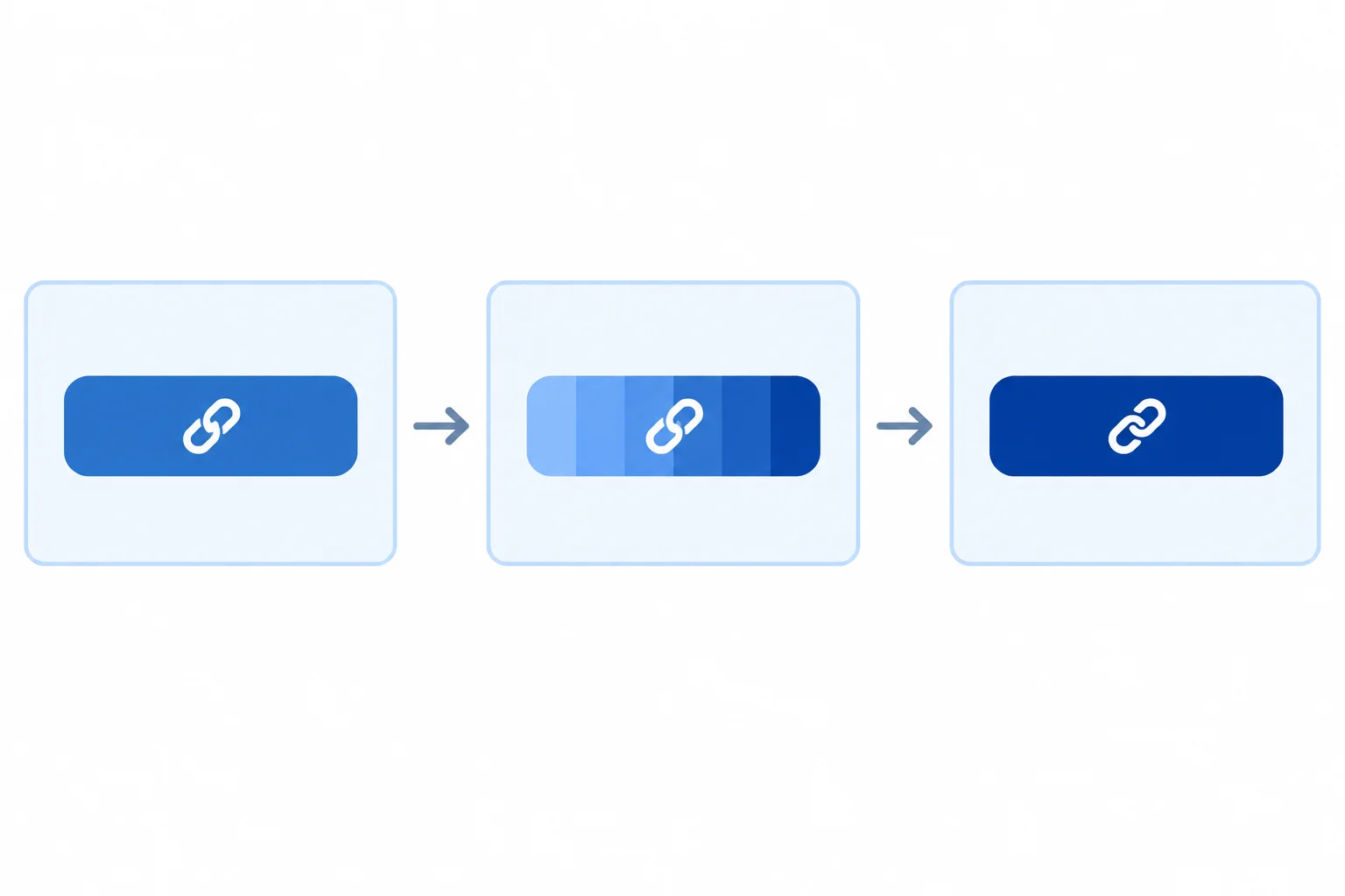
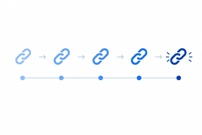
A transition can show intermediate values between a resting value and the final value.
Both versions reach the same final appearance. The difference is whether the change is immediate or briefly interpolated.
A transition is useful only when the property can change smoothly. In this tutorial, background-color and transform are the supported examples. Other property changes may not produce a smooth in-between result.
A short visual transition should support feedback, not become the only way to notice that a control changed state.
Example
Immediate background change
Short background transition
The hover state is the trigger in both cases. Only the second path includes a transition.
Match each observation to its role in the timeline.
Tap an item and then its matching pair.
Step 2 of 7
Add a deliberately scoped background-color transition to the workshop link using longhands and equivalent shorthand.
Create two files in the same local folder: index.html and styles.css. Save the complete contents of both files below before opening or refreshing index.html in your browser.
The supplied CSS already defines the link’s resting, hover, and keyboard-focus states. At this point, its background-color change is immediate; you will add the transition after confirming this baseline.
Save as index.html.
<!doctype html>
<html lang="en">
<head>
  <meta charset="utf-8">
  <meta name="viewport" content="width=device-width, initial-scale=1">
  <title>CSS Practice Workshop</title>
  <link rel="stylesheet" href="styles.css">
</head>
<body>
  <main>
    <h1 id="top">CSS Practice Workshop</h1>
    <p>
      <a class="action-link" href="#details"><span class="action-label">View session details</span></a>
    </p>

    <section>
      <h2 id="details">Session details</h2>
      <p>A 30-minute CSS practice session.</p>
      <p><a href="#top">Back to top</a></p>
    </section>
  </main>
</body>
</html>Rendered page after both files are saved: - Heading: CSS Practice Workshop - A blue link labeled “View session details” - A Session details heading and its paragraph - A Back to top link
Open this file only after saving `styles.css` in the same folder.
Save as styles.css. These baseline rules provide the existing component and state feedback.
body {
  margin: 2rem;
  font-family: Arial, sans-serif;
  background-color: #ffffff;
}

.action-link,
.action-label {
  display: inline-block;
}

.action-link {
  padding: 0.75rem 1rem;
  color: #ffffff;
  background-color: #1e40af;
  text-decoration: none;
}

.action-link:hover,
.action-link:focus-visible {
  background-color: #1e3a8a;
  text-decoration: underline;
}

.action-link:focus-visible {
  outline: 3px solid #111827;
  outline-offset: 3px;
}
Expected baseline behavior: - Resting link: white text on #1e40af blue. - Hover or keyboard focus: background changes immediately to #1e3a8a and the text is underlined. - Keyboard focus: a 3px dark outline appears with a 3px offset.
This baseline intentionally has no transition declaration yet.
Keep the hover and :focus-visible rules unchanged. Add transition longhands to the base .action-link rule, where the resting background is defined. A transition on the base selector can run when a state begins and when it ends.
150ms and 0.15s name the same duration. linear progresses at a constant rate; ease changes rate during the short interval. This example finishes with ease.
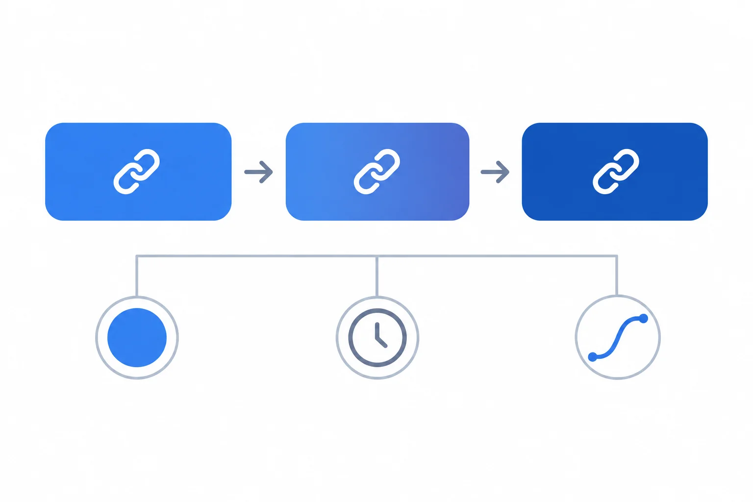
The interaction state still selects its final color immediately; the explicitly selected background-color value is what interpolates.
Each longhand has one job.
| Longhand | Example value | Purpose |
|---|---|---|
| transition-property | background-color | Select only the color change |
| transition-duration | 150ms or 0.15s | Set the short interval |
| transition-timing-function | linear or ease | Choose the rate pattern |
Replace the .action-link rule in styles.css with this longhand version, then save and refresh the local page.
.action-link {
  padding: 0.75rem 1rem;
  color: #ffffff;
  background-color: #1e40af;
  text-decoration: none;
  transition-property: background-color;
  transition-duration: 150ms;
  transition-timing-function: ease;
}
Expected behavior after refresh: - Resting link: white text on #1e40af blue. - Entering or leaving hover: the background-color changes over 150ms with ease. - Entering or leaving keyboard focus: the background-color changes over 150ms with ease; the underline and dark focus outline remain visible immediately.
Hover and focus use the same final colors and cues as the baseline; only the background-color change now interpolates.
The three longhands can be written as one shorthand declaration in this order: property, duration, timing function. Replace the three transition longhands with the shorthand below. The resulting behavior is equivalent.
Use this finished .action-link rule in styles.css, then save and refresh the page.
.action-link {
  padding: 0.75rem 1rem;
  color: #ffffff;
  background-color: #1e40af;
  text-decoration: none;
  transition: background-color 150ms ease;
}
Expected behavior after refresh: - The resting link remains #1e40af with white text. - On hover or keyboard focus, its background briefly eases to #1e3a8a. - When hover or focus ends, the background briefly eases back to #1e40af. - Underline and keyboard focus outline still appear immediately.
This replaces only the three transition longhands from the preceding version; keep the other stylesheet rules unchanged.
Tip
Avoid transition: all. It could animate a property added later even when that change should stay immediate. 150ms is a restrained example, not proof that motion is comfortable for every person.
Complete the base-selector shorthand so it matches the intended scoped transition.
.action-link {
  padding: 0.75rem 1rem;
  color: #ffffff;
  background-color: #1e40af;
  text-decoration: none;
  transition:   ;
}
Step 3 of 7
Apply a small transform to the link label while keeping the link target and surrounding normal-flow content stable.
A transform changes how an element is painted without changing the normal-flow space it occupies. Apply it only to the inner .action-label, not to the padded .action-link target.
In the active state, translate(0, -2px) draws the label 2 pixels upward. scale(1.02) draws it at 1.02 times its original size—about 2% larger. The label’s original layout footprint remains where it was.
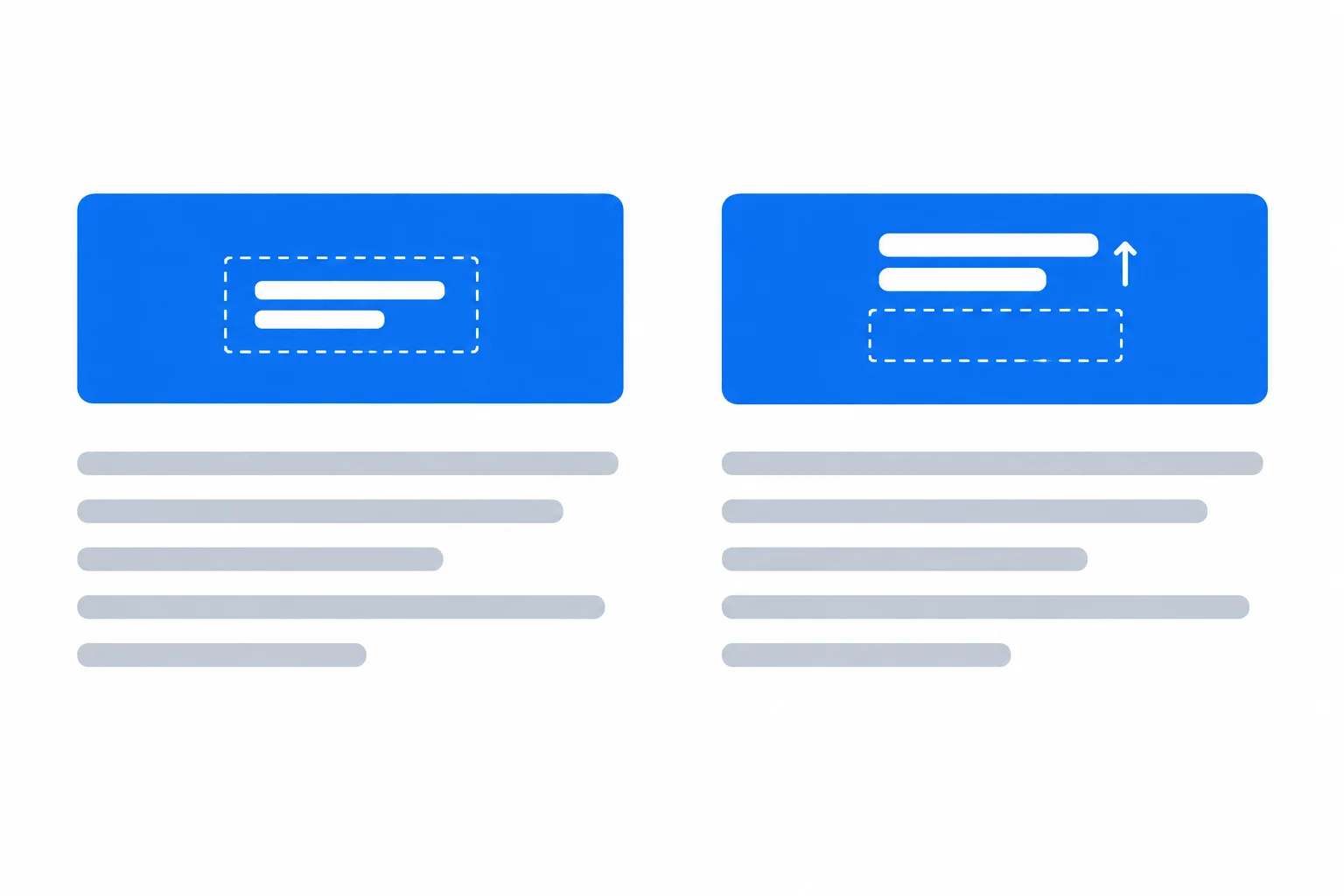
A transform changes the label's visual bounds. It does not reallocate normal-flow space or push neighboring content.
In styles.css, add these rules for the existing inner label. The resting transform gives the label a predictable starting appearance. Put the transition on .action-label so it can run when the state begins and when it ends.
Keep the existing .action-link background-color transition and its hover and focus-visible feedback rules.
Add these rules after the existing .action-link rules in styles.css, then save and refresh index.html.
.action-label {
  display: inline-block;
  transform: translate(0, 0) scale(1);
  transition: transform 150ms ease;
}

.action-link:hover .action-label,
.action-link:focus-visible .action-label {
  transform: translate(0, -2px) scale(1.02);
}On hover or focus-visible, the inner label moves upward by 2px and grows slightly. When the state ends, it returns to its resting appearance. The padded link surface and neighboring content remain stationary.
Rendered behavior after saving and refreshing the local page.
The transform is deliberately limited to the inner label. The clickable link surface stays in place.
Complete the label rules for the established resting and active states.
.action-label {
  display: inline-block;
  transform: ;
  transition: ;
}

.action-link:hover .action-label,
.action-link:focus-visible .action-label {
  transform: ;
}Which choice correctly completes the label treatment and predicts the result when the active state applies?
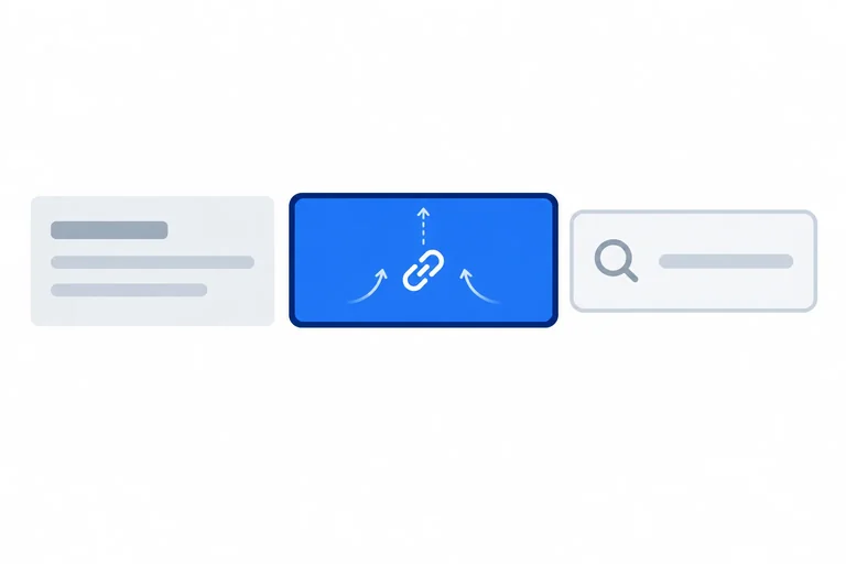
Step 4 of 7
Evaluate restrained motion so a control keeps immediate feedback and a stable target.
A transition is optional polish, not the signal that makes a control understandable. A person should be able to notice the background-state feedback, underline, and keyboard focus as soon as the link enters a state—even if they do not perceive the label movement.
The state rules apply without delay. The background transition begins without delay but interpolates toward its final color for 150ms. The underline and focus outline do not transition, so they appear immediately.
Keep the padded link itself stationary. The small visual change belongs to its inner label, so the clickable area and its place in the page do not shift.
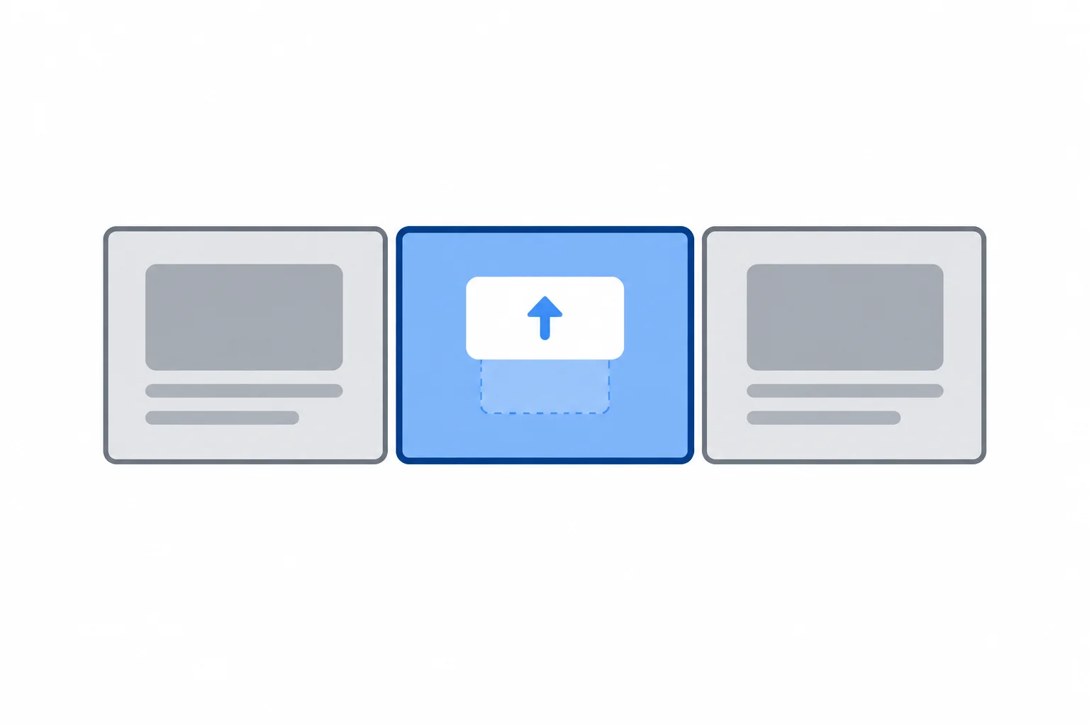
The link footprint and focus outline remain fixed; only the label's visual bounds change.
Use this check before keeping a motion treatment.
| Check | Prefer | Avoid |
|---|---|---|
| Interaction target | A stationary padded link | Moving or shrinking the whole link |
| Visual movement | A small label-only change inside the surface | A large excursion beyond the surface |
| State feedback | A background transition that starts without delay; immediate underline and focus outline | Delaying state rules until movement finishes |
| Surroundings | No overlap or clipping | Label covering nearby content or being cut off |
Warning
A short duration and a small distance do not automatically make motion accessible. Check the complete behavior: the target must remain stable, keyboard focus must be obvious immediately, and the link must still communicate its state when movement is absent.
Which treatment best preserves immediate, usable feedback for the workshop link?
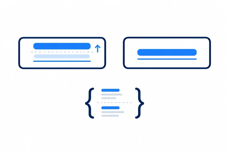
Complete this repair. The clickable box must stay in place, the visible words may receive the small visual motion, and the color, underline, and focus outline must remain clear without relying on movement.
.action-link {
  display: inline-block;
  padding: 0.75rem 1rem;
  color: #ffffff;
  background-color: #1e40af;
  transition: background-color 150ms ease;
}

 {
  display: inline-block;
  transform: translate(0, 0) scale(1);
  transition:  150ms ease;
}

.action-link:hover,
.action-link:focus-visible {
  background-color: #1e3a8a;
  text-decoration: underline;
}

.action-link:focus-visible {
  outline: 3px solid #111827;
  outline-offset: 3px;
}

 {
  transform: translate(0, -2px) scale(1.02);
}
Step 5 of 7
Add a preference-based CSS override that removes nonessential label motion while preserving immediate hover and keyboard-focus feedback.
A media query is a conditional CSS wrapper. Here, it checks the user’s reduced-motion preference; it is not a viewport or screen-size rule.
When the preference is reduce, remove this component’s nonessential interpolation and label movement. Keep the state feedback: the darker background, underline, and keyboard focus outline still appear immediately.
no-preference means that no reduced-motion preference was expressed. It does not mean unrestricted motion is appropriate.
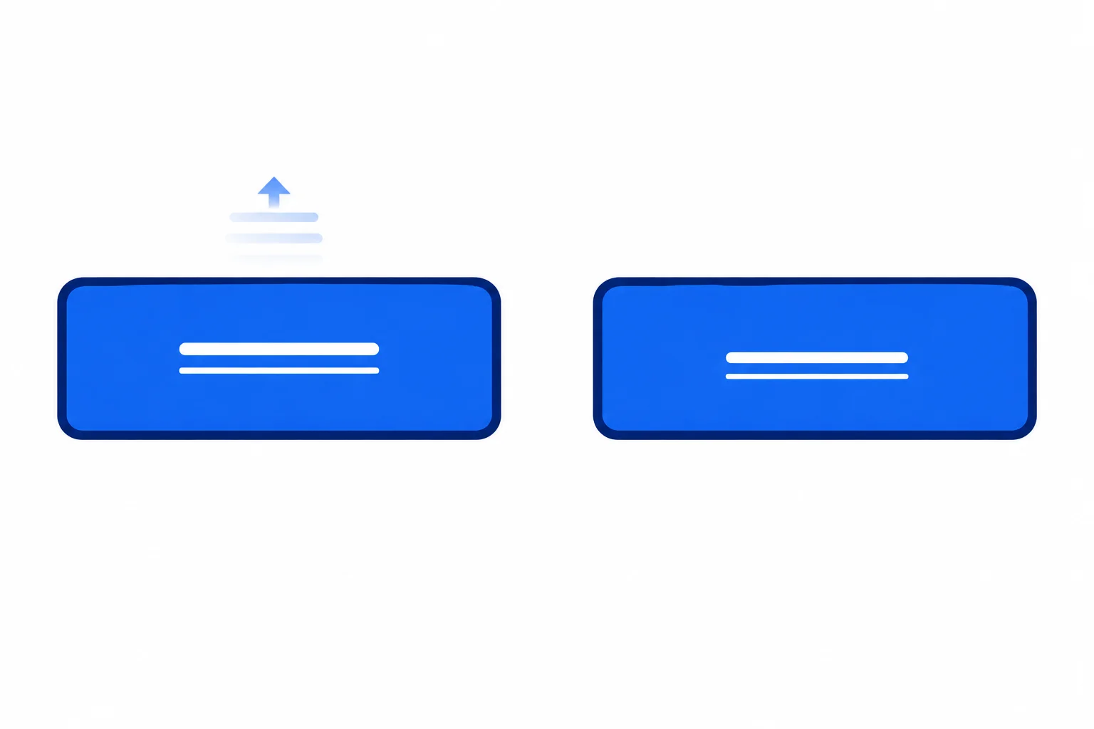
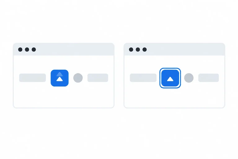
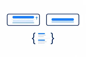
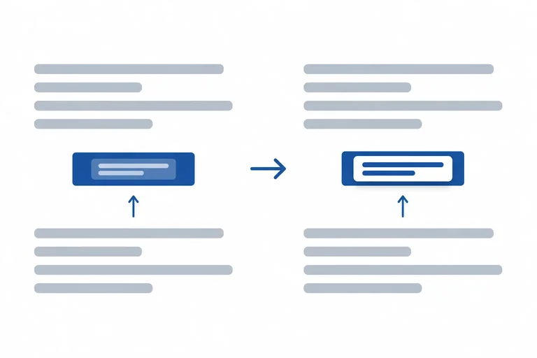
Default motion can add a small label movement. Reduced motion keeps the same visible state feedback without movement.
Add the override after the normal component rules in styles.css. The first selector list stops both declared transitions.
A transition controls interpolation only. If you removed only the transitions, the active transform could still make the label jump instantly. The second selector list resets the resting label and both active label states, so it overrides the hover and keyboard-focus movement too.
Add this final section after the normal .action-link and .action-label rules.
@media (prefers-reduced-motion: reduce) {
  .action-link,
  .action-label {
    transition: none;
  }

  .action-label,
  .action-link:hover .action-label,
  .action-link:focus-visible .action-label {
    transform: none;
  }
}With reduce: The label remains stationary. Background changes are immediate. The underline and focus outline remain visible. Without reduce: The existing short background-color and label transform transitions remain.
The visible result depends on whether the browser reports the reduced-motion preference as `reduce`.
Warning
Do not remove the existing hover or :focus-visible rules. Their background-color change, underline, and focus outline remain available; they simply happen immediately when reduced motion is requested.
Complete the reduced-motion media condition and the two scoped selector lists.
@media (prefers-reduced-motion: ) {
   {
    transition: none;
  }

   {
    transform: none;
  }
}
Step 6 of 7
Verify the workshop link locally under default and reduced-motion preferences, using pointer and keyboard checks.
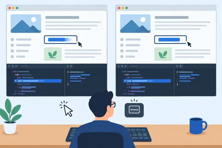
Open your local index.html and refresh the page after saving the CSS from the previous step. Compare the same link in two preference conditions:
prefers-reduced-motion: no-preference in browser developer tools.prefers-reduced-motion: reduce in developer tools.Developer-tool emulation affects the browser session, not your operating-system setting. When you finish, return the emulation control to its default or no-preference setting.
In each condition, test pointer hover and keyboard focus separately. Move the pointer onto and away from View session details. Then use Tab and Shift+Tab to enter and leave keyboard focus. Press Enter while the link is focused; it should navigate to Session details.
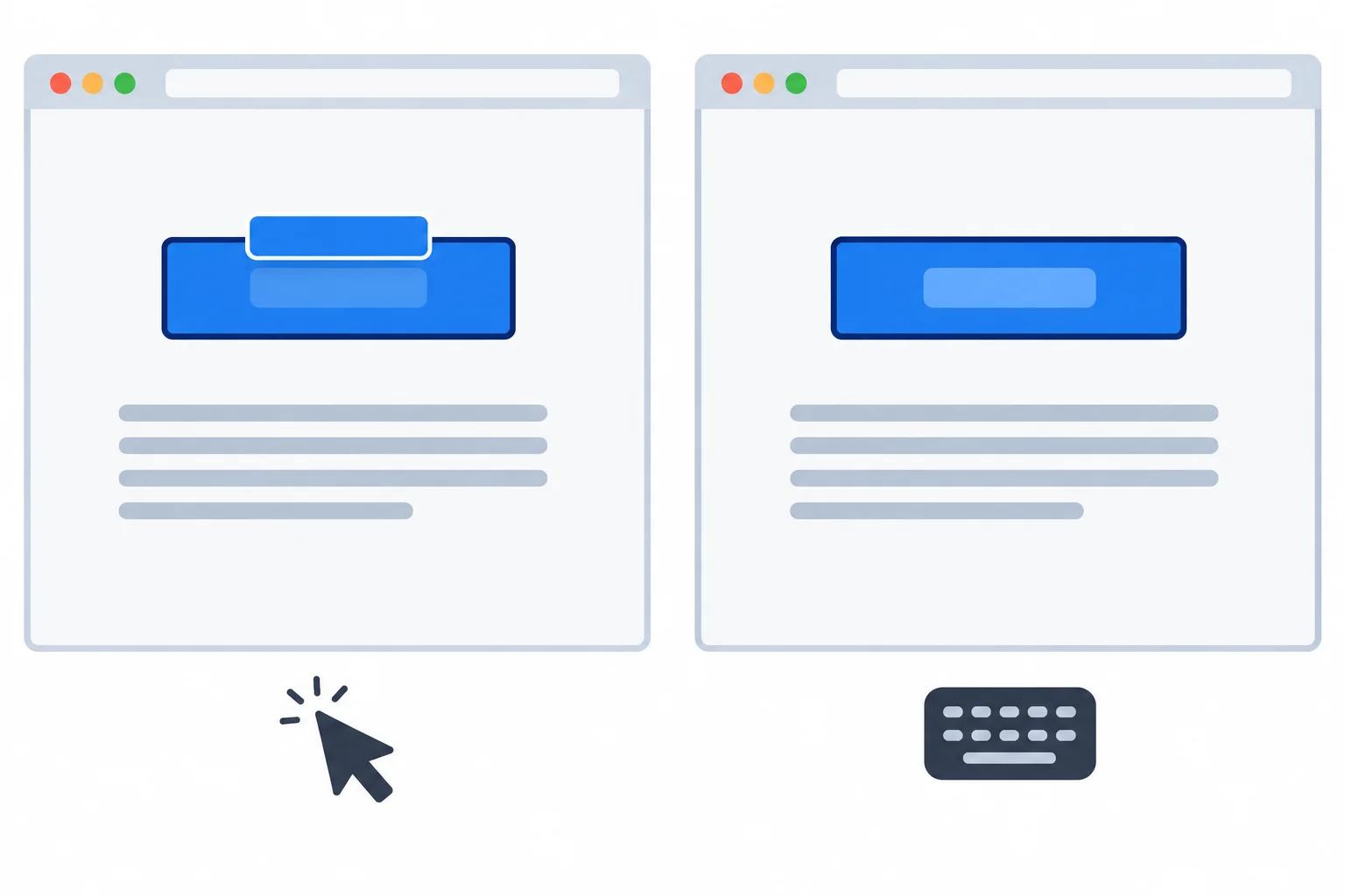
Compare the label’s visual movement with the stationary link target and neighboring content.
Use this observation matrix while testing. Entering and leaving hover or focus matters: a base transition can run in both directions. Check keyboard focus independently from pointer hover, because a pointer is not required to operate the link.
Record what happens in each condition.
| Check | Default motion | Reduced motion |
|---|---|---|
| Pointer enters or leaves | Brief background and label change | Immediate background change; label stays still |
| Keyboard focus enters or leaves | Brief background and label change; outline is immediate | Immediate background change; outline is immediate |
| State feedback | Underline and dark focus outline remain clear | Underline and dark focus outline remain clear |
| Layout and target | Nearby content stays put; padded link target stays stable | Nearby content stays put; padded link target stays stable |
| Enter activation | Navigates to the details fragment | Navigates to the details fragment |
Tip
If reduce is emulated but the default movement remains, inspect the matched CSS rules. If the reduced-motion media rule is not active, the preference may not be set to reduce or the media-query syntax may be wrong. If the media rule is active but its transition or transform declaration is crossed out, the override lost in the cascade. The reduced-motion rules should come after the normal component rules and include the active label selectors.
On your local page, write a short comparison report. Cover both preference conditions. State what happened when pointer hover and keyboard focus entered or left the link, whether label movement disappeared under reduced motion, whether the focus cue appeared immediately, and whether Enter activated the link in each condition. Also note any clipping, shifting neighboring content, or unstable target that you observed.
Write at least 160 characters (0/160).
Step 7 of 7
Complete and verify a restrained CSS transition treatment that preserves usable feedback for pointer, keyboard, and reduced-motion preferences.
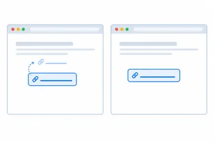
A successful repair keeps the link’s meaning and hit area unchanged. In Default motion, the blue surface changes briefly and the inner label has a restrained visual movement. In Reduced motion, the same hover and keyboard-focus feedback remains, but the label does not move.
Use this final check: select only the properties that should transition; keep movement inside the padded link; make the underline and focus outline immediate; then remove nonessential transition and transform behavior when the reduced-motion preference requests it.
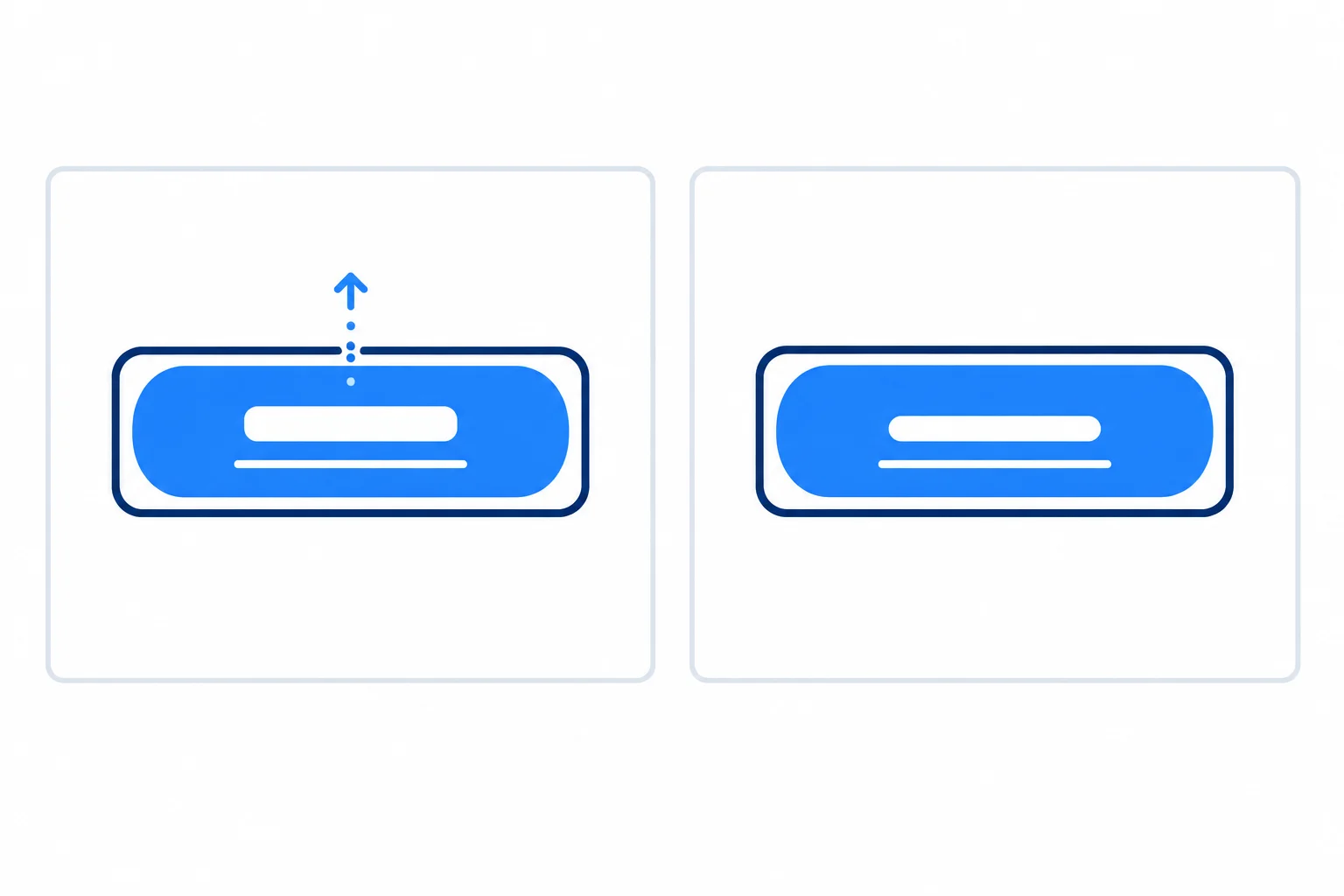
Default motion: brief label movement plus state feedback. Reduced motion: immediate state feedback with no label movement.
Complete the repair, then enter the matching declarations in your local styles.css. Keep the existing HTML and link behavior unchanged.
.action-link {
  display: inline-block;
  padding: 0.75rem 1rem;
  color: #ffffff;
  background-color: #1e40af;
  transition: ;
}

.action-label {
  display: inline-block;
  transform: translate(0, 0) scale(1);
  transition: ;
}

.action-link:hover,
.action-link:focus-visible {
  background-color: #1e3a8a;
  text-decoration: underline;
}

.action-link:hover .action-label,
.action-link:focus-visible .action-label {
  transform: translate(0, -2px) scale(1.02);
}

.action-link:focus-visible {
  outline: 3px solid #111827;
  outline-offset: 3px;
}

@media  {
  .action-link,
  .action-label {
    transition: ;
  }

  .action-label,
  .action-link:hover .action-label,
  .action-link:focus-visible .action-label {
    transform: ;
  }
}After completing the repair in your local styles.css, save and refresh the page. Test pointer hover and keyboard focus in Default motion. Then emulate prefers-reduced-motion: reduce in browser developer tools or use your operating-system reduced-motion setting, and test again.
In one compact report, confirm the behavior you observed for the label, background, underline, focus outline, and link navigation in both modes. Include whether nearby content stayed stationary.
Write at least 120 characters (0/120).
Summary
Use this decision sequence whenever you add interface motion:
Congratulations! You completed: Create Accessible CSS Transitions
You completed this level!
Up next: Responsive Layouts
 Arrange Content with FlexboxBuild flexible rows and columns that align, distribute space, and wrap while preserving meaningful reading and keyboard order.
Thousands of online courses in video, ebooks and audiobooks.
To test your knowledge during online courses
Generated directly from your cell phone's photo gallery and sent to your email

Download our app via QR Code or the links below:.


Carry knowledge in your pocket.
Download the Cursa app.
There are hundreds of free courses available, with a free certificate of completion that is saved in your mobile image gallery.
Download the app to access the Course Completion Certificate for Free.


+ 10 million
students

Free and Valid
Certificate

60 thousand free
exercises

4.8/5 rating in
app stores

Free courses in
video and ebooks