Step 1 of 8
Choose Grid for Shared Rows and Columns
Choose Grid when card columns and rows must align as a coordinated two-dimensional layout.

Learning path · Level 3 · Tutorial 2
Create page sections and card layouts with coordinated rows and columns, choosing Grid when two-dimensional alignment matters.
 Choose Grid for Shared Rows and Columns
Choose Grid when card columns and rows must align as a coordinated two-dimensional layout. 2 min
Choose Grid for Shared Rows and Columns
Choose Grid when card columns and rows must align as a coordinated two-dimensional layout. 2 min
 Identify the Parts of a Grid
Create a Grid container and identify its direct-child items, tracks, grid lines, and cells in a local Learning Hub page. 2 min
Identify the Parts of a Grid
Create a Grid container and identify its direct-child items, tracks, grid lines, and cells in a local Learning Hub page. 2 min
 Define Columns, Rows, and Gaps
Define fixed explicit tracks for a six-card grid and use gaps as internal gutters. 3 min
Define Columns, Rows, and Gaps
Define fixed explicit tracks for a six-card grid and use gaps as internal gutters. 3 min
 Use Flexible and Repeated Tracks
Use flexible `fr` tracks, compare unequal shares, and express repeated columns with `repeat()`. 3 min
Use Flexible and Repeated Tracks
Use flexible `fr` tracks, compare unequal shares, and express repeated columns with `repeat()`. 3 min
 Let Additional Cards Create Rows
Add a seventh card to a three-column grid and see how automatic placement creates an implicit row. 2 min
Let Additional Cards Create Rows
Add a seventh card to a three-column grid and see how automatic placement creates an implicit row. 2 min
 Allow Tracks to Shrink
Use minmax(0, 1fr) for shrinkable equal-share tracks and distinguish successful track sizing from unresolved unbroken-text overflow. 3 min
Allow Tracks to Shrink
Use minmax(0, 1fr) for shrinkable equal-share tracks and distinguish successful track sizing from unresolved unbroken-text overflow. 3 min
 Make a Card Span Two Columns
Apply a two-column span to the featured card and predict automatic placement when a spanning item cannot fit in the remaining row space. 3 min
Make a Card Span Two Columns
Apply a two-column span to the featured card and predict automatic placement when a spanning item cannot fit in the remaining row space. 3 min
 Build and Check the Final Card Layout
Assemble, run, and verify the final seven-card Learning Hub Grid layout. 3 min
Build and Check the Final Card Layout
Assemble, run, and verify the final seven-card Learning Hub Grid layout. 3 min
Step 1 of 8
Choose Grid when card columns and rows must align as a coordinated two-dimensional layout.
Choose a layout system by asking what must align, not by looking at whether the result happens to have rows.
Use Flexbox when content is mainly arranged along one direction. If it wraps, each new line can size and distribute its items independently.
Use Grid when the layout needs coordinated alignment in two directions: items should share the same column boundaries across rows, or the same row boundaries across columns. A card section is a common example: card 1 and card 4 can begin at the same shared column edge.
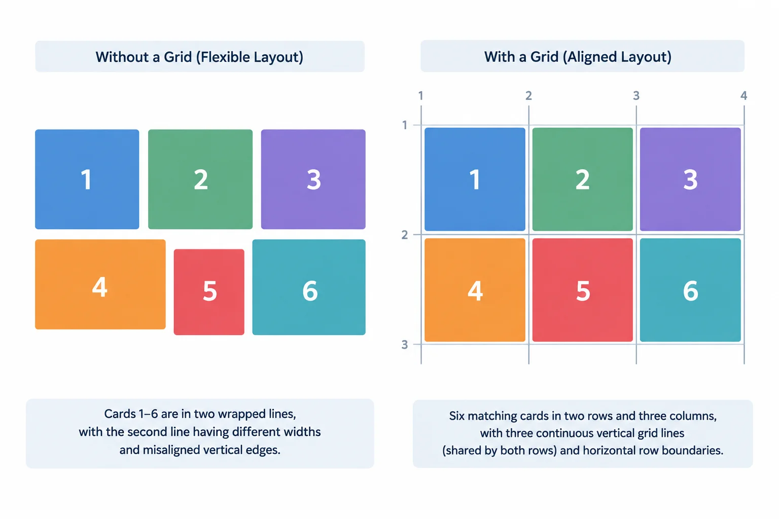
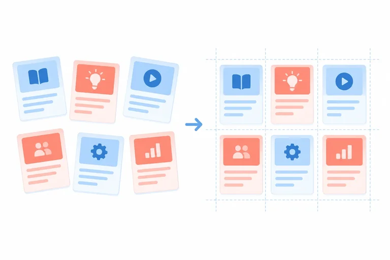
On the right, the shared vertical boundaries create consistent columns across the entire card section.
A track is a shared horizontal or vertical band in a Grid layout. Grid coordinates its rows and columns, so a card in a lower row can line up with a card above it.
With wrapped Flexbox, wrapping creates another line of items, but it does not establish shared column tracks between that line and the earlier one. That independence is useful when line-to-line alignment is not a requirement.
Use the alignment requirement to make the choice. Both tools can create a row-like visual result, but they organize it differently.
| Layout requirement | Best choice | Why |
|---|---|---|
| Navigation links in one horizontal run | Flexbox | One main direction matters |
| Tags that may wrap with independent line widths | Flexbox | No shared columns are required |
| Course cards aligned in matching columns over several rows | Grid | Shared column tracks matter |
| A dashboard area with aligned rows and columns | Grid | Both directions are coordinated |
Tip
Do not choose Grid merely because there are several cards. Choose it when card edges need to line up across multiple rows. You will build the tracks that create those shared boundaries in the next steps.
Choose the best layout-system pairing.
Step 2 of 8
Create a Grid container and identify its direct-child items, tracks, grid lines, and cells in a local Learning Hub page.
Grid begins with a parent-child relationship. When .card-grid receives display: grid;, it becomes the grid container. Only its direct <article class="card"> children become grid items.
An <h2> or <p> inside a card is content inside that card—not an item of the outer grid.
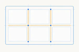
Grid lines are boundaries. The space between two adjacent grid lines is a track, either a row track or a column track. Where a row track and a column track intersect, they form a cell. This conceptual diagram names the parts; you will define track sizes in the next step.
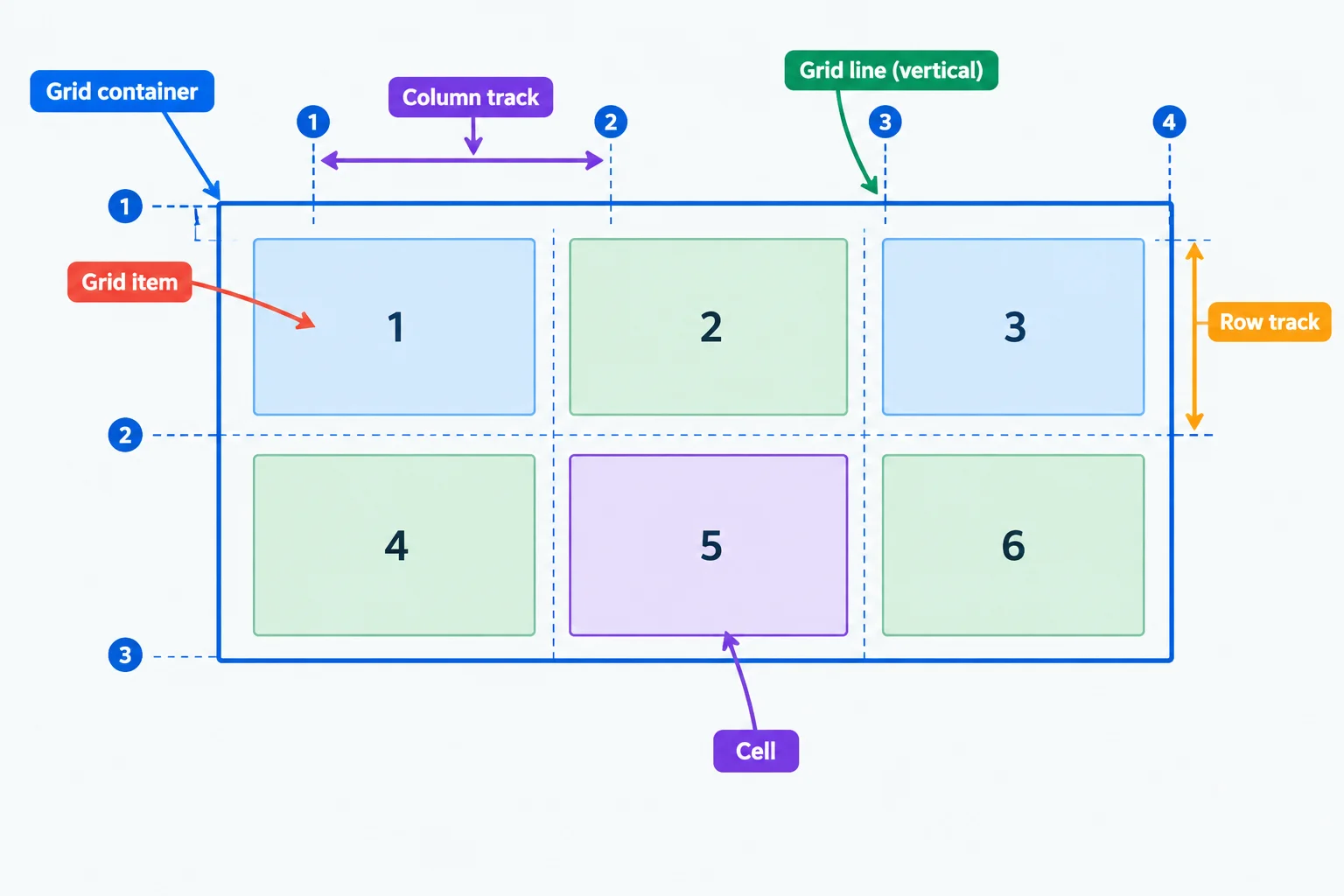
Conceptual anatomy: cards 1–6 are grid items because they are direct children of the grid container.
Create index.html and styles.css in the same local folder. This complete starting page has six text-only cards in document order. Save both files, then open or refresh index.html in your browser.
At this stage, the Grid declaration establishes the container but does not name column or row sizes. The expected browser result is therefore a vertical card list with a 1rem gap between cards. You will define the layout's tracks next.
Save as index.html.
<!doctype html>
<html lang="en">
<head>
  <meta charset="utf-8">
  <meta name="viewport" content="width=device-width, initial-scale=1">
  <title>Learning Hub</title>
  <link rel="stylesheet" href="styles.css">
</head>
<body>
  <main>
    <h1>Learning Hub</h1>
    <div class="card-grid">
      <article class="card">
        <h2>HTML Basics</h2>
        <p>Learn page structure and semantic elements.</p>
      </article>
      <article class="card">
        <h2>CSS Selectors</h2>
        <p>Target elements with clear CSS rules.</p>
      </article>
      <article class="card">
        <h2>Box Model</h2>
        <p>Understand padding, borders, and margins.</p>
      </article>
      <article class="card">
        <h2>Flexbox</h2>
        <p>Arrange content along one dimension.</p>
      </article>
      <article class="card">
        <h2>CSS Grid</h2>
        <p>Explore two-dimensional page layouts.</p>
      </article>
      <article class="card">
        <h2>Practice Project</h2>
        <p>Combine your HTML and CSS skills.</p>
      </article>
    </div>
  </main>
</body>
</html>Learning Hub HTML Basics Learn page structure and semantic elements. CSS Selectors Target elements with clear CSS rules. Box Model Understand padding, borders, and margins. Flexbox Arrange content along one dimension. CSS Grid Explore two-dimensional page layouts. Practice Project Combine your HTML and CSS skills. Visual layout: six bordered cards appear in one vertical column, with a 1rem vertical gap between adjacent cards.
After saving both files and refreshing this page in a browser, the linked stylesheet gives the cards their visible surfaces and vertical gaps.
Save as styles.css.
* {
  box-sizing: border-box;
}

body {
  margin: 0;
  padding: 2rem;
  background: #f8fafc;
  color: #1e293b;
  font-family: system-ui, sans-serif;
}

.card-grid {
  display: grid;
  gap: 1rem;
}

.card {
  padding: 1rem;
  border: 1px solid #cbd5e1;
  border-radius: 0.5rem;
  background: #ffffff;
}

.card h2 {
  margin-top: 0;
}Learning Hub [HTML Basics card] [CSS Selectors card] [Box Model card] [Flexbox card] [CSS Grid card] [Practice Project card] Visual layout: each card has a white surface, border, padding, and rounded corners. The six cards appear one below another, separated by 1rem gaps.
This is browser-rendered output, not console output. With no track sizes declared yet, the six cards are shown as one vertical column.
Match each description to the correct Grid term.
Tap an item and then its matching pair.
Complete the declaration that enables Grid for the card container.
.card-grid {
  display: ;
}
Step 3 of 8
Define fixed explicit tracks for a six-card grid and use gaps as internal gutters.
An explicit grid is the set of tracks you name with grid-template-columns and grid-template-rows.
For this card section, grid-template-columns defines three column tracks: vertical tracks arranged from left to right. Four vertical grid lines bound those three tracks, numbered 1 through 4.
Combined with two row tracks, the layout has six cells. The six cards fit one per cell.
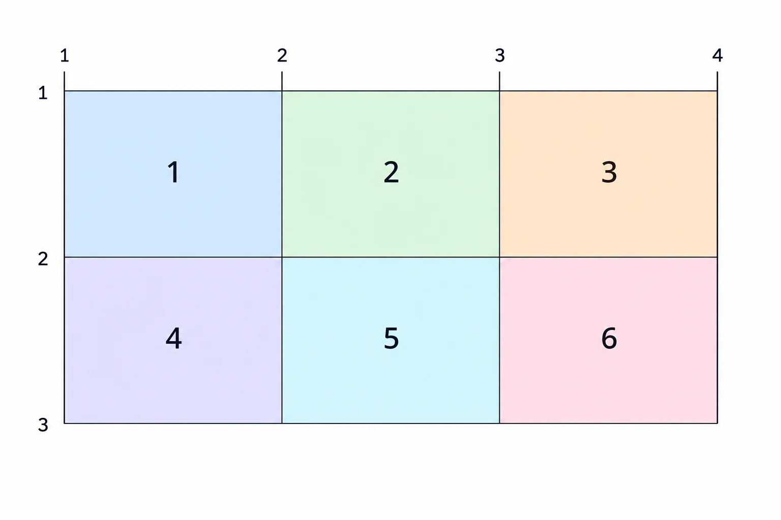
A track is the space between adjacent grid lines. A column track and a row track intersect in a cell.
Tip
A grid with three column tracks needs four vertical boundary lines. Likewise, two row tracks need three horizontal boundary lines.
Add track definitions to the existing .card-grid rule. grid-template-columns creates three fixed 12rem column tracks. grid-template-rows: auto auto; explicitly creates two rows.
An auto row accommodates the content in its cards instead of imposing a fixed text height. gap creates gutters between adjacent column and row tracks. It does not create space around the outside edge of the grid container; outer spacing is controlled separately.
Update the existing grid container rule in styles.css, then save and refresh your local index.html.
.card-grid {
  display: grid;
  grid-template-columns: 12rem 12rem 12rem;
  grid-template-rows: auto auto;
  gap: 1rem;
}
Expected browser result: Row 1: cards 1, 2, and 3 in three 12rem columns Row 2: cards 4, 5, and 6 in the same three columns Between neighboring columns: 1rem gaps Between the two rows: 1rem gap Around the outer edges of .card-grid: no gap added by this declaration
This is the expected rendered result in a browser: six cards occupy three fixed 12rem columns and two content-sized rows. The 1rem spaces occur only between neighboring cards.
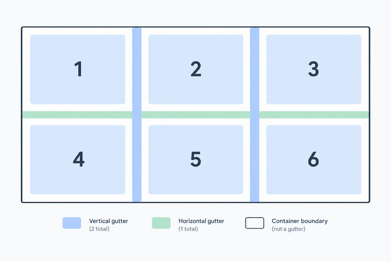
gap: 1rem; creates the highlighted internal gutters. It does not add an outer gutter.
Tip
If one card has more text, its auto row can become taller. Every card in that row shares the same row track, so the row height accommodates the tallest card's content.
True or false: gap adds space around the outside edges of a grid container.
Complete the CSS and the comment to match the target diagram: three fixed columns, two content-sized rows, and a 1rem internal gutter with no outer gutter added by gap.
.card-grid {
  display: grid;
  grid-template-columns: ;
  grid-template-rows: ;
  gap: ;
}

/* gap goes  tracks */
Step 4 of 8
Use flexible fr tracks, compare unequal shares, and express repeated columns with repeat().
Replace the fixed column definition from the previous step with flexible tracks. An fr unit is a share of the flexible space: the browser accounts for the grid’s gaps and other track-sizing requirements before dividing what remains.
With ordinary card text, three 1fr tracks receive equal shares. 1fr is not one third of the container’s full width because the two gaps are set aside before the remaining space is divided.
In styles.css, update the existing .card-grid rule. Keep the explicit rows and the gap for this comparison, then save and refresh index.html.
.card-grid {
  display: grid;
  grid-template-columns: 1fr 1fr 1fr;
  grid-template-rows: auto auto;
  gap: 1rem;
}Learning Hub [HTML Basics] [CSS Selectors] [Box Model] [Flexbox] [CSS Grid] [Practice Project]
At a width where the grid can display three columns, the browser shows six cards in two rows. The diagrammatic output represents the visible arrangement; each column receives an equal share of the space left after the two gaps.
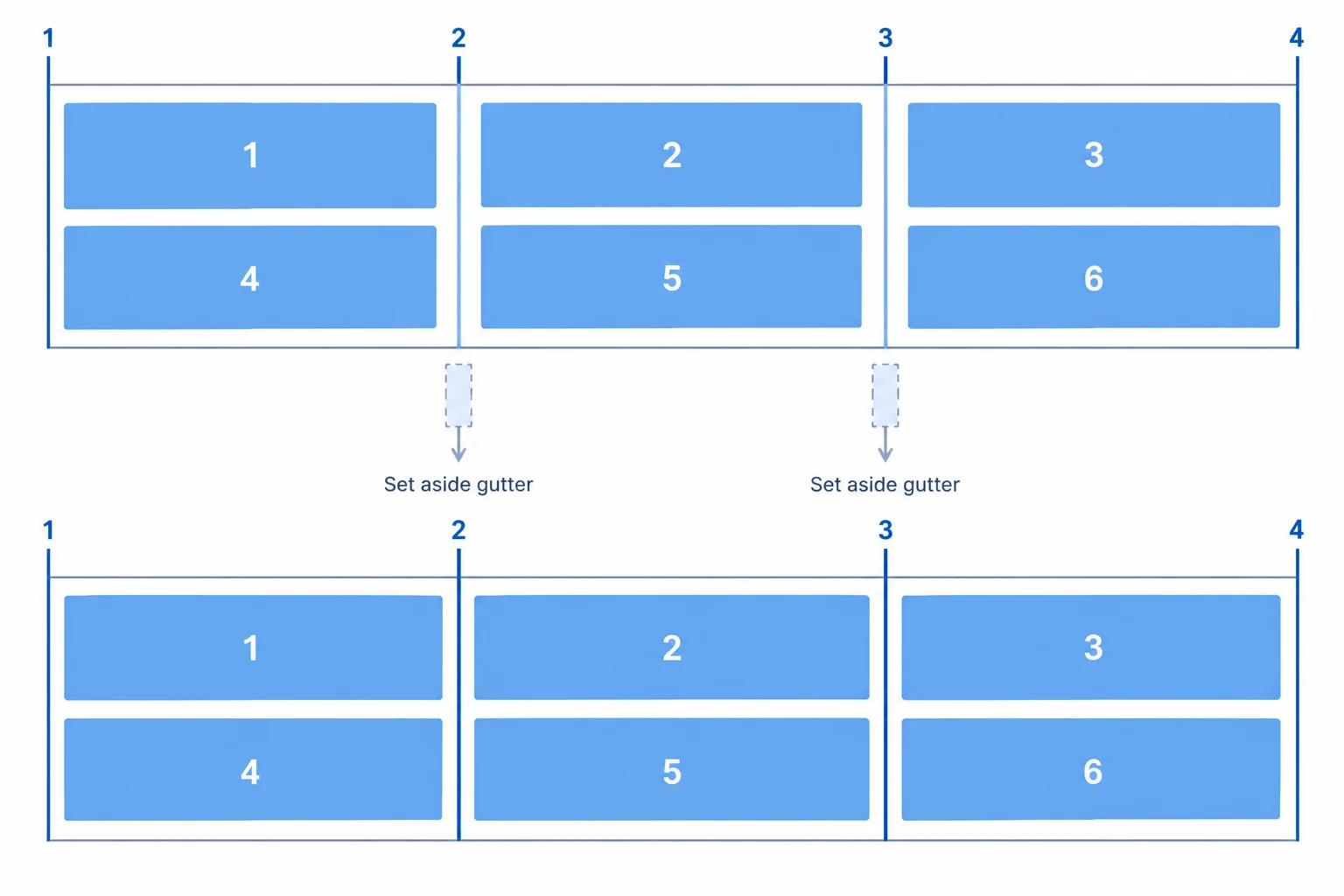
The gaps sit between tracks. The remaining flexible space is divided into three equal shares.
To give one column more room, change the number of shares—not the number of columns.
1fr 2fr 1fr still creates three tracks. After gaps and other sizing requirements are accounted for, the available flexible space is divided into four shares: one for the first track, two for the middle track, and one for the last track.
These values assume that 800px is available for flexible tracks after gaps and other requirements. Browser calculations can use fractional pixels.
| Column definition | Total shares | Track result from 800px |
|---|---|---|
| 1fr 1fr 1fr | 3 | about 266.67px each |
| 1fr 2fr 1fr | 4 | 200px, 400px, 200px |
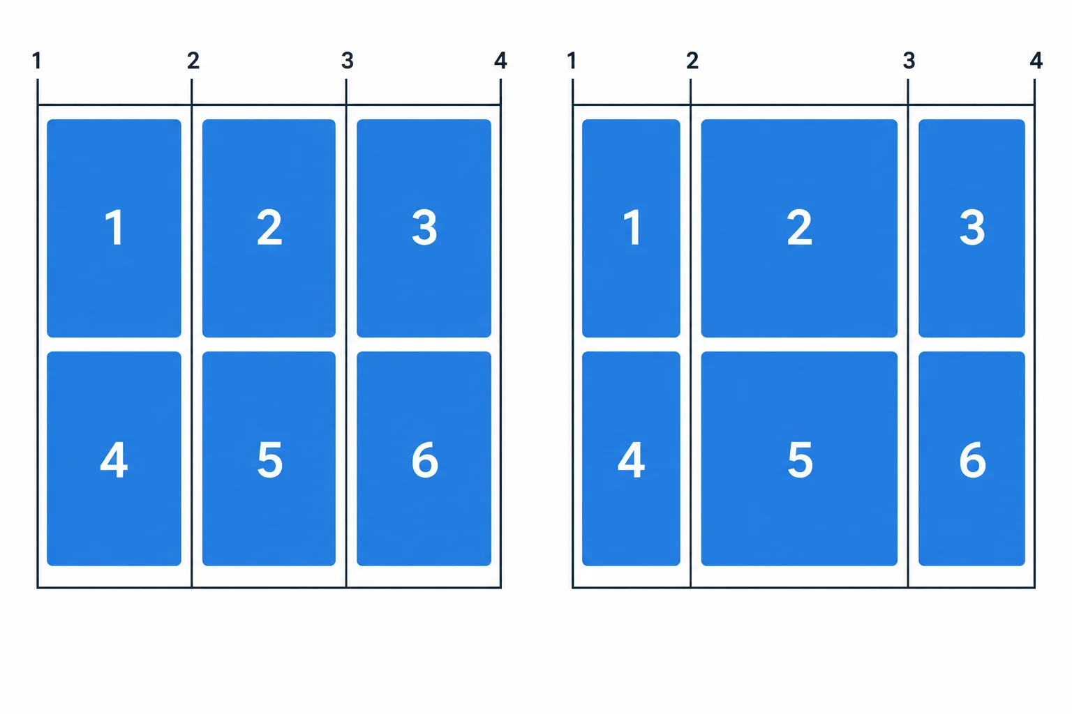
Changing share values changes track widths; it does not add or remove columns.
When a track definition repeats, use repeat() to write it once. repeat(3, 1fr) means “repeat a 1fr track three times.” It creates the same three equal flexible columns as the expanded form, while keeping the declaration shorter.
The grid still explicitly has three column tracks. repeat() is a compact notation, not an automatic column-count feature.
In the existing .card-grid rule, replace only the grid-template-columns declaration. Keep grid-template-rows: auto auto; and gap: 1rem; unchanged, then save and refresh index.html.
.card-grid {
  grid-template-columns: repeat(3, 1fr);
}Learning Hub [HTML Basics] [CSS Selectors] [Box Model] [Flexbox] [CSS Grid] [Practice Project]
This produces the same intended two-row, three-equal-column layout as the expanded `1fr 1fr 1fr` definition. The diagrammatic output represents the visible browser layout.
Warning
A flexible track can still be affected by a card’s content minimum, such as a long unbroken string. That can prevent a track from becoming as narrow as expected. The next step addresses shrinkable tracks; do not hide or clip essential text as a workaround.
Complete these two alternative column definitions. The first creates three equal flexible tracks with the repetition function. The second creates three tracks with a wider center track.
/* Three equal flexible column tracks */
.card-grid {
  grid-template-columns: ;
}

/* Three column tracks; the center gets twice the share */
.card-grid {
  grid-template-columns: ;
}
Step 5 of 8
Add a seventh card to a three-column grid and see how automatic placement creates an implicit row.
Keep the three flexible columns from the previous step, but remove grid-template-rows. The declared columns remain explicit tracks. With no row template, the grid creates row tracks when item placement needs them.
In styles.css, replace the existing .card-grid rule with this complete rule. Keep gap: 1rem;, then save and refresh your local page.
styles.css — Replace the existing .card-grid rule.
.card-grid {
  display: grid;
  grid-template-columns: repeat(3, 1fr);
  gap: 1rem;
}Learning Hub Row 1: HTML Basics | CSS Selectors | Box Model Row 2: Flexbox | CSS Grid | Practice Project
Expected browser arrangement after saving and refreshing. The original six cards still occupy two automatically created rows.
index.html — Add this after the existing sixth card, as a direct child of .card-grid. Save, then refresh the browser.
<article class="card">
  <h2>Next Steps</h2>
  <p>Continue building responsive layouts.</p>
</article>Learning Hub Row 1: HTML Basics | CSS Selectors | Box Model Row 2: Flexbox | CSS Grid | Practice Project Row 3: Next Steps | empty | empty
Expected browser arrangement after saving and refreshing. The new card begins the next available row; the other cells in that row are empty.
Default automatic placement fills available columns from left to right, then continues on a new row in document order.
With three explicit columns, cards 1–3 fill the first row and cards 4–6 fill the second. Card 7 has no open cell in those rows, so it begins a third row in column one. It does not create a fourth column.
The numbered cards represent their document order.
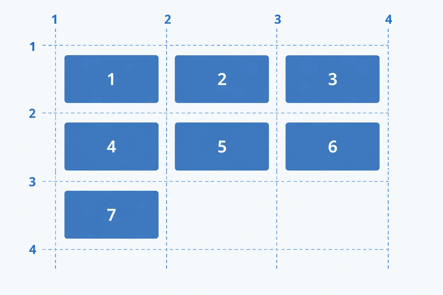
Card 7 starts the next available row, at row three and column one.
An implicit row is a row the grid creates because item placement needs it. Since this example has no grid-template-rows declaration, its row tracks are implicit. The seventh card causes a third implicit row to be created.
Implicit rows use default auto sizing. Their height can grow to accommodate the content in their cards. The three-column definition still controls the number of columns; adding content creates more rows, not more columns.
Compare the declared columns with the rows created for the cards.
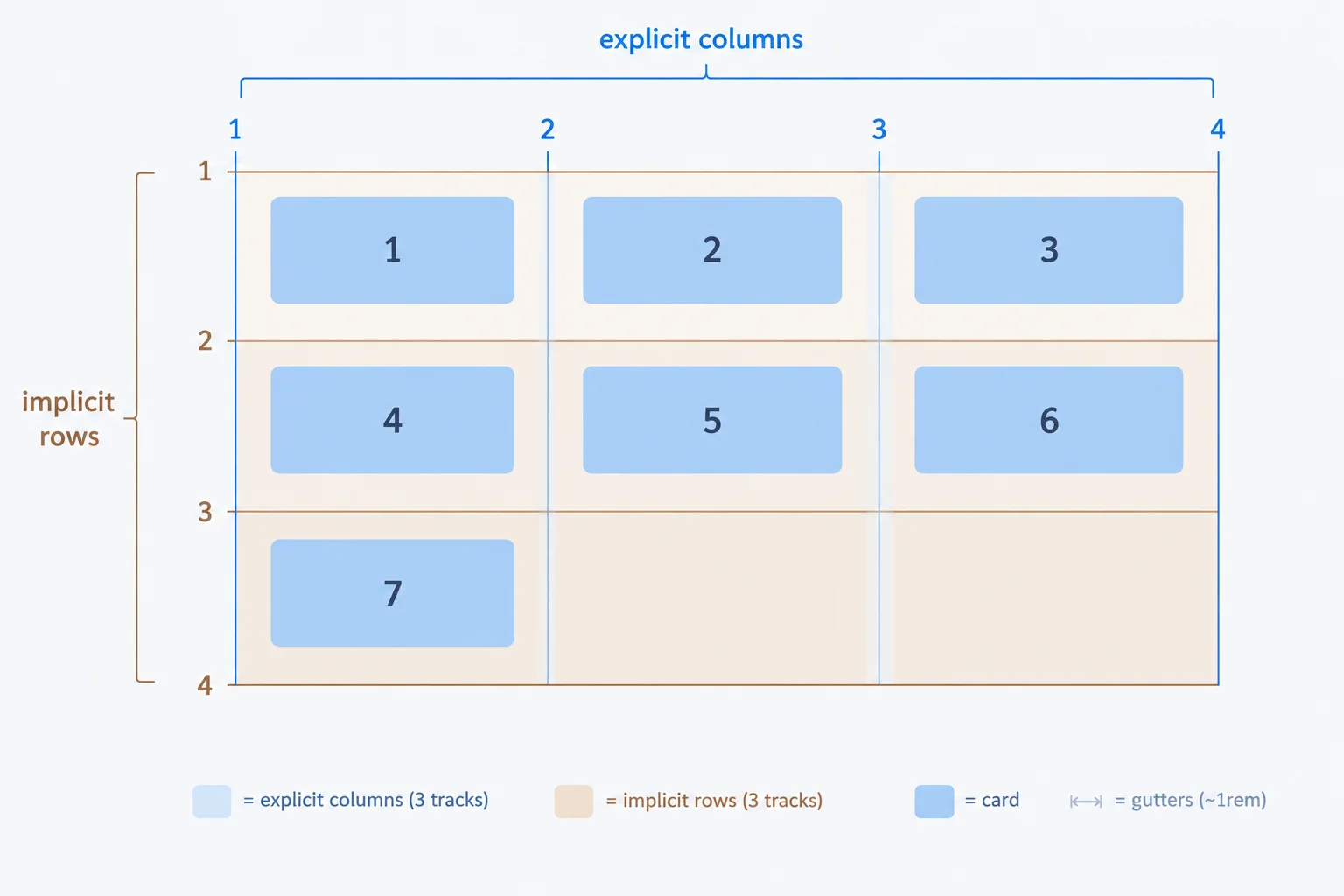
Only the three column tracks are declared here. The row tracks, including the third row for card 7, are created by automatic placement.
Tip
The explicit grid consists of tracks declared by grid-template-columns or grid-template-rows. In this example, the three column tracks are explicit, while the row tracks are supplied as placement requires them.
Complete the column definition for three equal flexible tracks.
.card-grid {
  display: grid;
  grid-template-columns: ;
  gap: 1rem;
}Choose the diagram that shows the placement after the seventh card is added. The new row must be implicit.

Step 6 of 8
Use minmax(0, 1fr) for shrinkable equal-share tracks and distinguish successful track sizing from unresolved unbroken-text overflow.
fr tracks may resist shrinkingYour grid currently uses repeat(3, 1fr). The three tracks normally share available space equally after the 1rem gaps are accounted for.
A bare 1fr track also has an automatic minimum. One long sequence with no break opportunities can contribute a large minimum width. Instead of all three tracks becoming narrower, that content can force its track wider and make the grid extend beyond the available width.
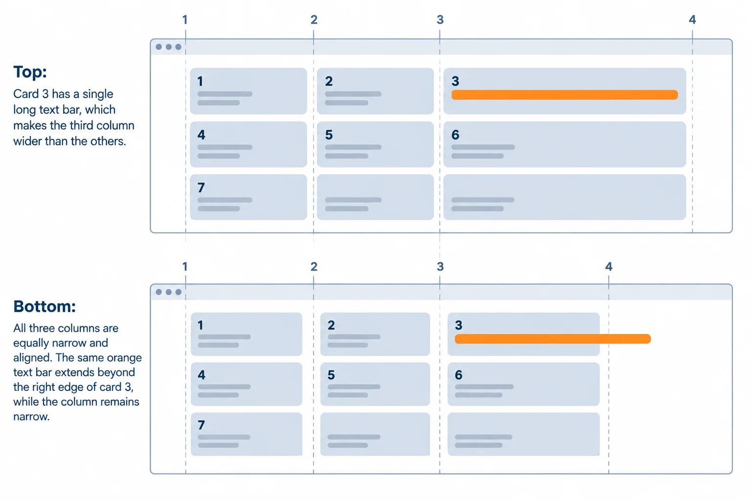
Changing the track minimum can let columns shrink. It does not, by itself, create a place for one unbroken string to wrap.
Replace the grid’s column declaration with minmax(0, 1fr) inside repeat(). Here, 0 is the minimum track size and 1fr is the flexible maximum. The grid can now keep three equal-share tracks as available space gets smaller.
For this comparison, temporarily replace the paragraph in the Box Model card with the unbroken test string on the next screen. Save both changes and refresh your local page.
In styles.css, replace the existing .card-grid rule with this rule.
.card-grid {
  display: grid;
  grid-template-columns: repeat(3, minmax(0, 1fr));
  gap: 1rem;
}
Expected browser result after saving and refreshing: Three equal column tracks are visible. A 1rem gap separates adjacent tracks. The grid still has three columns.
This is a visual browser result, so exact card widths depend on the browser window. With ordinary card text, the three columns remain equal-width and separated by `1rem` gaps.
In index.html, temporarily use this content for the existing Box Model card.
<article class="card">
  <h2>Box Model</h2>
  <p>CSSGridTrackSizingWithoutBreaks0123456789ABCDEFGHIJKLMNOPQRSTUVWXYZ</p>
</article>
Expected browser result after saving and refreshing with the updated CSS: The grid continues to use three equal shrinkable columns. At a constrained width, the Box Model string can extend beyond its card edge. The string remains visible rather than wrapping, hiding, or creating another column.
This is a visual browser result. If the window is wide, make it narrower until the long string tests the available width. The text is not supposed to wrap or be clipped by this track change.
Tip
After you have observed the result, restore the Box Model paragraph before continuing to the next step:
<p>Understand padding, borders, and margins.</p>
The remaining overflow was content behavior, not proof that the tracks failed to shrink. Do not hide or clip essential text to remove it. A text-wrapping approach is a separate concern covered later.
Complete the column-track value for three equal-share tracks that can shrink.
.card-grid {
  display: grid;
  grid-template-columns: repeat(3, );
  gap: 1rem;
}Which update-and-observation pair correctly describes the Box Model test?

Step 7 of 8
Apply a two-column span to the featured card and predict automatic placement when a spanning item cannot fit in the remaining row space.
Use a span when one grid item should occupy more than one adjacent column track. Put grid-column: span 2; on that item—not on .card-grid. The item covers two column tracks and the gap between them.
The first card is first in the HTML. With no starting grid line, automatic placement places it at the first available position. It occupies the first two columns, and Card 2 uses the remaining cell in row 1.
The HTML order does not change. A later two-column item moves to a new row if only one cell remains in the current row. That earlier cell can stay empty because the item needs two consecutive tracks.
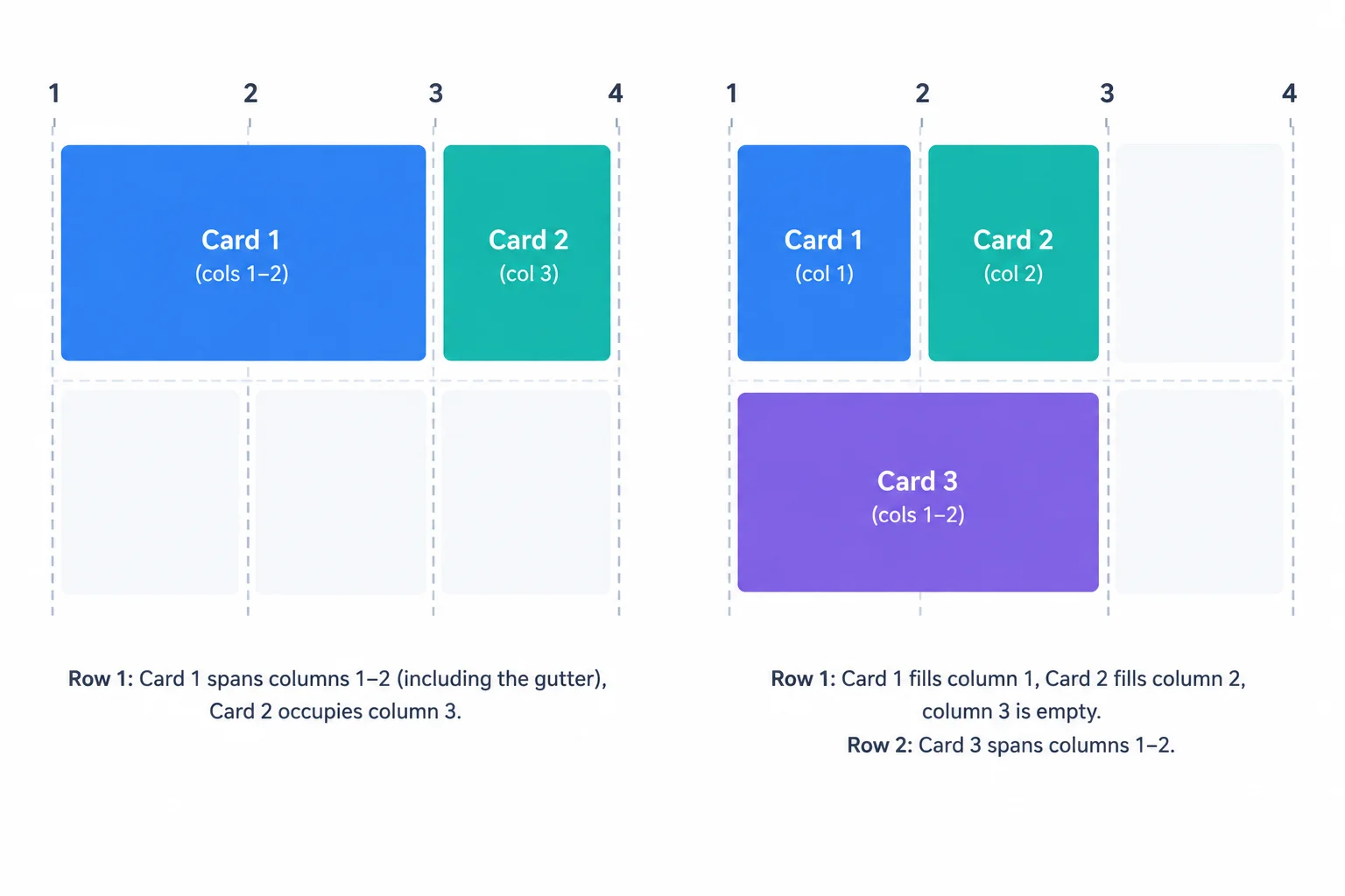
A spanning grid item needs consecutive free tracks. Automatic placement does not reorder items to fill every possible cell.
Continue with your existing local index.html and styles.css. Confirm that the Box Model card has its ordinary paragraph again. Then add card--featured only to the first card’s class attribute.
Do not change the three-column .card-grid rule. The span belongs to the featured grid item, while the container continues to provide three shrinkable equal-share tracks and a 1rem gap.
index.html — Make these edits in their existing locations, then save and refresh the browser.
<!-- First card: replace only its opening tag -->
<article class="card card--featured">

<!-- Box Model card: restore its paragraph -->
<p>Understand padding, borders, and margins.</p>Rendered Learning Hub grid before the span rule: Row 1: Card 1 HTML Basics | Card 2 CSS Selectors | Card 3 Box Model Row 2: Card 4 Flexbox | Card 5 CSS Grid | Card 6 Practice Project Row 3: Card 7 Next Steps | empty cell | empty cell The Box Model card shows its ordinary paragraph. The new card--featured class does not change placement until CSS defines it.
At this point, the added class has no placement effect because its CSS rule has not been added yet. Card widths vary with the browser window.
styles.css — Add this separate rule after the existing card rules. Save, then refresh index.html.
.card--featured {
  grid-column: span 2;
}Rendered Learning Hub grid: Row 1: Card 1 HTML Basics spans columns 1–2 | Card 2 CSS Selectors occupies column 3 Row 2: Card 3 Box Model | Card 4 Flexbox | Card 5 CSS Grid Row 3: Card 6 Practice Project | Card 7 Next Steps | empty cell
This is a graphical browser result. Exact card widths vary with the browser window, but these positions remain while three columns are available.
Complete the declaration that makes the featured item span exactly two column tracks.
After applying the featured-card span, choose the diagram that shows the Learning Hub placement and the separate case where a later two-column item cannot fit in the remaining space.

Step 8 of 8
Assemble, run, and verify the final seven-card Learning Hub Grid layout.
Replace your existing local index.html with this complete version. It keeps all seven cards in document order. Only the first card has the additional card--featured class, so it remains the first <article> in the source.
Save this file and the stylesheet on the next screen in the same folder. Then open or refresh index.html in your browser.
Save as index.html.
<!doctype html>
<html lang="en">
<head>
  <meta charset="utf-8">
  <meta name="viewport" content="width=device-width, initial-scale=1">
  <title>Learning Hub</title>
  <link rel="stylesheet" href="styles.css">
</head>
<body>
  <main>
    <h1>Learning Hub</h1>
    <div class="card-grid">
      <article class="card card--featured">
        <h2>HTML Basics</h2>
        <p>Learn page structure and semantic elements.</p>
      </article>
      <article class="card">
        <h2>CSS Selectors</h2>
        <p>Target elements with clear CSS rules.</p>
      </article>
      <article class="card">
        <h2>Box Model</h2>
        <p>Understand padding, borders, and margins.</p>
      </article>
      <article class="card">
        <h2>Flexbox</h2>
        <p>Arrange content along one dimension.</p>
      </article>
      <article class="card">
        <h2>CSS Grid</h2>
        <p>Explore two-dimensional page layouts.</p>
      </article>
      <article class="card">
        <h2>Practice Project</h2>
        <p>Combine your HTML and CSS skills.</p>
      </article>
      <article class="card">
        <h2>Next Steps</h2>
        <p>Continue building responsive layouts.</p>
      </article>
    </div>
  </main>
</body>
</html>
Expected browser result after both local files are saved: Learning Hub Row 1: HTML Basics occupies the first two columns; CSS Selectors occupies the third column. Row 2: Box Model, Flexbox, and CSS Grid occupy columns one through three. Row 3: Practice Project and Next Steps occupy columns one and two. All cards have visible borders, padding, and a 1rem gutter between adjacent cards.
This is the expected browser rendering after both this file and the `styles.css` file on the next screen are saved, then `index.html` is opened or refreshed.
Save as styles.css. This complete stylesheet supplies three explicit shrinkable equal-share column tracks and a 1rem gap. Because it has no grid-template-rows declaration, the needed rows are implicit.
* {
  box-sizing: border-box;
}

body {
  margin: 0;
  padding: 2rem;
  background: #f8fafc;
  color: #1e293b;
  font-family: system-ui, sans-serif;
}

.card-grid {
  display: grid;
  grid-template-columns: repeat(3, minmax(0, 1fr));
  gap: 1rem;
}

.card {
  padding: 1rem;
  border: 1px solid #cbd5e1;
  border-radius: 0.5rem;
  background: #ffffff;
}

.card h2 {
  margin-top: 0;
}

.card--featured {
  grid-column: span 2;
}
Expected browser result after opening or refreshing index.html: A three-column card grid appears below the Learning Hub heading. The HTML Basics card spans columns 1 and 2, including the gutter between those tracks. CSS Selectors is in column 3 of the first row. The remaining cards continue in document order across two more automatically created rows, with 1rem gutters between cards.
This is the expected browser rendering after this stylesheet and the preceding `index.html` are saved in the same folder. It describes the final styled state, not an unstyled interim page.
Use this diagram to compare the browser result with the intended placement.
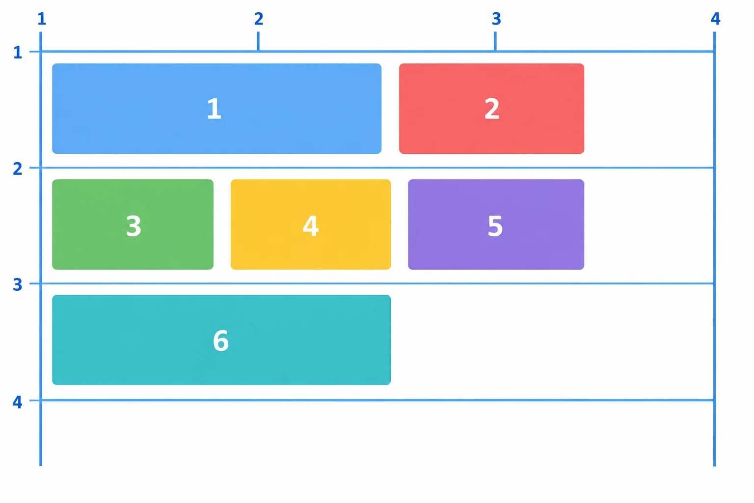
The card numbers show document order. Three column tracks are explicit; the rows are created implicitly as placement needs them.
Summary
Final layout checks
repeat(3, minmax(0, 1fr)) creates three explicit equal-share column tracks that can shrink.gap: 1rem; creates gutters only between adjacent tracks.Complete the core CSS declarations used in the final layout.
.card-grid {
  display: ;
  grid-template-columns: ;
  gap: 1rem;
}

.card--featured {
  grid-column: ;
}Run your saved index.html locally. Write a short verification report that addresses all five points:
minmax(0, 1fr) does not, by itself, make a long unbroken string wrap.Write at least 220 characters (0/220).
Congratulations! You completed: Create Two-Dimensional Layouts with CSS Grid
Thousands of online courses in video, ebooks and audiobooks.
To test your knowledge during online courses
Generated directly from your cell phone's photo gallery and sent to your email

Download our app via QR Code or the links below:.



Carry knowledge in your pocket.
Download the Cursa app.
There are hundreds of free courses available, with a free certificate of completion that is saved in your mobile image gallery.
Download the app to access the Course Completion Certificate for Free.


+ 10 million
students

Free and Valid
Certificate

60 thousand free
exercises

4.8/5 rating in
app stores

Free courses in
video and ebooks