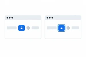
Step 1 of 7
Recognize What Each State Communicates
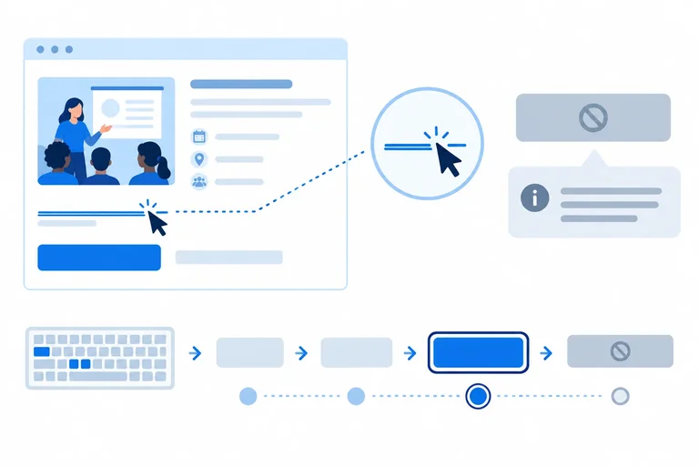
Distinguish the messages communicated by hover, focus, and disabled states, then create the local example used throughout this tutorial.

Learning path · Level 2 · Tutorial 6
Give links and form controls clear hover, keyboard-focus, and disabled appearances while preserving native behavior and visible focus.
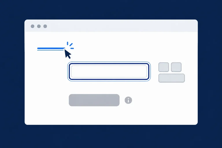
 Recognize What Each State Communicates
Distinguish the messages communicated by hover, focus, and disabled states, then create the local example used throughout this tutorial. 2 min
Recognize What Each State Communicates
Distinguish the messages communicated by hover, focus, and disabled states, then create the local example used throughout this tutorial. 2 min
 Add Hover Feedback Without Making It Essential
Add pointer-hover feedback that strengthens existing link and button affordances without making hover essential. 2 min
Add Hover Feedback Without Making It Essential
Add pointer-hover feedback that strengthens existing link and button affordances without making hover essential. 2 min
 Keep Keyboard Focus Clearly Visible
Apply a clear focus indicator with `:focus-visible` while preserving native keyboard behavior. 3 min
Keep Keyboard Focus Clearly Visible
Apply a clear focus indicator with `:focus-visible` while preserving native keyboard behavior. 3 min
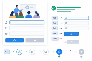 Use Real Disabled Behavior
Style a native disabled button and distinguish its browser behavior from a merely dimmed control. 2 min
Use Real Disabled Behavior
Style a native disabled button and distinguish its browser behavior from a merely dimmed control. 2 min
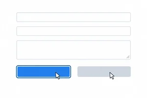 Make Overlapping States Work Together
Use source order and matching specificity to keep focus visible during hover and preserve the unavailable appearance of a disabled control. 2 min
Make Overlapping States Work Together
Use source order and matching specificity to keep focus visible during hover and preserve the unavailable appearance of a disabled control. 2 min
 Check Contrast Across Interaction States
Evaluate text, control, and focus-indicator contrast across interaction states, including the inactive-control exemption. 2 min
Check Contrast Across Interaction States
Evaluate text, control, and focus-indicator contrast across interaction states, including the inactive-control exemption. 2 min
 Finish and Test the Accessible State Styles
Complete the local stylesheet and verify hover, focus, disabled behavior, and relevant contrast evidence. 3 min
Finish and Test the Accessible State Styles
Complete the local stylesheet and verify hover, focus, disabled behavior, and relevant contrast evidence. 3 min
Step 1 of 7
Distinguish the messages communicated by hover, focus, and disabled states, then create the local example used throughout this tutorial.
Interactive controls can communicate different things:
These are different conditions, even when each changes an element’s appearance. Before any interaction, a link, input, or button still needs a recognizable default appearance so people can identify its purpose.
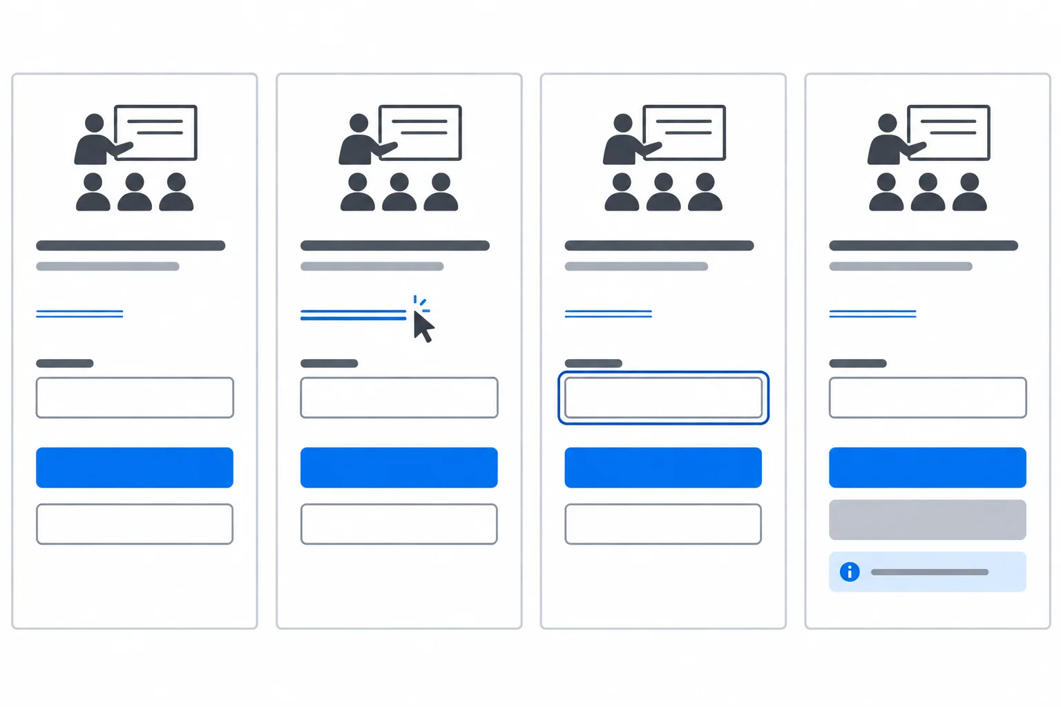
Default appearance identifies controls. A hover state signals pointer position, focus identifies the current target, and a disabled control signals unavailability.
Create a folder containing index.html and styles.css. This local starter page includes an underlined link, a labeled input, an enabled reset button, and an unavailable submit button. The browser’s native focus indicator is intentionally left intact for now.
Save this complete file as index.html.
<!doctype html>
<html lang="en">
  <head>
    <meta charset="utf-8">
    <meta name="viewport" content="width=device-width, initial-scale=1">
    <title>Workshop signup</title>
    <link rel="stylesheet" href="styles.css">
  </head>
  <body>
    <main>
      <h1>Workshop signup</h1>
      <p><a class="info-link" href="#details">Workshop details</a></p>

      <form>
        <label for="full-name">Full name</label>
        <input class="field" id="full-name" name="full-name" type="text">
        <p>
          <button class="action" type="reset">Clear form</button>
          <button class="action" type="submit" disabled>Join workshop</button>
          <span>Registration is closed in this demo.</span>
        </p>
      </form>

      <section id="details">
        <h2>Workshop details</h2>
        <p>This local demo has no signup service.</p>
      </section>
    </main>
  </body>
</html>Browser result: a page titled “Workshop signup” with a Workshop details link, a Full name field, a Clear form button, a Join workshop button, its registration message, and a Workshop details section.
Open `index.html` in a browser after also saving `styles.css` in the same folder.
Save this complete starter stylesheet as styles.css. It contains base styles only; later steps add interaction-state styles.
/* base styles */
:root {
  --surface: #ffffff;
  --text: #1f2937;
  --accent: #1d4ed8;
  --accent-hover: #1e40af;
  --focus: #111827;
  --border: #6b7280;
  --disabled-bg: #e5e7eb;
  --disabled-text: #4b5563;
}

* {
  box-sizing: border-box;
}

body {
  margin: 0;
  background-color: var(--surface);
  color: var(--text);
  font-family: system-ui, sans-serif;
  line-height: 1.5;
}

main {
  max-width: 40rem;
  margin: 0 auto;
  padding: 2rem;
}

form {
  max-width: 28rem;
}

label {
  display: block;
  margin-top: 1.5rem;
}

.info-link {
  color: var(--accent);
  font-size: 1rem;
  text-decoration: underline;
}

.field {
  display: block;
  width: 100%;
  margin: 0.5rem 0 1rem;
  padding: 0.75rem;
  border: 2px solid var(--border);
  border-radius: 0.25rem;
  background-color: var(--surface);
  color: var(--text);
  font: inherit;
  font-size: 1rem;
}

.action {
  margin-right: 0.5rem;
  padding: 0.75rem 1rem;
  border: 2px solid var(--accent);
  border-radius: 0.25rem;
  background-color: var(--accent);
  color: var(--surface);
  cursor: pointer;
  font: inherit;
  font-size: 1rem;
}Browser result: the link is blue and underlined, the Full name field has a visible gray border, and both buttons have a blue filled base appearance. The browser still provides its native focus indicator when you navigate to an enabled control.
Refresh the browser after saving. The exact native appearance of the disabled button and focus indicator can vary by browser at this starter stage.
Match each situation with the interaction condition it describes.
Tap an item and then its matching pair.

Step 2 of 7
Add pointer-hover feedback that strengthens existing link and button affordances without making hover essential.
A :hover pseudo-class matches while a pointing device is over an element. It can provide useful feedback, but it must not be the first moment a person can recognize what a control does.
Keep the link underlined and the button labeled in their default state. On hover, add another cue: strengthen the link underline, and underline the button text as its background changes. A person using touch may not get the same hover behavior, so labels and instructions must already be visible.
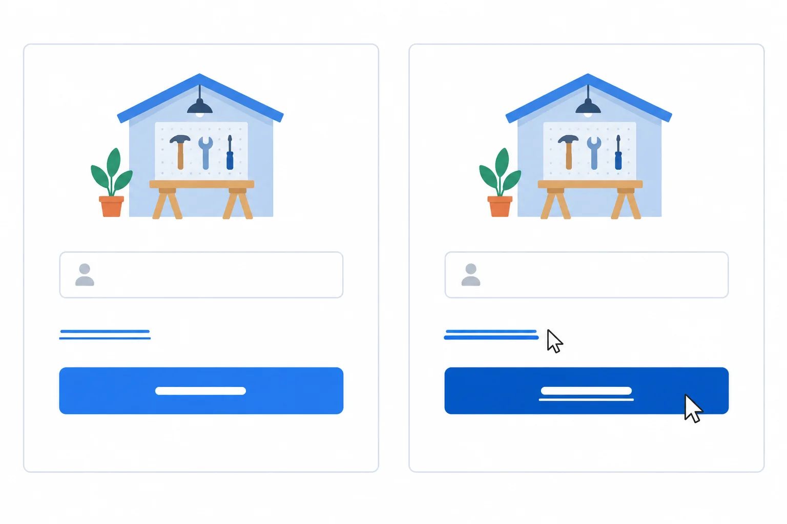
Both controls are recognizable before hover. Hover adds a non-color cue: a stronger underline.
Add these rules in the hover styles section of styles.css, after the base styles. The link’s underline is already present by default; hover makes that underline thicker. The button changes its surface color and gains an underline, so the feedback is not only a hue change.
Add these rules below your base styles in styles.css. Save, refresh the local page, and move a pointer over the link and enabled reset button.
.info-link:hover {
  color: var(--accent-hover);
  text-decoration-thickness: 3px;
}

.action:hover {
  background-color: var(--accent-hover);
  text-decoration: underline;
}Default: the Workshop details link remains underlined, and the Clear form button keeps its visible label and blue surface. Hover the link: its underline becomes 3px thick. Hover the enabled Clear form button: its background becomes darker and its text becomes underlined.
Check these visual results in the browser; CSS does not produce terminal output.
Tip
Do not put essential instructions in hover-only content. For example, do not reveal a button’s purpose only when a pointer reaches it. The visible label must communicate the purpose even when hover is unavailable.
Complete the four marked parts of these hover rules.
.info-link {
  color: var(--accent-hover);
  text-decoration-thickness: ;
}

.action {
  background-color: var(--accent-hover);
  text-decoration: ;
}A draft interface uses a button whose purpose is hidden until hover, and its hover state changes only the background color. Describe how you would repair the design so its purpose is available without hover and its hover state has a non-color cue. Then explain why the original design excludes or confuses some users.
Write at least 120 characters (0/120).

Step 3 of 7
Apply a clear focus indicator with :focus-visible while preserving native keyboard behavior.
A control has focus when it is the current target for interaction. :focus matches any focused element, whether focus arrived through the keyboard, a pointer, or another browser action.
:focus-visible is narrower: it matches focused elements when the browser determines that a visible focus indicator is needed. It is not a strict keyboard-only detector. For example, a text input can match :focus-visible after a pointer interaction because typing needs a clear target.
Keep the browser’s native focus indicator unless you provide an equally clear authored replacement. Never remove an outline globally just to change its appearance.
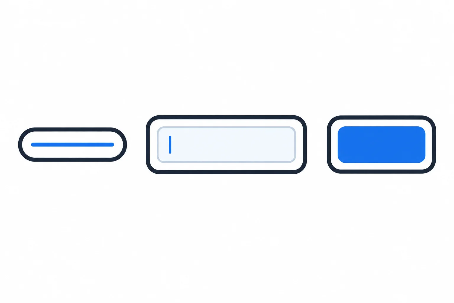
An outline can remain separate from a control’s border and background, helping the current target stand out.
Use Tab to move forward through reachable native controls and Shift+Tab to move backward. With focus on a link, Enter activates it. With focus on a native button, Enter or Space activates it.
State CSS changes appearance only; it must not replace these native keyboard behaviors. Test the local page in a browser after adding the styles.
Add this section after the hover styles in styles.css. It gives the link, field, and action button the same clear focus indicator.
/* focus styles */
.info-link:focus-visible,
.field:focus-visible,
.action:focus-visible {
  outline: 3px solid var(--focus);
  outline-offset: 3px;
}Focused link, field, or button: 3px dark outline (#111827) Gap between control edge and outline: 3px Control box dimensions: unchanged
After saving and refreshing the local page, this is the visual result whenever one of these controls matches `:focus-visible`. The outline is drawn outside the element, so its box dimensions do not change.
Tip
outline is drawn outside the element, so it does not change the element’s box dimensions. outline-offset creates space between the element and its outline.
Keep space around focusable controls. A nearby container with clipping overflow can cut off an outline, making focus harder to see. Do not add a global rule that removes outlines.
Which statement correctly distinguishes :focus and :focus-visible?
True or false: button:focus { outline: none; } is safe when no other focus indicator is provided.
Complete the five blanks to apply the authored focus indicator and identify the unsafe outline-removal rule.
.info-link,
.field:focus-visible,
.action:focus-visible {
  outline: ;
  outline-offset: ;
}

/*  matches every focused element. */
/* Never use  as the only focus feedback. */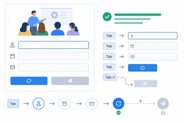
Step 4 of 7
Style a native disabled button and distinguish its browser behavior from a merely dimmed control.
A disabled control gets its unavailable behavior from HTML, not from a faded appearance. On a supported control such as a <button>, the disabled attribute prevents operation and removes the button from sequential keyboard focus: Tab moves past it.
The :disabled pseudo-class selects a control that is already disabled. CSS can make that state recognizable, but CSS does not create the behavior. An enabled button with muted colors—or only a different cursor—can still be activated and reached with Tab.
A link does not support native disabled behavior through a disabled attribute. Giving that attribute to an anchor does not stop it from working as a link.
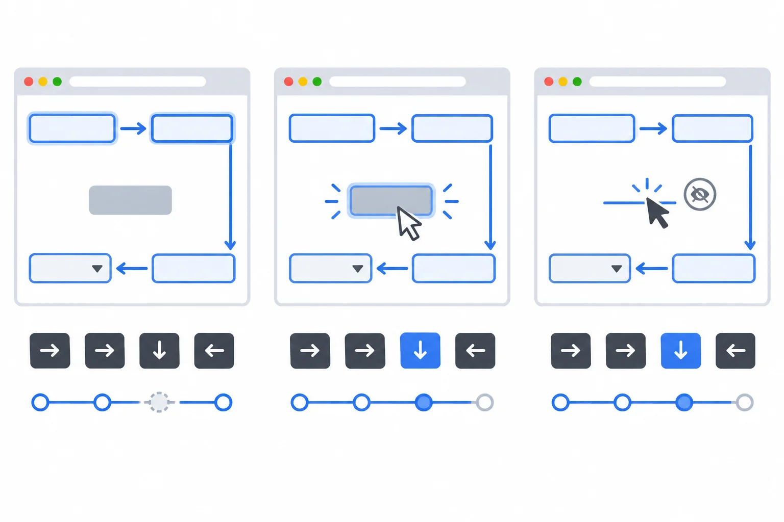
Only a button that is actually disabled is both unavailable for operation and skipped by sequential Tab navigation.
Keep the native attribute on the unavailable submit button and keep the explanation visible beside it. The message tells people why the action is unavailable; muted color is not the only cue.
These cases can look similar, but the browser behavior is different.
| Situation | When activated | Sequential Tab |
|---|---|---|
| Button with the disabled attribute | Does not operate | Skipped |
| Enabled button styled to look muted | Still operates | Reached |
| Link with a disabled attribute | Still navigates | Reached |
Keep this markup in index.html. The disabled attribute supplies the unavailable button behavior, while the adjacent text supplies a persistent explanation.
<form>
  <label for="full-name">Full name</label>
  <input class="field" id="full-name" name="full-name" type="text">
  <p>
    <button class="action" type="reset">Clear form</button>
    <button class="action" type="submit" disabled>Join workshop</button>
    <span>Registration is closed in this demo.</span>
  </p>
</form>Visible result: Full name [ text field ] [ Clear form ] [ Join workshop ] Registration is closed in this demo. Behavior: The Join workshop button cannot submit the form. Sequential Tab navigation reaches the text field and Clear form, but skips Join workshop.
Browser-rendering result after saving `index.html` and refreshing the local page.
Add this rule in the disabled styles section of styles.css, after the hover and focus sections. It selects the button that HTML has already disabled and gives it a muted but readable appearance. These declarations do not disable an enabled button; the HTML attribute remains necessary.
Append this rule to the disabled styles section. Save and refresh the local page.
/* disabled styles */
.action:disabled {
  border-color: var(--disabled-bg);
  background-color: var(--disabled-bg);
  color: var(--disabled-text);
  cursor: not-allowed;
  text-decoration: none;
}Visible result: The Join workshop button has a light muted background, readable dark muted text, no underline, and an unavailable cursor under a pointer. Behavior remains native HTML behavior: Pointer, Enter, and Space do not activate Join workshop. Sequential Tab navigation skips it. The message “Registration is closed in this demo.” remains visible beside the button.
Browser-rendering result when used with the disabled Join workshop button in `index.html`. Exact visual rendering varies slightly by browser.
Tip
Do not communicate unavailability with color alone. The readable message beside the button explains why the action cannot be used, including for someone who does not notice the muted appearance.
Complete the native attribute on this unavailable submit button.
<button class="action" type="submit" >Join workshop</button>Complete the pseudo-class that selects the genuinely unavailable action.
.action: {
  background-color: var(--disabled-bg);
  color: var(--disabled-text);
}Match each case to its browser behavior.
Tap an item and then its matching pair.
Step 5 of 7
Use source order and matching specificity to keep focus visible during hover and preserve the unavailable appearance of a disabled control.
An enabled control can be in a hover state and match :focus-visible at the same time. The selectors describe separate conditions; neither state cancels the other.
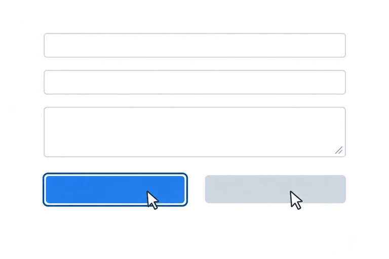
Give them separate visual jobs. Hover changes the button background and adds an underline. The focus indicator uses an outline outside the control. When a keyboard-focused button is also under the pointer, both cues can remain visible.
A disabled control can also be under a pointer and match :hover. Its unavailable appearance must therefore replace enabled hover feedback.
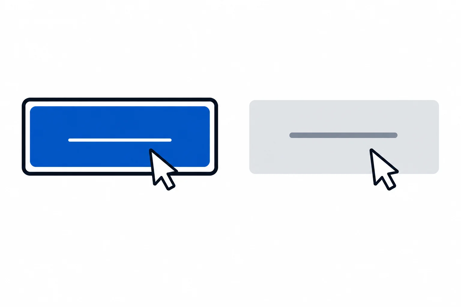
Hover plus focus-visible preserves both cues. Hover plus disabled keeps the unavailable appearance.
Tip
Inspect the result in the browser. Selector names do not give one state automatic priority: when rules affect the same property, the cascade resolves the result.
Keep the state sections in this order: hover, focus, then disabled. Hover and focus-visible set different properties, so their feedback can coexist.
.action:hover and .action:disabled have equal specificity: each contains one class and one pseudo-class. They both set background-color and text-decoration. Because the disabled rule comes later, it replaces the hover values for a disabled button under the pointer.
Keep these state sections in this order in styles.css, below the base styles. Save and refresh, then inspect both combined conditions in your browser.
/* hover styles */
.info-link:hover {
  color: var(--accent-hover);
  text-decoration-thickness: 3px;
}

.action:hover {
  background-color: var(--accent-hover);
  text-decoration: underline;
}

/* focus styles */
.info-link:focus-visible,
.field:focus-visible,
.action:focus-visible {
  outline: 3px solid var(--focus);
  outline-offset: 3px;
}

/* disabled styles */
.action:disabled {
  border-color: var(--disabled-bg);
  background-color: var(--disabled-bg);
  color: var(--disabled-text);
  cursor: not-allowed;
  text-decoration: none;
}Enabled .action with hover plus focus-visible: - The background uses var(--accent-hover). - The text is underlined. - The 3px focus outline remains visible outside the button, separated by a 3px offset. Disabled .action under the pointer: - The later disabled declarations keep the disabled background and disabled text color. - The text decoration is none, so the enabled hover underline does not appear.
This CSS produces visual browser results rather than console text. Check the enabled reset button with keyboard focus while the pointer is over it, then move the pointer over the disabled submit button.
Warning
Do not add a broad or later rule that sets outline: none; on a matching focused control. It can erase the authored focus indicator. Inspect the rendered overlap instead of assuming that a focus selector always wins.
A short stylesheet puts .action:disabled immediately before .action:hover. Both selectors match when the unavailable Join workshop button is under the pointer, and both have equal specificity.
Without changing either selector, describe the repair. Write the three disabled declarations that must replace the conflicting hover properties, and state where the disabled rule belongs. Then predict both final results:
.action is hovered and matches :focus-visible..action is hovered.Use the established custom properties and focus-outline values.
Write at least 180 characters (0/180).
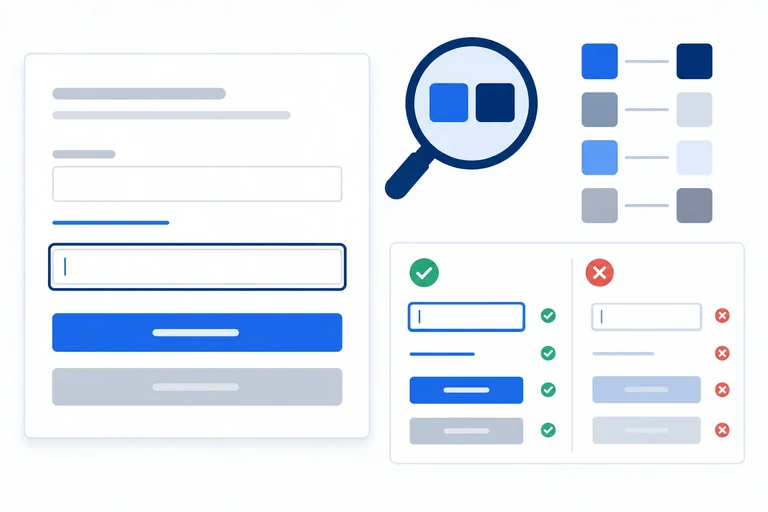
Step 6 of 7
Evaluate text, control, and focus-indicator contrast across interaction states, including the inactive-control exemption.
Contrast is a comparison between a cue and the color directly beside it, not a judgment based on the whole screen.
For this normal-size interface, enabled text needs at least 4.5:1 against its background. Visual information needed to identify an enabled control—such as an essential input boundary or button fill—needs at least 3:1 against adjacent colors. An authored focus indicator also needs at least 3:1.
Ask whether the feature communicates something necessary. A purely decorative border does not need its own target. But if a boundary is what makes a white input recognizable as a control, it is an essential non-text cue.
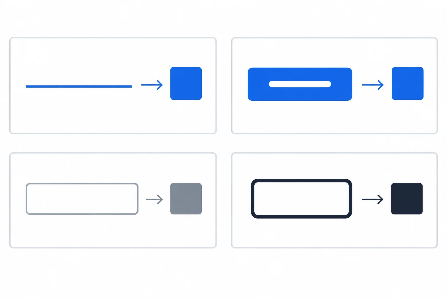
Compare each text, boundary, fill, or focus indicator with its adjacent background. For an offset outline, the surface beside the outline is the relevant adjacent color.
Enter the supplied hexadecimal values into a contrast checker and interpret the ratio by the cue’s purpose and state. Small display-rounding differences between checkers are normal.
The button label and its fill are separate pairs: white label text is compared with the blue fill, while the blue fill is compared with the surrounding white surface when that fill helps identify the enabled control. Likewise, the hovered link is a changed text pair that needs its own check.
These WCAG contrast readings use the colors in styles.css. Each row identifies the foreground or indicator, its adjacent background, and the requirement for that specific cue.
| Foreground or indicator | Adjacent background | State and purpose | Ratio | Requirement |
|---|---|---|---|---|
| --text (#1f2937) | --surface (#ffffff) | Default ordinary text | 14.7:1 | 4.5:1 |
| --accent (#1d4ed8) | --surface (#ffffff) | Default link text | 6.70:1 | 4.5:1 |
| --accent-hover (#1e40af) | --surface (#ffffff) | Hovered link text | 8.72:1 | 4.5:1 |
| --surface (#ffffff) | --accent (#1d4ed8) | Enabled button label | 6.70:1 | 4.5:1 |
| --surface (#ffffff) | --accent-hover (#1e40af) | Hovered enabled button label | 8.72:1 | 4.5:1 |
| --accent (#1d4ed8) | --surface (#ffffff) | Enabled button fill, when essential | 6.70:1 | 3:1 |
| --accent-hover (#1e40af) | --surface (#ffffff) | Hovered button fill, when essential | 8.72:1 | 3:1 |
| --border (#6b7280) | --surface (#ffffff) | Input boundary, when essential | 4.83:1 | 3:1 |
| --focus (#111827) | --surface (#ffffff) | Focus outline beside offset gap | 17.7:1 | 3:1 |
| --disabled-text (#4b5563) | --disabled-bg (#e5e7eb) | Disabled control label | About 6.1:1 | Exempt; readability check |
Example
The focus outline is a non-text focus indicator. Because outline-offset: 3px; leaves the page surface between the control and the outline, compare --focus with --surface, not automatically with the blue button fill inside the outline.
Inactive controls are exempt from the normal text and non-text contrast requirements. That exemption is not permission to make labels unreadable. The disabled button still has a readable label and the persistent explanation, “Registration is closed in this demo.” Together, they communicate unavailability without relying only on muted color.
Tip
These checks examine selected state cues, not the accessibility of an entire page. Use the actual adjacent colors and the role of each cue instead of assuming that every border or muted color has the same requirement.
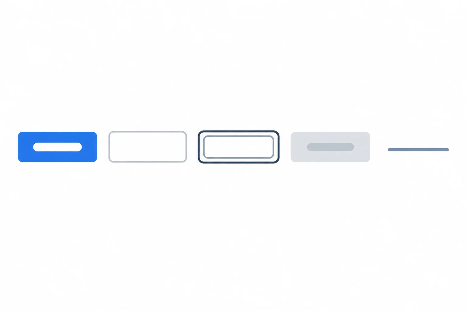
Read the cards from left to right as pairs A through E. The table provides the exact colors and checker readings.
Use these new checker readings. On the next screen, decide which enabled cues meet their applicable threshold, which enabled cue needs correction, and what should be done about the inactive label.
| Pair | Foreground or indicator | Adjacent background | State and role | Ratio |
|---|---|---|---|---|
| A | #ffffff | #1d4ed8 | Enabled button label | 6.70:1 |
| B | #9a9a9a | #ffffff | Enabled input boundary | 2.82:1 |
| C | #333333 | #ffffff | Authored focus outline beside offset gap | 12.63:1 |
| D | #9ca3af | #e5e7eb | Disabled control label | 2.04:1 |
| E | #6b7280 | #ffffff | Hovered link text | 4.83:1 |
Using pairs A through E from the previous screen, classify each pair. For every enabled text, essential non-text cue, or focus indicator, state whether it meets its applicable threshold and why. Identify the pair that needs correction. Then explain why pair D is exempt as an inactive control but should still be improved for readability.
Write at least 180 characters (0/180).
Step 7 of 7
Complete the local stylesheet and verify hover, focus, disabled behavior, and relevant contrast evidence.
Replace the contents of styles.css with these two code blocks in order. Together, they are the final reference stylesheet for the local Workshop signup page. This base section keeps every enabled control recognizable before interaction: the link is underlined, the field has a visible boundary, and the enabled button has a filled surface.
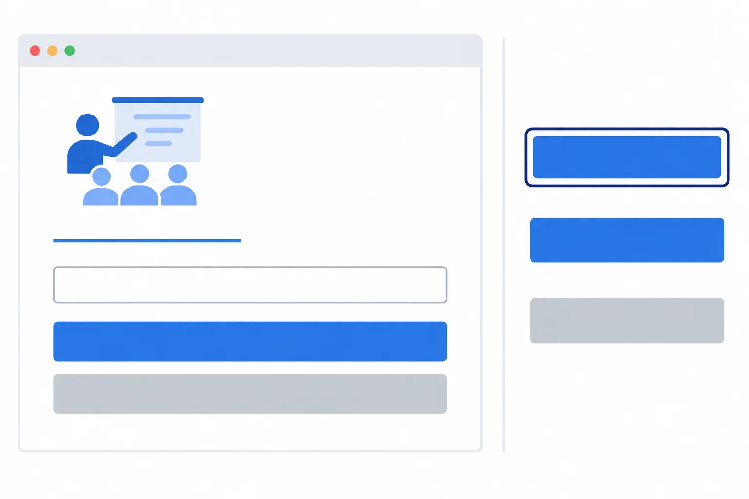
Controls remain identifiable before interaction. The focus indicator is a separate cue that can remain visible with hover.
Part 1 of 2 — save this base section first in styles.css.
/* base styles */
:root {
  --surface: #ffffff;
  --text: #1f2937;
  --accent: #1d4ed8;
  --accent-hover: #1e40af;
  --focus: #111827;
  --border: #6b7280;
  --disabled-bg: #e5e7eb;
  --disabled-text: #4b5563;
}

* {
  box-sizing: border-box;
}

body {
  margin: 0;
  background-color: var(--surface);
  color: var(--text);
  font-family: system-ui, sans-serif;
  line-height: 1.5;
}

main {
  max-width: 40rem;
  margin: 0 auto;
  padding: 2rem;
}

form {
  max-width: 28rem;
}

label {
  display: block;
  margin-top: 1.5rem;
}

.info-link {
  color: var(--accent);
  font-size: 1rem;
  text-decoration: underline;
}

.field {
  display: block;
  width: 100%;
  margin: 0.5rem 0 1rem;
  padding: 0.75rem;
  border: 2px solid var(--border);
  border-radius: 0.25rem;
  background-color: var(--surface);
  color: var(--text);
  font: inherit;
  font-size: 1rem;
}

.action {
  margin-right: 0.5rem;
  padding: 0.75rem 1rem;
  border: 2px solid var(--accent);
  border-radius: 0.25rem;
  background-color: var(--accent);
  color: var(--surface);
  cursor: pointer;
  font: inherit;
  font-size: 1rem;
}After refresh: The Workshop details link is blue and underlined. The Full name field has a visible gray border. Clear form is a filled blue button with white text. Join workshop still uses its browser-default disabled appearance until the state rules are added.
This stylesheet produces visual output in the browser after you save and refresh `index.html`.
Part 2 of 2 — append these state sections after the base styles. The order lets the later disabled rule replace matching hover properties.
/* hover styles */
.info-link:hover {
  color: var(--accent-hover);
  text-decoration-thickness: 3px;
}

.action:hover {
  background-color: var(--accent-hover);
  text-decoration: underline;
}

/* focus styles */
.info-link:focus-visible,
.field:focus-visible,
.action:focus-visible {
  outline: 3px solid var(--focus);
  outline-offset: 3px;
}

/* disabled styles */
.action:disabled {
  border-color: var(--disabled-bg);
  background-color: var(--disabled-bg);
  color: var(--disabled-text);
  cursor: not-allowed;
  text-decoration: none;
}After refresh: Hovering Workshop details makes its underline thicker. Hovering Clear form darkens its blue background and underlines its label. A focus-visible link, field, or enabled button has a dark 3px outline with a visible gap. A keyboard-focused Clear form button keeps that outline while hovered. Join workshop is muted, has no underline under the pointer, cannot be activated, and is skipped by Tab navigation.
Test these rendered results with a pointer and keyboard after saving and refreshing the page.
Use a contrast checker with the supplied colors. Each row identifies the foreground, indicator, or essential fill; its adjacent background; the state; and the threshold to apply. The inactive row is a readability record, not a required pass under the inactive-control exemption.
| Pair | State | Ratio | Threshold |
|---|---|---|---|
| #1d4ed8 text on #ffffff | Default link | 6.70:1 | 4.5:1 text |
| #1e40af text on #ffffff | Hovered link | 8.72:1 | 4.5:1 text |
| #ffffff text on #1d4ed8 | Enabled button label | 6.70:1 | 4.5:1 text |
| #1d4ed8 fill on #ffffff | Enabled button fill | 6.70:1 | 3:1 non-text |
| #ffffff text on #1e40af | Hovered button label | 8.72:1 | 4.5:1 text |
| #1e40af fill on #ffffff | Hovered button fill | 8.72:1 | 3:1 non-text |
| #6b7280 border on #ffffff | Enabled field boundary | 4.83:1 | 3:1 non-text |
| #111827 outline on #ffffff | Focus indicator | 17.7:1 | 3:1 non-text |
| #4b5563 text on #e5e7eb | Disabled control label | 6.0:1 | Exempt; keep readable |
Tip
The outline is offset from its control, so its adjacent color is the white page surface in this example. Record both button-label pairs and both button-fill pairs: text contrast and essential control-fill contrast answer different questions.
Complete the disabled declarations so the unavailable action retains its muted appearance when a pointer is over it.
.action:hover {
  background-color: var(--accent-hover);
  text-decoration: underline;
}

.action:disabled {
  background-color: ;
  color: ;
  text-decoration: ;
}Save both files and refresh the local page. Gather evidence with these trials:
Clear form is visibly a button. Confirm that no purpose or instruction appears only on hover.Clear form.Workshop details, press Enter.Pointer test in the field, then activate Clear form with the pointer and confirm the field empties.Keyboard test in the field, Tab back to Clear form, then activate it with Enter or Space and confirm the field empties.Clear form keyboard-focused and move the pointer over it. Confirm that its hover cue and focus indicator both remain visible.Join workshop is skipped. Move the pointer over it and confirm its unavailable appearance remains and it cannot be activated.Use the table readings as focused evidence for these states, not as a complete accessibility audit.
Write a concise test record for your local page. Report: persistent affordances and hover feedback; Tab and Shift+Tab movement and Enter on the details link; the separate pointer and keyboard reset trials; the combined hover and focus-visible result; and the skipped, unavailable Join workshop action.
Then record every table pair using its foreground or indicator color, adjacent background, interaction state, ratio, and threshold. State whether each enabled pair meets its threshold, and identify the disabled-label pair as exempt while noting its readability.
Write at least 450 characters (0/450).
Summary
Congratulations! You completed: Style Accessible Hover, Focus, and Disabled States
Thousands of online courses in video, ebooks and audiobooks.
To test your knowledge during online courses
Generated directly from your cell phone's photo gallery and sent to your email

Download our app via QR Code or the links below:.


Carry knowledge in your pocket.
Download the Cursa app.
There are hundreds of free courses available, with a free certificate of completion that is saved in your mobile image gallery.
Download the app to access the Course Completion Certificate for Free.


+ 10 million
students

Free and Valid
Certificate

60 thousand free
exercises

4.8/5 rating in
app stores

Free courses in
video and ebooks