
Step 1 of 9
Prepare a Repeatable Layout Check
Create a local Trail Guide fixture and establish a compact, reproducible matrix for responsive layout observations.

Learning path · Level 3 · Tutorial 7
Evaluate a responsive page on your own computer across widths, zoom levels, and content variations, then fix layout problems without hiding content or disrupting keyboard use.

 Prepare a Repeatable Layout Check
Create a local Trail Guide fixture and establish a compact, reproducible matrix for responsive layout observations. 3 min
Prepare a Repeatable Layout Check
Create a local Trail Guide fixture and establish a compact, reproducible matrix for responsive layout observations. 3 min
 Sweep Widths and Breakpoint Edges
Measure the Trail Guide layout across representative viewport widths and the 768 CSS px breakpoint edge, then record an observed result under repeatable baseline conditions. 2 min
Sweep Widths and Breakpoint Edges
Measure the Trail Guide layout across representative viewport widths and the 768 CSS px breakpoint edge, then record an observed result under repeatable baseline conditions. 2 min
 Check Text Enlargement at 200%
Evaluate the Trail Guide page at 200% enlargement while distinguishing browser page zoom from text-only zoom and other forms of magnification. 2 min
Check Text Enlargement at 200%
Evaluate the Trail Guide page at 200% enlargement while distinguishing browser page zoom from text-only zoom and other forms of magnification. 2 min
 Verify Reflow at Narrow Effective Widths
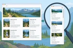
Evaluate Trail Guide at a direct narrow viewport and through a suitable 400% page-zoom comparison, then record what reflow evidence you observed. 3 min
Verify Reflow at Narrow Effective Widths
Evaluate Trail Guide at a direct narrow viewport and through a suitable 400% page-zoom comparison, then record what reflow evidence you observed. 3 min
 Stress the Layout with Realistic Content Changes
Use controlled text-length and item-count variations to expose responsive layout weaknesses that the Default content can conceal. 2 min
Stress the Layout with Realistic Content Changes
Use controlled text-length and item-count variations to expose responsive layout weaknesses that the Default content can conceal. 2 min
 Trace Overflow Before Changing CSS
Trace page-level horizontal overflow to its responsible element, make a focused CSS correction, and verify the saved result under the original conditions. 3 min
Trace Overflow Before Changing CSS
Trace page-level horizontal overflow to its responsible element, make a focused CSS correction, and verify the saved result under the original conditions. 3 min
 Compare Visual, Document, and Focus Order
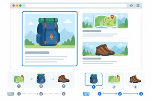
Compare rendered placement, HTML document order, and native keyboard focus order across the card-layout breakpoint, then remove the visual-order mismatch. 2 min
Compare Visual, Document, and Focus Order
Compare rendered placement, HTML document order, and native keyboard focus order across the card-layout breakpoint, then remove the visual-order mismatch. 2 min
 Check Scrolling and Focus Around Pinned Elements
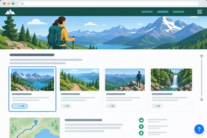
3 min
Check Scrolling and Focus Around Pinned Elements
3 min
 Complete a Reproducible Check and Retest
Finish with an evidence-based responsive check record and a verified correction that preserves content and keyboard access. 3 min
Complete a Reproducible Check and Retest
Finish with an evidence-based responsive check record and a verified correction that preserves content and keyboard access. 3 min
Step 1 of 9
Create a local Trail Guide fixture and establish a compact, reproducible matrix for responsive layout observations.
Responsive checking is a small matrix, not proof from one named device preset. Vary three independent dimensions:
Start from known conditions and use representative checks rather than every possible combination. If something looks suspicious, add focused checks around that condition. Record CSS pixels, not physical screen pixels.

Treat width, zoom, and content as separate variables. A suspicious result earns additional targeted checks.
Use this compact starting matrix after opening the fixture. Record the actual values you use; a device name is not a substitute for viewport measurements.
| Dimension | Starting condition | What to record |
|---|---|---|
| Browser | Your local browser | Browser/version |
| Viewport | For example, approximately 1280 × 800 CSS px | Width, height, and any uncertainty |
| Zoom | 100% page zoom | Zoom mode and level |
| Content | Default | Content variant |
On your computer, create one folder containing index.html and styles.css. Replace the contents of index.html with these three consecutive sections, in order. The native links point to real sections later in the same page.
<!doctype html>
<html lang="en">
  <head>
    <meta charset="utf-8">
    <meta name="viewport" content="width=device-width, initial-scale=1">
    <title>Trail Guide</title>
    <link rel="stylesheet" href="styles.css">
  </head>
  <body>
    <header class="site-header">
      <h1>Trail Guide</h1>
      <nav aria-label="Guide sections">
        <a href="#route-details">Routes</a>
        <a href="#packing-details">Packing</a>
        <a href="#walking-details">Walking</a>
      </nav>
    </header>

    <main>
      <section aria-labelledby="planning-heading">
        <h2 id="planning-heading">Plan a comfortable day outside</h2>
        <p>Use these three steps to prepare for a local trail.</p>
        <div class="cards">
          <article class="card">
            <h3>Choose a route</h3>
            <p>Match distance and terrain to the group's time and energy.</p>
            <p class="card__reference">Reference: ROUTE-014</p>
            <a href="#route-details">Read route details</a>
          </article>
          <article class="card card--featured">
            <h3>Pack supplies</h3>
            <p>Bring water, a map, layers, and a small first-aid kit.</p>
            <p class="card__reference">Reference: PACK-028</p>
            <a href="#packing-details">Read packing details</a>
          </article>

          <article class="card">
            <h3>Start walking</h3>
            <p>Set a steady pace and leave time to return before dark.</p>
            <p class="card__reference">Reference: WALK-041</p>
            <a href="#walking-details">Read walking details</a>
          </article>
        </div>
      </section>

      <section id="route-details">
        <h2>Route details</h2>
        <p>Check the trail surface, elevation, weather forecast, and daylight before leaving.</p>
        <p>Turn around early if conditions change or the group needs more time.</p>
      </section>

      <section id="packing-details">
        <h2>Packing details</h2>
        <p>Keep frequently used supplies accessible and protect them from changing weather.</p>
        <p>Tell someone where you plan to go and when you expect to return.</p>
      </section>
      <section id="walking-details">
        <h2>Walking details</h2>
        <p>Stay on marked paths, take planned breaks, and adjust the route when needed.</p>
        <p>Leave enough time to return safely before daylight fades.</p>
      </section>

      <section id="help">
        <h2>Need help?</h2>
        <p>Use local emergency guidance when urgent assistance is needed. This sample page is only a layout fixture.</p>
        <p>Keep route information available to the group and check changing conditions before continuing.</p>
      </section>
    </main>

    <a class="help-link" href="#help">Need help?</a>
  </body>
</html>* {
box-sizing: border-box;
}
body {
margin: 0;
font-family: system-ui, sans-serif;
color: #17212b;
background: #f4f7f5;
}
.site-header,
main {
width: min(72rem, calc(100% - 2rem));
margin: 0 auto;
}
.site-header {
position: sticky;
top: 0;
z-index: 1;
padding: 1rem 0;
background: #f4f7f5;
border-bottom: 1px solid #9ab5a2;
}
.site-header h1 {
margin: 0 0 0.5rem;
font-size: 2rem;
}
h2 {
font-size: 1.5rem;
}
.card h3 {
font-size: 1.25rem;
}
nav {
display: flex;
flex-wrap: wrap;
gap: 1rem;
}
main {
padding: 1.5rem 0 5rem;
}
section {
margin-bottom: 3rem;
}
.cards {
display: grid;
grid-template-columns: 1fr;
gap: 1rem;
}
.card {
min-width: 22rem;
padding: 1rem;
background: #ffffff;
border: 1px solid #9ab5a2;
border-radius: 0.5rem;
}
.card__reference {
color: #39514a;
white-space: nowrap;
}
.help-link {
position: fixed;
right: 1rem;
bottom: 1rem;
padding: 0.75rem 1rem;
color: #ffffff;
background: #155d3a;
border-radius: 0.5rem;
}
a:focus-visible {
outline: 3px solid #d06a00;
outline-offset: 3px;
}
@media (min-width: 768px) {
.cards {
grid-template-columns: repeat(2, minmax(0, 1fr));
}
.card--featured {
order: -1;
}
}Expected Default render: - A bounded Trail Guide page with a header that stays at the top while the page scrolls. - Three white cards with links to the Route, Packing, and Walking detail sections. - Below 768 CSS px, the cards use one grid column. - From 768 CSS px, the cards use two grid columns. - A green Need help? link remains fixed near the lower-right viewport edge. - Keyboard-focused links show a visible orange outline. - The detail sections provide page content to scroll.
Visual rendering varies slightly by browser and installed fonts. This describes the expected Default structure after both files are saved and index.html is opened locally.
Save both files and open index.html in your regular browser. Confirm that the stylesheet is applied, each navigation link reaches its section, and the page can scroll. Keep the initial content as Default and leave the CSS unchanged for now.
Before changing anything, create a note using these exact labels:
Browser/versionViewportZoom mode and levelContent variantSteps to reproduceExpectedActualResponsible element/ruleCorrectionRetest result
Tip
A defect record describes what you observed before you try to fix it. If a viewport measurement is estimated, state the uncertainty—for example, “approximately 1280 × 800 CSS px.”
Match each proposed check or record detail to its purpose.
Tap an item and then its matching pair.

Step 2 of 9
Measure the Trail Guide layout across representative viewport widths and the 768 CSS px breakpoint edge, then record an observed result under repeatable baseline conditions.
A responsive preview can set a precise viewport width in CSS pixels. Its display-fit scale only makes that preview fit on your screen; it does not change the page’s CSS layout like page zoom does.
For this width sweep, use 100% page zoom and the Default content variant. Record viewport dimensions in CSS pixels, not physical screen pixels. Keep the browser/version with your notes so another person can repeat the check.

The preview may look small because it is fitted to the screen. The value to record is the viewport width in CSS pixels; keep page zoom at 100% for this sweep.
Sample narrow, intermediate, and wide widths, then drag-resize slowly between them. A sampled width can look fine while a brief wrap, overlap, or horizontal overflow appears between samples.
At every stop, inspect card wrapping, gaps, clipping, overlap, and unexpected page-level horizontal scrolling. Vertical scrolling is normal. If a failure appears, note the first viewport width where it appears, plus the baseline conditions.
Run these width checks at 100% page zoom with Default, then resize continuously through the ranges.
| Viewport width | What to compare |
|---|---|
| 320 CSS px | Narrow single-column fit |
| 480 CSS px | Intermediate wrapping and spacing |
| 767 CSS px | Immediately below the breakpoint |
| 768 CSS px | Breakpoint layout change |
| 769 CSS px | Immediately above the breakpoint |
| 1024 CSS px | Wide layout spacing |
| 1280 CSS px | Wide bounded-container behavior |
Tip
A browser preview is useful for repeatable CSS-pixel measurements, but it does not reproduce every device browser, input method, font rendering, or viewport behavior. When an actual device is available, use it as a supplement—not as a replacement for a recorded preview check.
Which set best checks the edge of a min-width: 768px layout change?
On your own Trail Guide page, perform the width sweep at 100% page zoom with Default content. In your response:
Write at least 160 characters (0/160).

Step 3 of 9
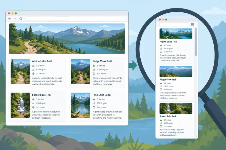
Evaluate the Trail Guide page at 200% enlargement while distinguishing browser page zoom from text-only zoom and other forms of magnification.
A 200% enlargement check asks a practical question: can people still read and use the page when text is much larger? A passing layout keeps every heading, link label, navigation control, and content area available. Extra vertical scrolling is normal; clipped text, overlap that hides a control, or missing content is not.
Use the Trail Guide page with the Default content variant. Keep the browser window and its viewport conditions recorded so that you can repeat a result.
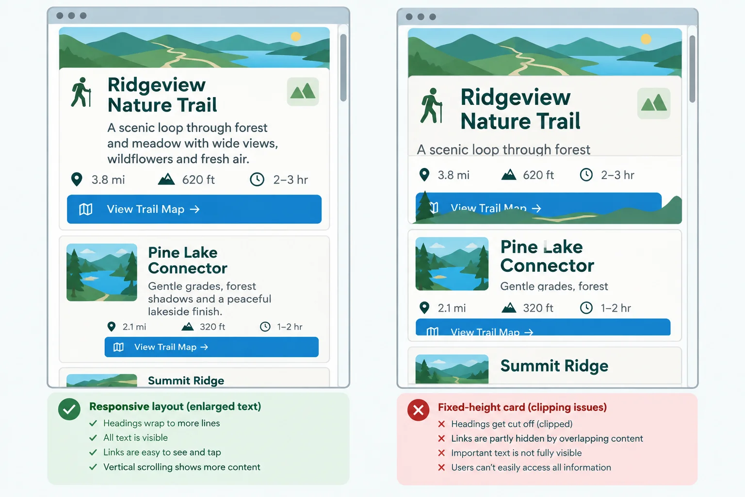
Wrapping to more lines is acceptable when content and controls remain visible and usable; clipping or obscuring them is not.
Use the regular browser window for the primary check. Set page zoom to 200%, inspect the page, then reset it to 100% before trying another mode.
If your browser supports text-only zoom, set that mode to 200% as an additional check. It can affect the layout differently, so do not treat it as the same test or combine its result with page zoom.
Record the mode and level used. A preview's display-fit scale, operating-system magnification, and pinch magnification are not browser page zoom.
These controls can look similar but provide different evidence.
| Mode or display change | What to record |
|---|---|
| Page zoom | 200%; primary check in the regular browser |
| Text-only zoom | 200%; additional check when supported |
| Preview display-fit scale | Do not record as page zoom |
| Operating-system or pinch magnification | Do not substitute for browser zoom |
Which observation supports an acceptable 200% enlargement result?
On your own computer, open index.html in a regular browser window using Default content. Record the browser/version and current viewport width and height in CSS px; mark either measurement as approximately if necessary.
200%.100%. If supported, repeat with text-only zoom at 200% and record it separately.A zoom value does not guarantee that each font visibly enlarged as intended: viewport-dependent font formulas can counteract apparent growth. Judge what is actually rendered. Reset to 100% when finished.
Write a concise result for your page. Include: Browser/version; Viewport (width × height CSS px, noting any approximation); Zoom mode and level; Content variant; and your observations. Classify the result as acceptable only if enlarged text and controls stayed readable, visible, and usable; otherwise identify what was lost or obstructed.
Write at least 120 characters (0/120).
Step 4 of 9
Evaluate Trail Guide at a direct narrow viewport and through a suitable 400% page-zoom comparison, then record what reflow evidence you observed.
Reflow is about the space available to ordinary page content, measured in CSS pixels—not physical screen pixels. Around 320 CSS px, prose, navigation, and cards should wrap or stack so that you can read each line without page-level horizontal scrolling. Vertical scrolling is normal.
Use two related checks:
Neither check replaces the other. The direct preview gives a controlled width; the zoom check shows how the page behaves when the effective viewport becomes narrow during enlargement.
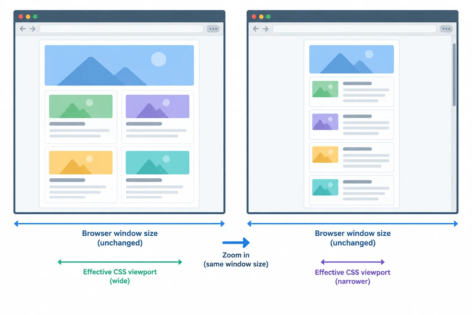
Keeping a regular browser window the same size, a viewport that is roughly 1280 CSS px wide at 100% page zoom becomes approximately 320 CSS px wide at 400% page zoom.
For the zoom comparison, first establish and record a baseline in a regular browser window: for example, 1280 × 800 CSS px at 100% page zoom with the Default content variant. Keep that browser window the same size, then change only page zoom to 400%.
This is an approximation: a roughly 1280-CSS-pixel-wide viewport at 100% becomes approximately 320 CSS px wide at 400%. Do not describe the full physical screen as the viewport.
Docked developer tools reduce the available viewport. Close them, undock them, or record the actual available dimensions. If you cannot establish the baseline, run the direct 320 CSS px check and explicitly record that the equivalent 400% comparison was not established.
Use the Default content variant for this step. Observe whether every ordinary card, heading, paragraph, and link remains available without horizontal page scrolling. Do not hide overflow or change CSS while checking; later steps handle diagnosis and correction.
| Check | Setup | What to record |
|---|---|---|
| Direct narrow width | 320 CSS px viewport width; 100% page zoom | Viewport width and height, Default, page-level horizontal scrolling or reflow result |
| Zoom comparison | Regular window near 1280 CSS px at 100%, then same window at 400% page zoom | Baseline dimensions, zoom mode and level, approximately resulting width, observed reflow result |
| Baseline unavailable | Direct 320 CSS px check only | What prevented the comparison and the limitation |
Match each observation from a narrow reflow check to its best conclusion.
Tap an item and then its matching pair.
Perform the direct 320 CSS px check and, if you can establish it, the 400% page-zoom comparison on your local Trail Guide page. Write a concise defect-style observation. Include the Browser/version, the baseline viewport and zoom, the resulting direct or approximately effective viewport conditions, the Content variant, and whether ordinary content required page-level horizontal scrolling. Also state whether any horizontal scrolling was contained within a genuinely two-dimensional item or was a page-level problem. If you could not establish the 400% baseline, state the limitation.
Write at least 180 characters (0/180).
Step 5 of 9
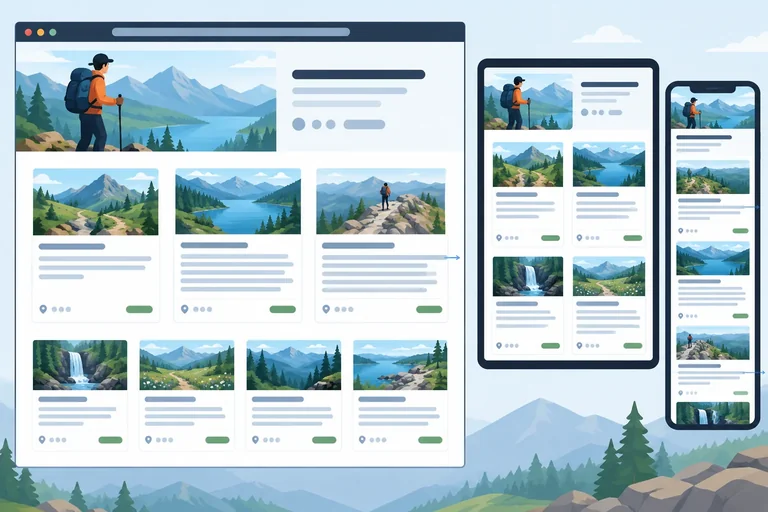
Use controlled text-length and item-count variations to expose responsive layout weaknesses that the Default content can conceal.
The Default Trail Guide page uses short labels and only three cards. It can look stable even when its layout will fail with realistic content.
A useful stress check changes one content factor at a time and repeats the same viewport width, page zoom, browser, and CSS. That way, an observed change has a clear cause. Do not change CSS during these checks; first collect evidence about what the content exposes.
Try isolated probes before combining them. After that, run the prescribed named variants: Long text and Extra cards.

The same layout can be challenged by text length, an unbroken string, or a larger number of items.
Start each check from a saved Default version. Use 100% page zoom and compare each change at 320 CSS px and near the breakpoint: 767, 768, and 769 CSS px. Keep the browser/version, CSS, and viewport height as consistent as practical.
First, isolate the effects: test a longer first heading alone, restore Default, then test the unbroken reference alone. The prescribed Long text variant contains both edits, so use it after those isolated observations. For Extra cards, duplicate only the three existing card elements once. Do not duplicate the detail sections or any IDs; the copied links can still point to the original fragment destinations.
Example
For the named Long text variant in index.html:
Choose a route that matches everyone's pace and daylight hours
.card__reference content with:TRAILGUIDE_REFERENCE_ABCDEFGHIJKLMNOPQRSTUVWXYZ0123456789
Restore the original short heading and reference before starting a different isolated probe or the later order check.
Observe the result before attempting any correction.
| Content change | Main pressure | Expected resilience |
|---|---|---|
| Longer heading | More text lines | Heading wraps; card grows |
| Unbroken reference | A token cannot break naturally | Text remains available without page-level horizontal scrolling |
| Extra cards | More grid items | Additional rows appear; every link remains reachable |
Match each controlled content change to the weakness it can reveal.
Tap an item and then its matching pair.
A page works with three cards, but you need to find out whether adding more cards creates inaccessible later rows or disrupts the repeated links.
Which named content variant should you use? In 2–4 sentences, describe a comparison with Default at 320 CSS px and at 767, 768, and 769 CSS px, all at 100% page zoom. State the single factor you change, two conditions you keep the same, and how copied markup avoids duplicate IDs.
Write at least 180 characters (0/180).

Step 6 of 9
Trace page-level horizontal overflow to its responsible element, make a focused CSS correction, and verify the saved result under the original conditions.
When you find page-level horizontal scrolling, do not begin by hiding overflow on the page. That can conceal essential content while leaving the responsible constraint in place.
First preserve the original reproduction. In your defect record, keep the Browser/version, Viewport, Zoom mode and level, Content variant, Steps to reproduce, Expected, and Actual fields. Include viewport height too, and write “approximately” if the measurement is estimated.
At the failing conditions—often the Long text variant at a narrow viewport width—open the element inspector. Select the element that extends beyond the viewport. Hover elements in the inspector to compare their box boundaries with the viewport, then inspect computed sizing and temporarily toggle one suspected declaration.
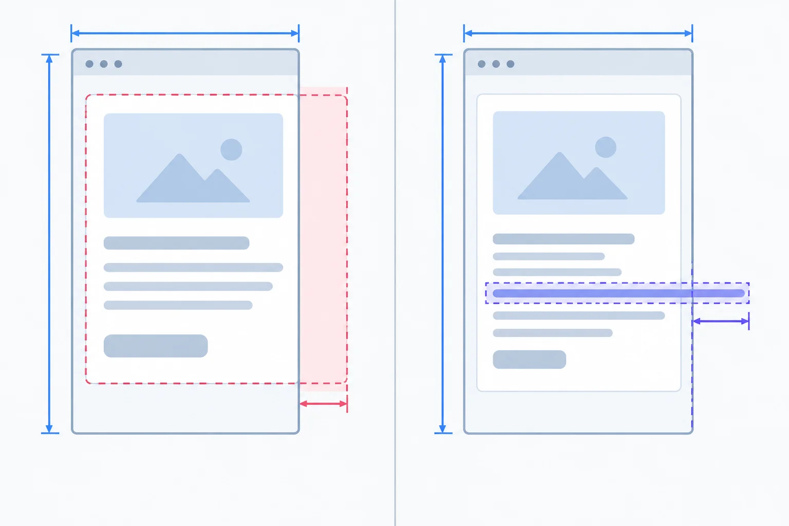
Trace whether the card box itself is too wide or whether its unbroken content is escaping the box.
Use the inspector as a hypothesis test, not as a permanent editor. If disabling .card’s minimum width removes the oversized box, that rule is the first confirmed cause. If the card then fits but the reference still protrudes, select .card__reference and inspect its computed white-space value.
A reference with white-space: nowrap cannot use normal line wrapping. Override or replace that rule before testing overflow-wrap. Change one rule at a time. A developer-tools toggle is temporary: once it works, save the corresponding change in styles.css, refresh, and verify it again.
Compare the visible boundary and the computed rules before choosing a correction.
| Observed evidence | Inspector check | Confirmed cause | Targeted action |
|---|---|---|---|
| Card boundary exceeds available grid space | Toggle the card minimum width | The card constraint is too large | Let the card shrink |
| Card fits, but reference protrudes | Check computed white-space, then test wrapping | The unbroken string is prevented from wrapping | Restore normal white-space and allow wrapping |
| Only page-level scroll is hidden | Check whether content is clipped | Cause has not been corrected | Restore visibility and trace the source |
Replace the relevant existing declarations in styles.css only after confirming the corresponding causes locally.
.card {
  min-width: 0;
}

.card__reference {
  white-space: normal;
  overflow-wrap: anywhere;
}
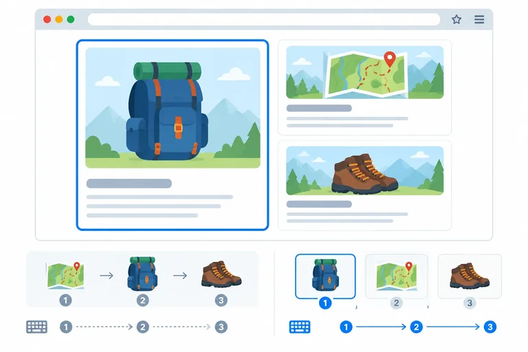
Expected result: The card stays within the viewport. The long reference wraps inside the card. Essential text and links remain visible. Page-level horizontal scrolling caused by the card minimum width and reference string is gone.
Expected visual result when retesting the original Long text failure, such as at 320 CSS px and 100% page zoom. Your exact viewport height may differ.
Tip
Do not use root-level overflow hiding, clipping, or a global size reduction as a substitute for correcting the responsible card or text constraint. Those approaches can remove evidence or make content unavailable.
Put this diagnose-change-retest workflow in the only dependable order.
In your own defect record, state the responsible selector and original rule, the original Viewport, Zoom mode and level, and Content variant. State the saved correction and what happened after retesting the exact Long text conditions and one nearby viewport width. Report only what you observed; note any limitation explicitly.
Write at least 100 characters (0/100).
Complete the saved CSS correction for the confirmed card and reference causes. Then retest the exact Long text failure and at least one nearby viewport width.
.card {
  min-width: ;
}

.card__reference {
  white-space: ;
  overflow-wrap: ;
}
Step 7 of 9
Compare rendered placement, HTML document order, and native keyboard focus order across the card-layout breakpoint, then remove the visual-order mismatch.
CSS can change the visual sequence without changing either the HTML document order or the native keyboard focus order. Check all three as separate evidence:
index.html.At 767 CSS px, the one-column layout may make these sequences look identical. At 768 CSS px, a layout rule can expose a difference. Tab visits focusable controls such as links; it does not stop on every heading or paragraph.
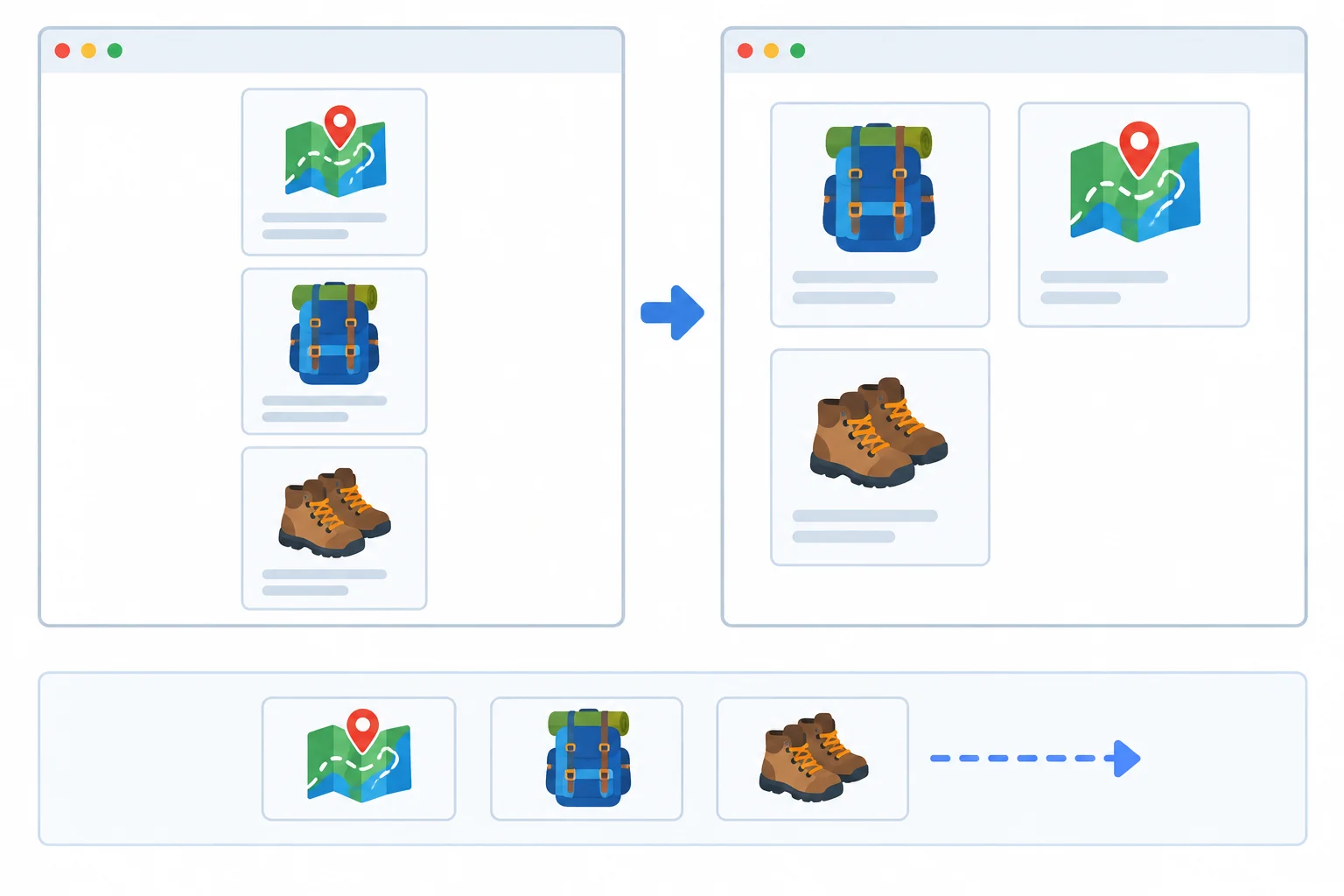
The rendered position can change at a breakpoint while document order and native keyboard focus order stay the same.
Restore the Default variant before this check: use the original three cards once, the original first heading, and the original reference text. At 100% page zoom, compare 767 CSS px and 768 CSS px.
index.html and note their source sequence.Record the card-link sequence separately from other links such as header or Help links. Do not infer document order from the wide visual grid.
Inspect this part of index.html. Its element sequence is the document order; CSS does not move these elements in the source.
<section class="cards">
  <article class="card">
    <h2>Choose a route</h2>
    <a href="#route-details">Route details</a>
  </article>
  <article class="card card--featured">
    <h2>Pack supplies</h2>
    <a href="#packing-details">Packing details</a>
  </article>
  <article class="card">
    <h2>Start walking</h2>
    <a href="#walking-details">Walking details</a>
  </article>
</section>Inspect the wide-layout rule in styles.css after completing the comparison. This rule changes rendered placement, not the HTML sequence or the browser's native Tab sequence.
@media (min-width: 768px) {
  .cards {
    grid-template-columns: repeat(2, minmax(0, 1fr));
  }

  .card--featured {
    order: -1;
  }
}After your 768 CSS px comparison, which targeted correction restores the card sequence without modifying native tab order?
Complete a concise order-check note for the three card links. Include the visual sequence, document order, and keyboard focus order at 767 CSS px and at 768 CSS px before the correction. Then identify the mismatch, state the CSS correction, and report what you observed after retesting both widths.
Write at least 120 characters (0/120).
Step 8 of 9
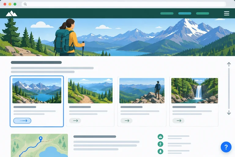
Horizontal fit is not enough. A sticky header can cover a fragment destination or a newly focused card link at the top of the viewport. A fixed help link can cover content or focus near the bottom.
Check while scrolling and while using Tab and Shift+Tab. At high page zoom, the effective viewport becomes shorter as well as narrower, so an obstruction that is hard to notice at 100% may become obvious.
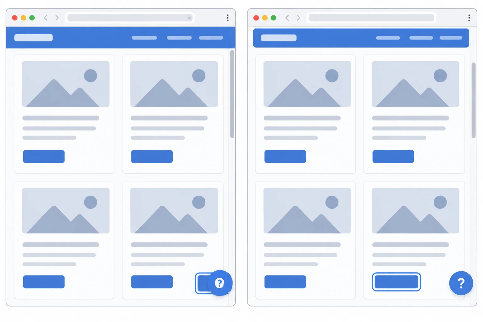
A focus outline is useful only when the associated control and its essential label are also visible.
Tip
Test the same focused control twice: first with the suspected positioning rule active, then with that rule temporarily disabled in the inspector. If the obstruction disappears, you have evidence for the responsible rule.
At the failing viewport width and page zoom, Tab through the native links from inside the page. Watch where the browser scrolls each link into view. Inspect both viewport edges, then follow a fragment link such as a card link or the help link and check its destination.
Do not treat a larger z-index, root-level overflow hiding, or clipping text as a fix. Those can conceal the symptom while leaving content or keyboard access obstructed.
Replace only the positioning portions of the existing rules. Keep their other visual declarations. In the existing wide-layout media query, add the positioning declarations shown here so pinned behavior is limited to wider conditions.
.site-header {
  position: static;
}

.help-link {
  position: static;
}

@media (min-width: 768px) {
  .site-header {
    position: sticky;
    top: 0;
  }

  .help-link {
    position: fixed;
    right: 1rem;
    bottom: 1rem;
  }
}
Expected result after saving and refreshing: Below the 768 CSS px wide-layout condition, the header and help link occupy space in normal document flow rather than layering over page content. A focused control, its label, and its complete focus indicator remain visible at the tested viewport width and page zoom. Tested fragment destinations are not obscured by those elements, and the final page content remains reachable by scrolling and keyboard navigation. At 768 CSS px and wider, the header is sticky and the help link is fixed again; retest those conditions separately if they were affected.
CSS does not print text. Save the change, refresh the local page, and verify this visual and keyboard result at the recorded failing conditions.
Warning
First disable one suspected positioning declaration temporarily and repeat the same keyboard route. Save only a correction supported by that comparison. At an effective narrow viewport, normal flow preserves space for the header and help link instead of layering them over content.
Use the regular browser window at the same size for the comparison. A viewport near 1280 CSS px wide at 100% page zoom becomes approximately 320 CSS px wide at 400% page zoom. Record the actual viewport height too, because reduced height can expose top or bottom obstruction.
After saving a confirmed correction, repeat Tab navigation, fragment-link navigation, and a scroll to the final page content. Vertical scrolling is expected; hidden focused controls are not.
Compare the same keyboard focus destination before and after changing the positioning rule.
In the demonstration, identify the focused control that is obscured before the correction. Then reproduce a comparable situation locally at a failing viewport width and page zoom. Use Tab until a card link receives focus, compare it with and without the suspected positioning rule, and save the matching correction only if the comparison confirms it.
In 3–5 sentences, record the focused control; whether both its label and focus indicator were visible before correction; the responsible positioning rule; your Viewport, including height and any approximation; Zoom mode and level; and the Retest result. Include whether a fragment destination and the final page content remained accessible.
Write at least 180 characters (0/180).
Step 9 of 9
Finish with an evidence-based responsive check record and a verified correction that preserves content and keyboard access.
A final regression pass starts with evidence, not a broad claim that the page is “responsive.” Reproduce the original failure using the same Browser/version, Viewport, Zoom mode and level, and Content variant. Confirm that the saved correction changes the observed result.
Then check representative neighboring conditions: a nearby viewport width, the layout on the other side of a breakpoint when relevant, and the interaction that was affected. This catches a correction that fixes one narrow case while creating a new problem elsewhere.
Run isolated checks before a combined stress check. For example, after recording a baseline, test Long text at 400% page zoom. Mark every check as observed pass, observed failure, or not checked. “Not checked” with a limitation is more useful than unsupported coverage.
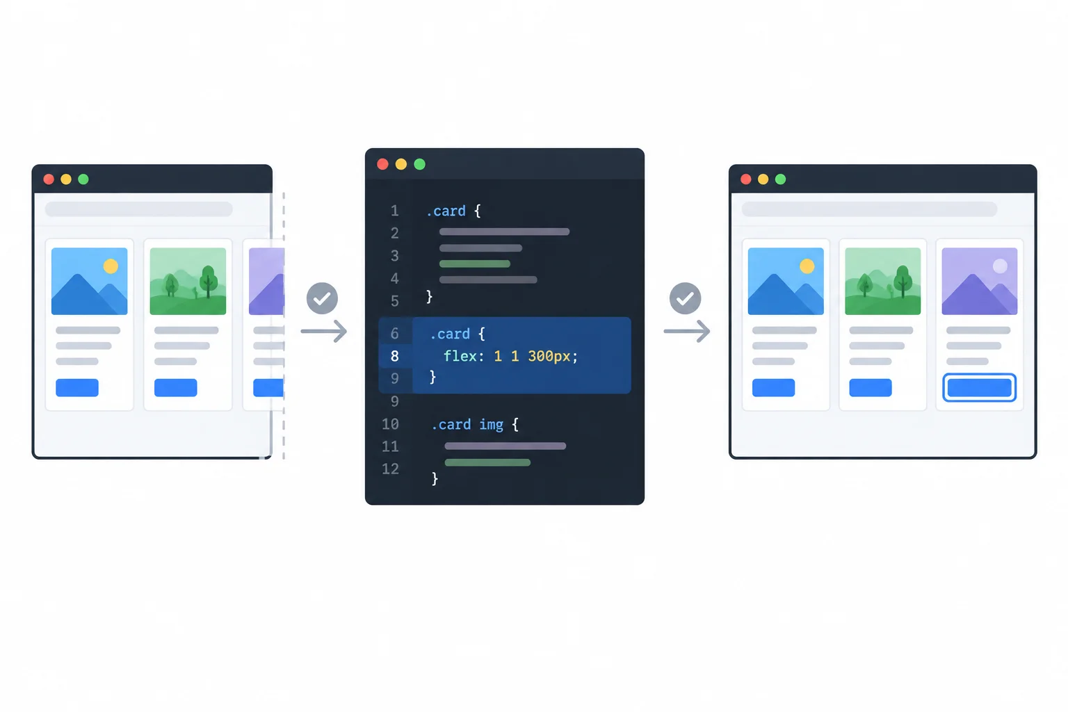
Retest the original conditions first, then check nearby conditions and keyboard access.
Use this compact matrix to make the final pass explicit. Record the actual viewport height too; if a browser preview measurement is estimated, write “approximately.” A browser preview’s display-fit scale is not page zoom.
For a combined stress check, retain the recorded baseline. At 400% page zoom, a regular browser window that was 1280 CSS px wide at 100% is approximately 320 CSS px wide when the window size is unchanged.
Mark each row with observed pass, observed failure, or not checked. Add a short note for the evidence or limitation.
| Check area | Conditions to record | Status and note |
|---|---|---|
| Width sweep | 320, 480, 767, 768, 769, 1024, 1280 CSS px at 100% page zoom | Status + first failure or pass note |
| Continuous resize | Resize through the breakpoint region | Status + observed transition |
| Text enlargement | 200% page zoom; text-only zoom at 200% where supported | Status + mode used |
| Reflow | 1280 CSS px at 100% → approximately 320 CSS px at 400% | Status + viewport limitation if any |
| Content variants | Default, Long text, Extra cards at narrow and breakpoint-adjacent widths | Status + variant |
| Order | Default: visual, document, and keyboard focus order on both sides of 768 CSS px | Status + sequence note |
| Pinned elements | Scroll and Tab around sticky header and fixed help link, including high zoom | Status + obstruction note |
| Combined stress | Long text at 400% page zoom after isolated checks | Status + baseline |
| Original defect | Exact original reproduction after saved correction | Retest result |
| Nearby regression | Representative neighboring widths or conditions | Status + result |
Submit a concise text report for one defect you found and corrected. Do not upload files.
Include these labels:
Then add a final matrix status covering width checks, 200% enlargement, approximately 320 CSS px reflow, content variants, order, and pinned-element scrolling. State any untested condition and its limitation explicitly.
Write at least 450 characters (0/450).
Summary
Congratulations! You completed: Check Responsive Layouts Across Sizes and Zoom
You completed this level!
Up next: JavaScript Fundamentals
 Work with JavaScript Values and VariablesRun JavaScript from a local HTML page and use named values and expressions to calculate and display results in the browser console.
Thousands of online courses in video, ebooks and audiobooks.
To test your knowledge during online courses
Generated directly from your cell phone's photo gallery and sent to your email

Download our app via QR Code or the links below:.


Carry knowledge in your pocket.
Download the Cursa app.
There are hundreds of free courses available, with a free certificate of completion that is saved in your mobile image gallery.
Download the app to access the Course Completion Certificate for Free.


+ 10 million
students

Free and Valid
Certificate

60 thousand free
exercises

4.8/5 rating in
app stores

Free courses in
video and ebooks