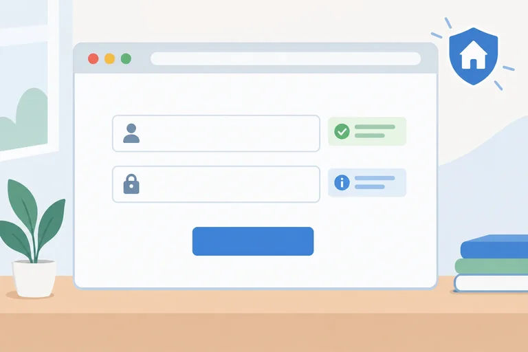
Step 1 of 8
Start with a Local-Only Form
Create and run a local starter form, distinguish temporary browser feedback from the persistent inline feedback you will build, and confirm that checks do not transmit or save values.

Learning path · Level 5 · Tutorial 4
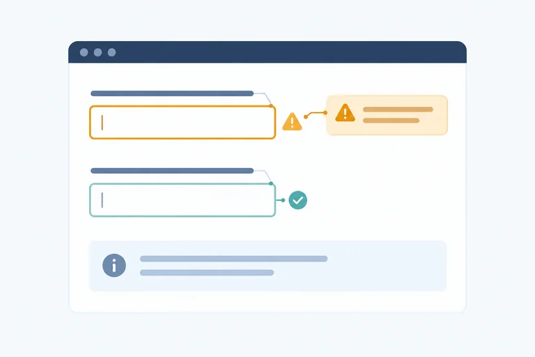
Enhance a local form with persistent, accessible validation feedback while retaining native constraint rules and making clear that no data is being sent.
 Start with a Local-Only Form
Create and run a local starter form, distinguish temporary browser feedback from the persistent inline feedback you will build, and confirm that checks do not transmit or save values. 2 min
Start with a Local-Only Form
Create and run a local starter form, distinguish temporary browser feedback from the persistent inline feedback you will build, and confirm that checks do not transmit or save values. 2 min
 Inspect Native Validity
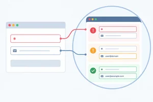
Inspect the browser's native validity results before turning those results into persistent accessible feedback. 3 min
Inspect Native Validity
Inspect the browser's native validity results before turning those results into persistent accessible feedback. 3 min
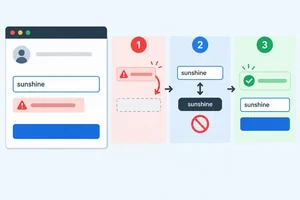 Add and Reset a Custom Rule
Add a case-sensitive reserved-name constraint while preserving native required validation and preventing stale custom errors. 3 min
Add and Reset a Custom Rule
Add a case-sensitive reserved-name constraint while preserving native required validation and preventing stale custom errors. 3 min
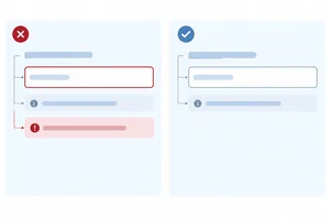 Render Associated Field Messages
Render persistent field messages into the starter’s existing error elements while keeping error text, aria-invalid, and stable descriptions synchronized. 4 min
Render Associated Field Messages
Render persistent field messages into the starter’s existing error elements while keeping error text, aria-invalid, and stable descriptions synchronized. 4 min
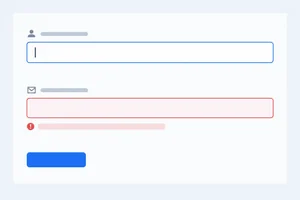 Clear Errors Without Interrupting Typing
Update feedback for edited fields without premature errors, stale messages, or focus movement. 4 min
Clear Errors Without Interrupting Typing
Update feedback for edited fields without premature errors, stale messages, or focus movement. 4 min
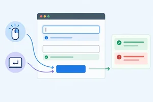 Reject Submission and Focus the First Error
Take control of native constraint validation presentation and focus the first invalid field only after a rejected local submission. 4 min
Reject Submission and Focus the First Error
Take control of native constraint validation presentation and focus the first invalid field only after a rejected local submission. 4 min
 Confirm Local Validation Politely
Show a polite, truthful status message after successful local validation, then clear it when the form changes. 3 min
Confirm Local Validation Politely
Show a polite, truthful status message after successful local validation, then clear it when the form changes. 3 min
 Verify the Complete Feedback Cycle
Run a compact manual check, diagnose a stale custom-validity pattern, and verify the completed form’s accessible local feedback lifecycle. 3 min
Verify the Complete Feedback Cycle
Run a compact manual check, diagnose a stale custom-validity pattern, and verify the completed form’s accessible local feedback lifecycle. 3 min
Step 1 of 8
Create and run a local starter form, distinguish temporary browser feedback from the persistent inline feedback you will build, and confirm that checks do not transmit or save values.
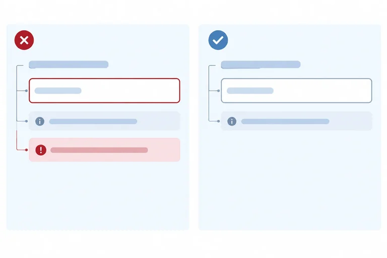
This form will keep feedback beside each field after a submission attempt. As a learner corrects a value, that field’s message will disappear; a fully valid check will confirm a local validation result.
This is different from a browser’s temporary validation popup. A popup can help in the moment, but it is not persistent inline feedback that remains visible on the page until your code updates it.
“Persistent” here means within the current page session. It does not mean saving messages or values across refreshes or visits.
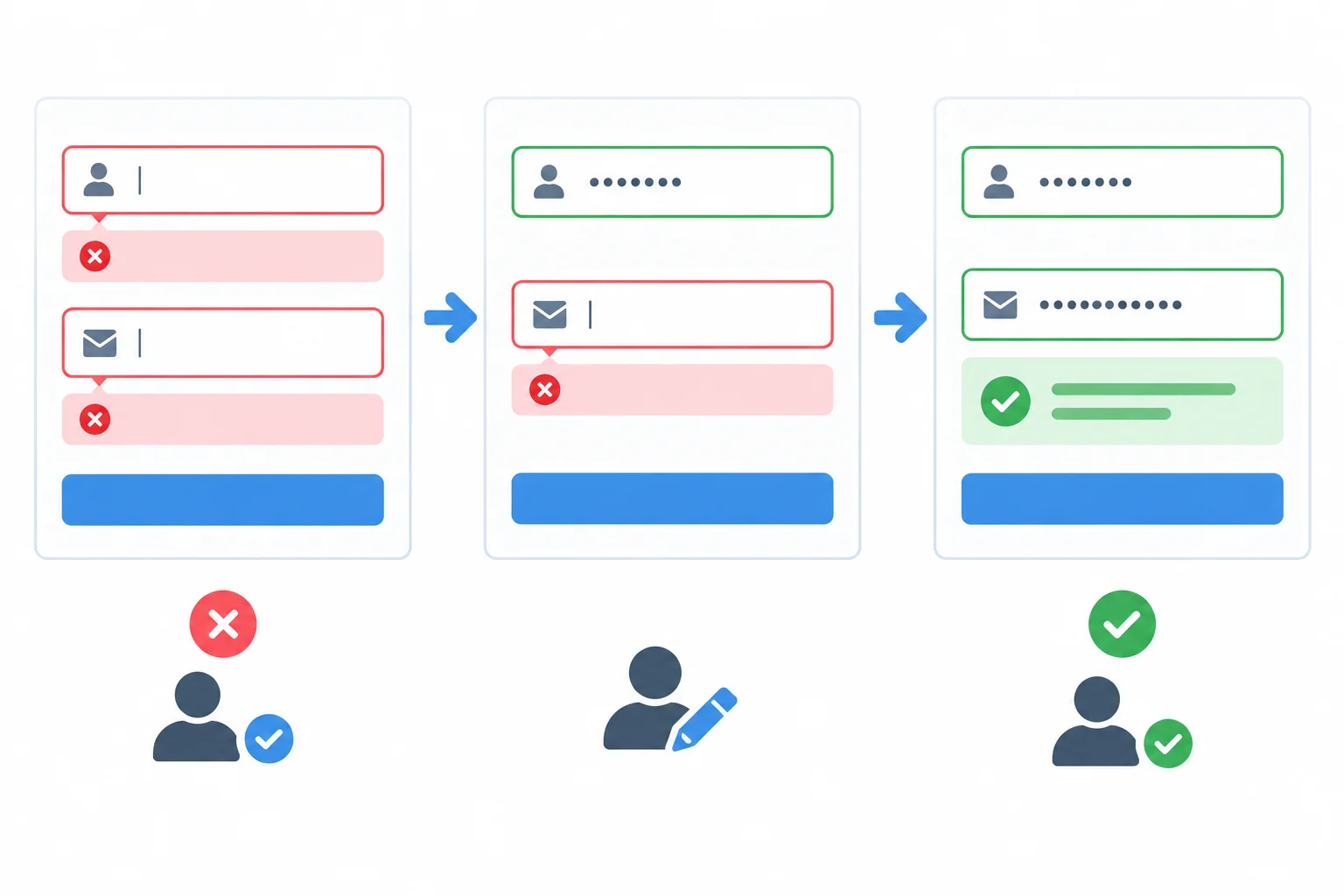
The goal is feedback that stays next to the relevant control until the current value changes it.
Make one folder and create these three files inside it: index.html, styles.css, and app.js. Then open index.html in your browser.
This starter deliberately retains the browser’s normal constraint behavior for now. Its empty error and status elements are stable page structure that later steps will fill without replacing the inputs.
File: index.html
<!doctype html>
<html lang="en">
  <head>
    <meta charset="utf-8">
    <meta name="viewport" content="width=device-width, initial-scale=1">
    <title>Workshop interest demo</title>
    <link rel="stylesheet" href="styles.css">
    <script src="app.js" defer></script>
  </head>
  <body>
    <main>
      <h1>Workshop interest demo</h1>
      <p>Check the values on this local page.</p>

      <form id="workshop-form">
        <div class="field">
          <label for="displayName">Display name</label>
          <input
            id="displayName"
            name="displayName"
            required
            aria-describedby="displayName-hint displayName-error"
          >
          <p id="displayName-hint" class="hint">Enter the name to display.</p>
          <p id="displayName-error" class="error-message"></p>
        </div>

        <div class="field">
          <label for="email">Email address</label>
          <input
            id="email"
            name="email"
            type="email"
            required
            aria-describedby="email-hint email-error"
          >
          <p id="email-hint" class="hint">Enter an email address.</p>
          <p id="email-error" class="error-message"></p>
        </div>

        <p id="form-status" role="status"></p>
        <button type="submit" disabled>Check form</button>
      </form>
    </main>
  </body>
</html>File: styles.css
:root {
  font-family: system-ui, sans-serif;
  color: #1f2937;
  background: #f5f7fb;
}

body {
  margin: 0;
}

main {
  max-width: 36rem;
  margin: 3rem auto;
  padding: 0 1rem;
}

form {
  display: grid;
  gap: 1.25rem;
  padding: 1.5rem;
  background: #ffffff;
  border-radius: 0.75rem;
}

.field {
  display: grid;
  gap: 0.4rem;
}

input,
button {
  font: inherit;
  padding: 0.65rem;
}

input[aria-invalid="true"] {
  border: 2px solid #b42318;
}

.hint {
  margin: 0;
  color: #4b5563;
}

.error-message {
  min-height: 1.5rem;
  margin: 0;
  color: #b42318;
  font-weight: 600;
}

button:disabled {
  cursor: not-allowed;
  opacity: 0.6;
}File: app.js
const form = document.querySelector("#workshop-form");
const displayNameInput = document.querySelector("#displayName");
const emailInput = document.querySelector("#email");
const fields = [displayNameInput, emailInput];
const submitButton = form.querySelector("button[type=\"submit\"]");

const state = {
  errors: {
    displayName: "",
    email: ""
  },
  hasSubmitted: false,
  status: ""
};

form.addEventListener("submit", (event) => {
  event.preventDefault();
});

submitButton.disabled = false;Riley and not-an-email, then check again. The email input should receive the browser’s native feedback.riley@example.com and check once more. The page should not navigate away.At this point, the empty inline message areas are expected: later steps will turn them into the persistent feedback shown in the target diagram.
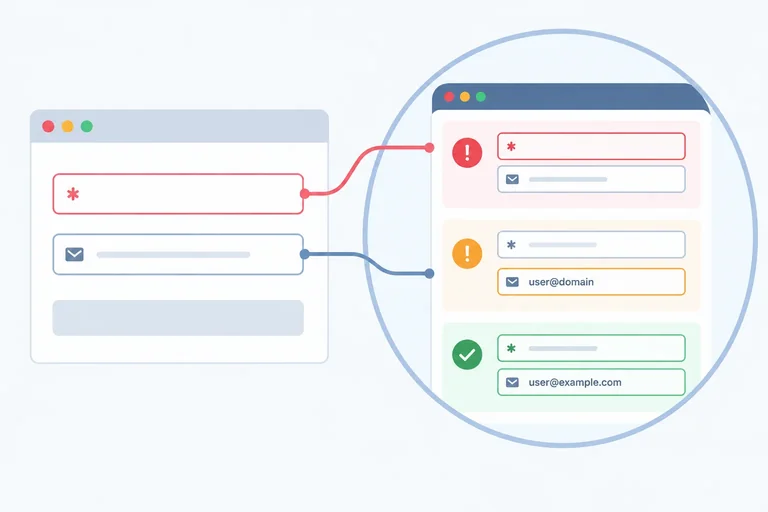
Tip
Refreshing this local page clears its current values and any future feedback. Nothing in this starter sends values to a server or saves them in browser storage.
After both controls contain natively valid values, which statement best explains what happens when the learner selects Check form?
Step 2 of 8
Inspect the browser's native validity results before turning those results into persistent accessible feedback.
Native HTML constraints already answer a basic question: is this control valid right now?
Call field.checkValidity() for one control or form.checkValidity() for the form. Each returns a Boolean:
true means the checked control, or every form control, currently passes its constraints.false means at least one relevant constraint fails.For a field, field.validity explains which kind of constraint failed. In this form, an empty required control produces valueMissing, while an email value with the wrong format produces typeMismatch.
A field can be invalid even though its value is still present in the input. Validity describes the current value; it does not erase or replace it.
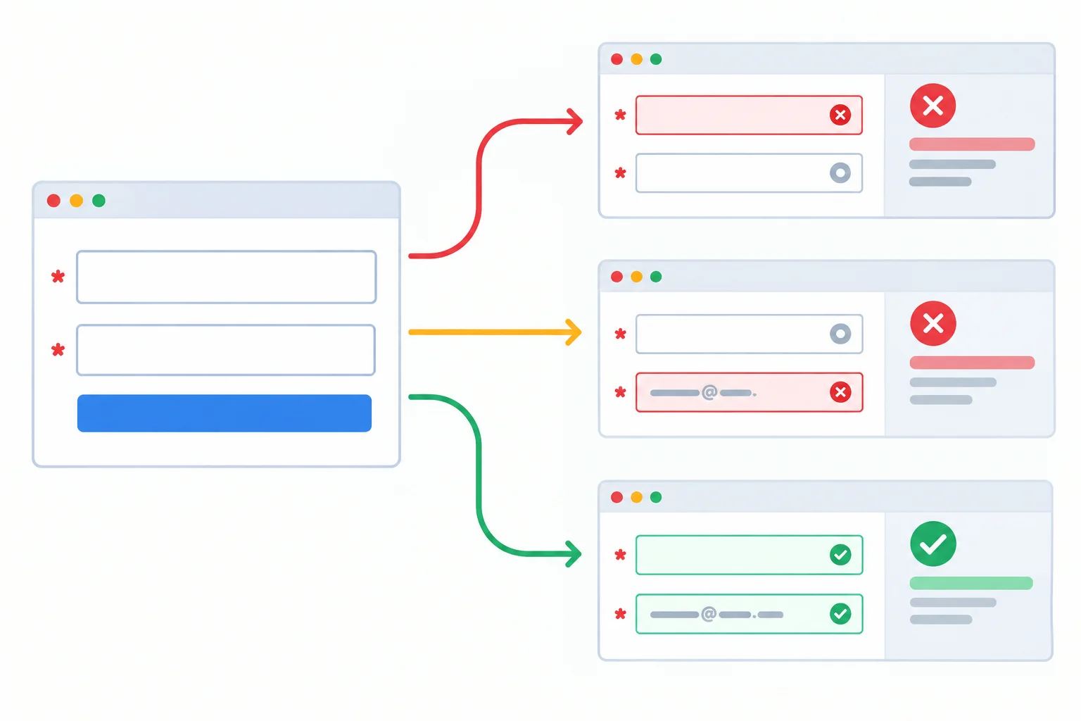
Constraint checks examine the current controls and return validity results; they do not create persistent field feedback.
Add this temporary inspection helper after the existing DOM references in app.js. Refresh the page and inspect the console. With the initial empty form, both fields fail because they are required.
function inspectField(field) {
  return {
    passes: field.checkValidity(),
    valueMissing: field.validity.valueMissing,
    typeMismatch: field.validity.typeMismatch,
    customError: field.validity.customError,
    valid: field.validity.valid,
    nativeMessage: field.validationMessage
  };
}

console.log(inspectField(displayNameInput));
console.log(inspectField(emailInput));
console.log("Form passes:", form.checkValidity());{
passes: false,
valueMissing: true,
typeMismatch: false,
customError: false,
valid: false,
nativeMessage: "Please fill out this field."
}
{
passes: false,
valueMissing: true,
typeMismatch: false,
customError: false,
valid: false,
nativeMessage: "Please fill out this field."
}
Form passes: falseConsole object formatting and the nativeMessage wording vary by browser and locale. Do not compare or depend on the exact nativeMessage text; inspect the Boolean properties instead.
Try these three states by editing the local controls, then refreshing the console output from the helper.
| Current values | Check result | Relevant flag | valid | Form result |
|---|---|---|---|---|
| Display name empty; email valid | displayName: false | valueMissing: true | false | false |
| Riley; malformed email | email: false | typeMismatch: true | false | false |
| Riley; riley@example.com | both fields: true | No native failure | true | true |
Tip
validity.valid is the overall field result. valueMissing, typeMismatch, and customError are more specific clues. At this point no custom constraint has been added, so customError is false.
validationMessage is useful for inspection, but its wording is generated by the browser and may change with browser or locale. Do not use an exact native message as your authored inline feedback.
Calling checkValidity() tells you whether constraints pass. It does not build a stable inline error element, associate that element with a field, or keep feedback visible beside the field. Those are separate rendering tasks you will add later.
Match each observation to its relevant validity result.
Tap an item and then its matching pair.
Complete the inspection helper so it records the Boolean check and the relevant native validity properties.
function getValiditySnapshot(field) {
  return {
    passes: field.(),
    missing: field.validity.,
    malformedEmail: field.validity.,
    customProblem: field.validity.,
    fullyValid: field.validity.
  };
}
Step 3 of 8
Add a case-sensitive reserved-name constraint while preserving native required validation and preventing stale custom errors.
A custom validity message becomes part of the browser’s constraint validation result. When it is nonempty, the field has validity.customError === true and is invalid—even if its built-in constraints otherwise pass.
The browser does not remove an old custom message when a person changes the input. Refresh the custom rule from the current value every time you inspect this field:
admin.This rule is case-sensitive: admin is reserved; Admin is not.
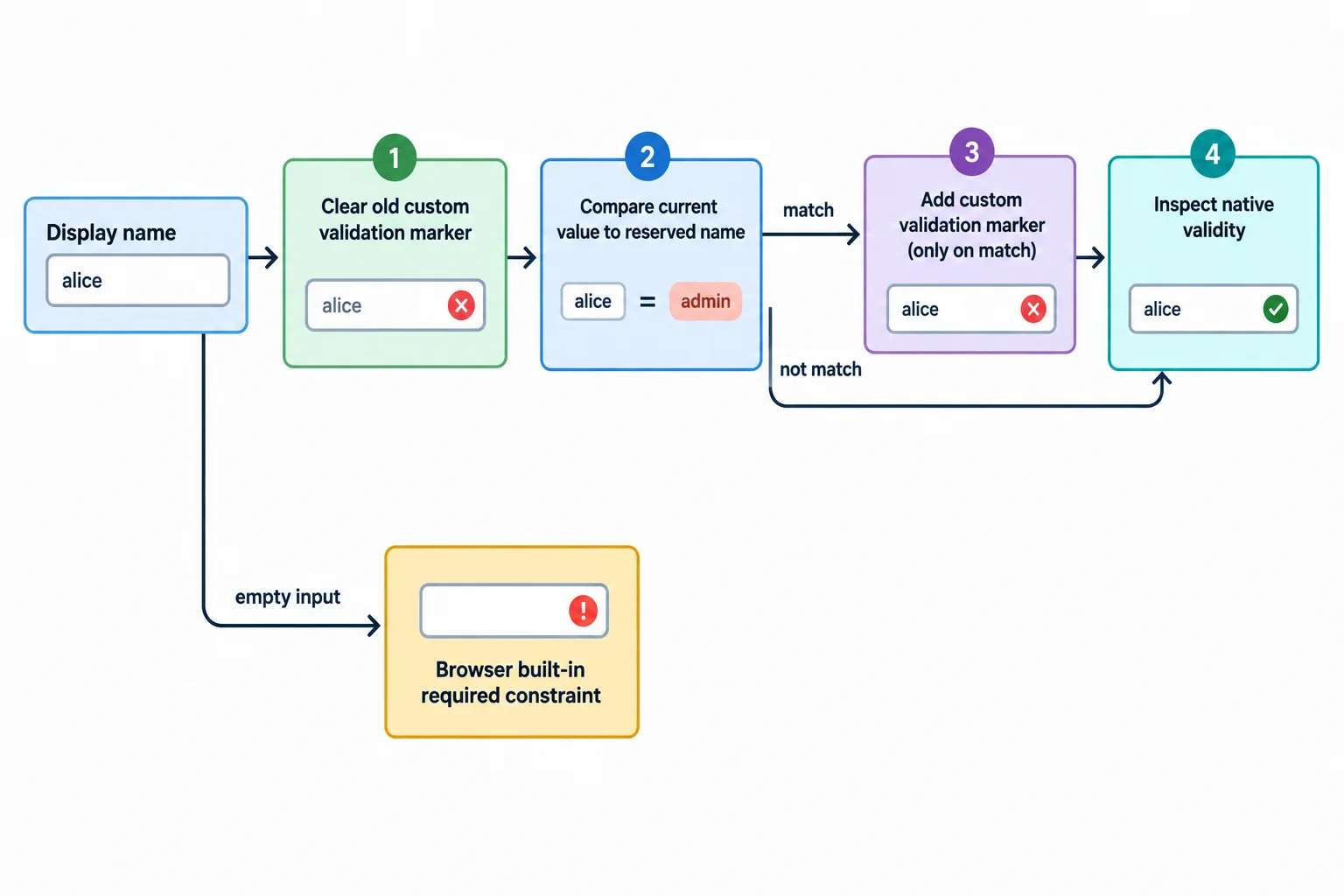
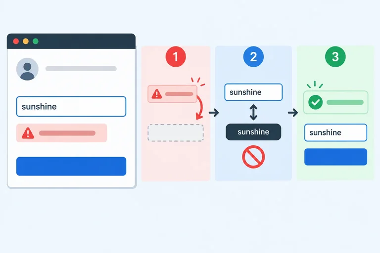
Resetting first prevents a custom error from becoming stale.
Add these helpers to app.js after the existing DOM references. They update only the native custom-validity state; field messages will be rendered in a later step.
function refreshDisplayNameRule() {
  displayNameInput.setCustomValidity("");

  if (displayNameInput.value === "admin") {
    displayNameInput.setCustomValidity(
      "Choose a display name other than admin."
    );
  }
}

function inspectDisplayNameValidity() {
  refreshDisplayNameRule();
  return displayNameInput.checkValidity();
}After refreshDisplayNameRule() runs, checkValidity() reads both the HTML constraints and the current custom rule. The empty value does not receive the reserved-name message: its existing required constraint remains responsible for making it invalid.
| Display-name value | Custom error after refresh | Validity result |
|---|---|---|
| Empty | No | Invalid: required rule |
| admin | Yes | Invalid: custom rule |
| Riley | No | Valid |
Complete the helper so it refreshes the custom rule and returns the current native validity result.
function isDisplayNameValid() {
  displayNameInput.setCustomValidity();

  if (displayNameInput.value === ) {
    displayNameInput.setCustomValidity();
  }

  return displayNameInput.();
}Without looking back, describe the reset-and-check sequence for the display-name field. Then predict whether an empty value, exact admin, and Riley are valid or invalid. Finally, explain what happens to validity.customError if admin is checked first and the value changes to Riley without clearing the old custom message.
Write at least 120 characters (0/120).
Step 4 of 8
Render persistent field messages into the starter’s existing error elements while keeping error text, aria-invalid, and stable descriptions synchronized.
The starter already contains the stable feedback structure and the existing state.errors object. Reuse them—do not add another const state declaration, and do not paste a second copy of the field markup.
Input values stay in the native controls. state.errors stores only the messages currently displayed beside those controls. Each input keeps two descriptions at all times: its helpful hint and its initially empty error paragraph. Rendering changes the error paragraph's text; it does not replace the input or alter its aria-describedby value.
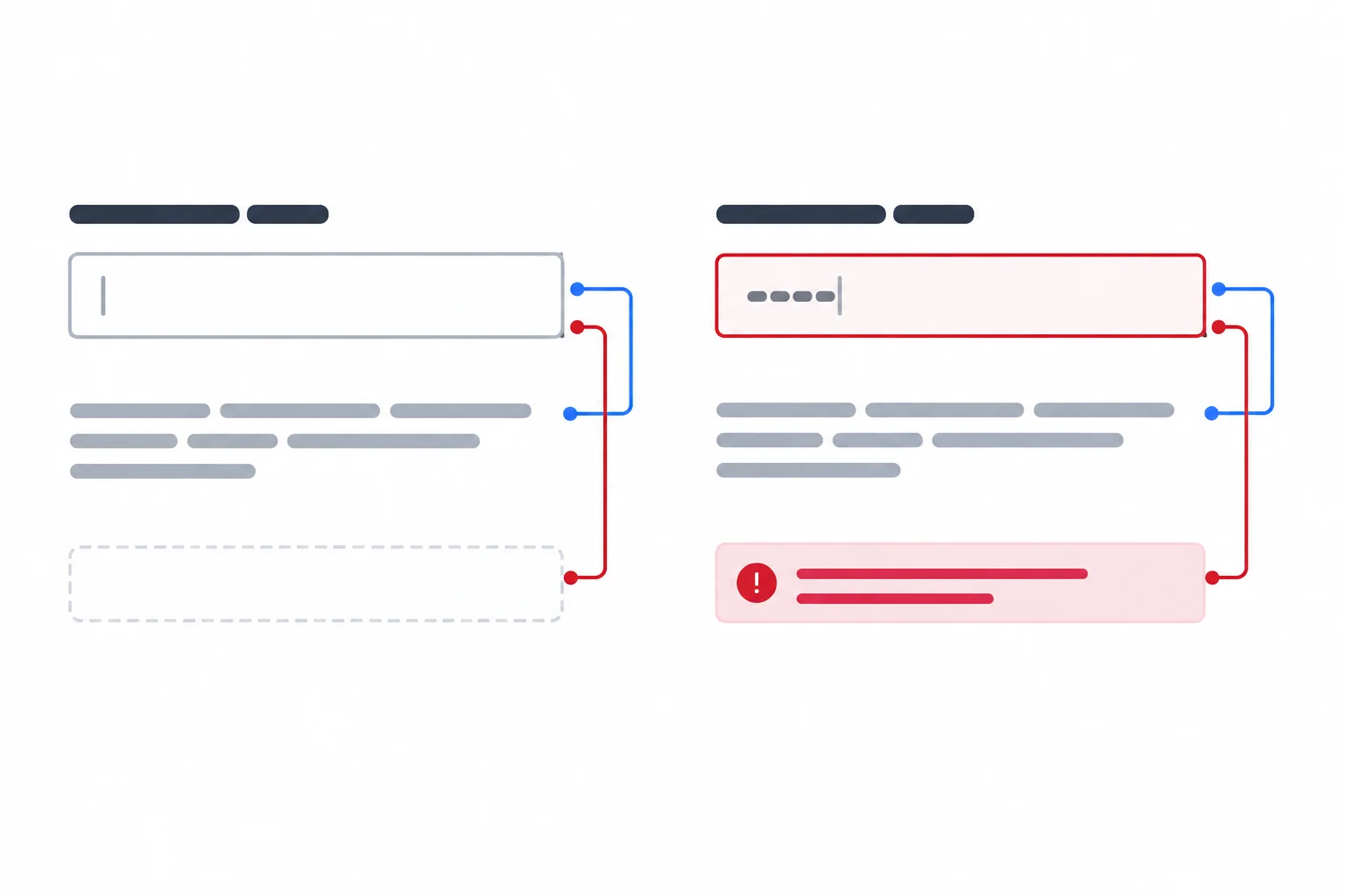
Keep both descriptions associated in every state. Only the error text and invalid attribute change.
Reference only: this block already exists in index.html. Keep it in place; do not add a duplicate with the same IDs. The existing .hint and .error-message classes match the supplied CSS.
<label for="displayName">Display name</label>
<input
  id="displayName"
  name="displayName"
  required
  aria-describedby="displayName-hint displayName-error"
>
<p id="displayName-hint" class="hint">Enter the name to display.</p>
<p id="displayName-error" class="error-message"></p>Use authored, concise messages rather than copying validationMessage, whose wording depends on the browser and locale. Before reading display-name validity, refresh its custom rule from the current value. This single validateField(field) path is then used by whole-form checks now and by recovery and submission behavior in later steps.
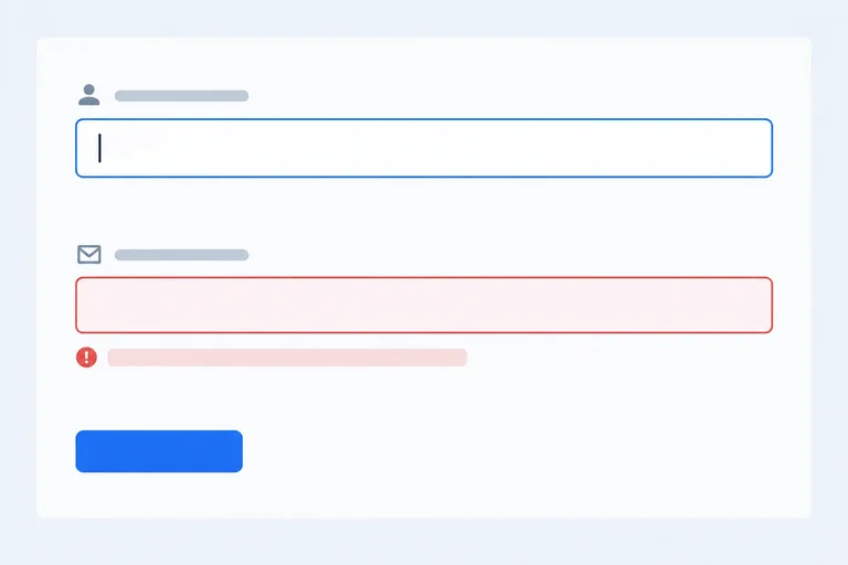
An empty string means no displayed error. The existing CSS makes the error words visible and adds a border only when aria-invalid="true"; color is reinforcement, not the only signal.
Add this one DOM reference alongside the existing references at the top of app.js. Do not change or redeclare the existing form, inputs, fields, or state.
const formStatus = document.querySelector("#form-status");Add these functions below the refreshDisplayNameRule() helper from the previous step. They store only field feedback in the existing state.errors object. The display-name rule is refreshed before any validity flag is inspected.
function validateField(field) {
  if (field === displayNameInput) {
    refreshDisplayNameRule();
  }

  if (field.validity.valueMissing) {
    return field === displayNameInput
      ? "Enter a display name."
      : "Enter an email address.";
  }

  if (field.validity.typeMismatch) {
    return "Enter an email address in a valid format.";
  }

  if (field.validity.customError) {
    return "Choose a display name other than admin.";
  }

  return "";
}

function validateForm() {
  fields.forEach((field) => {
    state.errors[field.name] = validateField(field);
  });

  return fields.every((field) => state.errors[field.name] === "");
}Add this renderer below the validation functions. It updates stable nodes with textContent, retains both existing aria-describedby references, and never changes focus. It also keeps the already-present status element synchronized with state.status, which is empty until a later step uses it.
function render() {
  fields.forEach((field) => {
    const error = state.errors[field.name];
    const errorElement = document.querySelector(
      "#" + field.name + "-error"
    );

    errorElement.textContent = error;

    if (error) {
      field.setAttribute("aria-invalid", "true");
    } else {
      field.removeAttribute("aria-invalid");
    }
  });

  formStatus.textContent = state.status;
}Complete the renderer. The input already has stable hint and error references in aria-describedby; this function must not change that association. It must show the matching current message and remove stale invalid state when the message becomes empty.
function render() {
  fields.forEach((field) => {
    const error = state.errors[field.name];
    const errorElement = document.querySelector(
      "#" + field.name + "-error"
    );

    errorElement. = error;

    if (error) {
      field.("aria-invalid", "true");
    } else {
      field.("aria-invalid");
    }
  });

  formStatus.textContent = state.status;
}
Step 5 of 8
Update feedback for edited fields without premature errors, stale messages, or focus movement.
An input event occurs while someone is still editing, so it should not introduce first-time errors. Use state.hasSubmitted as a gate: while it is false, typing leaves the displayed field errors empty.
Once an attempted check has occurred, the same event supports recovery. Revalidate only the field being edited, replace only its entry in state.errors, then render the updated state. A corrected field can recover immediately without erasing an error beside the other field.
Clear state.status on every edit. Any result text describes older values and must not remain visible after a value changes.
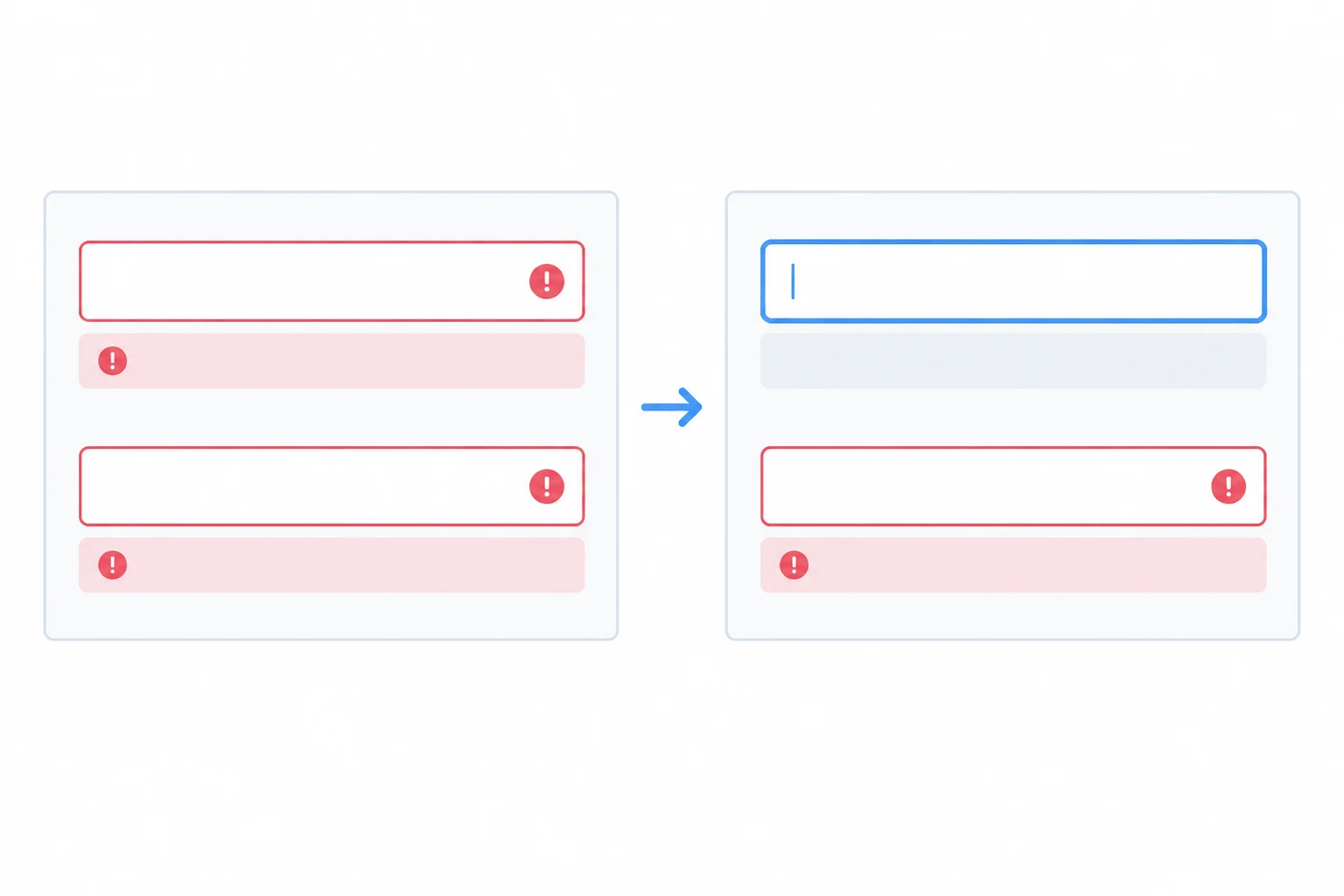
After an attempted check, update the edited field without disturbing another field’s feedback or moving focus.
Tip
Keep this update quiet. Do not call focus() from an input listener, and do not make ordinary typing errors assertive announcements. The person is already working in the edited control; stable inline feedback is sufficient.
Add this complete registration after render() in app.js. It uses the existing fields, state, validateField(), and render() from earlier steps. The listener clears an older result on every edit, but changes displayed field feedback only after feedback is active.
fields.forEach((field) => {
  field.addEventListener("input", () => {
    state.status = "";

    if (state.hasSubmitted) {
      state.errors[field.name] = validateField(field);
    }

    render();
  });
});
Complete the field-feedback registration. It must be safe to add to the current app.js as written.
fields.forEach((field) => {
  field.addEventListener("input", () => {


    if () {

    }


  });
});The listener has a deliberately narrow responsibility. It does not validate every control, change hasSubmitted, or decide where focus belongs. Those actions belong to the submission path added later.
When the edited field is Display name, validateField(field) refreshes the custom rule before reading validity. Therefore, changing exact admin to Riley can clear that field’s displayed error. It must not clear an existing Email address error.
These are the expected transitions after an input listener runs. The native controls keep their current values; state.errors holds only the messages being displayed.
| Situation | Edit | Displayed feedback afterward | Focus |
|---|---|---|---|
| No attempted check yet | Type in Display name | Both errors remain empty | Display name |
| Earlier attempt; both fields have errors | Change Display name to Riley | Display-name error clears; email error remains | Display name |
| Earlier attempt; email has an error | Change Email address to riley@example.com | Email error clears; display-name error is unchanged | Email address |
| A prior result is visible | Edit either field | Prior status text clears; edited error reflects the current value when feedback is active | Edited field |
Warning
Do not reset state.errors as a whole inside an input listener. One field can become valid while another remains invalid; replacing only state.errors[field.name] preserves useful feedback.
Evaluate both points in the editing lifecycle.
Case A — before an attempted check: state.hasSubmitted is false; both error strings are empty. The focused Display name input receives the value admin.
Case B — after an attempted check: state.hasSubmitted is true. Display name currently shows its reserved-name error, Email address currently shows Enter an email address., and state.status contains earlier result text. The focused Display name input changes from admin to Riley.
For each case, state what the listener changes in state.errors and state.status, what happens to focus, and why. Include the essential handler logic for Case B.
Write at least 180 characters (0/180).
Step 6 of 8
Take control of native constraint validation presentation and focus the first invalid field only after a rejected local submission.
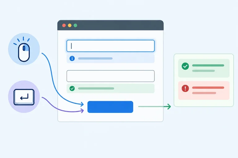
A form can be submitted by clicking Check form or by using the keyboard from a form control. Handle the form’s single submit event so both routes follow the same path.
On every attempt, prevent the browser’s default action first. Then mark that an attempt occurred, clear any result from an earlier form state, validate both fields, and render every current inline error. Only after rendering should a rejected attempt move focus.
This order means a person can see all problems at once, while focus starts at the first problem in document order: Display name, then Email address.
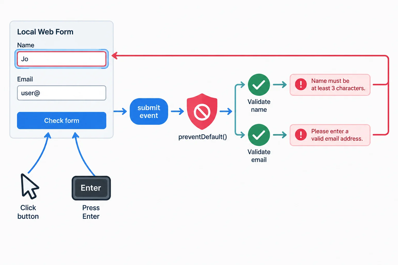
Render the complete feedback state before moving focus to the first invalid control.
Warning
Keep required and type="email" in the HTML. form.noValidate = true stops the browser’s automatic submission validation presentation, including its temporary popup, but it does not remove constraints or disable checkValidity() and the validity object.
Set it only after your validation functions and field-feedback listeners are ready. That lets your submit handler receive invalid attempts and present the persistent messages instead.
Add this after the existing field input listeners. The starter button remains disabled until this handler is attached. validateForm() refreshes both entries in state.errors; render() displays those current errors without replacing either input.
The Boolean captured in isValid decides whether focus moves. Because validation has already refreshed the custom rule, checking each field here identifies the current first invalid control.
Add after the existing input listeners in app.js.
form.addEventListener("submit", (event) => {
  event.preventDefault();
  state.hasSubmitted = true;
  state.status = "";

  const isValid = validateForm();
  render();

  if (!isValid) {
    const firstInvalidField = fields.find((field) => !field.checkValidity());
    firstInvalidField.focus();
  }
});

form.noValidate = true;
form.querySelector("button").disabled = false;
Tip
Test it in your local page:
Riley in Display name. Its error should clear, but focus must stay where you are typing; an Email address error remains until that field is corrected.not-an-email as the email, then submit. The current email error should be shown and Email address should receive focus.focus() belongs only in the rejected-submit branch—not in render() or an input listener. preventDefault() ensures this local demo neither navigates nor sends the entered values.
Put the operations in the one safe order for a submission attempt.
Complete the handler operations that reject an invalid local submission and focus the first invalid input.
form.addEventListener("submit", (event) => {

  state.hasSubmitted = true;
  state.status = "";

  const isValid = ;


  if () {
    const firstInvalidField = fields.find((field) => !field.checkValidity());

  }
});
Step 7 of 8
Show a polite, truthful status message after successful local validation, then clear it when the form changes.
index.html already contains an empty, stable result region:
<p id="form-status" role="status"></p>
Keep that element in the initial document. Do not create it only when the form becomes valid. Its role="status" communicates an update politely when its text changes.
The complete render() function from Step 4 already updates this region from state.status, after it renders field errors and aria-invalid. Reuse that complete renderer unchanged; do not redeclare formStatus or replace render() with a partial version.
A status update is non-urgent. Do not move focus to the status region and do not change it to role="alert".
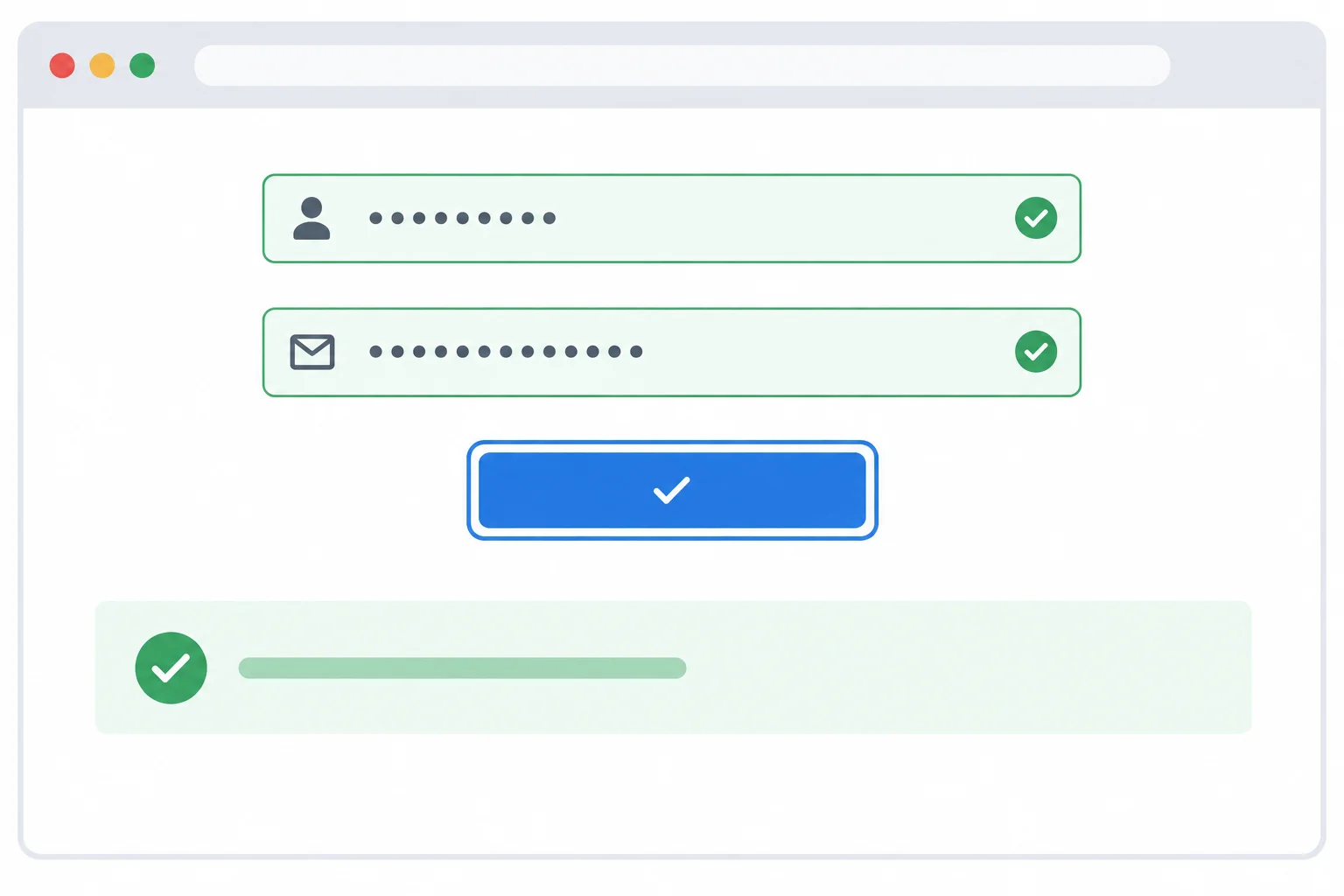
A polite status update gives useful feedback without interrupting the person's current focus.
A fresh whole-form pass is required before setting completion feedback. validateForm() refreshes both entries in state.errors; only when it returns true have all displayed field errors cleared.
This result says only that the browser checked the current local values. It does not mean data was sent, saved, registered, or accepted by a server. Browser validation is useful user feedback, not a security guarantee.
Replace the submit listener from Step 6 with this complete version. Keep the existing input listeners, complete render() function, form.noValidate = true, and enabled button code. Do not add a second submit listener.
form.addEventListener("submit", (event) => {
  event.preventDefault();
  state.hasSubmitted = true;
  state.status = "";

  const isValid = validateForm();

  if (!isValid) {
    render();
    const firstInvalidField = fields.find((field) => !field.checkValidity());
    firstInvalidField.focus();
    return;
  }

  state.status = "Form is valid locally. No data was sent or saved.";
  render();
});After Check form with Riley and riley@example.com: status: Form is valid locally. No data was sent or saved. scripted focus move: none After an edit in either field: status: empty focus: remains in the edited field
Expected browser state rather than console output. The later-edit result depends on the existing input listener from Step 5.
On an invalid attempt, this handler still renders every field error and focuses the first invalid field. On a valid attempt, it sets state.status and renders, with no focus() call.
The existing input listener already clears state.status before it renders an edit. That removal matters because a prior result described an earlier set of values. Test a valid check with Riley and riley@example.com, then edit either field: the result should disappear while your typing focus stays put.
Warning
Do not describe this demonstration as a completed registration, saved form, successful request, or server acceptance. The page does not send or store these values.
Which statement accurately describes a valid check followed by a later edit?
Complete these two isolated established update locations. This is a practice fragment: do not create another submit or input listener. The valid branch has already received a fresh validateForm() result, and the second assignment runs when a field is edited.
if (isValid) {
  state.status = ;
  render();
}

// Inside the existing input listener, before render():
state.status = ;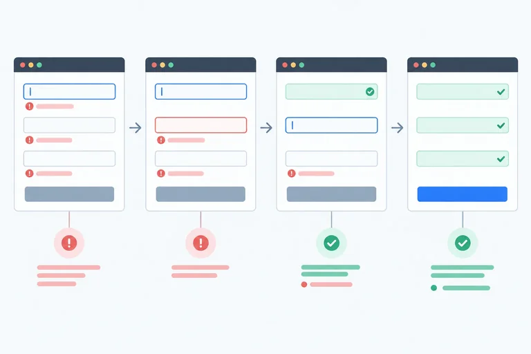
Step 8 of 8
Run a compact manual check, diagnose a stale custom-validity pattern, and verify the completed form’s accessible local feedback lifecycle.
Run this compact matrix against the finished local page. The production implementation from the earlier steps already refreshes the reserved-name rule before it reads validity; do not remove or replace that working behavior.
Use browser developer tools only if you want to inspect attributes. In every case, each input must retain its two stable aria-describedby references: its hint ID and its error ID. The result is a local interface check only: no demonstration value is sent, saved, or registered.
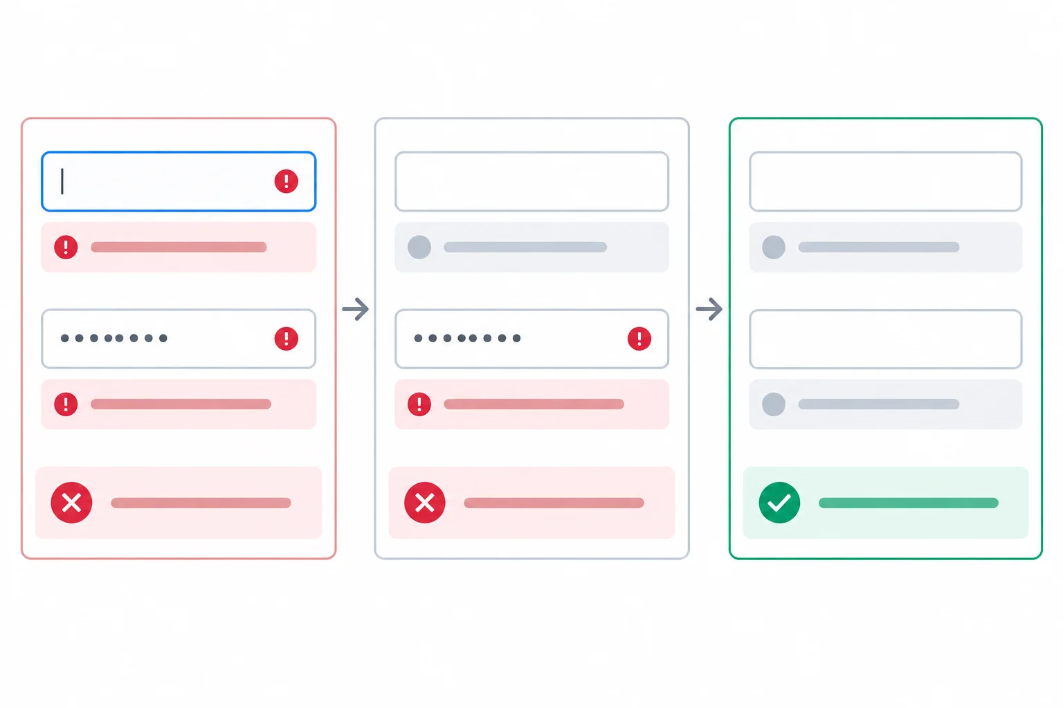
The controls and message regions stay in place. Errors, invalid state, focus, and status change without replacing inputs.
Expected observations for the finished form. “Authored message” means the English inline message from validateField(), not the browser- and locale-dependent validationMessage.
| Case and action | Field feedback and aria-invalid | Focus and status |
|---|---|---|
| Blank keyboard submission: leave both fields empty, tab to Check form, press Enter. | Both required-field messages are visible; both inputs have aria-invalid="true". | Focus moves to Display name; status is empty. |
| Malformed email: enter Riley and not-an-email, then submit. | Only “Enter an email address in a valid format.” is visible; only Email address is invalid. | Focus moves to Email address; status is empty. |
| Reserved name: enter admin and riley@example.com, then submit. | Display name shows its reserved-name message and is invalid. | Focus moves to Display name; status is empty. |
| Partial correction: after a blank submission, type Riley in focused Display name. | The Display name error clears and its aria-invalid is removed; Email address keeps its error. | Focus stays in Display name; status is empty. |
| Complete correction: enter riley@example.com, then submit again. | All errors are empty and aria-invalid is removed from both fields. | No script-driven focus move occurs; status says the local-only result. |
| Edit after success: change Email address to not-an-email. | Malformed-email feedback returns for Email address. | Focus stays in Email address; the earlier status is cleared. |
A stale custom error is a diagnostic case, not a missing part of the finished implementation. Your existing refreshDisplayNameRule() should already clear an earlier custom-validity state before it evaluates the current display-name value.
Use the isolated exercise below to reconstruct the two missing expressions from a deliberately faulty version of that helper. If your live page ever keeps the reserved-name error after the value changes, compare its one existing helper with this pattern; do not add a second helper or a second listener.
Complete the corrected expressions for this isolated helper fragment.
function refreshDisplayNameRule() {
  displayNameInput.setCustomValidity();

  if (displayNameInput.value === "admin") {
    displayNameInput.setCustomValidity();
  }
}On your own computer, complete every matrix case. Then write a short verification report based on what you observed—not copied source code. Include the keyboard submission result; what happens when Riley corrects the first error while Email address still has an error; the reserved-name result and focus target; the result after a successful recheck; and what changes after editing Email address following success. Also confirm whether both inputs retained their two aria-describedby references.
Do not send or store any demonstration values.
Write at least 350 characters (0/350).
Summary
You verified a complete accessible local-validation cycle.
Congratulations! You completed: Show Accessible Form Validation Feedback
Thousands of online courses in video, ebooks and audiobooks.
To test your knowledge during online courses
Generated directly from your cell phone's photo gallery and sent to your email

Download our app via QR Code or the links below:.


Carry knowledge in your pocket.
Download the Cursa app.
There are hundreds of free courses available, with a free certificate of completion that is saved in your mobile image gallery.
Download the app to access the Course Completion Certificate for Free.


+ 10 million
students

Free and Valid
Certificate

60 thousand free
exercises

4.8/5 rating in
app stores

Free courses in
video and ebooks