
Step 1 of 9
Connect Labels to Form Data
Create a labeled native text input and distinguish its accessible name from its submission name and entered value.

Learning path · Level 1 · Tutorial 7
Build a labeled, keyboard-usable form whose native controls expose meaningful names, roles, and states, then check browser validation locally with fictional input.
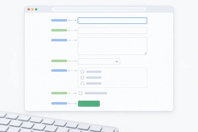
 Connect Labels to Form Data
Create a labeled native text input and distinguish its accessible name from its submission name and entered value. 3 min
Connect Labels to Form Data
Create a labeled native text input and distinguish its accessible name from its submission name and entered value. 3 min
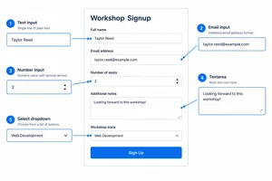 Choose Controls for Each Value
Choose suitable native HTML controls for each value in the local practice form. 3 min
Choose Controls for Each Value
Choose suitable native HTML controls for each value in the local practice form. 3 min
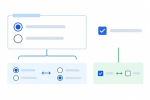 Group Choices Clearly
Build a native radio group for session choices and an independent checkbox, then connect selected values to submission data. 3 min
Group Choices Clearly
Build a native radio group for session choices and an independent checkbox, then connect selected values to submission data. 3 min
 Submit with a Button, Navigate with a Link
Use explicit native form submission and in-page navigation markup without replacing their built-in behavior. 2 min
Submit with a Button, Navigate with a Link
Use explicit native form submission and in-page navigation markup without replacing their built-in behavior. 2 min
 Require Values and Set Text Lengths
Add visible requirement instructions and native required and minimum-length constraints to the local practice form. 3 min
Require Values and Set Text Lengths
Add visible requirement instructions and native required and minimum-length constraints to the local practice form. 3 min
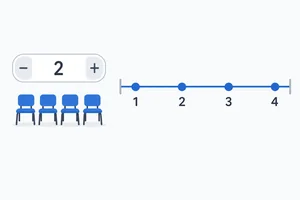 Constrain Numeric Values
Add native numeric range and increment constraints to the required seats field, then evaluate valid and invalid fictional values. 2 min
Constrain Numeric Values
Add native numeric range and increment constraints to the required seats field, then evaluate valid and invalid fictional values. 2 min
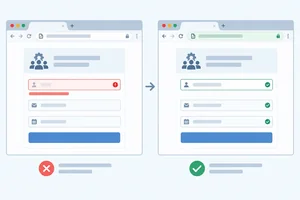 Try Invalid and Valid Input
Test fictional invalid and valid entries in the local form, then distinguish native browser validation from data delivery or storage. 4 min
Try Invalid and Valid Input
Test fictional invalid and valid entries in the local form, then distinguish native browser validation from data delivery or storage. 4 min
 Check Keyboard Use and Native Semantics
Operate the local practice form by keyboard and inspect the names, native roles, and current states exposed by its native controls. 3 min
Check Keyboard Use and Native Semantics
Operate the local practice form by keyboard and inspect the names, native roles, and current states exposed by its native controls. 3 min
 Build and Check the Complete Form
Complete the native workshop signup form, verify its integrated markup and keyboard behavior locally, and distinguish passing native validation from confirmed delivery or storage. 3 min
Build and Check the Complete Form
Complete the native workshop signup form, verify its integrated markup and keyboard behavior locally, and distinguish passing native validation from confirmed delivery or storage. 3 min
Step 1 of 9
Create a labeled native text input and distinguish its accessible name from its submission name and entered value.
A <form> contains controls that collect values for a possible submission. Start a local practice file named workshop.html. This is a fictional workshop form, not a real signup service.
The visible Badge name label is explicitly connected to its text input: the label’s for value and the input’s unique id are identical.
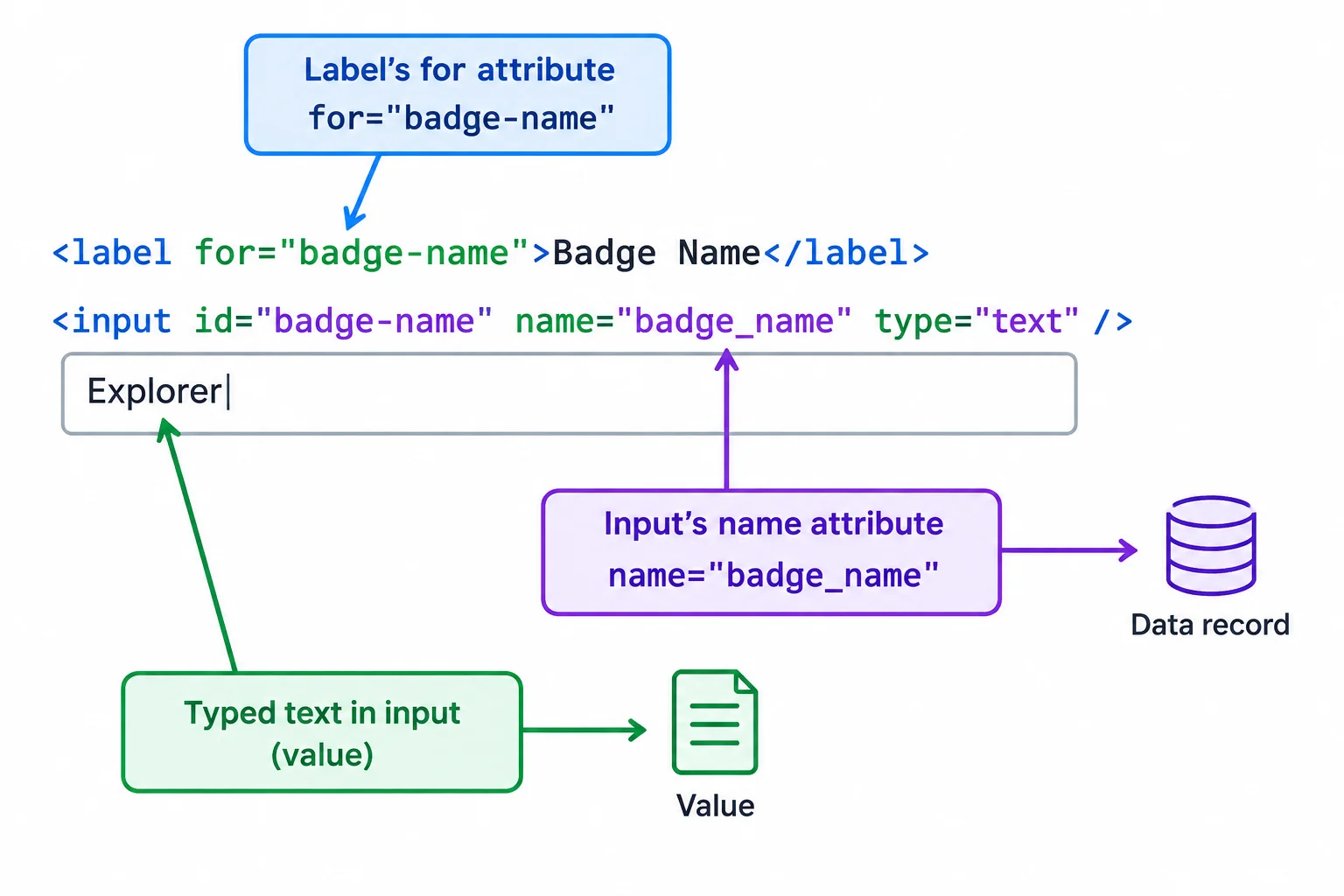
The label association, the submission name, and the entered value have different jobs.
Save this complete starter document as workshop.html, then open or refresh it in your browser.
<!doctype html>
<html lang="en">
<head>
  <meta charset="utf-8">
  <title>Practice workshop signup</title>
</head>
<body>
  <main>
    <h1>Practice workshop signup</h1>

    <form method="get">
      <label for="badge-name">Badge name</label>
      <input type="text" id="badge-name" name="badge_name">
    </form>
  </main>
</body>
</html>Practice workshop signup Badge name [ ]
Native input dimensions, borders, and fonts vary by browser. You should see the heading, the visible label, and one empty native text input.
The matching for and id create the label association. As a result, the label text supplies this text input’s accessible name: “Badge name.” The input is a native text control, so its native role is a textbox.
name="badge_name" has a separate purpose. It is the control’s submission name—the data key associated with this control if a submission is attempted. It does not replace the visible label and does not supply the accessible name.
For a fictional entry, the browser holds the text the person typed as the field’s value. Keep these three concepts separate when reading form markup.
| Part | Purpose | Example |
|---|---|---|
| Label text | Accessible name | Badge name |
| name attribute | Submission name | badge_name |
| Typed text | Field value | Alex |
Match each form fragment to its role or related fragment.
Tap an item and then its matching pair.
Step 2 of 9
Choose suitable native HTML controls for each value in the local practice form.
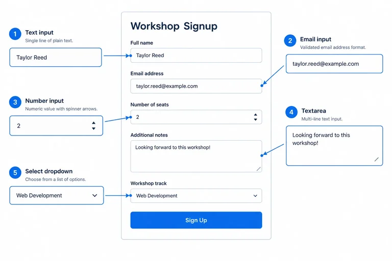
Different values call for different native controls. Use input type="text" for a badge name, input type="email" for an email address, and input type="number" for a seat quantity.
Use a number input when the value is genuinely a quantity with meaningful range or increments. A numeric-looking identifier, such as a membership code, is still text if arithmetic does not make sense.
Use textarea for notes that may span lines, and select for one choice from a short, fixed list. Keep an explicit, persistent visible label for every control. A placeholder disappears while typing and is not a replacement for a label.
Each control has a persistent visible label and a native browser-provided appearance.
Use this comparison when choosing the markup.
| Information needed | Native control | Reason |
|---|---|---|
| Badge text | input type="text" | Short free-form text |
| Email address | input type="email" | Email-shaped value |
| Seat quantity | input type="number" | A numeric quantity |
| Notes | textarea | May contain multiple lines |
| Topic | select | One choice from a short list |
In your local workshop.html, use this complete current version. It keeps the labeled badge-name field from the previous step and adds the other value types. Save the file, then refresh it in your browser to compare the native controls.
Current complete contents of workshop.html
<!doctype html>
<html lang="en">
<head>
  <meta charset="utf-8">
  <title>Practice workshop signup</title>
</head>
<body>
  <main>
    <h1>Practice workshop signup</h1>
    <form method="get">
      <label for="badge-name">Badge name</label>
      <input id="badge-name" name="badge_name" type="text">

      <label for="email">Email</label>
      <input id="email" name="email" type="email">

      <label for="seats">Seats</label>
      <input id="seats" name="seats" type="number">

      <label for="notes">Notes</label>
      <textarea id="notes" name="notes">First workshop</textarea>

      <label for="topic">Topic</label>
      <select id="topic" name="topic">
        <option value="">Choose a topic</option>
        <option value="html">HTML</option>
        <option value="css">CSS</option>
      </select>
    </form>
  </main>
</body>
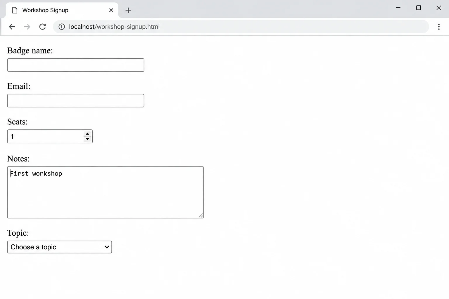
</html>Practice workshop signup Badge name [ ] Email [ ] Seats [ ▲▼ ] Notes [ First workshop ] [ ] Topic [ Choose a topic ▾ ]
Native control dimensions, select arrows, and number-input spinner appearance vary by browser and operating system. The control order, the initial textarea text, and the selected topic prompt should match this output.
A textarea does not use a value attribute for its initial text. Put that text between its opening and closing tags.
For a select, an option has visible text and a submitted value. For example, the learner sees CSS, while the option's submitted value is css. The first option is a prompt for choosing a topic; its visible wording remains useful even though its value is empty.
Complete the markup using the native control types and values that fit each information need. The labels shown in the fragment stay visible to the person using the form.
Fill all six blanks.
<label for="badge-name">Badge name</label>
<input id="badge-name" name="" type="">

<label for="email">Email</label>
<input id="email" name="email" type="">

<label for="seats">Seats</label>
<input id="seats" name="seats" type="">

<label for="notes">Notes</label>
<textarea id="notes" name="notes"></textarea>

<label for="topic">Topic</label>
<select id="topic" name="topic">
  <option value="">Choose a topic</option>
  <option value="html">HTML</option>
  <option value="">CSS</option>
</select>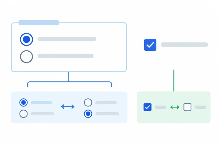
Step 3 of 9
Build a native radio group for session choices and an independent checkbox, then connect selected values to submission data.
Radio buttons represent mutually exclusive choices within one related group. A checkbox represents an independent on/off choice.
For this form, Morning and Afternoon are session choices, so they are radios in one group. Selecting one session leaves the other unselected. Workshop updates is independent: selecting it does not change the session choice, so it is a checkbox.
Each control still needs an explicit label. The fieldset legend supplies shared context for the session choices; it does not replace the individual Morning and Afternoon labels.
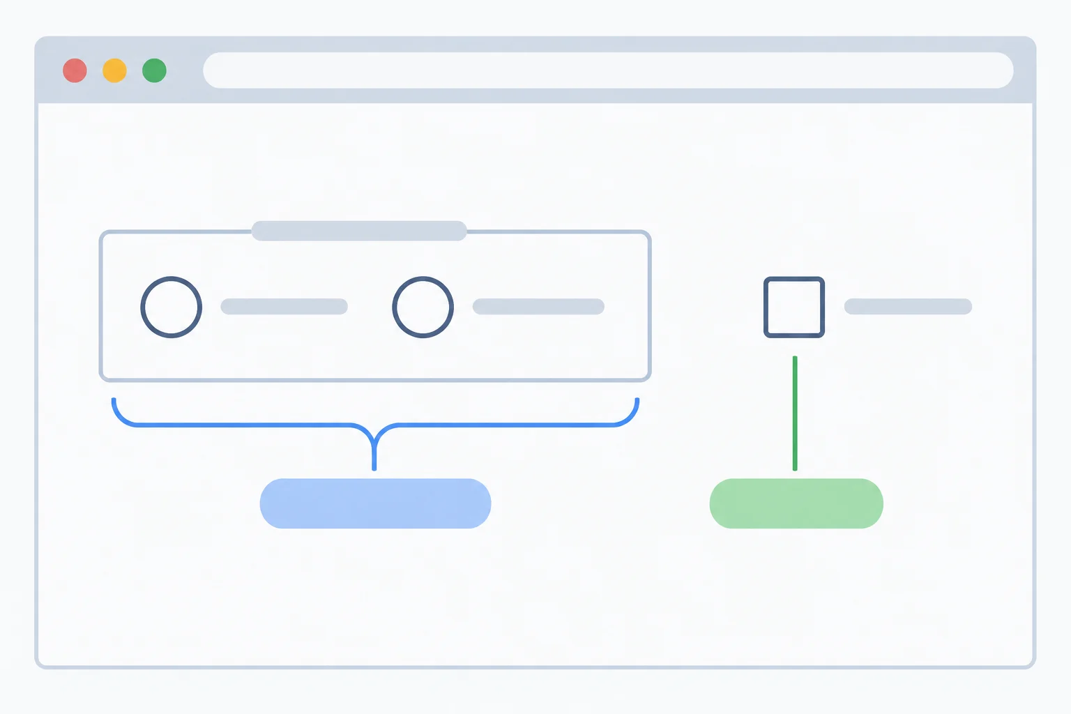
The session radios belong together; the updates checkbox is separate.
Tip
The checked attribute supplies an initial selection for a radio or checkbox. The reference form intentionally has no checked attributes here: it opens with no session selected and no updates selected.
A selection can be made later by the person using the form. Do not add checked when you build this reference version.
Replace the current contents of your local workshop.html with this complete version. The fieldset groups the session controls, and its legend provides their shared context.
The radio inputs have distinct IDs so each explicit label connects to one control. They share name="session", the submission name for this choice group. Their distinct values identify which session was selected. The checkbox has its own submission name because it is independent.
Save this complete file as workshop.html, then refresh it in your browser.
<!doctype html>
<html lang="en">
<head>
  <meta charset="utf-8">
  <title>Practice workshop signup</title>
</head>
<body>
  <main>
    <h1>Practice workshop signup</h1>
    <form method="get">
      <label for="badge-name">Badge name</label>
      <input id="badge-name" name="badge_name" type="text">

      <label for="email">Email</label>
      <input id="email" name="email" type="email">

      <label for="seats">Seats</label>
      <input id="seats" name="seats" type="number">

      <label for="notes">Notes</label>
      <textarea id="notes" name="notes">First workshop</textarea>

      <label for="topic">Topic</label>
      <select id="topic" name="topic">
        <option value="">Choose a topic</option>
        <option value="html">HTML</option>
        <option value="css">CSS</option>
      </select>

      <fieldset>
        <legend>Session</legend>
        <input id="session-morning" name="session" type="radio" value="morning">
        <label for="session-morning">Morning</label>

        <input id="session-afternoon" name="session" type="radio" value="afternoon">
        <label for="session-afternoon">Afternoon</label>
      </fieldset>

      <input id="updates" name="updates" type="checkbox" value="yes">
      <label for="updates">Send me workshop updates (optional)</label>
    </form>
  </main>
</body>
</html>Practice workshop signup Badge name [ ] Email [ ] Seats [ ] Notes [First workshop ] Topic [Choose a topic ] ┌ Session ──────────────────────┐ │ ○ Morning │ │ ○ Afternoon │ └───────────────────────────────┘ ☐ Send me workshop updates (optional)
Native control appearance varies by browser and operating system. The fieldset, two radio controls, and separate checkbox should be visible; all three choices begin unselected.
The visible labels supply accessible names: “Morning,” “Afternoon,” and “Send me workshop updates (optional).” The name attribute has a different job: it provides a submission name.
Only the selected radio can contribute data from the session group. An unchecked checkbox contributes no name/value entry. If the checkbox is checked, it contributes its own submission name and value.
These examples describe only the choice controls, not the other fields in the form.
| Control state | Submission name | Contributed value |
|---|---|---|
| Morning selected | session | morning |
| Afternoon selected | session | afternoon |
| Updates checked | updates | yes |
| Updates unchecked | No entry | No entry |
Write the HTML fragment for the two session choices and the independent updates checkbox. Include the fieldset, legend, input elements, and explicit labels. Do not add checked or required attributes.
Then state the choice data included if Afternoon is selected and updates is left unselected.
Write at least 250 characters (0/250).
Step 4 of 9
Use explicit native form submission and in-page navigation markup without replacing their built-in behavior.
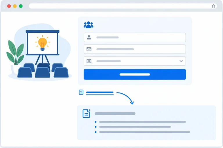
A form action and navigation have different jobs. Put a native submit button inside the form for the signup action. Put a link outside the form when a person should move to another location in the document.
An explicit type="submit" button starts applicable native validation. If the browser allows it, it makes a local submission attempt. This practice form has no receiving service, so a permitted attempt may navigate to the current document; it does not prove that data was delivered or stored.
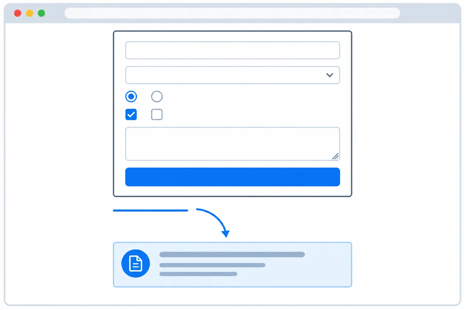
The submit button belongs inside the form. The separate link navigates to notes outside it.
Edit your existing workshop.html without adding another form closing tag:
</form> immediately after the updates checkbox and its label.</main>.Keep the one existing </form>. The link is outside the form, while the notes section is its fragment destination.
Use this exact source region after making the insertions. It replaces the former ending of the form through the point just before the existing </main>.
      <input id="updates" name="updates" type="checkbox" value="yes">
      <label for="updates">Send me workshop updates (optional)</label>

      <button type="submit">Submit practice signup</button>
    </form>

    <a href="#practice-notes">Practice notes</a>

    <section id="practice-notes">
      <h2>Practice notes</h2>
      <p>Use fictional practice data only.</p>
</section>[Form] Badge name Email Seats Notes Topic Session Send me workshop updates (optional) [Submit practice signup] Practice notes Practice notes Use fictional practice data only.
Rendered structure: the submit button is the last control inside the form. The Practice notes link and the notes section appear below the form.
These native elements express different intent without custom interaction code.
| Markup | Purpose | Built-in result |
|---|---|---|
| `<button type="submit">` | Form action | Runs applicable native validation, then attempts submission if allowed |
| `<button type="button">` | Non-submitting action | Does not submit or run native validation on its own |
| `<a href="#practice-notes">` | Navigation | Moves to the section with that id |
Tip
Write type="submit" even though a button inside a form defaults to submitting when its type is omitted. The explicit type makes the intended behavior clear.
Do not replace the native button with generic markup plus ARIA. A native button already provides button semantics and keyboard behavior. ARIA on generic markup does not create form submission or native validation.
Complete this source review. The first button must initiate the form action. The second must be explicitly non-submitting, so it must not launch native validation by itself. The final element must navigate to the notes section.
<form method="get">
  <button type="">Submit practice signup</button>
  <button type="">Review later</button>
</form>

< href="">Practice notes</a>

<section id="practice-notes">
  <h2>Practice notes</h2>
</section>
Step 5 of 9
Add visible requirement instructions and native required and minimum-length constraints to the local practice form.
required tells the browser that a supported control cannot be left empty when native validation runs, such as after an attempt to submit the form.
Put the requirement in the control’s visible label—or in the shared legend for session choices. This gives people the instruction before they submit; an unexplained symbol does not.
In this form, badge name, email, seats, topic, and one session choice are required. Notes and workshop updates remain optional. minlength="2" adds another rule for badge name: a nonempty value must contain at least two characters.
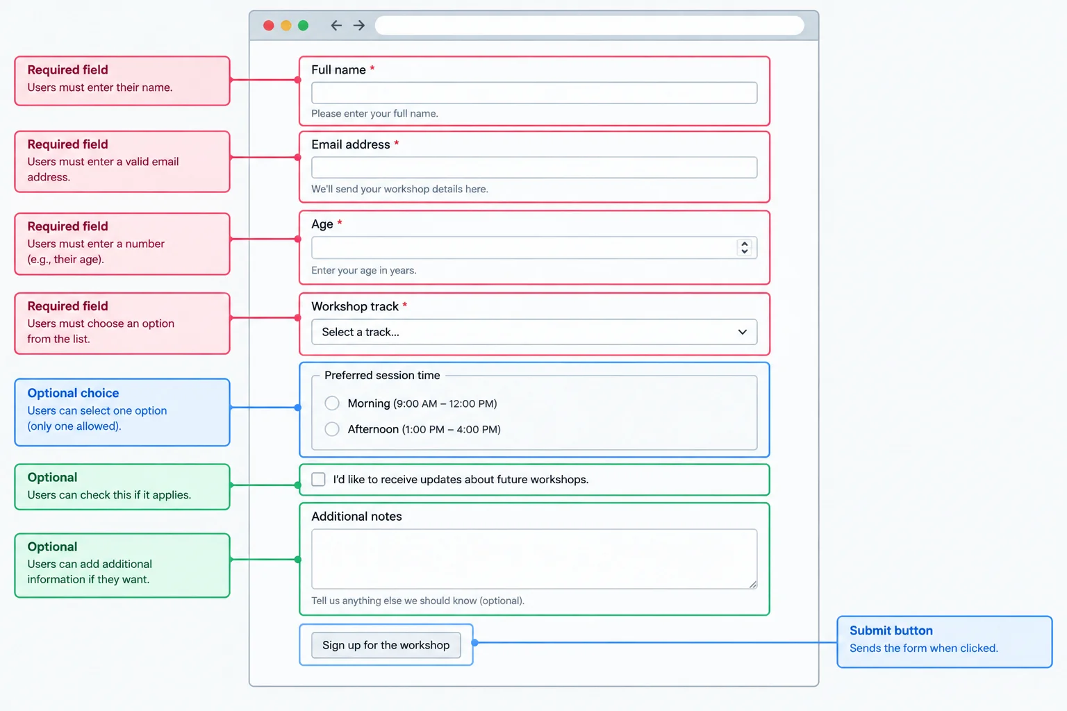
Visible label and legend instructions state what must be completed; native validation checks the matching constraints during a submission attempt.
Tip
minlength does not make a field required by itself. It constrains a value only when the user has entered one. Here, badge name uses both required and minlength="2"; notes uses neither constraint.
In workshop.html, use this first consecutive section of the document. Its attributes match the visible instructions.
<!doctype html>
<html lang="en">
<head>
  <meta charset="utf-8">
  <title>Practice workshop signup</title>
</head>
<body>
  <main>
    <h1>Practice workshop signup</h1>
    <form method="get">
      <label for="badge-name">Badge name (required, at least 2 characters)</label>
      <input type="text" id="badge-name" name="badge_name" minlength="2" required>

      <label for="email">Email (required)</label>
      <input type="email" id="email" name="email" required>

      <label for="seats">Seats (required, 1 to 4, whole numbers)</label>
      <input type="number" id="seats" name="seats" required>

      <label for="topic">Topic (required)</label>
      <select id="topic" name="topic" required>
        <option value="">Choose a topic</option>
        <option value="html">HTML</option>
        <option value="css">CSS</option>
      </select>

      <fieldset>
<legend>Session (required)</legend>Place this immediately after section 1. Together, the two consecutive sections are the complete workshop.html file. Save and refresh it.
        <input type="radio" id="session-morning" name="session" value="morning" required>
        <label for="session-morning">Morning</label>

        <input type="radio" id="session-afternoon" name="session" value="afternoon" required>
        <label for="session-afternoon">Afternoon</label>
      </fieldset>

      <input type="checkbox" id="updates" name="updates" value="yes">
      <label for="updates">Send me workshop updates (optional)</label>

      <label for="notes">Notes (optional)</label>
      <textarea id="notes" name="notes"></textarea>

      <button type="submit">Submit practice signup</button>
    </form>

    <a href="#practice-notes">Practice notes</a>

    <section id="practice-notes">
      <h2>Practice notes</h2>
      <p>Use fictional practice data only.</p>
    </section>
  </main>
</body>
</html>Practice workshop signup Badge name (required, at least 2 characters) [text field] Email (required) [email field] Seats (required, 1 to 4, whole numbers) [number field] Topic (required) [Choose a topic] Session (required) ( ) Morning ( ) Afternoon [ ] Send me workshop updates (optional) Notes (optional) [multiline text field] [Submit practice signup] Practice notes Practice notes Use fictional practice data only.
Native browser layout and control styling vary. This is a text representation of the complete page at this stage: visible requirement wording is present, the topic prompt is selected, and no session or updates choice is selected.
The first topic option has value="". Its visible prompt helps a person choose, but it contributes an empty value. While that prompt remains selected, the required select is invalid.
The two radios share the submission name session. Placing required on both radios consistently expresses that this group needs one selection. The checkbox is independent, so it stays optional.
When native validation runs, an empty optional text control can be valid. A one-character badge name is not long enough because badge name has a minimum length of two. The visible topic prompt does not satisfy the required select because its selected value is empty. The updates checkbox does not need to be checked.
These local rules do not show that information was delivered or stored anywhere.
Which statement correctly describes this form when native validation runs?
Fill every blank to complete the markup and the two validation-result comments.
<input type="text" id="badge-name" name="badge_name"  >

<select id="topic" name="topic" >
  <option value=>Choose a topic</option>
  <option value="html">HTML</option>
  <option value="css">CSS</option>
</select>

<textarea id="notes" name="notes"></textarea>

<!-- Empty notes:  during native validation. -->
<!-- Badge name value "A":  during native validation. -->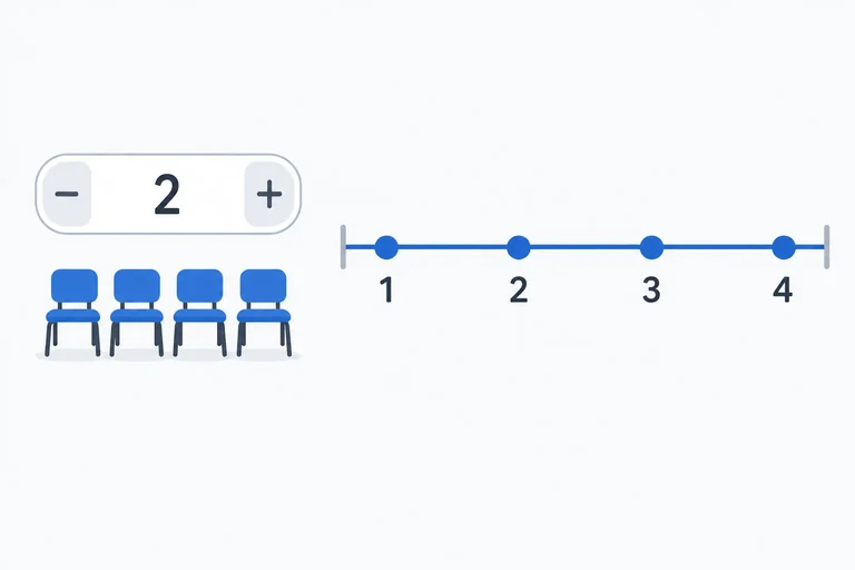
Step 6 of 9
Add native numeric range and increment constraints to the required seats field, then evaluate valid and invalid fictional values.
A number input can carry numeric rules in its attributes. For seats, min="1" sets the lowest allowed value and max="4" sets the highest.
step="1" permits increments of one starting at the minimum, so the allowed whole-number seat counts are 1, 2, 3, and 4. Keep required because the field must not be empty when native validation runs.
Constraints determine whether a value is valid. They do not guarantee that every browser will prevent an invalid value from being typed or temporarily displayed.
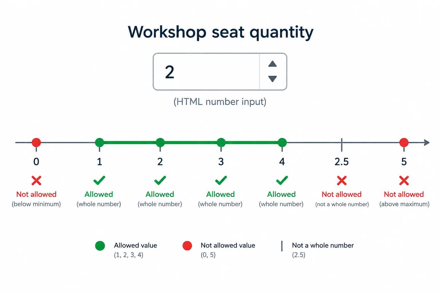
The range limits the values; the increment rule excludes fractional seat counts.
Tip
The visible label states the requirement for people using the form. The attributes provide the matching native validation rules for the browser.
In your existing workshop.html form, replace the existing seats label and input with these complete lines. This updates the existing seats field; it does not create another form. Save the file and refresh it in your browser.
Replace the existing seats label and input with this markup.
<label for="seats">Seats (required, 1 to 4, whole numbers)</label>
<input type="number" id="seats" name="seats" min="1" max="4" step="1" required>Seats (required, 1 to 4, whole numbers) [empty native number input]
Browser rendering varies: spinner arrows may look different or may not be shown. The constraints affect native validation even if the browser still lets someone type an invalid value temporarily.
Compare entries against both the range and the increment rule.
| Entry | Range rule | Increment rule | Valid? |
|---|---|---|---|
| 0 | Below 1 | Does not matter | No |
| 2.5 | Within 1 to 4 | Not a whole-number increment | No |
| 5 | Above 4 | Does not matter | No |
| 2 | Within 1 to 4 | Whole-number increment | Yes |
Complete the three numeric constraints for the seats field.
<input type="number" id="seats" name="seats" required min="" max="" step="">For the seats field, write the three attribute values you would use for min, max, and step. Then classify each entry as valid or invalid and give a brief reason: 0, 2.5, 5, and 2.
Write at least 120 characters (0/120).
Step 7 of 9
Test fictional invalid and valid entries in the local form, then distinguish native browser validation from data delivery or storage.
Native validation runs when you attempt to submit the local form. Enter fictional values in workshop.html, then activate Submit practice signup.
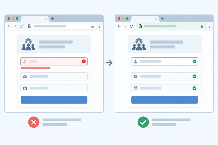
If a native constraint fails, the browser commonly prevents the submission attempt and focuses or reports an invalid control. Its exact message, appearance, and the first control it reports can vary by browser and operating system.
Correct the reported issue and try again. Another invalid control may then be reported, so repeat until every required value and constraint is valid.
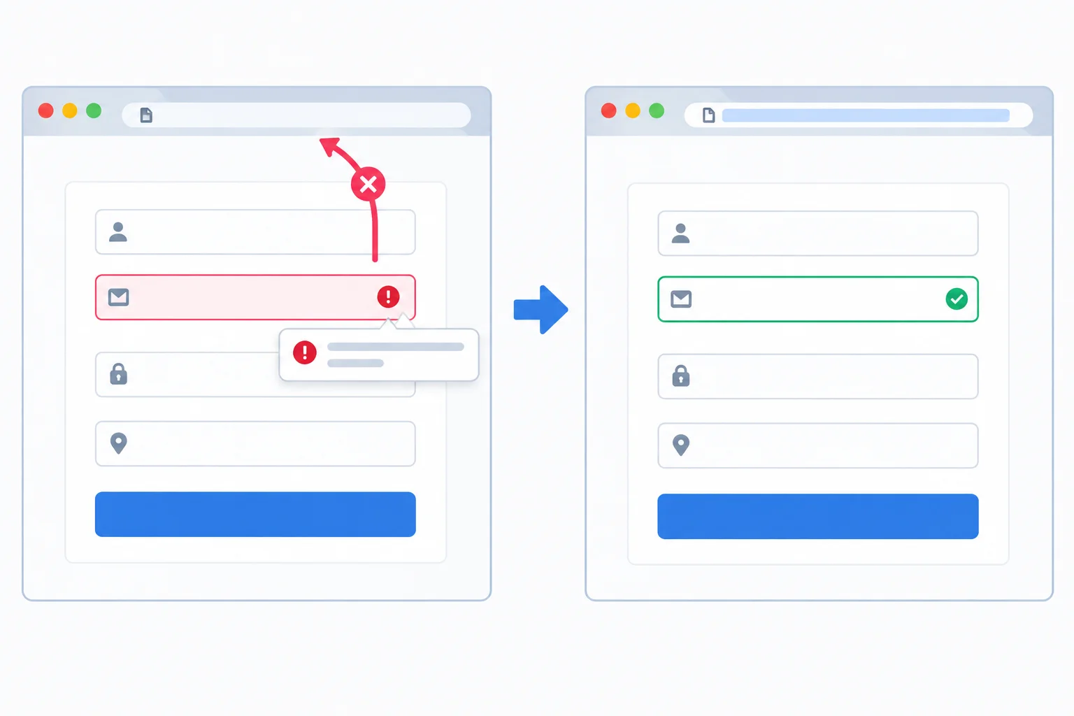
Native validation can block an invalid attempt before a permitted submission attempt.
Start each run from the same otherwise valid fictional entry. Change only the value named in the middle column so you can connect the browser feedback to one constraint at a time.
| Test | Change from the valid entry | Expected local result |
|---|---|---|
| Empty required control | Leave one required control empty; repeat for badge name, email, seats, topic, and session | Blocked; browser reports or focuses an invalid control |
| Badge length | Use a one-character badge name | Blocked by the minimum text length |
| Email format | Use malformed email text | Blocked by supported email syntax checking |
| Seats below range | Use 0 | Blocked by the minimum value |
| Seats above range | Use 5 | Blocked by the maximum value |
| Seats increment | Use 2.5 | Blocked because the value is not a whole allowed step |
| Reference valid entry | Alex; alex@example.com; 2; HTML; Morning; First workshop; updates unchecked | A submission attempt is permitted locally |
Warning
With method="get", a permitted local submission attempt can place form values in the URL. Use fictional data only.
A syntactically valid email does not show that the address exists or belongs to anyone. Likewise, a permitted local attempt may reload the document, change its URL, or behave differently across browsers. None of these observations proves that data was received or stored.
Client-side native validation is useful feedback, not a security guarantee. Any real receiving service must validate data it receives.
Put this local workflow in the order that follows native validation.
Use workshop.html now. Begin with an otherwise valid fictional entry, introduce one invalidity from the test matrix, attempt submission, correct it, and retry.
Write a three-part report:
Write at least 180 characters (0/180).

Step 8 of 9
Operate the local practice form by keyboard and inspect the names, native roles, and current states exposed by its native controls.
Use the browser’s native keyboard behavior—no custom code is needed.
To correct invalid fictional input without a pointer, use Tab to reach the submit button and activate it. Native validation commonly reports or focuses an invalid control. Correct that control with the keyboard, then retry: another invalid required control may be reported next.
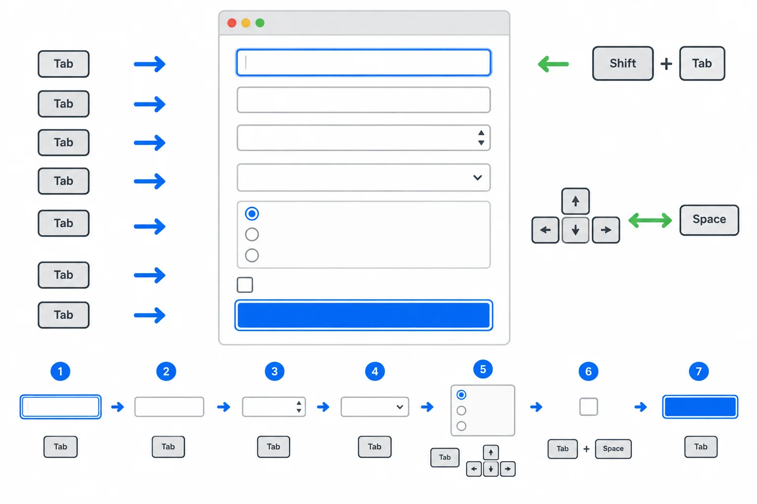
Focus moves through native controls in document order. The browser supplies the focus indicator and the controls’ keyboard behavior.
Tip
Keep the browser’s visible focus indicator in view while practicing. It tells you which control will receive the next keyboard command.
Browser accessibility information lets you inspect what native HTML exposes automatically. Look for a control’s Name, Role, and Properties or States.
In Chrome or Edge, open Developer Tools with F12. Open Elements, select the HTML node for a control such as an input, select, or button, then open the Accessibility pane in the Elements sidebar. Find its computed Name and Role, then inspect listed properties or states.
Other browsers may call this an Accessibility panel, Inspector, or accessibility tree. Select the control’s HTML node first, then look for equivalent Name, Role, and Properties/States information. Panel wording can vary, but the native information is what you are checking.
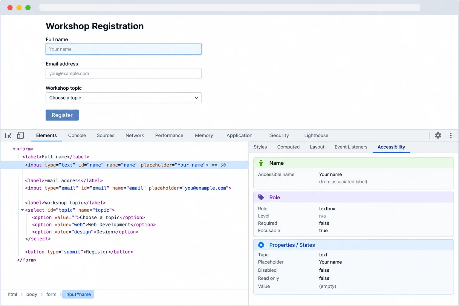
Select the control’s HTML node, then inspect its Name, Role, and Properties or States. Pane labels and placement vary by browser.
An explicit label supplies a control’s accessible name. The native element supplies its native role. Current facts such as required and checked are states.
The submission name is separate: it is the value of the HTML name attribute used as a data key during a submission. For example, the badge-name control has an accessible name based on its visible label, while badge_name is its submission name.
The Session legend adds group context; it does not replace the individual accessible names “Morning” and “Afternoon.” The source starts with no checked attribute on the session radios or updates checkbox. After a keyboard selection, the current checked state changes even though the original markup has not changed.
Inspect these representative controls in your local form.
| Control | Accessible name | Native role | State / submission name |
|---|---|---|---|
| Badge name input | Badge name (required, at least 2 characters) | textbox | required; badge_name |
| Seats input | Seats (required, 1 to 4, whole numbers) | spinbutton | required; seats |
| Topic select | Topic (required) | combobox | required; topic |
| Morning choice | Morning | radio | required; checked changes; session |
| Updates choice | Send me workshop updates (optional) | checkbox | checked changes; updates |
| Submit control | Submit practice signup | button | no submission name |
Match each control to the native role you should find in browser accessibility information.
Tap an item and then its matching pair.
Use only the keyboard on your local workshop.html form. Leave or enter one fictional invalid required value, reach the submit button, activate it, correct the reported issue, and retry. Then inspect representative controls using your browser’s accessibility information.
In 3–5 sentences, report:
Write at least 220 characters (0/220).

Step 9 of 9
Complete the native workshop signup form, verify its integrated markup and keyboard behavior locally, and distinguish passing native validation from confirmed delivery or storage.
Replace the contents of your local workshop.html with the two consecutive sections below. Together, they form one complete document. This final version uses only native HTML: no CSS, JavaScript, ARIA, external service, or second file.
The form collects fictional practice values. Its method="get" can make a local submission attempt, but it has no receiving service.
| Area | Check |
|---|---|
| Labels | Each label's for value matches its control's id. |
| Submission names | The name attribute is a data key, separate from the accessible name. |
| Session choices | Distinct radio IDs share the session submission name. |
| Actions | The submit button is inside the form; the navigation link is outside it. |
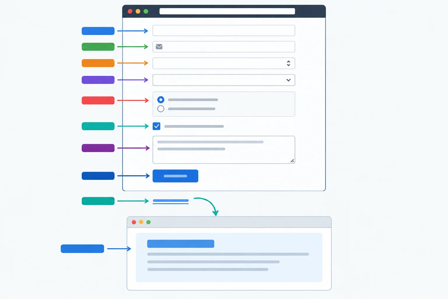
The form combines the established native controls without custom interaction.
Save this as the first consecutive section of workshop.html.
<!doctype html>
<html lang="en">
<head>
  <meta charset="utf-8">
  <title>Practice workshop signup</title>
</head>
<body>
  <main>
    <h1>Practice workshop signup</h1>
    <form method="get">
      <label for="badge-name">Badge name (required, at least 2 characters)</label>
      <input type="text" id="badge-name" name="badge_name" minlength="2" required>

      <label for="email">Email (required)</label>
      <input type="email" id="email" name="email" required>

      <label for="seats">Seats (required, 1 to 4, whole numbers)</label>
      <input type="number" id="seats" name="seats" min="1" max="4" step="1" required>

      <label for="topic">Topic (required)</label>
      <select id="topic" name="topic" required>
        <option value="">Choose a topic</option>
        <option value="html">HTML</option>
        <option value="css">CSS</option>
</select>Place this immediately after part 1. The two sections together are the complete workshop.html document. Save, refresh, and compare the rendered control order with the expected result.
      <fieldset>
        <legend>Session (required)</legend>
        <input type="radio" id="session-morning" name="session" value="morning" required>
        <label for="session-morning">Morning</label>

        <input type="radio" id="session-afternoon" name="session" value="afternoon" required>
        <label for="session-afternoon">Afternoon</label>
      </fieldset>

      <input type="checkbox" id="updates" name="updates" value="yes">
      <label for="updates">Send me workshop updates (optional)</label>

      <label for="notes">Notes (optional)</label>
      <textarea id="notes" name="notes"></textarea>

      <button type="submit">Submit practice signup</button>
    </form>

    <a href="#practice-notes">Practice notes</a>

    <section id="practice-notes">
      <h2>Practice notes</h2>
      <p>Use fictional practice data only.</p>
    </section>
  </main>
</body>
</html>Browser tab title: Practice workshop signup Page content, in order: Practice workshop signup Badge name (required, at least 2 characters) — empty text input Email (required) — empty email input Seats (required, 1 to 4, whole numbers) — empty number input Topic (required) — select showing Choose a topic Session (required) — fieldset with unselected Morning and Afternoon radio buttons Send me workshop updates (optional) — unchecked checkbox Notes (optional) — empty multiline text area Submit practice signup — submit button Practice notes — link Practice notes — destination heading Use fictional practice data only. — destination paragraph
Native control styling, validation messages, and spacing vary by browser and operating system. The visible order and content below should remain the same.
Check your saved source as well as the browser view. Confirm that visible requirements are in associated labels or the session legend, and that the navigation link is outside the form.
For a valid fictional entry, use Alex, alex@example.com, 2 seats, the HTML topic, and the Morning session. Leave updates unchecked and enter First workshop as notes.
Use this compact checklist while reviewing workshop.html.
| Area | Source relationship to verify |
|---|---|
| Badge field | for and id use badge-name; name uses badge_name; minlength and required are present |
| Email and seats | Use email and number types; both are required; seats has min, max, and step |
| Topic | Required select begins with an empty-value prompt option |
| Sessions | Distinct IDs, shared session submission name, and required on both radios |
| Optional controls | Updates checkbox and notes textarea have no required attribute |
| Actions | Explicit submit button is in the form; Practice notes link targets the notes section |
| A local check can demonstrate | A local check cannot demonstrate |
|---|---|
| The source has the intended native controls, labels, constraints, and grouping. | That a receiving service accepted or stored data. |
| Native validation accepts the fictional entry under local constraints. | That an email address exists or belongs to someone. |
| Keyboard operation reaches and activates native controls. | That values were delivered anywhere. |
Complete this integrated source review. Each blank is an attribute value already established by the complete reference form.
<label for="">Badge name (required, at least 2 characters)</label>
<input type="" id="email" name="email" required>

<input type="number" id="seats" name="seats" min="" max="" step="1" required>

<input type="radio" id="session-morning" name="" value="morning" required>

<a href="">Practice notes</a>Run one final keyboard-only check in your own saved file. Begin with at least one required control invalid. Use Tab, Shift+Tab, and the native keys for the focused control to reach the submit button, activate it, correct the reported issue, and retry with the valid fictional entry.
Browser feedback and local navigation can vary. Use fictional data only.
After reviewing your saved source and testing in the browser, provide concise evidence. Include:
Write at least 300 characters (0/300).
Congratulations! You completed: Build Accessible Forms with Native Validation
You completed this level!
Up next: CSS Foundations
 Apply CSS with Stylesheets and SelectorsConnect a stylesheet to a local HTML page, target the intended elements with reusable selectors, and inspect which rules match.
Thousands of online courses in video, ebooks and audiobooks.
To test your knowledge during online courses
Generated directly from your cell phone's photo gallery and sent to your email

Download our app via QR Code or the links below:.


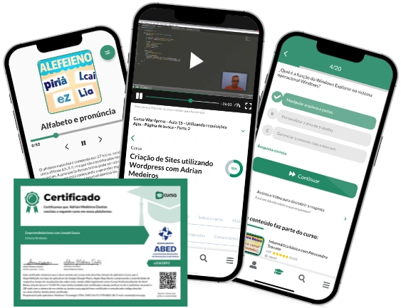
Carry knowledge in your pocket.
Download the Cursa app.
There are hundreds of free courses available, with a free certificate of completion that is saved in your mobile image gallery.
Download the app to access the Course Completion Certificate for Free.


+ 10 million
students

Free and Valid
Certificate

60 thousand free
exercises

4.8/5 rating in
app stores

Free courses in
video and ebooks