Step 1 of 9
Create a Flex Container
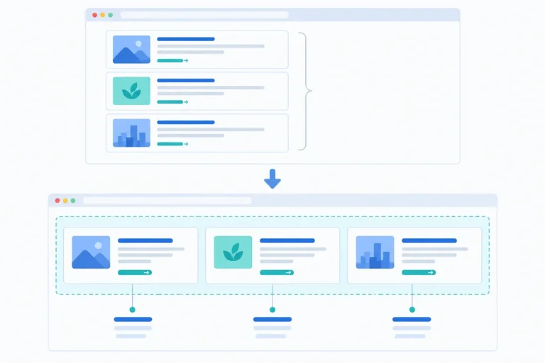
Turn the Resource library card wrapper into a flex container and identify its direct flex items.

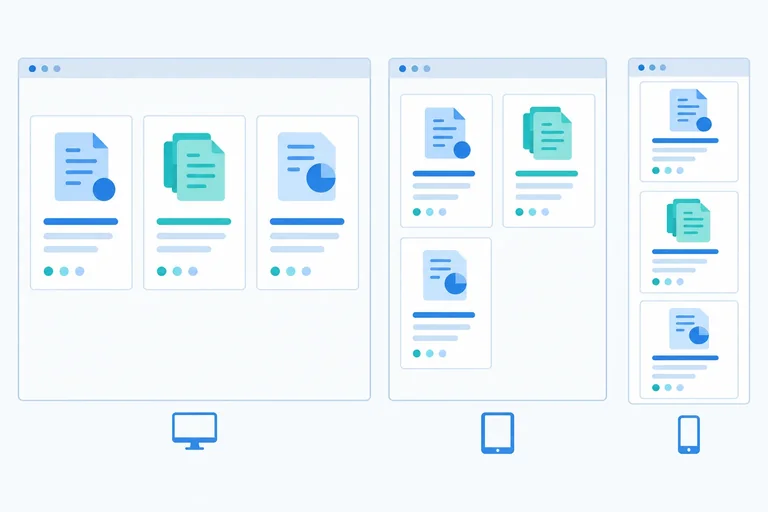
Learning path · Level 3 · Tutorial 1
Build flexible rows and columns that align, distribute space, and wrap while preserving meaningful reading and keyboard order.
 Create a Flex Container
Turn the Resource library card wrapper into a flex container and identify its direct flex items. 2 min
Create a Flex Container
Turn the Resource library card wrapper into a flex container and identify its direct flex items. 2 min
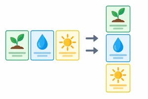 Read the Main and Cross Axes
Identify Flexbox’s main and cross axes, then choose row or column for a requested card arrangement. 2 min
Read the Main and Cross Axes
Identify Flexbox’s main and cross axes, then choose row or column for a requested card arrangement. 2 min
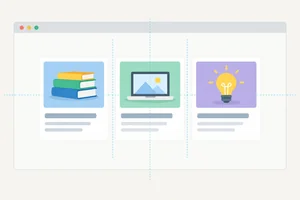 Align Items and Set Gaps
Choose container properties that position flex items on each axis and create consistent gutters between cards. 3 min
Align Items and Set Gaps
Choose container properties that position flex items on each axis and create consistent gutters between cards. 3 min
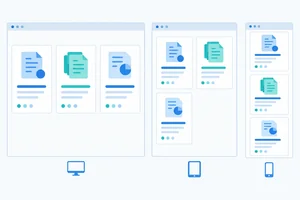 Let Cards Wrap onto New Lines
Let the Resource library cards create additional flex lines as their available width becomes too narrow. 2 min
Let Cards Wrap onto New Lines
Let the Resource library cards create additional flex lines as their available width becomes too narrow. 2 min
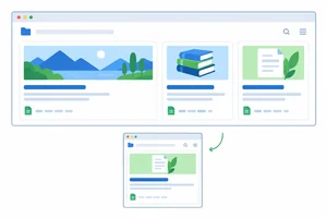 Set a Starting Size and Share Extra Space
Use flex-basis and flex-grow to start resource cards at a preferred size and distribute positive free space proportionally. 2 min
Set a Starting Size and Share Extra Space
Use flex-basis and flex-grow to start resource cards at a preferred size and distribute positive free space proportionally. 2 min
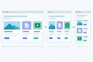 Control Shrinking with the Flex Shorthand
Control whether Resource library cards grow, shrink, and start from a preferred size by reading and writing the complete flex shorthand. 2 min
Control Shrinking with the Flex Shorthand
Control whether Resource library cards grow, shrink, and start from a preferred size by reading and writing the complete flex shorthand. 2 min
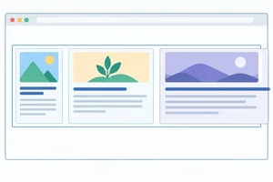 Remove an Unwanted Minimum-Width Constraint
Allow a constrained flex item to shrink while preserving readable, fully visible heading text. 3 min
Remove an Unwanted Minimum-Width Constraint
Allow a constrained flex item to shrink while preserving readable, fully visible heading text. 3 min
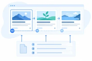 Keep Visual and Document Order Together
Keep Flexbox presentation aligned with the meaningful source and keyboard sequence. 2 min
Keep Visual and Document Order Together
Keep Flexbox presentation aligned with the meaningful source and keyboard sequence. 2 min
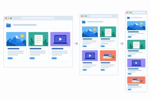 Build and Check the Flexible Resource Library
Build and locally verify a wrapping Flexbox resource library with readable content and a meaningful keyboard sequence. 4 min
Build and Check the Flexible Resource Library
Build and locally verify a wrapping Flexbox resource library with readable content and a meaningful keyboard sequence. 4 min
Step 1 of 9
Turn the Resource library card wrapper into a flex container and identify its direct flex items.
Create a folder for this example and add two files beside each other: index.html and styles.css. The HTML links to the stylesheet and provides the Resource library content used throughout this tutorial.
index.html
<!doctype html>
<html lang="en">
<head>
  <meta charset="utf-8">
  <title>Resource library</title>
  <link rel="stylesheet" href="styles.css">
</head>
<body>
  <main>
    <h1>Resource library</h1>

    <div class="resources">
      <article class="resource-card resource-card--featured">
        <h2 class="resource-title">HTML reference</h2>
        <p>Review the elements that give page content meaning.</p>
        <a href="#html-notes">Read HTML notes</a>
      </article>

      <article class="resource-card">
        <h2 class="resource-title">CSS layout notes</h2>
        <p>Use layout rules to arrange content clearly.</p>
        <a href="#css-notes">Read CSS notes</a>
      </article>

      <article class="resource-card">
        <h2 class="resource-title">Accessibility checklist</h2>
        <p>Check that content remains usable for everyone.</p>
        <a href="#accessibility-notes">Read accessibility notes</a>
      </article>
    </div>

    <section id="html-notes">
      <h2>HTML reference</h2>
      <p>Semantic elements describe the purpose of content.</p>
    </section>

    <section id="css-notes">
      <h2>CSS layout notes</h2>
      <p>Layout rules control how content uses available space.</p>
    </section>

    <section id="accessibility-notes">
      <h2>Accessibility checklist</h2>
      <p>Meaningful order supports reading and keyboard navigation.</p>
    </section>
  </main>
</body>
</html>Browser result: a page titled Resource library with the three resource cards followed by their matching destination sections.
After you also save the starter stylesheet beside this file and open or refresh index.html, the browser displays the Resource library heading, three outlined cards, and three destination sections below them.
styles.css
body {
  font-family: system-ui, sans-serif;
  margin: 0;
  padding: 2rem;
}

.resources {
  border: 0.125rem solid #94a3b8;
  padding: 1rem;
}

.resource-card {
  border: 0.125rem solid #cbd5e1;
  padding: 1rem;
}

.resource-title {
  margin-top: 0;
}Browser result: the Resources wrapper has an outer border. HTML reference, CSS layout notes, and Accessibility checklist are separate outlined cards stacked vertically.
This is the starting, non-Flexbox view. At a typical wide browser width, the cards are block elements and appear one below another inside the outlined wrapper.
Flexbox is a one-dimensional layout system: it arranges flex items along one main axis, making it useful for rows and columns.
Add display: flex to .resources. This element becomes the flex container. Its three direct <article> children become flex items.
A heading, paragraph, or link inside an article is nested content. It does not automatically become a flex item of .resources.
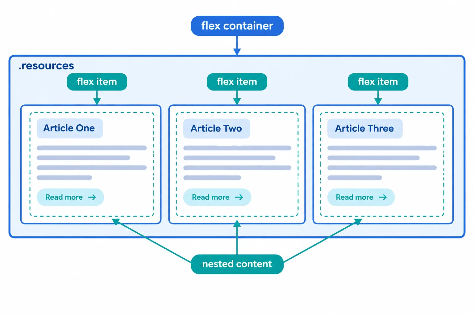
Only the three direct article children become flex items of the Resources flex container.
Replace the existing .resources rule in styles.css with this rule, then save and refresh the browser.
.resources {
  display: flex;
  border: 0.125rem solid #94a3b8;
  padding: 1rem;
}Browser result: HTML reference, CSS layout notes, and Accessibility checklist appear side by side as three flex items inside the Resources flex container.
At a typical wide browser width, the three cards now occupy one line within the bordered wrapper. Their headings, paragraphs, and links remain inside their own cards.
Complete the container declaration and the selector for the three direct card elements. Do not target their nested headings or links.
.resources {
  display: ;
}

.resources >  {
  border-color: #0f766e;
}
Step 2 of 9
Identify Flexbox’s main and cross axes, then choose row or column for a requested card arrangement.
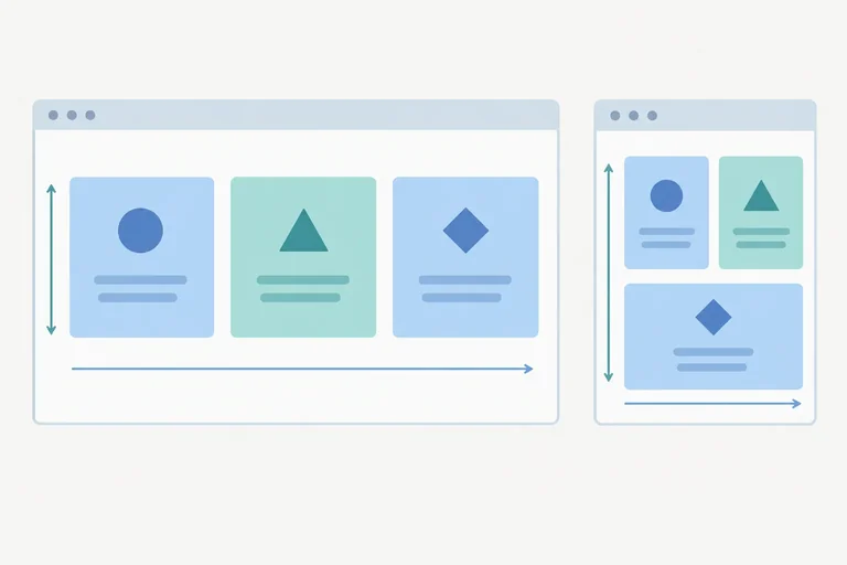
A flex container has two directions: the main axis, where its flex items are arranged, and the cross axis, which is perpendicular to it.
In this tutorial’s left-to-right horizontal writing:
flex-direction: row is the default. The main axis runs horizontally; the cross axis runs vertically.flex-direction: column makes the main axis run vertically; the cross axis runs horizontally.“Main” means the direction selected for arranging items. It does not always mean horizontal.
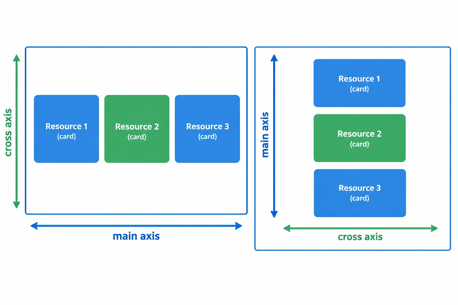
Changing the flex direction changes which physical direction is the main axis.
The Resource library cards are direct children of .resources, so flex-direction controls whether those cards form a row or a vertical stack. You do not need to change their HTML sequence.
Because row is the default, add flex-direction only when you want the stacked arrangement.
Add this declaration to the existing .resources rule when the cards should stack from top to bottom. Save styles.css, then refresh your local browser.
.resources {
  display: flex;
  flex-direction: column;
}Browser result: the HTML reference card appears first, the CSS layout notes card appears below it, and the Accessibility checklist card appears last. The cards form one vertical stack inside the bordered resources container.
The existing border and padding on `.resources`, plus the border and padding on each card, remain in effect from the previous step.
Match each axis label to its direction in a left-to-right horizontal writing layout.
Tap an item and then its matching pair.
Complete the declaration that stacks the resource cards vertically without changing their HTML order.
.resources {
  display: flex;
  flex-direction: ;
}
Step 3 of 9
Choose container properties that position flex items on each axis and create consistent gutters between cards.
With flex-direction: row, the main axis runs horizontally. If the cards occupy less than the container’s available width, the remainder is free space. justify-content positions the card group or distributes that free space along the main axis.
It affects flex items, not the text inside a card. The comparison below uses the same three cards and the same container; only the handling of main-axis free space changes.
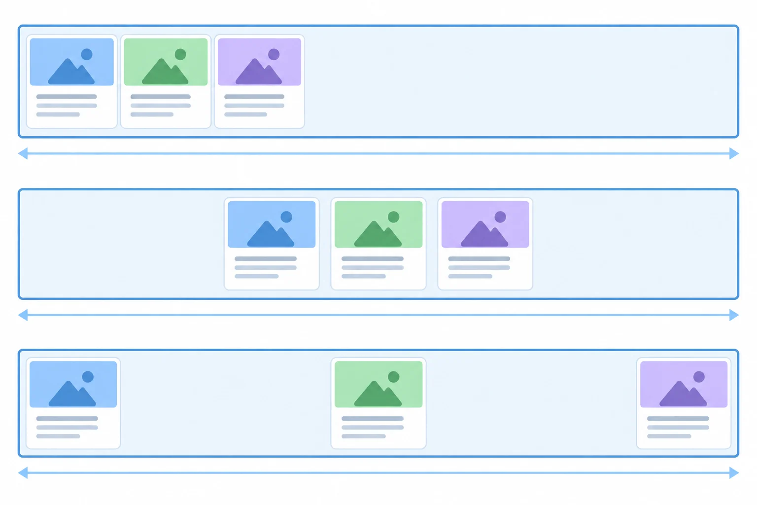
The container and cards remain the same; justify-content changes where main-axis free space goes.
Choose the value that matches the intended result.
| Value | Card placement | Free-space result |
|---|---|---|
| flex-start | At the left main-axis edge | After the last card |
| center | In the horizontal middle | Split across both outer sides |
| space-between | First and last cards at opposite edges | Distributed between cards |
align-items works on the cross axis. In a row, that axis is vertical.
stretch is the default. A flex item with an automatic cross-axis size can stretch to the flex line’s cross size.flex-start places cards at the top cross-axis edge.center places cards halfway between the top and bottom edges.Stretch is most visible when cards have automatic heights. It does not override an explicit cross-axis size. A container also needs extra cross-axis space before top or center placement becomes visible.
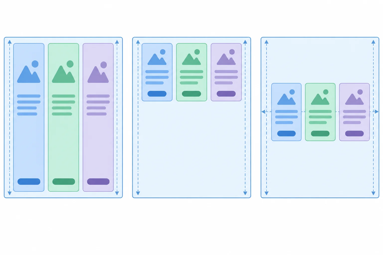
For a row, align-items changes vertical placement or stretching.
Replace the earlier .resources and .resource-card rules with these temporary comparison rules. flex-direction: row explicitly replaces the column direction used in the previous step. The fixed height only makes cross-axis centering easy to inspect.
.resources {
  display: flex;
  flex-direction: row;
  width: 48rem;
  height: 14rem;
  justify-content: flex-start;
  align-items: center;
  gap: 1rem;
  border: 0.125rem solid #94a3b8;
  padding: 1rem;
}

.resource-card {
  width: 12rem;
  border: 0.125rem solid #cbd5e1;
  padding: 1rem;
}Browser result: the Resource library is a horizontal row inside a 14rem-tall content area. The cards keep their automatic content-based heights and sit vertically in the middle instead of stretching from the top inner edge to the bottom inner edge.
The existing `.resource-title` rule remains in effect. Exact text wrapping can vary slightly with browser fonts.
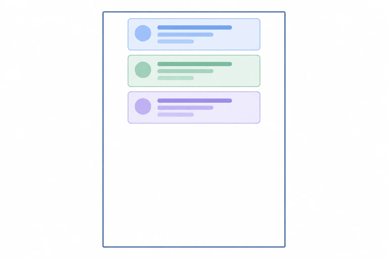
This target will be recreated after you examine how gutters differ from outer container space.
gap creates a gutter between neighboring flex items. It does not add space between the first or last card and the container edge; container padding provides that outer space.
A declared gap remains present with space-between. However, space-between also distributes any remaining main-axis free space between cards. The visible separation can therefore be larger than the declared gap.
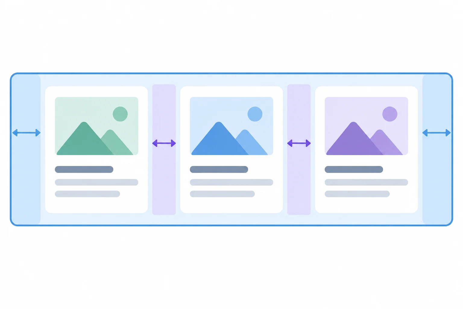
A gap is between items. Main-axis distribution can add more visible space between those same items.
Replace the temporary comparison rules with this combined row arrangement. It keeps the explicit row direction, so the first property controls horizontal distribution and the second controls vertical alignment.
.resources {
  display: flex;
  flex-direction: row;
  width: 48rem;
  height: 14rem;
  justify-content: space-between;
  align-items: center;
  gap: 1rem;
  border: 0.125rem solid #94a3b8;
  padding: 1rem;
}

.resource-card {
  width: 12rem;
  border: 0.125rem solid #cbd5e1;
  padding: 1rem;
}Browser result: the three cards form a horizontally distributed row and are vertically centered in the 14rem-tall content area. The first and last cards meet the padded inner edges. Each visible separation between neighboring cards is 2.625rem: the 1rem gap plus 1.625rem of distributed free space.
This calculation uses the existing content-box sizing: each card’s outer width is 14.25rem, including its padding and border.
Tip
Keep the responsibilities separate:
justify-content places or distributes items on the main axis.align-items positions items on the cross axis.gap creates the recurring space between neighboring items.When direction changes to column, these properties still use the main and cross axes; the physical directions change with the axes.
Use the column target shown earlier. Complete the container recipe for a top-centered vertical stack with a recurring gutter. The 48rem content height is large enough for the three actual cards, their two gutters, and unused space below.
.resources {
  display: flex;
  height: 48rem;
  : ;
  : ;
  : center;
  : 1rem;
  border: 0.125rem solid #94a3b8;
  padding: 1rem;
}

.resource-card {
  width: 12rem;
  border: 0.125rem solid #cbd5e1;
  padding: 1rem;
}
Step 4 of 9
Let the Resource library cards create additional flex lines as their available width becomes too narrow.
A flex container uses one flex line by default: flex-wrap: nowrap. In a row, this keeps all three flex items on the same line. It does not promise that an authored width remains unchanged: when the line is too narrow, items may become narrower within their size constraints rather than move to another line.
For a controlled comparison, give .resources a 30rem content width. The existing cards use the default content-box sizing. Each width: 12rem card also has 1rem padding and 0.125rem borders on both sides, so its outer width is 14.25rem.

With the default nowrap behavior, a narrower flex container still keeps its direct children on one flex line.
For this comparison, replace the current .resources and .resource-card rules with these temporary rules. The 30rem width is the container's content width; its padding and border remain outside that measurement.
.resources {
  display: flex;
  flex-direction: row;
  justify-content: flex-start;
  width: 30rem;
  border: 0.125rem solid #94a3b8;
  padding: 1rem;
  gap: 1rem;
}

.resource-card {
  width: 12rem;
  border: 0.125rem solid #cbd5e1;
  padding: 1rem;
}Browser result: HTML reference, CSS layout notes, and Accessibility checklist remain on one horizontal flex line. No card starts a second line; the cards can be narrower than their authored 12rem content widths.
View this at a browser width that can display the 30rem container and its outer padding. The exact compressed card widths can vary with content, but no second card line is created.
Add flex-wrap: wrap when cards should form additional lines instead of remaining on one crowded row.
Here, two card outer widths require 28.5rem (14.25rem each). With their 1rem gutter, the first line needs 29.5rem, so two cards fit in the 30rem available content width. A third card does not fit and starts a second line.
gap works in both directions: it separates neighboring cards on a line and separates wrapped lines. Each line is laid out independently. With justify-content: flex-start, the lone final card begins at the main-axis start; it does not reserve an empty shared column beside it.
Add the wrapping declaration to the temporary .resources rule, then save styles.css and refresh your browser.
.resources {
  display: flex;
  flex-direction: row;
  flex-wrap: wrap;
  justify-content: flex-start;
  width: 30rem;
  border: 0.125rem solid #94a3b8;
  padding: 1rem;
  gap: 1rem;
}

.resource-card {
  width: 12rem;
  border: 0.125rem solid #cbd5e1;
  padding: 1rem;
}Browser result: HTML reference and CSS layout notes appear on the first line. Accessibility checklist starts a second line at the left main-axis edge. A 1rem gap separates the cards and the two lines.
This result uses the existing card padding and borders, so each card has a 14.25rem outer width. The 1rem gap is visible both between the first two cards and between the two lines.
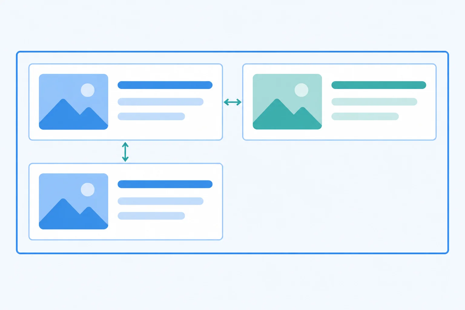
Wrapping creates independent flex lines. The final line has one card at its start, not a blank placeholder that aligns it into a shared column.
Complete the declaration for .resources, then predict the layout at a 30rem available content width. Each card has an outer width of 14.25rem, and the gap is 1rem.
State how many cards appear on the first line, how many appear on the final line, and where the final-line card begins.
Write at least 55 characters (0/55).
Step 5 of 9
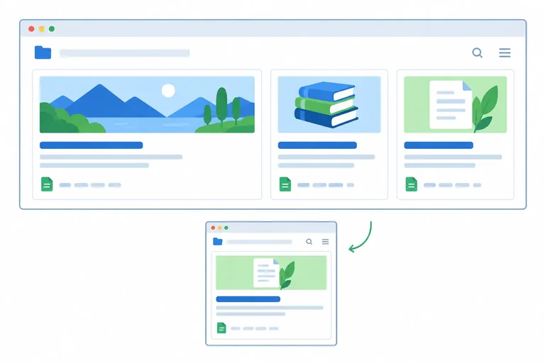
Use flex-basis and flex-grow to start resource cards at a preferred size and distribute positive free space proportionally.
flex-basis gives each flex item a preferred starting size on the main axis. In this row layout, 12rem is the preferred starting width for each resource card.
It is a starting point, not a promise about the final width. When a flex line has positive free space, flex-grow determines whether—and by what proportion—items receive some of that space.
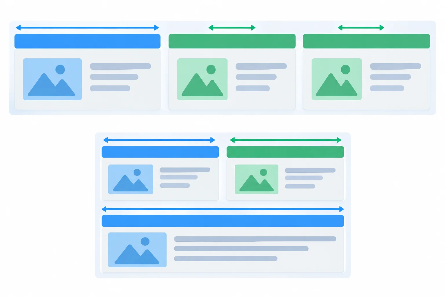
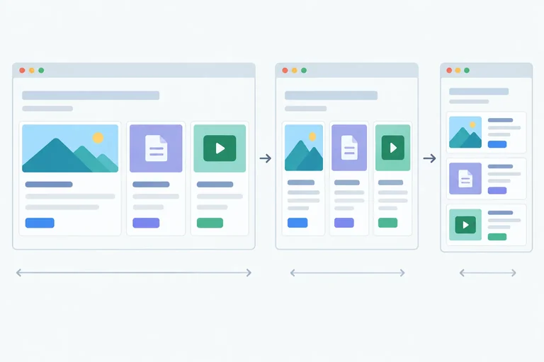
Equal pale areas represent preferred starting sizes. Colored extensions represent positive free space distributed on each flex line.
Use flex-grow only to describe how positive free space is shared on one flex line. A value of 0 leaves an item out of growth. Positive values are relative shares: a factor of 2 receives twice the added space of a factor of 1.
This ratio applies to added space—not to final card widths. If every card starts at 12rem, the featured card’s final width includes its own 12rem starting size plus its larger added share. Wrapped lines resolve their available space independently, so a card alone on a last line can grow.
Compare the meaning of common growth factors when a line has positive free space.
| flex-grow value | Result when space is available |
|---|---|
| 0 | Receives no added space through growth |
| 1 | Receives one relative share |
| 2 | Receives two relative shares |
| 1 and 2 together | The factor 2 item gets twice each factor 1 item’s added share |
Replace the temporary .resources and .resource-card rules from the wrapping comparison with these demonstration rules. The first card already has the resource-card--featured class.
.resources {
  display: flex;
  flex-direction: row;
  flex-wrap: wrap;
  width: 48rem;
  border: 0.125rem solid #94a3b8;
  padding: 1rem;
  gap: 1rem;
}

.resource-card {
  flex-basis: 12rem;
  flex-grow: 1;
  border: 0.125rem solid #cbd5e1;
  padding: 1rem;
}

.resource-card--featured {
  flex-grow: 2;
}Browser result: the three cards appear on one row at the 48rem content width. All begin from the same preferred width, then the featured HTML reference card receives a larger portion of the remaining horizontal space than either ordinary card. The cards remain in document order.
The exact pixel widths depend on the browser’s root font size, but the relative result is the same.
Complete the preferred-size and growth configuration for the Resource library cards.
.resource-card {
  flex-basis: ;
  flex-grow: ;
}

.resource-card--featured {
  flex-grow: ;
}A wide flex line contains three cards. Each has flex-basis: 12rem; the featured card has flex-grow: 2; and each ordinary card has flex-grow: 1. Which interpretation is accurate?
Step 6 of 9
Control whether Resource library cards grow, shrink, and start from a preferred size by reading and writing the complete flex shorthand.
flex-shrink controls whether a flex item participates in becoming smaller when the items on one flex line do not fit.
flex-shrink: 0 keeps that item out of shrinkage.flex-shrink: 1 lets it shrink, subject to minimum-size constraints.A shrink factor is a participation factor, not a number of pixels. Two items with the same factor can lose different pixel amounts when their starting sizes differ.
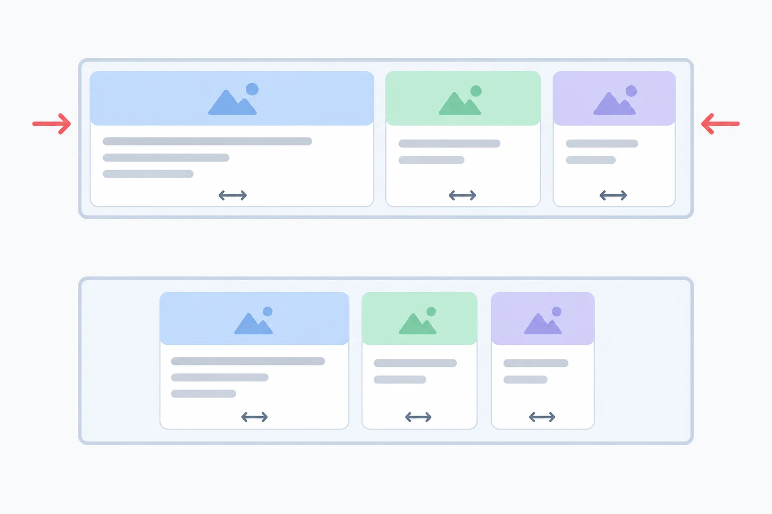
Equal shrink factors do not require equal pixel reductions: an item's starting size also affects shrink distribution.
Tip
flex-wrap and flex-shrink solve different decisions. Wrapping permits another flex line. Shrinking adjusts sizes on a line that has insufficient space. You may use both properties together, but a shrink factor does not turn wrapping on.
The flex shorthand lists three components in this order:
grow → shrink → basis
The basis is the preferred starting main-axis size used in the previous step. The first two numbers state whether an item can receive positive free space or help resolve a shortage of space.
These complete declarations express different sizing policies.
| Declaration | Growth | Shrink | Starting basis |
|---|---|---|---|
| flex: 0 1 auto | No | Yes | auto |
| flex: 0 0 12rem | No | No | 12rem |
| flex: 1 1 12rem | Yes | Yes | 12rem |
For a temporary comparison, replace the sizing declarations from the previous step with these rules. Keep the existing .resources rule, including its 48rem width, wrapping, and 1rem gap.
.resource-card {
  flex: 1 1 12rem;
}

.resource-card--featured {
  flex: 0 0 12rem;
}Browser result after saving and refreshing: The three cards fit on one row at the earlier 48rem container width. The featured HTML reference card stays at its 12rem basis and does not take extra width or shrink. The two ordinary cards may share the remaining positive free space and are wider than their 12rem basis.
Exact final widths vary with the container's available width and the cards' padding and borders. The important result is which cards receive extra space.
Match each complete flex declaration to its behavior.
Tap an item and then its matching pair.
Complete the declaration for resource cards that may both grow and shrink from a preferred 12rem basis.
.resource-card {
  flex:   ;
}
Step 7 of 9
Allow a constrained flex item to shrink while preserving readable, fully visible heading text.
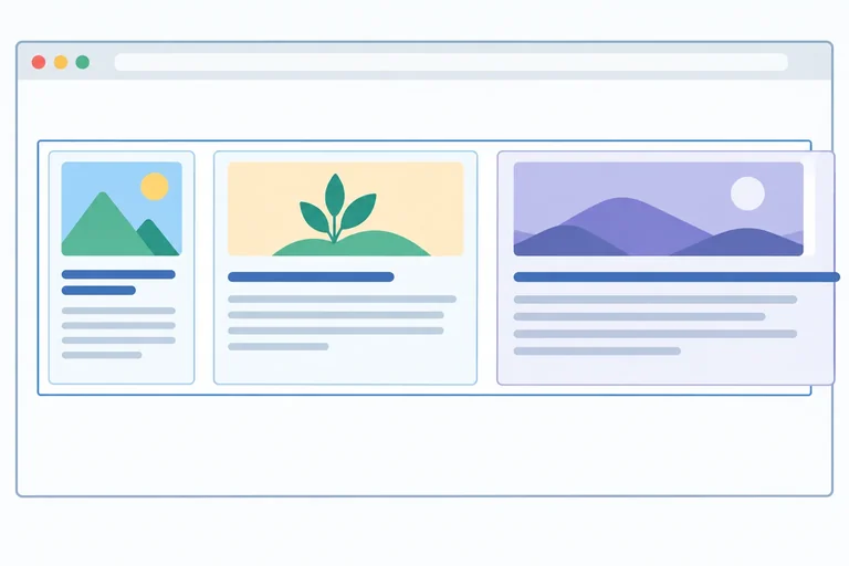
A card can be allowed to shrink and still stop sooner than expected. In this row, flex: 1 1 12rem permits shrinking, but a flex item also has an automatic minimum width based on its content.
A non-wrapping heading makes that content-based minimum wider because its whole phrase must stay on one line. At the 42rem test width below, a card box can therefore resist shrinking and extend the row beyond its container. This is a box-size constraint; it does not mean that Flexbox ignored flex-shrink.
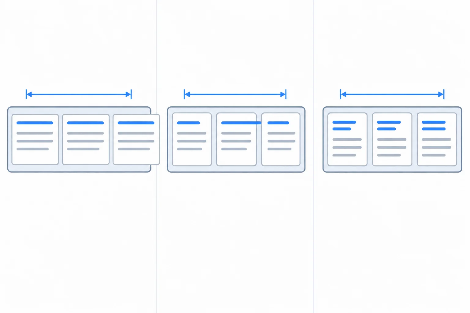
From left to right: an automatic item minimum holds a card box open; min-width: 0 shrinks the box but does not change no-wrap text; normal wrapping completes the readable repair.
For a temporary local comparison, replace the current .resources, .resource-card, and .resource-card--featured rules with these rules. The 42rem content width is narrower than the three cards' preferred outer widths plus two gutters, but is wide enough for the longest individual heading word after normal wrapping is restored.
.resources {
  display: flex;
  flex-direction: row;
  flex-wrap: nowrap;
  width: 42rem;
  border: 0.125rem solid #94a3b8;
  padding: 1rem;
  gap: 1rem;
}

.resource-card {
  flex: 1 1 12rem;
  border: 0.125rem solid #cbd5e1;
  padding: 1rem;
}

.resource-card--featured {
  flex: 1 1 12rem;
}

.resource-title {
  white-space: nowrap;
}Browser result: the three cards remain on one row. Their headings remain on one line, and a card box can keep the row wider than the 42rem container content width rather than producing a readable narrow-card layout.
Expected browser result after saving styles.css and refreshing index.html.
Repair the box and the text as separate concerns. Apply min-width: 0 to the constrained flex item—here, each .resource-card. This permits its box to become narrower than its automatic minimum width.
That change alone does not make a non-wrapping heading readable: the box can shrink while its heading still paints outside it. Restore white-space: normal so ordinary heading words can wrap within the smaller card.
Removing a no-wrap rule can resolve some layouts by itself. Conversely, min-width: 0 is a targeted flex-item safeguard, not a universal fix for every kind of overflow.
Keep the temporary .resources rule from the previous screen. Replace the card and title rules with these readable-shrink rules.
.resource-card {
  flex: 1 1 12rem;
  min-width: 0;
  border: 0.125rem solid #cbd5e1;
  padding: 1rem;
}

.resource-card--featured {
  flex: 1 1 12rem;
}

.resource-title {
  white-space: normal;
}Browser result: all three card boxes can shrink within the narrow row. Multi-word headings use additional lines as needed, and the heading text remains fully visible inside its card.
Expected browser result after saving styles.css and refreshing index.html at the same 42rem test width.
Warning
Do not hide essential headings with overflow: hidden or truncation merely to make a narrow row look tidy. A heading that wraps remains understandable; a clipped heading removes information from the reader.
Complete the two declarations for a card that must shrink at the narrow test width while keeping its heading readable.
.resource-card {
  flex: 1 1 12rem;
  min-width: ;
}

.resource-title {
  white-space: ;
}At a test width that accommodates each longest individual heading word after wrapping is enabled, choose the rule pair that explicitly removes the affected flex item's automatic minimum-width barrier, keeps its heading readable, and does not hide essential content.
Step 8 of 9
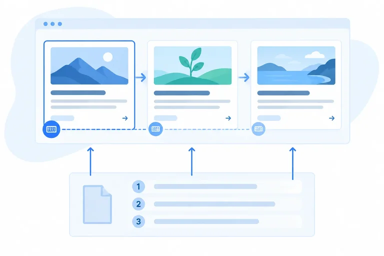
Keep Flexbox presentation aligned with the meaningful source and keyboard sequence.
The HTML source sequence is the document order. It provides the meaningful reading sequence and, for the cards’ native links, the expected sequence when a keyboard user presses Tab.
Flexbox can change where cards appear without changing that source sequence. When visual placement differs from document order, a person reading left to right may encounter cards in a different sequence from a keyboard user.
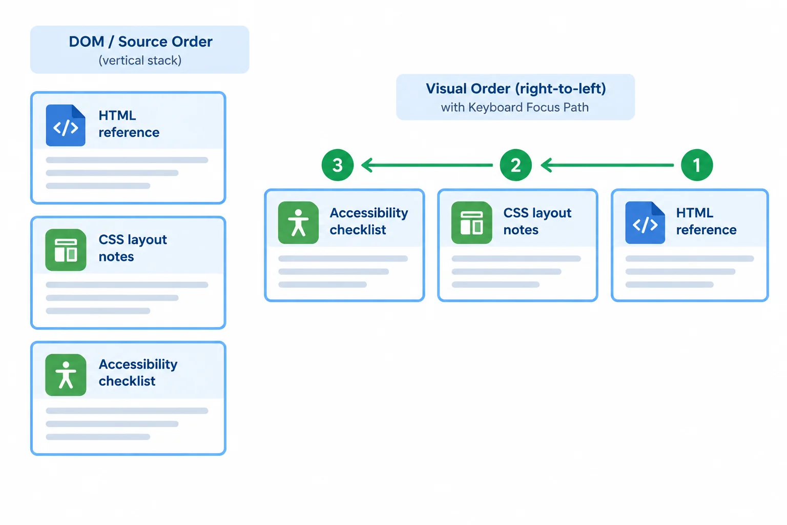
Flexbox can change presentation without rewriting document order.
Two Flexbox features can create a mismatch:
flex-direction: row-reverse reverses visual placement along a row.flex-direction: column-reverse reverses visual placement in a column.order changes a flex item’s visual placement relative to its siblings.None of them moves an <article> in the HTML. Native link focus still follows the source. Avoid visual reordering when it would make the page’s meaningful sequence unclear.
Temporary comparison: add this to the current .resources rule, save, and refresh your browser.
.resources {
  display: flex;
  flex-direction: row-reverse;
  gap: 1rem;
}Visual row, left to right: Accessibility checklist, CSS layout notes, HTML reference. After reloading, Tab reaches Read HTML notes, then Read CSS notes, then Read accessibility notes.
Expected browser result after saving the CSS. The existing width, card sizing, and other declarations remain in effect.
Separate comparison: first restore flex-direction: row, then temporarily add this rule, save, and refresh. Do not combine this comparison with row-reverse.
.resource-card--featured {
  order: 1;
}Visual row, left to right: CSS layout notes, Accessibility checklist, HTML reference. After reloading, Tab still reaches Read HTML notes, then Read CSS notes, then Read accessibility notes.
Expected browser result after saving the CSS with a normal row direction.
Warning
Do not use order, row-reverse, or column-reverse to simulate a new reading sequence. If a different sequence is genuinely meaningful, place the corresponding HTML elements in that sequence instead.
For this Resource library, preserve the established document order: HTML reference, CSS layout notes, then Accessibility checklist.
Delete any temporary reverse-direction declaration and any order override. A normal row lets the visual sequence match the document sequence. Wrapping and gap adapt the layout without changing its meaning.
Use this normal container arrangement after removing the temporary visual-reordering rules. Keep your existing card sizing and readable text rules.
.resources {
  display: flex;
  flex-direction: row;
  flex-wrap: wrap;
  gap: 1rem;
}At a wide viewport, the visual row reads left to right: HTML reference, CSS layout notes, Accessibility checklist. At narrower widths, cards may wrap onto additional lines, but their document and Tab sequence remains Read HTML notes, Read CSS notes, Read accessibility notes.
Expected browser result after saving the CSS and reloading the local page.
Tip
Save both local files and refresh the browser. At a width where the three cards share a row, compare the visual sequence with the HTML sequence.
Then reload the page and press Tab. Leave the native focus indicator visible. It should move through the card links in the same meaningful sequence, even if wrapping creates additional lines.
A preview displays these cards from left to right: Accessibility checklist, CSS layout notes, HTML reference. Arrange the article headings in the intended document order that repairs this mismatch.
Step 9 of 9
Build and locally verify a wrapping Flexbox resource library with readable content and a meaningful keyboard sequence.
Replace the temporary comparison rules with the complete final local page. Keep index.html and styles.css in the same folder. The articles remain in meaningful document order, and each link points to a destination in this file.
index.html
<!doctype html>
<html lang="en">
<head>
  <meta charset="utf-8">
  <title>Resource library</title>
  <link rel="stylesheet" href="styles.css">
</head>
<body>
  <main>
    <h1>Resource library</h1>

    <div class="resources">
      <article class="resource-card resource-card--featured">
        <h2 class="resource-title">HTML reference</h2>
        <p>Review the elements that give page content meaning.</p>
        <a href="#html-notes">Read HTML notes</a>
      </article>

      <article class="resource-card">
        <h2 class="resource-title">CSS layout notes</h2>
        <p>Use layout rules to arrange content clearly.</p>
        <a href="#css-notes">Read CSS notes</a>
      </article>

      <article class="resource-card">
        <h2 class="resource-title">Accessibility checklist</h2>
        <p>Check that content remains usable for everyone.</p>
        <a href="#accessibility-notes">Read accessibility notes</a>
      </article>
    </div>

    <section id="html-notes">
      <h2>HTML reference</h2>
      <p>Semantic elements describe the purpose of content.</p>
    </section>

    <section id="css-notes">
      <h2>CSS layout notes</h2>
      <p>Layout rules control how content uses available space.</p>
    </section>

    <section id="accessibility-notes">
      <h2>Accessibility checklist</h2>
      <p>Meaningful order supports reading and keyboard navigation.</p>
    </section>
  </main>
</body>
</html>Resource library Three resource cards appear before the destination sections: HTML reference CSS layout notes Accessibility checklist Each card contains its matching link. Selecting a link moves to its matching section lower on the page.
After you also save the stylesheet from the next screen, exact line breaks and card rows vary with the browser width.
This stylesheet makes .resources a wrapping flex container with a 1rem gutter. Every card starts from a 12rem preferred size, can grow and shrink, and may shrink below its automatic minimum when needed. The featured card receives a larger share of extra space on a line, while normal wrapping keeps text visible.
styles.css
body {
  font-family: system-ui, sans-serif;
  margin: 0;
  padding: 2rem;
}

.resources {
  display: flex;
  flex-direction: row;
  flex-wrap: wrap;
  gap: 1rem;
  border: 0.125rem solid #94a3b8;
  padding: 1rem;
}

.resource-card {
  flex: 1 1 12rem;
  min-width: 0;
  border: 0.125rem solid #cbd5e1;
  padding: 1rem;
}

.resource-card--featured {
  flex: 2 1 12rem;
}

.resource-title {
  margin-top: 0;
  white-space: normal;
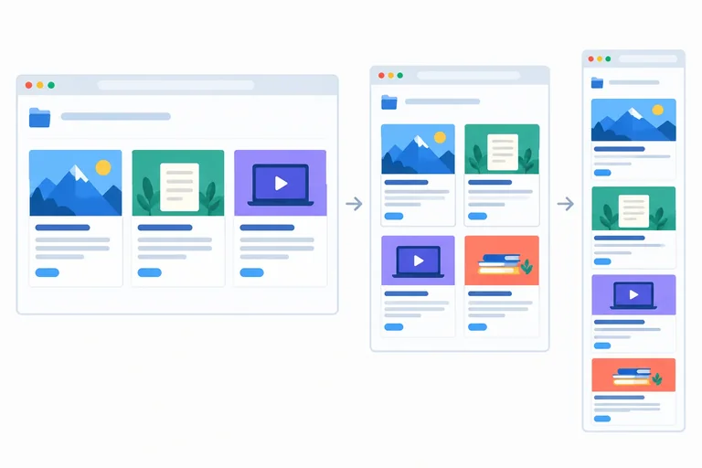
}Wide browser: the three cards can share one horizontal row with 1rem gutters. The featured HTML reference card receives a larger share of positive free space. Narrower browser: cards move onto additional flex lines as space runs out. Card headings and text remain fully visible and can wrap normally. Tab navigation follows the links in HTML reference, CSS layout notes, Accessibility checklist order.
The precise number of cards per line and final card widths depend on the available browser width. No text should be clipped.
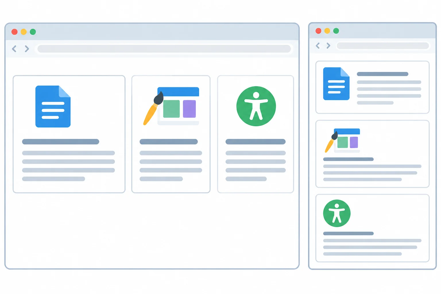
Extra width is shared within a flex line. As width decreases, cards wrap in document order rather than hiding their content.
Complete the essential shared rules for the final layout.
.resources {
  display: ;
  flex-direction: ;
  flex-wrap: ;
  gap: ;
}

.resource-card {
  flex:  1 12rem;
  min-width: ;
}Save both files, then open or refresh index.html in your browser. Compare a wide window with a narrower window until cards need another line. Confirm that no essential heading or paragraph text disappears. Then reload the page, focus the page, and use Tab through the three card links. Report the visual behavior and the focus sequence you observed.
Write at least 100 characters (0/100).
Summary
.resources is the flex container: it creates a wrapping row and provides 1rem gutters between flex items..resource-card uses flex: 1 1 12rem as its flexible sizing policy; the featured override only changes its share of extra space.min-width: 0 permits a constrained flex item to shrink, while white-space: normal keeps essential text readable rather than clipped.Congratulations! You completed: Arrange Content with Flexbox
Thousands of online courses in video, ebooks and audiobooks.
To test your knowledge during online courses
Generated directly from your cell phone's photo gallery and sent to your email

Download our app via QR Code or the links below:.


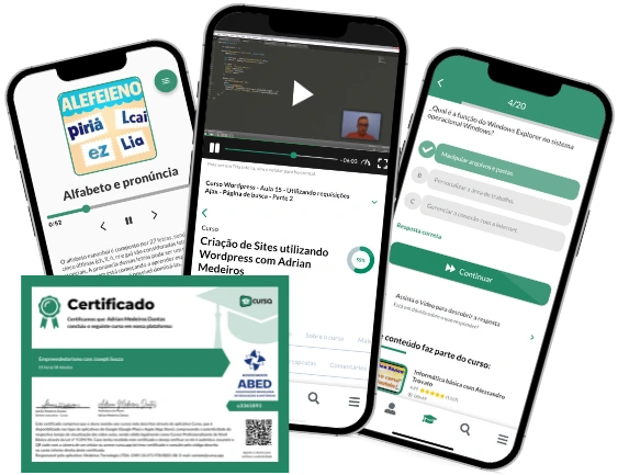
Carry knowledge in your pocket.
Download the Cursa app.
There are hundreds of free courses available, with a free certificate of completion that is saved in your mobile image gallery.
Download the app to access the Course Completion Certificate for Free.


+ 10 million
students

Free and Valid
Certificate

60 thousand free
exercises

4.8/5 rating in
app stores

Free courses in
video and ebooks