
Step 1 of 9
Keep Layout in Flow
Compare static positioning with relative visual offsets, then set up a scrollable Workshop Guide page for later positioning examples.

Learning path · Level 3 · Tutorial 6
Position overlays, sticky headers, and fixed utilities deliberately, then resolve layering conflicts without hiding content or disrupting reading and keyboard order.

 Keep Layout in Flow
Compare static positioning with relative visual offsets, then set up a scrollable Workshop Guide page for later positioning examples. 2 min
Keep Layout in Flow
Compare static positioning with relative visual offsets, then set up a scrollable Workshop Guide page for later positioning examples. 2 min
 Anchor an Absolute Overlay
Attach the Workshop Guide’s Featured badge to the correct card with absolute positioning and explicit edge offsets. 3 min
Anchor an Absolute Overlay
Attach the Workshop Guide’s Featured badge to the correct card with absolute positioning and explicit edge offsets. 3 min
 Place a Viewport Utility
Position the native Back to top utility with fixed positioning, then recognize when a transformed ancestor changes its reference frame. 2 min
Place a Viewport Utility
Position the native Back to top utility with fixed positioning, then recognize when a transformed ancestor changes its reference frame. 2 min
 Make a Header Sticky
Configure a sticky Workshop Guide header, identify its threshold, and predict how its containing block limits its movement. 3 min
Make a Header Sticky
Configure a sticky Workshop Guide header, identify its threshold, and predict how its containing block limits its movement. 3 min
 Diagnose Sticky Constraints
Diagnose failed sticky behavior by tracing overflow ancestors, the active scroll container, and available containing-block travel. 3 min
Diagnose Sticky Constraints
Diagnose failed sticky behavior by tracing overflow ancestors, the active scroll container, and available containing-block travel. 3 min
 Read Local Layer Levels
Recognize the stacking contexts created by the positioning rules used in the tutorial. 3 min
Read Local Layer Levels
Recognize the stacking contexts created by the positioning rules used in the tutorial. 3 min
 Resolve Nested Layering Conflicts
Trace nested stacking contexts to find the level that actually controls an overlap, then repair the ancestor instead of escalating a child’s z-index. 3 min
Resolve Nested Layering Conflicts
Trace nested stacking contexts to find the level that actually controls an overlap, then repair the ancestor instead of escalating a child’s z-index. 3 min
 Keep Content and Focus Accessible
Correct positioned overlaps while keeping Workshop Guide content, controls, and keyboard focus visible. 3 min
Keep Content and Focus Accessible
Correct positioned overlaps while keeping Workshop Guide content, controls, and keyboard focus visible. 3 min
 Repair and Verify the Complete Page
Repair the complete Workshop Guide, then verify its positioning, layers, utility fallback, and focus visibility in a local browser. 3 min
Repair and Verify the Complete Page
Repair the complete Workshop Guide, then verify its positioning, layers, utility fallback, and focus visibility in a local browser. 3 min
Step 1 of 9
Compare static positioning with relative visual offsets, then set up a scrollable Workshop Guide page for later positioning examples.
Use positioning to adjust a selected element—not to replace Grid for the workshop cards or normal flow for the page structure.
position: static keeps an element in normal flow. Its top and left values do not reposition it.
position: relative also retains its original space in normal flow, but it can visually shift its rendered box. A positive top moves that box down; a positive left moves it right. Neighboring content does not move into the original, retained space.
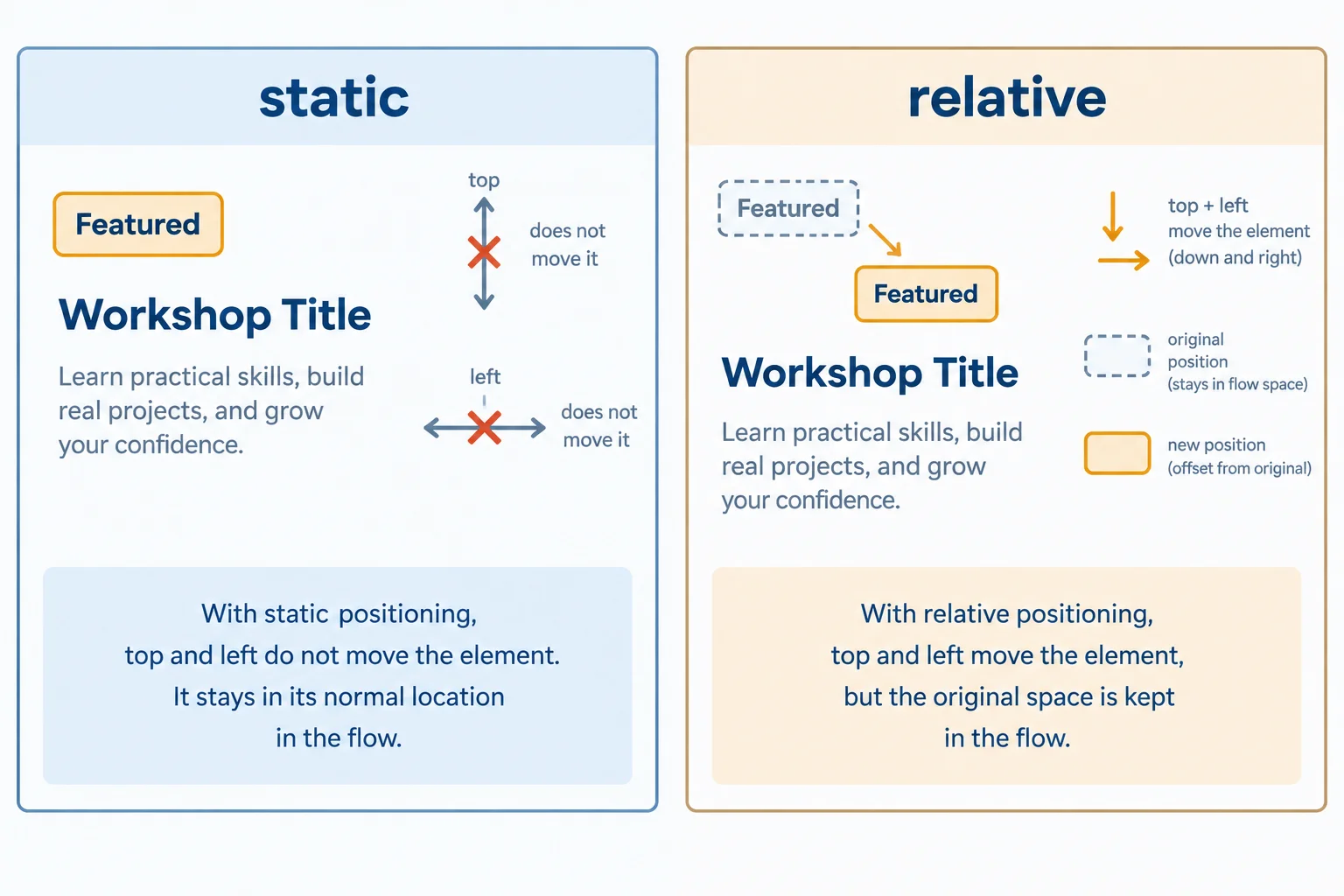
Dashed outline: retained flow space. Solid outline: rendered box.
Create index.html and styles.css in the same local folder. Paste the two complete files below, then open or refresh index.html in your browser.
The starter uses Grid for the cards. Its intentional minimum page height guarantees a vertical scroll range for later positioning observations; it is a tutorial fixture, not a replacement for content-driven page sizing.
index.html
<!doctype html>
<html lang="en">
  <head>
    <meta charset="utf-8">
    <meta name="viewport" content="width=device-width, initial-scale=1">
    <title>Workshop Guide</title>
    <link rel="stylesheet" href="styles.css">
  </head>
  <body id="page-top">
    <header class="site-header">
      <strong>Workshop Guide</strong>
      <a href="#schedule">Workshop schedule</a>
    </header>

    <main class="page-content">
      <h1>Choose a workshop</h1>
      <p>Choose a practical session and prepare for focused work.</p>

      <section class="workshop-list" aria-label="Workshops">
        <article class="workshop-card">
          <span class="card-badge">Featured</span>
          <h2>HTML Lab</h2>
          <p>Build a structured workshop page with meaningful HTML.</p>
          <a href="#schedule">View workshop schedule</a>
        </article>
        <article class="workshop-card">
          <h2>CSS Studio</h2>
          <p>Explore layout and surface styles.</p>
          <a href="#schedule">View workshop schedule</a>
        </article>
        <article class="workshop-card">
          <h2>Accessibility Clinic</h2>
          <p>Review focus and reading order.</p>
          <a href="#schedule">View workshop schedule</a>
        </article>
      </section>

      <section id="schedule">
        <h2>Workshop schedule</h2>
        <p>Sessions run throughout the week.</p>
        <p>Bring notes and questions to your selected workshop.</p>
      </section>
    </main>

    <a class="page-utility" href="#page-top">Back to top</a>
  </body>
</html>
styles.css — static badge
:root {
  font-family: system-ui, sans-serif;
  color: #1f2937;
  background: #f8fafc;
}

* {
  box-sizing: border-box;
}

body {
  margin: 0;
  line-height: 1.5;
}

a:focus-visible {
  outline: 3px solid #b45309;
  outline-offset: 3px;
}

.site-header {
  display: flex;
  flex-wrap: wrap;
  justify-content: space-between;
  gap: 1rem;
  padding: 1rem;
  background: #16324f;
  color: #ffffff;
}

.site-header a {
  color: #ffffff;
}

.page-content {
  max-width: 70rem;
  min-height: calc(100vh + 20rem);
  margin: 0 auto;
  padding: 2rem 1rem 5rem;
}

.workshop-list {
  display: grid;
  grid-template-columns: repeat(auto-fit, minmax(14rem, 1fr));
  gap: 1rem;
}

.workshop-card {
  padding: 1rem;
  border: 1px solid #94a3b8;
  border-radius: 0.5rem;
  background: #ffffff;
}

.card-badge {
  position: static;
  top: 0.5rem;
  left: 1rem;
  display: inline-block;
  padding: 0.25rem 0.5rem;
  border-radius: 0.25rem;
  background: #fef3c7;
}

#schedule {
  margin-top: 3rem;
}

.page-utility {
  display: inline-block;
  margin: 1rem;
}Browser result: A dark Workshop Guide header appears above “Choose a workshop.” HTML Lab, CSS Studio, and Accessibility Clinic appear as Grid cards. The Featured badge sits in its ordinary inline location before the HTML Lab heading: its top and left values have no visible effect. The page has a vertical scroll range.
The page can scroll because `.page-content` is taller than the viewport. At this stage, scrolling moves every visible page element because none is fixed or sticky.
The starter badge has offset values, but static positioning ignores them. To make a small visual adjustment, replace only the .card-badge rule with the version below.
The rendered badge moves down by 0.5rem and right by 1rem. Its original space remains reserved, so the HTML Lab heading does not move up or left to fill that space.
Replace the existing .card-badge rule
.card-badge {
  position: relative;
  top: 0.5rem;
  left: 1rem;
  display: inline-block;
  padding: 0.25rem 0.5rem;
  border-radius: 0.25rem;
  background: #fef3c7;
}Browser result: The Featured badge in the HTML Lab card appears 0.5rem lower and 1rem to the right of its earlier location. The heading and paragraph remain laid out as if the badge had not moved, leaving its original flow space reserved.
The dashed retained space is a conceptual aid from the diagram; browsers do not draw it.
Tip
A relative offset can create visible overlap because the rendered box moves while its original layout space remains. Use it for a small adjustment, not instead of the card Grid or intentional spacing.
Match each positioning example to its rendered outcome.
Tap an item and then its matching pair.
Complete the relative-offset rule and identify where the badge's original space remains reserved.
.card-badge {
  position: ;
  top: ;
  left: ;
}

/* Its original space remains in . */
Step 2 of 9
Attach the Workshop Guide’s Featured badge to the correct card with absolute positioning and explicit edge offsets.
Use position: absolute for an element that should visually sit over another element, such as the Featured badge. It is removed from normal flow, so it reserves no space among its siblings. Grid still arranges the workshop cards; positioning only adjusts the badge.
In this untransformed example, an absolutely positioned element uses its nearest non-static ancestor as its containing block. That ancestor does not have to be the immediate parent.
Set position: relative on .workshop-card. With no offsets on the card itself, this establishes the intended anchor without moving the card.
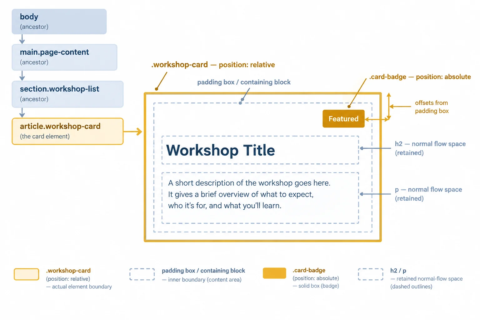
The badge has no retained flow space. The card is the nearest non-static ancestor, so its padding box supplies the badge’s offset reference.
In styles.css, replace the existing .workshop-card and .card-badge rules with these complete rules. Do not change the existing HTML Lab markup or text in index.html.
The card’s larger top padding reserves a dedicated band for the out-of-flow badge, so the heading and paragraph remain clear.
.workshop-card {
  position: relative;
  padding: 3rem 1rem 1rem;
  border: 1px solid #94a3b8;
  border-radius: 0.5rem;
  background: #ffffff;
}

.card-badge {
  position: absolute;
  inset: 0.5rem 1rem auto auto;
  display: inline-block;
  padding: 0.25rem 0.5rem;
  border-radius: 0.25rem;
  background: #fef3c7;
}Workshop Guide after refresh: - The Featured badge appears in the upper-right area of the HTML Lab card. - The HTML Lab heading begins below the badge rather than beneath it. - CSS Studio and Accessibility Clinic have no badge. - When the card moves with the Grid layout, the Featured badge moves with that card.
Visual browser result after saving `styles.css` and refreshing `index.html`.
Example
position: relative is the anchor here, not a request to shift the card. The .card-badge is positioned independently, but it follows the HTML Lab card whenever that card changes location within .workshop-list.
Absolute offsets are measured from the edges of the positioned ancestor’s padding box. top, right, bottom, and left select the edge to offset from. The four-value inset shorthand uses top-right-bottom-left order.
In the badge rule, inset: 0.5rem 1rem auto auto; places the badge 0.5rem from the card’s top padding edge and 1rem from its right padding edge. auto leaves the bottom and left offsets unspecified.
Without a qualifying ancestor, the badge would use the initial containing block instead of a card-specific anchor.
Offset reference for the badge
| Property | Meaning in this card |
|---|---|
| top | Distance from the top padding edge |
| right | Distance from the right padding edge |
| bottom | Distance from the bottom padding edge |
| left | Distance from the left padding edge |
| inset | Shorthand: top right bottom left |
Tip
The badge is outside normal flow, so it cannot make the card taller or push the heading away. Reserve room for its actual footprint with padding or another intentional layout choice. Do not assume an overlay will create room for itself.
Using the ancestor diagram, complete the card-and-badge CSS. Identify the selector that establishes the containing block, then complete the overlay rule.
. {
  position: ;
  padding: 3rem 1rem 1rem;
}

. {
  position: ;
  inset: ;
}
Step 3 of 9
Position the native Back to top utility with fixed positioning, then recognize when a transformed ancestor changes its reference frame.
position: fixed removes an element from normal flow. In the ordinary case, its offsets use the viewport as the reference, so page content can scroll while the fixed element stays at its chosen viewport edge.
Use this for a small persistent utility, not for the ordinary page layout. The Workshop Guide already uses a native Back to top link with href="#page-top"; selecting it follows the fragment link to the body target. No JavaScript is needed.
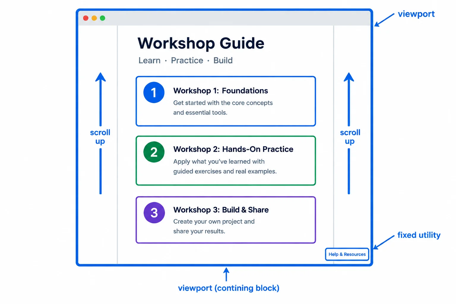
The utility's rendered box stays at the viewport edge, but it does not retain a space in the document layout.
In styles.css, add this rule after the starter’s existing .page-utility rule. The HTML already contains the required link near the end of the body. Save, refresh index.html, scroll, and select the link to confirm its native fragment behavior.
.page-utility {
  position: fixed;
  right: 1rem;
  bottom: 1rem;
  margin: 0;
}
Expected browser result: - The “Back to top” link remains 1rem from the viewport’s right and bottom edges while the Workshop Guide content scrolls. - The workshop cards and Workshop schedule can pass behind the link because it reserves no normal-flow space. - Selecting “Back to top” moves the document to the element with id="page-top".
Browser rendering is visual. The exact page position after selecting the fragment link depends on the browser's current scroll position.
Warning
A fixed element does not create a gap where it would have appeared in normal flow. As you scroll, ordinary content can pass behind the Back to top link. That persistence is useful only when the utility does not obstruct content or controls.
A non-none transform on an ancestor can establish the containing block for fixed and absolute descendants. Therefore, fixed does not always mean viewport-relative.
If .page-utility becomes a descendant of transformed .page-content, its right and bottom offsets reference .page-content rather than the viewport. Keep the utility outside that transformed ancestor when it is intended to follow the viewport.
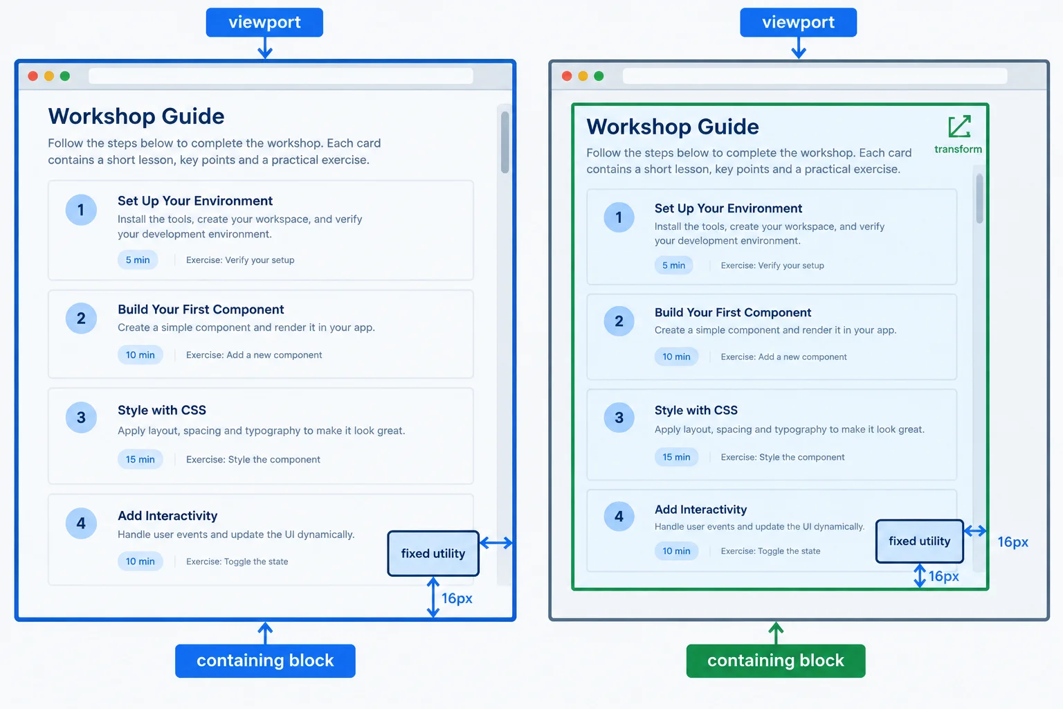
Offsets reference the viewport in the ordinary case, but a transformed ancestor can become the containing block for its fixed descendant.
For this temporary experiment, cut the existing utility link from after </main> and place that exact link immediately before the closing </main> tag. Keep all existing Workshop Guide content inside the main element.
<main class="page-content">
  <!-- Existing Workshop Guide content remains here. -->

  <a class="page-utility" href="#page-top">Back to top</a>
</main>Temporarily add this deliberately broken variation after the fixed utility rule, then refresh and scroll. When you finish observing it, remove this rule and return the utility link to its original position after </main>.
/* Deliberately broken: changes the fixed utility's containing block. */
.page-content {
  transform: translate(0);
}
Expected browser result with the temporary variation: - The transformed .page-content boundary, not the viewport, becomes the utility's containing block. - The utility is positioned from .page-content's right and bottom edges. - During document scrolling, the utility moves with that page-content region instead of remaining at one viewport edge.
Browser rendering is visual. The utility's exact moment of appearance varies with the height of `.page-content` and the current document scroll position.
Complete the fixed-edge rule and the two diagnostic comments for the Workshop Guide.
.page-utility {
  position: ;
  right: ;
  bottom: ;
}

/* An absolute utility inside .page-content  with document scrolling. */
/* A fixed utility inside transformed .page-content uses  as its containing block. */
Step 4 of 9
Configure a sticky Workshop Guide header, identify its threshold, and predict how its containing block limits its movement.
position: sticky retains the header’s original slot in normal flow. As its rendered box shifts during scrolling, that flow space remains reserved.
For vertical sticking, a non-auto inset such as top: 0 creates the threshold. Once the header reaches that threshold, it is held at the top edge of its nearest scroll container’s scrollport.
Sticky is not fixed. A fixed element is removed from normal flow and reserves no normal-flow space. A sticky element also remains constrained by its containing block: when that boundary ends, it cannot keep sticking beyond it.
Read the dashed outline as the flow slot and the solid outline as the rendered header.
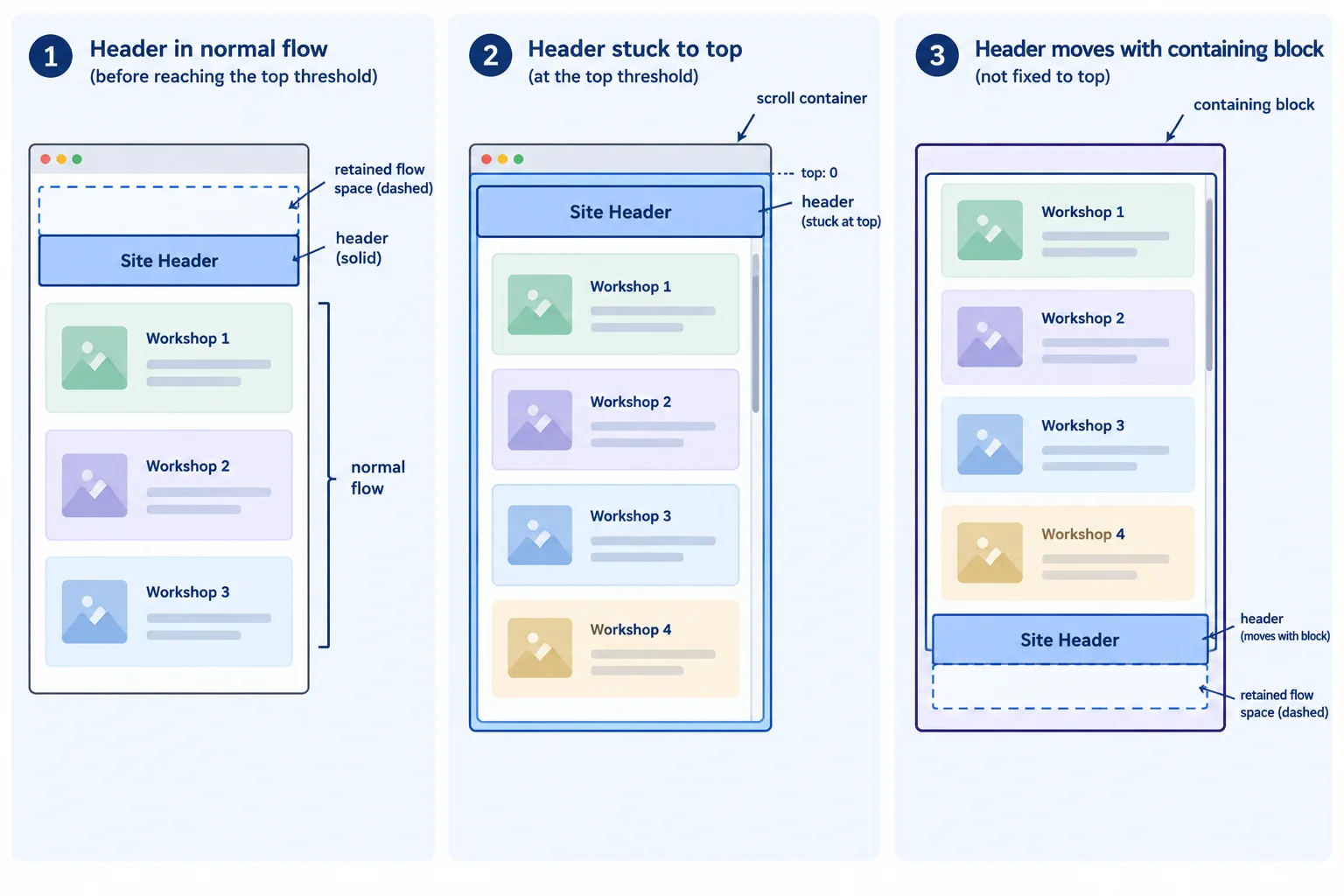
Sticky keeps its normal-flow slot throughout. Only its rendered box shifts, and only within the containing block.
In your existing Workshop Guide files, add the following rule after the existing .site-header rule in styles.css. The page already has enough vertical content for you to scroll.
Save, refresh index.html, and scroll downward. The header remains part of normal flow: its original slot is still reserved while its rendered box is held at the threshold. It is not an out-of-flow fixed header.
Add this rule after the existing .site-header rule in styles.css.
.site-header {
  position: sticky;
  top: 0;
}Browser result after saving and refreshing index.html: At the page start: the Workshop Guide header appears in its normal position at the top of the page. While scrolling downward: the rendered header stays at the top edge of the scrolling view while the page content moves beneath it. Its original normal-flow slot remains reserved. Near the end of its containing block: the header moves with that boundary instead of continuing beyond it.
This is an expected browser result, not console output. The exact amount of scrolling depends on the browser window height.
Watch the same header pass through its three sticky states.
The flow slot remains reserved; the rendered header shifts only after its threshold and only within its containing block.
Complete the Workshop Guide rule so the header retains its normal-flow slot and begins shifting when it reaches the top edge.
.site-header {
  position: ;
  top: ;
}Match the configuration cues and scrolling states to the expected header behavior.
Tap an item and then its matching pair.

Step 5 of 9
Diagnose failed sticky behavior by tracing overflow ancestors, the active scroll container, and available containing-block travel.
When sticky behavior seems to fail, do not start by changing top. Trace the environment in this order:
overflow: auto, scroll, or hidden.An overflow ancestor can become the relevant scroll container, even if it has no visible scrollbar. For example, overflow: hidden can capture sticky behavior while the document page—not that ancestor—is what visibly scrolls.
Sticky also needs room to travel. A short containing block, or one filled by the sticky element itself, can leave little or no time in the stuck state.
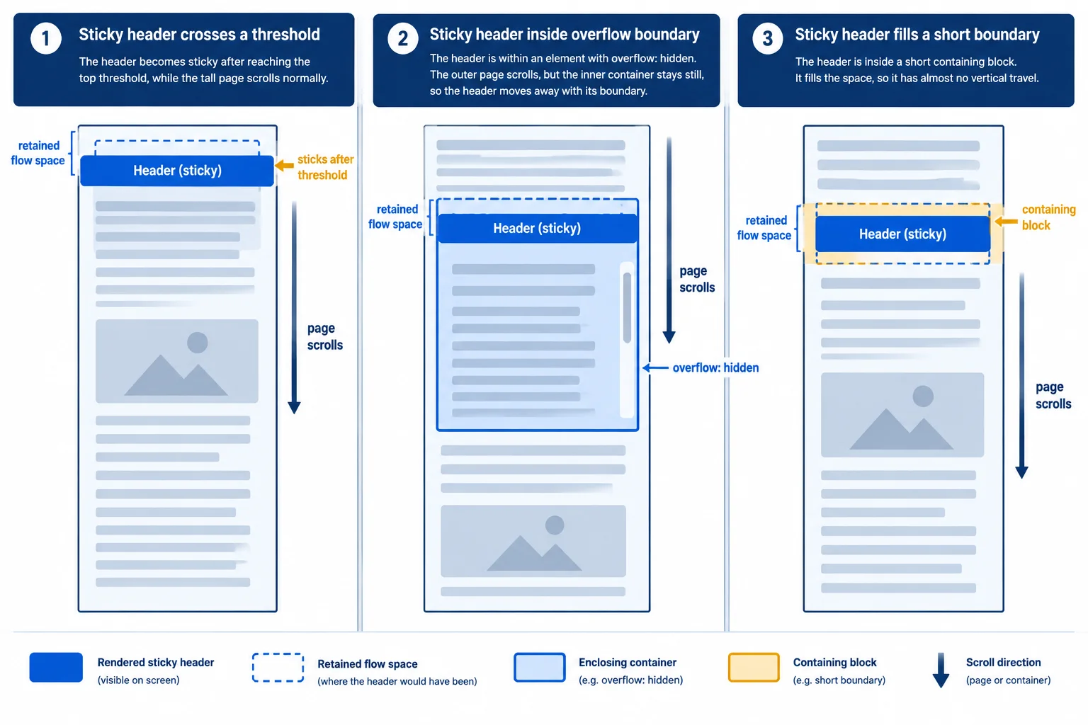
Find the relevant scroll container, observe what scrolls, then measure the available space within the containing block.
Create a temporary local folder named case-a so this diagnostic does not replace your Workshop Guide files. Create index.html in that folder and paste this complete case. The .page-shell is a real ancestor of .site-header, so its overflow can affect the header’s sticky behavior.
<!doctype html>
<html lang="en">
  <head>
    <meta charset="utf-8">
    <meta name="viewport" content="width=device-width, initial-scale=1">
    <title>Workshop Guide</title>
    <link rel="stylesheet" href="styles.css">
  </head>
  <body id="page-top">
    <div class="page-shell">
      <header class="site-header">
        <strong>Workshop Guide</strong>
        <a href="#schedule">Workshop schedule</a>
      </header>

      <main class="page-content">
        <h1>Choose a workshop</h1>
        <section class="workshop-list" aria-label="Workshops">
          <article class="workshop-card"><span class="card-badge">Featured</span><h2>HTML Lab</h2><p>Build a structured workshop page with meaningful HTML.</p><a href="#schedule">View workshop schedule</a></article>
          <article class="workshop-card"><h2>CSS Studio</h2><p>Explore layout and surface styles.</p><a href="#schedule">View workshop schedule</a></article>
          <article class="workshop-card"><h2>Accessibility Clinic</h2><p>Review focus and reading order.</p><a href="#schedule">View workshop schedule</a></article>
        </section>
        <section id="schedule"><h2>Workshop schedule</h2><p>Sessions run throughout the week.</p></section>
      </main>
    </div>
    <a class="page-utility" href="#page-top">Back to top</a>
  </body>
</html>Create styles.css beside index.html. Save both files, open index.html, and scroll the document page. Then replace the entire .page-shell rule with the repaired rule shown in the expected result and test again.
* {
  box-sizing: border-box;
}

body {
  margin: 0;
  font-family: system-ui, sans-serif;
  line-height: 1.5;
}

/* Deliberately broken: this ancestor captures sticky behavior. */
.page-shell {
  overflow: hidden;
}

.site-header {
  position: sticky;
  top: 0;
  display: flex;
  flex-wrap: wrap;
  justify-content: space-between;
  gap: 1rem;
  padding: 1rem;
  background: #16324f;
  color: #ffffff;
}

.site-header a {
  color: #ffffff;
}

.page-content {
  min-height: calc(100vh + 20rem);
  max-width: 70rem;
  margin: 0 auto;
  padding: 2rem 1rem;
}

.workshop-list {
  display: grid;
  grid-template-columns: repeat(auto-fit, minmax(14rem, 1fr));
  gap: 1rem;
}

.workshop-card {
  padding: 1rem;
  border: 1px solid #94a3b8;
  border-radius: 0.5rem;
}

.card-badge {
  display: inline-block;
  padding: 0.25rem 0.5rem;
  background: #fef3c7;
}

#schedule {
  margin-top: 3rem;
}

.page-utility {
  display: inline-block;
  margin: 1rem;
}Broken state with overflow: hidden:
- The document page scrolls.
- The header scrolls out of view instead of remaining at the viewport top.
- .page-shell has no visible scrollbar, but it is the header's relevant scroll container.
Repaired state after replacing the .page-shell rule with:
.page-shell {
overflow: visible;
}
- The document page remains the relevant scrolling area.
- After the header reaches the top threshold, it remains at the viewport top while the page content scrolls beneath it.Browser visual output after both local files are saved and the page is scrolled.
Create another temporary local folder named case-b. This complete case uses a short .header-wrapper as the sticky header’s containing block. The introductory area lets you scroll until the header reaches its threshold.
<!doctype html>
<html lang="en">
  <head>
    <meta charset="utf-8">
    <meta name="viewport" content="width=device-width, initial-scale=1">
    <title>Workshop Guide</title>
    <link rel="stylesheet" href="styles.css">
  </head>
  <body id="page-top">
    <p class="scroll-intro">Scroll to bring the Workshop Guide header to the top edge.</p>

    <div class="header-wrapper">
      <header class="site-header">
        <strong>Workshop Guide</strong>
        <a href="#schedule">Workshop schedule</a>
      </header>
    </div>

    <main class="page-content">
      <h1>Choose a workshop</h1>
      <section class="workshop-list" aria-label="Workshops">
        <article class="workshop-card"><span class="card-badge">Featured</span><h2>HTML Lab</h2><p>Build a structured workshop page with meaningful HTML.</p><a href="#schedule">View workshop schedule</a></article>
        <article class="workshop-card"><h2>CSS Studio</h2><p>Explore layout and surface styles.</p><a href="#schedule">View workshop schedule</a></article>
        <article class="workshop-card"><h2>Accessibility Clinic</h2><p>Review focus and reading order.</p><a href="#schedule">View workshop schedule</a></article>
      </section>
      <section id="schedule"><h2>Workshop schedule</h2><p>Sessions run throughout the week.</p></section>
    </main>
    <a class="page-utility" href="#page-top">Back to top</a>
  </body>
</html>Create styles.css beside the Case B HTML. Save, open the page, and scroll past the introduction. Then replace the entire .header-wrapper rule with the repaired rule described in the expected result.
* {
  box-sizing: border-box;
}

body {
  margin: 0;
  font-family: system-ui, sans-serif;
  line-height: 1.5;
}

.scroll-intro {
  min-height: 8rem;
  margin: 0;
  padding: 2rem 1rem;
  background: #e0f2fe;
}

/* Deliberately broken: the wrapper is no taller than its sticky child. */
.header-wrapper {
  height: 4rem;
}

.site-header {
  position: sticky;
  top: 0;
  height: 4rem;
  display: flex;
  flex-wrap: wrap;
  justify-content: space-between;
  gap: 1rem;
  padding: 1rem;
  background: #16324f;
  color: #ffffff;
}

.site-header a {
  color: #ffffff;
}

.page-content {
  min-height: calc(100vh + 20rem);
  max-width: 70rem;
  margin: 0 auto;
  padding: 2rem 1rem;
}

.workshop-list {
  display: grid;
  grid-template-columns: repeat(auto-fit, minmax(14rem, 1fr));
  gap: 1rem;
}

.workshop-card {
  padding: 1rem;
  border: 1px solid #94a3b8;
  border-radius: 0.5rem;
}

.card-badge {
  display: inline-block;
  padding: 0.25rem 0.5rem;
  background: #fef3c7;
}

#schedule {
  margin-top: 3rem;
}

.page-utility {
  display: inline-block;
  margin: 1rem;
}Broken state with a 4rem wrapper:
- The document page scrolls normally.
- The header reaches top: 0, but immediately has to leave because its containing block ends.
- The sticky element fills its containing block, so it has no meaningful travel.
Repaired state after replacing the .header-wrapper rule with:
.header-wrapper {
min-height: 16rem;
}
- The header can remain at the top threshold while scrolling through the wrapper's extra space.
- It stops sticking when the bottom of .header-wrapper reaches the header's boundary.
- The repair adds containing-block space; it does not change the sticky threshold.Browser visual output after both local files are saved and the page is scrolled.
Put the sticky-diagnosis checks in the most useful order.
Complete the replacement rules for the two locally reproducible cases. These are separate repairs: Case A is the overflow-ancestor case, and Case B is the short-wrapper case.
/* Case A replacement: page scrolling should control the header. */
.page-shell {
  overflow: ;
}

/* Case B replacement: 4rem header plus 12rem of travel. */
.header-wrapper {
  min-height: ;
}
Step 6 of 9
Recognize the stacking contexts created by the positioning rules used in the tutorial.
A z-index value sets a stack level within a stacking context; it is not a universal page-wide priority number. A stacking context is a local layering boundary that groups its contents for layering.
For the Workshop Guide, use a small, deliberate sibling hierarchy when these regions overlap:
.page-content at level 1.site-header at level 2.page-utility at level 3Grid still arranges the workshop cards, and normal flow still arranges ordinary page content. Positioning and z-index address specific overlaps rather than replacing layout.
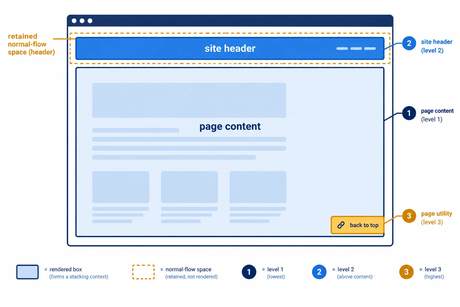
When these sibling regions overlap, use the intentional order: content 1, header 2, utility 3.
This is a focused set of stacking-context triggers used by this tutorial, not a complete list of every possible trigger.
Compare z-index: auto with a numeric value, then note the positioning modes and properties that establish their own boundary.
| Declaration or condition | Creates a stacking context? | Why |
|---|---|---|
| `position: relative; z-index: auto;` | No | The z-index is auto |
| `position: relative; z-index: 0;` | Yes | A non-auto z-index creates one |
| `position: absolute; z-index: 1;` | Yes | A non-auto z-index creates one |
| `position: fixed; z-index: auto;` | Yes | Fixed creates one |
| `position: sticky; z-index: auto;` | Yes | Sticky creates one |
| `transform: translate(0);` | Yes | The transform is non-none |
| Flex or Grid item with `z-index: 1;` | Yes | A non-auto z-index creates one |
Tip
A non-none transform creates a stacking context as well as connecting to the earlier fixed-positioning exception. Flex and Grid items are a useful boundary case: a non-auto z-index can create a stacking context even when the item is not positioned.
Do not react to an overlap by escalating numbers. First identify the relevant stacking contexts, then choose the smallest values that state the intended relationship.
In styles.css, add these rules after the earlier positioning rules. Save, refresh index.html, and scroll until the header meets the content.
.page-content {
  position: relative;
  z-index: 1;
}

.site-header {
  position: sticky;
  top: 0;
  z-index: 2;
}

.page-utility {
  position: fixed;
  right: 1rem;
  bottom: 1rem;
  z-index: 3;
}
Expected browser result: At the top of the page, the Workshop Guide header appears in its normal location and the Back to top link appears at the bottom-right viewport edge. While scrolling, the header remains above page content where they meet. The Back to top link remains above both the header and page content. The workshop cards retain their Grid layout.
The visible change is most apparent while scrolling, when the sticky header and fixed utility overlap page content.
Match each sample to its stacking-context result.
Tap an item and then its matching pair.
Complete the z-index values for the intended Workshop Guide sibling hierarchy.
.page-content {
  position: relative;
  z-index: ;
}

.site-header {
  position: sticky;
  top: 0;
  z-index: ;
}

.page-utility {
  position: fixed;
  right: 1rem;
  bottom: 1rem;
  z-index: ;
}
Step 7 of 9
Trace nested stacking contexts to find the level that actually controls an overlap, then repair the ancestor instead of escalating a child’s z-index.
A stacking context is treated as one unit within its parent context. A child can have a very large z-index, but that number is compared only within the child’s own context.
In the intended Workshop Guide hierarchy, .page-content is at level 1 and .site-header is at level 2 in the same root stacking context. The badge belongs inside .page-content, so a badge at z-index: 999 cannot move the whole content region ahead of the header.
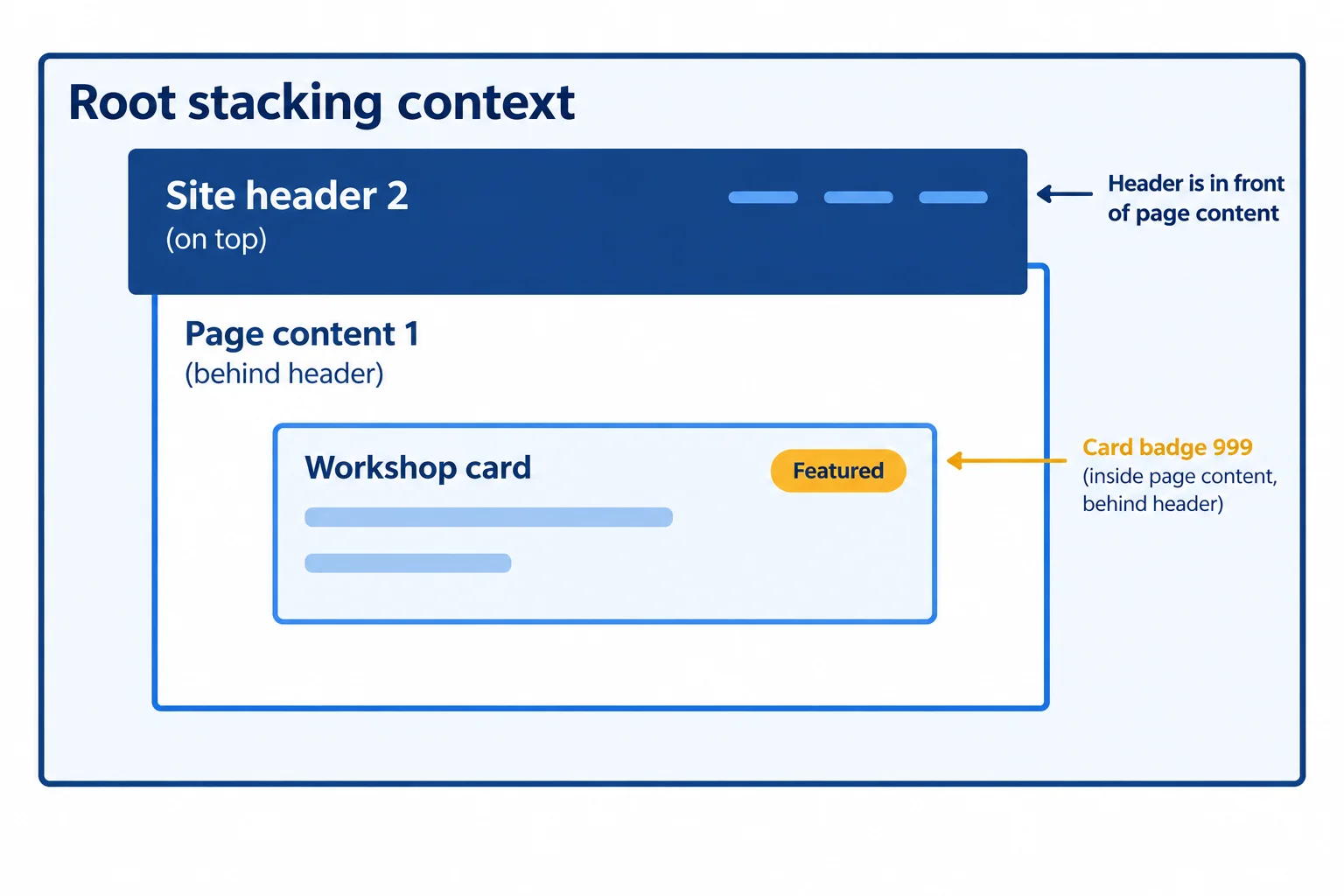
Compare the sibling contexts first: page content at level 1 versus the header at level 2.
When an overlap is wrong, trace each element outward until you find the stacking contexts that compete in a shared parent context. Do not start by increasing a descendant’s number.
Here, .card-badge has a local level inside .page-content. But .page-content and .site-header compete in the root stacking context. If the whole content region covers the header, inspect the content region’s level.
Repair the competing ancestor level, or remove an unnecessary context only when doing so does not disrupt the intended local hierarchy. Raising a trapped child cannot cross its ancestor’s boundary.
In styles.css, temporarily paste this deliberately broken variation after the earlier positioning rules. Save and refresh index.html, then scroll until content meets the sticky header.
/* Deliberately broken: the content context covers the header context. */
.page-content {
  position: relative;
  z-index: 4;
}

.site-header {
  position: sticky;
  top: 0;
  z-index: 2;
}

.page-utility {
  position: fixed;
  right: 1rem;
  bottom: 1rem;
  z-index: 3;
}

.workshop-card {
  position: relative;
}

.card-badge {
  position: absolute;
  inset: 0.5rem 1rem auto auto;
  z-index: 999;
}
Expected browser result: When page content reaches the sticky header, the content region—including the Featured badge—renders above the header. The badge's 999 is local to the page-content stacking context; it is not compared directly with the header's 2.
Browser result after saving and refreshing: this is a visual result, not terminal output.
Replace only the deliberately broken .page-content rule with this rule. The header and utility keep their established levels.
.page-content {
  position: relative;
  z-index: 1;
}
Expected browser result: At the meeting point, the sticky site header renders above page content and every child inside it, including the Featured badge. The utility remains above both at its viewport edge.
Browser result after saving and refreshing: this restores the intended local hierarchy.
In the intended hierarchy, which statement correctly predicts the overlap?
Write two short parts based on the deliberately broken variation you tested:
.site-header, .page-content, and .card-badge, with their shown levels. Explain why increasing the badge’s level does not repair content covering the header.Write at least 120 characters (0/120).

Step 8 of 9
Correct positioned overlaps while keeping Workshop Guide content, controls, and keyboard focus visible.
A correct layer order is only the start. A badge, sticky header, or fixed utility can still cover readable text, a link, or its visible keyboard focus outline.
Position and z-index do not change DOM order or sequential keyboard focus. Keep the visual arrangement understandable in that existing source order, then check it while scrolling and using Tab.
For each positioned element, ask: does its rendered box leave enough room for the content and focus indicator that must remain usable?
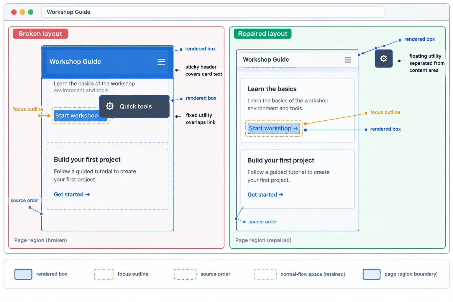
A rendered box can obstruct content even after its stack level is correct. The focus outline needs clear space too.
An absolutely positioned .card-badge does not enlarge .workshop-card. Keep the card's 3rem top padding so its heading has a dedicated band clear of the badge's actual footprint.
A fixed utility also reserves no space. In constrained space, keep Back to top in normal flow. At this example's wide-layout breakpoint, the utility can become fixed only when the content receives a clear right-side lane. The header can become sticky at that breakpoint while retaining its normal-flow slot.
If a sticky header still leaves too little usable reading area, reduce its footprint or return it to normal flow for that layout. Raising z-index cannot repair a space problem.
Add these rules after the earlier Workshop Guide positioning rules in styles.css. Existing border, color, and Grid declarations remain unchanged. Save and refresh index.html; then compare a width below the example's wide-layout breakpoint with one that meets it.
.page-content {
  position: relative;
  z-index: 1;
}

.site-header {
  position: relative;
  z-index: 2;
}

.workshop-card {
  position: relative;
  padding: 3rem 1rem 1rem;
}

.card-badge {
  position: absolute;
  inset: 0.5rem 1rem auto auto;
}

.page-utility {
  position: static;
  display: inline-block;
  margin: 1rem;
}

@media (min-width: 48rem) {
  .site-header {
    position: sticky;
    top: 0;
  }

  .page-content {
    padding-right: 8rem;
  }

  .page-utility {
    position: fixed;
    right: 1rem;
    bottom: 1rem;
    z-index: 3;
    margin: 0;
  }
}Below 48rem: The header and Back to top link retain normal-flow space. The utility appears after the page content and does not float over a card or link. At or above 48rem: The header sticks at the top while scrolling. Back to top stays at the bottom-right viewport edge. The page content ends before the reserved right-side lane, and the Featured badge remains clear of the HTML Lab heading.
Expected browser result after saving and refreshing `index.html`. The utility becomes fixed only at the example's wide-layout breakpoint.
Tip
The right-side lane addresses the fixed utility's horizontal footprint; the normal-flow fallback addresses layouts that do not have enough room. If content, a control, or its focus outline is still covered, change the positioning or available space—not merely the layer number.
Complete the utility repair. It must retain its place in the document when layout space is limited, then use the viewport-edge offsets at the example's wide-layout breakpoint.
.page-utility {
  position: ;
  display: inline-block;
  margin: 1rem;
}

@media (min-width: 48rem) {
  .page-utility {
    position: ;
    right: 1rem;
    bottom: 1rem;
    z-index: 3;
    margin: 0;
  }
}After completing the repair in your local styles.css, refresh index.html. Perform a focused check rather than a full responsive test:
Back to top.Write a short test log. State the positioning mode used for the utility in each layout, then report whether card text, links, and every visible focus outline stayed unobstructed. If you find an overlap, name the rendered box causing it and the CSS rule you would adjust.
Write at least 140 characters (0/140).

Step 9 of 9
Repair the complete Workshop Guide, then verify its positioning, layers, utility fallback, and focus visibility in a local browser.
Use one final decision sequence instead of changing offsets or increasing z-index at random:
For the Workshop Guide, the badge should follow its card, the header should retain flow space when sticky at the example's wide-layout breakpoint, and the utility needs a safe normal-flow fallback before that breakpoint.
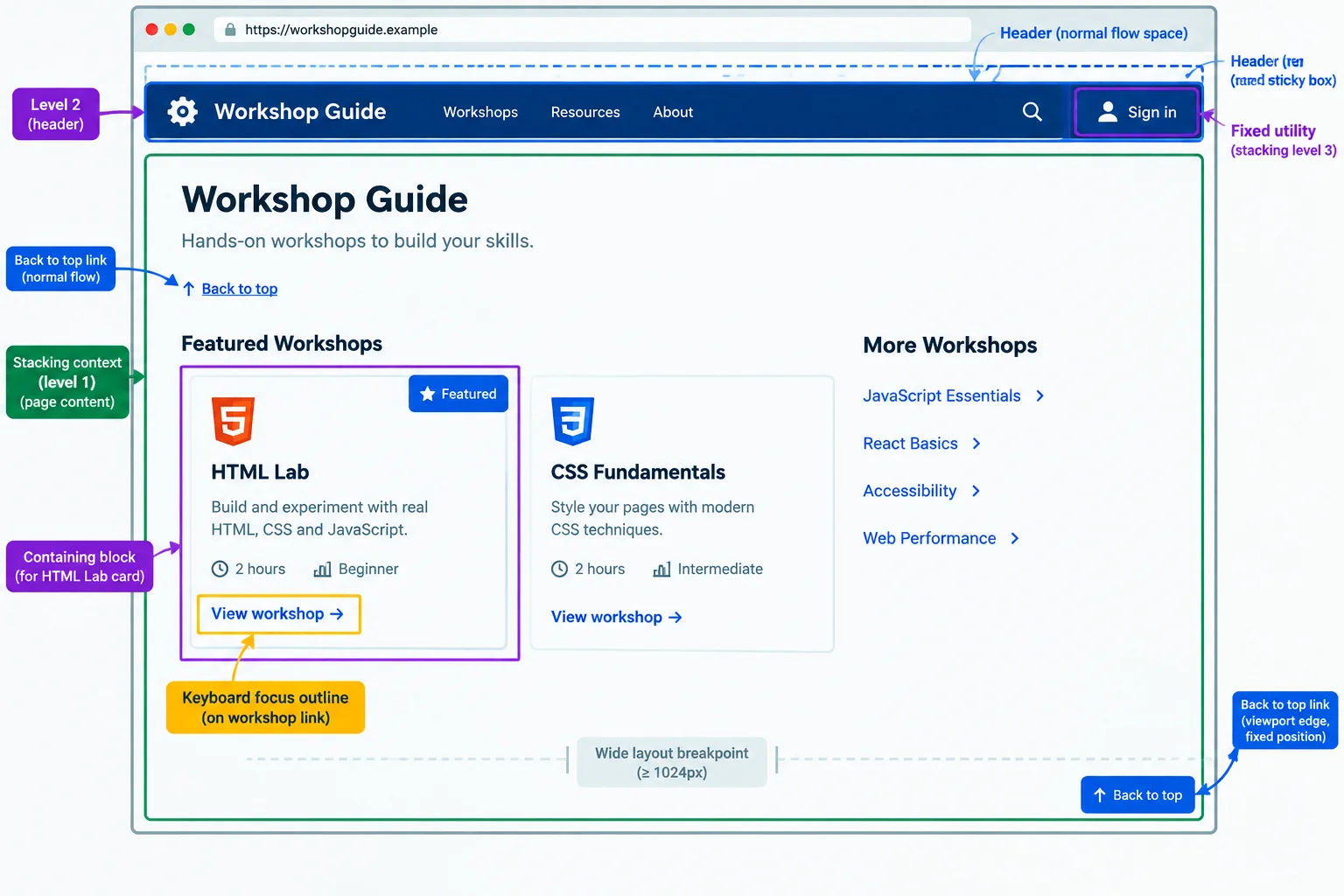
Trace flow space, reference, scrolling, and local layer boundaries in that order.
Tip
This is a focused final repair check, not a complete responsive test. Verify positioning, overlap, and keyboard-focus outcomes here. The next tutorial expands the work into broader checks across widths, zoom levels, and content variations.
Use this self-contained deliberately broken variation so every issue has a known starting point. Replace your local index.html with this file, then replace styles.css with the broken stylesheet on the next screen. The page uses the same Workshop Guide content and local-file setup used throughout this tutorial.
index.html — deliberately broken variation
<!doctype html>
<html lang="en">
  <head>
    <meta charset="utf-8">
    <meta name="viewport" content="width=device-width, initial-scale=1">
    <title>Workshop Guide</title>
    <link rel="stylesheet" href="styles.css">
  </head>
  <body id="page-top">
    <div class="page-shell">
      <header class="site-header">
        <strong>Workshop Guide</strong>
        <a href="#schedule">Workshop schedule</a>
      </header>

      <main class="page-content">
        <h1>Choose a workshop</h1>
        <p>Choose a practical session and prepare for focused work.</p>

        <section class="workshop-list" aria-label="Workshops">
          <article class="workshop-card"><span class="card-badge">Featured</span><h2>HTML Lab</h2><p>Build a structured workshop page with meaningful HTML.</p><a href="#schedule">View workshop schedule</a></article>
          <article class="workshop-card"><h2>CSS Studio</h2><p>Explore layout and surface styles.</p><a href="#schedule">View workshop schedule</a></article>
          <article class="workshop-card"><h2>Accessibility Clinic</h2><p>Review focus and reading order.</p><a href="#schedule">View workshop schedule</a></article>
        </section>

        <section id="schedule">
          <h2>Workshop schedule</h2>
          <p>Sessions run throughout the week.</p>
          <p>Bring notes and questions to your selected workshop.</p>
        </section>
      </main>
    </div>

    <a class="page-utility" href="#page-top">Back to top</a>
  </body>
</html>styles.css — deliberately broken variation. Paste this beside the HTML, save both files, refresh index.html, and scroll before repairing it.
:root {
  font-family: system-ui, sans-serif;
  color: #1f2937;
  background: #f8fafc;
}

* {
  box-sizing: border-box;
}

body {
  margin: 0;
  line-height: 1.5;
}

a:focus-visible {
  outline: 3px solid #b45309;
  outline-offset: 3px;
}

/* Deliberately broken: captures sticky during page scrolling. */
.page-shell {
  overflow: hidden;
}

.site-header {
  position: sticky;
  top: 0;
  z-index: 2;
  display: flex;
  flex-wrap: wrap;
  justify-content: space-between;
  gap: 1rem;
  padding: 1rem;
  background: #16324f;
  color: #ffffff;
}

.site-header a {
  color: #ffffff;
}

/* Deliberately broken: this context is above the header. */
.page-content {
  position: relative;
  z-index: 4;
  max-width: 70rem;
  min-height: calc(100vh + 20rem);
  margin: 0 auto;
  padding: 2rem 1rem 5rem;
}

.workshop-list {
  display: grid;
  grid-template-columns: repeat(auto-fit, minmax(14rem, 1fr));
  gap: 1rem;
}

.workshop-card {
  position: static;
  padding: 3rem 1rem 1rem;
  border: 1px solid #94a3b8;
  border-radius: 0.5rem;
  background: #ffffff;
}

.card-badge {
  position: absolute;
  inset: 0.5rem 1rem auto auto;
  padding: 0.25rem 0.5rem;
  border-radius: 0.25rem;
  background: #fef3c7;
}

#schedule {
  margin-top: 3rem;
}

.page-utility {
  position: fixed;
  right: 1rem;
  bottom: 1rem;
  z-index: 3;
  padding: 0.5rem;
  background: #16324f;
  color: #ffffff;
}Broken browser result after save and refresh: • The Featured badge is positioned against .page-content rather than the HTML Lab card, so it does not occupy that card’s corner. • During document scrolling, the header scrolls away because .page-shell captures sticky behavior. • .page-content has level 4 while the header has level 2, so the content region is incorrectly ranked above the header’s stacking context. • Back to top stays fixed even below the example's wide-layout breakpoint, instead of retaining a normal-flow fallback. • The page has enough vertical content to scroll and inspect these conditions.
Visual browser output; exact wrapping varies with the browser width.
Complete the compact repair. It addresses the sticky constraint, the badge's containing block, the competing ancestor layer level, and the utility's fallback.
.page-shell {
  overflow: ;
}

.site-header {
  position: ;
  z-index: 2;
}

.page-content {
  position: relative;
  z-index: ;
}

.workshop-card {
  position: ;
}

.page-utility {
  position: ;
}

@media (min-width: 48rem) {
  .site-header {
    position: ;
    top: 0;
  }

  .page-utility {
    position: fixed;
    right: 1rem;
    bottom: 1rem;
    z-index: 3;
  }
}After completing the exercise, replace your entire local styles.css with this repaired reference. Save, refresh index.html, then check the results described below.
:root {
  font-family: system-ui, sans-serif;
  color: #1f2937;
  background: #f8fafc;
}

* {
  box-sizing: border-box;
}

body {
  margin: 0;
  line-height: 1.5;
}

a:focus-visible {
  outline: 3px solid #b45309;
  outline-offset: 3px;
}

.page-shell {
  overflow: visible;
}

.site-header {
  position: relative;
  z-index: 2;
  display: flex;
  flex-wrap: wrap;
  justify-content: space-between;
  gap: 1rem;
  padding: 1rem;
  background: #16324f;
  color: #ffffff;
}

.site-header a {
  color: #ffffff;
}

.page-content {
  position: relative;
  z-index: 1;
  max-width: 70rem;
  min-height: calc(100vh + 20rem);
  margin: 0 auto;
  padding: 2rem 1rem 5rem;
}

.workshop-list {
  display: grid;
  grid-template-columns: repeat(auto-fit, minmax(14rem, 1fr));
  gap: 1rem;
}

.workshop-card {
  position: relative;
  padding: 3rem 1rem 1rem;
  border: 1px solid #94a3b8;
  border-radius: 0.5rem;
  background: #ffffff;
}

.card-badge {
  position: absolute;
  inset: 0.5rem 1rem auto auto;
  padding: 0.25rem 0.5rem;
  border-radius: 0.25rem;
  background: #fef3c7;
}

#schedule {
  margin-top: 3rem;
}

.page-utility {
  position: static;
  display: inline-block;
  margin: 1rem;
  padding: 0.5rem;
  background: #16324f;
  color: #ffffff;
}

@media (min-width: 48rem) {
  .site-header {
    position: sticky;
    top: 0;
  }

  .page-content {
    padding-right: 8rem;
  }

  .page-utility {
    position: fixed;
    right: 1rem;
    bottom: 1rem;
    z-index: 3;
    margin: 0;
  }
}Repaired browser result after save and refresh: Below the example's wide-layout breakpoint: • Featured is attached to the HTML Lab card’s top-right corner. • The header remains in normal flow. • Back to top appears after the page content in normal flow. At or above the example's wide-layout breakpoint: • The header sticks at top: 0 while document content scrolls beneath it. • The layer order is page content at 1, header at 2, and fixed utility at 3. • The right-side padding lane keeps content clear of the fixed Back to top link. Keyboard check: • Tab reaches the header link, workshop links, and Back to top in source order, with the visible outline unobscured.
Visual browser output; line wrapping and the exact scroll distance vary with the browser window.
On your computer, use the repaired local page. Check below the example's wide-layout breakpoint, then at or above it. Scroll until the cards and Workshop schedule pass the header area. Press Tab through the header link, workshop links, and Back to top.
Write a short test log that names the repair decisions for the badge anchor, sticky constraint, ancestor layer level, and utility fallback. Then report what you observed for badge attachment, header scrolling, the header/content layer order, utility behavior, and visible focus.
Write at least 220 characters (0/220).
Summary
Congratulations! You completed: Position and Layer Elements with CSS
Thousands of online courses in video, ebooks and audiobooks.
To test your knowledge during online courses
Generated directly from your cell phone's photo gallery and sent to your email

Download our app via QR Code or the links below:.


Carry knowledge in your pocket.
Download the Cursa app.
There are hundreds of free courses available, with a free certificate of completion that is saved in your mobile image gallery.
Download the app to access the Course Completion Certificate for Free.


+ 10 million
students

Free and Valid
Certificate

60 thousand free
exercises

4.8/5 rating in
app stores

Free courses in
video and ebooks