
Step 1 of 7
Combine a Text Base with Viewport Growth
Use a rem-based text base together with viewport growth for a Reading Room heading.

Learning path · Level 3 · Tutorial 5
Keep headings and body text readable as available space changes, including long words, expanded content, and user zoom.

 Combine a Text Base with Viewport Growth
Use a rem-based text base together with viewport growth for a Reading Room heading. 2 min
Combine a Text Base with Viewport Growth
Use a rem-based text base together with viewport growth for a Reading Room heading. 2 min
 Bound Fluid Headings with clamp()
Use clamp() to keep the Reading Room heading fluid within a deliberate minimum and maximum. 2 min
Bound Fluid Headings with clamp()
Use clamp() to keep the Reading Room heading fluid within a deliberate minimum and maximum. 2 min
 Keep Prose Lines Comfortable
Limit prose line length with an approximate `ch` ceiling while preserving normal narrowing in smaller containers. 2 min
Keep Prose Lines Comfortable
Limit prose line length with an approximate `ch` ceiling while preserving normal narrowing in smaller containers. 2 min
 Wrap Long Strings Without Losing Text
Keep the complete Reading Room reference visible in a narrow article by allowing it to wrap instead of clipping or shrinking essential text. 2 min
Wrap Long Strings Without Losing Text
Keep the complete Reading Room reference visible in a narrow article by allowing it to wrap instead of clipping or shrinking essential text. 2 min
 Let Text Containers Grow
Repair a normal-flow article container so longer headings and added prose remain visible. 2 min
Let Text Containers Grow
Repair a normal-flow article container so longer headings and added prose remain visible. 2 min
 Check Whether Zoom Enlarges Text Enough
Use a focused 100% and 200% page zoom comparison to understand how viewport-based sizing, clamp() bounds, and container constraints affect readable text. 2 min
Check Whether Zoom Enlarges Text Enough
Use a focused 100% and 200% page zoom comparison to understand how viewport-based sizing, clamp() bounds, and container constraints affect readable text. 2 min
 Apply and Verify Readable Typography
Finish and locally verify an article whose typography adapts without sacrificing readable or complete content. 3 min
Apply and Verify Readable Typography
Finish and locally verify an article whose typography adapts without sacrificing readable or complete content. 3 min
Step 1 of 7
Use a rem-based text base together with viewport growth for a Reading Room heading.
A vw unit is 1% of the viewport width: the browser’s visible page width, not the width of article.story. So 2vw becomes smaller in a narrow viewport and larger in a wide viewport.
A heading sized only with font-size: 2vw has no text-based starting size. It can become too small in a narrow viewport and continue growing in a wide viewport. calc(1.25rem + 2vw) combines a rem-based text base with continuous viewport growth. It improves the narrow-width result, although it still has no upper limit; a later step will address that.
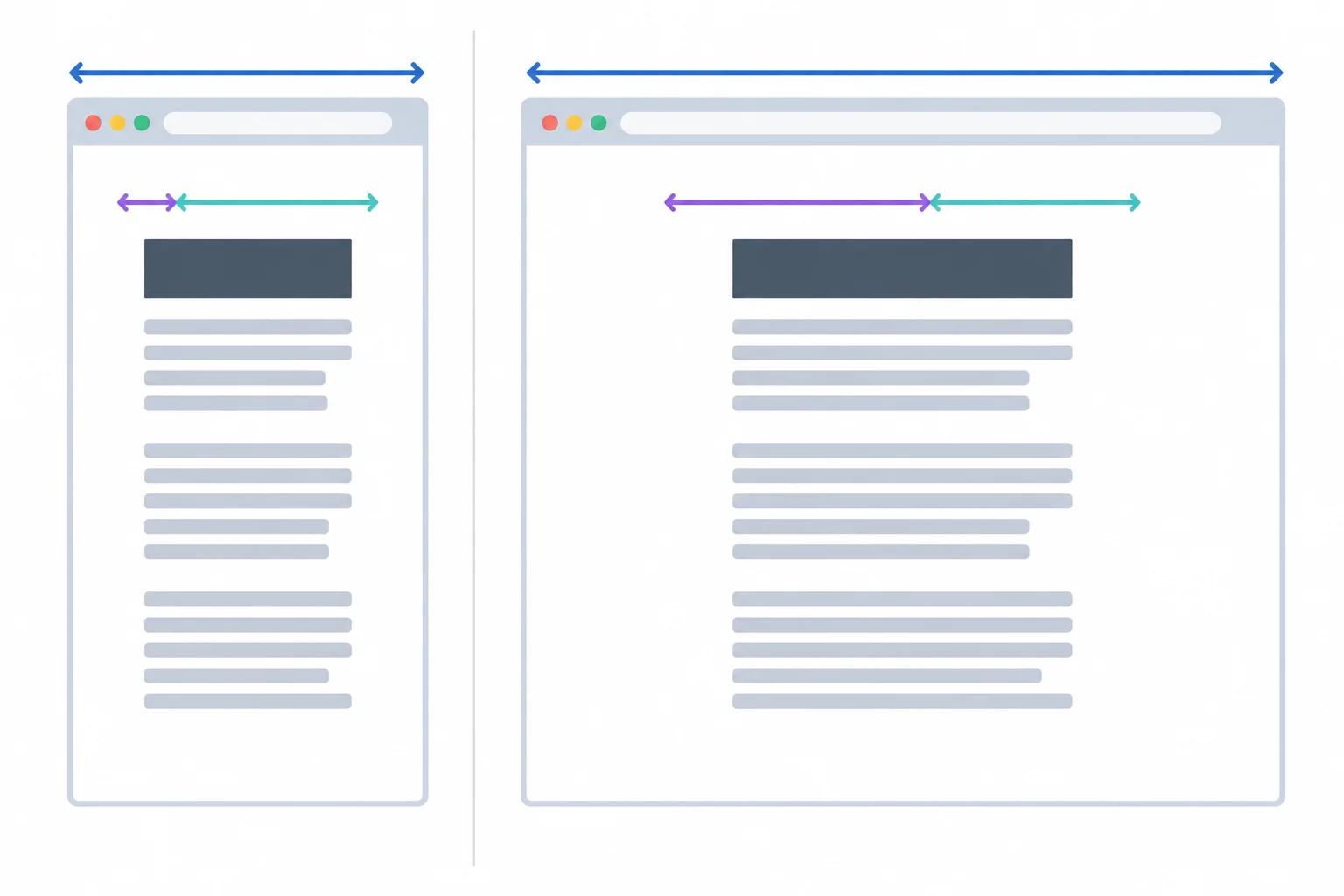
The vw contribution follows the full viewport width, even when article.story is narrower.
For these numerical illustrations only, assume 1rem = 16 CSS px. These are CSS font-size values at 100% page zoom; they do not predict visible text enlargement at other zoom levels.
| Viewport width | 2vw only | calc(1.25rem + 2vw) |
|---|---|---|
| 400 CSS px | 8 CSS px | 28 CSS px |
| 800 CSS px | 16 CSS px | 36 CSS px |
| 1600 CSS px | 32 CSS px | 52 CSS px |
In your local folder, create or update index.html. The viewport meta declaration permits ordinary browser page zoom; it does not restrict it.
<!doctype html>
<html lang="en">
<head>
  <meta charset="utf-8">
  <meta name="viewport" content="width=device-width, initial-scale=1.0">
  <title>Reading Room</title>
  <link rel="stylesheet" href="styles.css">
</head>
<body>
  <main class="page">
    <article class="story">
      <h1 class="story__title">Reading on Any Screen</h1>
      <p>Reading Room collects practical notes for people who want a calmer, more deliberate reading experience.</p>
    </article>
  </main>
</body>
</html>The browser shows a Reading Room article with the heading “Reading on Any Screen” followed by one prose paragraph.
The exact default spacing can vary slightly by browser before the stylesheet is applied.
Create or update styles.css, then save both files and refresh index.html. The commented declaration is a viewport-only comparison; keep the mixed declaration active.
html {
  font-size: 100%;
}

body {
  margin: 0;
  font-family: system-ui, sans-serif;
  font-size: 1rem;
  line-height: 1.5;
}

.page {
  padding: 1.5rem;
}

.story {
  width: auto;
}

.story__title {
  /* Viewport-only comparison: font-size: 2vw; */
  font-size: calc(1.25rem + 2vw);
  line-height: 1.15;
}The Reading Room heading has a readable rem-based size in a narrow browser window and grows continuously as the viewport width increases. The paragraph remains at the body size of 1rem.
The system font and exact rendered pixels can vary by device. Resize the browser window to observe the continuous heading-size change.
Tip
The 1.25rem contribution gives the heading a usable text base. The 2vw contribution adds fluid growth as the viewport width changes. At a wide viewport, this mixed value continues to grow, so it is not yet a complete readability solution.
Complete the mixed heading declaration.
font-size: calc( + );Write the complete CSS declaration for the mixed heading size. Then compare it with font-size: 2vw at a narrow viewport and at a wide viewport. Explain how the rem-based contribution changes each comparison.
Write at least 120 characters (0/120).

Step 2 of 7
Use clamp() to keep the Reading Room heading fluid within a deliberate minimum and maximum.
clamp() gives a heading three size instructions in one declaration:
The preferred value is used only while it falls between the two bounds. Here, the rem values set the range and the mixed calc() expression from the previous step supplies fluid growth.

The heading follows its preferred value only in the middle region; the minimum and maximum bound the selected size.
In styles.css, replace the mixed heading declaration with this bounded revision. Save the file and refresh index.html.
.story__title {
  font-size: clamp(1.75rem, calc(1.25rem + 2vw), 3rem);
  line-height: 1.15;
}
Expected browser result: the Reading Room heading is 28 CSS px at a 400 CSS px viewport, 36 CSS px at 800 CSS px, and stops at 48 CSS px at 1600 CSS px, using the illustration assumption.
The numerical sizes below use the stated illustration assumption only; the browser renders the heading continuously between these sample widths.
For this numerical illustration only, assume 1rem = 16 CSS px at 100% page zoom. The preferred value is 20 CSS px + 2vw. clamp() compares that preferred value with its 28 CSS px minimum and 48 CSS px maximum.
At 400 CSS px, the preferred value equals the minimum exactly. At 800 CSS px, it lies between both limits. At 1600 CSS px, it exceeds the maximum.
The selected CSS font-size changes only while the preferred value remains within the allowed range.
| Viewport width | Preferred value | Selected result | Active part |
|---|---|---|---|
| 400 CSS px | 28 CSS px | 28 CSS px | minimum boundary |
| 800 CSS px | 36 CSS px | 36 CSS px | preferred value |
| 1600 CSS px | 52 CSS px | 48 CSS px | maximum |
Tip
Bounds control the CSS font-size range, but they do not by themselves prove that visible text enlargement will work well at page zoom. A later check will test that behavior.
Match each clamp() argument to its role.
Tap an item and then its matching pair.
Complete the shared heading declaration using the established minimum, fluid preferred value, and maximum.
.story__title {
  font-size: clamp(, , );
}
Step 3 of 7
Limit prose line length with an approximate ch ceiling while preserving normal narrowing in smaller containers.
Font size and line length solve different readability problems. A heading can scale well while a wide article still creates tiring, hard-to-follow lines.
The ch unit is based on the advance width of the current font’s zero glyph. It is therefore an approximate measure, not an exact character count. A maximum of 65ch gives this article an illustrative prose-width ceiling.
When space is wider than that ceiling, the article does not keep stretching. When space becomes narrower, normal block sizing still lets the article narrow with its container.
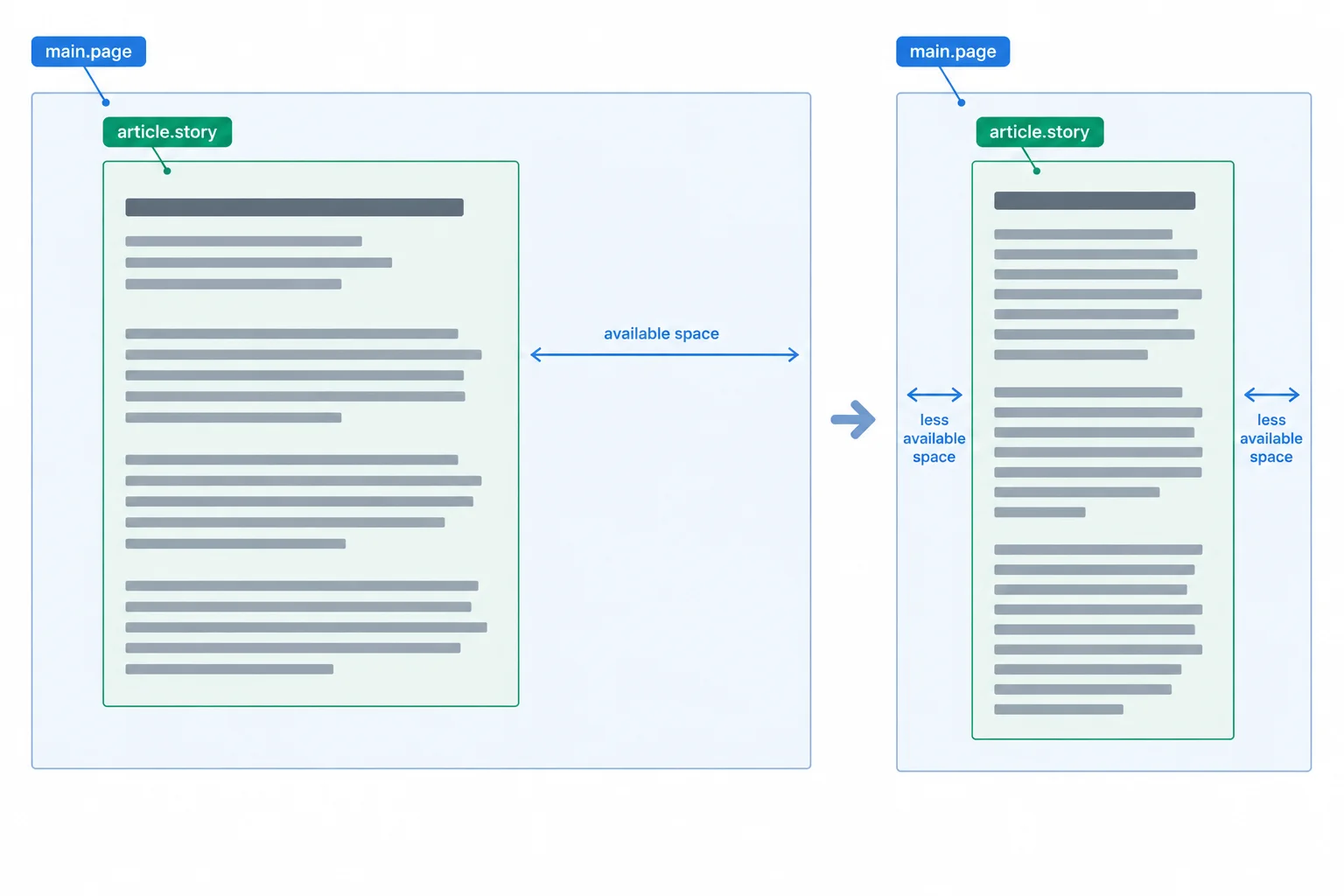
max-width limits long lines without requiring the article to stay that wide.
In styles.css, update the existing .story rule with this rule. Save the file and refresh index.html. width: auto retains ordinary block sizing while max-width sets the prose-width ceiling.
.story {
  width: auto;
  max-width: 65ch;
}Rendered page: at wide viewport widths, the Reading Room article stops growing after it reaches a comfortable prose column. When the browser window narrows, the article narrows and its ordinary prose wraps into additional visible lines.
The exact number of wrapped lines varies with the browser window and system font.
A rigid width asks the article to remain a particular width even when its container has less room. A max-width sets only an upper limit: below that limit, the article can use the available width.
This is why a line-length limit complements a suitable font-size value. The first manages how far readers scan across a line; the second manages the size of the letters.
Read this comparison; do not add the Before rule to your stylesheet. The After rule is the rule applied on the previous screen.
/* Before: rigid width */
.story {
  width: 65ch;
}

/* After: prose-width ceiling */
.story {
  width: auto;
  max-width: 65ch;
}
Tip
Do not treat 65ch as a universal line-length rule or an exact number of characters. Font metrics and content affect the result. Here it is a useful ceiling to test with this Reading Room article.
Which rule is the best fit for an article that should cap long prose lines but still narrow with its container?
Complete the article rule so it has a prose-width ceiling but can still narrow within a smaller container.
.story {
  width: ;
  : ;
}
Step 4 of 7
Keep the complete Reading Room reference visible in a narrow article by allowing it to wrap instead of clipping or shrinking essential text.
Ordinary prose can wrap at spaces. The Reading Room reference is different: it is one unbroken string. When the available line becomes narrower than that string, the surrounding paragraphs may wrap normally while the reference extends beyond the article edge.
The article’s fluid width and max-width: 65ch keep prose line length manageable, but they do not create break opportunities inside a long string. The repair should preserve every character while allowing the reference to use more than one line when necessary.
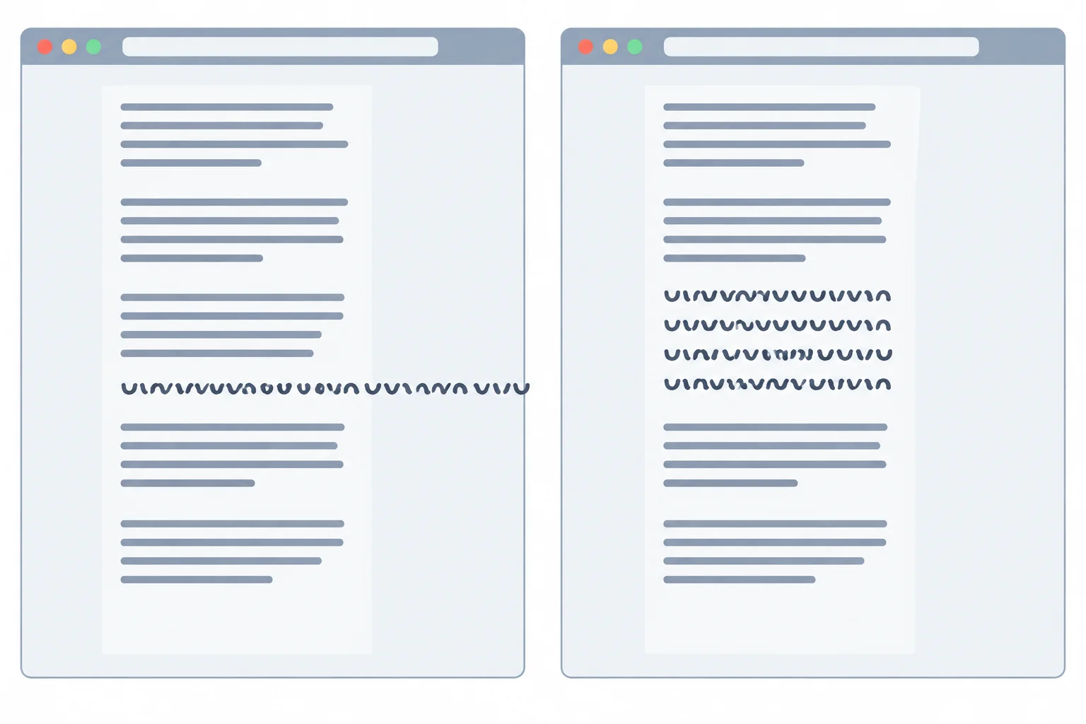
Ordinary prose can wrap while an unbroken reference still overflows. The repair keeps all characters visible within the available line.
Warning
Before: Do not use overflow: hidden to make the article appear contained. It can conceal characters that extend past an edge. Shrinking all text also has a different cost: it reduces readability.
When the full reference is essential, preserve it and allow wrapping rather than clipping, hiding, or changing the text to fit one line.
Step 1 created the heading and one ordinary paragraph, but it did not yet add the reference for this stress case. In index.html, add the supplied paragraph exactly once inside article.story, after the existing ordinary paragraph. Keep the reference text unchanged; it is the long-string test for this step.
In index.html, place this paragraph after the existing prose paragraph inside article.story.
<p class="story__reference">ReadingRoomReferenceABCDEFGHIJKLMNOPQRSTUVWXYZ0123456789ABCDEFGHIJKLMNOPQRSTUVWXYZ0123456789</p>Now add the repaired rule to styles.css. It permits a break only when the unbroken reference needs one in the available line.
/* After: preserve the full reference in a narrow article */
.story__reference {
  overflow-wrap: anywhere;
}In a narrow browser window, the reference wraps onto additional lines within the article. Its final characters remain visible.
The exact number of lines depends on the available article width and font metrics.
Complete the declaration for the reference paragraph.
.story__reference {
  : ;
}Save both local files and refresh index.html. Narrow the browser window until the article is clearly narrow. Inspect the reference from its beginning through its final characters.
For this check, keep the reference text intact. Do not hide overflow or reduce the text size to force it onto one line.
In one or two sentences, write the complete wrapping declaration you used and report whether the full reference remained visible after you narrowed the local page.
Write at least 60 characters (0/60).

Step 5 of 7
Repair a normal-flow article container so longer headings and added prose remain visible.
Narrower lines, a longer heading, and additional prose all create more lines. In normal block flow, article.story should become taller to hold those lines.
A readable line-length ceiling such as max-width: 65ch and safe wrapping for p.story__reference solve horizontal pressure. They can also make content use more vertical space. That is expected: preserve the readable font sizes and let the text container grow.
Missing text is a different problem. A fixed height or restrictive max-height can limit the article vertically. When that restriction is paired with hidden overflow, existing content is concealed instead of remaining available to read.
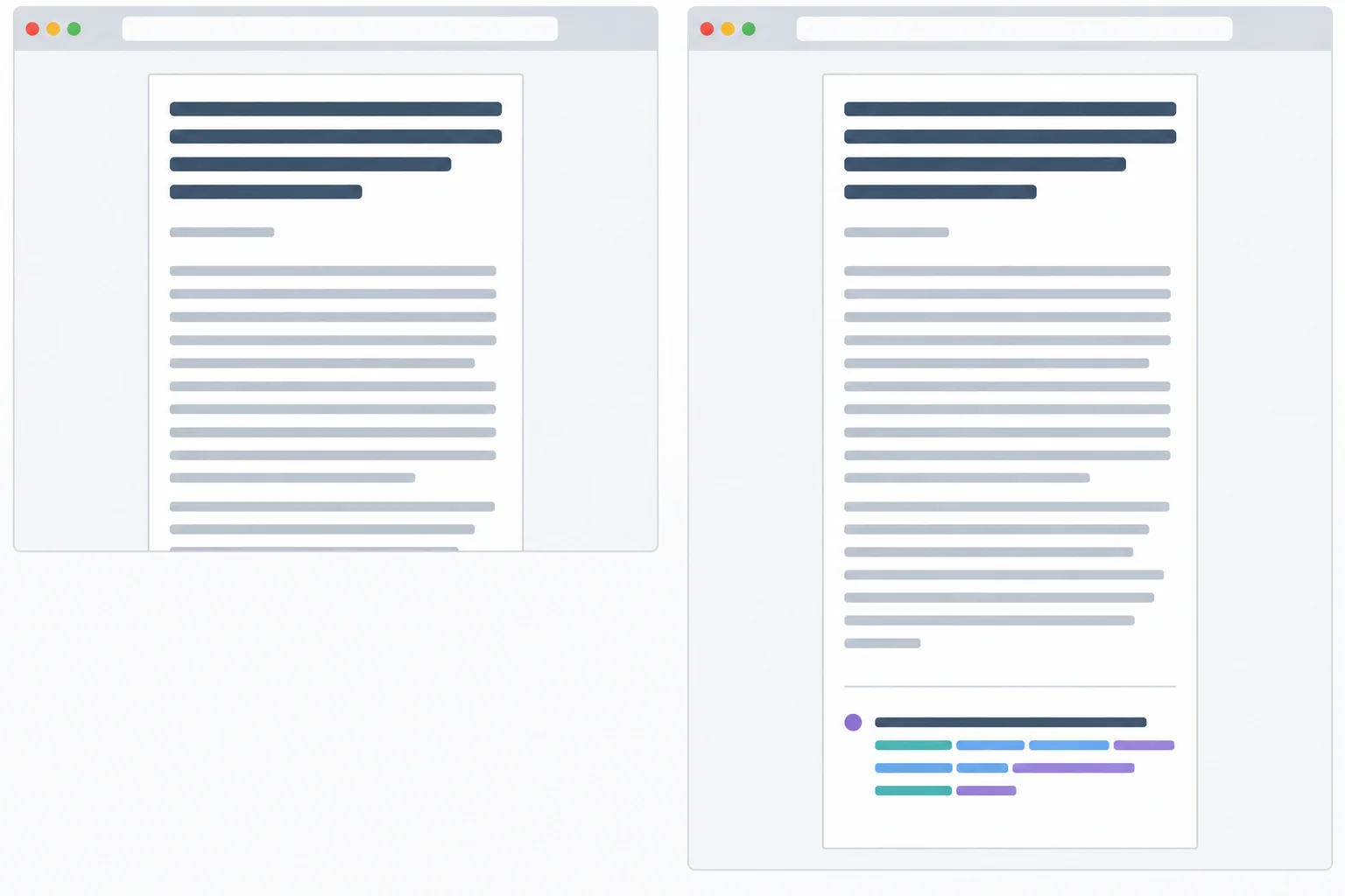
When wrapping creates more lines, a normal-flow article should expand vertically instead of concealing its lower content.
Create a deliberate, temporary failure so you can recognize it. In index.html, replace the existing article.story element with the stress content below. It uses the longer test heading, an additional copy of the prose paragraph, and the unbroken reference.
Save the file and refresh the browser. At this point, the article can still grow because no vertical restriction has been added yet.
Replace the existing article.story element in index.html with this temporary stress-test content.
<article class="story">
  <h1 class="story__title">Reading on Any Screen When Headings Grow and Readers Enlarge the Page</h1>
  <p>Reading Room collects practical notes for people who want a calmer, more deliberate reading experience.</p>
  <p>Reading Room collects practical notes for people who want a calmer, more deliberate reading experience.</p>
  <p class="story__reference">ReadingRoomReferenceABCDEFGHIJKLMNOPQRSTUVWXYZ0123456789ABCDEFGHIJKLMNOPQRSTUVWXYZ0123456789</p>
</article>Browser result: the longer heading, two prose paragraphs, and the complete reference are present. The article becomes as tall as its wrapped content requires.
Exact line breaks depend on the browser width and system font. Before the restrictive CSS is added, every heading, paragraph, and reference character should remain visible.
Now temporarily replace the current .story rule in styles.css with this restrictive comparison rule. Do not add it below the current rule: replace the current rule so this failure has one clear cause. Save, refresh, and narrow the browser window.
/* Before: temporary clipping test */
.story {
  width: auto;
  max-width: 65ch;
  height: 12rem;
  overflow: hidden;
}Browser result at a narrow viewport width: the article stops at a rigid lower edge. Some lower paragraph lines or part of the reference are no longer visible, even though they remain in the HTML.
The exact first hidden line varies with viewport width, but a narrow view should conceal lower content while the HTML still contains it.
The wrapped heading and reference did not remove content. The temporary container rule did.
A fixed height reserves only a set vertical space. overflow: hidden then conceals anything extending beyond that space. Reducing the heading or body font size merely forces content into an old box; it does not repair the box constraint.
Remove the temporary rule entirely before applying the repaired rule. Do not paste the repaired rule after the temporary rule: declarations such as height: 12rem and overflow: hidden would otherwise remain active through the cascade.
Select the entire temporary .story rule from the previous screen, delete it, and replace it with this repaired rule. Save and refresh at the same narrow browser width.
/* After: let the article grow with its content */
.story {
  width: auto;
  max-width: 65ch;
}Browser result at the same narrow viewport width: the long heading, both prose paragraphs, and every character of the reference remain visible. The article grows downward to contain its wrapped content.
The article may be taller than before. Its exact height and line breaks vary with available width, which is expected.
Tip
Omitting the unnecessary height and overflow declarations restores normal block behavior: content determines the article height, and essential text is not clipped. The article still has its max-width: 65ch prose-width ceiling and can narrow because its width remains automatic.
After testing the temporary failure and repaired state locally, write 2–4 sentences. Identify the two temporary declarations that caused missing text, explain how they worked together, and write the repaired .story rule that keeps the prose-width ceiling while allowing the article to grow. Do not propose reducing the heading or body font size.
Write at least 120 characters (0/120).

Step 6 of 7
Use a focused 100% and 200% page zoom comparison to understand how viewport-based sizing, clamp() bounds, and container constraints affect readable text.
Page zoom commonly changes two related conditions. It enlarges rendered CSS pixels, but it also commonly reduces the viewport width measured in CSS pixels. Because vw follows viewport width rather than article.story, the vw contribution can become smaller during zoom.
The existing heading rule combines rem-based parts with 2vw:
clamp(1.75rem, calc(1.25rem + 2vw), 3rem)
Its rem-based parts can enlarge with page zoom. Yet a shrinking vw contribution can offset part of the visible text enlargement a reader expects. Therefore, 200% page zoom does not necessarily make a heading with a vw contribution look exactly twice as large.
A clamp maximum can also stop the preferred value from controlling the selected CSS font-size. Because this maximum uses rem, it is not a fixed physical-size cap; however, rem bounds alone still do not guarantee proportional visible enlargement.

At page zoom, examine both visible text enlargement and the narrower viewport width used by vw.
For these numerical illustrations only, assume 1rem = 16 CSS px. The preferred value is 20 CSS px + 2vw. The 200% row illustrates a common situation where an 800 CSS px viewport at 100% becomes 400 CSS px wide at 200% in the same browser window. CSS font-size values alone do not fully predict visible text enlargement.
| Page zoom | Viewport width | Preferred value | Selected result |
|---|---|---|---|
| 100% | 400 CSS px | 20 + 8 = 28 CSS px | minimum: 28 CSS px |
| 100% | 800 CSS px | 20 + 16 = 36 CSS px | preferred value: 36 CSS px |
| 100% | 1600 CSS px | 20 + 32 = 52 CSS px | maximum: 48 CSS px |
| 200% | 400 CSS px | 20 + 8 = 28 CSS px | minimum: 28 CSS px |
Using the paired conditions from the previous screen—800 CSS px at 100% page zoom and 400 CSS px at 200% page zoom—which statement describes the active part of the shared heading rule?
Use a focused local comparison, not a full accessibility audit. Your Reading Room article already has the longer test heading, repeated prose, and the unbroken reference.
When heading enlargement is inadequate, adjust the rem/vw balance or clamp() bounds, or test rem-only sizing. When essential text is cut off, revise the container constraint instead of reducing text size.
Warning
Use this temporary revision only if your focused check shows that the viewport contribution leaves the heading inadequately enlarged. Replace the active .story__title rule in styles.css, save, refresh, and compare 100% and 200% page zoom again. This is a rem-only sizing revision to test, not a universal required value.
If you choose to test the rem-only revision, replace the active .story__title rule with this complete rule. Keep the article in normal flow so additional wrapped lines can make it taller.
/* Revision: test rem-only heading sizing */
.story__title {
  font-size: 2.5rem;
  line-height: 1.15;
}At 100% page zoom: the heading uses a 2.5rem CSS font-size. At 200% page zoom: the heading appears enlarged and may wrap onto more lines. The normal-flow article becomes taller as its text wraps; essential text remains visible.
Exact line breaks depend on your browser window width. At both zoom levels, verify that the heading is readable and that `article.story` grows rather than concealing content.
Choose the repair that matches what you actually observe. Do not shrink all text merely to fit an old box, and do not assume that one formula guarantees readability.
| Observed symptom | Suitable revision | Recheck |
|---|---|---|
| Heading enlarges too little | Reduce the vw influence, revise clamp() bounds, or test rem-only sizing | Heading size and wrapping at both zoom levels |
| Essential text is cut off | Remove unnecessary height or max-height restrictions and overflow hiding | The article grows and all text remains visible |
| Prose lines are too long | Keep width: auto with max-width: 65ch | Manageable line length and narrowing |
| Reference overflows | Keep overflow-wrap: anywhere on .story__reference | Every character remains visible |
Write 3–5 sentences based on your focused local comparison. Explain why 200% page zoom does not necessarily make a heading with a vw contribution look exactly twice as large. Identify one suitable sizing revision if heading enlargement is inadequate. If essential text is cut off instead, identify the different container revision needed. Then describe the result you observed, or would verify, after rechecking at 100% and 200% page zoom.
Write at least 220 characters (0/220).

Step 7 of 7
Finish and locally verify an article whose typography adapts without sacrificing readable or complete content.
Build the final local Reading Room article in your two existing files. This stress-tested version uses the longer heading, repeats the prose paragraph, and includes the unbroken reference. Keep the article in normal block flow. The stylesheet below restores the integrated repaired state from the earlier steps.
Replace the contents of your existing local index.html with this complete article, then save the file.
<!doctype html>
<html lang="en">
<head>
  <meta charset="utf-8">
  <meta name="viewport" content="width=device-width, initial-scale=1.0">
  <title>Reading Room</title>
  <link rel="stylesheet" href="styles.css">
</head>
<body>
  <main class="page">
    <article class="story">
      <h1 class="story__title">Reading on Any Screen When Headings Grow and Readers Enlarge the Page</h1>
      <p>Reading Room collects practical notes for people who want a calmer, more deliberate reading experience.</p>
      <p>Reading Room collects practical notes for people who want a calmer, more deliberate reading experience.</p>
      <p class="story__reference">ReadingRoomReferenceABCDEFGHIJKLMNOPQRSTUVWXYZ0123456789ABCDEFGHIJKLMNOPQRSTUVWXYZ0123456789</p>
    </article>
  </main>
</body>
</html>
Expected browser result: A Reading Room article appears with a long heading, two prose paragraphs, and one unbroken reference string. The linked stylesheet controls its typography and wrapping.
The exact line breaks depend on the available viewport width and the browser’s page zoom.
Replace the contents of your existing local styles.css with this integrated repaired state. Keep the bounded heading as the baseline unless your earlier focused page-zoom check gave you a reason to test a sizing revision.
html {
  font-size: 100%;
}

body {
  margin: 0;
  font-family: system-ui, sans-serif;
  font-size: 1rem;
  line-height: 1.5;
}

.page {
  padding: 1.5rem;
}

/* After: flexible prose measure and content-driven height */
.story {
  width: auto;
  max-width: 65ch;
}

/* After: bounded fluid heading size */
.story__title {
  font-size: clamp(1.75rem, calc(1.25rem + 2vw), 3rem);
  line-height: 1.15;
}

/* After: preserve the full reference in a narrow article */
.story__reference {
  overflow-wrap: anywhere;
}
Expected browser result: The article has a limited prose line length on wide screens, can narrow with the page, wraps the long reference when needed, and grows vertically to keep all text visible.
At narrower widths or higher page zoom, the heading, prose, and reference can use more lines. The article should become taller rather than hide content.
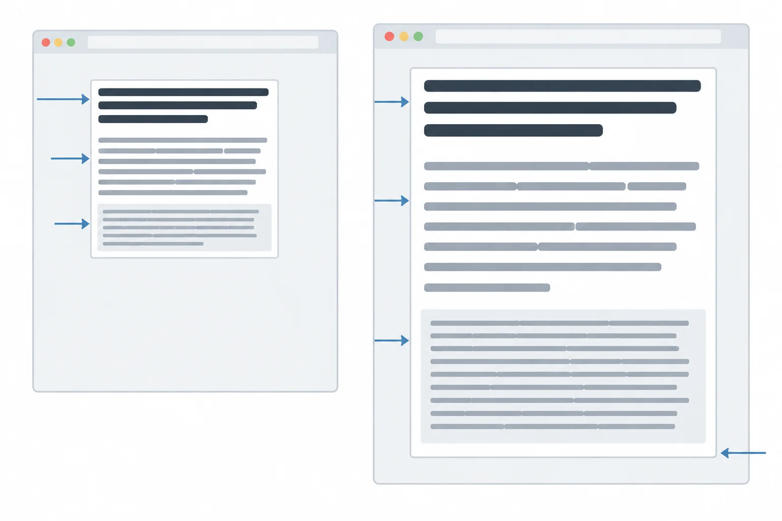
At a narrow viewport width and at page zoom, additional wrapping can make article.story taller. The heading, prose, and p.story__reference remain visible.
Save both files, open index.html, and make one focused verification pass. First narrow the browser window. Then compare 100% and 200% page zoom. Check heading readability, prose line length, the full reference, and whether the article grows instead of cutting off content. This is a focused local check, not a complete accessibility audit.
Choose a repair for the symptom you actually observe. The Before states are deliberately restrictive comparisons, not rules to combine with the completed stylesheet.
| Symptom | Before state | After repair |
|---|---|---|
| Heading size follows only viewport width | font-size: 2vw | Use bounded rem-and-vw sizing; revise after zoom observations if needed |
| Prose lines are overly long | No prose-width ceiling | width: auto with max-width: 65ch |
| Reference visibly extends beyond article | No wrapping rule for .story__reference | overflow-wrap: anywhere |
| Reference characters are clipped or missing | overflow: hidden | Remove clipping and use overflow-wrap: anywhere |
| Extra content disappears | Fixed height plus overflow: hidden | Remove restrictive height and clipping |
Complete the integrated repaired CSS excerpt for the Reading Room article.
.story {
  width: ;
  max-width: ;
}

.story__title {
  font-size: ;
  line-height: 1.15;
}

.story__reference {
  overflow-wrap: ;
}After completing the repair locally, test either a narrow viewport width or page zoom at 100% and 200%. Write 3–5 sentences about one before-and-after observation. Identify the symptom, name the exact rule you changed, and state whether the heading, prose, and full reference remain readable and visible afterward. Also state whether the article container grows with its content.
Write at least 180 characters (0/180).
Summary
Typography adapts through several separate decisions. Keep a suitable heading size, manageable line length, safe wrapping for essential unbroken text, and content-driven container height. These choices improve the tested Reading Room article, but they do not guarantee readability in every browser, viewport width, zoom setting, or future content change. Retest after a meaningful revision.
Congratulations! You completed: Make Typography Adapt Without Losing Readability
Thousands of online courses in video, ebooks and audiobooks.
To test your knowledge during online courses
Generated directly from your cell phone's photo gallery and sent to your email

Download our app via QR Code or the links below:.



Carry knowledge in your pocket.
Download the Cursa app.
There are hundreds of free courses available, with a free certificate of completion that is saved in your mobile image gallery.
Download the app to access the Course Completion Certificate for Free.


+ 10 million
students

Free and Valid
Certificate

60 thousand free
exercises

4.8/5 rating in
app stores

Free courses in
video and ebooks