
Step 1 of 9
Identify the Parts of an Element's Box
Identify the four box-model regions and distinguish internal spacing from external spacing.

Learning path · Level 2 · Tutorial 4
Size and space individual elements predictably, choose suitable display behavior, and handle overflow without accidentally losing content.
 Identify the Parts of an Element's Box
Identify the four box-model regions and distinguish internal spacing from external spacing. 2 min
Identify the Parts of an Element's Box
Identify the four box-model regions and distinguish internal spacing from external spacing. 2 min
 Set Width and Height
Choose fixed, percentage, and automatic dimensions for a workshop card, and identify the reference used by a percentage width. 2 min
Set Width and Height
Choose fixed, percentage, and automatic dimensions for a workshop card, and identify the reference used by a percentage width. 2 min
 Apply Padding, Borders, and Margins
Use side-specific properties and shorthands to place spacing inside or outside Workshop Details cards. 2 min
Apply Padding, Borders, and Margins
Use side-specific properties and shorthands to place spacing inside or outside Workshop Details cards. 2 min
 Make Size Calculations Predictable
Calculate predictable element widths by comparing content-box and border-box sizing. 2 min
Make Size Calculations Predictable
Calculate predictable element widths by comparing content-box and border-box sizing. 2 min
 Choose Block, Inline, or Inline-Block
Select block, inline, or inline-block behavior based on line flow and explicit sizing. 2 min
Choose Block, Inline, or Inline-Block
Select block, inline, or inline-block behavior based on line flow and explicit sizing. 2 min
 Recognize Collapsing Vertical Margins
Predict collapsed vertical sibling margins and use one intentional margin to create a requested gap. 2 min
Recognize Collapsing Vertical Margins
Predict collapsed vertical sibling margins and use one intentional margin to create a requested gap. 2 min
 Handle Overflow Without Losing Information
Inspect constrained text, compare overflow values, and choose a repair that keeps essential information available. 2 min
Handle Overflow Without Losing Information
Inspect constrained text, compare overflow values, and choose a repair that keeps essential information available. 2 min
 Understand What Display None Removes
See why display: none removes essential content from both layout and assistive-technology access, then restore the Workshop Details access note. 1 min
Understand What Display None Removes
See why display: none removes essential content from both layout and assistive-technology access, then restore the Workshop Details access note. 1 min
 Repair and Check the Workshop Cards
Apply a coordinated set of CSS fixes so the cards have predictable dimensions, intentional spacing, and readable essential information. 3 min
Repair and Check the Workshop Cards
Apply a coordinated set of CSS fixes so the cards have predictable dimensions, intentional spacing, and readable essential information. 3 min
Step 1 of 9
Identify the four box-model regions and distinguish internal spacing from external spacing.
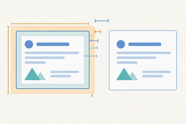
Every rendered element has a rectangular box. Read its regions from the inside outward: content, padding, and border. Margin sits outside the border.
Content is where text or other element content appears. Padding creates room inside the border, around that content. Margin creates space outside the border, separating the element from nearby boxes.
A border surrounds the padding and content. Margin is not part of the visible bordered card.
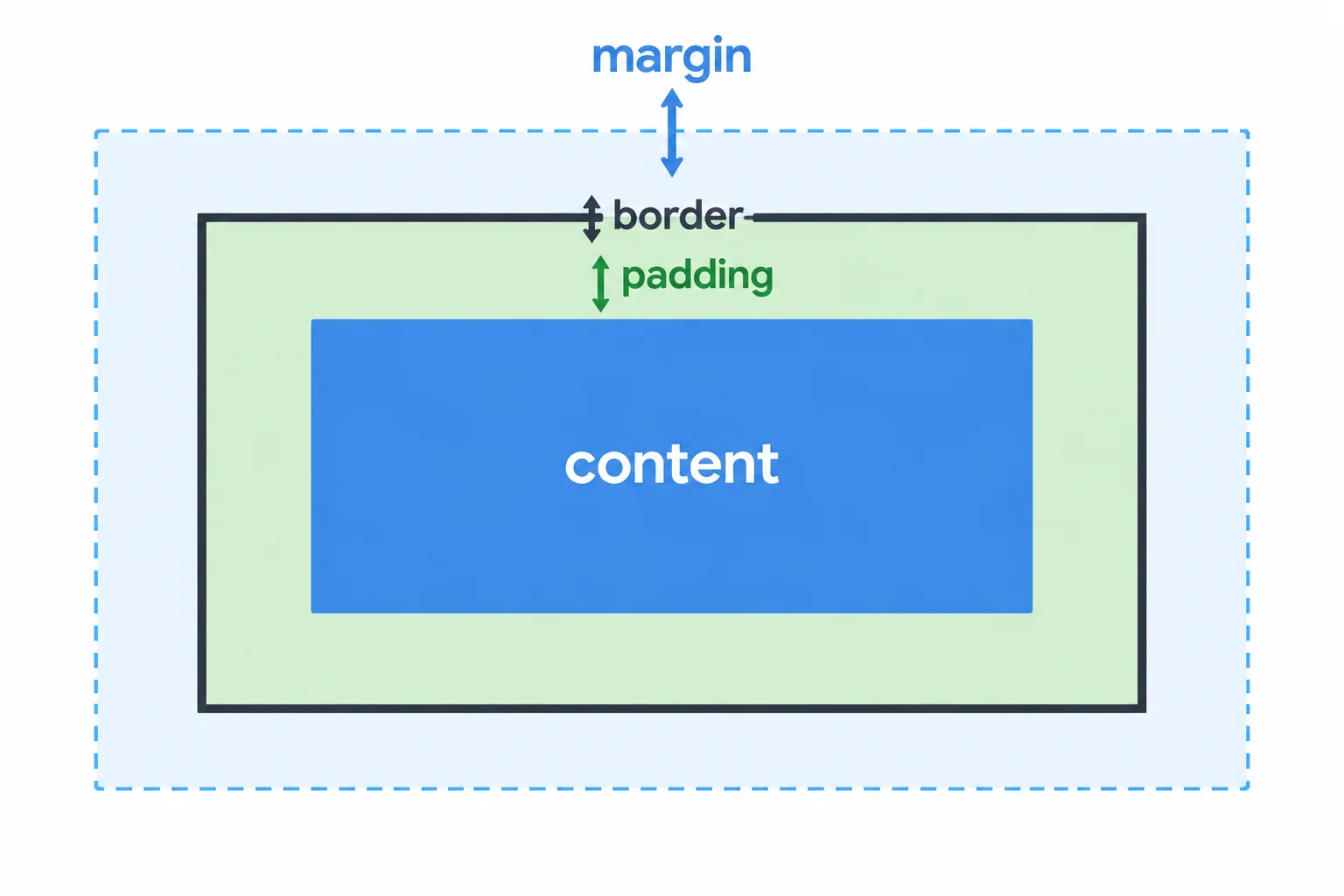
Padding is internal space; margin separates this box from neighboring boxes.
Create index.html and styles.css in the same local folder. Paste the complete files below, then open index.html in your browser.
The borders make each card boundary visible. The empty room between card text and its border is padding. The blank gap after each card is margin.
<!doctype html>
<html lang="en">
<head>
  <meta charset="utf-8">
  <title>Workshop Details</title>
  <link rel="stylesheet" href="styles.css">
</head>
<body>
  <div class="workshop">
    <article class="session-card">
      <h2 class="session-title">CSS Basics</h2>
      <span class="session-tag">Beginner</span>
      <p class="session-notes">Bring a notebook and questions for the workshop.</p>
    </article>
    <article class="session-card">
      <h2 class="session-title">HTML Review</h2>
      <span class="session-tag">Beginner</span>
      <p class="session-notes">Review headings, links, and tables before the workshop.</p>
    </article>
    <p class="access-note">The entrance is step-free.</p>
  </div>
</body>
</html>.session-card {
border-width: 2px;
border-style: solid;
padding-top: 16px;
padding-right: 16px;
padding-bottom: 16px;
padding-left: 16px;
margin-bottom: 24px;
}
.session-title,
.session-notes,
.access-note {
margin-top: 0;
margin-right: 0;
margin-bottom: 0;
margin-left: 0;
}Expected browser rendering: Two bordered session cards appear one below the other. Each card has visible empty space between its text and border. A visible vertical gap follows each card. Below the second gap, the access note “The entrance is step-free.” remains visible.
Font metrics and the available page width can vary, but the border, inner padding, vertical gaps, and access note should all be visible.

After saving both files and refreshing the browser, check for the card borders, internal padding, external gaps, and visible access note.
Inspect the first article.session-card in your browser developer tools. In the Computed or Layout panel, find the box-model diagram.
The center represents the content area. Moving outward, find padding, border, and margin. The measurements shown there help you see where each region begins and ends. Panel names and appearance vary by browser, but the nested model is the same.
Tip
The text elements in this example have their default margins set to zero. That makes the blank area between the card text and its border easier to recognize as padding, rather than space created by a heading or paragraph.
Match each box-model region to its position and purpose.
Tap an item and then its matching pair.

Step 2 of 9
Choose fixed, percentage, and automatic dimensions for a workshop card, and identify the reference used by a percentage width.
An ordinary article is a block box. In these first sizing examples, use box-sizing: content-box;: a declared width names the content width.
Use width: auto; when the card should use the available horizontal space. The browser accounts for the card’s padding and border while determining that space.
Use height: auto; for ordinary text in normal flow. When text needs additional lines, the card grows taller with it.
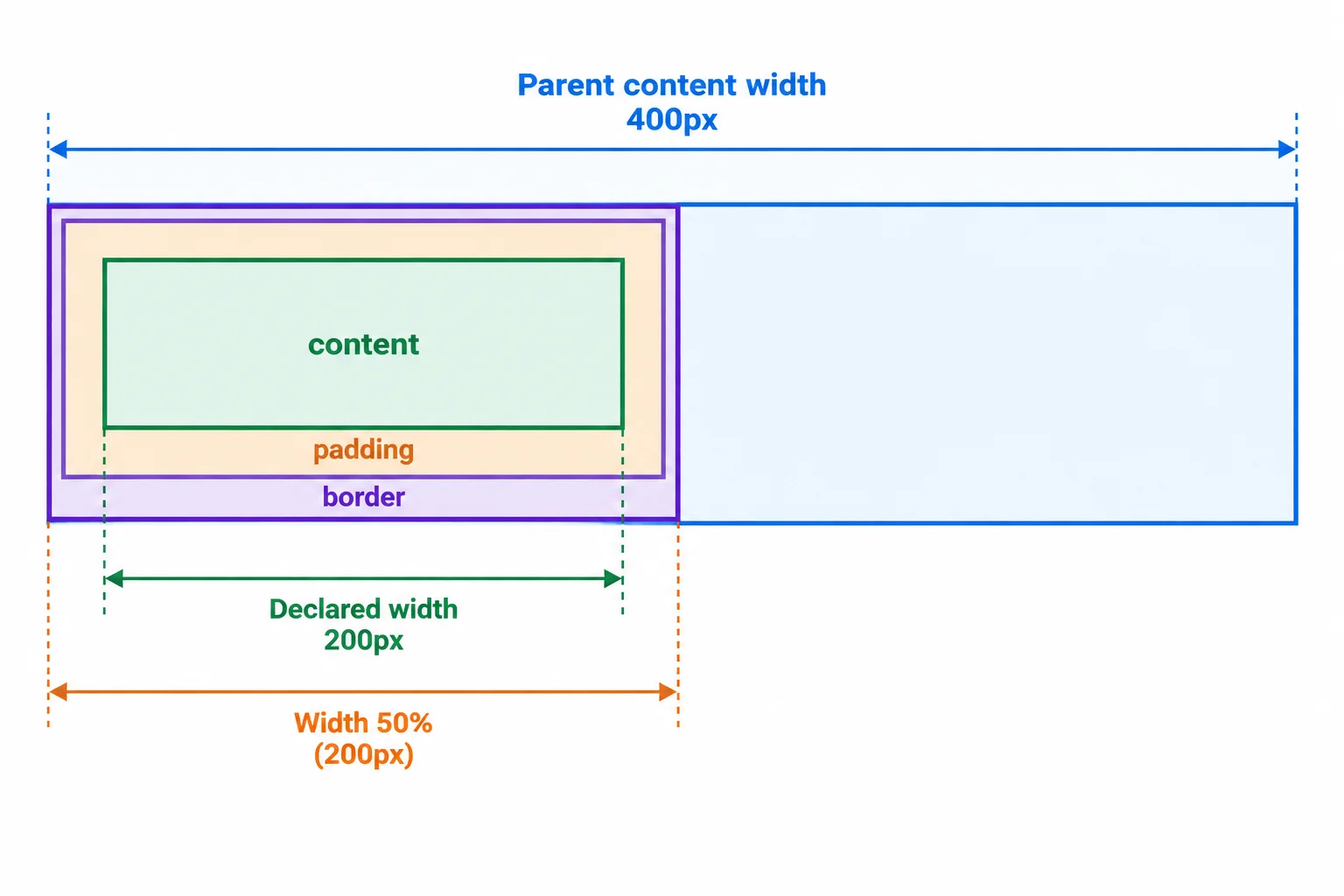
For this example, 50% is measured from the .workshop content width: 50% of 400px gives a 200px declared width.
Replace the first card’s existing .session-notes paragraph with this exact paragraph. It is deliberately long enough to wrap in the demonstrated card.
<p class="session-notes">Bring a notebook, questions, and a pen for the workshop. We will review the examples carefully, leave time for discussion, and confirm the next practice activity before the session ends.</p>Add these rules to styles.css, then save both files and refresh index.html. The first card becomes taller as the supplied notes wrap, while width: auto; continues to govern its horizontal size.
.workshop {
  width: 400px;
  padding: 0;
  border: 0;
}

.session-card {
  box-sizing: content-box;
  width: auto;
  height: auto;
  padding: 16px;
  border: 2px solid;
}

.session-title,
.session-notes,
.access-note {
  margin: 0;
}
Expected browser result after refresh: .workshop: 400px content width ┌────────────────────────────────────┐ │ CSS Basics │ │ Beginner │ │ Bring a notebook, questions, and │ │ a pen for the workshop. We will │ │ review the examples carefully, │ │ leave time for discussion, and │ │ confirm the next practice activity │ │ before the session ends. │ └────────────────────────────────────┘ The first card is taller because its notes wrap to multiple lines. Its width still uses the available horizontal space inside `.workshop`.
This is a schematic browser result. Exact line breaks can vary with the browser’s default font, but the supplied paragraph wraps and makes the first card taller; its horizontal size remains governed by the shown `width: auto;` rule.
Tip
auto is not a fixed measurement. For this normal block card, automatic width lets the browser derive a suitable horizontal size from available space, and automatic height lets normal-flow text determine the card’s height.
Choose a fixed width when the example needs one exact declared content width. Choose a percentage when the width should be a proportion of its containing block’s content width.
Here, .workshop has a 400px content width because its padding and border are both zero. Therefore, a child declaration of width: 50%; produces a 200px declared width. This is a demonstration measurement, not a responsive layout pattern.
A fixed height constrains vertical space, but it does not guarantee that all text fits inside it.
Compare the common sizing choices for a Workshop Details card.
| Need | Declaration | Result or reference |
|---|---|---|
| Fixed content width | width: 200px; | 200px declared width |
| Relative content width | width: 50%; | 50% of parent content width |
| Available horizontal space | width: auto; | Available width for the block |
| Text determines height | height: auto; | Box grows with normal-flow text |
| Constrained vertical space | height: 72px; | Text may not fit |
Complete the rule for a card that occupies half of the parent’s content width and grows vertically with its normal-flow text. Then record the card’s declared width.
.workshop {
  width: 400px;
  padding: 0;
  border: 0;
}

.session-card {
  box-sizing: content-box;
  width: ;
  height: ;
}

/* declared width: ; */
Step 3 of 9
Use side-specific properties and shorthands to place spacing inside or outside Workshop Details cards.
A card has two different kinds of space:
A border is the visible line between those regions. Its width is part of the box, so it contributes to the element’s dimensions.
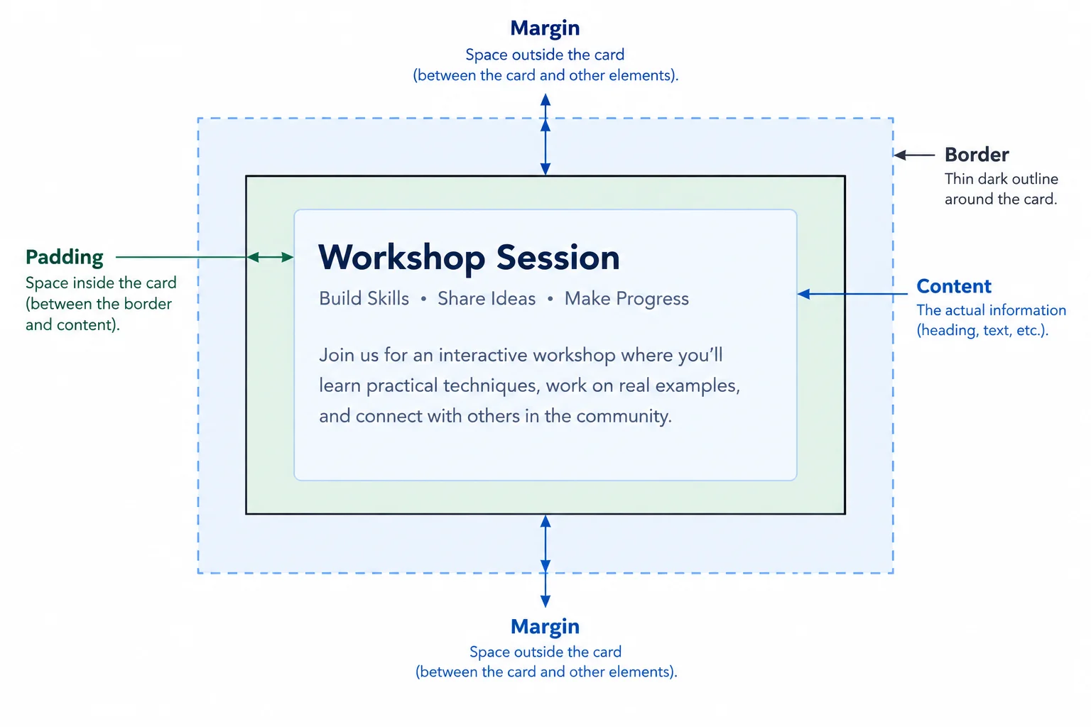
Padding creates room inside the card; margin creates room around it.
Use a side-specific property when only one side needs adjustment. For example, padding-left adds internal space on the left, while margin-bottom adds external space below an element.
Shorthands set several sides at once. Their values always follow a predictable pattern.
Read shorthand values from the patterns below. In a four-value shorthand, continue clockwise from the top.
| Number of values | Meaning | Example |
|---|---|---|
| 1 | all four sides | padding: 12px; |
| 2 | top/bottom | right/left | margin: 8px 16px; |
| 3 | top | right/left | bottom | padding: 8px 16px 12px; |
| 4 | top | right | bottom | left | margin: 8px 16px 12px 4px; |
These declarations style each article.session-card in the Workshop Details page.
.session-card {
  padding: 12px 16px;
  margin-bottom: 24px;
  border: 2px solid;
}
Tip
border: 2px solid; combines a border width and style. No color is declared, so the border uses the current text color. The visible 2px border adds to the box’s dimensions; margin remains outside the box.
Put the four sides in the order used by a four-value padding or margin shorthand.
Complete the CSS declarations.
.session-card {
  padding: ;
  margin: ;
  border:  ;
}

.access-note {
  margin: ;
}
Step 4 of 9
Calculate predictable element widths by comparing content-box and border-box sizing.
A declared width does not always describe the same part of a box. box-sizing decides whether that width applies to the content alone or to the whole border box.
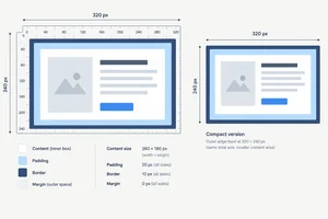
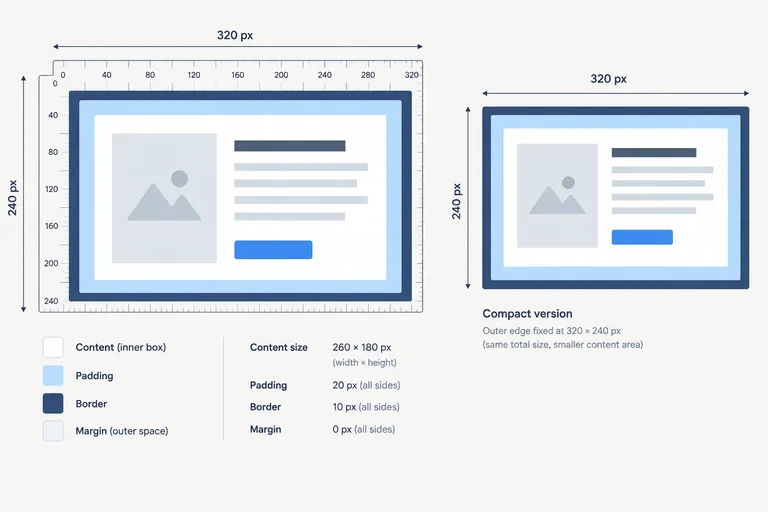
With box-sizing: content-box;, width: 200px; sets the content width. Add left and right padding (32px total) and borders (4px total) to find the border-box width: 236px.
With box-sizing: border-box;, the declared width already includes content, padding, and border. The border-box width is therefore 200px. Margin remains outside in both cases.
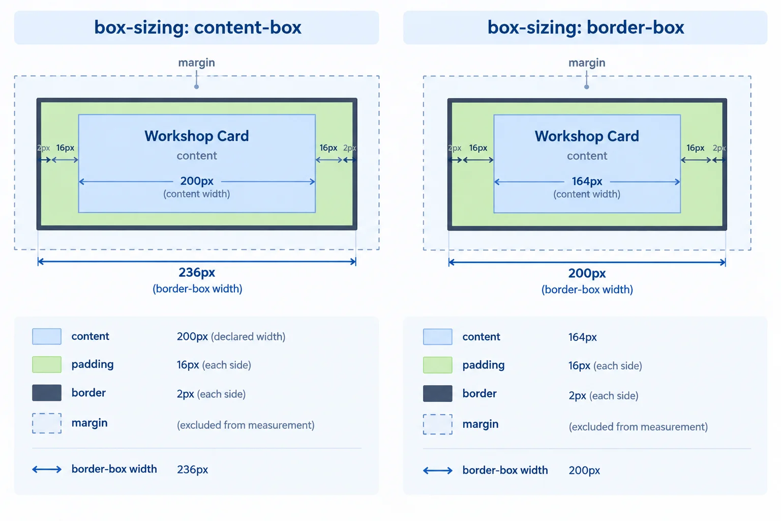
Margin sits outside the border-box width in both sizing modes.
The standard card has width: 200px;, padding: 16px;, and border: 2px solid;. Padding applies on both horizontal sides, as does the border.
| Measurement | box-sizing: content-box | box-sizing: border-box |
|---|---|---|
| declared width | 200px content width | 200px border-box width |
| horizontal padding | 32px added | included |
| horizontal border | 4px added | included |
| border-box width | 236px | 200px |
| content width | 200px | 164px |
| margin | outside | outside |
In styles.css, use this rule to test the content-box version. Save and refresh index.html, then inspect a card in your browser developer tools. Next, change only content-box to border-box, save, refresh, and inspect again.
.session-card {
  width: 200px;
  padding: 16px;
  border: 2px solid;
  box-sizing: content-box;
}
Expected browser / developer-tools comparison box-sizing: content-box Declared width: 200px Content width: 200px Horizontal padding: 32px Horizontal border: 4px Border-box width: 236px After changing only to box-sizing: border-box Declared width: 200px Content width: 164px Horizontal padding: 32px Horizontal border: 4px Border-box width: 200px
Browser developer tools use different labels and layouts. Compare the displayed content width and outer border boundary to these expected measurements.
Tip
The same inclusion rule applies when you explicitly declare a height: under border-box, padding and border are included in that declared dimension. A margin is still outside the border box.
A card uses the standard measurements and box-sizing: border-box;. What content width remains, in CSS pixels?
Complete the CSS and calculation notes for the standard card. Choose the sizing value that makes the card's border-box width match its declared width.
.session-card {
  width: 200px;
  padding: 16px;
  border: 2px solid;
  margin: 24px;
  box-sizing: ;
}

/* With content-box, border-box width: px. */
/* With border-box, border-box width: px. */
/* The margin is  the border-box. */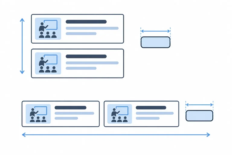
Step 5 of 9
Select block, inline, or inline-block behavior based on line flow and explicit sizing.
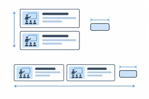
In normal document flow, ordinary block boxes are placed one after another. An article is block-level by default, so each workshop card begins on a new line.
Inline content flows within a line. A span, such as the Beginner label, is ordinarily inline and can share a line with nearby inline content.
When a block box has width: auto;, it ordinarily uses the available horizontal space in its parent. This visual behavior does not change the element’s HTML meaning.
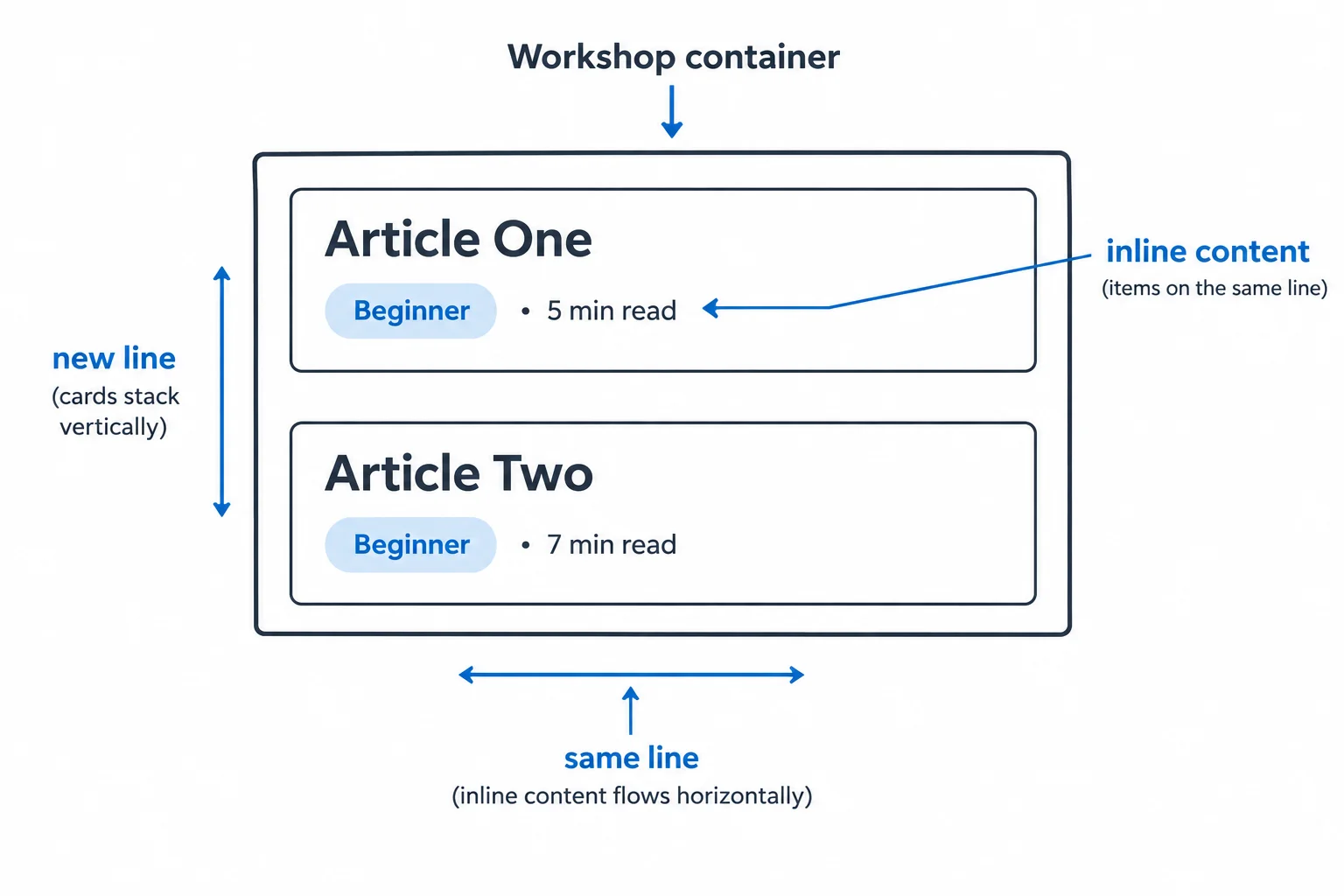
Block boxes stack in normal flow; inline content participates within a text line.
Use display when an individual element needs different visual flow or sizing behavior. The element keeps its HTML meaning: changing a span to inline-block does not turn it into a heading or a button.
An ordinary non-replaced inline element does not use width and height to form a sized box in the way a block box does. Choose inline-block when an element must remain inline-level while accepting explicit dimensions.
Compare the three values for ordinary elements in normal flow.
| Value | Flow behavior | Explicit width and height |
|---|---|---|
| block | Starts on a new line | Accepted |
| inline | Stays within a line | Do not size the box |
| inline-block | Stays within a line | Accepted |
Add this rule to styles.css when each Beginner label needs an explicit width but must remain inline-level. Save the file and refresh index.html.
.session-tag {
  display: inline-block;
  width: 90px;
  padding: 4px;
  border: 1px solid;
}
Expected browser rendering: CSS Basics [ Beginner ] Bring a notebook and questions for the workshop. Each Beginner label has a visible bordered box. Its declared content width is 90px; padding and border add around that content. The label remains inline-level and does not become a card-wide block.
Browser rendering is visual, so fonts and exact wrapping vary. Check that the label has a declared content width of 90 CSS pixels and remains inline-level rather than taking the card’s full available width.
Match each display value to its behavior.
Tap an item and then its matching pair.
Complete the declaration so the Beginner span accepts the explicit width while continuing to participate within a line.
.session-tag {
  display: ;
  width: 90px;
  padding: 4px;
  border: 1px solid;
}
Step 6 of 9
Predict collapsed vertical sibling margins and use one intentional margin to create a requested gap.
Two consecutive block siblings in normal flow can have touching vertical margins. When those touching margins are positive, they collapse into one visible gap. The gap is the larger margin, not the sum of both margins.
Margin remains outside each card’s border. This step considers only vertical margins between consecutive block siblings.
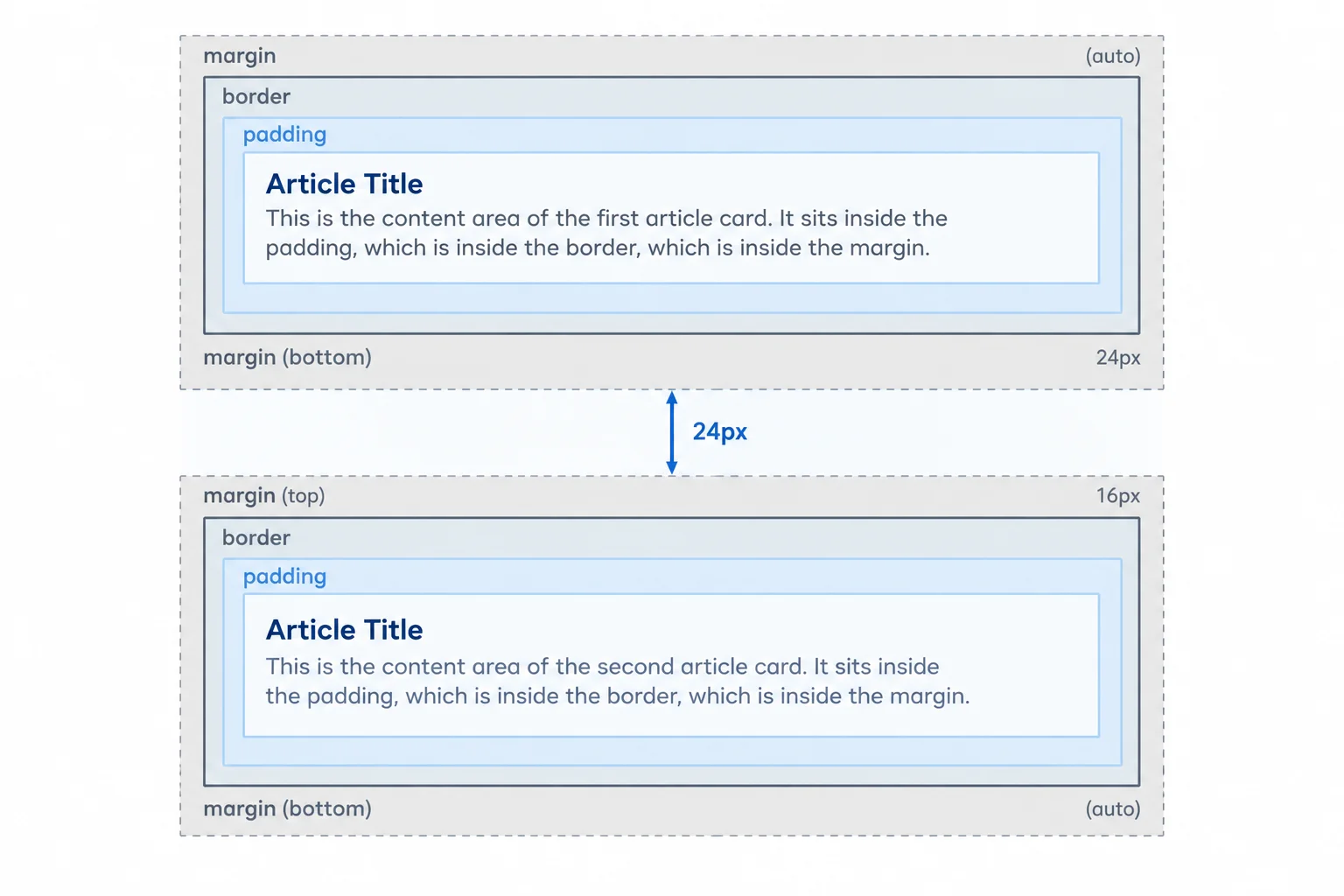
For these positive vertical margins, the visible sibling gap is 24px, not 40px.
Replace only the opening article tags in index.html. Keep the existing session-card class on both cards and leave each closing </article> tag unchanged.
<article class="session-card first-card">
  <h2 class="session-title">CSS Basics</h2>
  <!-- existing card content -->
</article>

<article class="session-card second-card">
  <h2 class="session-title">HTML Review</h2>
  <!-- existing card content -->
</article>Add these rules to styles.css, then save both files and refresh the browser. The two article elements remain ordinary block siblings.
.session-card.first-card {
  margin-bottom: 24px;
}

.session-card.second-card {
  margin-top: 16px;
}CSS Basics card [24px rendered vertical gap] HTML Review card
The browser renders this visually; the output summarizes the expected arrangement rather than console text.
The collapse rule is specific. It does not mean that every pair of margins combines or disappears. The comparison below stays within the situations needed for these cards.
Compare the margin situations below.
| Situation | Do the margins collapse? | Result |
|---|---|---|
| Positive vertical margins of consecutive block siblings | Yes | The larger margin sets the gap |
| Horizontal margins | No | Each remains horizontal space |
| Vertical margins on inline-blocks | No | Each margin remains separate |
Tip
For an intentional boundary between siblings, let one card own the space. For example, put a bottom margin on the first card and no touching top margin on the next card. One declared margin is easier to inspect and adjust than a desired gap split across both cards.
The two Workshop Details cards configured on the preceding screen touch vertically. What visible gap do they create?
The first card has the first-card class. Complete its rule with one declaration that creates a 32px vertical boundary before the next ordinary block sibling. Do not add a declaration to the second card.
.session-card.first-card {

}
Step 7 of 9
Inspect constrained text, compare overflow values, and choose a repair that keeps essential information available.
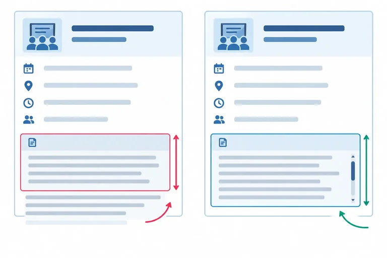
Overflow happens when content needs more space than its box provides. First inspect the constrained dimension. A fixed height can leave too little vertical space for notes that wrap onto several lines.
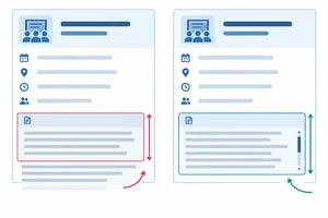
With height: 48px;, extra text can extend beyond the paragraph’s box. The box still occupies only its declared layout height. The default treatment, overflow: visible;, lets the extra text paint outside that boundary; it does not make the box taller.

With height: 48px; and overflow: visible;, text can paint outside the box, but the box’s layout height remains 48px.
Choose a treatment only after deciding whether the constrained size is intentional. For ordinary session prose, a fixed height is usually unnecessary: let the paragraph grow. If a region must remain a particular height, its necessary content must still be reachable.
These values apply when content is larger than the available space inside its box.
| Value | What happens to excess content | Suitable for essential notes? |
|---|---|---|
| visible | Paints outside the box; layout dimensions do not grow | Only when overlap is acceptable |
| hidden | Clips excess content; no user-facing scrolling controls | No |
| auto | Provides scrolling when needed | Yes, for an intentionally constrained region |
| scroll | Requests scrolling even when content fits | Usually unnecessary for ordinary notes |
Replace the .session-notes rule you are testing with this rule only when the notes do not need a fixed-height region. Do not add Alternative B as well. Save styles.css and refresh index.html.
.session-notes {
  height: auto;
  overflow: visible;
}
Expected browser result: The session-notes paragraph expands vertically to contain all of its text. No notes extend beyond the paragraph box.
The exact number of displayed lines depends on the card width and browser font rendering. The paragraph should grow rather than clip or overlap nearby content.
Use this separate replacement rule only when the notes must remain in a 48px-tall region. Do not add Alternative A as well. Save styles.css and refresh index.html.
.session-notes {
  height: 48px;
  overflow: auto;
}
Expected browser result: The session-notes box remains 48px tall. When its text needs more space, a scroll mechanism makes the remaining notes reachable.
Scrollbar appearance varies by browser and operating system. When the notes exceed 48px, a user must be able to scroll to the remaining text.
An essential session-notes region must remain 48px tall because it is intentionally constrained. Which declaration best preserves access to longer notes?
Complete the repair for essential notes in an intentionally 48px-tall region.
.session-notes {
  height: 48px;
  overflow: ;
}
Step 8 of 9
See why display: none removes essential content from both layout and assistive-technology access, then restore the Workshop Details access note.
display: none; does more than make an element visually disappear. It removes the element and all of its descendants from normal layout, so neighboring content can move into its former space.
It also normally removes that content from the accessibility tree: the browser’s representation of content used by assistive technologies such as screen readers. The HTML can still contain the element, but source code alone does not keep it available to a screen reader.
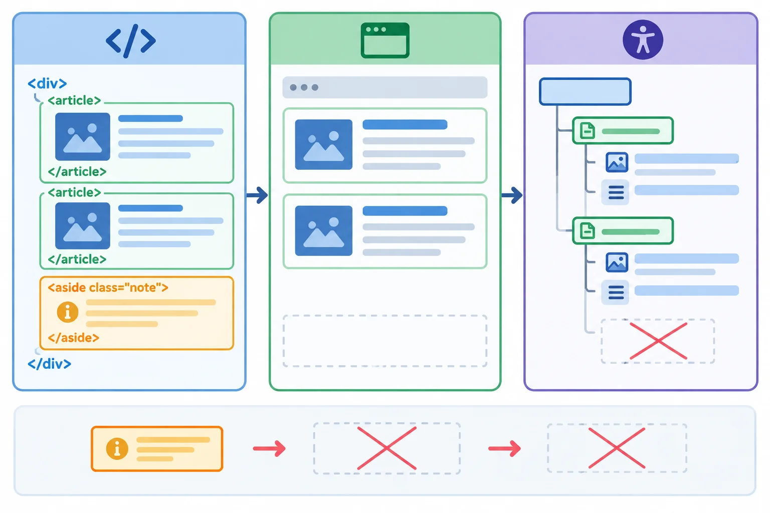
With display: none, content can remain in the source while being absent from normal layout and the accessibility tree.
The Workshop Details page includes an essential access note: The entrance is step-free. Hiding this p.access-note with display: none; makes the note unavailable to people who need that information through a screen reader as well as to sighted users.
This differs from overflow behavior. Overflow controls what happens when content exceeds a box’s available space. display: none; instead removes the element itself from layout and normally from the accessibility tree.
Current rule in styles.css
.access-note {
  display: none;
}
Warning
Do not use display: none; for information that must remain available. Inspect whether the content is essential before hiding it; keeping text in index.html is not enough.
True or false: Because the access note remains in index.html, a screen reader can generally read it after .access-note { display: none; } is applied.
The access note is essential. Complete the declaration in styles.css to restore it to normal layout.
.access-note {
  display: ;
}
Step 9 of 9
Apply a coordinated set of CSS fixes so the cards have predictable dimensions, intentional spacing, and readable essential information.
This final repair combines techniques you have already used. Check the page in a deliberate order:
box-sizing.span tag a sized inline-level box.The target is two 200px border-box cards with a 24px gap, readable notes, a compact sized tag, and an access note that remains available.
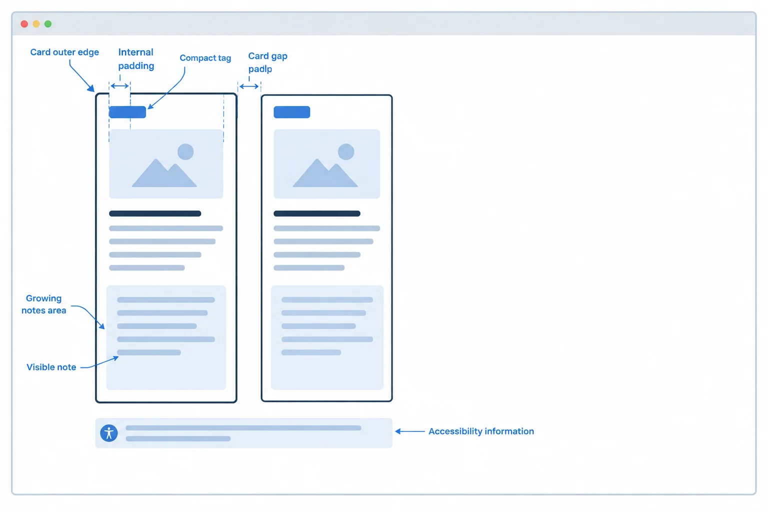
The repaired page has a fixed outer card width, internal padding, one intentional sibling gap, an inline-level sized tag, unconstrained notes, and a visible access note.
Create or open index.html and styles.css in the same local folder. Replace the contents of index.html with this complete markup. The first card has longer notes so you can confirm that ordinary text remains readable when it needs multiple lines.
index.html
<!doctype html>
<html lang="en">
<head>
  <meta charset="utf-8">
  <title>Workshop Details</title>
  <link rel="stylesheet" href="styles.css">
</head>
<body>
  <div class="workshop">
    <article class="session-card">
      <h2 class="session-title">CSS Basics</h2>
      <span class="session-tag">Beginner</span>
      <p class="session-notes">Bring a notebook, questions, and a pen for the workshop. We will review the examples carefully, leave time for discussion, and confirm the next practice activity before the session ends.</p>
    </article>
    <article class="session-card">
      <h2 class="session-title">HTML Review</h2>
      <span class="session-tag">Beginner</span>
      <p class="session-notes">Review headings, links, and tables before the workshop.</p>
    </article>
    <p class="access-note">The entrance is step-free.</p>
  </div>
</body>
</html>Complete the stylesheet declarations for the coordinated repair. The bottom margin is the single intentional boundary between the two cards.
.workshop {
  width: 400px;
  padding: 0;
  border: 0;
}

.session-card {
  width: 200px;
  box-sizing: ;
  padding: 16px;
  border: 2px solid;
  margin: 0 0 ;
}

.session-title,
.session-notes,
.access-note {
  margin: 0;
}

.session-tag {
  display: ;
  width: 80px;
  padding: 4px;
  border: 1px solid;
}

.session-notes {
  height: ;
  overflow: ;
}

.access-note {
  display: ;
}Replace the contents of styles.css with the completed stylesheet, save it, and refresh index.html. Then inspect the first .session-card in browser developer tools. Compare its box-model values with the expected browser and inspection result attached to the code.
styles.css
.workshop {
  width: 400px;
  padding: 0;
  border: 0;
}

.session-card {
  width: 200px;
  box-sizing: border-box;
  padding: 16px;
  border: 2px solid;
  margin: 0 0 24px;
}

.session-title,
.session-notes,
.access-note {
  margin: 0;
}

.session-tag {
  display: inline-block;
  width: 80px;
  padding: 4px;
  border: 1px solid;
}

.session-notes {
  height: auto;
  overflow: visible;
}

.access-note {
  display: block;
}
Expected visible result after refresh: • Two bordered session cards appear one below the other. • Each card’s outer border width is 200px. • The space from the first card’s border to the second card’s border is 24px. • Each Beginner tag is a compact sized inline-block box, not a full-width row. • The longer CSS Basics notes use additional lines as needed; no note text is clipped. • The entrance is step-free. is visible below the cards. Expected inspection for the first .session-card: declared width: 200px border-box width: 200px content width: 164px horizontal padding: 16px on each side border: 2px on each side margin-bottom: 24px
This is an expected browser-and-developer-tools reference, not automatic inspection. Font rendering and line wrapping can vary slightly by browser, but the listed CSS-pixel measurements should match.
Summary
Use this checklist while reviewing your local page:
Beginner span is sized without becoming a block row.display: none;.Using your own local page and developer tools, report your complete verification. State the first card’s declared width, border-box width, and calculated content width; the measured gap between the two cards; and what you observed about the tag, the notes, and the access note after completing the repair.
Write at least 120 characters (0/120).
Congratulations! You completed: Control Element Size and Spacing
Thousands of online courses in video, ebooks and audiobooks.
To test your knowledge during online courses
Generated directly from your cell phone's photo gallery and sent to your email

Download our app via QR Code or the links below:.



Carry knowledge in your pocket.
Download the Cursa app.
There are hundreds of free courses available, with a free certificate of completion that is saved in your mobile image gallery.
Download the app to access the Course Completion Certificate for Free.


+ 10 million
students

Free and Valid
Certificate

60 thousand free
exercises

4.8/5 rating in
app stores

Free courses in
video and ebooks