Step 1 of 6
Keep Images Inside Their Containers
Constrain a local image with proportional sizing so it remains inside a fluid page container without distortion.

Learning path · Level 3 · Tutorial 4
Make your own local images and video fit responsive containers, preserving proportions and choosing deliberately when media should be cropped.
 Keep Images Inside Their Containers
Constrain a local image with proportional sizing so it remains inside a fluid page container without distortion. 2 min
Keep Images Inside Their Containers
Constrain a local image with proportional sizing so it remains inside a fluid page container without distortion. 2 min
 Add a Local Video with Native Controls
Embed a learner-owned local video with native browser controls and reuse proportional sizing so it fits the responsive gallery. 2 min
Add a Local Video with Native Controls
Embed a learner-owned local video with native browser controls and reuse proportional sizing so it fits the responsive gallery. 2 min
 Choose a Responsive Media Frame
Create an empty, fluid 16:9 media frame and verify that its height follows its width. 2 min
Choose a Responsive Media Frame
Create an empty, fluid 16:9 media frame and verify that its height follows its width. 2 min
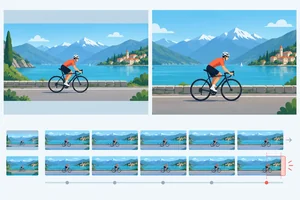 Choose Between Contain and Cover
Choose between contain and cover inside an intentional media frame while avoiding distortion and protecting meaningful image or video content. 3 min
Choose Between Contain and Cover
Choose between contain and cover inside an intentional media frame while avoiding distortion and protecting meaningful image or video content. 3 min
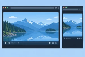 Check Video at Narrow Widths
Check a narrow video layout for both proportional visual fit and usable native playback controls. 2 min
Check Video at Narrow Widths
Check a narrow video layout for both proportional visual fit and usable native playback controls. 2 min
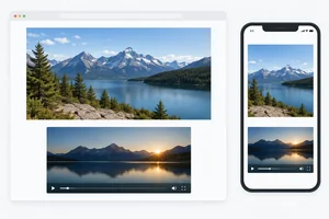 Build and Review Your Responsive Gallery
Finish Local Media Gallery with a naturally proportioned image, a framed local video, and a practical narrow-layout review. 3 min
Build and Review Your Responsive Gallery
Finish Local Media Gallery with a naturally proportioned image, a framed local video, and a practical narrow-layout review. 3 min
Step 1 of 6
Constrain a local image with proportional sizing so it remains inside a fluid page container without distortion.
Every image has intrinsic dimensions: its source width and height. Their relationship creates its intrinsic proportions. For example, an illustrative source that is 1200 × 800 pixels has a 3:2 shape.
A fluid .page can become narrower than a large image. Without a sizing limit, the image may extend past its container. Proportional scaling reduces width and height together, so visual shapes keep their intended appearance. Changing width and height independently can cause distortion.
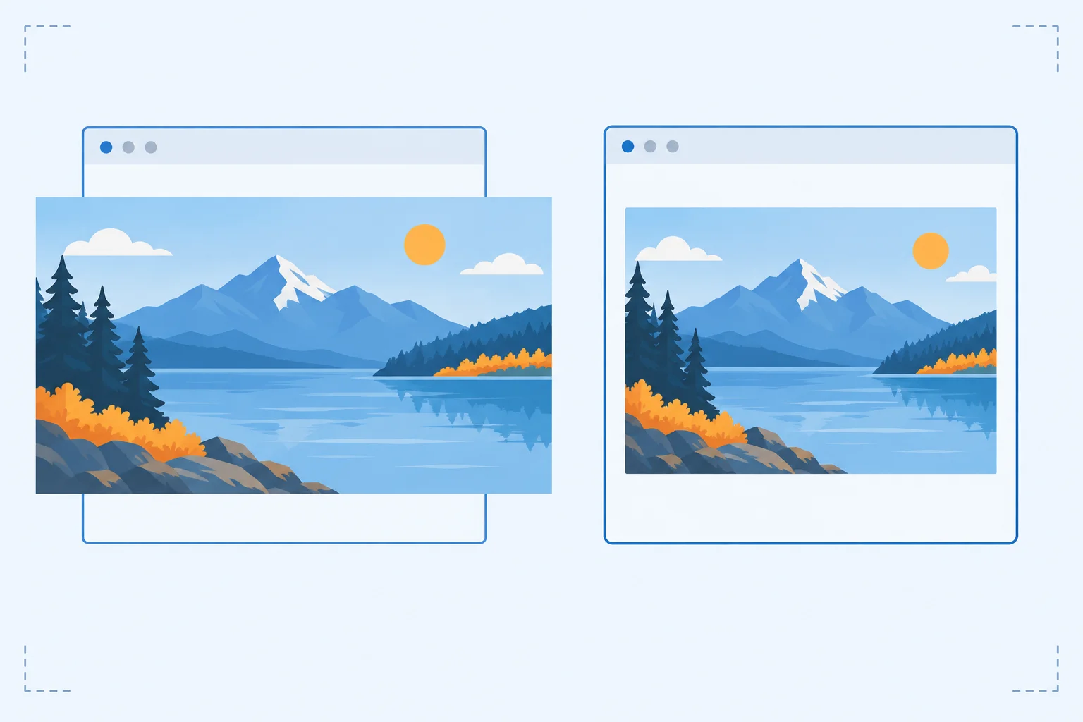
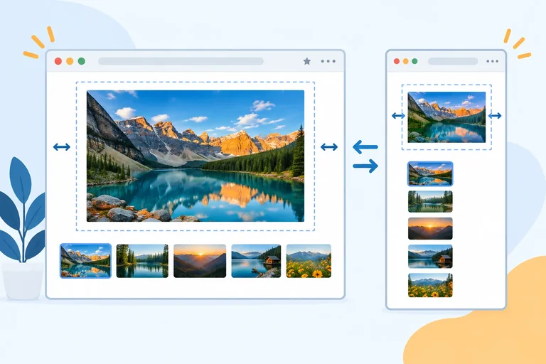
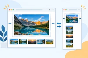
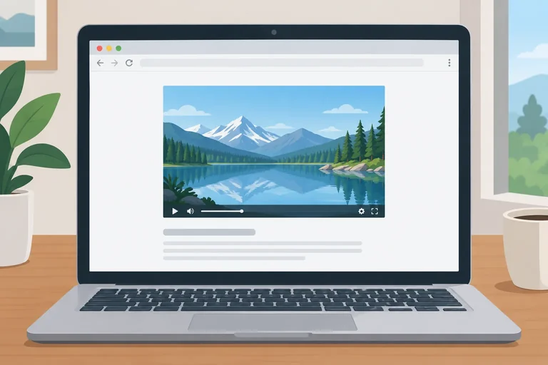
An illustrative 1200 × 800 pixel source can shrink inside a narrower .page while retaining its intrinsic proportions.
Create a local folder for Local Media Gallery. Put an image in a media folder. This starter example uses media/photo.jpg; if your image has another real name or extension, change the src to match it. Replace the sample alternative text with an accurate description of your chosen image.
Save both complete files below in the same folder. The .page rule uses the fluid, bounded page-container pattern you already know.
Save as index.html.
<!doctype html>
<html lang="en">
  <head>
    <meta charset="utf-8">
    <meta name="viewport" content="width=device-width, initial-scale=1">
    <title>Local Media Gallery</title>
    <link rel="stylesheet" href="styles.css">
  </head>
  <body>
    <main class="page">
      <h1>Local Media Gallery</h1>
      <img class="media-natural" src="media/photo.jpg" alt="A red bicycle leaning against a brick wall">
    </main>
  </body>
</html>Save as styles.css. Then open index.html in a browser. The expected render below describes the page when both files are saved and the image path is valid.
* {
  box-sizing: border-box;
}

body {
  margin: 0;
  font-family: system-ui, sans-serif;
}

.page {
  width: 100%;
  max-width: 48rem;
  margin: 0 auto;
  padding: 1.5rem 1rem 3rem;
}

.media-natural {
  display: block;
  max-width: 100%;
  height: auto;
}Browser render: A centered, bounded page area contains the heading “Local Media Gallery” and the chosen photo below it. At a wide browser width, the page stops growing at 48rem. At a narrower width, the page and photo become narrower together. A large photo stays within the page content area and keeps its original shape; a smaller photo remains at its natural displayed width.
Your chosen image and its natural displayed width will differ. A smaller source image is not enlarged by this rule.
Complete the proportional-sizing rule. Then enter the completed declarations in your local styles.css file.
.media-natural {


}Ensure your local .media-natural rule is complete, save both files, and open index.html. First view the page wide, then gradually make the browser narrower.
In 2–4 sentences, name the three declarations you used, report whether the image shrank or overflowed, and decide whether the result was proportional scaling or distortion. Explain what happened to your image if it began narrower than .page.
Write at least 120 characters (0/120).
Step 2 of 6
Embed a learner-owned local video with native browser controls and reuse proportional sizing so it fits the responsive gallery.
A <video> element can play a learner-owned, browser-playable local file through its src attribute. The boolean controls attribute asks the browser to show its built-in playback interface—no JavaScript is needed.
For this sizing practice, choose a short clip without essential audio information. Native controls can look different across browsers; they do not need to match an illustration exactly.
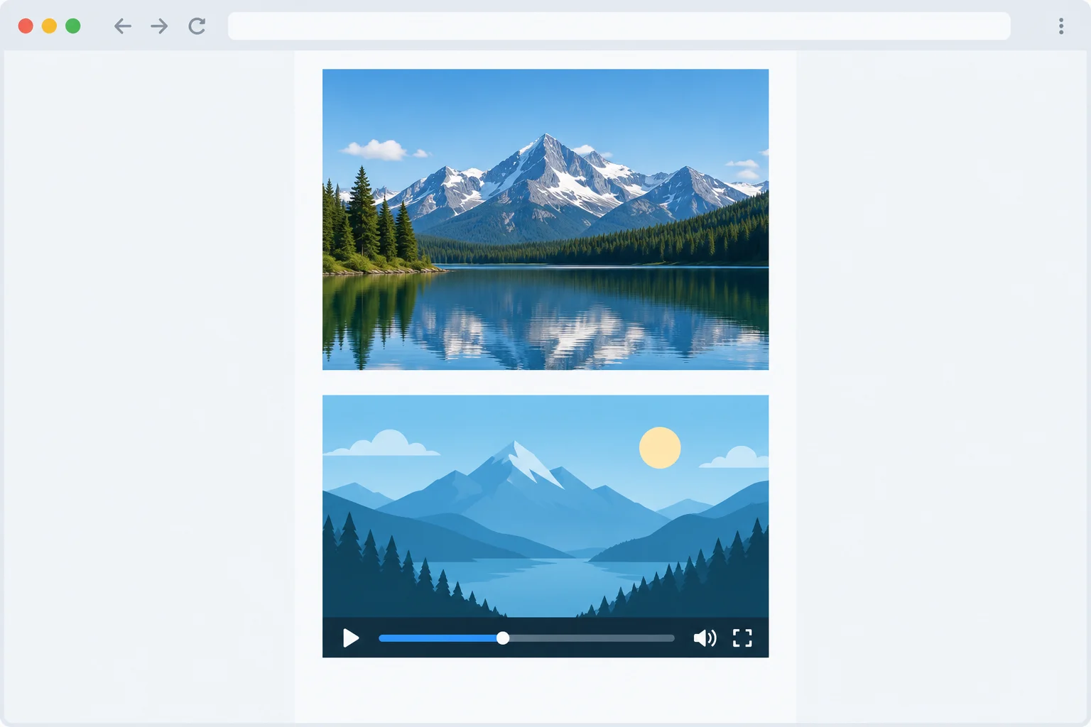
The browser supplies native controls. Their exact appearance varies by browser.
In index.html, add this video below the existing image in Local Media Gallery. The example uses media/clip.mp4.
Put your own browser-playable video in the media folder. If its real filename or extension differs, change the src value to match it. Do not rename an incompatible file just to match this example.
Add below the existing image in index.html.
<video class="media-natural" src="media/clip.mp4" controls>
  Your browser cannot play this video.
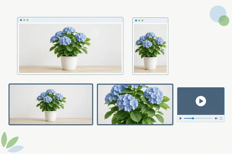
</video>Local Media Gallery [Your chosen image, displayed no wider than the centered page container] [Your video, displayed below the image at its intrinsic proportions] [Native browser playback controls appear along the bottom of the video player]
The chosen image, video poster frame, intrinsic dimensions, and native control design vary by your files and browser. The important result is that both media elements remain inside `.page`, and the video keeps its intrinsic proportions as the page narrows.
The existing .media-natural class provides the same proportional scaling for this video that it provided for the image: it limits the displayed width to the container and preserves intrinsic proportions with automatic height.
Do not add a separate forced height. If the player does not load or play, first check the relative path and whether the browser can play that file; CSS sizing cannot repair either problem.
Tip
Save index.html and refresh the browser. max-width: 100%; is a limit, not a command to enlarge a smaller video. A smaller source can remain narrower than .page.
Complete the sample video element for the gallery.
<video class="media-natural" src="" >
  Your browser cannot play this video.
</video>Add the completed markup to your local index.html. If your clip has a different real path, update only the src value to match it. Save, refresh, start playback, and then narrow the browser window.
Check that the player stays inside .page and changes size without distortion. A failed load or failed playback points to the file path or browser compatibility before it points to the proportional-sizing rule.
After testing your own gallery, report the relative path you used and what happened when you played the clip and narrowed the browser window. State whether native controls appeared and whether the video stayed within its container with proportional scaling.
Write at least 80 characters (0/80).
Step 3 of 6
Create an empty, fluid 16:9 media frame and verify that its height follows its width.
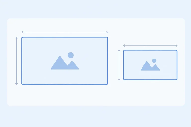
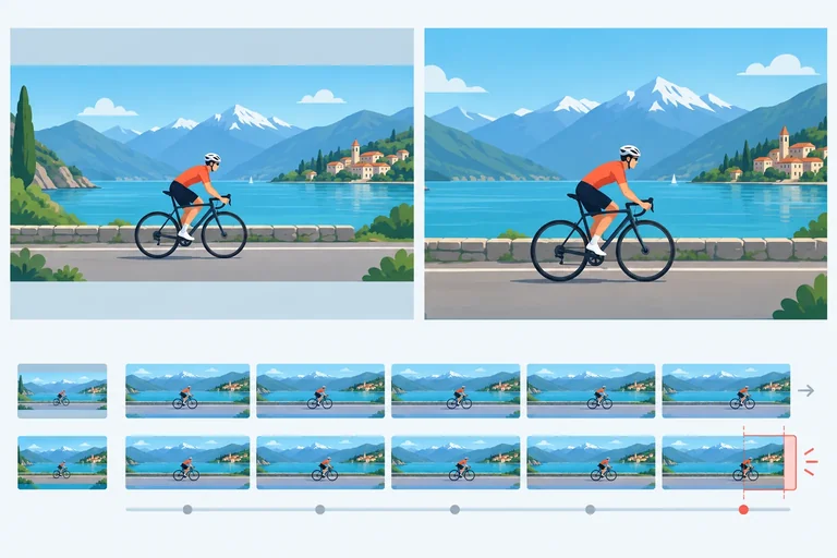
A source’s intrinsic dimensions describe the proportions built into an image or video. A media frame is different: it is a layout box whose shape you choose for the page.
For Local Media Gallery, create an empty 16:9 media frame before placing media inside it. This isolates the frame’s size from a source’s intrinsic proportions. The frame reserves a deliberate area in the layout, but it does not yet decide how differently shaped media will appear inside.
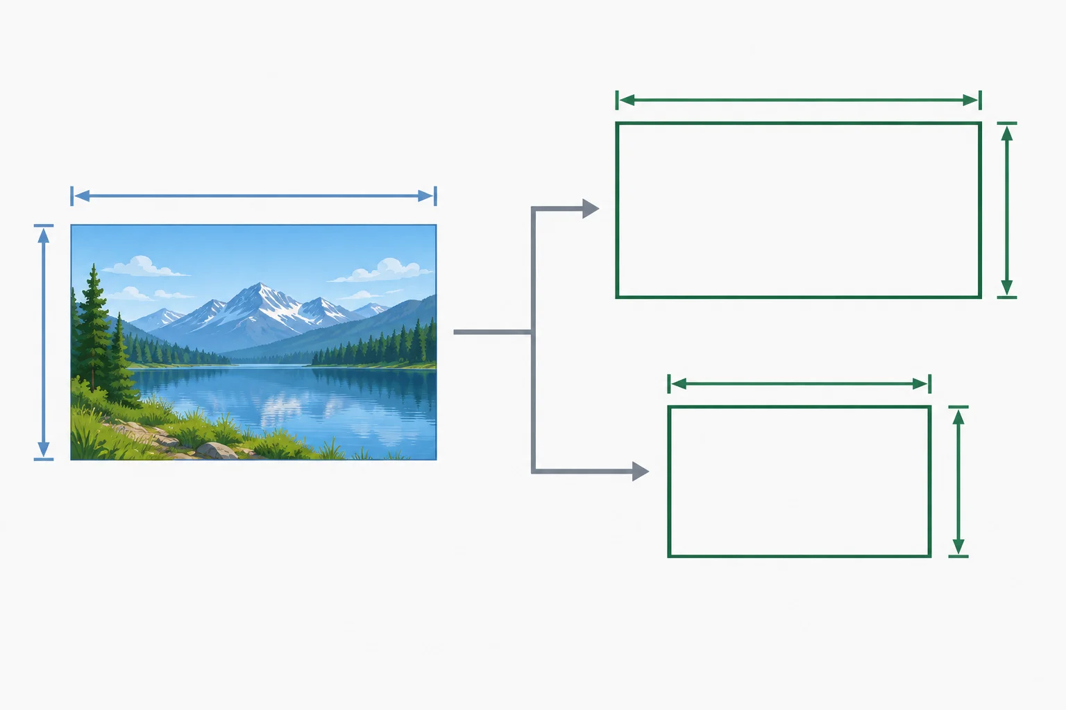
A source can have one intrinsic proportion while the page uses a different, intentional media frame.
Inside the existing <main class="page"> on your Local Media Gallery page, add this empty frame below the video. It has no image or video child yet, so its outline makes the frame-sizing behavior visible.
Add below the existing video in the .page container.
<section>
  <h2>16:9 frame test</h2>
  <div class="media-frame"></div>
</section>Add this rule to styles.css. The border and background only make the empty media frame visible while you test its sizing.
.media-frame {
  box-sizing: border-box;
  width: 100%;
  aspect-ratio: 16 / 9;
  border: 2px dashed #52657a;
  background: #eef3f7;
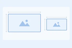
}Wide rendering, with 640px available inside .page: 16:9 frame test [ empty dashed media frame: 640px wide × 360px high ] Narrow rendering, with 320px available inside .page: 16:9 frame test [ empty dashed media frame: 320px wide × 180px high ]
These illustrative dimensions occur when the available content width is 640px or 320px. Your actual frame size depends on the available width inside `.page`, but its 16:9 shape remains the same.
Tip
width: 100%; makes the media frame fluid within .page. Because there is no fixed height, aspect-ratio lets its height follow its width.
Do not add a definite height here. Setting both width and height to definite values can override the preferred ratio. The outlined result confirms frame sizing only; it is not yet a complete media-fitting solution.
Complete the aspect-ratio declaration for the outlined media frame.
.media-frame {
  box-sizing: border-box;
  width: 100%;
  aspect-ratio:  / ;
  border: 2px dashed #52657a;
  background: #eef3f7;
}After saving your CSS, narrow the browser until the outlined .media-frame is 320px wide. Which displayed size preserves 16:9 proportions?
Step 4 of 6
Choose between contain and cover inside an intentional media frame while avoiding distortion and protecting meaningful image or video content.
A .media-frame already provides a fluid 16:9 box. Give an image or video inside it the .media-fill class so the media element occupies that box:
width: 100% and height: 100% size the media element to the media frame.object-fit decides how its visual content fits inside that element.This differs from .media-natural. A media frame has an intentional shape, so a source with different intrinsic proportions needs unused space or intentional cropping to avoid distortion.
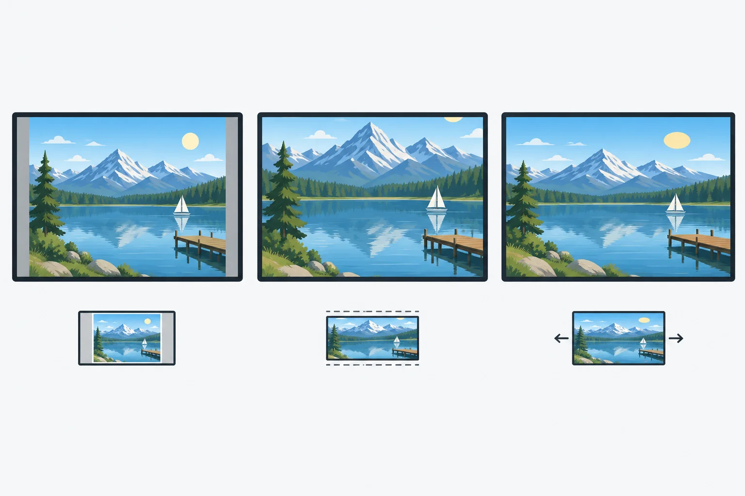
Contain and cover preserve intrinsic proportions. Contain can leave unused space; cover can crop edges; forced stretching causes distortion.
Add one fitting class with .media-fill; do not combine .media-natural and .media-fill on the same media element. object-fit changes how content is drawn inside the media element. It does not resize the surrounding .media-frame.
Add these rules below your existing .media-frame rule in styles.css. The default centered alignment is used in both fitting modes.
Add these rules to styles.css.
.media-fill {
  display: block;
  width: 100%;
  height: 100%;
}

.fit-contain {
  object-fit: contain;
}

.fit-cover {
  object-fit: cover;
}Browser result: No visible change occurs yet if the media frame is still empty. The rules become visible after they are applied to media inside a .media-frame.
Saving these CSS rules alone produces no visible fitting change until an image or video uses `media-fill` together with one fitting class.
In index.html, replace the empty <div class="media-frame"></div> from the 16:9 frame test with this complete media frame. It uses your existing local video path; update the path only if your real file differs.
<div class="media-frame">
  <video class="media-fill fit-contain" src="media/clip.mp4" controls>
    Your browser cannot play this video.
  </video>
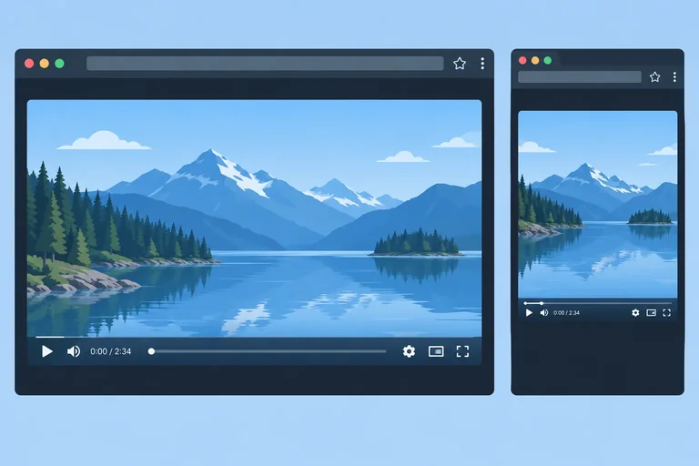
</div>Browser result: The video occupies the fluid 16:9 media frame and keeps proportional scaling. With fit-contain, the complete video remains visible; unused space can appear inside the frame when its intrinsic proportions differ. Native playback controls are available.
The exact unused space and the appearance of native controls vary with your video’s intrinsic dimensions and browser. A valid local video path is required.
Save, refresh, and play your local clip with .fit-contain. Then change only the fitting class to .fit-cover, refresh, and play the relevant sequence again.
With contain, all of the source remains visible, though unused space may appear. With cover, the media frame fills, but content near an edge can be lost. Keep contain when every detail or action matters. Keep cover only when the visible crop still preserves the intended meaning. Restore the class that fits your own clip.
Watch why a crop that looks safe at the beginning can remove meaningful action later in a video sequence.
For a source wider than a 16:9 media frame, contain leaves unused space above and below, while cover crops the left and right edges. Judge video crops across the relevant sequence.
Complete the two fitting rules in styles.css.
.fit-contain {
  object-fit: ;
}

.fit-cover {
  object-fit: ;
}Match each content requirement to the appropriate fitting result.
Tap an item and then its matching pair.
Step 5 of 6
Check a narrow video layout for both proportional visual fit and usable native playback controls.
A video can have a correct media frame and still be hard to operate. Treat these as separate checks:
object-fit changes how image or video content is drawn inside its box. It does not enlarge, move, or rearrange the browser’s native controls. Control designs and available features can differ between browsers.
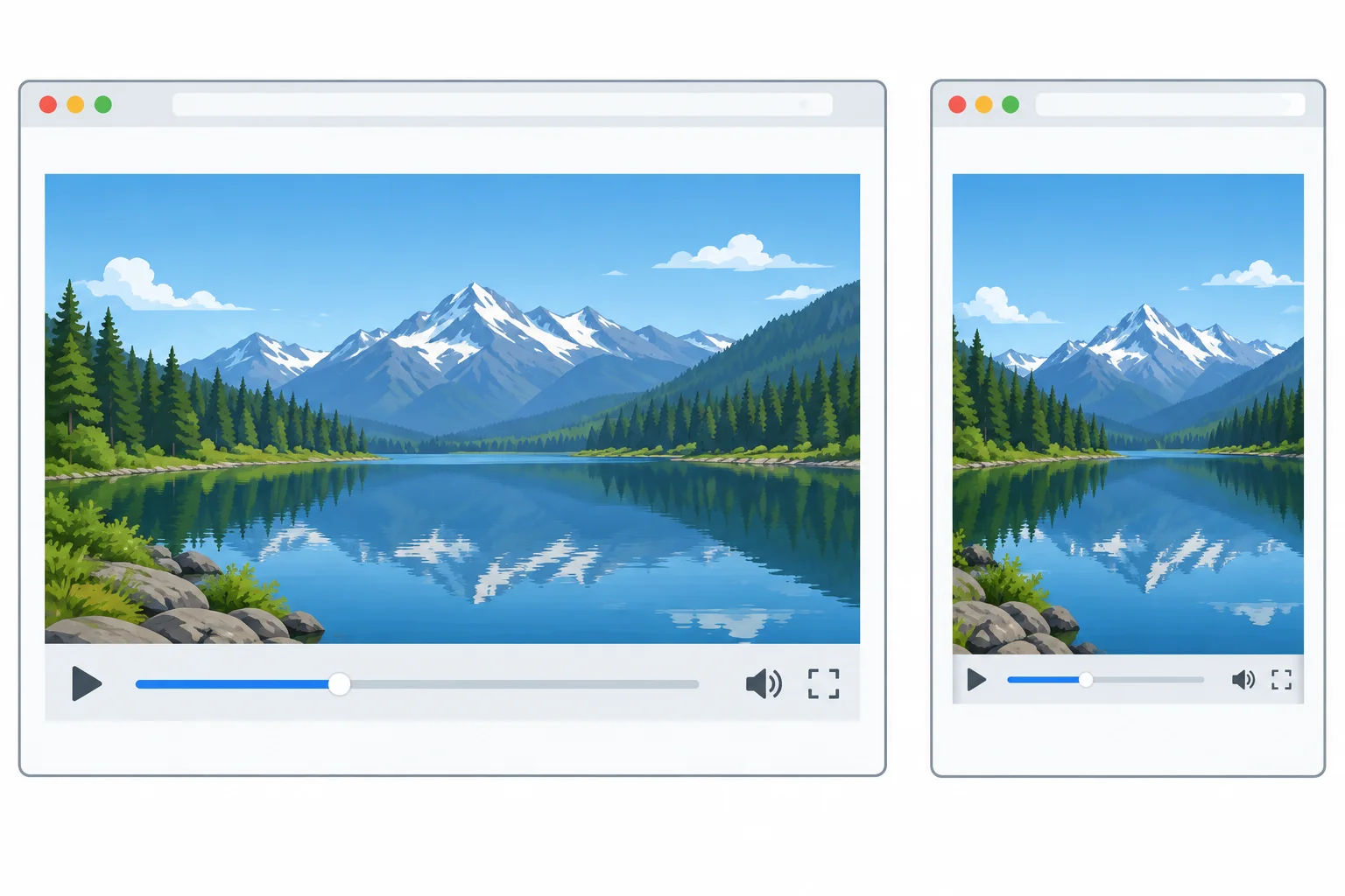
Proportional scaling can succeed while the native playback interface becomes cramped.
Warning
Do not solve a cramped player by removing controls or hiding overflow. Those changes can conceal the problem while making playback less usable.
Open your local Local Media Gallery and make the browser window narrow enough to resemble a small viewport. Perform this focused check on the video:
Tab to check access to the controls your browser makes available.This is a focused media check, not a full device or zoom test.
Tip
If the picture fits but interaction is impractical, give the player more of the available layout width. Use an existing responsive layout technique: for example, let the player occupy a single narrow-layout column or span the available width. Keep the page fluid; do not force a wider page just to enlarge the player.
At a narrow width, a video keeps its proportions but its native controls are too cramped to use comfortably. Which correction is most appropriate?
Narrow your local gallery and operate its native player. In 3–5 sentences, report whether the media remains proportional, whether important content stays visible, whether the available controls are usable, and whether the page gains horizontal overflow. Then name the correction you would choose if the player is cramped.
Write at least 140 characters (0/140).
Step 6 of 6
Finish Local Media Gallery with a naturally proportioned image, a framed local video, and a practical narrow-layout review.
You will now combine the techniques from this tutorial into Local Media Gallery. The finished page has two deliberate modes:
Your goal is not to make every box look full. First decide whether a source needs its natural shape or a deliberate frame. Then prevent distortion, assess any intentional cropping, and check the player at a narrow width.
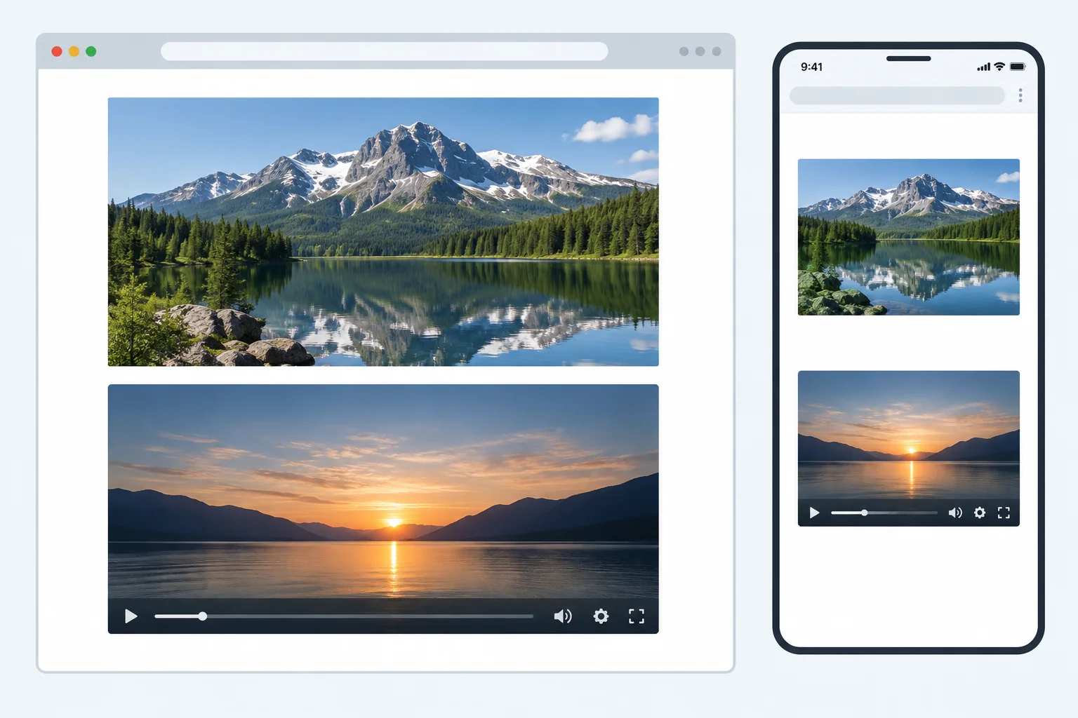
This is an illustrative expected render. Your chosen media and your browser's native controls will not look identical, but the proportional scaling and frame behavior should match.
In your local folder, keep index.html, styles.css, and the media folder. Put your own browser-playable image and video in that folder.
This complete example uses media/photo.jpg and media/clip.mp4. Change each path and extension if your real files differ. Replace the sample image alternative text with an accurate description of your chosen image.
index.html — replace the file contents with this complete page.
<!doctype html>
<html lang="en">
  <head>
    <meta charset="utf-8">
    <meta name="viewport" content="width=device-width, initial-scale=1">
    <title>Local Media Gallery</title>
    <link rel="stylesheet" href="styles.css">
  </head>
  <body>
    <main class="page">
      <h1>Local Media Gallery</h1>

      <section aria-labelledby="photo-heading">
        <h2 id="photo-heading">Natural photo</h2>
        <img class="media-natural" src="media/photo.jpg" alt="A red bicycle leaning against a brick wall">
      </section>

      <section aria-labelledby="video-heading">
        <h2 id="video-heading">Framed video</h2>
        <div class="media-frame">
          <video class="media-fill fit-contain" src="media/clip.mp4" controls>
            Your browser cannot play this video.
          </video>
        </div>
      </section>
    </main>
  </body>
</html>Browser render: a Local Media Gallery heading, a naturally proportioned photo, then a 16:9 framed video with native playback controls.
The exact photo, video image, and native control design depend on your local files and browser. The illustrated expected layout is shown below.
styles.css — replace the file contents with these sizing rules.
* {
  box-sizing: border-box;
}

body {
  margin: 0;
  font-family: system-ui, sans-serif;
}

.page {
  width: 100%;
  max-width: 48rem;
  margin: 0 auto;
  padding: 1.5rem 1rem 3rem;
}

section + section {
  margin-top: 2rem;
}

.media-natural {
  display: block;
  max-width: 100%;
  height: auto;
}

.media-frame {
  width: 100%;
  aspect-ratio: 16 / 9;
  background-color: #e8e8e8;
}

.media-fill {
  display: block;
  width: 100%;
  height: 100%;
}

.fit-contain {
  object-fit: contain;
}

.fit-cover {
  object-fit: cover;
}Wide view: the photo keeps its intrinsic proportions, and the video sits inside a 16:9 media frame. Narrow view: both areas become narrower without unintended media overflow or distortion.
Together with index.html, these rules produce the wide and narrow behavior illustrated below. A contained video may show unused space when its intrinsic proportions differ from 16:9.
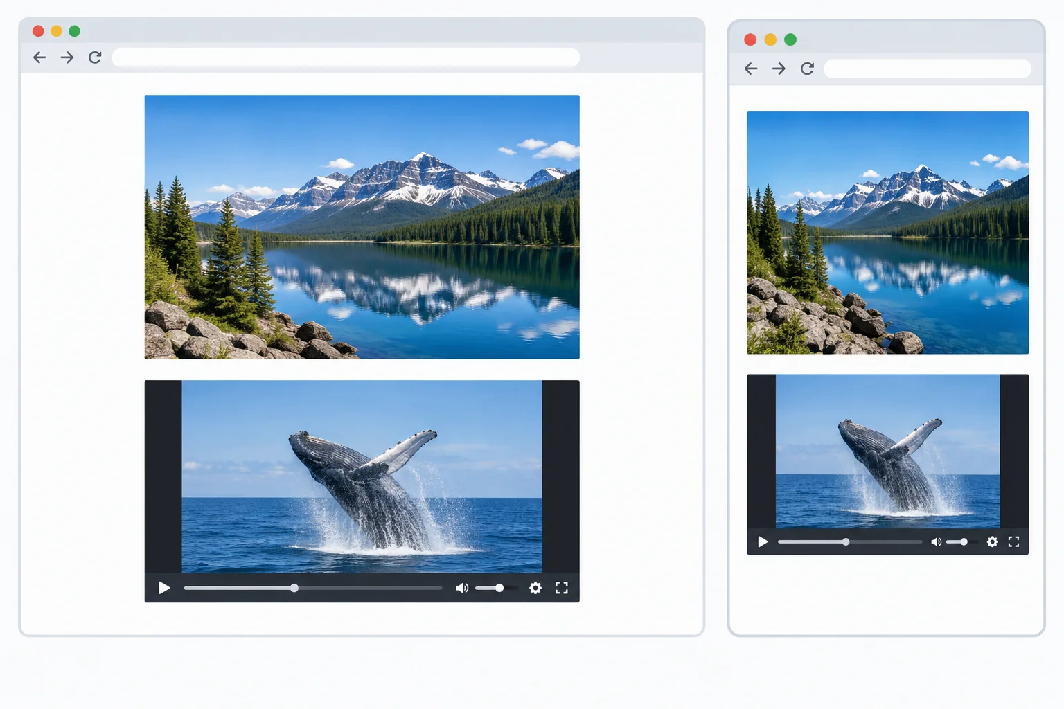
After saving both files, compare your page with this behavior. The media itself, unused space, and browser-native controls vary with your files and browser.
Complete the framed-video markup used in the final gallery.
<div class="media-frame">
  <video class="" src="media/clip.mp4" >
    Your browser cannot play this video.
  </video>
</div>Summary
.media-natural when the source should retain its intrinsic proportions as it scales..media-frame when the layout needs a deliberate 16:9 shape, then preserve media proportions with object-fit.contain when all content must remain visible; use cover only when intentional cropping keeps the meaning intact throughout a video sequence.Run the completed local page at a wide width, then make the browser window narrow enough to test the gallery and play the relevant part of your clip.
In 3–6 sentences, report:
contain or cover, and why that choice preserves the content that matters.If essential video action is cropped or the controls are impractical, revise the fitting choice or give the video more available layout width using techniques you already learned.
Write at least 120 characters (0/120).
Congratulations! You completed: Size Images and Video for Responsive Layouts
Thousands of online courses in video, ebooks and audiobooks.
To test your knowledge during online courses
Generated directly from your cell phone's photo gallery and sent to your email

Download our app via QR Code or the links below:.


Carry knowledge in your pocket.
Download the Cursa app.
There are hundreds of free courses available, with a free certificate of completion that is saved in your mobile image gallery.
Download the app to access the Course Completion Certificate for Free.


+ 10 million
students

Free and Valid
Certificate

60 thousand free
exercises

4.8/5 rating in
app stores

Free courses in
video and ebooks