
Step 1 of 8
Read and Apply CSS Colors
Recognize equivalent hexadecimal and RGB colors, then identify the foreground and painted background that determine how text appears.

Learning path · Level 2 · Tutorial 5
Build consistent text and surface styles with reusable CSS custom properties, then check that text remains readable against its background.

 Read and Apply CSS Colors
Recognize equivalent hexadecimal and RGB colors, then identify the foreground and painted background that determine how text appears. 1 min
Read and Apply CSS Colors
Recognize equivalent hexadecimal and RGB colors, then identify the foreground and painted background that determine how text appears. 1 min
 Build a Coordinated Card Surface
Apply literal color, border, and corner styles to a two-card Study Notes page. 2 min
Build a Coordinated Card Surface
Apply literal color, border, and corner styles to a two-card Study Notes page. 2 min
 Replace Repeated Values with Custom Properties
Refactor repeated page and card values into role-based CSS custom properties on :root. 2 min
Replace Repeated Values with Custom Properties
Refactor repeated page and card values into role-based CSS custom properties on :root. 2 min
 Create a Local Surface Variant
Override one reusable surface value locally, then trace where the custom property is inherited and where it becomes visible. 2 min
Create a Local Surface Variant
Override one reusable surface value locally, then trace where the custom property is inherited and where it becomes visible. 2 min
 Use Fallbacks Without Hiding Invalid Values
Use a fallback for a missing custom property, but correct a defined value when it is invalid for the property that consumes it. 1 min
Use Fallbacks Without Hiding Invalid Values
Use a fallback for a missing custom property, but correct a defined value when it is invalid for the property that consumes it. 1 min
 Choose the Correct Text Contrast Threshold
Select the WCAG AA text-contrast threshold from actual font size and weight, then judge a near-threshold measurement accurately. 2 min
Choose the Correct Text Contrast Threshold
Select the WCAG AA text-contrast threshold from actual font size and weight, then judge a near-threshold measurement accurately. 2 min
 Check and Repair a Failing Color Pair
Measure a failing shared note color, correct it, and verify readable text against both card surfaces. 2 min
Check and Repair a Failing Color Pair
Measure a failing shared note color, correct it, and verify readable text against both card surfaces. 2 min
 Apply and Verify Your Reusable Surface Styles
Finish a reusable Study Notes interface, verify shared and local custom-property behavior, and confirm readable text on both card surfaces. 2 min
Apply and Verify Your Reusable Surface Styles
Finish a reusable Study Notes interface, verify shared and local custom-property behavior, and confirm readable text on both card surfaces. 2 min
Step 1 of 8
Recognize equivalent hexadecimal and RGB colors, then identify the foreground and painted background that determine how text appears.
CSS can write an opaque color in hexadecimal with six digits: #rrggbb. The three pairs represent red, green, and blue channel values. You only need to recognize the pattern here—no manual number conversion is required.
For example, #1f2937 is a dark blue-gray color. The same color can be written as rgb(31 41 55). In modern rgb() syntax, the three channel values are space-separated and each ranges from 0 to 255.
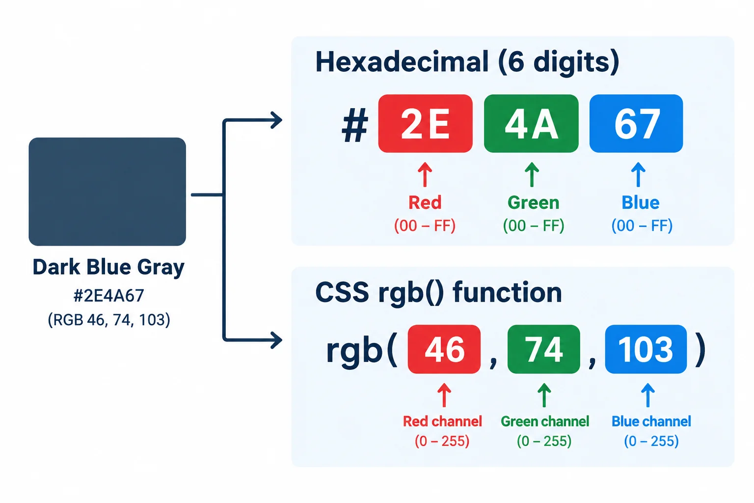
Both notations can describe the same opaque red, green, and blue channel values.
Text appearance depends on a pair: the foreground color of the text and the background painted immediately behind it. A dark foreground may be readable on a light background but look very different on another background.
An element can inherit color from an ancestor. In contrast, background-color is not inherited. If a paragraph has no painted background of its own, its background is transparent, so you see the painted background of an ancestor behind its text.
A paragraph inside the article inherits the body text color. It does not inherit the article background color; the white article paint simply appears behind the paragraph.
body {
  color: #1f2937;
  background-color: #f3f4f6;
}

article {
  background-color: #ffffff;
}

article p {
  font-size: 16px;
}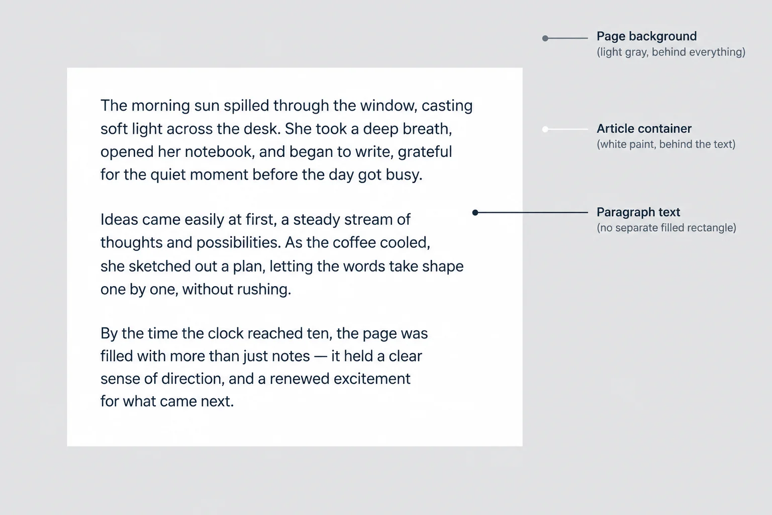
For this paragraph, the foreground is the dark text color and the immediate painted background is the article's white fill.
Match each six-digit hexadecimal color with its equivalent space-separated RGB notation.
Tap an item and then its matching pair.
Complete the declarations for the same text/background pair used in the earlier example. Write the foreground in RGB notation and the page background in hexadecimal notation.
.study-note {
  color: ;
  background-color: ;
}
Step 2 of 8
Apply literal color, border, and corner styles to a two-card Study Notes page.
A surface is a visually grouped content area. Each article card coordinates four parts:
border: width style color.Padding creates space inside the card, but it does not create the border or rounded shape. The two articles remain ordinary block elements, so they stack in normal document flow.
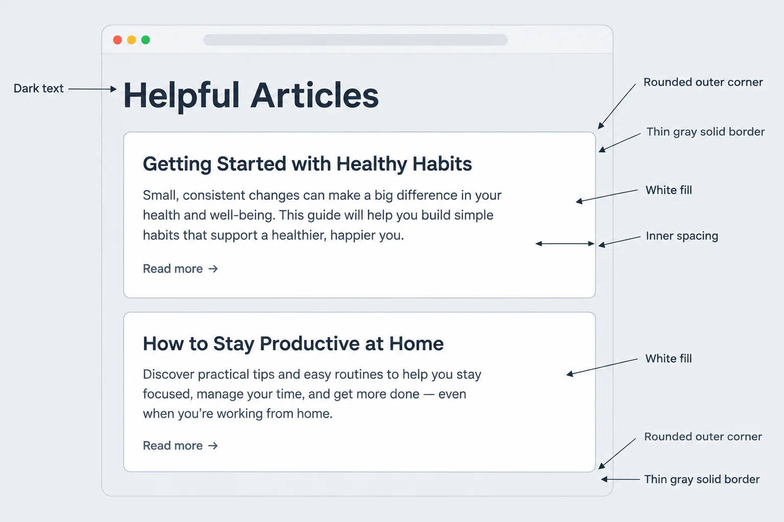
The same coordinated surface treatment makes separate articles look like related parts of one page.
In your local project folder, create or replace index.html with this page. Both articles use the shared card class. The second article also has the card--featured class, which will be used in a later step.
Save this as index.html.
<!doctype html>
<html lang="en">
<head>
  <meta charset="utf-8">
  <meta name="viewport" content="width=device-width, initial-scale=1.0">
  <title>Study Notes</title>
  <link rel="stylesheet" href="styles.css">
</head>
<body>
  <main>
    <h1>Study Notes</h1>

    <article class="card">
      <h2>Reading plan</h2>
      <p class="card__note">Read one chapter and write down one useful idea.</p>
    </article>

    <article class="card card--featured">
      <h2>Practice plan</h2>
      <p class="card__note">Practice the examples after reading each chapter.</p>
    </article>
  </main>
</body>
</html>Now add literal colors and measurements in styles.css. The body supplies the page text color and pale page background. Each .card paints its own white surface, visible solid edge, and rounded corners.
Save both files and refresh index.html in your browser. You should see two white cards with dark text on a pale gray page.
Save this as styles.css, then refresh index.html in your browser.
body {
  background-color: #f3f4f6;
  color: #1f2937;
  font-family: system-ui, sans-serif;
}

.card {
  background-color: #ffffff;
  border: 1px solid #9ca3af;
  border-radius: 0.75rem;
  padding: 1rem;
}

.card h2 {
  font-size: 24px;
  font-weight: 400;
}

.card__note {
  font-size: 16px;
  font-weight: 400;
}Study Notes ╭────────────────────────────────────────────╮ │ Reading plan │ │ Read one chapter and write down one useful │ │ idea. │ ╰────────────────────────────────────────────╯ ╭────────────────────────────────────────────╮ │ Practice plan │ │ Practice the examples after reading each │ │ chapter. │ ╰────────────────────────────────────────────╯ Page background: pale gray Card fill: white; border: thin gray; corners: rounded
Schematic browser-render output: exact dimensions and line wrapping depend on your browser window, but both cards should have white fills, thin gray borders, rounded corners, and dark text on the pale gray page.
Tip
border-radius is independent of border thickness: 1px controls the thickness of the edge, while 0.75rem controls how curved each corner appears. Changing padding changes inner space without changing the fill, border color, or corner radius.
Complete the missing surface declarations. Then use this styling in your local styles.css and compare both rendered cards with the annotated visual from the first screen.
body {
  font-family: system-ui, sans-serif;
  : #1f2937;
  background-color: #f3f4f6;
}

.card {
  : #ffffff;
  border: 1px solid ;
  : 0.75rem;
  padding: 1rem;
}
Step 3 of 8
Refactor repeated page and card values into role-based CSS custom properties on :root.
Repeated literal values make a page harder to update. A custom property stores a reusable CSS value under a name beginning with two hyphens.
Put shared defaults on :root, then use var(...) wherever a normal CSS value belongs. Choose names by role: --color-surface describes the card’s job, unlike a name such as --white, which only describes its current appearance.
Custom-property names are case-sensitive. --color-surface and --Color-Surface are different names.

Shared custom properties coordinate repeated page and card values.
Replace your entire local styles.css with this complete file, then save and refresh index.html. It preserves the established selectors, typography, and browser-default spacing because it adds no margin rules. The visible page should look the same as it did with literal values; only the way CSS stores the repeated values has changed.
styles.css — complete replacement
:root {
  --color-text: #1f2937;
  --color-page: #f3f4f6;
  --color-surface: #ffffff;
  --color-border: #9ca3af;
  --space-card: 1rem;
  --radius-card: 0.75rem;
  --border-width: 1px;
}

body {
  background-color: var(--color-page);
  color: var(--color-text);
  font-family: system-ui, sans-serif;
}

.card {
  background-color: var(--color-surface);
  border: var(--border-width) solid var(--color-border);
  border-radius: var(--radius-card);
  padding: var(--space-card);
}

.card h2 {
  font-size: 24px;
  font-weight: 400;
}

.card__note {
  font-size: 16px;
  font-weight: 400;
}Rendered result: Study Notes appears on a pale gray page. Reading plan and Practice plan appear as two stacked white cards. Each card has dark text, a thin gray border, rounded corners, and 1rem of inner padding. The heading and note text keep their previous sizes and weights.
After saving and refreshing, inspect the rendered page in your browser. This CSS has no terminal output; the expected result is the visual result below.
Tip
The selectors stay the same. If a shared value changes later, edit its declaration on :root; every declaration using that var(...) reference can update without changing its selector.
Complete the missing shared values and the two references used by the card.
:root {
  --color-text: #1f2937;
  --color-page: #f3f4f6;
  --color-surface: ;
  --color-border: #9ca3af;
  --space-card: ;
  --radius-card: ;
  --border-width: ;
}

.card {
  background-color: ;
  border: var(--border-width) solid var(--color-border);
  border-radius: var(--radius-card);
  padding: ;
}Using the refactored page, write a short verification with these three parts:
:root block containing all seven shared declarations..card block that consumes the surface color, border width, border color, radius, and spacing values.--space-card changes from 1rem to 1.5rem on :root, state exactly which visible card style changes and which cards change. Also state whether you need to edit the .card selector.Write at least 180 characters (0/180).

Step 4 of 8
Override one reusable surface value locally, then trace where the custom property is inherited and where it becomes visible.
A custom property normally inherits. When an element does not supply its own winning value, it can receive the value from its parent.
The second article has both classes: .card and .card--featured. A local override on .card--featured changes --color-surface for that article and for its descendants. It does not change the shared default on :root, the first card, or anything outside the featured card.

The featured card begins a local surface value. Its note receives that custom property, but has no painted surface unless a declaration consumes the value.
Keep the shared default on :root. In styles.css, add this separate rule for the second article. The existing .card rule already consumes --color-surface for background-color, so the featured card uses its local value automatically.
Save the file and refresh your browser. The second card should have a pale indigo surface, while the first card remains white.
styles.css — add this rule after the existing .card rule.
.card {
  background-color: var(--color-surface);
}

.card--featured {
  --color-surface: #eef2ff;
}Browser rendering after refresh: Reading plan: white card surface (#ffffff); border, radius, and padding unchanged. Practice plan: pale indigo card surface (#eef2ff); same border, radius, and padding.
After saving and refreshing `index.html`, compare the rendered card fills. The border, corner radius, and padding remain unchanged because this rule changes only the surface custom property.
Match each part of the page to its effect after the featured-card rule is added.
Tap an item and then its matching pair.
In your local styles.css, add the featured-card override. Then write the complete rule you added and five short mappings for the computed --color-surface: :root, the Reading plan card, its note, the Practice plan card, and its note.
Write at least 140 characters (0/140).

Step 5 of 8
Use a fallback for a missing custom property, but correct a defined value when it is invalid for the property that consumes it.
A fallback is the second argument of var(). In these examples, it is used only when the referenced custom property has no defined or inherited value.
If --color-note is missing, the browser uses #595959 here:
var(--color-note, #595959)
The fallback makes this particular reference usable. It does not create --color-note for other declarations.

When no value for the referenced custom property exists in the element's inheritance path, the fallback supplies the value for this color declaration.
Use this reference when no --color-note value is defined or inherited.
.card__note {
  color: var(--color-note, #595959);
}A custom property can store tokens that are unsuitable for the property where you use it. A fallback is not a type check.
In the isolated example below, 16px is defined, so var() substitutes it. The result is effectively color: 16px, which is invalid at computed-value time. Because the color declaration fails, the note inherits its parent card's text color instead. The fallback is not selected.
Assume the existing page defines --color-text: #1f2937 on :root. This example intentionally uses an invalid value for color.
.card {
  color: var(--color-text);
}

.card__note {
  --color-note: 16px;
  color: var(--color-note, #595959);
}Compare the state of the custom property with the result of the color declaration.
| Value of --color-note | What color receives | Visible note color |
|---|---|---|
| Missing | Fallback is substituted | #595959 |
| #595959 | Valid color is substituted | #595959 |
| 16px | Declaration is invalid; color inherits | #1f2937 |
Using the three cases from the previous screen, write five short lines:
--color-note is missing.--color-note is a valid color value.--color-note is 16px and is used by color.color declaration that includes an appropriate fallback reference.Write at least 80 characters (0/80).

Step 6 of 8
Select the WCAG AA text-contrast threshold from actual font size and weight, then judge a near-threshold measurement accurately.
Text needs enough contrast against the background directly behind it.
A contrast ratio belongs to one foreground/background pair. The same text color can pass on one surface and fail on another.
These thresholds assess text contrast. A passing ratio is important, but it does not by itself make an entire interface accessible.
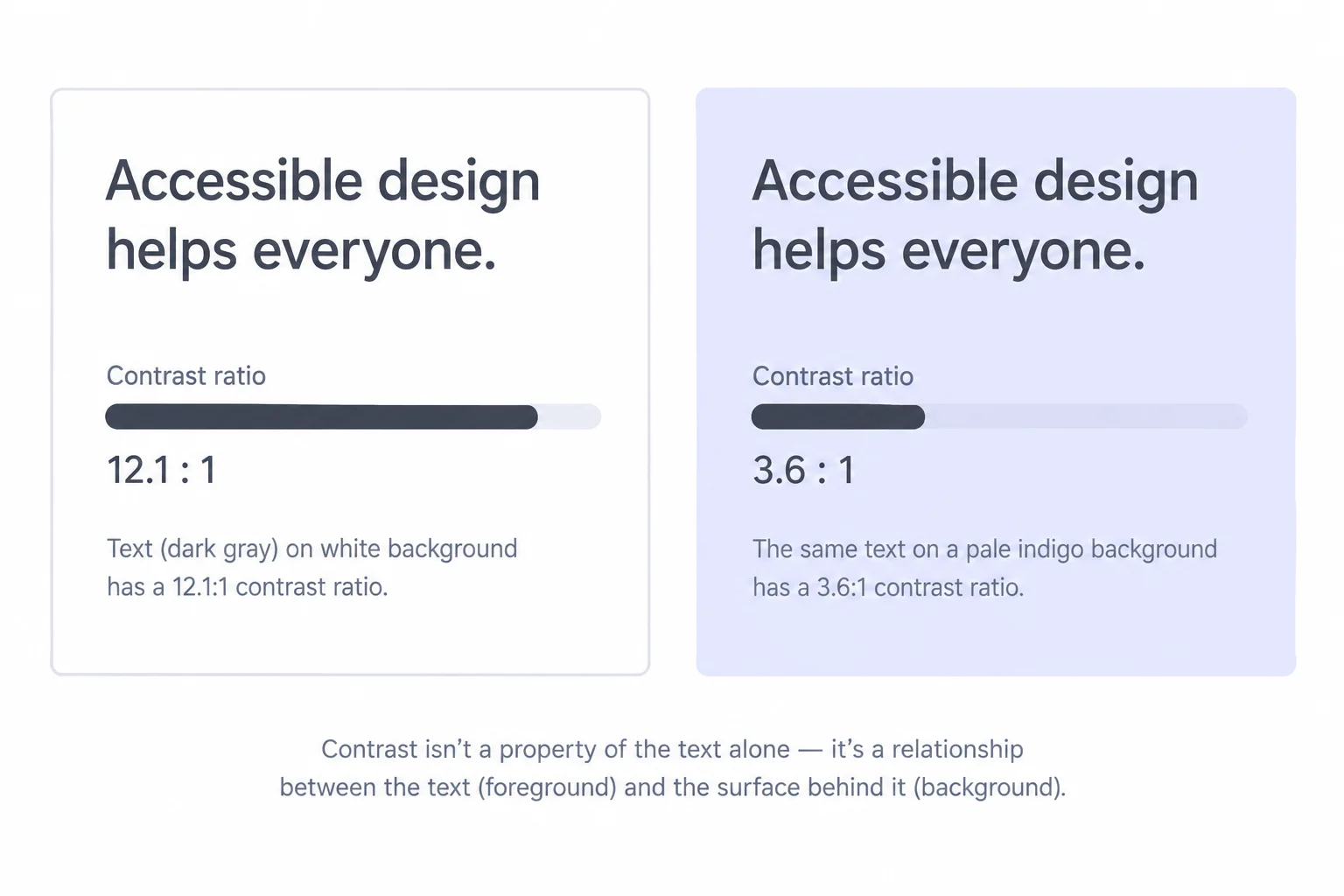
Evaluate text together with the surface immediately behind it.
Do not choose a threshold from the HTML element name. A heading is only large text when its rendered size and weight meet a large-text rule.
At regular weight 400, text is large at 24px or more. At bold weight 700, text is large at 18⅔px—approximately 18.67px—or more.
The Study Notes card headings are 24px at weight 400, so they meet the large-text rule. The 16px notes at weight 400 are normal text.
Use actual CSS size and weight, not whether the element is a paragraph or heading.
| Rendered text | Classification | Minimum ratio |
|---|---|---|
| 16px, weight 400 | Normal text | 4.5:1 |
| 24px, weight 400 | Large text | 3:1 |
| 18.67px, weight 700 | Large text | 3:1 |
Warning
A result slightly below a requirement does not pass. For normal text, ≈4.48:1 is below 4.5:1, so it fails. Do not round it upward to claim a pass.
In the next step, you will use these rules to classify samples. Later, you will measure actual text/background pairs in your own browser and correct a failing pair.
Match each sample with its WCAG AA classification, required threshold, and outcome where a measurement is given.
Match every sample to its correct evaluation.
Tap an item and then its matching pair.

Step 7 of 8
Measure a failing shared note color, correct it, and verify readable text against both card surfaces.
A contrast checker evaluates a foreground/background pair, not a color in isolation. Inspect each .card__note in your browser’s DevTools to find its computed color, then identify the painted surface immediately behind it.
The two notes can share one computed foreground while sitting on different backgrounds. The Reading plan note sits on the root surface. The Practice plan note sits on the featured card’s locally overridden surface. Check both pairs separately.

Check the Reading plan note against #ffffff and the Practice plan note against #eef2ff.
Create a real failing state before repairing it. Replace your local styles.css with this complete trial file, save it, and refresh index.html.
Then open a contrast checker in your own browser. Enter each foreground and background pair shown by the rendered page. The notes are still 16px at weight 400, so compare both readings with the normal-text threshold of 4.5:1. A checker evaluates values you enter; it does not inspect this tutorial or your local files.
styles.css — complete failing trial state. Save this file and refresh your local page before measuring both note/surface pairs.
:root {
  --color-text: #1f2937;
  --color-page: #f3f4f6;
  --color-surface: #ffffff;
  --color-border: #9ca3af;
  --color-note: #777777;
  --space-card: 1rem;
  --radius-card: 0.75rem;
  --border-width: 1px;
}

body {
  background-color: var(--color-page);
  color: var(--color-text);
  font-family: system-ui, sans-serif;
}

.card {
  background-color: var(--color-surface);
  border: var(--border-width) solid var(--color-border);
  border-radius: var(--radius-card);
  padding: var(--space-card);
}

.card--featured {
  --color-surface: #eef2ff;
}

.card h2 {
  font-size: 24px;
  font-weight: 400;
}

.card__note {
  color: var(--color-note);
  font-size: 16px;
  font-weight: 400;
}
Expected rendered result after saving and refreshing: Computed .card__note color: #777777 Reading plan: #777777 on #ffffff — ≈4.48:1 — Fail at 4.5:1 Practice plan: #777777 on #eef2ff — ≈4.00:1 — Fail at 4.5:1
Expected contrast readings are approximate. Your checker may use different formatting, but a result below 4.5:1 is still a failure.
The failure belongs to the shared note-color value, not to the name of the color or a visual guess. Change that responsible custom property from the trial value to the corrected value below. Because both notes consume var(--color-note), saving and refreshing updates both notes.
Re-enter both repaired foreground/background pairs in your own checker. The featured card still needs its own check because its local surface override remains in effect.
styles.css — replace the failing --color-note declaration with this value. Keep the existing .card__note rule that consumes the custom property.
:root {
  --color-note: #595959;
}

.card__note {
  color: var(--color-note);
}
Expected rendered result after saving and refreshing: Computed .card__note color: #595959 Reading plan: #595959 on #ffffff — ≈7.00:1 — Pass at 4.5:1 Practice plan: #595959 on #eef2ff — ≈6.25:1 — Pass at 4.5:1
Use DevTools and a checker in your own browser to confirm the rendered values. These expected readings show the result to compare with after the repair.
These sample readings help interpret the trial and repaired states. Do not round a near-threshold result upward: ≈4.48:1 remains below 4.5:1.
| Foreground / surface | Sample ratio | Threshold | Result |
|---|---|---|---|
| #777777 / #ffffff | ≈4.48:1 | 4.5:1 | Fail |
| #777777 / #eef2ff | ≈4.00:1 | 4.5:1 | Fail |
| #595959 / #ffffff | ≈7.00:1 | 4.5:1 | Pass |
| #595959 / #eef2ff | ≈6.25:1 | 4.5:1 | Pass |
After you have applied the repair in your local styles.css, record the result of your verification. Include:
Use the readings from your own checker, and make clear that both notes are normal text.
Write at least 150 characters (0/150).

Step 8 of 8
Finish a reusable Study Notes interface, verify shared and local custom-property behavior, and confirm readable text on both card surfaces.
Finish your local Study Notes page using the index.html and styles.css from the previous step.
Keep all shared custom properties on :root. Change the shared card padding to --space-card: 1.5rem, retain --color-note: #595959, and keep .card--featured as the local override for --color-surface: #eef2ff.
Save and refresh. Both cards should gain more inner space because both consume --space-card. Only the Practice plan card should have the pale indigo surface. The Reading plan card remains white.
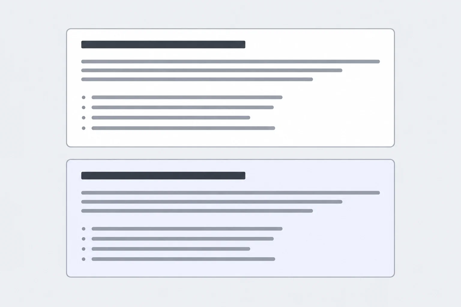
The shared spacing change affects both cards, while the local surface override affects only the featured card.
Tip
The notes remain 16px at weight 400, so they are normal text. In a contrast checker in your own browser, check #595959 against each actual card surface: #ffffff and #eef2ff. Compare each reading with the normal-text threshold of 4.5:1.
Complete the final shared spacing value and the custom property used by the featured-card override.
:root {
  --space-card: ;
}

.card {
  padding: var(--space-card);
}

.card--featured {
  : #eef2ff;
}index.html
<!doctype html>
<html lang="en">
<head>
  <meta charset="utf-8">
  <meta name="viewport" content="width=device-width, initial-scale=1.0">
  <title>Study Notes</title>
  <link rel="stylesheet" href="styles.css">
</head>
<body>
  <main>
    <h1>Study Notes</h1>

    <article class="card">
      <h2>Reading plan</h2>
      <p class="card__note">Read one chapter and write down one useful idea.</p>
    </article>

    <article class="card card--featured">
      <h2>Practice plan</h2>
      <p class="card__note">Practice the examples after reading each chapter.</p>
    </article>
  </main>
</body>
</html>styles.css
:root {
  --color-text: #1f2937;
  --color-page: #f3f4f6;
  --color-surface: #ffffff;
  --color-border: #9ca3af;
  --color-note: #595959;
  --space-card: 1.5rem;
  --radius-card: 0.75rem;
  --border-width: 1px;
}

body {
  background-color: var(--color-page);
  color: var(--color-text);
  font-family: system-ui, sans-serif;
}

.card {
  background-color: var(--color-surface);
  border: var(--border-width) solid var(--color-border);
  border-radius: var(--radius-card);
  padding: var(--space-card);
}

.card--featured {
  --color-surface: #eef2ff;
}

.card h2 {
  font-size: 24px;
  font-weight: 400;
}

.card__note {
  color: var(--color-note);
  font-size: 16px;
  font-weight: 400;
}
Compare your saved local files with these blocks after attempting the edits yourself. This stylesheet continues the corrected working state from the previous step: it adds no body padding, card margin, heading-margin reset, interaction state, responsive rule, or animation.
After saving and refreshing your local page, record your final verification.
.card--featured surface override did not change the Reading plan card.#595959 on #ffffff.#595959 on #eef2ff.Write at least 180 characters (0/180).
Summary
:root provide shared values for the interface.Congratulations! You completed: Create Reusable Colors and Surfaces
Thousands of online courses in video, ebooks and audiobooks.
To test your knowledge during online courses
Generated directly from your cell phone's photo gallery and sent to your email

Download our app via QR Code or the links below:.



Carry knowledge in your pocket.
Download the Cursa app.
There are hundreds of free courses available, with a free certificate of completion that is saved in your mobile image gallery.
Download the app to access the Course Completion Certificate for Free.


+ 10 million
students

Free and Valid
Certificate

60 thousand free
exercises

4.8/5 rating in
app stores

Free courses in
video and ebooks