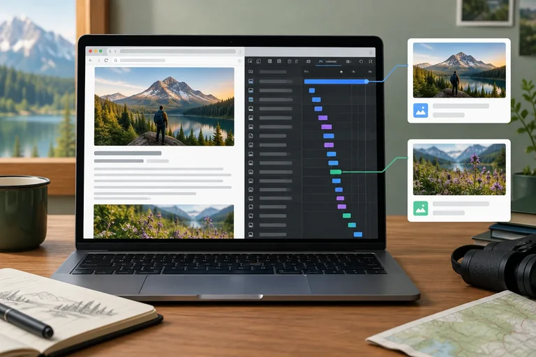
Step 1 of 8
Establish the Media Baseline
Create a complete local Field Notes baseline and collect comparable evidence before changing image delivery.

Learning path · Level 13 · Tutorial 4
Reduce unnecessary media transfers and loading-related layout shifts while preserving image quality, responsive behavior, and accessibility. Use your own media for local comparisons.
 Establish the Media Baseline
Create a complete local Field Notes baseline and collect comparable evidence before changing image delivery. 3 min
Establish the Media Baseline
Create a complete local Field Notes baseline and collect comparable evidence before changing image delivery. 3 min
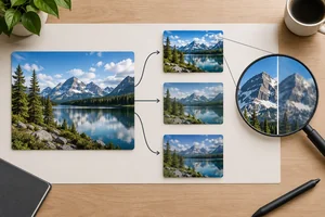 Create Smaller, Usable Image Variants
Create appropriately sized local JPEG variants and select an encoding quality using visible evidence from your own photograph. 4 min
Create Smaller, Usable Image Variants
Create appropriately sized local JPEG variants and select an encoding quality using visible evidence from your own photograph. 4 min
 Reserve Space Before Images Arrive
Reserve proportional image space before image pixels arrive while keeping the Field Notes article responsive and comparable with its baseline. 3 min
Reserve Space Before Images Arrive
Reserve proportional image space before image pixels arrive while keeping the Field Notes article responsive and comparable with its baseline. 3 min
 Match Image Downloads to the Layout
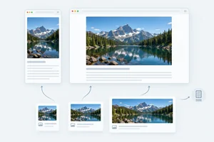
Configure width-based responsive image candidates for the Field Notes hero image, then verify browser selection under controlled viewport and DPR conditions. 4 min
Match Image Downloads to the Layout
Configure width-based responsive image candidates for the Field Notes hero image, then verify browser selection under controlled viewport and DPR conditions. 4 min
 Protect Important Initial Images
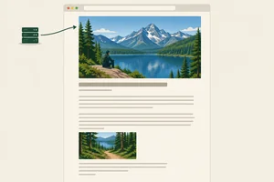
Keep the likely LCP image eagerly discoverable and apply high fetch priority only when justified. 3 min
Protect Important Initial Images
Keep the likely LCP image eagerly discoverable and apply high fetch priority only when justified. 3 min
 Defer Suitable Offscreen Images
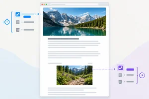
Defer the distant Field Notes detail image with native lazy loading while preserving stable geometry, responsive behavior, and its text alternative. 3 min
Defer Suitable Offscreen Images
Defer the distant Field Notes detail image with native lazy loading while preserving stable geometry, responsive behavior, and its text alternative. 3 min
 Choose a Video Preload Policy
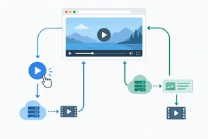
Choose a video preload hint based on viewing intent, then compare pre-Play and post-Play transfers without treating browser hints as guarantees. 3 min
Choose a Video Preload Policy
Choose a video preload hint based on viewing intent, then compare pre-Play and post-Play transfers without treating browser hints as guarantees. 3 min
 Verify the Complete Media Strategy
Accept or revise image and video loading changes with comparable local evidence while checking quality, behavior, and accessibility. 4 min
Verify the Complete Media Strategy
Accept or revise image and video loading changes with comparable local evidence while checking quality, behavior, and accessibility. 4 min
Step 1 of 8
Create a complete local Field Notes baseline and collect comparable evidence before changing image delivery.
A file’s source resolution and encoding determine how many bytes the browser transfers. CSS determines how large that already-selected file is drawn.
For this baseline, a 1440 × 960 source displayed at 720 CSS pixels wide is still requested as the original file. Making it look smaller with CSS does not create a smaller download.
Prepare one learner-owned 3:2 photograph with at least 1440 source pixels of width. Crop locally if needed, but do not upscale it. Keep it as photo-original.jpg.
The offscreen image needs its own URL. The simplest safe choice is a separately named copy of photo-original.jpg called detail-original.jpg. If you use a different detail photograph, keep it 3:2 and at least 1440 source pixels wide; this also ensures you can later create its 960 × 640 version without upscaling.
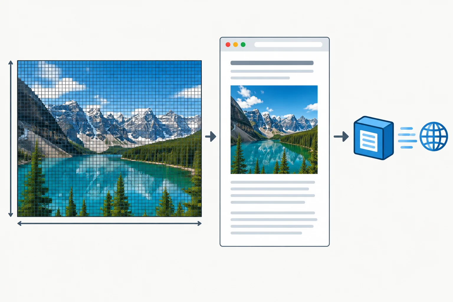
Source pixels describe file image data; CSS pixels describe rendered layout size; transferred bytes describe network cost.
Create a new local Vite vanilla fixture if you do not already have one, then create public/media/ inside it. Put your two learner-owned files there:
photo-original.jpg — the 3:2 reference photograph, at least 1440 source pixels widedetail-original.jpg — a separately addressed 3:2 offscreen image; a copy of the reference photograph is validReplace index.html with the complete baseline below. Replace the sample alt values with text alternatives that accurately describe your own photographs in their article roles. This baseline intentionally has no responsive source list, image dimension attributes, or loading hints; those changes come later.
<!doctype html>
<html lang="en">
  <head>
    <meta charset="UTF-8">
    <meta name="viewport" content="width=device-width, initial-scale=1.0">
    <title>Field Notes</title>
    <link rel="stylesheet" href="/styles.css">
  </head>
  <body>
    <main class="article">
      <header>
        <p class="eyebrow">Observations from the field</p>
        <h1>Field Notes</h1>
        <p class="intro">A short record of weather, route choices, and small details noticed along the trail.</p>
      </header>

      <figure>
        <img src="/media/photo-original.jpg" alt="A weathered notebook beside a trail map on a wooden table.">
        <figcaption>Notebook and map at the start of the walk.</figcaption>
      </figure>

      <p>The path began under thin cloud cover, with dry ground near the trailhead and cooler air under the trees.</p>
      <p>At the first turn, a hand-drawn marker pointed toward a low ridge. The route stayed quiet except for wind in the branches.</p>
      <p>By midday, the light had shifted enough to make the map easier to read. A pause near the ridge provided a clear view of the valley.</p>
      <p>These notes collect details worth revisiting rather than attempting to document every part of the walk.</p>

      <section class="detail">
        <h2>Later detail</h2>
        <p>This photograph appears well below the initial viewport in the baseline article.</p>
        <figure>
          <img src="/media/detail-original.jpg" alt="Close view of a trail marker beside grasses and stones.">
          <figcaption>A marker observed later on the route.</figcaption>
        </figure>
      </section>
    </main>
  </body>
</html>Field Notes Observations from the field A short record of weather, route choices, and small details noticed along the trail. [Lead photograph] Notebook and map at the start of the walk. Article paragraphs Later detail This photograph appears well below the initial viewport in the baseline article. [Detail photograph] A marker observed later on the route.
After this file is used with the stylesheet on the next screen and served locally, the page is a single-column Field Notes article. The lead photograph appears near the heading; the detail section is far below the initial viewport.
body {
  margin: 0;
  color: #1d2528;
  background: #f7f5ef;
  font-family: system-ui, sans-serif;
  line-height: 1.6;
}

.article {
  width: calc(100% - 32px);
  max-width: 720px;
  margin: 0 auto;
  padding: 32px 0 64px;
}

.eyebrow {
  margin: 0;
  color: #53645b;
  font-size: 0.875rem;
  font-weight: 700;
  letter-spacing: 0.04em;
  text-transform: uppercase;
}

h1,
h2 {
  line-height: 1.15;
}

h1 {
  margin: 0.25rem 0 0;
}

.intro {
  font-size: 1.125rem;
}

figure {
  margin: 24px 0;
}

img {
  display: block;
  width: 100%;
  height: auto;
}

figcaption {
  margin-top: 8px;
  color: #53645b;
  font-size: 0.875rem;
}

.detail {
  margin-top: 720px;
}A Field Notes article centered in a single column with 16 px gutters on each side. The column expands with the viewport until it reaches 720 CSS pixels. Both loaded photographs fill the column width proportionally. The Later detail section begins far below the initial article content.
Used with the preceding `index.html`, this stylesheet makes the article column fluid up to 720 CSS pixels wide. On a throttled reload, the baseline has no deliberate image-space reservation before each image’s intrinsic size is known.
Build and preview the fixture with the local workflow you used previously. Make an initial recording with a fresh reload and fixed conditions. For example, choose one viewport and keep the same cache state, network throttling, and CPU throttling for later comparisons.
In Network, note both media requests and their transferred amounts. In your performance or Web Vitals evidence, identify the actual LCP element and resource if one is reported. The hero image is a candidate, not an assumption. During a throttled reload, watch whether image arrival pushes article content downward.
In Quality/accessibility notes, include source dimensions, rendered dimensions in CSS pixels, whether each text alternative fits its photograph, and any movement you observed. Use decimal kB for transfer sizes and ms for timings.
Use these labels unchanged whenever you compare this article later.
| Record label | Your baseline observation |
|---|---|
| Viewport | Record width in px |
| DPR | Record as DPR 1 or DPR 2 |
| Cache | Record cache condition |
| Network throttling | Record selected setting |
| CPU throttling | Record selected setting |
| Selected image URL | Record the hero image URL used in this baseline |
| Transferred media | Record both image transfers in decimal kB |
| LCP element/resource | Record the measured element and resource, if applicable |
| LCP time | Record time in ms, if available |
| Layout shifts | Record observed loading-related movement or shift evidence |
| Quality/accessibility notes | Record dimensions, visible quality, and text-alternative check |
After making one controlled baseline recording, submit a compact baseline note.
Viewport, DPR, Cache, Network throttling, CPU throttling, Selected image URL, Transferred media, LCP element/resource, LCP time, Layout shifts, and Quality/accessibility notes.Write at least 300 characters (0/300).
Step 2 of 8
Create appropriately sized local JPEG variants and select an encoding quality using visible evidence from your own photograph.
Start with your learner-owned 3:2 photograph in public/media/photo-original.jpg. Keep this original available as the baseline; it must be at least 1440 source pixels wide after any crop.
In a local image editor, crop first if needed, then export smaller copies without changing the 3:2 proportion. Do not enlarge a source that is smaller than an export target: upscaling adds pixels but does not restore detail.
These are source-pixel dimensions. They describe the exported files, not the width at which CSS will later display them.
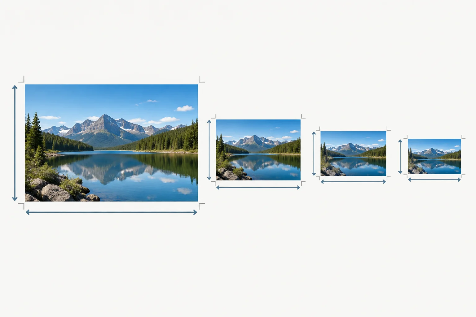
Every required export keeps the photograph's 3:2 shape; only its source-pixel dimensions change.
Use these exact filenames and export dimensions. The two detail files have their own URLs so later tests can distinguish the offscreen image from the hero image.
| File | Source dimensions | Role |
|---|---|---|
| photo-original.jpg | Your 3:2 source, at least 1440 px wide | Hero baseline |
| photo-480.jpg | 480 × 320 px | Small hero variant |
| photo-960.jpg | 960 × 640 px | Medium hero variant |
| photo-1440.jpg | 1440 × 960 px | Large hero variant |
| detail-original.jpg | A separately named 3:2 original or copy | Offscreen baseline |
| detail-960.jpg | 960 × 640 px | Offscreen optimized variant |
For the common exercise, export JPEG files. At the same dimensions, an editor's compression or quality setting can substantially change transferred bytes and visible detail.
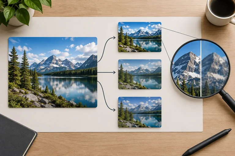
Make two temporary JPEG candidates at 960 × 640 using two different quality settings available in your editor. Compare them at the article's intended display size, then inspect an important detailed area at 100% zoom. Look for softened edges, blocky textures, halos around contrast edges, or color banding.
Choose the smaller candidate only when the photograph still supports its article role. A format or setting is not automatically better merely because its file is smaller.
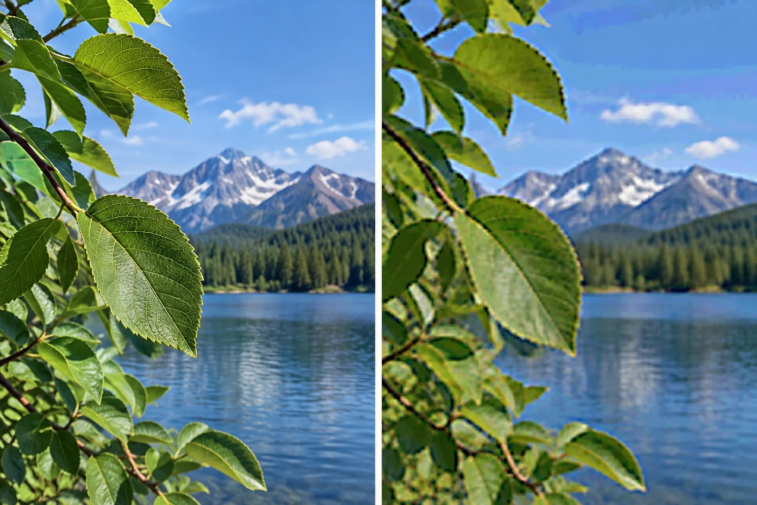
Compare candidates at equal dimensions. Reject a smaller file if compression visibly harms detail that matters in your photograph.
Tip
File size alone is not a quality score. A very small reduction in decimal kB may not justify a visible loss in a focal detail, such as an eye, leaf texture, building edge, or text that is part of the photograph.
After choosing the JPEG quality for each target, place the selected files in public/media/. Keep photo-original.jpg and create detail-original.jpg as separately named resources; they may be copies when your photograph is the same.
Record the dimensions and actual file size of every exported variant in decimal kB. File sizes depend on the photograph, editor, quality setting, and metadata, so another learner's values are not targets.
Also record which two same-dimension candidates you compared, the selected quality setting as your editor describes it, and the visible detail that drove your decision.
Example
Example only — replace every value with your own observation:
photo-480.jpg — 480 × 320 px — 38.6 kBphoto-960.jpg — 960 × 640 px — 128.4 kBphoto-1440.jpg — 1440 × 960 px — 241.9 kBdetail-960.jpg — 960 × 640 px — 131.2 kB
Quality/accessibility notes: two 960 × 640 JPEG candidates were compared at the intended display size. The selected export retained fine leaf edges; the lower-quality candidate showed block artifacts with little worthwhile byte saving. Keep the existing text alternative appropriate to the photograph's role.
Write a compact decision record for your own exports. Report the dimensions and decimal kB file sizes of photo-480.jpg, photo-960.jpg, photo-1440.jpg, and detail-960.jpg. Then name the two same-dimension JPEG quality candidates you compared, state which one you selected, identify one visible detail you checked, and explain why you rejected the other candidate.
Write at least 220 characters (0/220).

Step 3 of 8
Reserve proportional image space before image pixels arrive while keeping the Field Notes article responsive and comparable with its baseline.
An image can be responsive and still move the article while it loads. Add width and height attributes that state the image’s real dimensions. Before its pixels arrive, the browser can use their ratio as an aspect-ratio hint and reserve a box.
For the 3:2 Field Notes photographs, width="1440" and height="960" communicate that ratio. They do not force the image to render at 1440 CSS px wide. The existing CSS controls the rendered width; width: 100% and height: auto keep the displayed image proportional inside the article wrapper.
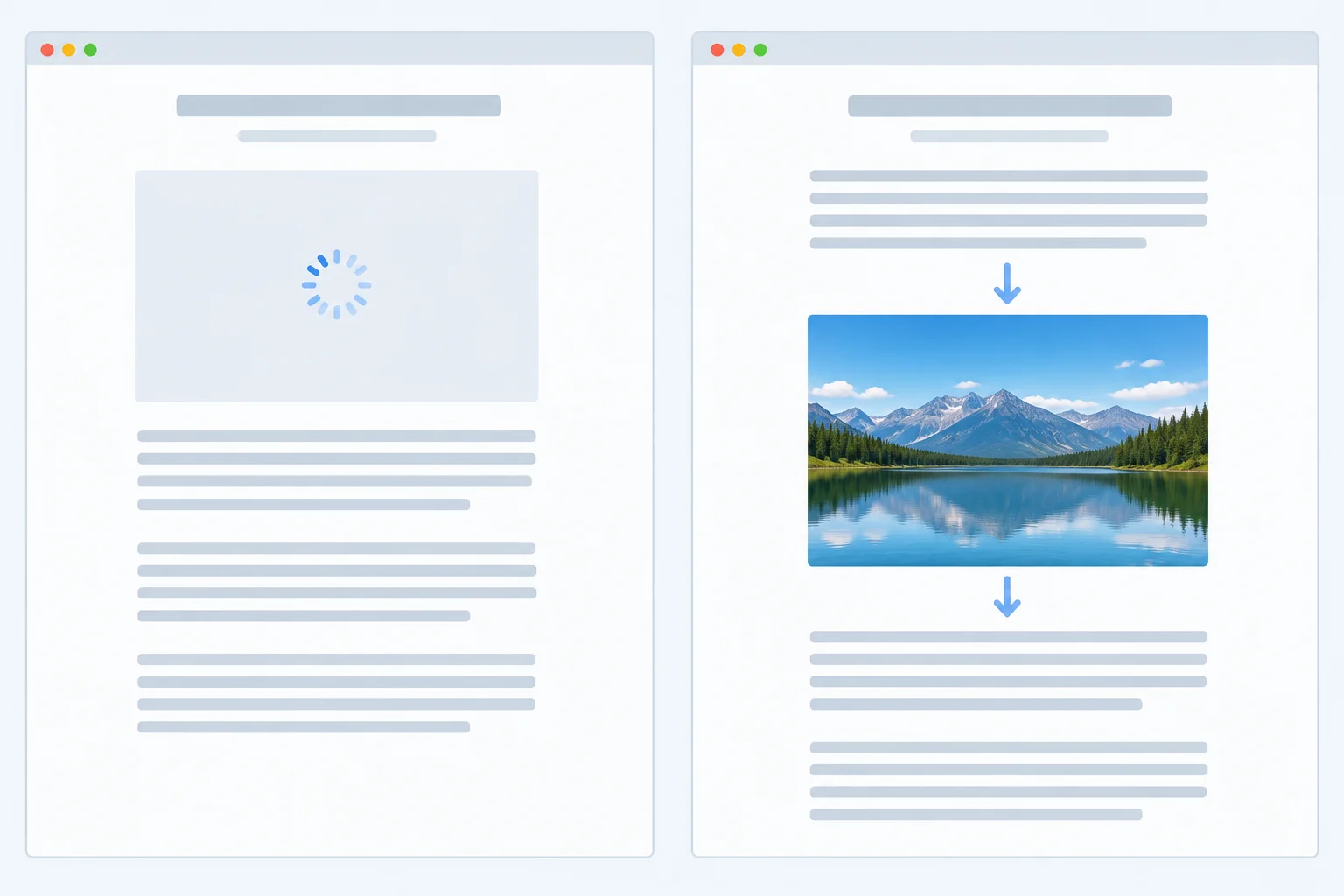
When the reserved box matches the arriving media geometry, surrounding article content can stay in place.
Tip
A placeholder helps only when it occupies the final intended geometry. For a responsive 3:2 image, an arbitrary fixed height might match at one rendered width and disagree at another.
If a design intentionally uses a fixed-ratio media container, give that container the same intended ratio with CSS, such as aspect-ratio: 3 / 2. In this Field Notes fixture, accurate image dimensions plus the existing proportional image CSS are sufficient.
Keep the baseline article geometry unchanged: do not alter .article, figure, figcaption, the article paragraphs, or .detail. In index.html, edit only the two existing opening <img> tags by adding accurate dimensions. Keep each image in its existing <figure> and retain or adapt its text alternative for your own photograph.
In index.html, replace each existing figure with the corresponding version below in the same location. The figure structure, captions, URLs, and surrounding article content stay unchanged; only width and height are added to the image elements.
<figure>
  <img
    src="/media/photo-original.jpg"
    width="1440"
    height="960"
    alt="A weathered notebook beside a trail map on a wooden table."
  >
  <figcaption>Notebook and map at the start of the walk.</figcaption>
</figure>

<!-- Keep the existing Field Notes paragraphs here. -->

<figure>
  <img
    src="/media/detail-original.jpg"
    width="1440"
    height="960"
    alt="Close view of a trail marker beside grasses and stones."
  >
  <figcaption>A marker observed later on the route.</figcaption>
</figure>
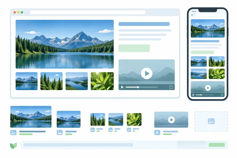
Expected visible result during a throttled reload: - Before each photograph’s pixels appear, its figure contains an empty 3:2 image box. - At a 720 CSS px rendered width, that box is 720 CSS px wide by 480 CSS px high. - When the photograph appears, its caption and the following article content remain in the same positions.
Expected visual result after a throttled reload. The photograph pixels depend on your own files, but the reserved geometry does not.
No CSS replacement is needed if you kept the baseline stylesheet. Verify that this existing rule remains present. It makes the displayed width responsive while the HTML attributes provide the pre-load ratio hint.
img {
  display: block;
  width: 100%;
  height: auto;
}
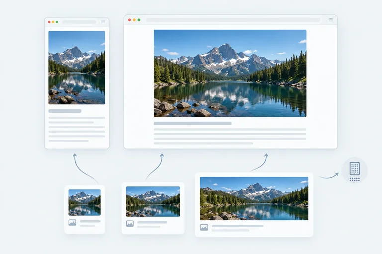
Expected visible result: - The image fills the current article wrapper rather than rendering at its 1440 source-pixel width. - At a 480 CSS px viewport, the wrapper is 448 CSS px wide and a 3:2 image is about 298.7 CSS px high. - At a wide viewport, the wrapper stops growing at 720 CSS px and the image remains proportional.
Expected visual result after a reload. This is a responsive-size check, not a fixed-width requirement.
Complete the ratio hints and responsive sizing for the Field Notes hero image.
<img
  src="/media/photo-original.jpg"
  width=""
  height=""
  alt="A weathered notebook beside a trail map on a wooden table."
>

<style>
  img {
    width: ;
    height: ;
  }
</style>Apply the dimension attributes to both existing Field Notes images and preserve the baseline responsive image rule. Then reload through your local Vite preview using the same Viewport, DPR, Cache, Network throttling, and CPU throttling conditions as your baseline. Use throttling slow enough to observe the empty image areas before their pixels arrive.
Write at least 180 characters (0/180).
Step 4 of 8
Configure width-based responsive image candidates for the Field Notes hero image, then verify browser selection under controlled viewport and DPR conditions.
srcset gives the browser a set of image-file candidates. With width descriptors, each descriptor states the file’s real source width: the 480 × 320 export is 480w, the 960 × 640 export is 960w, and the 1440 × 960 export is 1440w. A descriptor is not a prediction of displayed width.
sizes answers a separate question: how wide the image is expected to render in CSS pixels. It helps the browser choose a srcset candidate; it does not apply styling or resize the image.
In Field Notes, the article wrapper is viewport width minus 32 px until it reaches its 720 px maximum. The changeover is 752 px because 752 px − 32 px = 720 px.
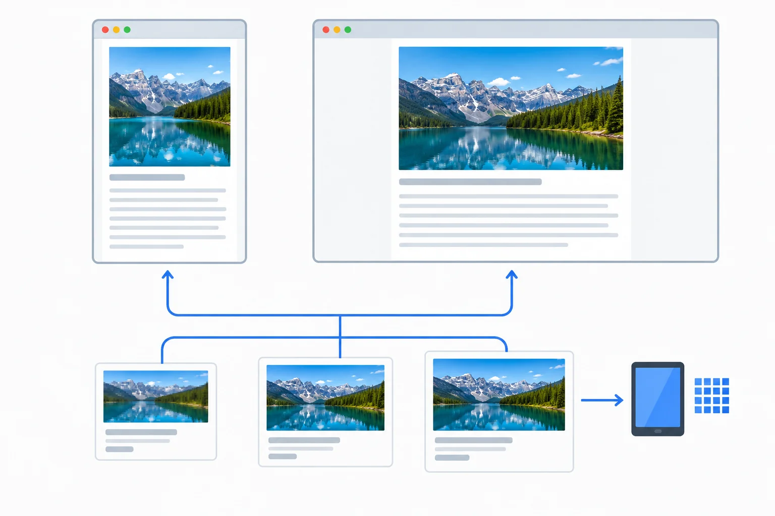
The layout predicts rendered CSS width; the browser selects from source files that accurately report their widths.
These are approximate source-pixel demands, not promises of one selected URL. The browser also considers its selection behavior and current conditions.
| Viewport | Expected rendered width | DPR 1 approximate demand | DPR 2 approximate demand |
|---|---|---|---|
| 480 px | 448 CSS px | 448 source px | 896 source px |
| 752 px | 720 CSS px | 720 source px | 1440 source px |
| 1200 px | 720 CSS px | 720 source px | 1440 source px |
Do not replace styles.css in this step. Keep the baseline stylesheet and verify that these existing rules remain present. They determine the hero’s rendered width; sizes only describes that result to the browser.
styles.css — existing rules to preserve, not a replacement for the full file
.article {
  width: calc(100% - 32px);
  max-width: 720px;
  margin: 0 auto;
}

img {
  display: block;
  width: 100%;
  height: auto;
}Rendered result: Below a 752 px viewport, the hero fills the wrapper at viewport width minus 32 px. At 752 px and wider, the hero is capped at 720 CSS px. The image remains proportional at a 3:2 ratio.
Visual result, not terminal output. Exact requested image URL depends on the browser, Viewport, DPR, Cache, and other conditions.
In index.html, replace only the opening <img> tag in the first existing <figure>—the hero image. Keep its existing caption, all article text, the offscreen-image figure, and the existing styles.css unchanged. The src remains a usable fallback. Adapt the alt value to your own photograph while preserving a useful text alternative.
index.html — replacement for the existing hero <img> opening tag
<img
  class="hero-image"
  src="/media/photo-1440.jpg"
  srcset="/media/photo-480.jpg 480w,
          /media/photo-960.jpg 960w,
          /media/photo-1440.jpg 1440w"
  sizes="(max-width: 752px) calc(100vw - 32px), 720px"
  width="1440"
  height="960"
  alt="A weathered notebook beside a trail map on a wooden table."
>Rendered result: The Field Notes hero fills the article wrapper while preserving its 3:2 space. The browser requests one suitable candidate from the listed sources rather than treating CSS display width as a download-size instruction. The image caption remains below the hero image.
Visual result, not terminal output. A browser may choose a different valid candidate under different Viewport, DPR, Cache, or browser conditions.
Warning
Every width descriptor must match the actual exported file. For example, do not label a 960-source-pixel file as 720w merely because the article can render at 720 CSS px. A false descriptor gives the browser incorrect selection information.
After saving the hero markup and performing a reload, run this in the DevTools Console. You can also confirm the requested file in the Network panel. For comparisons, use fresh reloads and record controlled conditions.
document.querySelector(".hero-image").currentSrchttp://localhost:5173/media/photo-960.jpg
Illustrative output only. `currentSrc` returns an absolute URL in the browser, and the selected file can vary with Viewport, DPR, Cache, browser behavior, and conditions.
Complete the responsive-source descriptors and the layout description for the Field Notes hero image.
<img
  class="hero-image"
  src="/media/photo-1440.jpg"
  srcset="/media/photo-480.jpg ,
          /media/photo-960.jpg ,
          /media/photo-1440.jpg "
  sizes=""
  width="1440"
  height="960"
  alt="A weathered notebook beside a trail map on a wooden table."
>Apply the responsive hero configuration in your local index.html. Use fresh reloads under controlled conditions. Compare the hero at Viewport 480 px and Viewport 1200 px, each at DPR 1 and DPR 2. Inspect currentSrc after each reload or inspect the hero request in Network.
In your response, first paste your complete opening hero <img> tag, including src, srcset, sizes, width, height, and your adapted alt. Then provide four compact records using these labels exactly: Viewport, DPR, Cache, Network throttling, CPU throttling, and Selected image URL.
Finish by explaining why a selected URL that differs from your approximate source-pixel demand is not automatically a configuration error.
Write at least 450 characters (0/450).
Step 5 of 8
Keep the likely LCP image eagerly discoverable and apply high fetch priority only when justified.
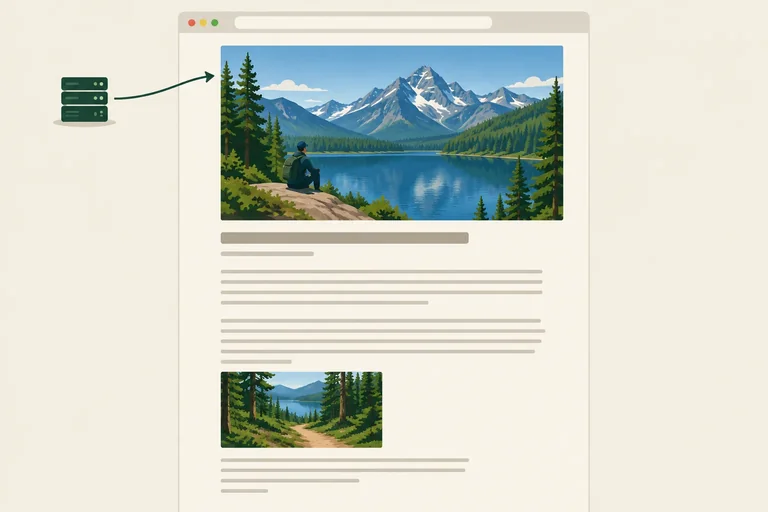
Use your earlier recording, not the image’s size alone, to identify an important initial image. When the Field Notes hero image is visible in the initial viewport and is the measured LCP element/resource, its real image URLs must be present in the initial index.html markup.
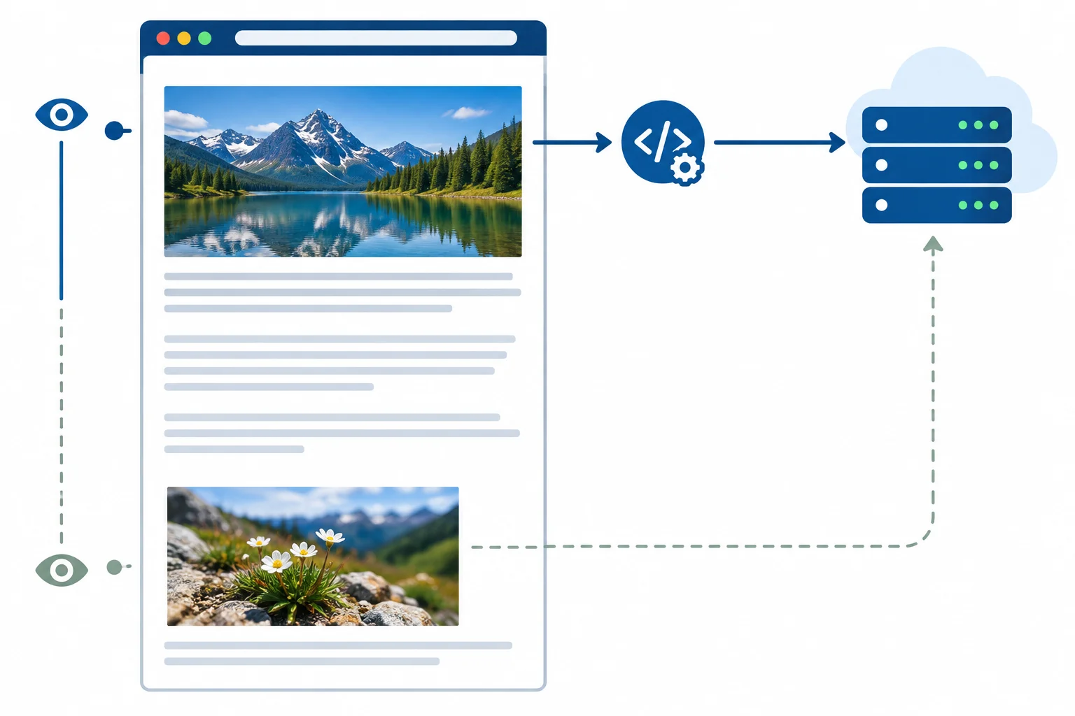
That lets the HTML parser discover src and srcset while reading the page. Do not wait to insert the real source after scrolling or after unnecessary JavaScript work. A large image may still take time to transfer and decode, but late discovery adds avoidable waiting before a request can begin.
Direct discovery is for the measured initial-viewport candidate; it is not a reason to prioritize every image.
For the existing hero image, loading="eager" makes its intended treatment explicit. Eager is also the normal image-loading behavior, so this mainly protects important initial content from an accidental lazy setting.
Use fetchpriority="high" only when your recorded initial view identifies this hero as the LCP image or gives equally strong evidence that it is the important initial-content candidate. It is a browser scheduling hint—not a guaranteed request start time and not a substitute for a real source in initial HTML.
In index.html, edit only the opening hero <img> in the first existing <figure>. This keeps the responsive configuration from the preceding step and adds only the two loading-policy attributes. Keep your own adapted alt value if you changed the sample text alternative.
<img
  class="hero-image"
  src="/media/photo-1440.jpg"
  srcset="/media/photo-480.jpg 480w,
          /media/photo-960.jpg 960w,
          /media/photo-1440.jpg 1440w"
  sizes="(max-width: 752px) calc(100vw - 32px), 720px"
  width="1440"
  height="960"
  loading="eager"
  fetchpriority="high"
  alt="A weathered notebook beside a trail map on a wooden table."
>
Expected observable result: The hero remains visually unchanged, responsive, and space-reserved. Its real responsive sources are present in the initial HTML. The hero request remains eligible for eager loading and has a high-priority hint when initial-viewport evidence justifies that choice.
Exact request timing, selected candidate, and LCP changes vary by browser and conditions. Repeat a controlled measurement to determine whether this justified hint changed observed behavior.
Warning
Do not add another <main>, <article>, heading, paragraph, or image. Do not change the current src fallback, srcset, sizes, dimensions, CSS, caption, or text alternative merely to add priority.
Priority does not replace responsive source selection or reserved space. Do not mark every image fetchpriority="high": competing high-priority requests weaken the deliberate choice. After a comparable reload, inspect request timing and LCP evidence again rather than assuming this hint improved LCP.
A controlled recording shows that the Field Notes hero image is in the initial viewport and is the LCP element/resource. Its real URL is currently inserted only after a script runs, and the element has loading="lazy". The detail image is well below the initial viewport. Which repair is best?
Step 6 of 8
Defer the distant Field Notes detail image with native lazy loading while preserving stable geometry, responsive behavior, and its text alternative.
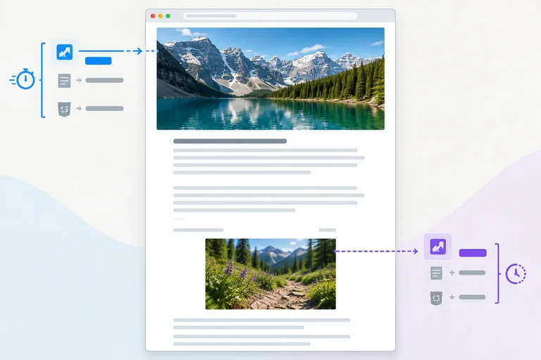
Native lazy loading is for media that is not needed to present the initial article. In Field Notes, the hero image remains available for the initial view; the detail photograph is well below it and is a suitable lazy-loading candidate.
loading="lazy" asks the browser to defer an offscreen image. It does not remove the real URL, accurate dimensions, responsive CSS, or the text alternative. The image must still be ready to appear when a reader reaches it.
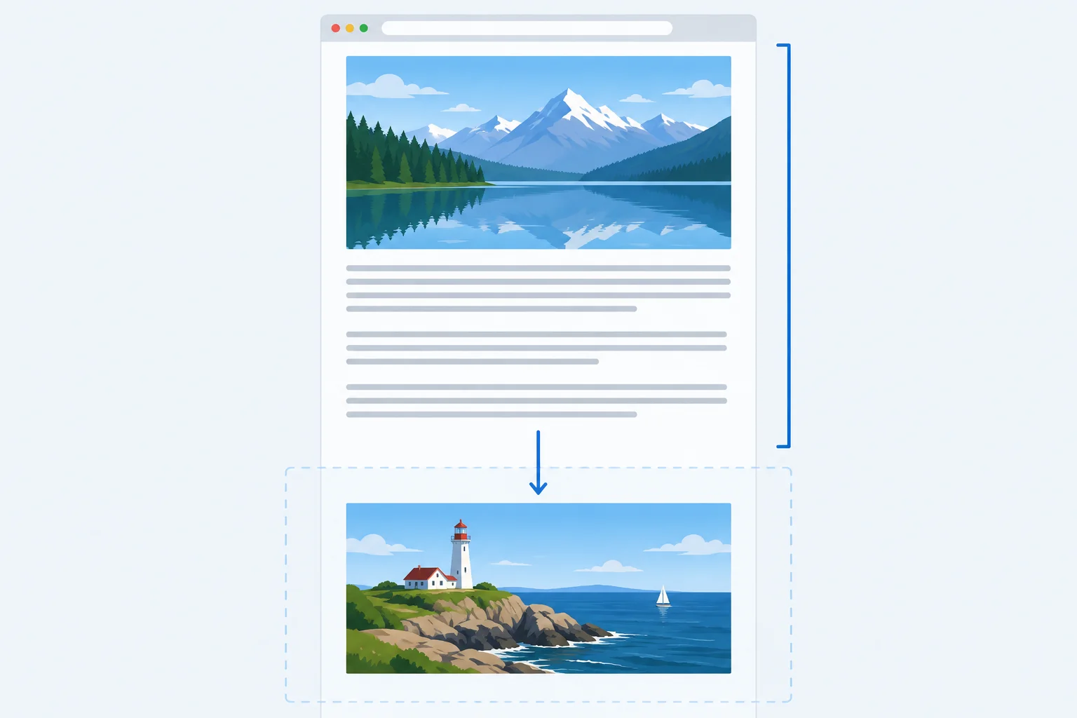
Native lazy loading is distance-based, not a promise to wait until the exact moment an image becomes visible.
Lazy loading answers whether work can be deferred. Fetch priority answers how an eligible request may be scheduled. They are separate decisions.
A browser uses its own distance threshold for native lazy loading. The detail image can therefore appear in Network during the initial load—especially with a tall viewport or particular browser conditions—without proving that loading="lazy" failed.
Choose from the image’s role in the reader’s initial viewport. Do not give every image high priority.
| Image role | Loading decision | Priority decision |
|---|---|---|
| Likely LCP hero | Needed initially | High only when justified |
| Other image in the initial viewport | Needed initially | Normal unless evidence supports otherwise |
| Distant article detail | Can be deferred | Normal priority |
In index.html, replace only the existing opening <img> tag inside the Later detail figure. Keep the surrounding section, caption, article paragraphs, and styles.css unchanged. The distinct detail URL remains real; its accurate dimensions preserve 3:2 geometry before it arrives.
Adapt the sample alt value only if needed so it remains a useful text alternative for your own photograph and its article role.
index.html — replacement for the existing offscreen image opening tag
<img
  src="/media/detail-960.jpg"
  width="960"
  height="640"
  loading="lazy"
  alt="Close view of a trail marker beside grasses and stones."
>Before the image pixels arrive: a 3:2 space is reserved in the Later detail section. After scrolling to the section: the detail image appears. During its arrival: surrounding article text remains in its reserved position.
The request timing is browser-dependent. `/media/detail-960.jpg` may be requested before scrolling when it is within the browser’s lazy-loading distance threshold; that observation alone does not mean lazy loading failed.
Tip
Do not change the hero image to lazy loading. Also, do not add fetchpriority="high" to this distant detail image merely because it is an image. Its source URL, dimensions, responsive sizing, and text alternative remain part of a correct lazy-loaded element.
Match each image role to its best loading and priority policy.
Tap an item and then its matching pair.
In your local Field Notes article, verify only the two images that exist in the fixture: the hero image and the distant detail image. Keep the controlled conditions used in earlier comparisons, then perform a fresh reload and inspect the detail-image request in Network.
Report whether /media/detail-960.jpg was requested before scrolling, after scrolling, or was not observed. Scroll until the detail image appears, then report whether surrounding article text moved. An early request is an observation that can result from the browser’s distance threshold; it is not, by itself, proof that lazy loading failed.
Write at least 120 characters (0/120).
Step 7 of 8
Choose a video preload hint based on viewing intent, then compare pre-Play and post-Play transfers without treating browser hints as guarantees.
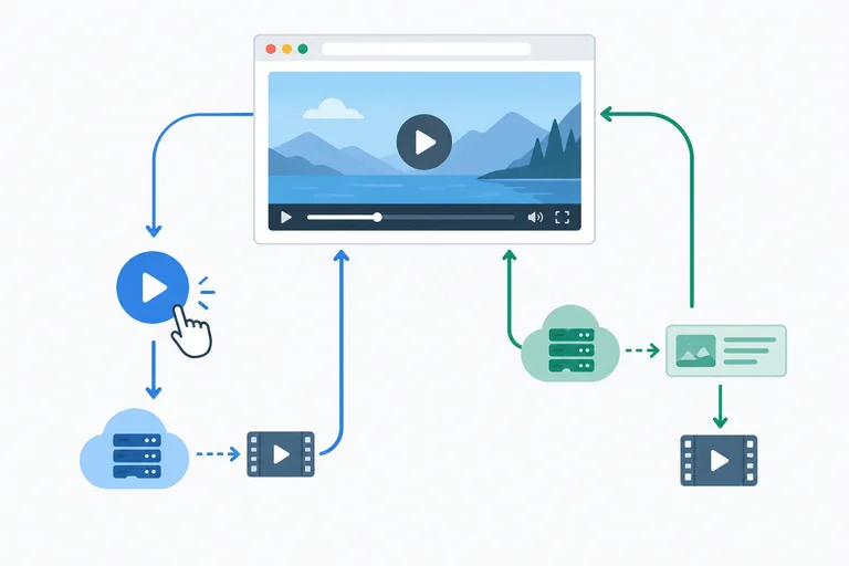
preload is a hint about what a browser may fetch before a visitor starts a video. It does not replace native controls or prevent a visitor from playing the clip.
preload="none" asks the browser not to preload video data. Choose it when a clip is optional and many visitors may never play it.preload="metadata" asks for information such as duration and dimensions before playback. Choose it when that information helps a visitor decide whether to play.Metadata is not necessarily free: its transferred amount depends on the file and browser. Both values are hints, so caching, browser policy, native controls, and pressing Play can change the requests you observe.
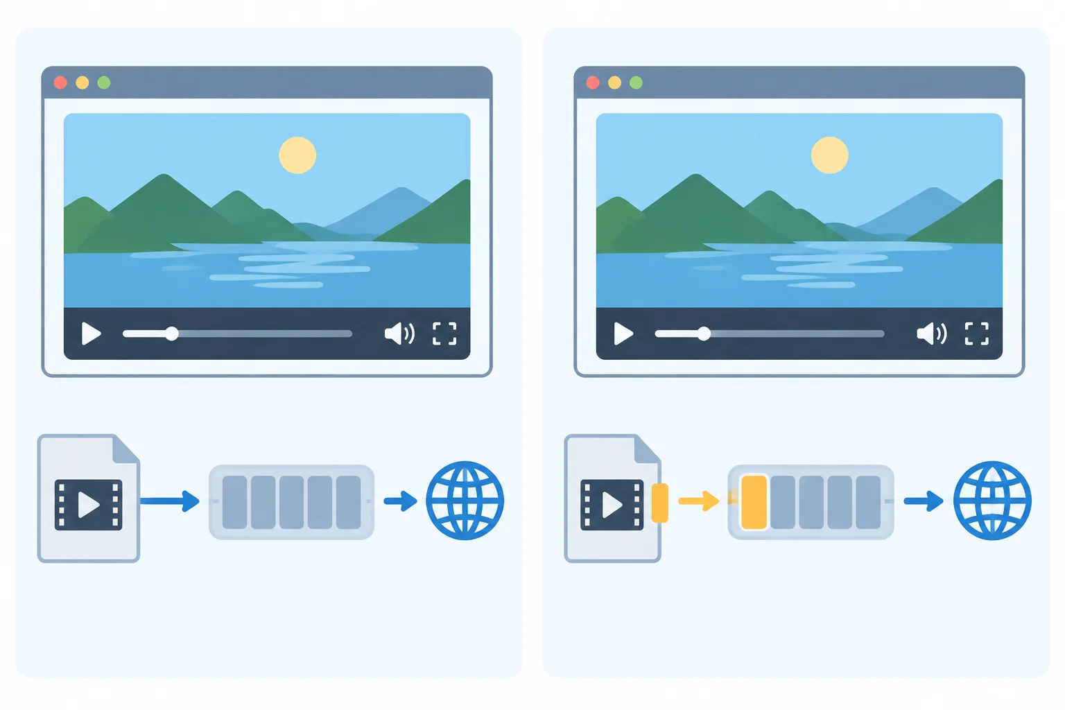
The information transfer can be useful, but it has a transfer cost and can differ across browsers.
Create a separate video.html fixture and place a learner-owned browser-playable video at public/media/clip.mp4. Find the clip’s intrinsic dimensions in local file information, then replace the example width and height values below with the accurate values for your clip. These attributes reserve the correct ratio while CSS keeps the displayed video responsive.
Replace the visible description with a concise transcript or equivalent description when the clip communicates information that is not already available in nearby article text. This fixture deliberately uses native controls and no autoplay. It is separate from the Field Notes image article so the video comparison does not alter that controlled fixture.
Save as video.html in the local Vite fixture. Replace the example dimensions and description before testing.
<!doctype html>
<html lang="en">
  <head>
    <meta charset="UTF-8">
    <meta name="viewport" content="width=device-width, initial-scale=1.0">
    <title>Field Notes video test</title>
    <style>
      body {
        margin: 0;
        font-family: system-ui, sans-serif;
      }

      main {
        width: calc(100% - 32px);
        max-width: 720px;
        margin: 32px auto;
      }

      video {
        display: block;
        width: 100%;
        height: auto;
      }
    </style>
  </head>
  <body>
    <main>
      <h1>Field Notes</h1>
      <p>A short optional field clip.</p>
      <!-- Replace 1280 and 720 with your clip's intrinsic dimensions. -->
      <video controls preload="none" width="1280" height="720" aria-describedby="clip-description">
        <source src="/media/clip.mp4" type="video/mp4">
        Your browser does not support HTML video.
      </video>
      <p id="clip-description">Replace with a concise transcript or equivalent description if the clip adds information not available in the article.</p>
    </main>
  </body>
</html>A Field Notes page appears with the heading, a short clip description, and a video player that fills the responsive content width. Native playback controls are visible. The video does not start on its own. Before video pixels arrive, the player reserves space using the proportion implied by the width and height values you supplied.
The visible video frame, intrinsic dimensions, duration, and transfers depend on your own `clip.mp4`. The browser’s exact native-control appearance also varies.
Tip
Serve the file through your local Vite server and open /video.html. For the second run, change only the preload value. Do not change the video file, its dimensions, accessible description, or surrounding layout between runs.
Make two fresh comparisons: one with preload="none" and one with preload="metadata". In the Network panel, filter for Media, clear the record before each run, and note transferred media before pressing Play. Then press Play once and note the total media transfer shown by your browser.
Use the same record labels as the article measurements: Viewport, DPR, Cache, Network throttling, CPU throttling, Selected image URL, Transferred media, LCP element/resource, LCP time, Layout shifts, and Quality/accessibility notes. For labels unrelated to this video fixture, record not applicable rather than inventing a result.
A request before playback does not automatically mean a policy failed, and no initial request does not mean Play is blocked. If no suitable local video is available, do not claim a local result; use the illustrative table below to make a reasoned policy choice instead.
This is illustrative data, not an expected result for your clip.mp4. Assume the same viewport, DPR, empty cache, and throttling for each row. “After Play” is the total media transfer recorded after the visitor starts the clip.
| Policy | Transferred media before Play | Transferred media after Play | Observed result |
|---|---|---|---|
| preload="none" | 0.0 kB | 4800.0 kB | Request began after Play |
| preload="metadata" | 36.2 kB | 4800.0 kB | Small request before Play; playback requested more data |
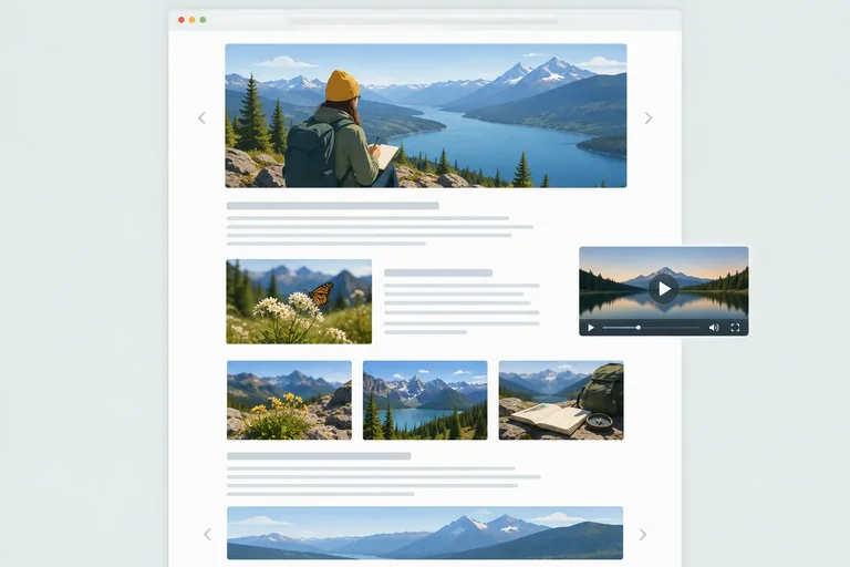
An article includes two clips:
For each clip, name the appropriate preload attribute value taught in the preceding screens and justify the decision. Interpret the illustrative transfer record: explain why the pre-Play transfer is not automatically free and why a deferred pre-Play request does not stop a visitor-initiated request. State one controlled check you would repeat in your own browser.
Write at least 180 characters (0/180).
Step 8 of 8
Accept or revise image and video loading changes with comparable local evidence while checking quality, behavior, and accessibility.
Make the decision from a like-for-like comparison, not from one unusually fast or slow local run. Keep Field Notes as the same article fixture used for the baseline: the same article copy, image order, wrapper layout, and learner-owned photographs. Integrate the completed image changes in index.html while preserving the existing styles.css layout rules.
Measure the article’s initial viewport before scrolling, then scroll to verify the offscreen image. Keep the video comparison in video.html. A video preload decision answers a separate viewing-intent question; it is not evidence that the article LCP improved.
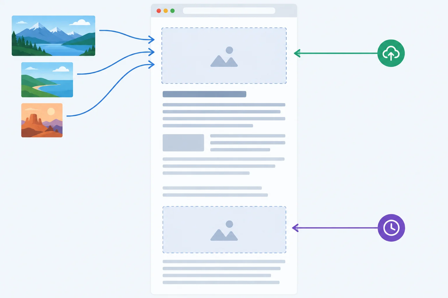
The final article preserves proportional space for both images, matches the hero download to the layout, and defers only the offscreen image.
Repeat article runs under the same recorded conditions. Use a fresh reload when comparing cache conditions, record the initial load before scrolling, and then scroll until the detail image appears.
Interpret the evidence together. Lower transferred media does not guarantee a faster LCP time, and the LCP element can change between runs. Reserved image geometry can remove image-related movement while unrelated content still produces layout shifts. These local recordings are diagnostic evidence, not real-user performance evidence.
Use these labels unchanged for the baseline and integrated article runs. Enter your observed decimal kB and ms values; values from another computer are not targets.
| Record label | Baseline run | Integrated run | What to note |
|---|---|---|---|
| Viewport | Observed value | Same value | Width in px |
| DPR | Observed value | Same value | DPR 1 or DPR 2 |
| Cache | Observed value | Same condition | Fresh or warm condition |
| Network throttling | Observed value | Same value | Configured profile |
| CPU throttling | Observed value | Same value | Configured profile |
| Selected image URL | Observed value | Observed value | Hero currentSrc or Network request |
| Transferred media | Observed value | Observed value | Initial media in decimal kB |
| LCP element/resource | Observed value | Observed value | Element and associated resource |
| LCP time | Observed value | Observed value | Timing in ms |
| Layout shifts | Observed value | Observed value | Image-related and other shifts |
| Quality/accessibility notes | Observed value | Observed value | Quality, text alternatives, and offscreen behavior |
Summary
A controlled fresh reload at the chosen initial viewport confirmed that the hero image was the LCP element/resource. The detail image remained well below the initial viewport. Complete the three loading-policy values for this measured scenario.
<img
  class="hero-image"
  src="/media/photo-1440.jpg"
  srcset="/media/photo-480.jpg 480w,
          /media/photo-960.jpg 960w,
          /media/photo-1440.jpg 1440w"
  sizes="(max-width: 752px) calc(100vw - 32px), 720px"
  width="1440"
  height="960"
  loading=""
  fetchpriority=""
  alt="A weathered notebook beside a trail map on a wooden table."
>

<img
  src="/media/detail-960.jpg"
  width="960"
  height="640"
  loading=""
  alt="Close view of a trail marker beside grasses and stones."
>Complete your local integrated image-policy check, then submit a concise 5–8 bullet observation record. Do not submit files.
Use the labels exactly: Viewport, DPR, Cache, Network throttling, CPU throttling, Selected image URL, Transferred media, LCP element/resource, LCP time, Layout shifts, and Quality/accessibility notes.
Include before-and-after article observations; whether /media/detail-960.jpg appeared successfully after scrolling; and a keep or revise justification for responsive sources, reserved dimensions, the hero policy, and offscreen loading. Separately state the preload="none" or preload="metadata" decision for video.html and confirm native controls and playback. Confirm narrow and wide quality, zoom, and text alternatives. End with one limitation of the local evidence and your final keep/revise decision. If something was not observed, say so rather than inventing a value.
Write at least 500 characters (0/500).
Congratulations! You completed: Optimize Image and Media Loading
Thousands of online courses in video, ebooks and audiobooks.
To test your knowledge during online courses
Generated directly from your cell phone's photo gallery and sent to your email

Download our app via QR Code or the links below:.



Carry knowledge in your pocket.
Download the Cursa app.
There are hundreds of free courses available, with a free certificate of completion that is saved in your mobile image gallery.
Download the app to access the Course Completion Certificate for Free.


+ 10 million
students

Free and Valid
Certificate

60 thousand free
exercises

4.8/5 rating in
app stores

Free courses in
video and ebooks