
Step 1 of 7
Set the Layout Viewport
Prepare the local Community Workshops page with a viewport declaration that supports device-width layout while preserving user zoom.

Learning path · Level 3 · Tutorial 3
Combine bounded fluid containers with content-driven media queries so a locally created page adapts from narrow to wide viewports.
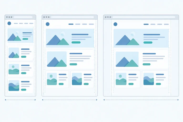
 Set the Layout Viewport
Prepare the local Community Workshops page with a viewport declaration that supports device-width layout while preserving user zoom. 2 min
Set the Layout Viewport
Prepare the local Community Workshops page with a viewport declaration that supports device-width layout while preserving user zoom. 2 min
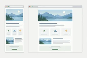 Build a Bounded Fluid Container
Make the Community Workshops page container resize fluidly, stay centered, and stop growing at a readable maximum width. 3 min
Build a Bounded Fluid Container
Make the Community Workshops page container resize fluidly, stay centered, and stop growing at a readable maximum width. 3 min
 Let Content Suggest a Breakpoint
Observe when bounded fluid sizing is enough and when content fit suggests a different layout arrangement. 2 min
Let Content Suggest a Breakpoint
Observe when bounded fluid sizing is enough and when content fit suggests a different layout arrangement. 2 min
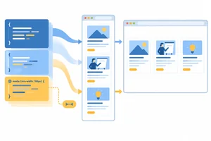 Write Mobile-First Media Queries
Write narrow-screen base rules first, then use one min-width media query to override only the grid gap at a content-driven breakpoint. 3 min
Write Mobile-First Media Queries
Write narrow-screen base rules first, then use one min-width media query to override only the grid gap at a content-driven breakpoint. 3 min
 Adapt the Header with Flexbox
Switch the Community Workshops header from a stacked base arrangement to a wide-viewport row without changing document order. 2 min
Adapt the Header with Flexbox
Switch the Community Workshops header from a stacked base arrangement to a wide-viewport row without changing document order. 2 min
 Change Grid Columns and Spans Together
Adapt the workshop grid from one column to two while keeping the featured-card span valid only in the wide layout. 3 min
Change Grid Columns and Spans Together
Adapt the workshop grid from one column to two while keeping the featured-card span valid only in the wide layout. 3 min
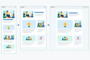 Finish and Check the Responsive Page
Complete the Community Workshops page, then check how its bounded fluid container and targeted media-query overrides work together. 4 min
Finish and Check the Responsive Page
Complete the Community Workshops page, then check how its bounded fluid container and targeted media-query overrides work together. 4 min
Step 1 of 7
Prepare the local Community Workshops page with a viewport declaration that supports device-width layout while preserving user zoom.
A browser uses a layout viewport: the available space it uses to lay out a page. On a mobile browser, if a page does not declare its viewport, the browser may lay out the page in a wider space and then scale the whole result down. Text and controls can appear unexpectedly small.
Add one metadata element in the HTML <head> so the layout viewport follows the device width. This affects layout; it does not replace CSS sizing rules.
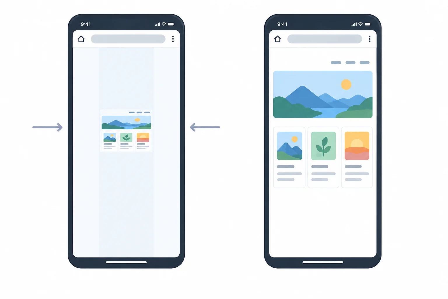
Without a viewport declaration, a mobile browser can scale down a layout made in a wider viewport. With the declaration, the layout viewport follows the device width.
Warning
Use this exact declaration:
<meta name="viewport" content="width=device-width, initial-scale=1">
width=device-width asks for a layout viewport as wide as the device. initial-scale=1 starts the page at its normal scale. Do not add attributes that limit zoom: people may need browser zoom to read and use a page.
Create or open two files in the same local folder: index.html and styles.css. Save the complete HTML below as index.html. It connects the stylesheet, places the viewport declaration in the <head>, and provides the Community Workshops content that later steps will adapt.
Save as index.html
<!doctype html>
<html lang="en">
<head>
  <meta charset="utf-8">
  <meta name="viewport" content="width=device-width, initial-scale=1">
  <title>Community Workshops</title>
  <link rel="stylesheet" href="styles.css">
</head>
<body>
  <div class="page">
    <header class="site-header">
      <h1>Community Workshops</h1>
      <nav class="site-nav" aria-label="Workshop topics">
        <a href="#html">HTML</a>
        <a href="#css">CSS</a>
        <a href="#planning">Planning</a>
      </nav>
    </header>

    <main>
      <section class="workshop-grid" aria-label="Workshops">
        <article class="workshop-card workshop-card--featured" id="html">
          <h2>Build a Web Page</h2>
          <p>Plan and create a small page with meaningful HTML.</p>
        </article>
        <article class="workshop-card" id="css">
          <h2>Style a Layout</h2>
          <p>Use CSS rules to create a clear, readable layout.</p>
        </article>
        <article class="workshop-card" id="planning">
          <h2>Plan a Project</h2>
          <p>Break a project into practical next steps.</p>
        </article>
      </section>
    </main>
  </div>
</body>
</html>Browser page preview: the title “Community Workshops” appears first, followed by the HTML, CSS, and Planning links. Below them, the three workshop headings and their descriptions appear in document order: Build a Web Page, Style a Layout, and Plan a Project. At this starter stage, the page is a simple vertical document.
Expected browser preview after you save both this file and the stylesheet below, then open or refresh index.html.
Save as styles.css
* {
  box-sizing: border-box;
}

body {
  margin: 0;
  background: #f4f6f8;
  color: #1f2933;
  font-family: Arial, sans-serif;
  line-height: 1.5;
}Browser page preview: the same Community Workshops content remains in its original vertical document order. The page has no default outer body margin, a pale background, dark text, and Arial text. Later steps will add the layout rules that arrange and size this content.
Expected browser preview when this stylesheet is saved beside index.html and the page is refreshed.
Complete the viewport declaration in the <head>. Fill only the metadata name and its two standard content values; do not add an attribute that restricts user zoom.
<head>
  <meta charset="utf-8">
  <meta name="" content=", ">
  <title>Community Workshops</title>
</head>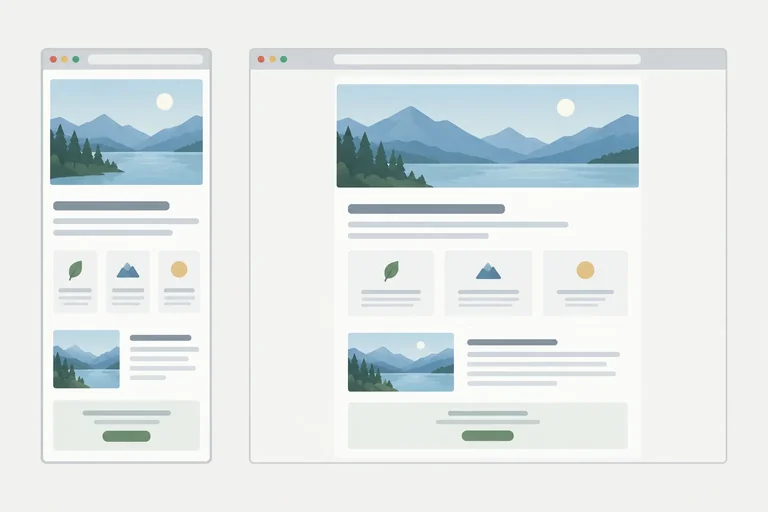
Step 2 of 7
Make the Community Workshops page container resize fluidly, stay centered, and stop growing at a readable maximum width.
A fluid container changes size continuously as its containing block changes. In this page, .page uses a percentage width, so it can become narrower or wider with the available layout space.
A percentage alone can become too wide on a large viewport. Add a max-width cap: below that cap, the container grows and shrinks; once it reaches the cap, its own width stops growing.
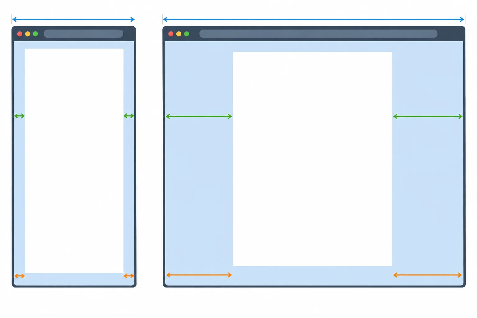
Below its cap, the container width changes. After it reaches its cap, the surrounding margins change instead.
In styles.css, replace the current starter stylesheet with this complete version. It preserves the starter sizing and body rules, then adds the .page rule.
The percentage width provides the fluid foundation. max-width limits that width rather than replacing it. margin: 0 auto; means zero vertical margin and automatic horizontal margins. When horizontal space remains, the browser divides it between the two sides and centers the container.
Replace the current contents of styles.css with this complete stylesheet, then save and refresh index.html.
* {
  box-sizing: border-box;
}

body {
  margin: 0;
  background: #f4f6f8;
  color: #1f2933;
  font-family: Arial, sans-serif;
  line-height: 1.5;
}

.page {
  width: 90%;
  max-width: 64rem;
  margin: 0 auto;
}Browser preview after refreshing index.html: - The Community Workshops header, navigation, and cards appear inside one centered page column. - In a narrow viewport, the column occupies about 90% of the available width, leaving small equal side margins. - As the viewport widens, the column grows until it reaches its maximum width. - Beyond that point, the column stays the same width while equal empty margins grow on both sides.
Expected browser result after refreshing `index.html`: this is a visual CSS result, so the preview describes the page state rather than terminal text.
Tip
A max-width is a limit, not a fixed width. On a narrow viewport, 90% is smaller than the cap, so it controls the container. On a sufficiently wide viewport, the cap controls the container and the automatic side margins use the extra space.
Match each simplified container diagram to its expected behavior.
Tap an item and then its matching pair.
Complete the bounded fluid container rule.
.page {
  width: ;
  max-width: ;
  margin: ;
}
Step 3 of 7
Observe when bounded fluid sizing is enough and when content fit suggests a different layout arrangement.
A fluid container can change continuously: as the viewport gains or loses space, the container becomes wider or narrower within its existing rules. Nothing else has to rearrange.
A breakpoint is different. It is a point where the content needs a different arrangement—for example, a stacked header becoming a row or a one-column card layout becoming two columns. The change is discrete rather than gradual.

Container width can resize continuously. A new header or grid arrangement is a breakpoint-triggered structural change.
Use this distinction while observing a page.
| What changes? | Type of change | What to observe |
|---|---|---|
| Container becomes wider | Continuous fluid sizing | Width changes while the arrangement stays the same |
| Header moves from stacked to side by side | Structural layout change | Content receives a different arrangement |
| Cards move from one column to two | Structural layout change | The number of grid tracks changes |
Resize the viewport gradually and watch the content, not a device name. Fluid sizing may be enough for a range of widths. Consider a new arrangement only when the current one stops serving the content well.
Useful signals include navigation labels becoming crowded, side-by-side columns becoming too cramped, or single-column cards becoming unnecessarily spread out. These are content-fit observations, not universal measurements.

Narrow viewport and Wide viewport can use different arrangements while preserving the same document order.
Tip
In this example, 768 CSS pixels is a candidate breakpoint to investigate. It is not a device standard and not a promise that every page should change there. Start with the space the navigation and cards need, then validate whether that threshold produces a comfortable arrangement.
Match each observation to the best interpretation.
Tap an item and then its matching pair.
A page container grows smoothly as the viewport widens. At a nearby width, the navigation begins to feel crowded in its current arrangement, while the cards would benefit from more horizontal room. Which plan uses the strongest breakpoint rationale?

Step 4 of 7
Write narrow-screen base rules first, then use one min-width media query to override only the grid gap at a content-driven breakpoint.
A media query applies its nested CSS rules only when its condition matches. Write narrow-screen base styles first, outside any query. Then add an override for a wider viewport.
For this page, the base grid keeps gap: 1rem;. At the candidate breakpoint, a later rule changes only that gap. The layout does not need a new structure yet.
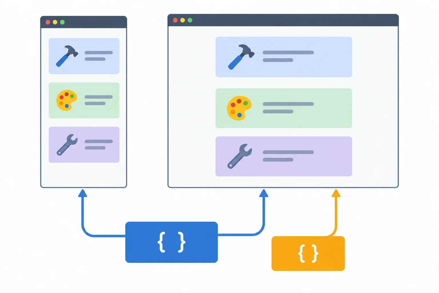
Narrow viewport: the base gap is active. Wide viewport: the matching override replaces only the gap value; other base declarations continue to apply.
Place one @media block at the end of styles.css. min-width matches when the viewport is 768 CSS pixels or wider, including exactly 768px.
The nested .workshop-grid rule has the same selector as the base rule and comes later, so its gap value overrides the base value when the query matches. Keep declarations that do not change—such as display and grid-template-columns—in the base rule. They continue to apply without being repeated.
Replace the current contents of styles.css with this complete version. The single media query is the final block; later steps will extend this same block rather than add another one.
* {
  box-sizing: border-box;
}

body {
  margin: 0;
  background: #f4f6f8;
  color: #1f2933;
  font-family: Arial, sans-serif;
  line-height: 1.5;
}

.page {
  width: 90%;
  max-width: 64rem;
  margin: 0 auto;
}

.workshop-grid {
  display: grid;
  grid-template-columns: minmax(0, 1fr);
  gap: 1rem;
}

@media (min-width: 768px) {
  .workshop-grid {
    gap: 1.5rem;
  }
}Narrow viewport, below 768px: The centered page container is 90% wide until its maximum width applies. The three workshop articles appear in one column with a 1rem gap. At 768px and above: The same centered, one-column grid remains. The space between its articles changes to 1.5rem. The display and column definition still come from the base rule.
Expected visual output after saving and refreshing `index.html`: this preview describes the page state produced by this complete stylesheet. The page remains a one-column grid at both widths; only its gap changes when the query matches.
Trace the same stylesheet at three viewport widths.
| Viewport width | Query matches? | Active gap | Other base declarations |
|---|---|---|---|
| Below 768px | No | 1rem | Still active |
| Exactly 768px | Yes | 1.5rem | Still active |
| Above 768px | Yes | 1.5rem | Still active |
Complete the wide-viewport override for the workshop grid.
@media (min-width: ) {
  .workshop-grid {
    gap: ;
  }
}Write a short CSS check for the local page:
@media rule that changes the workshop-grid gap.Submit your response to reveal an example check.
Write at least 60 characters (0/60).

Step 5 of 7
Switch the Community Workshops header from a stacked base arrangement to a wide-viewport row without changing document order.
The header keeps the same HTML order at every viewport: the h1 comes first, followed by the navigation. Only its presentation changes.
In the Narrow viewport base styles, stack the title above the navigation. Let navigation links wrap so longer labels or reduced space do not force a crowded row. When the viewport has enough room, the existing wide-viewport override can place the title and navigation beside each other.
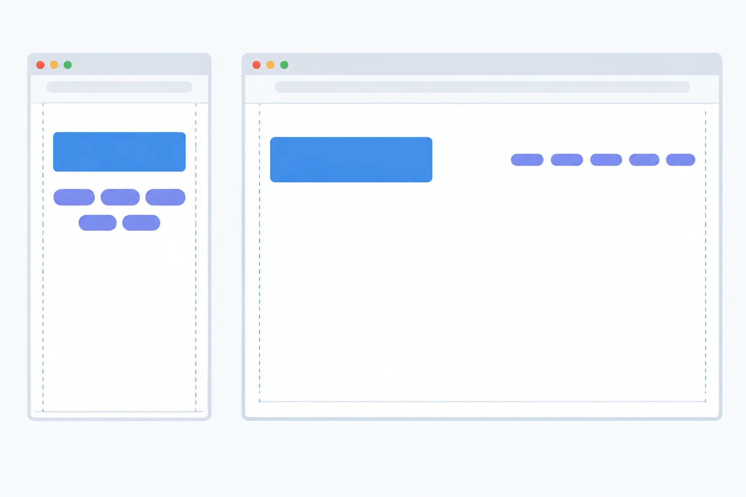
Narrow viewport: the title is above navigation. Wide viewport: title and navigation share a row.
Tip
Wrapping is a safeguard, not a reason to force a row. Keep flex-wrap: wrap; on .site-nav in the base styles. It continues to apply at wider sizes unless a later override deliberately changes it.
Replace the current contents of styles.css with this complete version, then save and refresh index.html. It preserves the earlier container and grid rules, adds the header base styles, and extends the one existing @media (min-width: 768px) block.
The override repeats only properties that change. The header stays a flex container, its base gap remains available, and navigation wrapping remains available without duplication.
Complete, runnable stylesheet: replace the contents of styles.css with this code.
* {
  box-sizing: border-box;
}

body {
  margin: 0;
  background: #f4f6f8;
  color: #1f2933;
  font-family: Arial, sans-serif;
  line-height: 1.5;
}

.page {
  width: 90%;
  max-width: 64rem;
  margin: 0 auto;
}

.site-header {
  display: flex;
  flex-direction: column;
  gap: 1rem;
  padding: 2rem 0 1rem;
}

.site-header h1 {
  margin: 0;
}

.site-nav {
  display: flex;
  flex-wrap: wrap;
  gap: 1rem;
}

.site-nav a {
  color: #175c8c;
}

.workshop-grid {
  display: grid;
  grid-template-columns: minmax(0, 1fr);
  gap: 1rem;
}

@media (min-width: 768px) {
  .site-header {
    flex-direction: row;
    align-items: center;
    justify-content: space-between;
  }

  .workshop-grid {
    gap: 1.5rem;
  }
}
Expected visual result: Narrow viewport, below 768 CSS pixels: The Community Workshops title appears above the HTML, CSS, and Planning navigation links. If the links need more room, they can wrap. The workshop grid remains one column with a 1rem gap. Wide viewport, at or above 768 CSS pixels: The title and navigation appear in one horizontal header row. The title is on one side of the bounded page container and navigation is on the other, vertically centered. The grid still has one column at this stage, but its gap is 1.5rem.
Expected output preview for this complete stylesheet. HTML and CSS render visually rather than printing terminal output.
Complete the three declaration values for the wide-viewport header override.
@media (min-width: 768px) {
  .site-header {
    flex-direction: ;
    align-items: ;
    justify-content: ;
  }
}Below the candidate breakpoint, the title and navigation become crowded beside each other. Which plan correctly completes the header override and explains why the same content stays stacked at that width?

Step 6 of 7
Adapt the workshop grid from one column to two while keeping the featured-card span valid only in the wide layout.
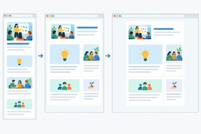
The base styles describe the Narrow viewport: one explicit, shrinkable grid column places all three cards automatically in document order. The featured card needs no special placement there.
At the breakpoint, coordinate two changes in the existing wide-viewport override: create two explicit columns, then let the featured card span both columns. A two-column span is valid only where those two columns exist.

Narrow viewport: cards stack in one column. Wide viewport: two explicit columns exist, so the featured card can span both while the remaining cards stay in document order.
Replace the current contents of styles.css with this complete stylesheet, then save and refresh index.html. It retains the existing single media query at the end of the file. The base grid stays one column; the wide-viewport override adds both the second column and the featured-card span.
* {
  box-sizing: border-box;
}

body {
  margin: 0;
  background: #f4f6f8;
  color: #1f2933;
  font-family: Arial, sans-serif;
  line-height: 1.5;
}

.page {
  width: 90%;
  max-width: 64rem;
  margin: 0 auto;
}

.site-header {
  display: flex;
  flex-direction: column;
  gap: 1rem;
  padding: 2rem 0 1rem;
}

.site-header h1 {
  margin: 0;
}

.site-nav {
  display: flex;
  flex-wrap: wrap;
  gap: 1rem;
}

.site-nav a {
  color: #175c8c;
}

.workshop-grid {
  display: grid;
  grid-template-columns: minmax(0, 1fr);
  gap: 1rem;
}

@media (min-width: 768px) {
  .site-header {
    flex-direction: row;
    align-items: center;
    justify-content: space-between;
  }

  .workshop-grid {
    grid-template-columns: repeat(2, minmax(0, 1fr));
    gap: 1.5rem;
  }

  .workshop-card--featured {
    grid-column: span 2;
  }
}Narrow viewport, below 768px: The title is above the navigation. Build a Web Page, Style a Layout, and Plan a Project each occupy a separate row in one grid column, with 1rem gaps. Wide viewport, 768px and above: The title and navigation form a row. Build a Web Page fills the first grid row across two columns. Style a Layout and Plan a Project appear side by side below it, with 1.5rem gaps.
Expected visual result after saving this stylesheet and refreshing the local page. This preview is associated with the complete CSS shown above.
Warning
Do not place grid-column: span 2; in the base styles. The base grid has only one explicit column. A request to span two columns can make the browser create an unintended implicit column, so the featured card no longer follows the intended one-column structure.
Do not hide that structural problem with overflow rules. Keep the span in the wide-viewport override, alongside the two-column definition.
Which rule placement can create an unintended implicit column in the Narrow viewport?
Which diagram pair shows the expected grid structure after the coordinated rules are applied?
Complete the coordinated grid rules for the Narrow viewport and Wide viewport.
.workshop-grid {
  display: grid;
  grid-template-columns: ;
  gap: 1rem;
}

@media (min-width: 768px) {
  .workshop-grid {
    grid-template-columns: ;
    gap: 1.5rem;
  }

  .workshop-card--featured {
    grid-column: ;
  }
}
Step 7 of 7
Complete the Community Workshops page, then check how its bounded fluid container and targeted media-query overrides work together.
Use the same two local files: index.html and styles.css. The reference below preserves the established document order and all example content. Save it as index.html only if you need to restore or compare your file; the responsive behavior is defined in the stylesheet on the next screen.
<!doctype html>
<html lang="en">
<head>
  <meta charset="utf-8">
  <meta name="viewport" content="width=device-width, initial-scale=1">
  <title>Community Workshops</title>
  <link rel="stylesheet" href="styles.css">
</head>
<body>
  <div class="page">
    <header class="site-header">
      <h1>Community Workshops</h1>
      <nav class="site-nav" aria-label="Workshop topics">
        <a href="#html">HTML</a>
        <a href="#css">CSS</a>
        <a href="#planning">Planning</a>
      </nav>
    </header>

    <main>
      <section class="workshop-grid" aria-label="Workshops">
        <article class="workshop-card workshop-card--featured" id="html">
          <h2>Build a Web Page</h2>
          <p>Plan and create a small page with meaningful HTML.</p>
        </article>
        <article class="workshop-card" id="css">
          <h2>Style a Layout</h2>
          <p>Use CSS rules to create a clear, readable layout.</p>
        </article>
        <article class="workshop-card" id="planning">
          <h2>Plan a Project</h2>
          <p>Break a project into practical next steps.</p>
        </article>
      </section>
    </main>
  </div>
</body>
</html>
Expected rendered page with the final stylesheet: Below 768 CSS pixels, the title is above the navigation and the three workshop articles occupy one grid column. At 768 CSS pixels and above, the title and navigation share a row; the first article occupies both grid columns, followed by the remaining articles.
Visual browser result when this file is saved beside the complete styles.css reference on the next screen.
Replace the entire contents of styles.css with this completed reference. Replacing the file avoids duplicate rules or a second media query. The base styles form the fluid foundation; the one existing media-query block remains at the end and contains only the wide-viewport overrides.
* {
  box-sizing: border-box;
}

body {
  margin: 0;
  background: #f4f6f8;
  color: #1f2933;
  font-family: Arial, sans-serif;
  line-height: 1.5;
}

.page {
  width: 90%;
  max-width: 64rem;
  margin: 0 auto;
}

.site-header {
  display: flex;
  flex-direction: column;
  gap: 1rem;
  padding: 2rem 0 1rem;
}

.site-header h1 {
  margin: 0;
}

.site-nav {
  display: flex;
  flex-wrap: wrap;
  gap: 1rem;
}

.site-nav a {
  color: #175c8c;
}

.workshop-grid {
  display: grid;
  grid-template-columns: minmax(0, 1fr);
  gap: 1rem;
}

@media (min-width: 768px) {
  .site-header {
    flex-direction: row;
    align-items: center;
    justify-content: space-between;
  }

  .workshop-grid {
    grid-template-columns: repeat(2, minmax(0, 1fr));
    gap: 1.5rem;
  }

  .workshop-card--featured {
    grid-column: span 2;
  }
}
Expected rendered result: Narrow viewport: the .page container is 90% wide, the header is stacked, and all workshop articles are in one grid column with a 1rem gap. Wide viewport: the header becomes a row, the grid has two columns with a 1.5rem gap, and the featured first article spans both columns. On sufficiently wide viewports, the container stops at 64rem and equal side margins continue to grow.
Visual browser result after saving this complete stylesheet and refreshing index.html.
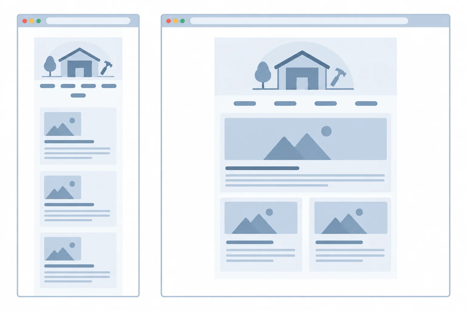
The container changes continuously. The header and grid arrangement change only when the wide-viewport override matches.
Summary
.page container is fluid while 90% is below its 64rem cap; after that, automatic side margins use the extra viewport space.min-width override changes the header direction, grid columns, gap, and featured-card placement.Complete the missing values in this integrated excerpt. It combines the bounded fluid container with the targeted wide-viewport header and grid changes.
Fill each marker with the CSS value that completes the responsive layout.
.page {
  width: ;
  max-width: ;
  margin: ;
}

.site-header {
  display: flex;
  flex-direction: column;
  gap: 1rem;
}

.workshop-grid {
  display: grid;
  grid-template-columns: minmax(0, 1fr);
  gap: 1rem;
}

@media (min-width: ) {
  .site-header {
    flex-direction: ;
    align-items: center;
    justify-content: space-between;
  }

  .workshop-grid {
    grid-template-columns: ;
    gap: 1.5rem;
  }

  .workshop-card--featured {
    grid-column: span 2;
  }
}Save both files and refresh index.html in your own browser. Resize from a narrow viewport through the candidate breakpoint and into a much wider viewport. Use the page content—not a device label—to decide whether the existing threshold provides a comfortable transition. If it does not, edit the threshold in the one existing media query and check again.
In 3–5 sentences, report your browser observation. Describe the container before and after its cap, the header and grid transition at the breakpoint, why the featured-card span remains safe, and whether you would retain or change the breakpoint based on this content.
Write at least 180 characters (0/180).
Congratulations! You completed: Adapt Layouts with Fluid Sizing and Media Queries
Thousands of online courses in video, ebooks and audiobooks.
To test your knowledge during online courses
Generated directly from your cell phone's photo gallery and sent to your email

Download our app via QR Code or the links below:.


Carry knowledge in your pocket.
Download the Cursa app.
There are hundreds of free courses available, with a free certificate of completion that is saved in your mobile image gallery.
Download the app to access the Course Completion Certificate for Free.


+ 10 million
students

Free and Valid
Certificate

60 thousand free
exercises

4.8/5 rating in
app stores

Free courses in
video and ebooks