Step 1 of 8
Define the Promise and the Primary Action
Identify the visitor, promised resource, and completed action that anchor a focused landing page.

Learning path · Level 6 · Tutorial 1
Draft an annotated landing-page outline that fulfills an incoming message's promise, presents a clear offer, and guides visitors toward one accessible, well-supported action. Practice uses text rather than a live website.
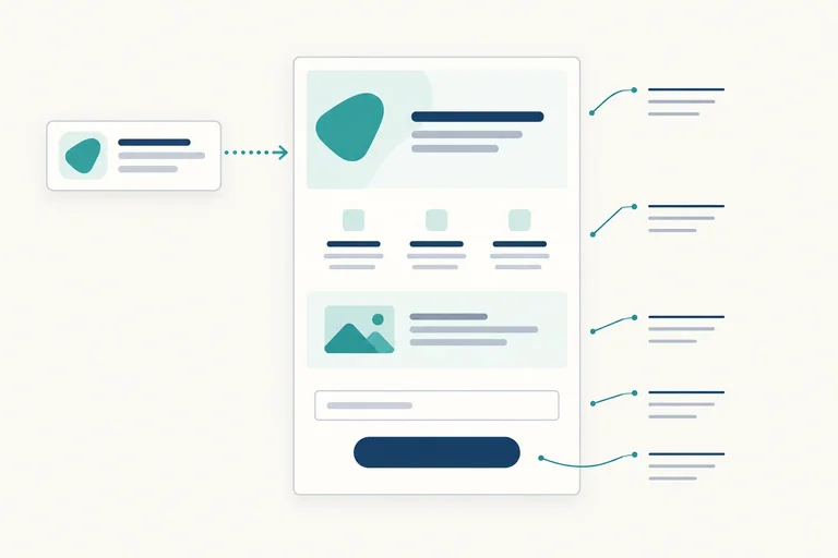
 Define the Promise and the Primary Action
Identify the visitor, promised resource, and completed action that anchor a focused landing page. 2 min
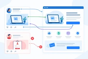 Find and Repair Message Mismatches
Compare a fictional incoming message with landing-page elements, then repair audience, offer, and action mismatches without changing the promise. 2 min
 Arrange the Page Around Visitor Questions
Order a ClearWeek landing page so the offer and primary action appear before the supporting detail. 2 min
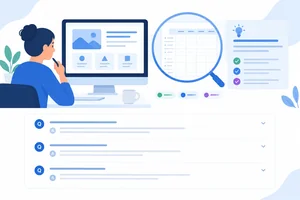 Support Claims and Answer Real Concerns
Use relevant, clearly labeled evidence and known facts to support the fictional ClearWeek landing-page draft without inventing outcomes or praise. 2 min
 Keep One Action in Focus
Keep the fictional ClearWeek landing page centered on the action promised by its incoming message, without hiding useful support. 2 min
 Specify the Smallest Useful Form
Specify the minimum information needed to request the fictional ClearWeek free weekly planning template, plus clear expectations before and after a successful request. 2 min
 Annotate Accessible Reading and Interaction
Add concrete accessibility requirements to the fictional ClearWeek landing-page structure and request flow. 2 min
 Finish and Review Your Landing-Page Draft
Complete and review a coherent annotated text wireframe that fulfills the incoming promise and supports one accessible action. 3 min
Step 1 of 8
Identify the visitor, promised resource, and completed action that anchor a focused landing page.
This fictional ClearWeek scenario starts with an incoming message—not with a general company introduction.
A landing page is a focused destination for one audience need and one primary conversion action. Its job is to carry the incoming promise forward and make the next step clear.
Incoming message:
“Free weekly planning template for freelance designers. Get it by email—no account needed.”
Here, the visitor should quickly recognize the relevant resource and one clear action. A call to action (CTA) tells the visitor what that action is. For ClearWeek, the primary CTA label is Get the free template.
A click begins an action; it is not proof that delivery has succeeded. The expected delivery happens by email after a successful request.
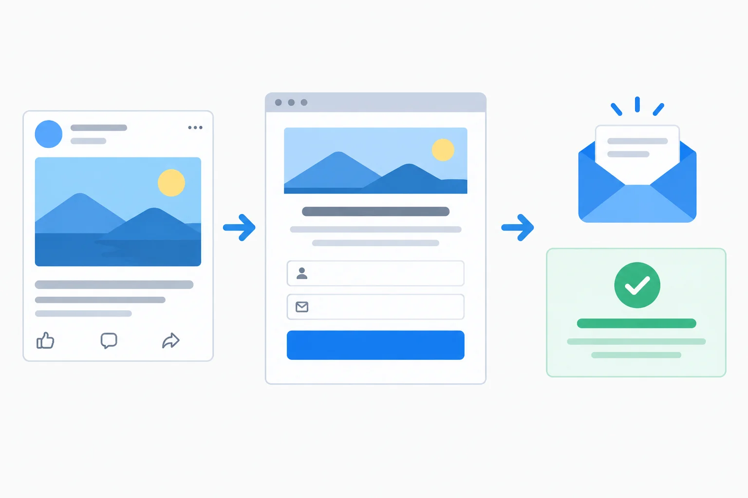
Incoming message → Landing page → Successful request → Confirmation
Use the case facts as the boundary of your draft. Do not turn a likely visitor motivation into a guaranteed result.
Provided case facts
Client/project, Next task, and Due day.A safe way to describe the audience need is: a freelance designer looking for a weekly planning resource. Claims such as “save hours,” “never miss a deadline,” or “become more productive” are not provided facts.
Example
| Statement | Status |
| --- | --- |
| The template is free and copyable plain text. | Provided case fact |
| It contains a weekly planning structure. | Provided case fact |
| It will save every designer time. | [Evidence needed: guaranteed time savings] |
| Freelance designers may want a simpler week. | Assumption about visitors’ needs |
Keep the landing page grounded in the first two rows. An assumption can guide later research, but it is not supported copy.
A text wireframe is a short, numbered outline of what a landing page says and does. It specifies decisions before visual design or implementation; it is not a live website.
For this step, use brief annotations:
Copy: Free weekly planning template for freelance designers.
Interaction: Get the free template starts the request for the same free template.
This outline names visible content and intended behavior without claiming that a visitor has already received anything.
Write a concise ClearWeek page brief in three labeled lines:
Use only the fictional case facts. State the action as a completed template request with expected email delivery—not merely a button click. Do not add productivity promises, payment, an account, or marketing-email enrollment.
Step 2 of 8
Compare a fictional incoming message with landing-page elements, then repair audience, offer, and action mismatches without changing the promise.
The fictional ClearWeek incoming message makes one connected promise:
“Free weekly planning template for freelance designers. Get it by email—no account needed.”
Message match means that the landing page preserves the substance of that promise. The wording may change, but visitors should still find:
A polished headline is not enough if the landing page changes any of these commitments.
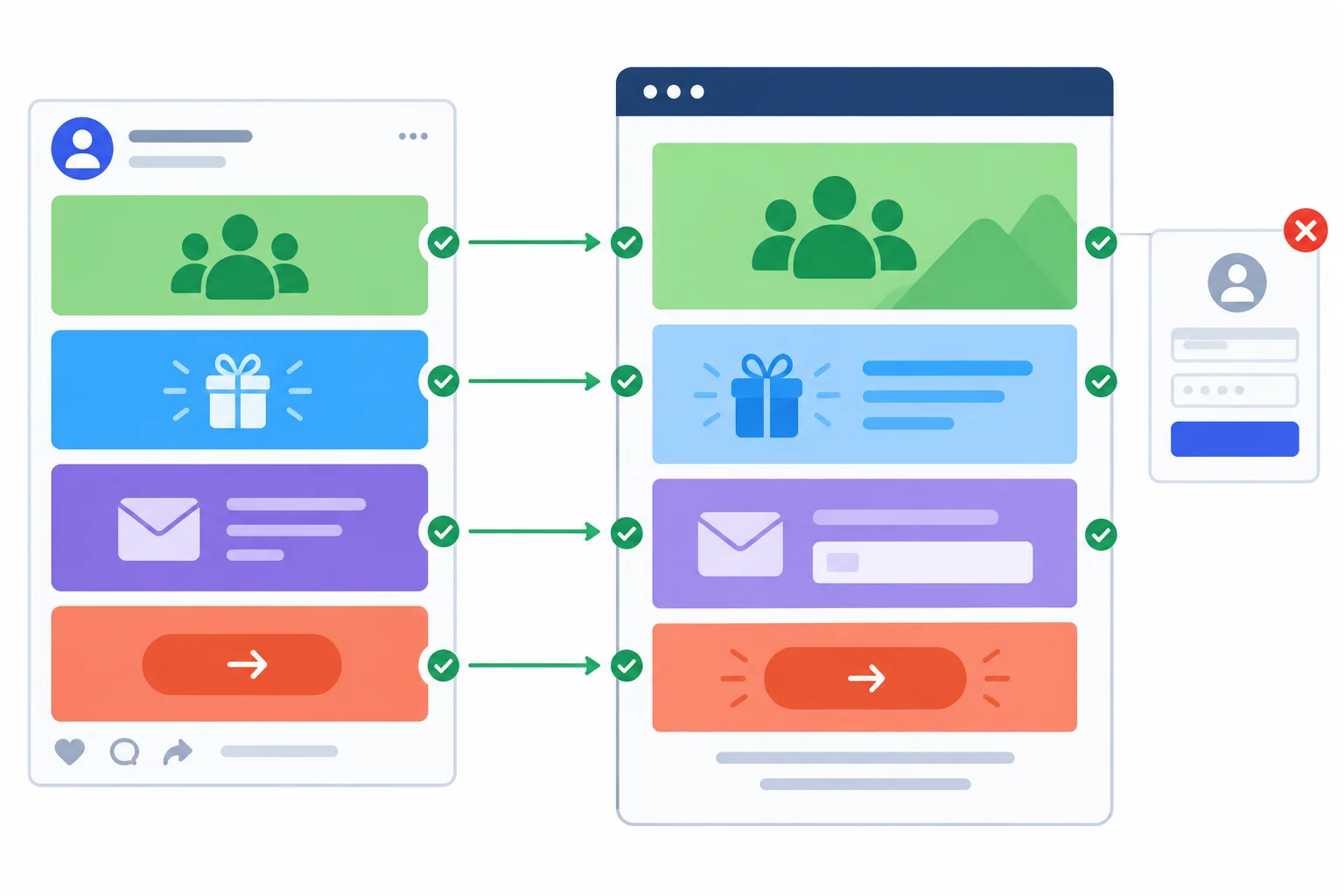
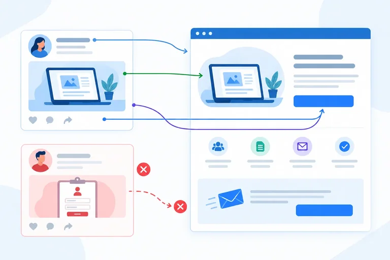
Compare the incoming message with the landing page element by element—not only by headline wording.
Use a side-by-side check before drafting more of the landing page. A mismatch can affect the audience, resource, conditions, or requested action. The repair restores the original promise; it does not substitute a different conversion goal.
The matching wording below is not required verbatim. It shows how each ClearWeek commitment can appear clearly on a landing page.
| Incoming promise | Matching landing-page element | Mismatch | Repair |
|---|---|---|---|
| For freelance designers | Headline names freelance designers | “Planning tools for every business” | Name freelance designers clearly |
| Free weekly planning template | Copy describes a free, copyable plain-text template | “Book a free planning consultation” | Describe the free weekly planning template |
| Get it by email; no account needed | Request copy states email delivery and no account | “Create an account to continue” | Use an email-only request with no account |
| Request the template | Primary CTA: “Get the free template” | Primary CTA: “Start your account” | Use the promised template-request action |
Match each flawed landing-page element to the promise it breaks and the repair that restores it.
Tap an item and then its matching pair.

Step 3 of 8
Order a ClearWeek landing page so the offer and primary action appear before the supporting detail.
In this fictional ClearWeek scenario, a text wireframe is a numbered outline of a landing page. It communicates what visitors encounter first, next, and later—before visual styling or implementation.
Start with the decision a visitor needs to make. The opening must quickly answer:
For ClearWeek, the visitor is a freelance designer, the offer is a free weekly planning template, and the primary action is requesting it by email.
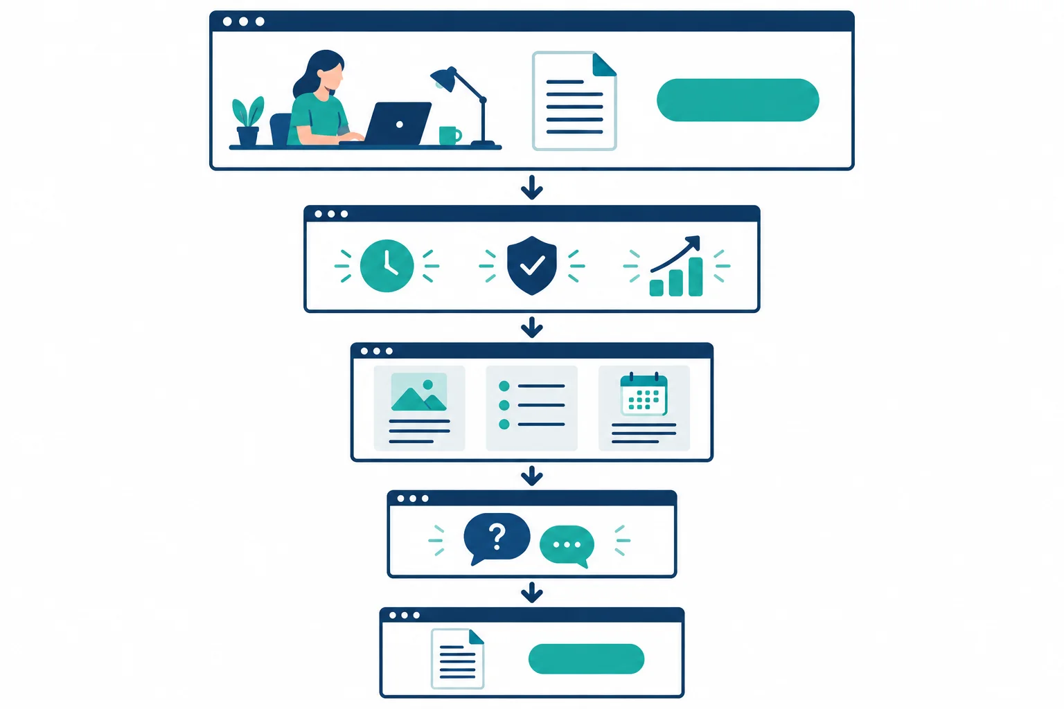
A useful sequence moves from the offer and primary CTA to supporting detail, then gives visitors the same action again.
Tip
This is a decision path, not a rigid universal template or a screen-height rule. If visitors need a different question answered sooner, adjust the order—but do not hide the audience, offer, or primary CTA behind later sections.
Use short annotations to separate what visitors read from what the page does:
Detailed evidence evaluation and accessibility requirements come later.
The following text wireframe makes the offer and primary CTA understandable before its supporting details. It uses numbered sections rather than a visual mockup.
Example
1. Offer and primary CTA
Copy: Free weekly planning template for freelance designers. Keep each Client/project, Next task, and Due day together in copyable plain text.
Interaction: Primary CTA: Get the free template.
2. Benefits
Copy: Use the template to record the current project, its next task, and its due day for the week.
3. Preview or proof
Evidence: Illustrative preview
Copy: Client/project | Next task | Due day
Studio North website | Draft homepage outline | Tuesday
4. Questions before requesting
Copy: Free, with no account or payment. The template is delivered by email after a successful request; the email address is used for delivery only.
5. Repeat primary CTA
Interaction: Repeat the same primary CTA: Get the free template.
Tip
The preview helps a visitor inspect what the template contains. Its label identifies it as an Illustrative preview; deciding what evidence can support broader claims is a later task.
Arrange these supplied text-wireframe sections into the most coherent order for the ClearWeek landing page.
Create a compact ClearWeek text wireframe.
Copy: and Interaction: annotations.Your opening must identify freelance designers, the free weekly planning template, a useful feature of the template, and the primary next step. Keep it understandable without relying on later sections.
Write at least 300 characters (0/300).
Step 4 of 8
Use relevant, clearly labeled evidence and known facts to support the fictional ClearWeek landing-page draft without inventing outcomes or praise.
This fictional ClearWeek landing page can show what the free weekly planning template contains. It cannot prove an outcome that the case does not document.
Match the proof to the claim:
Do not turn a preview into a promise such as guaranteed productivity or time savings.
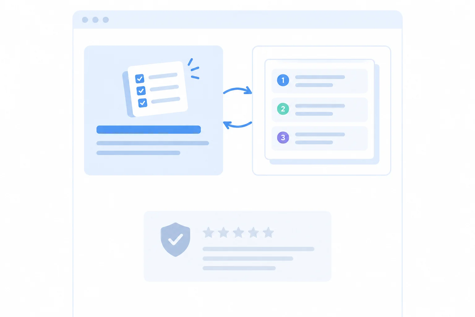
A preview is most useful beside the claim about the template’s contents, not isolated in a generic trust area.
Use evidence-status labels in the text wireframe so readers can distinguish known facts from an example and from a gap.
Provided case fact is available for ClearWeek’s free cost, no-account requirement, copyable plain-text format, email delivery, and delivery-only email use.
Illustrative preview can show a realistic example of the template. It demonstrates the layout and headings, not a measured outcome.
For an unsupported statement, write [Evidence needed: specific claim], narrow the wording, or remove it. Never substitute fictional praise or an unsupported statistic.
These annotations could appear in the relevant numbered sections of the fictional text wireframe.
| Page claim or concern | Nearest support | Status |
|---|---|---|
| The template includes three planning headings | A visible sample with the three headings | Illustrative preview |
| The request is free and needs no account | Known offer conditions | Provided case fact |
| This template guarantees faster planning | No documented result is supplied | [Evidence needed: guaranteed faster planning] |
Answer concerns with facts the visitor needs to decide: what the template contains, whether it costs anything, whether an account is required, how it arrives, and how the email address is used.
For example, a numbered section can separate visible wording from behavior:
4. Request detailsCopy: State the known offer conditions plainly.Interaction: The request uses the visitor’s email address for delivery.
A concern response should clarify a real uncertainty; it should not add a benefit that ClearWeek has not established.
Match each fictional ClearWeek claim to the evidence status or response it needs.
Tap an item and then its matching pair.
Complete two additions to this fictional ClearWeek text wireframe.
Evidence: annotation for a preview claim. Use the correct evidence-status label and the supplied illustrative row.Copy: or Interaction:, to this visitor concern: “Do I need an account, and what happens to my email address?”Use short numbered sections. Do not add a result promise, testimonial, or statistic.
Write at least 120 characters (0/120).
Step 5 of 8
Keep the fictional ClearWeek landing page centered on the action promised by its incoming message, without hiding useful support.
The incoming message promises one thing to one audience: a free weekly planning template for freelance designers, requested by email with no account needed.
A call to action (CTA) turns that promise into an action. For ClearWeek, the primary CTA is Get the free template. It should keep that wording and refer to the same request wherever it appears.
Repeat this primary CTA when a visitor has enough context to act: near the opening offer and again after useful supporting detail. Repetition is not competition when both buttons lead to the same request.
Avoid giving unrelated goals equal emphasis, such as a webinar, a paid service, or a general account signup. Those choices can pull attention away from the promised task.
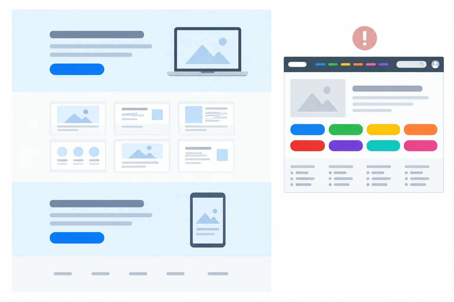
A focused page repeats one primary CTA after relevant context. Helpful supporting links remain available but do not compete with that action.
Example
Use a text wireframe to state where the action belongs and why. This fictional ClearWeek example keeps the incoming promise intact.
1. Offer and primary CTA
Copy: Free weekly planning template for freelance designers. Get it by email—no account needed.
Interaction: Primary CTA: Get the free template.
2. Benefits and preview
Copy: A copyable plain-text template for organizing client work and next tasks.
Evidence: Illustrative preview — Client/project | Next task | Due day; Studio North website | Draft homepage outline | Tuesday.
3. Template details and primary CTA
Evidence: Provided case fact — The template costs nothing and requires no account or payment.
Interaction: Repeat the same primary CTA: Get the free template.
4. Supporting links
Interaction: Provide quieter links for Privacy details and Help with the template. These help visitors evaluate the request without becoming alternative conversion goals.
Which page arrangement best fulfills the incoming message while keeping one action in focus?

Step 6 of 8
Specify the minimum information needed to request the fictional ClearWeek free weekly planning template, plus clear expectations before and after a successful request.
In this fictional ClearWeek scenario, ask for a field only when it is necessary to fulfill the primary CTA. The visitor is requesting a free weekly planning template by email, so an email address has a direct delivery purpose.
Do not add a field merely because it could be useful later. Marking a name or phone field “optional” does not make it necessary. The request does not need an account, payment, company details, or marketing enrollment.
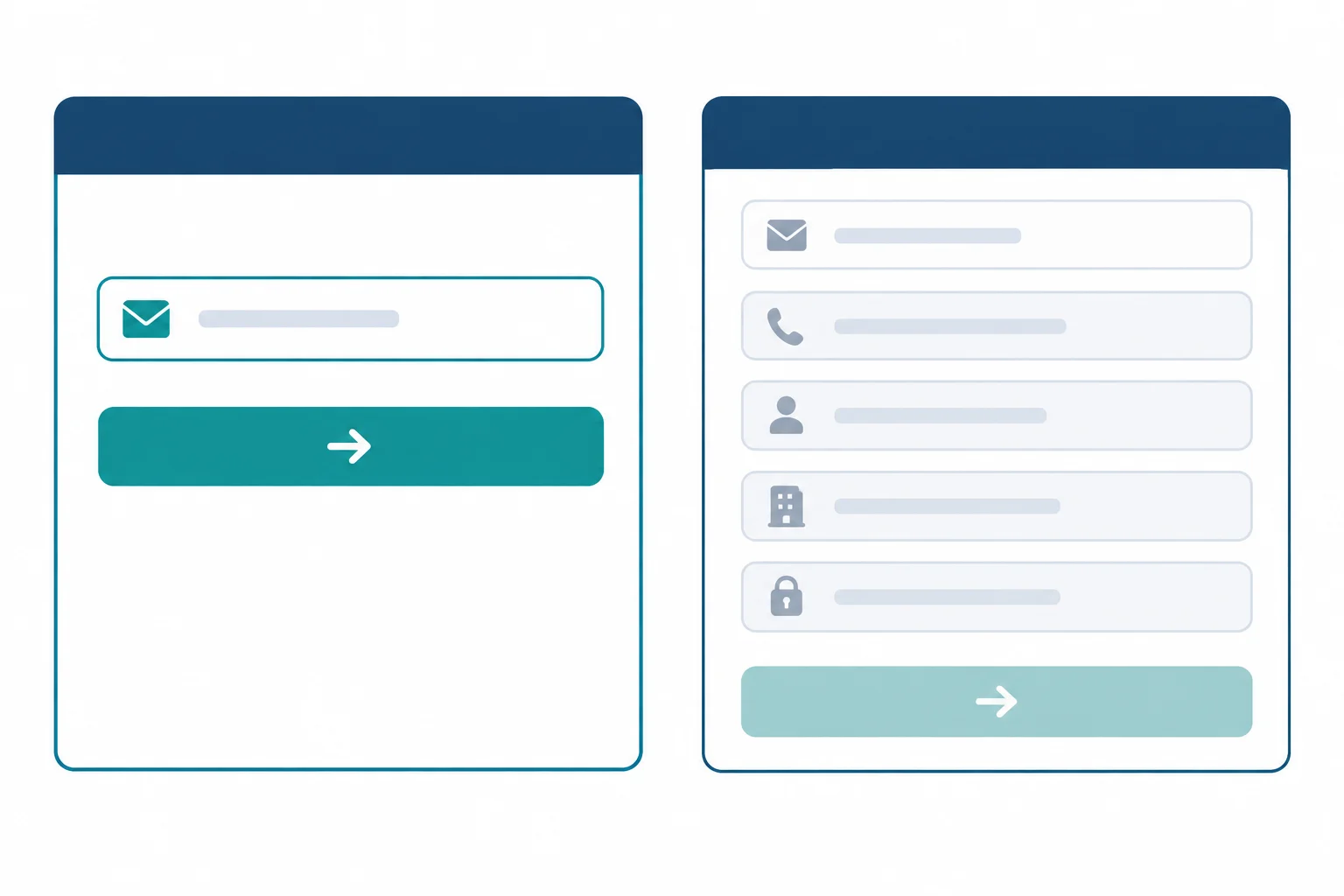
For this offer, the compact form supports delivery; extra fields do not help fulfill the request.
Use the stated delivery purpose to decide what belongs in the form.
| Potential field or requirement | Delivery purpose | Include? |
|---|---|---|
| Email address | Where to send the template | Yes |
| First name | Not needed for delivery | No |
| Phone number | Not needed for delivery | No |
| Company details | Not needed for delivery | No |
| Account creation | Not needed to request or receive it | No |
A form should set expectations before the visitor acts, then confirm what happened afterward. In a text wireframe, specify both messages rather than assuming that a button click proves success.
Incoming message → Landing page → Successful request → Confirmation
The form and confirmation below are text specifications only. No personal data is submitted and no real email is sent in this practice.
Copy: Free weekly planning template for freelance designers.
Evidence: Provided case fact — the template is copyable plain text and costs nothing.
Copy: Email address
Copy: Get the free template
Interaction: Before submission, state: “Receive the free weekly planning template by email. No account or payment needed. Your email address is used for delivery only; this request does not enroll you in marketing emails.”
Evidence: Provided case fact — delivery is by email only, with no account, payment, or marketing enrollment.
Interaction: After a successful request, show: “Request received. The free weekly planning template will be delivered by email. Check your inbox.”
Evidence: Provided case fact — the template is delivered after a successful request.
Tip
A successful-request note has two jobs: confirm that the request worked and tell the visitor what happens next. Avoid implying that clicking the primary CTA alone means delivery succeeded.
For the fictional ClearWeek landing page, draft the request-flow specification in four labeled lines:
Fields: list only the fields or requirements to include.
Why required: explain why the included field is necessary.
Before submission: write a concise expectation note.
Successful request: write a concise confirmation and next-step note.
Use the fixed primary CTA and case facts. Do not add marketing enrollment, account creation, payment, or unsupported promises.
Write at least 180 characters (0/180).

Step 7 of 8
Add concrete accessibility requirements to the fictional ClearWeek landing-page structure and request flow.
Accessibility requirements make the landing page’s meaning and action available in a sensible sequence—not only in a wide visual layout.
For the fictional ClearWeek page, a visitor reading from top to bottom should understand the same path:
Incoming message → Landing page → Successful request → Confirmation
Use numbered sections and headings so the offer appears before the request details that depend on it. On a narrow screen, sections may stack, but their order should still explain who the template is for, what it is, how to request it, and what happens next.
A text wireframe can specify this intended experience. It cannot prove that a later implementation works accessibly.
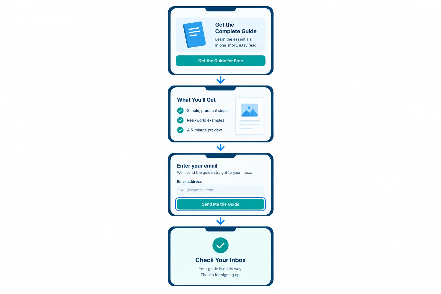
The sequence keeps the offer and primary CTA understandable before the Email address request and confirmation.
Write accessibility requirements as explicit annotations in the text wireframe.
Descriptive links
A link should name its destination or purpose. “Click here” depends on nearby visual context; a phrase such as “Read how ClearWeek uses your email” remains meaningful when read on its own.
Visible form labels
The field needs the persistent visible label Email address, plus clear required-field information. Placeholder text can disappear when someone types and is not a label.
Keyboard behavior
Specify that links, the Email address field, and Get the free template can be reached and operated by keyboard in the same logical order as the page. Also specify a visible focus indicator so a keyboard user can tell where they are.
Example
Copy: Free weekly planning template for freelance designers.
Interaction: Get the free template takes the visitor to the request form.
Accessibility: This is the first heading and is read before supporting sections.
Copy: Copyable plain-text template with Client/project, Next task, and Due day.
Evidence: Illustrative preview — Studio North website | Draft homepage outline | Tuesday.
Accessibility: This section follows Offer and primary CTA in the reading order.
Copy: Email address — required. Get the free template.
Interaction: A successful request sends the free weekly planning template by email; the email address is used for delivery only.
Accessibility: Email address remains visibly displayed as the field label. Keyboard focus reaches the field and button in this order and is visibly indicated.
Example
Copy: Check your email for the free weekly planning template. Requesting the template does not enroll you in marketing emails.
Interaction: Show this confirmation only after a successful request.
Accessibility: The confirmation follows the request in the reading order.
Copy: Read how ClearWeek uses your email.
Accessibility: The link wording identifies its purpose without relying on its position or nearby text. Every interactive element is keyboard-operable, and its visible focus indicator remains clear.
These are intended requirements, not proof. A future implementation still needs to be checked with its actual content, keyboard behavior, and interface.
Which statement accurately describes an accessibility annotation in a text wireframe?
Review this fictional ClearWeek draft:
Copy: [field placeholder: “Enter email”] [button: Get the free template]
Copy: Free weekly planning template for freelance designers. Get it by email—no account needed.
Copy: Click here
Write a short accessibility annotation set for this text wireframe. Identify the inaccessible patterns, state the logical section order, provide a descriptive link purpose, specify the visible required-field information, and state keyboard and visible-focus requirements. End by distinguishing these intended specifications from verified implementation behavior.
Write at least 250 characters (0/250).

Step 8 of 8
Complete and review a coherent annotated text wireframe that fulfills the incoming promise and supports one accessible action.
This final step assembles the fragments you have drafted into one coherent annotated text wireframe. It does not introduce a new page-building task.
Review the complete path:
Incoming message → Landing page → Successful request → Confirmation
At each point, check that the page asks for no more and promises no less than the incoming message: “Free weekly planning template for freelance designers. Get it by email—no account needed.”
A finished text wireframe makes the copy, evidence status, interaction behavior, and accessibility requirements explicit. It is ready for design or implementation discussion, but it does not prove usability, accessibility, or conversion performance.
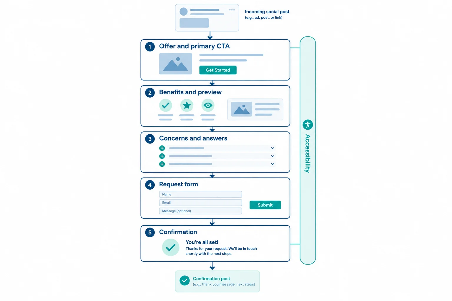
Review the same path from Incoming message to Confirmation. Each section should support the one promised request.
Use short numbered sections so the decision flow is visible before any visual design.
Copy: Free weekly planning template for freelance designers.
Copy: Get it by email—no account needed.
Interaction: Get the free template leads to the Request form.
Accessibility: Use a clear page heading. Make the primary CTA keyboard-operable with a visible focus indicator.
Copy: Use copyable plain text to organize Client/project, Next task, and Due day.
Evidence: Illustrative preview. Studio North website | Draft homepage outline | Tuesday
Copy: Free. No account or payment required. Your email address is used for delivery only. Requesting the template does not enroll you in marketing emails.
Evidence: Provided case fact.
Interaction: A repeated Get the free template refers to the same Request form, not a different offer.
Copy: Get the free template.
Interaction: Request only one field: Email address. Explain that the template is delivered by email after a successful request.
Accessibility: Keep the visible Email address label persistent, identify it as required, and preserve a logical keyboard order and visible focus indicator.
Copy: Check your email for the free weekly planning template.
Interaction: Confirm that the request succeeded and state the delivery next step.
Accessibility: Make the confirmation understandable when read in sequence, including on a narrow screen.
Evidence boundary
Evidence: Evidence needed. [Evidence needed: evidence that the template improves planning outcomes.] Do not add that performance claim unless suitable evidence becomes available. The accurate preview supports what the template contains; it does not prove an outcome.
Summary
Before calling the draft complete, verify that:
Get the free template, remains the focused action;Explicit decisions make this a useful handoff draft. They do not guarantee that a future page will be accessible, usable, or high converting.
Create your revised ClearWeek text wireframe in short numbered sections. Include the matched offer, benefits, relevant proof, objection responses, focused primary CTA, essential form, confirmation, and accessibility requirements.
Use Copy:, Evidence:, Interaction:, and Accessibility: where relevant. Label evidence honestly. Identify one inconsistency and its repair, or state why your draft passes the consistency check. End by explicitly noting a remaining evidence gap in the required bracketed format. Do not invent testimonials, statistics, or results.
Write at least 650 characters (0/650).
Congratulations! You completed: Draft a Landing Page That Matches Visitor Intent
Thousands of online courses in video, ebooks and audiobooks.
To test your knowledge during online courses
Generated directly from your cell phone's photo gallery and sent to your email
Download our app via QR Code or the links below:.


Carry knowledge in your pocket.
Download the Cursa app.
There are hundreds of free courses available, with a free certificate of completion that is saved in your mobile image gallery.
Download the app to access the Course Completion Certificate for Free.

+ 10 million
students

Free and Valid
Certificate

60 thousand free
exercises

4.8/5 rating in
app stores

Free courses in
video and ebooks