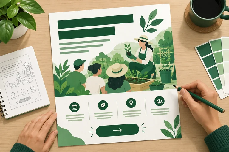
Step 1 of 8
Plan what viewers should notice first
Plan a deliberate reading order for the Maple Library graphic before building it.

Learning path · Level 2 · Tutorial 3
Create a simple marketing graphic in Canva's free tier or another free design tool, then check its readability, accessibility, and permitted use of visual elements.
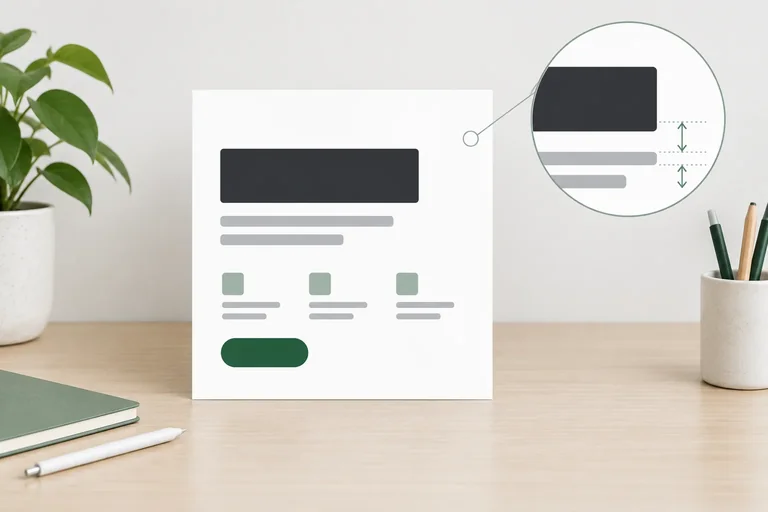
 Plan what viewers should notice first
Plan a deliberate reading order for the Maple Library graphic before building it. 2 min
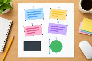 Build a free, editable starting graphic
Create a blank, editable Maple Library practice graphic with the supplied text, basic free elements, and no paid dependencies. 3 min
 Check permission before using an asset
Check selected visual resources before using them in the Maple Library practice graphic, then document a practical permission decision. 4 min
 Make the layout easy to scan
Arrange the Maple Library graphic with clear hierarchy, consistent typography, alignment, and whitespace. 4 min
 Use contrast and meaning beyond color
Check the Maple Library graphic’s text-background contrast and ensure that its CTA and other instructions do not depend on color alone. 3 min
 Keep essential information outside the image
Draft accompanying text and a concise alt-text note so the essential message in the Maple Library graphic is available outside the exported image. 3 min
 Preview, fix, and export
Preview the Maple Library graphic using a reproducible 360 px local browser method, correct readability issues in the editable source, and inspect the exported PNG. 4 min
 Complete your graphic and final check
Validate the finished Maple Library practice graphic and retain the records that support its readability, accessibility, and permitted use. 3 min
Step 1 of 8
Plan a deliberate reading order for the Maple Library graphic before building it.
A marketing graphic does not need to repeat an entire content brief. It needs one message that a viewer can understand quickly.
For this practice graphic, the main message is the headline: Start your first herb garden.
Plan the viewer’s attention in this order:
This order is intentional. The organization name identifies the sender, but it should not distract from what the viewer can do or gain.
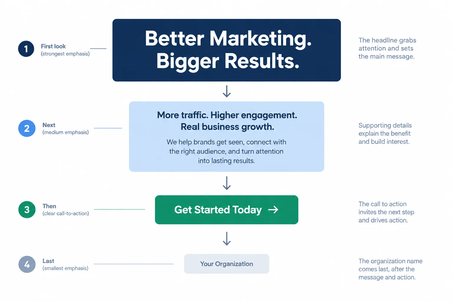
Plan what a viewer should notice first, next, and last.
Reading order is a visual decision, not the order in which you typed the words. A viewer should be able to identify the headline first even when scanning quickly.
Decoration can support the garden theme, for example with one quiet leaf shape near an edge. It competes when it becomes more noticeable than the headline, covers essential words, or makes the viewer search for the message.
At this planning stage, describe decoration by its job: support the message, never become the message.
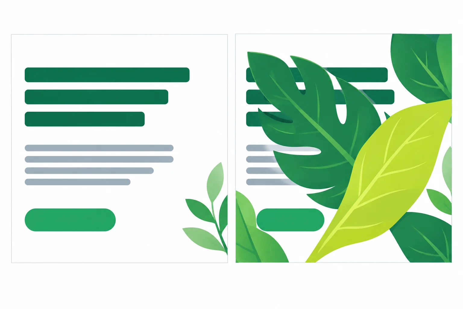
Useful decoration frames information; competing decoration steals attention from it.
Put the four Maple Library message components into the intended reading order, from first noticed to last noticed.
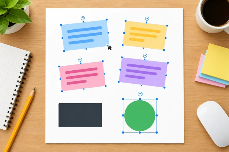
Which draft gives the message a clear reading order while keeping decoration secondary?
Step 2 of 8
Create a blank, editable Maple Library practice graphic with the supplied text, basic free elements, and no paid dependencies.
Use Canva Free or another free editor that lets you create editable text, add basic shapes, and export a PNG. A free account may be required.
Create a new blank square canvas at 1080 × 1080 px. Set the working graphic background to #FFFFFF. Start from the blank canvas rather than a supplied project, template, or downloaded image: you need to be able to edit every part yourself.
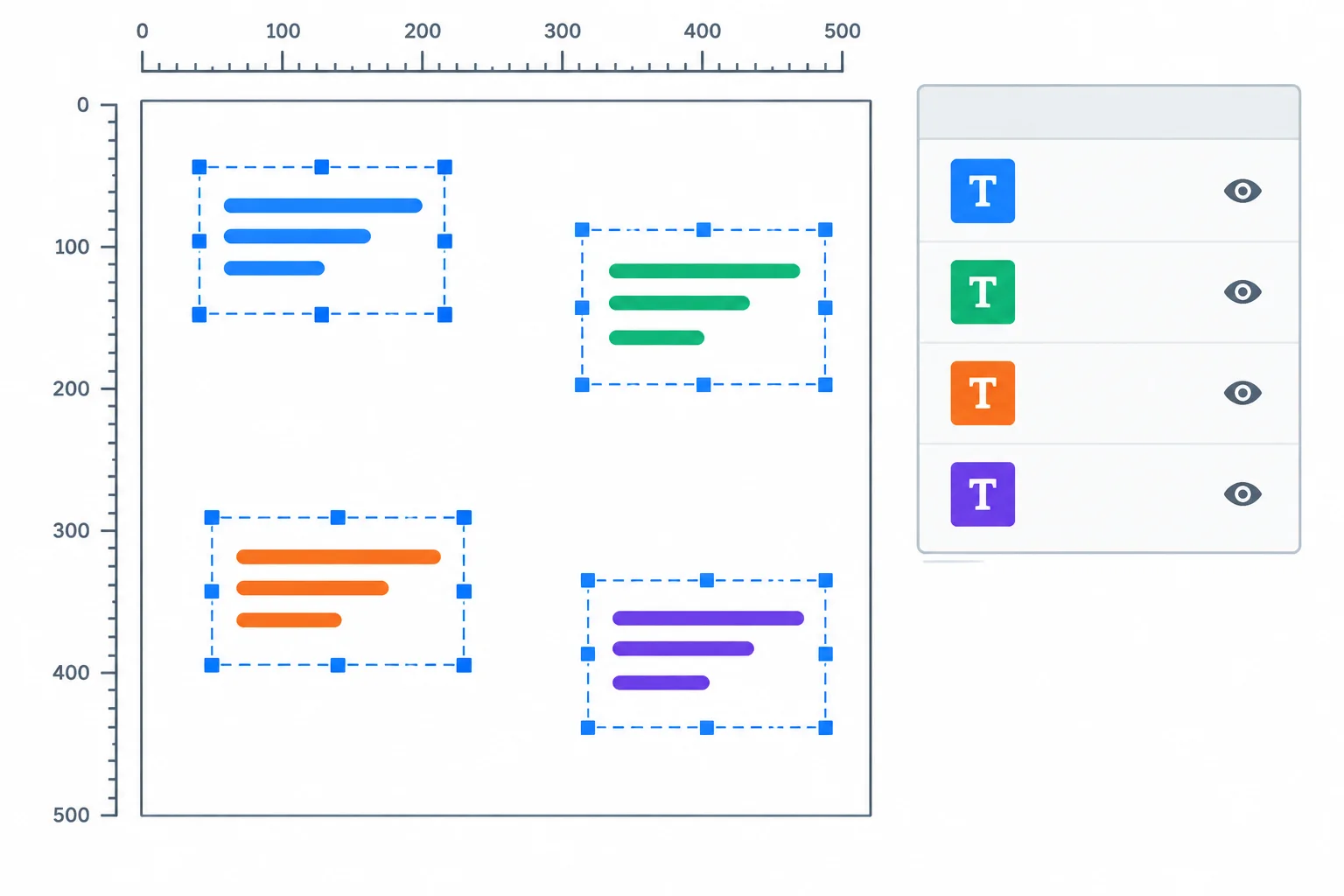
Build separate editable objects on the square canvas. The graphic can stay simple at this stage.
Add the supplied copy as four separate editable text objects. Use Arial when it is available without payment; otherwise choose one available free sans-serif font and use it consistently. Use #1F2937 for the main text.
Make the headline bold. Keep the supporting detail regular. The organization name and call to action (CTA) also remain editable text, not part of one flattened image. You will refine placement, size, and spacing later.
Example
Create these four editable objects:
Organization name
Maple Library
Headline
Start your first herb garden
Supporting detail
Free beginner workshop
Call to action (CTA)
Ask at the library desk
A paid-feature marker or an invitation to begin a paid trial is a signal to choose another option. Do not start a trial for this exercise.
A useful starting graphic does not need a photo or illustration. If you want an extra visual element, use a simple built-in shape. The optional accent color is #166534; it can support the text, but it is not required.
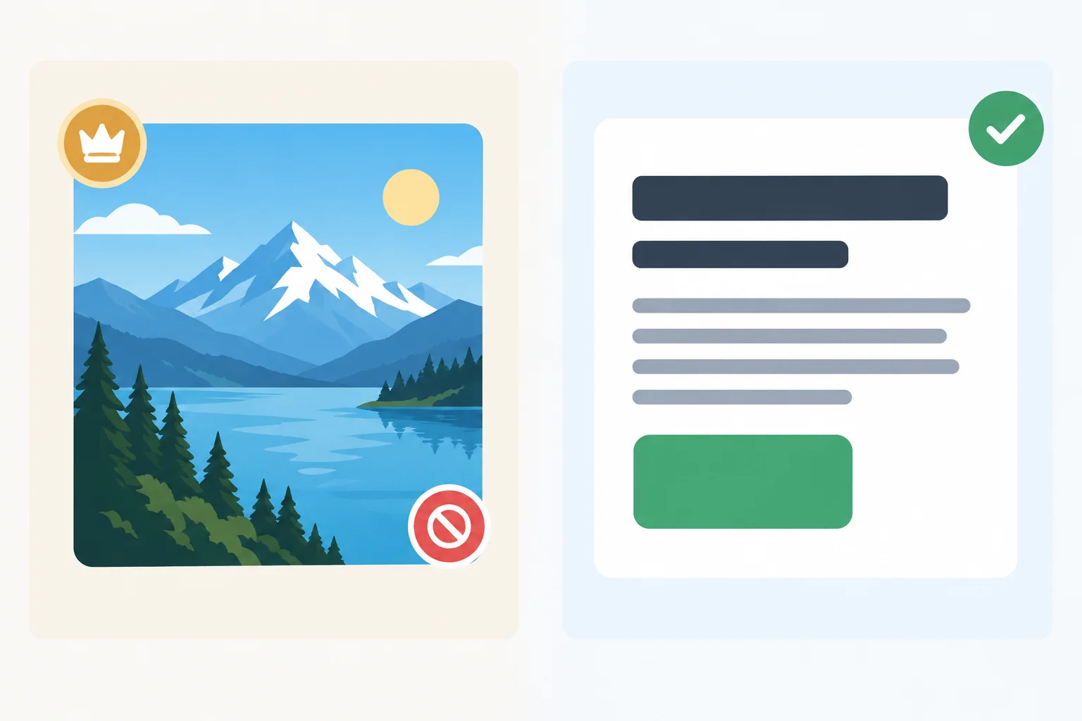
When a feature requires payment or a trial, retain the message and use editable text plus a basic shape instead.
Tip
Save the editable working design in your own tool as maple-library-herb-workshop. Keep its text objects editable so you can improve the graphic in later steps. Do not rely on a screenshot as your only working version.
In your own editor, create and save the starting graphic. Then report: the canvas dimensions you used, the editable text components you added, and any paid element you replaced with a free alternative. If no paid prompt appeared, say so.
Write at least 50 characters (0/50).

Step 3 of 8
Check selected visual resources before using them in the Maple Library practice graphic, then document a practical permission decision.
Before adding any optional visual resource, separate three ideas:
Only the third point answers whether a visual resource belongs in the Maple Library practice graphic. A free-looking asset is not automatically cleared for promotional use.

Free access and a clean preview are not permission checks. Review the provider’s current terms for the intended promotional use.
For each selected font, built-in element, or optional stock asset, check the provider’s current terms. Look for whether your intended promotional use is permitted, any restrictions that matter, and whether credit is required.
Record the result in your local file, maple-library-notes.txt. Do not guess a license from an icon, a search result, or a missing watermark. If a point cannot be verified after checking, write Unclear.
Use these fields in this exact order for every resource you keep. Enter the provider and terms that apply to the specific resource and your intended use.
| Field | What to record |
|---|---|
| Element | The specific font, shape, or optional asset |
| Creator/provider | Who made or provides it |
| Source | Where you obtained or selected it |
| License/terms | The applicable current terms or license |
| Permitted use and restrictions | Promotional use and relevant limits |
| Attribution | Required credit, or no requirement found |
| Checked on | The date in YYYY-MM-DD format |
Warning
Attribution is not a substitute for permission. If terms prohibit the intended use, or permission remains unresolved after checking, replace the resource with a verified alternative—or remove it. A text-and-shape graphic remains a valid option.
Match each permission scenario to the most appropriate decision for the Maple Library practice graphic.
Tap an item and then its matching pair.
In maple-library-notes.txt, create one complete record for a resource you actually selected for maple-library-herb-workshop. Use this exact field order:
Element | Creator/provider | Source | License/terms | Permitted use and restrictions | Attribution | Checked on
Use the provider’s current information and write the check date as YYYY-MM-DD. Then add one short decision: keep the resource, or, if any permission remains Unclear or unsuitable, state that you removed it or replaced it with a verified alternative. This can be a font, a built-in shape, or an optional visual asset.
Write at least 120 characters (0/120).

Step 4 of 8
Arrange the Maple Library graphic with clear hierarchy, consistent typography, alignment, and whitespace.
Your reading order becomes visible through size, weight, and placement. On the 1080 × 1080 px canvas, give the headline the largest, boldest treatment and the most open space. Keep the supporting detail close enough to explain the headline, but smaller and regular weight. Put the call to action (CTA) where it is easy to find after those two lines. Keep “Maple Library” present but secondary.
A viewer should be able to scan: headline → supporting detail → CTA. Decoration and shapes should guide that path, not become another message.
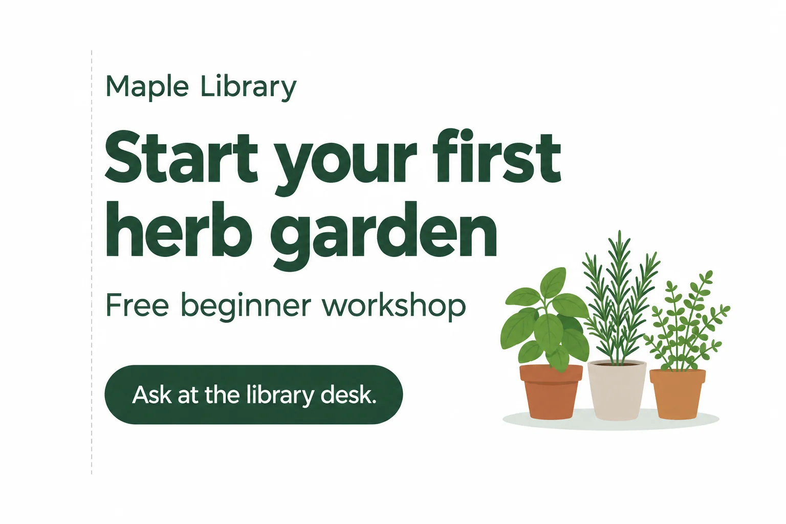
Size, proximity, and a shared edge make the intended reading order visible.
Use Arial if it is available without payment. Otherwise, choose one available free sans-serif font and use it consistently. Use bold for the headline and regular weight for the supporting detail and CTA. A small number of treatments makes differences meaningful; competing fonts, outlines, effects, or many weights make scanning harder.
Align the text objects and any CTA shape to a shared edge rather than placing each object independently. Keep the headline and supporting detail as a close group. Leave more whitespace before the CTA because it has a different job. Maintain comfortable margins on every side.
Tip
Use short, intentional line breaks. If text feels cramped, widen its text box, revise the break, or create more space around it. Do not squeeze, stretch, or distort letters to make them fit. Font size is still provisional until a later viewing-size check.
Choose the layout that is easier to scan for the Maple Library workshop message.
In your editable working design, refine the layout before moving on. Then describe the two changes you made: one change to emphasis and one change to alignment or spacing.
Write at least 80 characters (0/80).

Step 5 of 8
Check the Maple Library graphic’s text-background contrast and ensure that its CTA and other instructions do not depend on color alone.
Contrast is a relationship between a foreground and its background—not a property of a color by itself. Check each text-background pair used in your graphic.
Enter the two hex values into a free browser-based contrast checker. For this exercise, use at least 4.5:1 as a conservative target for all text. This is a useful readability check, not proof of complete accessibility.
Use solid, uncluttered areas behind essential text. A busy photo, pattern, or uneven color can make otherwise dark text hard to read.
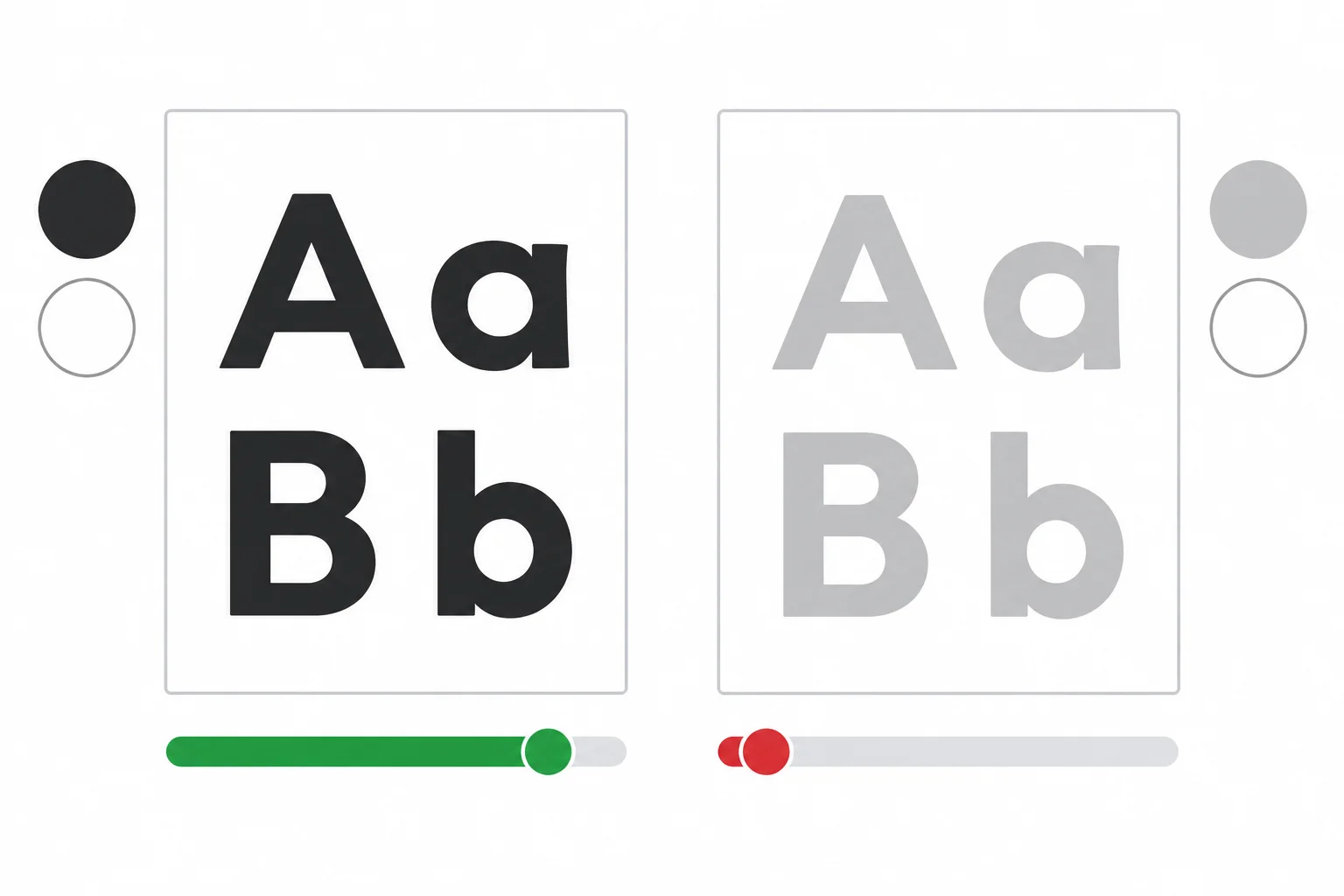
The same white background can support readable dark text or weak pale text, depending on the foreground color.
These ratios apply only to the listed foreground-background pairs. Confirm every pair in your own working graphic with a checker.
| Text on background | Contrast ratio | Use for text? |
|---|---|---|
| #1F2937 on #FFFFFF | 14.68:1 | Yes |
| #166534 on #FFFFFF | 7.14:1 | Yes, if used as text |
| #9CA3AF on #FFFFFF | about 2.54:1 | Weak example—fix |
Color can reinforce meaning, but it must not carry an essential instruction alone. For example, do not rely on “use the green option” when the viewer needs to know what to do. Give the action clear words.
A green shape may visually group the call to action (CTA), but after you export a PNG it is only part of the image. It is not an interactive button. The CTA still needs explicit action wording: “Ask at the library desk.”
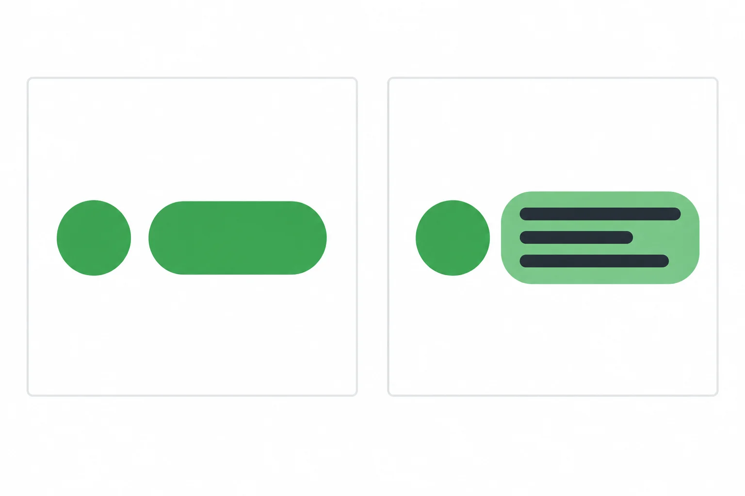
Keep the CTA wording understandable even when its green accent is ignored.
A draft uses pale gray supporting text on white and signals its action only with a green shape. Which revision best corrects both problems?
Work in your editable design, maple-library-herb-workshop. Inspect every unique text-background pair in the graphic with a free browser-based contrast checker.
If a result is below 4.5:1, correct the foreground or background while preserving a solid, uncluttered text area. If an instruction depends only on color, revise it so words state the meaning.
In maple-library-notes.txt, record each checked pair and any change. Then report one record here using this format:
Foreground on background | ratio | meets/needs correction | correction made
Also state whether your CTA uses written action words rather than color alone.
Write at least 50 characters (0/50).
Step 6 of 8
Draft accompanying text and a concise alt-text note so the essential message in the Maple Library graphic is available outside the exported image.
An exported PNG is an image. Its visible text is not automatically available as readable text to assistive technologies.
Keep the existing graphic, but record two supporting notes in maple-library-notes.txt:
These notes do not create a new format or change the graphic. They preserve access to its message. Exporting maple-library-herb-workshop.png does not automatically attach either note to a future publishing destination.
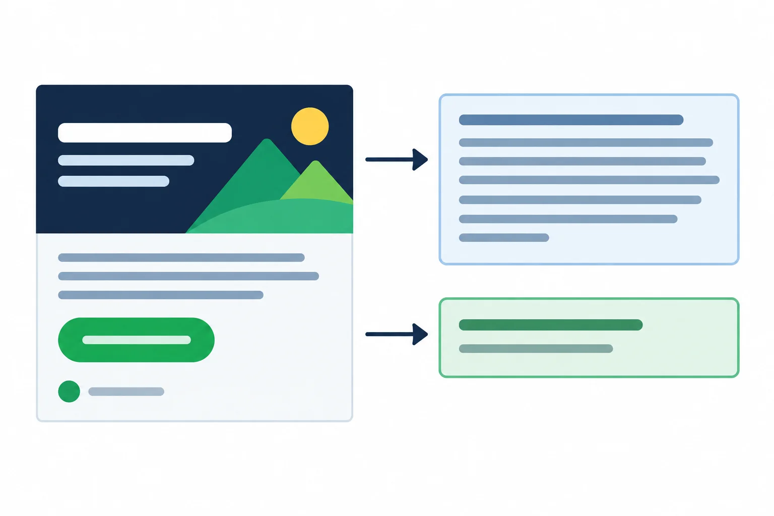
The graphic remains the same; accompanying text and alt text make its essential message available outside the image.
Example
Write both notes in maple-library-notes.txt. Use these exact labels:
Accompanying text
Maple Library: Start your first herb garden. Free beginner workshop. Ask at the library desk.
Alt text
Maple Library graphic promoting a free beginner workshop: Start your first herb garden. Ask at the library desk.
The accompanying text carries every essential message component in plain text. The alt text is shorter because it describes the graphic’s purpose and meaningful content; it does not need to describe decorative shapes, spacing, or colors.
Tip
Do not add claims that are absent from the graphic. For example, do not invent a date, location beyond the library desk, registration requirement, instructor, or gardening outcome.
If the accompanying text appears next to the graphic in a future context, alt text can stay concise and avoid repeating irrelevant decoration. The right amount of detail depends on what nearby text already provides.
For the Maple Library practice graphic, write both labeled notes below.
Include every essential message component in Accompanying text. Then write concise Alt text that states the graphic’s purpose and meaningful information. Do not add a date, outcome, or other claim not supplied for this practice scenario, and do not describe decorative details.
Write at least 130 characters (0/130).
Step 7 of 8
Preview the Maple Library graphic using a reproducible 360 px local browser method, correct readability issues in the editable source, and inspect the exported PNG.
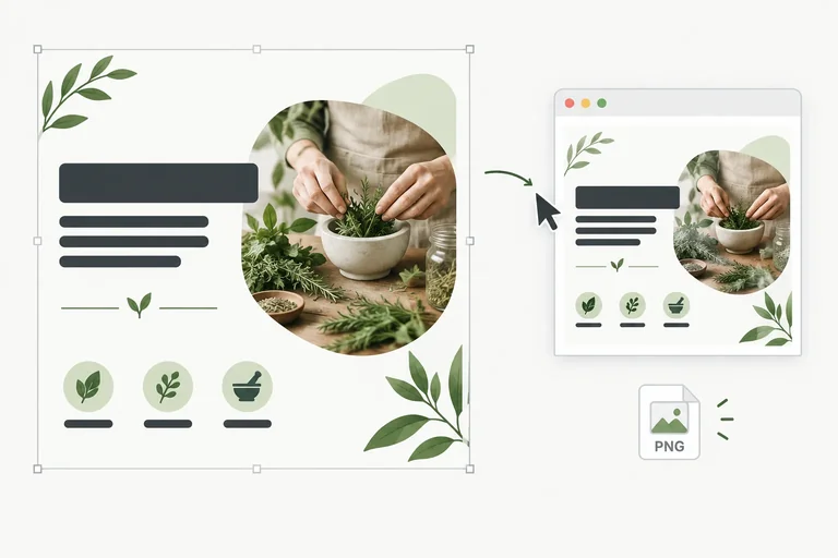
The canvas stays 1080 × 1080 px, but this practice graphic is intended to be viewed at approximately 360 px wide. Start by exporting the current editable design as a draft PNG named maple-library-herb-workshop.png. This draft gives you a real file to inspect before you decide whether the layout is finished.
Create one local folder for the draft PNG and the preview file in the next item. This method works independently of the editor you used. You will correct maple-library-herb-workshop in the editor, export again with the same PNG name, and repeat this exact preview.
In a plain-text editor, save this complete file as preview-360.html in the same local folder as maple-library-herb-workshop.png. Open preview-360.html in a web browser. Set the browser page zoom to 100%.
<!doctype html>
<html lang="en">
<head>
  <meta charset="utf-8">
  <title>360 px graphic preview</title>
  <style>
    body {
      margin: 24px;
      background: #ffffff;
    }
    img {
      display: block;
      width: 360px;
      height: auto;
    }
  </style>
</head>
<body>
  <img src="maple-library-herb-workshop.png" alt="Square Maple Library workshop graphic preview">
</body>
</html>At browser zoom 100%, a white local browser page shows the current square graphic at 360 CSS pixels wide.
The image content changes as you replace the PNG, but its displayed width remains 360 CSS pixels when the browser page zoom is 100%. Reload the page after exporting a replacement PNG.
Tip
Canvas dimensions, editor zoom, and displayed viewing width are different measurements. The 1080 × 1080 px canvas is the source file. A 100% editor zoom only scales that editor workspace. In the local preview file, width: 360px sets the displayed image width; use browser zoom of 100% so that reference remains consistent.
With preview-360.html open at browser zoom 100%, inspect the draft as a viewer would. Can you notice the headline first, then the supporting detail, then the call to action (CTA)?
Look specifically for supporting detail that is too small, an awkward line break, text or shapes crowded against an edge, weak headline or CTA emphasis, or CTA wording that is hard to find. A large editor view can hide each of these problems.
If you find one, return to the editable working design maple-library-herb-workshop. Correct the source—not a flattened PNG—then export the PNG again and reload the same local preview. Make a focused correction and compare its visible effect at 360 px.
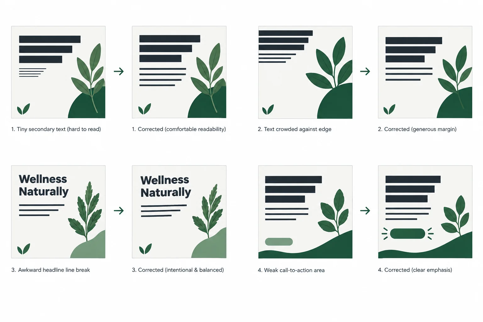
At approximately 360 px wide, small text, cramped margins, accidental breaks, and weak emphasis become easier to judge. Compare each issue with its correction.
Warning
Do not repair the exported image itself. The PNG is a flattened result. Make changes to editable text objects and shapes in maple-library-herb-workshop, then export a replacement PNG and inspect it again through the local preview.
After the preview is readable, export the corrected editable design as maple-library-herb-workshop.png. Keep the 1080 × 1080 px square canvas. Use available free PNG export settings; this exercise does not require paid resizing or a transparent background.
Replace the draft PNG in the same folder, reload preview-360.html, and inspect the updated exported file at 360 px wide. Check the actual output for clipped text or shapes, blur, missing elements, and watermarks. If you find a problem, return to the editable source, correct it, export again, and reload the preview.
Tip
Keep the editable working design maple-library-herb-workshop, the exported maple-library-herb-workshop.png, and maple-library-notes.txt. The notes retain the asset-permission record plus the labeled Accompanying text and Alt text prepared earlier. A PNG export does not replace any of these records.
Open the current maple-library-herb-workshop.png through preview-360.html at browser zoom 100%, so the graphic displays at 360 px wide. Report either one correction you made and its observed effect, or—if no correction was needed—the specific readability and output checks that passed. No upload or automatic file inspection is required.
Write at least 30 characters (0/30).

Step 8 of 8
Validate the finished Maple Library practice graphic and retain the records that support its readability, accessibility, and permitted use.
Use this final review only after you have corrected the editable working design and opened maple-library-herb-workshop.png on your own computer. The goal is not a perfect-looking file at full editor zoom; it is a clear, usable graphic at its intended viewing width of approximately 360 px.
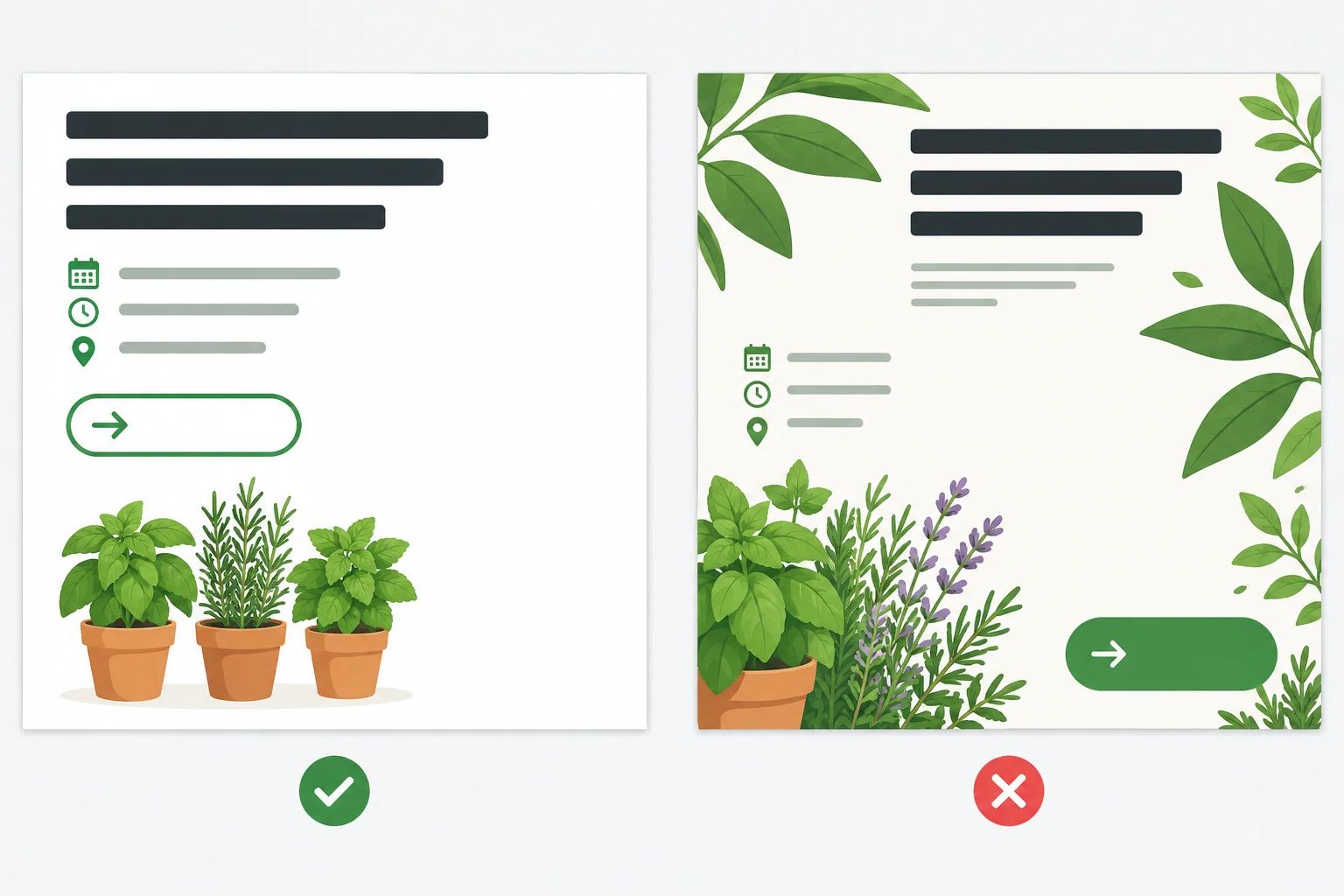
At approximately 360 px wide, the headline should lead the eye before the supporting detail and CTA. The right-hand problems are examples to fix.
Check the finished graphic against each row. If any check fails, return to the editable design, correct it, then repeat the viewing-size check.
| Check | Pass condition | Record or action |
|---|---|---|
| Message and order | Headline first; supporting detail second; CTA third | State the intended reading order |
| Typography and layout | Readable font, alignment edge, whitespace, comfortable margins | Fix crowding, weak emphasis, or awkward breaks |
| Viewing size | Clear at approximately 360 px wide | Record one observation after opening the PNG |
| Contrast and meaning | All text meets 4.5:1 target; meaning is not color-only | Record the contrast result and any wording or label used |
| Accessible support | Accompanying text and Alt text preserve essential information | Keep both notes in maple-library-notes.txt |
| Permission | Every selected resource is documented or replaced | Retain the asset record and required attribution |
Keep the supporting records with the finished practice graphic. In maple-library-notes.txt, retain the asset-record fields in this order:
Element | Creator/provider | Source | License/terms | Permitted use and restrictions | Attribution | Checked on
Use a date such as 2025-03-08. If permission is unresolved, write Unclear, replace the resource with a verified alternative, or remove it. Free access, no watermark, or an attribution line alone does not establish permission for the intended promotional use.
Example
Accompanying text
Maple Library: Start your first herb garden. Free beginner workshop. Ask at the library desk.
Alt text
Square Maple Library graphic promoting a free beginner workshop: “Start your first herb garden.” It directs viewers to ask at the library desk.
Adapt the Alt text to its future context. If nearby plain text already states the full message, the Alt text can be shorter; decoration does not need description. These notes remain separate from the PNG until a future publishing destination uses them.
Warning
Do not mark the practice graphic complete while it has a watermark, a paid-only dependency, clipped or blurry essential text, an unclear asset record, or an unresolved readability problem. Correct the issue in maple-library-herb-workshop, then export and inspect maple-library-herb-workshop.png again.
Complete your final self-review. Use brief evidence from your own finished practice graphic and notes. Include: (1) the intended reading order, (2) one observation from viewing the exported graphic at approximately 360 px wide, (3) your text contrast result, (4) your Accompanying text and a context-appropriate Alt text note, (5) one documented permission record or an asset you replaced because its permission was Unclear, and (6) confirmation of how you corrected any outstanding issue. No file submission is required.
Write at least 300 characters (0/300).
Congratulations! You completed: Create Readable Marketing Visuals with Free Tools
Thousands of online courses in video, ebooks and audiobooks.
To test your knowledge during online courses
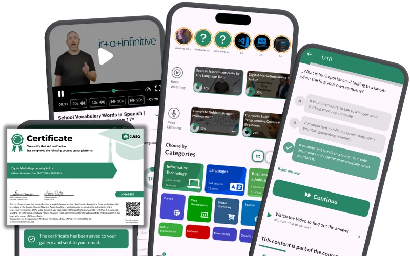
Generated directly from your cell phone's photo gallery and sent to your email

Download our app via QR Code or the links below:.


Carry knowledge in your pocket.
Download the Cursa app.
There are hundreds of free courses available, with a free certificate of completion that is saved in your mobile image gallery.
Download the app to access the Course Completion Certificate for Free.

+ 10 million
students

Free and Valid
Certificate

60 thousand free
exercises

4.8/5 rating in
app stores

Free courses in
video and ebooks