Great UX isn’t only what users see—it’s also what they read. UX writing (and microcopy) is the tiny layer of text that helps people move through an interface with confidence: button labels, error messages, helper text, onboarding tips, empty states, and confirmation screens. When those words are clear and consistent, users make fewer mistakes, feel less friction, and complete tasks faster.
Unlike marketing copy, UX writing focuses on usability: it reduces ambiguity, sets expectations, and supports decision-making at the exact moment a user needs it. If you’re improving your product design skills, learning UX writing is one of the highest-impact additions to your toolkit—especially when you’re already designing in tools like Figma or Adobe XD.
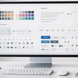
What UX writing includes (and why it matters)
UX writing appears in many interface surfaces and directly influences usability outcomes.
Key microcopy areas include:
• Buttons and calls to action (CTAs): clarify what happens next (e.g., “Create account” vs. “Submit”).
• Form labels and helper text: prevent errors before they occur (e.g., password rules shown upfront).
• Error messages: explain what went wrong and how to fix it—without blame.
• Empty states: tell users what this area is for and what to do now.
• Onboarding and tips: reduce learning time and increase activation.
• Confirmation and success messages: reassure users and reduce repeat actions (“Payment received” with a receipt link).
Principle 1: Be specific—remove guesswork
Specificity is one of the fastest ways to improve UX.
Replace generic terms such as Continue, Next, or Submit with labels that reflect the user’s goal.
Examples:
- Submit → Create account
- Continue → Review order
- Next → Choose delivery
When labels match the user’s intent, the interface becomes self-explanatory and reduces hesitation.
Principle 2: Write like a conversation, not a manual
Effective microcopy feels human—short, direct, and calm.
Best practices:
- Use simple vocabulary
- Prefer active voice
- Avoid technical jargon
- Keep sentences short and scannable
For example:
Technical:
Authentication failed.
Human-centered:
We couldn’t sign you in. Please check your email or password.
This becomes even more important on mobile interfaces where scanning speed matters.

Principle 3: Make every message actionable
When something goes wrong, users need a clear next step.
Strong error messages include three parts:
- What happened
- Why it matters
- How to fix it
Example:
Weak:
Invalid input.
Better:
Phone number must include a country code (for example: +1 555 0100).
Add recovery options when possible:
- Try again
- Reset password
- Contact support
- Use another payment method
For deeper usability guidance, Nielsen Norman Group provides practical research on error messaging:
https://www.nngroup.com/articles/error-message-guidelines/
Principle 4: Support accessibility with your words
UX writing is an important part of inclusive design.
Clear language benefits:
- Users with cognitive load
- Non-native speakers
- Users relying on assistive technology
High-impact practices:
• Don’t rely on color alone: pair visual signals with explicit text (e.g., “Required”).
• Keep instructions near inputs: avoid hiding requirements elsewhere.
• Use consistent terminology: don’t switch between “plan,” “membership,” and “subscription.”
• Respect screen readers: descriptive labels are better than placeholder-only fields.
To strengthen inclusive design skills, explore:
https://cursa.app/free-online-courses/accessibility-design
Principle 5: Create a voice and tone that fits the moment
A product’s voice is consistent personality.
Its tone adapts to context.
Examples of tone shifts:
• Onboarding: encouraging and supportive
• Errors: empathetic and solution-focused
• Payments/security: calm, precise, and reassuring
Many teams maintain a small voice and tone guide covering typical interface scenarios:
- Success messages
- Warnings
- Errors
- Loading states
- Empty states
This keeps communication consistent across screens.
How to practice UX writing inside Figma and Adobe XD
You can integrate UX writing directly into your design workflow.
Try this approach:
- Start with user intent
Write one sentence describing what the user wants to accomplish on the screen. - Draft microcopy early
Label buttons and fields before finalizing layout. - Test scan-ability
Zoom out and check if the primary action is obvious within three seconds. - Create reusable patterns
Build components for common microcopy types (errors, helpers, tooltips). - Prototype real scenarios
Include success states, errors, and edge cases in your prototypes.
To build these habits while improving your tool workflows, explore:
https://cursa.app/free-online-courses/figma-en
https://cursa.app/free-online-courses/adobe-xd

Microcopy checklist you can use on any screen
Before releasing a design, review microcopy with this checklist:
• Clarity: Can a first-time user understand it immediately?
• Brevity: Is it as short as possible without losing meaning?
• Consistency: Do terms match across the product and the https://cursa.app/free-online-courses/user-interface-design system?
• Actionability: Does it tell the user what to do next?
• Tone: Does it match the emotional context of the moment?
• Inclusivity: Is the language respectful, accessible, and easy to understand?
Build UX writing into your learning path
UX writing strengthens every design artifact—from wireframes to prototypes—because it makes interfaces clearer and more usable.
To expand your UX skills, explore the broader learning catalog at:
https://cursa.app/free-online-art-and-design-en-courses
Then dive into the dedicated UX collection:
https://cursa.app/free-courses-art-and-design-en-online
Combining UX writing, interaction design, and accessibility will help you create products that are not only visually polished but genuinely easy to use.