Duration of the online course: 2 hours and 56 minutes
New
Building consistent interfaces gets harder as products grow, teams expand, and platforms multiply. This free online course helps you turn scattered styles into a reliable, scalable design system in Figma—so your UI stays cohesive, your components stay maintainable, and handoff becomes smoother for everyone involved.
You will learn how to set up a solid system foundation, organize libraries for team collaboration, and use a structured approach to variables that supports real-world product needs. Starting with color, you will connect primitive values to semantic meaning so decisions scale without breaking when a palette changes. You will apply the same mindset to typography, creating styles that are easy to use and easy to expand, while keeping naming practical for teams. Spacing, borders, layout, and breakpoints are treated as deliberate systems rather than one-off choices, helping you design responsively with predictable results across screens.
As the system evolves, you will move beyond tokens into reusable UI elements. You will refine the way components are built for different contexts, understand how interaction states should differ between web and app patterns, and learn why certain behaviors or states belong in one platform library but not another. You will also see how variables can be scoped to reduce mistakes, make them simpler to consume, and keep your file structure clean as the system grows.
By the end, you will have a clear, repeatable method for creating a complete Figma design system that balances flexibility with control. Whether you are a UI designer, product designer, or anyone supporting a design-to-development workflow, you will be able to create assets that scale, communicate intent, and save time—without sacrificing craft or clarity.
Master Figma for free with our comprehensive online courses. Learn UI/UX design from experts with interactive lessons. Start designing like a pro today!
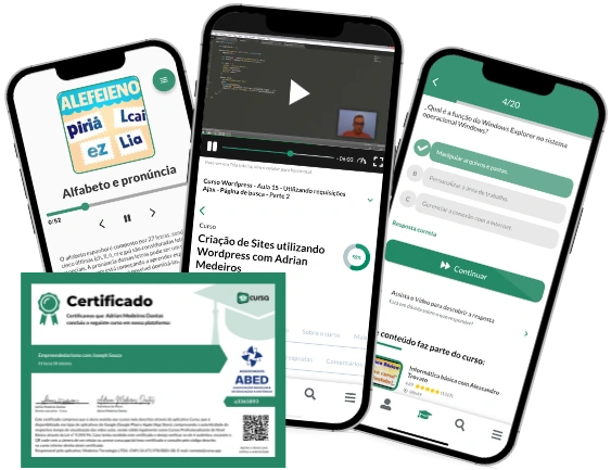
2 hours and 56 minutes of online video course
Digital certificate of course completion (Free)
Exercises to train your knowledge
100% free, from content to certificate
Ready to get started?Download the app and get started today.
Install the app now
to access the course
Over 5,000 free courses
Programming, English, Digital Marketing and much more! Learn whatever you want, for free.
Study plan with AI
Our app's Artificial Intelligence can create a study schedule for the course you choose.
From zero to professional success
Improve your resume with our free Certificate and then use our Artificial Intelligence to find your dream job.
You can also use the QR Code or the links below.


Free CourseUser Interface Design
5

(3)

12h04m

21 exercises

Free CourseUI Design for beginners
5
(1)
1h20m
5 exercises

Free CoursePrinciple UI/UX
4.97
(36)
6h39m
20 exercises

Free CourseWeb and Desktop app UI design in Figma
4.88
(8)
1h16m

Free CourseWeb design
4.86
(7)
4h17m
18 exercises

Free CourseAdobe XD Tutorials
4.83
(23)
7h23m
16 exercises

Free CourseUX design for mobile
4.78
(94)
1h37m
24 exercises

Free CourseUX/UI design course
4.71

(31)
2h34m
20 exercises

Free CourseUX user experience design
4.64
(11)
17h36m
16 exercises

Free CourseLearn Web Design for Beginners
4.5
(2)
3h07m
6 exercises
Thousands of online courses in video, ebooks and audiobooks.
To test your knowledge during online courses
Generated directly from your cell phone's photo gallery and sent to your email
Download our app via QR Code or the links below::.
Carry knowledge in your pocket.
Download the Cursa app.
There are hundreds of free courses available, with a free certificate of completion that is saved in your mobile image gallery.
Download the app to access the Course Completion Certificate for Free.

+ 10 million
students
Free and Valid
Certificate
60 thousand free
exercises
4.8/5 rating in
app stores
Free courses in
video and ebooks