A strong UX portfolio isn’t a gallery of pretty screens—it’s a set of decision-making stories. Hiring teams skim fast, looking for signals: how you framed the problem, what you prioritized, how you handled constraints, and whether your outcomes make sense. This guide shows a practical, repeatable structure for UX case studies that are easy to scan and hard to dismiss.
Start with a one-screen “case study header”
Your first screen should answer the recruiter’s immediate questions without scrolling too far. Treat it like a movie poster + trailer summary.
Include:
- Project title (specific, not generic)
- Product type (mobile app, web platform, internal tool)
- Role (solo designer, UX in a team, UI + UX, researcher)
- Timeline (weeks/months) and team (PM, devs, stakeholders)
- Tools (e.g., Figma, Adobe XD)
- Outcome headline (what changed or improved)
Write the problem as a tension, not a task
Avoid vague descriptions like “Redesign the homepage.” Instead, communicate the conflict that made the work valuable.
Examples:
- Weak: “Create a checkout flow.”
- Strong: “Users abandoned checkout because shipping costs appeared late, and support tickets spiked after failed payments.”
To keep it scannable, use a short block:
- Context: what product and audience
- Problem: what wasn’t working
- Impact: why it mattered to users/business
- Goal: what success looked like
Show your process as decisions (not a timeline)
Recruiters don’t need every artifact. They want to see how you reasoned. Organize your process around decisions you made and the evidence behind them.
Helpful section titles:
- What we needed to learn (questions, assumptions, risks)
- What we found (patterns, surprises, constraints)
- What we changed (design choices and tradeoffs)
- What we validated (how you checked the solution)
This structure works whether you used lightweight feedback or formal testing—and avoids the common “research → personas → wireframes → prototype” template fatigue.

Make research readable: insights → implications
If you include research, keep it concise. Large clusters of sticky notes rarely communicate value unless they lead to clear decisions.
Use paired statements:
- Insight: Users didn’t understand the difference between “Saved” and “Submitted.”
- Implication: Change labels, add status guidance, and confirm next steps in the UI.
To add credibility without overwhelming detail, briefly mention:
- Who you learned from (e.g., 5–8 participants, support logs, stakeholder interviews)
- How you learned (interviews, task testing, analytics review)
- What changed because of it
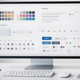
Include IA and flows when they reduce complexity
Information architecture and user flows are powerful portfolio artifacts when the product has multiple paths, roles, or edge cases.
Focus on:
- One happy path flow
- One edge case (errors, permissions, empty states)
- A short note explaining why the structure works
Pair flows with a UX principle you applied (for example: progressive disclosure, minimize cognitive load, recognition over recall).
To deepen UI craft, explore:
https://cursa.app/free-online-courses/user-interface-design
Present wireframes and prototypes with “why” captions
Wireframes are most persuasive when they include reasoning.
Add short annotations:
- What changed: combined two steps into one screen
- Why: reduced back-and-forth and confusion
- Risk: could feel dense
- Mitigation: clearer hierarchy + progressive disclosure
If your work lives in Figma, improve documentation and prototyping workflows through:
https://cursa.app/free-online-courses/figma-en
For interactive prototypes in Adobe XD, explore:
https://cursa.app/free-online-courses/adobe-xd
Show accessibility and inclusivity as part of the design
Accessibility signals professional maturity—even when it isn’t the headline of the project.
Include a short section describing checks such as:
- Color contrast
- Focus states and keyboard navigation
- Form error messaging and guidance text
- Touch target sizing
- Screen reader labels (conceptually)
You can expand this skillset with:
https://cursa.app/free-online-courses/accessibility-design
End with outcomes, not deliverables
A common portfolio weakness is ending with “final screens.” Instead, summarize outcomes and learning.
Examples of strong outcomes:
- Before/after usability issues resolved
- Stakeholder alignment achieved (approved direction, dev-ready specs)
- Reduced support tickets (if known)
- Faster task completion in testing
- Clearer comprehension in user feedback
Also include a short “What I’d improve next” section. This shows reflection and growth.

Make case studies scannable with consistent UX writing
Treat portfolio copy like product UX writing: clear, concise, and structured.
Best practices:
- Use headings every 1–2 screens
- Keep paragraphs to 2–4 lines
- Prefer bullets over dense text
- Bold signal words (problem, decision, outcome)
- Use the same section order across projects
When case studies share the same structure, readers focus on your thinking—not on locating information.
Build a focused learning path to strengthen your portfolio projects
If you’re assembling case studies and want to strengthen the underlying craft, explore the broader catalog at:
https://cursa.app/free-online-art-and-design-en-courses
Then dive into the dedicated UX collection:
https://cursa.app/free-courses-art-and-design-en-online
Pair storytelling skills with practical tooling such as Figma prototyping, design systems, interaction patterns, and accessibility practices.
For deeper external reading on UX communication and usability research, Nielsen Norman Group’s articles are a strong reference:
https://www.nngroup.com/articles/