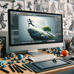
Video animation isn’t only about moving objects—it’s about guiding attention, shaping emotion, and making information effortless to understand. Whether you’re creating a short logo sting, a product explainer, or a looping social clip, strong motion design principles will instantly upgrade your work and help you build a recognizable style.
This guide focuses on motion design fundamentals (not lighting, not beginner 3D modeling, and not character-focused animation). You’ll learn a practical set of principles you can apply in any software, including 3D tools like Blender and classic 2D motion workflows.
1) Start with the message, not the movement
Every animation decision should answer a simple question: “What should the viewer understand or feel next?”
Define one primary objective per shot:
- Reveal
- Compare
- Emphasize
- Transition
- Explain
When motion has a job, it becomes clearer and more satisfying.
2) Use hierarchy to control attention
In motion design, hierarchy is created with scale, contrast, timing, and placement.
Practical techniques:
- Animate the most important element first
- Give primary elements more distance or speed
- Delay secondary elements slightly
- Keep supporting motion subtle
This prevents the viewer’s attention from bouncing across the screen.
3) Timing is meaning
Animation timing directly affects emotion and readability.
Examples:
- Fast timing: energetic, urgent, playful
- Slow timing: premium, calm, cinematic
Try defining simple timing rules:
- Title visibility duration
- Transition speed
- Pause after key information
Even a 6–10 frame pause can dramatically improve clarity.
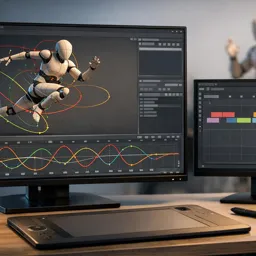
4) Easing: the difference between mechanical and natural
Linear motion looks robotic.
Most motion benefits from ease in and ease out, where objects accelerate and decelerate naturally.
When working with a graph editor:
- Aim for smooth S-shaped curves
- Adjust curves depending on tone
- Avoid abrupt velocity changes
Easing is often the single biggest improvement beginners can make.

5) Work in “poses” even for motion graphics
Borrow a technique from character animation: strong poses.
Plan 3–5 key compositions for each sequence:
- Start
- Reveal
- Emphasize
- Settle
- Exit
If each pose works as a still image, the motion between them becomes easier to refine.
6) Arcs and paths make motion feel intentional
Movement along curved paths often feels more natural than rigid straight lines.
Benefits:
- Smoother visual flow
- Less mechanical movement
- Better camera motion in 3D
Even simple shapes gain elegance when they travel along subtle arcs.
7) Overlap and follow-through add richness
Objects rarely start and stop at the same moment.
Add life with:
- Overlap: elements begin slightly before or after others
- Follow-through: a small movement after the main action
Examples:
- Background slides in after the headline
- Icons settle slightly after the main object
- Shadows catch up a few frames later
These small offsets make animation feel organic.
8) Build transitions that feel motivated
Good transitions connect ideas instead of interrupting them.
Examples of motivated transitions:
- An arrow becoming a wipe
- A graph line extending into a divider
- A rotating object becoming the next scene
When motion carries across scenes, the animation feels cohesive.
9) Consistency creates style
Style often comes from consistent rules rather than complexity.
Define a small motion system:
- Corner radius
- Stroke weight
- Motion duration
- Easing style
- Shadow softness
Repeating these rules creates a recognizable visual language.
10) Use constraints to avoid over-animating
A common beginner mistake is animating everything.
Use constraints such as:
- Limit moving elements per scene
- Limit movement distance
- Animate only one property at a time
(position or scale or rotation)
Constraints force stronger creative decisions and cleaner visuals.
11) Sound design makes motion feel real
Even simple animation improves dramatically with subtle sound.
Useful sound cues include:
- Whooshes for transitions
- Clicks for UI interactions
- Impacts for settling motion
- Ambient sound for atmosphere
Align audio cues with keyframes to strengthen timing.

12) Polish pass checklist (the professional finish)
Before exporting, perform a final polish review.
Check:
- Spacing: elements settle with comfortable margins
- Tangents: avoid awkward edge alignments
- Rhythm: allow breathing space after reveals
- Motion curves: remove jitter and velocity jumps
- Readability: the message works even without sound
A careful polish pass often separates amateur motion from professional work.
Where to practice these principles (and level up fast)
Choose one short exercise and repeat it with variation:
- Animate a logo reveal in three styles (playful, premium, tech)
- Create a 10-second explainer segment with motivated transitions
- Reanimate the same layout using different easing and timing rules
To explore motion in 3D environments, practice with:
https://cursa.app/free-online-courses/blender
You can also expand into broader motion design workflows with:
https://cursa.app/free-online-courses/3d-animation
Keep learning video animations
Explore additional creative learning paths:
https://cursa.app/free-online-art-and-design-en-courses
Or go directly to the video animation collection:
https://cursa.app/free-courses-art-and-design-en-online
As your skills grow, you can branch into:
https://cursa.app/free-online-courses/character-animation
Even then, the same core motion design fundamentals—timing, easing, hierarchy, and motivated transitions—will continue to shape professional-quality animations.