Great design isn’t just about taste—it’s about process. A reliable workflow helps you move from a vague idea (“make it pop”) to a clear solution that communicates, looks intentional, and ships on time. This guide breaks down a practical, repeatable graphic design workflow you can apply to posters, social media graphics, presentations, brand assets, and layout projects.
1) Start with the brief: define the problem before the pixels
Before choosing fonts or colors, clarify what the design must do. Capture the goal (inform, persuade, guide, sell), the audience (who, what they care about, where they’ll see it), the content (must-have text, logo rules, calls-to-action), and the constraints (formats, sizes, deadlines, brand guidelines). If the brief is missing, write a one-paragraph “working brief” and confirm it with stakeholders. This single step prevents endless revisions later.
2) Research quickly: collect references with a purpose
Inspiration is most useful when it’s specific. Gather examples in three buckets: (1) competitors and industry standards, (2) styles your audience already trusts, and (3) wildcards that could differentiate the design. Look for patterns: common layouts, typical typography choices, recurring imagery, and tone. Then decide what to follow and what to avoid. A small, intentional reference set beats an endless scroll of images.
3) Build a moodboard that leads to decisions
A moodboard isn’t decoration—it’s a decision tool. Choose a direction for: color mood (warm, cool, muted, high-contrast), typography personality (neutral, editorial, playful, technical), and imagery style (photography vs. illustration, realistic vs. abstract). Add short notes next to each reference explaining why it’s relevant (e.g., “strong hierarchy,” “friendly tone,” “high legibility on mobile”). That makes feedback concrete and keeps the project aligned.

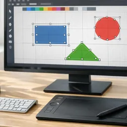
4) Sketch and wireframe: solve layout before styling
Even if you design digitally, quick sketches help you explore options fast. Focus on structure: headline placement, supporting text blocks, image areas, and the call-to-action. Then translate the best sketch into a simple wireframe (rectangles and lines). You’re aiming for clarity: what should be noticed first, second, and third? If the wireframe reads well in grayscale, it’s much easier to make it look good with color later.
5) Set hierarchy with typography: readability is a feature
Strong hierarchy is the difference between “nice” and “effective.” Limit yourself to a small type system: a headline style, a subhead style, and body text. Use size, weight, spacing, and alignment to guide attention. A practical check: squint at your design—does the structure remain obvious? For deeper study, explore focused lessons in https://cursa.app/free-online-courses/typography and fundamentals in https://cursa.app/free-online-courses/graphic-design-basics.
6) Choose color strategically: use a small palette with clear roles
Instead of picking “pretty colors,” assign roles: primary (brand or dominant), secondary (support), accent (CTA/highlights), and neutrals (background/text). Test contrast for accessibility and readability—especially for mobile and small sizes. If the design must support a brand, pull colors from brand guidelines and vary only tints/shades. If it’s open-ended, start with 1–2 anchor colors and build from there.
7) Work in the right tool for the job (and keep files organized)
Many projects combine tools. Vectors for logos/icons, layout tools for multipage documents, and quick template-driven tools for speed. Learn the strengths of each: https://cursa.app/free-online-courses/adobe-illustrator (vector graphics), https://cursa.app/free-online-courses/adobe-indesign (layout and publications), https://cursa.app/free-online-courses/canva (fast production and variations), https://cursa.app/free-online-courses/coreldraw-en (vector workflows), and https://cursa.app/free-online-courses/krita (raster illustration/painting). Whatever you use, name layers clearly, keep assets in folders (Images, Fonts, Exports), and save versions (v1, v2, v3) so feedback doesn’t derail progress.
8) Iterate with intention: design variations that answer different questions
Instead of random alternatives, create variations with a purpose:
- Variation A (Hierarchy): change headline size/placement and CTA prominence.
- Variation B (Typography): swap type pairing while keeping layout constant.
- Variation C (Color): test a different palette with the same structure.
This method makes reviews faster because stakeholders can react to specific tradeoffs rather than vague preferences.
9) Prepare for real-world use: export, proof, and stress-test
Finalizing isn’t just clicking “Export.” Stress-test the design in the context it will appear: view on a phone, print a draft, zoom out to thumbnail size, and check alignment and margins. For print, confirm bleed and safe areas; for digital, export optimized sizes and formats (PNG/JPG/SVG/PDF as appropriate). Proofread everything—then proofread again after export. Small mistakes are easiest to miss at the end.

10) Build your personal workflow checklist (and reuse it)
The fastest way to level up is to make the process repeatable. Turn the steps above into a one-page checklist you can use for every project: brief, references, moodboard, wireframe, type system, palette roles, iterations, export checklist. Over time, you’ll refine it with your own templates, grids, and preset styles—reducing decision fatigue and increasing consistency.
To deepen your skills across software, layout, color, and typography, browse the broader learning paths in https://cursa.app/free-online-art-and-design-en-courses and explore the full https://cursa.app/free-courses-art-and-design-en-online collection.
Recommended next steps
- Practice the workflow on a small project: redesign a simple event flyer in 60–90 minutes.
- Create a mini style guide (type scale + color roles) and reuse it for three different deliverables.
- Pick one tool focus for the week (vector, layout, or rapid production) and build muscle memory.