


Strong graphic design isn’t just about making a single layout look good—it’s about creating a repeatable way to produce many designs that feel consistent, intentional, and easy to expand. That’s the purpose of a design system: a practical toolkit of rules and reusable parts (colors, type styles, spacing, components, and layout patterns) that helps you design faster while keeping quality high.
This guide introduces design systems from a graphic design perspective (not just UI). You’ll learn how to build a lightweight system you can apply to social posts, presentations, print materials, and brand assets—using whatever tools you’re learning, from foundational skills to professional software.
What a design system is (and what it isn’t)
A design system is a documented set of design decisions that you can reuse. It typically includes:
- Foundations: color palette, typography, spacing, grid rules, icon style, imagery rules.
- Components: buttons, badges, cards, headers, footers, callouts, tables, form elements (or print equivalents like info boxes, pull quotes, labels).
- Guidelines: when to use each element, accessibility considerations, do/don’t examples.
It’s not the same as a “brand board” or a logo file folder. Those are pieces of the puzzle. A design system goes further by making your decisions operational—so you can produce consistent layouts without reinventing them every time.
Why design systems matter in graphic design workflows
Even for solo designers, a simple system reduces friction. It helps you:
- Design faster by reusing components and preset styles.
- Keep consistency across formats (print, social, slides, PDFs).
- Scale projects without visual drift as the number of assets grows.
- Collaborate smoothly when multiple people touch the same files.
If you’re building your foundations, start with core principles in https://cursa.app/free-online-courses/graphic-design-basics, then apply them systemically with the steps below.
Step 1: Define the foundation layer (the “rules of the game”)
Color: choose roles, not just swatches
Instead of collecting random colors, assign each color a job:
- Primary: main brand/attention color
- Secondary: support color for variety
- Neutrals: backgrounds, text, dividers
- Status colors (optional): success, warning, error
This role-based approach prevents “palette drift,” where every new design adds new shades. If you want deeper mastery of how color behaves in layouts, it pairs well with structured practice inside your design courses—but keep your system simple at first.

Typography: set a hierarchy you can reuse
Typography becomes scalable when you define a small set of text styles and reuse them everywhere. A solid starter set:
- H1: big headlines
- H2: section titles
- Body: paragraphs
- Caption: small notes, labels
- Button/Label: short UI-like text
Lock down sizes, weights, line height, and spacing rules. For focused training on type decisions, explore https://cursa.app/free-online-courses/typography courses and translate what you learn into reusable styles in your system.
Spacing and layout: pick a grid and a spacing scale
Design systems feel “professional” when spacing is consistent. Choose:
- A spacing scale (example: 4, 8, 12, 16, 24, 32, 48)
- A grid rule (example: 12-column grid for layouts, or consistent margins for print)
When everything snaps to the same rhythm, layouts become easier to build and easier to read.
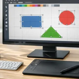
Step 2: Build reusable components (the “LEGO bricks”)
Components are pre-designed pieces you can drop into new layouts. Start with the parts you use most often:
- Header blocks (headline + subtitle + accent line)
- Callout boxes (highlight key points)
- Cards (image + title + short text)
- CTA blocks (button-like elements for digital or “sign-up” boxes for print)
- Icon + label pairs
Give each component rules: minimum padding, where it can be placed, and what text styles it uses. This is where your system becomes truly repeatable.
Step 3: Create templates for common outputs
Templates turn your system into a production engine. Choose 3–5 formats you create often, such as:
- Instagram post and story
- Flyer or poster
- Presentation slide deck cover + content slide
- Email header banner
- One-page PDF handout
Each template should pull from your foundations (type styles, color roles, spacing scale) and your components (headers, cards, callouts). Over time, you can expand this library without losing consistency.
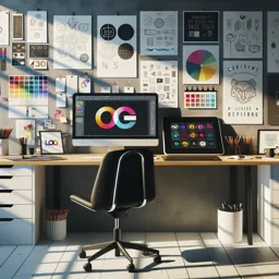
Step 4: Document your system (so you can actually use it)
Documentation can be simple: one page that answers “how do I design with this?” Include:
- Do/don’t examples for typography and spacing
- Color usage rules (what not to combine)
- Component guidelines (when to use which variant)
- Accessibility basics (contrast checks, readable sizes)
For contrast checking, tools like the https://webaim.org/resources/contrastchecker/ are a straightforward way to validate readability when you’re designing for screens.

How design systems fit with popular design tools
You can build a design system in almost any tool—the concepts are the same even if the buttons differ:
- Vector tools: create symbol libraries, style presets, reusable icons (see https://cursa.app/free-online-courses/adobe-illustrator and https://cursa.app/free-online-courses/coreldraw-en).
- Layout tools: set paragraph/character styles, grids, and master pages for repeatable documents (see https://cursa.app/free-online-courses/adobe-indesign).
- Template-first tools: define brand kits, reusable components, and page templates for quick production (see https://cursa.app/free-online-courses/canva).
- Digital art workflows: keep brushes, color sets, and text treatments consistent in mixed-media assets (see https://cursa.app/free-online-courses/krita).
The key is to translate “good taste” into repeatable settings: styles, swatches, components, and templates you can reuse.
A simple mini-project: build a one-week design system
To make this practical, try a short build:
- Day 1: Choose a palette (5–9 colors with roles) and a type pair (or single family with multiple weights).
- Day 2: Define text styles (H1/H2/Body/Caption) and a spacing scale.
- Day 3: Create 6–10 basic components (header, card, callout, footer strip, icon+label, CTA).
- Day 4: Build 3 templates you’ll reuse (post, flyer, slide).
- Day 5: Produce 5 real assets from your templates and refine weak spots.
By the end, you’ll have a system you can expand for new projects—without starting from zero each time.
Continue learning: turn fundamentals into a system
Design systems work best when they’re grounded in strong fundamentals: hierarchy, alignment, spacing, and type. To keep building those skills while exploring multiple tools and levels, browse the https://cursa.app/free-courses-art-and-design-en-online course collection, or jump up a level to the broader https://cursa.app/free-online-art-and-design-en-courses category for related creative tracks.
A design system doesn’t need to be huge to be powerful. Start small, document your decisions, and reuse your best building blocks. Consistency will stop feeling like a struggle—and start becoming your default.


