


Responsive mobile design ensures your interfaces adapt effortlessly to various screen sizes and devices. By prioritizing usability, performance, and accessibility, designers can deliver seamless experiences for every user, whether on a smartphone, tablet, or desktop.
The Core Principles of Responsive Mobile Design
- Flexible Layouts: Use relative units like percentages instead of fixed pixels to allow layouts to adjust smoothly to different screens.
- Fluid Images and Media: Scale images and videos within their containers to prevent distortion or overflow.
- Media Queries: Apply CSS media queries to specify different styles for various screen sizes and device characteristics.
- Touch-Friendly Elements: Design buttons and interactive elements that are comfortably sized and spaced for tapping.
- Prioritizing Content: Highlight essential information first, especially on smaller screens, to guide user attention efficiently.
Tools and Techniques for Building Responsive Mobile Interfaces
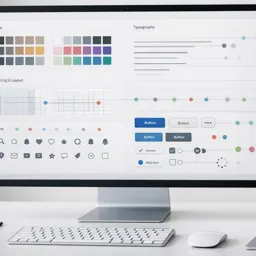
- Frameworks: CSS frameworks such as Bootstrap and Materialize provide pre-built responsive components and layouts.
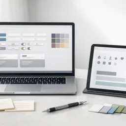
- Prototyping Tools: Use Figma, Adobe XD, or Sketch to design interactive prototypes and test responsiveness in real-time.
- Grid Systems: Implement grid-based designs to maintain structural consistency across devices.
Common Pitfalls and Solutions
- Ignoring Performance: Optimize images and animations to prevent slow loading times on mobile devices.
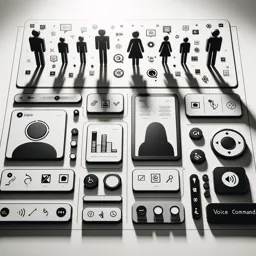
- Overlooking Accessibility: Ensure designs accommodate all users, including those with visual or motor impairments, by providing sufficient color contrast and alternative text for images.
- Not Testing on Multiple Devices: Regularly test your interfaces on a range of devices to catch layout or functionality issues early.
Conclusion
Responsive mobile design is essential for modern digital products. By adhering to best practices, utilizing the right tools, and continuously testing across devices, designers can create mobile experiences that are intuitive, efficient, and enjoyable for all users.


