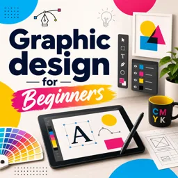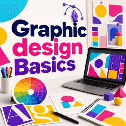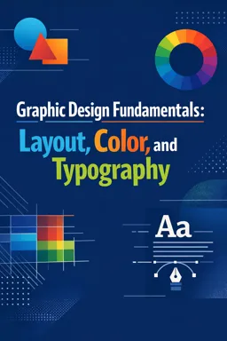


Download this free ebook on graphic design fundamentals, covering layout, color, typography, accessibility, and practical design workflows.
Free ebook content
-

Core Principles of Layout: Alignment, Grids, and Visual Order
+ Exercise: In a multi-column text layout, what is the main benefit of aligning text to a baseline grid?
-
Visual Hierarchy: Guiding Attention with Scale, Weight, and Placement
+ Exercise: A layout has a large headline, but users still feel confused about what to read next. According to visual hierarchy principles, what is the most likely issue?
-
Spacing and Rhythm: Using White Space to Improve Clarity
+ Exercise: Which spacing approach best improves clarity by making content groups easy to scan?
-
Contrast and Emphasis: Creating Readable, Impactful Compositions
+ Exercise: Which approach best creates emphasis without sacrificing readability in a layout?


-
Color Harmony: Building Balanced Palettes for Mood and Function
+ Exercise: When a palette achieves the desired emotional mood but reduces readability or makes actions unclear, what is the best design response?
-
Color Accessibility: Ensuring Legibility and Inclusive Design Choices
+ Exercise: When designing interactive states and status messages, what is the most accessible way to communicate meaning?
-
Typography Foundations: Readability, Structure, and Type Anatomy
+ Exercise: A paragraph is readable when single letters are clear, but reading long passages feels tiring and you often lose your place. Which adjustment most directly targets readability rather than legibility?
-
Type Pairing Systems: Combining Fonts for Cohesion and Hierarchy
+ Exercise: What best describes how a type pairing system helps maintain cohesion and hierarchy across multiple layouts?
-
Practical Redesign: Rebuilding a Flyer with Clear Layout and Type
+ Exercise: When rebuilding an event flyer for clarity, which approach best supports fast scanning and a clear next action?
-
Simple Brand Moodboard: Defining Visual Direction with Type and Color
+ Exercise: What is the main purpose of a simple brand moodboard when deciding on typography and color?
-
Quality Check Workflow: Consistent Alignment, Spacing, and Export Readiness
+ Exercise: Which approach best describes an effective quality check workflow before handing off a design?
About the free ebook
Graphic Design Fundamentals: Layout, Color, and Typography
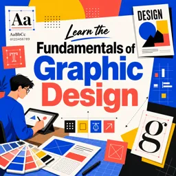
This free ebook introduces the essential visual decisions behind clear, effective graphic design. Learn how layout, color, and typography work together to create designs that communicate quickly, feel intentional, and support a brand’s purpose.
Build compositions with clarity
Explore alignment, grids, spacing, contrast, and visual hierarchy to organize information and guide attention. Practical principles help you make posters, flyers, social graphics, and brand materials easier to scan and more visually balanced.
Use color with purpose
Discover how harmonious palettes can shape mood, reinforce meaning, and improve usability. The ebook also addresses color accessibility, helping you make choices that preserve legibility and offer stronger experiences for more viewers.
Create readable typographic systems
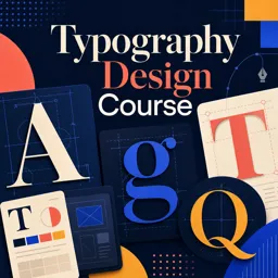
Develop a working understanding of type anatomy, readability, structure, and font pairing. Learn to establish hierarchy with scale, weight, and placement so headlines, supporting copy, and calls to action work as one cohesive system.
Apply the fundamentals to real design work
Put these ideas into practice through redesign and visual-direction exercises, then use a quality-check workflow to review alignment, spacing, consistency, and export readiness. By the end, you will have a reliable framework for evaluating and improving everyday graphic design.
What you will strengthen
- Organizing content with grids, alignment, and white space
- Creating emphasis through contrast and hierarchy
- Selecting accessible color and effective type combinations
- Reviewing designs before final export
How do grids improve a graphic design layout?
Grids create consistent alignment, organize content, and make layouts easier to scan.
What makes a color palette accessible?
Accessible palettes use sufficient contrast and do not rely on color alone to communicate meaning.
How can I pair fonts for a flyer or poster?
Choose fonts with distinct roles, compatible moods, and clear differences in hierarchy.
This ebook includes:

11 content chapters

Digital certificate of course completion (Free)

Exercises to train your knowledge

100% free, from content to certificate
Ready to get started?

 recommended
In the app you will also find...

Over 5,000 free courses
Programming, English, Digital Marketing and much more! Learn whatever you want, for free.

Study plan with AI
Our app's Artificial Intelligence can create a study schedule for the course you choose.

From zero to professional success
Improve your resume with our free Certificate and then use our Artificial Intelligence to find your dream job.
You can also use the QR Code or the links below.