You can drive plenty of traffic to your website, but if visitors do not take action, that traffic rarely turns into results. This is exactly the problem a well-designed landing page solves. A landing page is a focused web page built around a single goal, whether that is collecting an email, selling a product, or getting people to sign up for an event. In this guide, you will learn what a landing page is, why it works, and how to create one that consistently turns visitors into customers.
What is a landing page
A landing page is a standalone page designed to guide a visitor toward one specific action. Unlike a homepage, which offers many links and options, a landing page removes distractions and keeps the reader focused on a single objective. That objective is usually called the conversion, and it can be anything from downloading a free guide to buying a product.
Because the page has a clear purpose, it is easier for visitors to understand what you are offering and what they should do next. This clarity is what makes landing pages so effective in digital marketing campaigns.
Why landing pages matter
When you run an ad or send an email campaign, you want the people who click to take a specific action. Sending them to a general homepage often leads to confusion and lost opportunities. A dedicated landing page, on the other hand, matches the promise of your ad and makes the next step obvious.
- They increase conversions by focusing attention on one goal.
- They allow you to measure results clearly and improve over time.
- They create a consistent experience from ad to page, building trust.
The essential elements of a high-converting landing page
While designs vary, most effective landing pages share a set of core components. Understanding each one will help you build pages that perform well.
- A clear headline: the first thing visitors read should instantly communicate the value of your offer.
- A supporting subheadline: a short sentence that adds detail and reinforces the main message.
- A strong call to action (CTA): a button with clear, action-oriented text such as “Get my free guide” or “Start now.”
- Benefits, not just features: explain how your offer improves the visitor’s life or solves their problem.
- Visuals: relevant images or short videos that support your message and show your product in context.
- Social proof: testimonials, reviews, or trust badges that reassure hesitant visitors.
- A simple form: ask only for the information you truly need to reduce friction.
Keep it focused and distraction-free
One of the biggest mistakes beginners make is adding too many options. A landing page should not have a full navigation menu, multiple offers, or links that pull visitors away. Every element on the page should support the single goal. If something does not help move the visitor toward the action, consider removing it.
Write copy that speaks to your audience
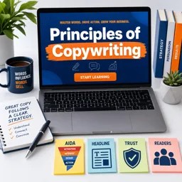
Great landing pages are built on clear, persuasive writing. Speak directly to your reader using simple language, and focus on the outcome they want. Instead of describing what your product is, describe what it does for them. Address common objections and answer the questions a visitor is likely to have before deciding.
| Feature-focused copy | Benefit-focused copy |
|---|---|
| Our course has 40 video lessons | Learn a new skill at your own pace, step by step |
| The app syncs across devices | Access your work anywhere, anytime |
Design for mobile and speed
A large share of visitors will view your page on a smartphone, so your landing page must look great and work smoothly on smaller screens. Use readable fonts, buttons that are easy to tap, and a layout that adapts to any device. Page speed also matters: a page that loads slowly can lose visitors before they even see your offer. Compress images and keep the design lightweight to avoid delays.
Test and improve continuously
No landing page is perfect on the first try. The most successful marketers treat their pages as works in progress and improve them based on data. A common technique is A/B testing, where you create two versions of a page with one difference, such as a different headline or button color, and see which one performs better. Small changes can lead to meaningful improvements over time.
- Start with a clear hypothesis about what might improve results.
- Change one element at a time so you know what caused the difference.
- Give the test enough time to gather reliable data before deciding.
Common mistakes to avoid
- Weak or vague headlines that fail to communicate value quickly.
- Too many calls to action that confuse the visitor about what to do.
- Long forms that ask for more information than necessary.
- Ignoring mobile users and slow loading times.
Conclusion
A great landing page is one of the most valuable tools in digital marketing. By focusing on a single goal, writing benefit-driven copy, and removing distractions, you can turn more of your visitors into leads and customers. Remember to design for mobile, keep your page fast, and keep testing to improve results. If you want to sharpen these skills and build campaigns that truly convert, explore the free digital marketing courses available on Cursa, where you can learn practical strategies step by step.