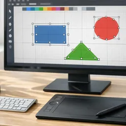
Adobe Illustrator is a powerful tool for creating logos, providing designers with the precision and flexibility needed to bring brand identities to life. Whether you’re a beginner or an experienced designer, understanding the step-by-step process for creating professional-quality logos will help you produce impactful designs. In this article, we’ll go through a comprehensive guide to designing stunning logos in Adobe Illustrator, from concept to final export.
1. Start with a Clear Concept
Every great logo starts with a strong concept. Begin by brainstorming ideas and sketching rough drafts on paper. Focus on the message and personality you want the logo to convey. Think about:
- Target Audience: Who will see this logo? What emotions should it evoke?
- Brand Values: What characteristics define the brand? Is it modern, traditional, playful, or serious?
Once you have a few ideas sketched out, choose the best concept to refine in Illustrator.
2. Set Up Your Illustrator Document
Open Adobe Illustrator and create a new document. Set up your workspace to ensure you’re working at the correct dimensions and color mode:
- Document Size: For logos, a square canvas (e.g., 500px x 500px) is ideal.
- Color Mode: Choose CMYK for print designs and RGB for digital use.
- Grid and Guides: Enable grids and guides for alignment. Go to View > Show Grid and Show Guides to help position elements accurately.
3. Create Basic Shapes Using Shape Tools
Start by creating the basic elements of your logo using Illustrator’s Shape Tools. Use the Rectangle Tool (M), Ellipse Tool (L), and Polygon Tool to draw circles, squares, and other geometric shapes.
- Tip: Hold down Shift while drawing shapes to maintain perfect proportions, and use the Align Panel to center objects on the canvas.
4. Utilize the Pen Tool for Custom Paths
For more complex or custom shapes, use the Pen Tool (P). This tool allows you to create precise curves and angles by placing anchor points. Mastering the Pen Tool is crucial for logo design, as it helps you draw unique shapes and symbols.
- Tip: Use Smart Guides to snap your paths to existing anchor points and lines for better precision.
5. Combine Shapes Using the Pathfinder Tool
The Pathfinder Tool is a designer’s best friend when creating logos. It allows you to merge, subtract, and intersect shapes to form new ones.
- Unite: Combine multiple overlapping shapes into a single form.
- Minus Front: Subtract one shape from another to create cut-out effects.
- Divide: Split shapes into separate elements for more complex designs.
Experiment with different Pathfinder options to achieve your desired look.
6. Apply Colors and Gradients Strategically
Color plays a crucial role in logo design. Choose a color palette that reflects the brand’s identity. You can use the Color Guide panel in Illustrator to explore harmonious color schemes.
- Tip: Use Gradients to add depth and dimension to your logo. The Gradient Tool (G) allows you to create linear, radial, or freeform gradients.
7. Incorporate Text Using the Type Tool
If your logo includes text, use the Type Tool (T) to add the brand name or tagline. Choose a font that complements your logo’s style and ensure that it’s legible at various sizes.
- Tip: Use Create Outlines (right-click the text and select Create Outlines) to convert text into editable vector shapes. This is important for logos, as it ensures the text won’t change if the font is unavailable on another system.
8. Refine Your Logo with the Direct Selection Tool
Use the Direct Selection Tool (A) to adjust individual anchor points and paths. This tool is useful for fine-tuning curves and ensuring that your shapes are perfectly aligned.
- Tip: Zoom in and out frequently to check your design at different levels of detail.
9. Test the Logo in Black and White
A strong logo should work well in both color and monochrome. Convert your logo to black and white to see if it maintains its clarity and impact. This is crucial for ensuring the logo looks good on letterheads, business cards, and promotional materials.
- Tip: Use the Recolor Artwork option in the Properties Panel to quickly test different color schemes and monochrome versions.
10. Save and Export Your Logo Correctly
Once your logo is complete, it’s time to save and export it in various formats:
- AI (Adobe Illustrator): For an editable source file.
- SVG: Ideal for web and digital use, as it scales without losing quality.
- EPS: Use for print designs, as it maintains vector integrity.
- PNG: A transparent raster format for web use.
- PDF: For sharing and printing.
Conclusion
Creating a stunning logo in Adobe Illustrator requires a combination of creativity, technical skill, and a clear design process. By starting with a strong concept, mastering the basic tools like the Pen Tool and Pathfinder, and refining your design with careful adjustments, you can produce a professional-quality logo that captures the essence of any brand. Remember to experiment, test your design in different formats, and enjoy the creative process!


