


Figma has become a powerful tool for UI/UX designers, and one of its standout features is the ability to create components. Components in Figma allow designers to build reusable elements that can be applied across multiple projects, ensuring consistency and efficiency. In this article, we’ll explore how to master Figma components and use them to create a robust, scalable design system.
1. What Are Figma Components?
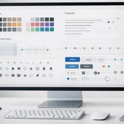
Components in Figma are reusable design elements that can be used multiple times in your project. They function similarly to symbols in other design tools and are perfect for elements like buttons, navigation bars, and icons.
- Main Component: The original version of the component that controls all linked copies.
- Instance: A copy of the main component that can be customized without affecting the original structure.
Using components not only saves time but also helps maintain consistency throughout your design.
2. Creating a Main Component
To create a component in Figma, select a design element (like a button or icon) and use the shortcut CTRL + ALT + K (Windows) or Command + Option + K (Mac), or right-click and select Create Component. This will turn your element into a Main Component.
- Tip: Name your components clearly to keep your design system organized. For example, use names like
Button/PrimaryorIcon/Checkmark.
3. Building a Design System Using Components
A design system is a collection of reusable components and styles that define the look and feel of a product. Start by identifying the core elements your system needs, such as:
- Buttons: Create different states (default, hover, active) as separate components.
- Icons: Use Figma’s vector editing tools to design or import a library of icons.
- Typography: Set up text styles for headings, subheadings, and paragraphs.
Group these components in a dedicated Design System file to keep everything organized and accessible.
4. Using Variants for Component States
Figma’s Variants feature allows you to group multiple versions of a component (like button states) into a single entity. This makes it easier to manage and switch between states.
- Tip: Use Variants for buttons (primary, secondary, disabled), checkboxes (checked, unchecked), and form fields (empty, filled, error).
To create a Variant, select your component and click on Add Variant in the right panel. Arrange your variants visually for easy navigation.
5. Implementing Auto Layout in Components
Auto Layout is a powerful feature that makes your components responsive to content changes. It’s ideal for building buttons, cards, and lists.
- Tip: Select your component, then click Auto Layout (Shift + A). Adjust padding, spacing, and alignment in the right panel.
Using Auto Layout ensures that your components resize correctly when you add or change text, making your design system more flexible.
6. Nesting Components for Advanced Designs
You can nest components within other components to create more complex elements. For example, nest an Icon Component inside a Button Component. This setup allows you to update icons globally without altering the button design.
- Tip: Use nested components for building navigation bars, dropdowns, and card layouts.
7. Swapping Instances Efficiently
When working with multiple instances, you can quickly swap between different components using the Instance Swapfeature. Select the instance, go to the Properties Panel, and choose the new component from the dropdown menu.
- Tip: Use Instance Swap to replace button styles, icons, or entire sections without disrupting your layout.
8. Create and Share Component Libraries
To use your components across multiple projects, publish them as a shared library. Go to the Assets Panel, click on your file, and select Publish Library.
- Tip: Regularly update your shared library to reflect design changes and ensure that all team members are using the latest components.
9. Document Your Components for Team Use
A successful design system requires clear documentation. Use Figma’s Comments and Description Fields to explain how and when to use each component.
- Tip: Create a dedicated Design System Guide page in Figma, listing usage guidelines, do’s and don’ts, and examples of components in context.
10. Test and Iterate on Your Design System
Regularly test your components in real-world scenarios to identify gaps or inconsistencies. Gather feedback from other designers and stakeholders to continuously improve your system.
- Tip: Create test pages to see how your components behave in various layouts and device screens.
Conclusion
Mastering Figma components is essential for creating scalable and reusable design systems. By understanding how to create, organize, and document components, you can build a cohesive design system that improves collaboration and ensures visual consistency across all your projects. Start by defining your core elements, implement Auto Layout and Variants, and share your system with your team for maximum impact.


