Creating responsive layouts is a fundamental skill for UI/UX designers, ensuring that your designs look great on screens of all sizes. Figma’s powerful tools and features make it easy to build responsive layouts that adapt seamlessly across desktop, tablet, and mobile devices. In this article, we’ll cover best practices and techniques for designing responsive layouts in Figma.
1. Start with a Fluid Design System
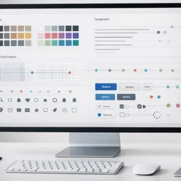
Before diving into responsive layouts, establish a fluid design system with consistent components and styles. Define core elements like typography, buttons, and spacing units that can scale up or down based on the screen size.
- Tip: Use Auto Layout and Constraints to create flexible components that can adjust to different screen widths.
2. Use Frames to Represent Different Screen Sizes
Frames in Figma represent the boundaries of your design. Start by setting up frames for each device size, such as Desktop (1440px), Tablet (768px), and Mobile (375px). This allows you to visualize how your design will look on different screens.
- Tip: Use the Frame Tool (F) and select preset sizes from the right panel for quick setup.
3. Leverage Auto Layout for Responsive Elements
Auto Layout is one of the most powerful features in Figma for creating responsive designs. It allows elements to resize, align, and distribute space dynamically based on the content.
- Tip: Select a frame or group of elements, then click Auto Layout (Shift + A). Adjust padding, spacing, and alignment in the right panel to control how the content responds.
4. Set Constraints for Responsive Behavior
Figma’s Constraints define how elements should behave when the frame size changes. Constraints help elements stick to specific positions (e.g., top, bottom, left, right) or scale proportionally with the frame.
- Example: To make a button stick to the bottom of the frame, set its constraints to Bottom and Center.
- Tip: Select a layer and use the Constraints section in the Properties Panel to set responsive behaviors for each element.
5. Create and Use Grids for Layout Consistency
Grids are essential for maintaining consistent spacing and alignment in responsive designs. Use Column Grids for desktop layouts and switch to Single-Column Grids for mobile designs.
- Tip: Enable grids by selecting the frame and clicking Layout Grid in the right panel. Set the number of columns, gutter size, and margins according to your layout needs.
6. Implement Breakpoints for Different Screen Sizes
Breakpoints define how your layout should change at specific screen widths. For example, a three-column layout on desktop may collapse into a single column on mobile.
- Tip: Use separate frames for each breakpoint (e.g., Desktop, Tablet, and Mobile) and rearrange the layout elements as needed to fit the screen size.
7. Use Variants for Responsive Components
Figma’s Variants feature allows you to group multiple versions of a component into a single entity. This is useful for creating responsive components like navigation bars, which may change layout based on the screen size.
- Tip: Create a Variant for each breakpoint (e.g.,
Nav/Desktop,Nav/Mobile) and switch between them using the Instance Swap feature.
8. Utilize Component Properties for Flexible Designs
Component properties like Hug Contents and Fill Container determine how components behave within a responsive layout.
- Hug Contents: Resizes the component based on its content size.
- Fill Container: Makes the component fill the available space within its frame.
- Tip: Use these properties to build buttons, cards, and other UI elements that adjust to different content sizes and screen widths.
9. Design for Touch Targets on Mobile
Mobile users interact with touchscreens, so it’s important to ensure that interactive elements like buttons and links are large enough to tap comfortably.
- Tip: Maintain a minimum touch target size of 48px x 48px for buttons and interactive elements to meet accessibility standards.
10. Preview and Test Your Responsive Design
Once your responsive layout is complete, use Figma’s Prototype Mode to simulate interactions and transitions. Test your design on multiple screen sizes to identify any layout issues.
- Tip: Use the Preview Window (accessible from the top-right corner) and select different device presets to see how your design behaves on various screen sizes.
Conclusion
Designing responsive layouts in Figma requires careful planning and understanding of how elements should adapt to different screens. By leveraging tools like Auto Layout, Constraints, and Grids, you can create flexible and visually appealing designs that work across all devices. Remember to implement breakpoints, use Variants for responsive components, and test thoroughly to ensure a seamless experience for your users.