
Duration of the online course: 3 hours and 4 minutes
New
Designing modern interfaces often gets stuck in endless CSS naming, overrides, and one-off styles. This free online course helps you switch to a cleaner, faster way of building web UI with Tailwind CSS, using a utility-first approach that keeps your styles consistent and your components easy to iterate. You will learn how to move from idea to responsive layout quickly, without sacrificing structure, accessibility, or maintainability.
You will start by setting up Tailwind in a lightweight project with PostCSS, then get comfortable with the workflow that makes Tailwind effective: composing designs directly in your markup with purposeful, reusable utilities. As you build, you will practice responsive patterns, stateful styling for hover/focus/active, and techniques to keep interfaces polished even when content is unpredictable. The course emphasizes how to make text feel designed, handle long titles gracefully, and work with SVG icons in a way that makes color styling straightforward.
As the UI becomes more component-driven, you will explore when and why to extract reusable building blocks, and how to compose utilities with @apply to create semantic component classes without fighting Tailwind’s layering system. You will also customize your design system through configuration, extending theme values safely so your upgrades stay smooth and your defaults remain intact.
Beyond visuals, you will learn how to think about production readiness: keeping CSS bundles small by removing unused styles, structuring cards with full-bleed images and padded content, cropping and positioning media without distortion, and locking imagery to predictable aspect ratios for consistent layouts. You will also create depth with shadows and layering while understanding why stacking contexts sometimes block z-index from working as expected.
To finish, you will assemble practical navigation patterns with Flexbox, including a mobile-first navbar with a toggleable drawer and a dropdown that stays visually contained without changing the navbar’s height. You will also see approaches for handling interactions responsibly and for cases where mobile and desktop designs diverge so much that separate markup becomes the most practical solution.
Discover a curated list of free online CSS courses designed to elevate your web design skills. Master styling, layouts, and responsive design with ease. Join now!
Explore our free online course on TailwindCSS, a utility-first CSS framework that makes styling fast and responsive. Boost your web development skills today!
Discover responsive web design with our free online course. Learn to create websites that adapt flawlessly to any device or screen size. Enroll now and build user-friendly, responsive interfaces effectively!
3 hours and 4 minutes of online video course
Digital certificate of course completion (Free)
Exercises to train your knowledge
100% free, from content to certificate
Ready to get started?Download the app and get started today.
Install the app now
to access the course
Over 5,000 free courses
Programming, English, Digital Marketing and much more! Learn whatever you want, for free.
Study plan with AI
Our app's Artificial Intelligence can create a study schedule for the course you choose.
From zero to professional success
Improve your resume with our free Certificate and then use our Artificial Intelligence to find your dream job.
You can also use the QR Code or the links below.


Free CourseLaravel
5

(1)

4h04m

20 exercises

Free CourseProgressive Web Application PWA for Beginners
5
(3)
3h24m
15 exercises

Free CoursePHP for Beginners: Learn PHP, MySQL, MVC, Routing, Authentication and Testing
5
(1)
10h45m
49 exercises

Free CourseJavaScript for beginners
4.88
(25)
1h40m
2 exercises

Free CourseUmbraco CMS
4.86
(22)
6h21m
19 exercises

Free CourseFull Stack Web Development
4.83
(18)
26h16m
48 exercises

Free CourseAngular 2 for Beginners
4.79
(29)
1h02m
9 exercises

Free CourseDesign and code a landing page
4.76
(34)
4h40m
15 exercises

Free CourseMySQL Database
4.75

(4)
3h53m
6 exercises

Free CourseJavascript
4.75
(106)
4h52m
46 exercises
Thousands of online courses in video, ebooks and audiobooks.
To test your knowledge during online courses
Generated directly from your cell phone's photo gallery and sent to your email
Download our app via QR Code or the links below::.
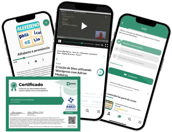
Carry knowledge in your pocket.
Download the Cursa app.
There are hundreds of free courses available, with a free certificate of completion that is saved in your mobile image gallery.
Download the app to access the Course Completion Certificate for Free.

+ 10 million
students
Free and Valid
Certificate
60 thousand free
exercises
4.8/5 rating in
app stores
Free courses in
video and ebooks