Responsive web design is an approach that makes websites adapt smoothly to different screen sizes, devices, and orientations.

6


Free CourseBuild a responsive website
4.6


(8)

7h14m

11 exercises
Free CourseTailwind CSS for Beginners
New
3h01m
5 exercises
Free CourseCSS Grid and Flexbox to responsive websites
New
5h44m
32 exercises
Free CourseCSS Front-End Web Developer
New
6h28m
13 exercises
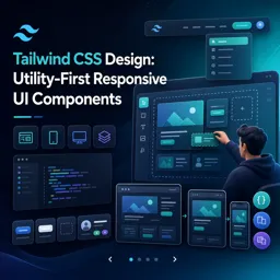
Free CourseTailwind CSS Design: Utility-First Responsive UI Components
New
3h04m
19 exercises
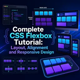
Free CourseComplete CSS Flexbox Tutorial: Layout, Alignment and Responsive Design
New
1h12m
10 exercises
Learn how to create flexible, accessible, and visually appealing websites with our collection of free Responsive Web Design courses. These online courses help students, beginners, developers, and digital professionals build practical front-end development skills without tuition costs. Study at your own pace, complete educational exercises, and earn free certification after successfully finishing your chosen course.
Responsive Web Design is an essential discipline for creating websites that adapt correctly to smartphones, tablets, laptops, and desktop screens. Through structured lessons, you can study fundamental concepts such as flexible layouts, mobile-first development, CSS media queries, responsive images, breakpoints, fluid typography, navigation menus, and modern page organization.
The free courses combine theoretical instruction with exercises that reinforce each topic and encourage practical learning. Depending on the selected course, you may also explore HTML, CSS, Flexbox, CSS Grid, semantic markup, user interface design, accessibility, browser compatibility, and website performance. These educational resources can help you develop portfolio projects or strengthen your preparation for front-end development opportunities.
Every course listed on this page is free and designed to support independent online education. Learners can review lessons according to their schedules, use included exercises to evaluate their understanding, and receive a free certificate upon course completion. Certification can demonstrate continuing education and may be added to a résumé, professional profile, or learning portfolio.
To access and study these Responsive Web Design courses, you must install the Cursa application. Android users can obtain the educational app through Google Play by selecting Download for Android. Apple users can install it from the App Store by selecting Download for iOS / iPhone.
Start learning today with free online Responsive Web Design training. Compare the available courses, choose the curriculum that matches your educational goals, complete the exercises, and develop the technical knowledge required to design responsive websites for modern devices.
What is responsive web design?
Responsive web design is an approach that makes websites adapt smoothly to different screen sizes, devices, and orientations.
What will I learn in a responsive web design course?
You can learn responsive layouts, media queries, mobile-first design, CSS Grid, Flexbox, and fluid sizing techniques.
Do I need to know HTML and CSS before learning responsive web design?
Basic HTML and CSS knowledge is helpful, but beginner courses can teach the fundamentals while introducing responsive techniques.
How do CSS Grid and Flexbox help create responsive websites?
CSS Grid organizes two-dimensional page layouts, while Flexbox aligns items in one direction. Both help layouts adjust across screen sizes.
Is Tailwind CSS useful for responsive web design?
Yes. Tailwind CSS includes responsive utility classes that let you apply styles at breakpoints for mobile, tablet, and desktop layouts.
What is mobile-first responsive design?
Mobile-first design starts with styles for small screens and then adds enhancements for larger screens using responsive breakpoints.
Can I build responsive UI components with Tailwind CSS?
Yes. Tailwind CSS can be used to build responsive navigation bars, cards, forms, grids, buttons, and other reusable UI components.

Complete any course and issue your certificate via the app — at no cost.

Download the app! to have access to more than 4,000 Online Courses + Certificate, all free!
Download the app! 100% free courses.


Carry knowledge in your pocket.
Download the Cursa app.
There are hundreds of free courses available, with a free certificate of completion that is saved in your mobile image gallery.
Download the app to access the Course Completion Certificate for Free.


+ 10 million
students

Free and Valid
Certificate

60 thousand free
exercises

4.8/5 rating in
app stores

Free courses in
video and ebooks
















What are people saying about free online courses of Responsive Web Design
Msizi Mtshali
to long but interesting
CourseBuild a responsive website
Abdul Basit
known for high income
CourseBuild a responsive website