Duration of the online course: 3 hours and 33 minutes
New
Turn raw numbers into visuals people understand. This free online course helps you build practical Matplotlib skills in Python so you can present data clearly, support decisions, and communicate insights with confidence. Whether you are learning programming, moving into data analysis, or improving your reporting workflow, Matplotlib is a core tool that keeps showing up in real projects because it is flexible, widely used, and works well with common data formats.
You will start by creating and customizing your first plots, learning how to control titles, labels, legends, colors, and styling so your charts look intentional instead of default. From there, you will practice selecting the right visual for the question you are trying to answer: comparisons with bar charts, proportions with pie charts when appropriate, trends with line charts, distributions with histograms, and relationships with scatter plots. You will also work with data coming from CSV files, reinforcing the everyday task of moving from a dataset to a meaningful graphic.
As you progress, you will strengthen the kind of understanding that makes your charts more than just pictures. You will learn to interpret distributions and communicate them well, choose binning strategies for histograms, and highlight changes over time using area fills and stack plots. The course also covers plotting time series data with readable date labels, a key skill for analytics dashboards and reports.
To bring everything together, you will explore real-time plotting concepts and how live charts can help you monitor changing values during experiments or ongoing processes. Finally, you will learn to compose multiple charts in a single figure using subplots, making it easier to tell a complete story and compare views side by side. With short lessons and practice questions throughout, you will build a solid foundation to create polished Python visualizations for coursework, portfolios, and professional use.
3 hours and 33 minutes of online video course
Digital certificate of course completion (Free)
Exercises to train your knowledge
100% free, from content to certificate
Ready to get started?Download the app and get started today.
Install the app now
to access the courseOver 5,000 free courses
Programming, English, Digital Marketing and much more! Learn whatever you want, for free.
Study plan with AI
Our app's Artificial Intelligence can create a study schedule for the course you choose.
From zero to professional success
Improve your resume with our free Certificate and then use our Artificial Intelligence to find your dream job.
You can also use the QR Code or the links below.


Free CourseJava Programming
5

(4)

9h15m

48 exercises

Free CourseRuby on Rails
5
(7)
9h39m
34 exercises

Free CourseCreate Desktop App
5
(3)
5h33m
30 exercises
Free CoursePython GUIs With TKinter
4.86
(7)
49h59m
56 exercises

Free CourseJava
4.84
(56)
22h17m
28 exercises

Free CourseC++ as your first Programming Language
4.79
(105)
5h12m
23 exercises

Free CourseC# Sharp for beginner
4.78
(37)
3h55m
15 exercises

Free CourseJava for beginners
4.77
(181)
26h50m
49 exercises

Free CourseComputer science and Java
4.75
(65)
9h15m
31 exercises

Free CourseMachine Learning
4.74

(119)
25h09m
20 exercises
Thousands of online courses in video, ebooks and audiobooks.
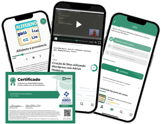
To test your knowledge during online courses
Generated directly from your cell phone's photo gallery and sent to your email
Download our app via QR Code or the links below::.
Carry knowledge in your pocket.
Download the Cursa app.
There are hundreds of free courses available, with a free certificate of completion that is saved in your mobile image gallery.
Download the app to access the Course Completion Certificate for Free.

+ 10 million
students
Free and Valid
Certificate
60 thousand free
exercises
4.8/5 rating in
app stores
Free courses in
video and ebooks