
Exercises
Put your typography skills to the test with this graphic design quiz. Explore essential type terms that every designer should know, including kerning, leading, tracking, ligatures, serif and sans serif typefaces, and text alignment. Whether you are a design student, beginner, or creative professional refreshing your fundamentals, these questions will help you assess your understanding of how type is spaced, styled, and arranged for clear, effective visual communication.
Answer the questions below and check the explanation for each answer.
0/7 answered
Auto audio on: the next questions will be read aloud when you click Continue.
Kerning is the process of adjusting the spacing between characters in a proportional font to achieve a visually pleasing result. It involves modifying the space between individual characters to improve readability or the overall look of the text. This differs from simply adjusting the font size or line spacing. A well-kerned text has no awkward gaps and appears evenly spaced.
In typography, a serif refers to the stroke in letters that have a tail, ear, or crossline. It is the small projecting feature at the end of a stroke of a letter. Serif fonts typically include these embellishments, whereas 'sans-serif' fonts do not have these features.
Leading in typography refers to the distance between the baselines of consecutive lines of text. It's an important part of text formatting as it affects readability and visual appearance. Unlike kerning or tracking, which affect horizontal spacing, leading deals with vertical spacing.
A typeface without serifs is referred to as sans-serif. The term "sans-serif" literally means "without serif," where sans is French for without. They are known for their clean, modern look compared to serif fonts which have small projecting features at the ends of strokes.
Right-align is a type of alignment in typography. It refers to text that is aligned along the right side, creating a straight edge on the right side of the text block, often used in design layouts. Force-justify and Kerning-align are not standard terms in typography for alignment.
Tracking in typography refers to the adjustment of the overall spacing between words or characters in a block of text. This adjustment is applied consistently to all letters, ensuring uniformity.
A ligature in typography is a special character created by joining two or more characters together. It is used to improve the appearance and readability of certain character combinations by merging them into a single glyph. Common examples include 'fi' and 'fl'.
Free CoursePro Logo Design
4.9

(9)

10h16m

45 exercises
Free CourseBeginners guide to Graphic Design
4.8
(289)
6h26m
22 exercises
Free CourseGame artist using Krita
4.8
(9)
8h54m
31 exercises
Free CourseGraphic design for Beginners
4.8
(13)
11h12m
Free CourseCanva Video Editor
4.7

(15)
21m
5 exercises
Free CourseAdobe illustrator
4.7
(54)
5h32m
20 exercises
Free CourseCorelDRAW for Beginners: Complete Graphic Design and Vector Tools Training
4.7
(3)
8h03m
46 exercises
Free CourseAnimation
4.6
(8)
31m
5 exercises
Thousands of online courses in video, ebooks and audiobooks.
To test your knowledge during online courses
Generated directly from your cell phone's photo gallery and sent to your email

Download our app via QR Code or the links below:.


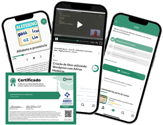
Carry knowledge in your pocket.
Download the Cursa app.
There are hundreds of free courses available, with a free certificate of completion that is saved in your mobile image gallery.
Download the app to access the Course Completion Certificate for Free.


+ 10 million
students

Free and Valid
Certificate

60 thousand free
exercises

4.8/5 rating in
app stores

Free courses in
video and ebooks