
Exercises
Put your logo design skills to the test with this Logo Design Mastery Quiz. Explore the essential principles behind effective brand marks, including purpose, simplicity, color psychology, typography, scalability, monochrome design, negative space, and wordmarks. You will also review the typical stages of the logo design process and identify the qualities that make logos memorable and versatile. Whether you are a beginner designer, marketing student, business owner, or branding enthusiast, this quiz is a practical way to assess your understanding of strong, recognizable logo design.
Answer the questions below and check the explanation for each answer.
0/10 answered
Auto audio on: the next questions will be read aloud when you click Continue.
A logo serves as a visual representation of a brand.It is designed to make the brand recognizable and memorable.It is not intended to provide detailed product information or replace a mission statement.
Simplicity in logo design ensures that the logo is easily recognizable and memorable.Complex designs can hinder legibility and recall.Simplicity doesn't mean lack of creativity; it is about effective communication through minimal design.
Color in logo design is crucial as it conveys brand personality and triggers emotions.It plays a strategic role in branding, influencing perceptions and reactions.Colors are not chosen at random but are selected to align with the brand's message and audience.
Choosing a font for a logo should be aligned with the brand's voice and message.The right font communicates the brand's tone, whether it's professional, playful, or contemporary.Popularity or the designer's identity is secondary to brand alignment and readability.
Scalability ensures a logo maintains its quality and legibility at all sizes and formats.A well-designed logo is versatile and can be used in various applications, from business cards to billboards without losing clarity.This makes scalability highly important.
A monochrome logo enhances focus on the design's form and composition without color distractions.It is often used to ensure the design is effective in its purest form before adding colors.While it may affect costs, the main reason is usually design clarity and consistency.
Successful logos are often simple and memorable, allowing easy recognition and recall.While trends can influence design, timeless logos rely on their simplicity to remain effective across different trends and contexts.
Negative space in logo design can create hidden images or dual meanings within the logo.This adds an element of surprise and depth, making the logo more engaging.Effective use of negative space showcases creativity and clever design thinking.
Wordmark logos are typographic logos that prominently feature the brand name.They rely on unique typography and styling to make the brand name both recognizable and memorable, with no additional symbols or images.
Publishing logo critiques in design magazines is not a standard step in the logo design process.Key steps include research, sketching, digital design, and refinement to ensure the logo accurately represents the brand.
Free CoursePro Logo Design
4.9

(9)

10h16m

45 exercises
Free CourseBeginners guide to Graphic Design
4.8
(289)
6h26m
22 exercises
Free CourseGame artist using Krita
4.8
(9)
8h54m
31 exercises
Free CourseGraphic design for Beginners
4.8
(13)
11h12m
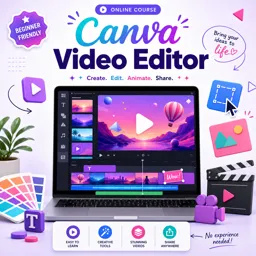
Free CourseCanva Video Editor
4.7

(15)
21m
5 exercises
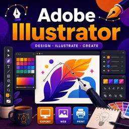
Free CourseAdobe illustrator
4.7
(54)
5h32m
20 exercises

Free CourseCorelDRAW for Beginners: Complete Graphic Design and Vector Tools Training
4.7
(3)
8h03m
46 exercises

Free CourseAnimation
4.6
(8)
31m
5 exercises
Thousands of online courses in video, ebooks and audiobooks.
To test your knowledge during online courses
Generated directly from your cell phone's photo gallery and sent to your email

Download our app via QR Code or the links below:.


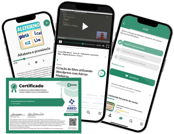
Carry knowledge in your pocket.
Download the Cursa app.
There are hundreds of free courses available, with a free certificate of completion that is saved in your mobile image gallery.
Download the app to access the Course Completion Certificate for Free.


+ 10 million
students

Free and Valid
Certificate

60 thousand free
exercises

4.8/5 rating in
app stores

Free courses in
video and ebooks