
Exercises
Put your graphic design layout skills to the test. This quiz explores essential layout design principles, including grids, white space, balance, alignment, contrast, visual hierarchy, proximity, consistency, margins, padding, and typography. Discover how designers organize elements, direct a viewer’s attention, emphasize key content, and create clear, effective compositions for print, digital, and advertising projects. Ideal for aspiring graphic designers, students, and creative professionals who want to strengthen their understanding of visual communication and page layout.
Answer the questions below and check the explanation for each answer.
0/14 answered
Auto audio on: the next questions will be read aloud when you click Continue.
The primary purpose of a grid is to ensure consistency and alignment throughout a layout, helping to organize content efficiently.
White space, also known as negative space, refers to the empty space surrounding objects in a layout, providing visual breathing room.
Alignment tools help achieve balance in a layout by ensuring elements are placed evenly and aesthetically pleasing within a design.
Visual hierarchy uses varying size, color, and positioning to guide the viewer's eye through a design, highlighting the most important elements first.
Poor alignment can lead to a disorganized and unprofessional appearance, making layouts look cluttered and difficult to read.
Contrast in design differentiates elements clearly, making them stand out and facilitating a better understanding of the design's structure.
Bold typography is a common technique to emphasize an element, drawing attention to important text or information within a layout.
Margins provide space between the edges of a layout and the main content, preventing elements from appearing cramped against the borders.
The principle of hierarchy relates to positioning elements based on their importance, ensuring key information is noticed first.
When choosing typefaces, consider readability and style coherence to ensure the text is legible and fits well with the overall design.
Proximity in design means grouping related elements together, helping users quickly identify connected information.
Consistency ensures a uniform look and feel, which helps enhance the user's experience and reinforces brand identity across various media.
Padding refers to the internal space between the edge of a box and its contents, ensuring elements are well-spaced within a boundary.
The goal of layout design in advertising is to attract and hold the viewer's attention, ensuring that the message is communicated effectively.
Free CoursePro Logo Design
4.9

(9)

10h16m

45 exercises
Free CourseBeginners guide to Graphic Design
4.8
(289)
6h26m
22 exercises

Free CourseGame artist using Krita
4.8
(9)
8h54m
31 exercises
Free CourseGraphic design for Beginners
4.8
(13)
11h12m
Free CourseCanva Video Editor
4.7

(15)
21m
5 exercises
Free CourseAdobe illustrator
4.7
(54)
5h32m
20 exercises
Free CourseCorelDRAW for Beginners: Complete Graphic Design and Vector Tools Training
4.7
(3)
8h03m
46 exercises
Free CourseAnimation
4.6
(8)
31m
5 exercises
Thousands of online courses in video, ebooks and audiobooks.
To test your knowledge during online courses
Generated directly from your cell phone's photo gallery and sent to your email

Download our app via QR Code or the links below:.


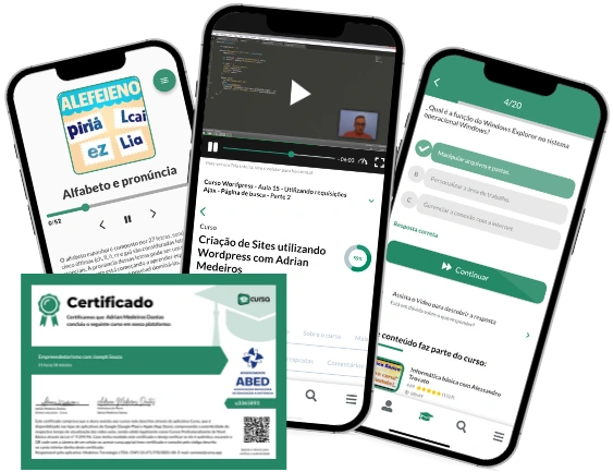
Carry knowledge in your pocket.
Download the Cursa app.
There are hundreds of free courses available, with a free certificate of completion that is saved in your mobile image gallery.
Download the app to access the Course Completion Certificate for Free.


+ 10 million
students

Free and Valid
Certificate

60 thousand free
exercises

4.8/5 rating in
app stores

Free courses in
video and ebooks