Introduction
The world of data science is vast, but at its core lies the discipline of statistics. Understanding fundamental statistical tools is crucial for anyone aspiring to make sense of complex datasets and extract meaningful insights. This article explores essential statistical tools that every budding data scientist should have in their toolkit.
Why Are Statistical Tools Important for Data Science?
Statistical tools enable data scientists to describe, summarize, and make inferences from data. They help in identifying patterns, testing hypotheses, and making predictions based on data-driven evidence. Familiarity with these tools empowers professionals to make more informed decisions and create robust data-driven solutions.
Descriptive Statistics
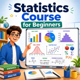
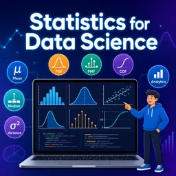
Descriptive statistics are used to summarize the main characteristics of a dataset. Key measures include:
- Mean: The average value, indicating central tendency.
- Median: The middle value, offering a measure less sensitive to outliers.
- Mode: The most frequently occurring value.
- Standard Deviation & Variance: Indicate the spread or dispersion of data points.
These measures help you quickly grasp the overall structure of your data.
Probability Distributions
Understanding probability distributions is vital for modeling natural phenomena. Some commonly used distributions in data science are:
- Normal Distribution: Often used in natural and social sciences for data that tend to cluster around a mean.
- Binomial Distribution: Useful for binary outcomes (success/failure experiments).
- Poisson Distribution: Applied to count data or the number of events occurring in a fixed interval.
Recognizing the type of distribution helps guide appropriate analytical techniques and inferences.
Hypothesis Testing
Hypothesis testing provides a framework to make decisions or inferences about population parameters based on sample data. The process typically involves:
- Setting up a null hypothesis and an alternative hypothesis.
- Choosing a significance level (commonly 0.05).
- Calculating a p-value to determine the strength of evidence against the null hypothesis.
Examples include t-tests, chi-squared tests, and ANOVA, which are fundamental for validating assumptions and claims about data.
Correlation and Regression Analysis
Detecting relationships among variables is a critical aspect of data science. Correlation coefficients measure the strength and direction of linear relationships. Regression analysis, such as linear regression, is used to model the relationship between a dependent variable and one or more independent variables.
- Correlation: Quantifies association (e.g., Pearson correlation coefficient).
- Regression: Predicts values and uncovers relationships (e.g., simple and multiple linear regression).
Data Visualization
Visual representation of statistical findings helps communicate insights clearly. Popular visualization techniques include:
- Histograms
- Box plots
- Scatter plots
- Bar charts
These tools transform raw data into understandable graphics, making patterns and outliers more apparent.
Conclusion
Mastering these statistical tools lays a strong foundation for any data scientist. As you advance, you can explore more sophisticated techniques, but a solid grasp of these basics is essential for solving real-world data problems. Build these skills, and you’ll be well-equipped to turn data into actionable knowledge.