


Introduction to Strapi
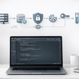
Strapi is a popular open-source headless Content Management System (CMS) designed for flexible and scalable backend development. Unlike traditional CMS platforms, Strapi acts solely as the backend, offering a user-friendly interface for managing content while delivering data to frontend applications via RESTful or GraphQL APIs.
Why Choose a Headless CMS?
Headless CMSs like Strapi separate the backend (where content is managed) from the frontend (where content is displayed). This architecture provides several benefits:
- Developer freedom for choosing frontend frameworks and technologies.
- Improved scalability and performance.
- Centralized content management for multiple platforms (web, mobile, etc.).
- Simplified integration with other tools and APIs.
Key Features of Strapi
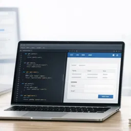
- Custom Content Types: Easily create, edit, and manage different content types with a visual builder.
- API Generation: Automatically generates RESTful and GraphQL APIs for every content type.
- User Roles & Permissions: Fine-grained access control for different user groups.
- Extensibility: Support for plugins and custom plugins to fit project needs.
- Self-Hosted: Full control over your data and infrastructure, with deployment flexibility.
Typical Use Cases
- Blogs and content-driven websites
- Mobile app backends
- E-commerce product management
- Multi-channel content platforms
- APIs for IoT applications
Strapi in the Backend Development Workflow
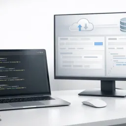
Strapi is built with modern JavaScript technology and can be integrated seamlessly with popular frontend libraries and frameworks. Developers can set up content structures quickly and generate APIs without extensive coding, accelerating both prototyping and production deployments.
Because it is open-source, Strapi also has an active community and a wide ecosystem of plugins, making it a great choice for developers looking for flexibility and control.
Conclusion
Strapi stands out as a powerful tool for backend development, particularly when building flexible, modern web and mobile applications. Its headless architecture, ease of use, and extensibility make it an excellent choice for projects that require robust content management without sacrificing development speed or scalability.


