Think about the last time you opened a website on your phone and everything fit perfectly—text was readable, buttons were easy to tap, and images resized to your screen. That smooth experience is the result of responsive web design. In this beginner’s guide, you’ll learn what it is, why it matters, and the core techniques used to build sites that look great on any device.
What is responsive web design?
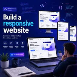
Responsive web design is an approach to building websites that automatically adapt their layout to the size of the screen displaying them. Instead of creating separate versions for desktop and mobile, you build a single site that reflows and resizes its content to fit phones, tablets, laptops, and large monitors alike.
The term was popularized by web designer Ethan Marcotte, who described combining flexible layouts, flexible images, and media queries into one cohesive method. Today it is considered a standard practice rather than an optional extra.
Why responsive design matters
A responsive site brings clear benefits for both users and site owners:
- Better user experience: visitors can read and navigate comfortably on any device.
- Wider reach: mobile traffic makes up a large share of web usage, so a mobile-friendly site serves more people.
- Easier maintenance: one codebase is simpler to update than multiple separate versions.
- Search visibility: search engines favor mobile-friendly pages in their rankings.
The core building blocks
Responsive design rests on three main techniques that work together:
- Fluid grids: layouts are sized in relative units like percentages instead of fixed pixels, so columns shrink and grow with the screen.
- Flexible images: images are set to scale within their containers, preventing them from overflowing on small screens.
- Media queries: a CSS feature that applies different styles depending on screen characteristics such as width, allowing the layout to change at specific points.
Understanding breakpoints
A breakpoint is the screen width at which your layout changes—for example, switching from a three-column layout to a single column. While exact values vary by project, designers often plan around common device ranges:
| Device type | Approximate width | Typical layout |
|---|---|---|
| Phones | up to 600px | Single column |
| Tablets | 600px – 900px | Two columns |
| Laptops | 900px – 1200px | Multi-column |
| Large screens | 1200px and up | Wide, spacious layout |
Rather than memorizing fixed numbers, choose breakpoints based on where your own content starts to look cramped or awkward.
The mobile-first approach
Many developers now design for the smallest screen first and then add complexity for larger ones. This “mobile-first” mindset encourages you to prioritize essential content and keep interfaces simple. Starting small and scaling up often leads to cleaner, faster websites than trimming a large desktop design down to fit a phone.
Tips for getting started
- Use relative units like percentages,
em, orreminstead of fixed pixels for layout. - Add the viewport meta tag so mobile browsers render pages at the correct scale.
- Test your site on real devices and using your browser’s built-in responsive tools.
- Consider a CSS framework with a responsive grid to speed up your first projects.
- Keep navigation simple and touch-friendly on small screens.
Start building responsively
Responsive web design is no longer a nice-to-have—it’s how modern websites are built. By mastering fluid grids, flexible images, and media queries, you can create pages that work beautifully for every visitor, no matter what device they use.
If you’d like to practice these skills step by step, explore the free Web Development courses available on Cursa, which cover HTML, CSS, and responsive layouts from the ground up.