Exercises
This quiz assesses practical knowledge of data journalism, from evaluating datasets and cleaning records to choosing statistics and producing honest visualizations. Questions address machine-readable formats, missing values, table joins, normalization, sampling bias, reproducibility, anonymization, percentage points, confidence intervals, and misleading charts. Several visual scenarios challenge you to recognize problems that could weaken or distort a data-driven story.
Answer the questions below and check the explanation for each answer.
0/16 answered
Auto audio on: the next questions will be read aloud when you click Continue.
Understanding provenance and methodology is essential. The source, collection process, definitions, and limitations determine whether the data can support reliable reporting.
A CSV is machine-readable and can be imported directly into spreadsheets, databases, and analysis tools. Scans and screenshots usually require extraction first.
Missing data can mean unknown, unavailable, withheld, or not applicable. Replacing every blank with zero introduces a claim that the measured quantity was actually absent.
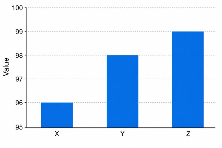
A truncated baseline can make small differences appear enormous. Bar length encodes magnitude, so bar charts should generally use a zero baseline unless a different choice is clearly justified and disclosed.
A join requires a common key, such as a standardized municipality code. Names alone can create mismatches because of spelling, abbreviation, or boundary differences.
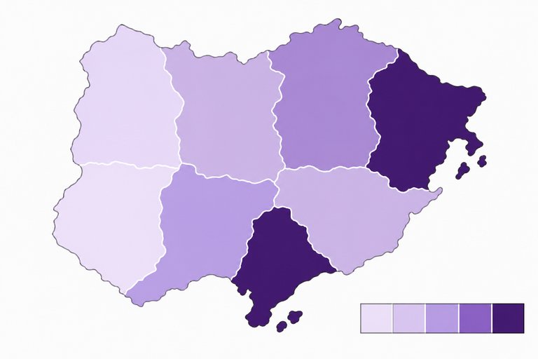
Large populations often produce larger totals even when individual risk is lower. A rate such as crashes per 100,000 residents enables a fairer comparison among regions.
The median is the middle ordered value and is resistant to extreme observations. The mean can be pulled sharply upward or downward by outliers.
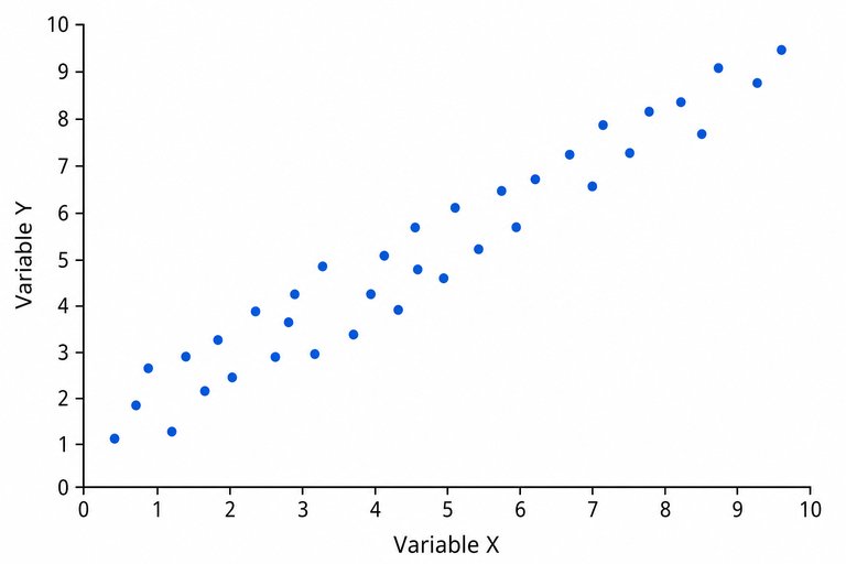
The upward pattern indicates a positive association. A scatterplot alone cannot establish causation because confounding variables, selection effects, or reverse causality may explain the relationship.
Voluntary participants may differ systematically from nonparticipants. This self-selection bias means the poll should not be presented as representative without an appropriate sampling design.
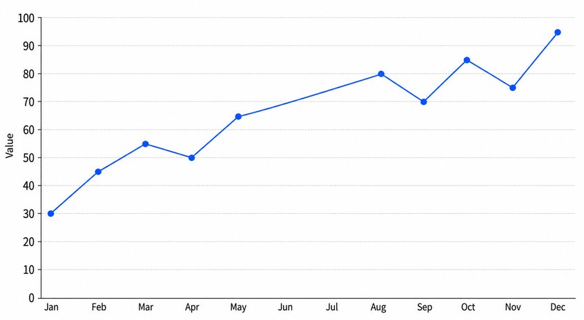
Connecting points across a data gap can imply continuous measurement or gradual change that was never observed. The gap should be shown explicitly and explained.
Preserving raw files and recording each transformation creates an audit trail. Scripts and documentation allow calculations to be checked, repeated, corrected, and updated.
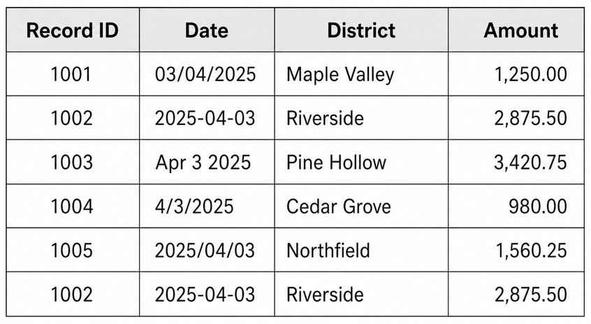
Formatting inconsistencies should be standardized, while possible duplicates should be investigated rather than blindly kept or deleted. Documented rules make the cleaning process reviewable.
The percentage-point change is 50 minus 40, or 10 points. The relative increase is 25%, but that is a different calculation and should not be confused with percentage points.
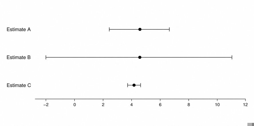
Estimate B has the widest interval. A wider confidence interval indicates less precision and therefore greater uncertainty around the point estimate.
Attributes such as age, postal code, job, and event date can form a unique combination. Journalists must assess re-identification risk rather than assuming that removing direct names is sufficient.
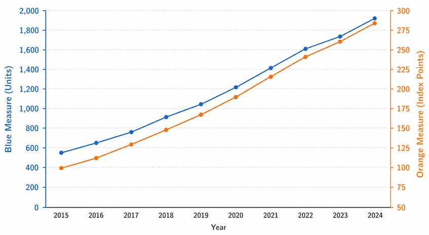
Dual axes can be scaled so two lines appear to rise and fall together, exaggerating an apparent relationship. Reporters should justify the scales and consider separate charts or normalized measures.
Thousands of online courses in video, ebooks and audiobooks.
To test your knowledge during online courses
Generated directly from your cell phone's photo gallery and sent to your email

Download our app via QR Code or the links below:.


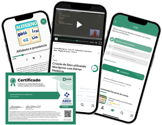
Carry knowledge in your pocket.
Download the Cursa app.
There are hundreds of free courses available, with a free certificate of completion that is saved in your mobile image gallery.
Download the app to access the Course Completion Certificate for Free.


+ 10 million
students

Free and Valid
Certificate

60 thousand free
exercises

4.8/5 rating in
app stores

Free courses in
video and ebooks