
Exercises
Assess your practical understanding of CSS Grid Layout through 17 questions covering grid containers, rows and columns, fractional units, gaps, responsive track sizing, explicit and implicit grids, item placement, alignment, named areas, dense packing, overlapping items, subgrid, and accessibility. The quiz combines foundational concepts with intermediate and advanced scenarios useful for building modern web interfaces.
Answer the questions below and check the explanation for each answer.
0/17 answered
Auto audio on: the next questions will be read aloud when you click Continue.
display: grid; creates a block-level grid container. Its direct children become grid items that can be placed into rows and columns.
repeat(3, 1fr) defines three tracks, each receiving one equal fraction of the available space.
The gap property sets spacing between adjacent grid tracks without adding space around the outside of the grid.
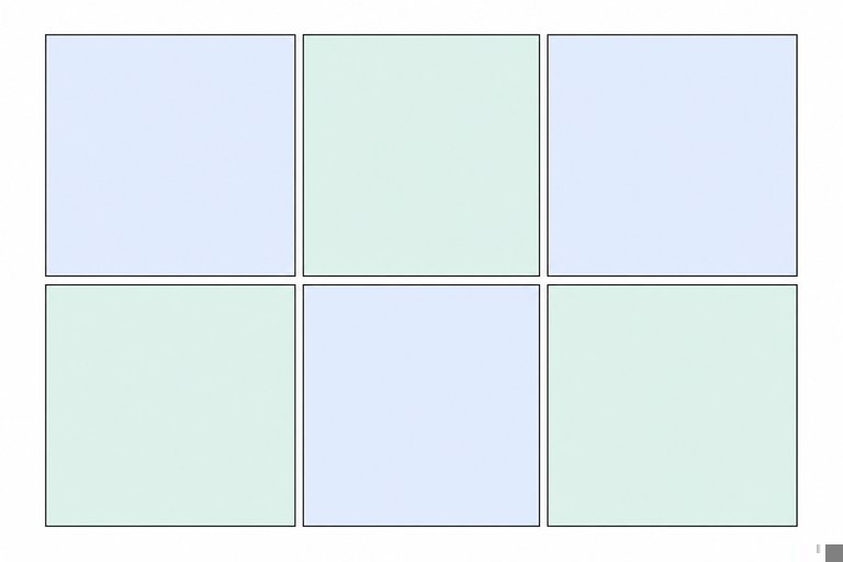
Vertical grid tracks are columns. Horizontal tracks are rows, while gaps are the spaces separating tracks.
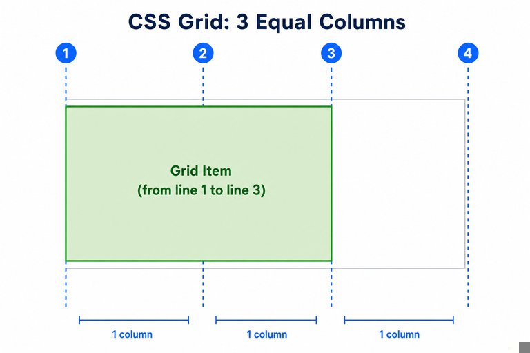
The item begins at grid line 1 and ends at grid line 3, covering the tracks between lines 1–2 and 2–3. It therefore spans two columns.
The flexible tracks contain three fractional shares in total. The 1fr track receives one share, while the 2fr track receives two shares.
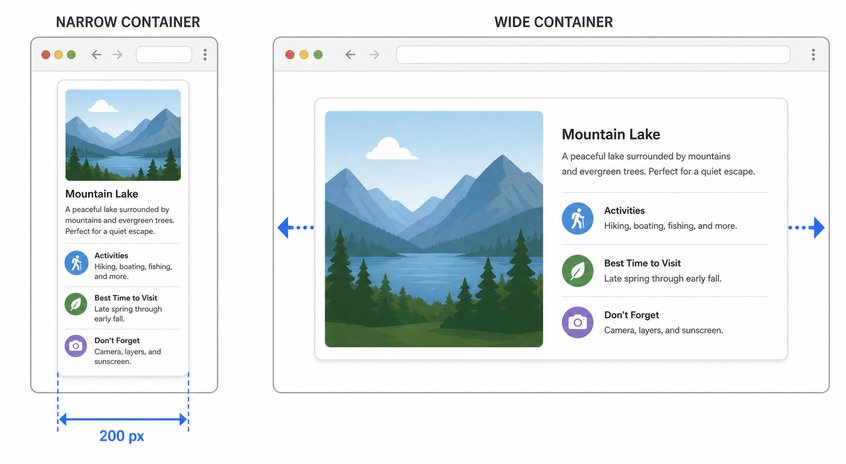
minmax(200px, 1fr) gives the track a 200px minimum and a flexible maximum that can share remaining space.
auto-fit collapses unoccupied repeated tracks, allowing occupied tracks to expand. auto-fill can preserve space for empty tracks.
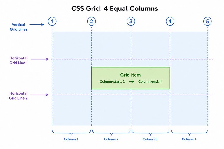
grid-column: 2 / 4; places the item's column start at vertical line 2 and its column end at vertical line 4.
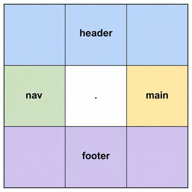
A period marks an empty cell that is not assigned to a named grid area. Multiple periods may be used for visual spacing in the template string.
align-items sets the default block-axis alignment of grid items inside their individual grid areas. align-content instead distributes the grid tracks within the container.
justify-items controls item alignment within grid areas along the inline axis, which is horizontal in the default left-to-right writing mode.
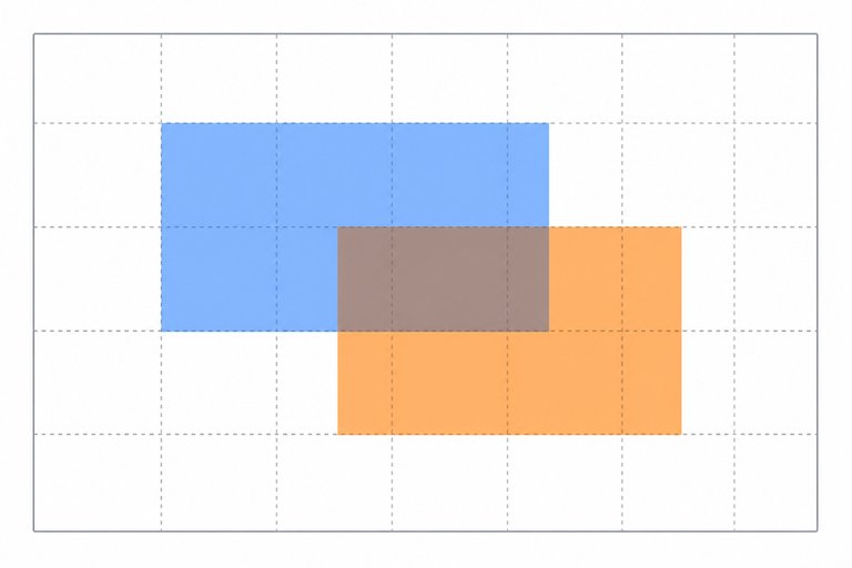
The z-index property controls the stacking order of overlapping grid items. An item with a higher stacking level is painted above one with a lower level.
Placement beyond the explicit grid can generate tracks in the implicit grid. Their sizing can be controlled with grid-auto-columns or grid-auto-rows.
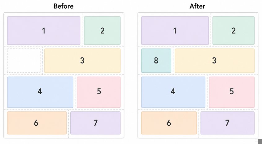
The dense packing mode lets the auto-placement algorithm search earlier gaps for later items that fit. This can make visual order differ from source order.
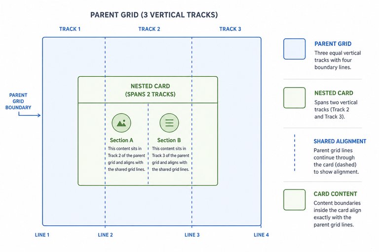
Subgrid lets a nested grid use the sizing and alignment of its parent's tracks on the selected axis, helping nested content align consistently.
Grid placement changes visual arrangement but generally does not change document order. Screen readers and keyboard focus may follow the HTML source, causing a confusing experience if the orders differ greatly.

Free CourseLaravel
5

(2)

4h04m

20 exercises
Free CourseProgressive Web Application PWA for Beginners
5
(5)
3h24m
15 exercises
Free CourseLearn Laravel in 30 Days: Beginner to Pro
5
(1)
17h00m
30 exercises
Free CoursePHP for Beginners: Learn PHP, MySQL, MVC, Routing, Authentication and Testing
5
(1)
10h45m
49 exercises

Free CourseLaravel Full Course: Build, CRUD, Auth, Email and Deploy to Live Server
5
(1)
3h52m
15 exercises
Free CourseWeb Development Foundations: HTML, CSS, Git and Command Line
5
(3)
14h11m
37 exercises
Free CourseCSS Complete Tutorial
5
(1)
8h30m
49 exercises
Free CoursePHP for Beginners: Learn PHP, MySQL and Login Systems
5
(3)
10h49m
29 exercises
Thousands of online courses in video, ebooks and audiobooks.
To test your knowledge during online courses
Generated directly from your cell phone's photo gallery and sent to your email

Download our app via QR Code or the links below:.


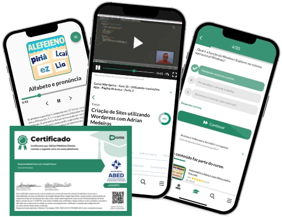
Carry knowledge in your pocket.
Download the Cursa app.
There are hundreds of free courses available, with a free certificate of completion that is saved in your mobile image gallery.
Download the app to access the Course Completion Certificate for Free.


+ 10 million
students

Free and Valid
Certificate

60 thousand free
exercises

4.8/5 rating in
app stores

Free courses in
video and ebooks