
Exercises
Put your CSS Flexbox knowledge to the test. This quiz covers essential flexbox concepts used to build responsive, well-aligned web layouts, including flex-direction, flex-wrap, justify-content, align-items, order, and flex-grow. Explore how flex items behave along the main and cross axes, learn the default direction of a flex container, and check your understanding of centering, spacing, and stretching elements. Ideal for web development students, beginner front-end developers, and anyone reviewing modern CSS layout techniques.
Answer the questions below and check the explanation for each answer.
0/10 answered
Auto audio on: the next questions will be read aloud when you click Continue.
The term flex in CSS Flexbox refers to Flexible Box. It indicates a layout model that provides a more efficient way to align and distribute space among items in a container, even when their size is unknown or dynamic. The key benefit of Flexbox is its ability to adjust the size of items based on the container's space, which allows for responsive designs.
The flex-direction property is used to define the direction in which the flex items are placed in the flex container. The possible values are row, row-reverse, column, and column-reverse. This determines the main axis of the container, along which the flex items will be aligned.
Flex items are aligned along the main axis using the justify-content property. It is responsible for distributing the space between and around the flex items within the flex container.
In contrast, the align-items property is used to align items along the cross axis, and flex-wrap controls whether items are forced into a single line or can wrap onto multiple lines.
The correct property to change the rendering order of a flex item is order. The order property in CSS is specifically used within a flex or grid container to dictate the order in which the items appear in the layout. It does not affect their order in the source document, just their display order.
To ensure all items in a flex container are placed on one line without wrapping to the next line, set the flex-wrap property to nowrap. This setting forces all flex items to be on a single line, regardless of the available space in the container.
The flex-grow property defines the ability for a flex item to grow if necessary. It specifies how much of the remaining space in the flex container should be assigned to the item. A value of 0 means the item will not grow, while a positive number will make it grow to use available space. The higher the number, the more space the item can take.
The default value of the flex-direction property is row. This means that, by default, the flex items are laid out in a row along the main axis.
To center flex items both vertically and horizontally within a flex container, you should use the CSS properties align-items: center; and justify-content: center;. These properties ensure that the items are centered along the main and cross axes of the flex container.
The property justify-content: space-evenly; distributes the space evenly between and around the flex items along the main axis. Each item gets an equal amount of space, ensuring an even distribution.
Setting align-items to stretch in a flex container makes the items stretch to fill the container's cross size, which is typically the height of the items if the flex-direction is row, or the width if the flex-direction is column.

Free CourseLaravel
5

(2)

4h04m

20 exercises
Free CourseProgressive Web Application PWA for Beginners
5
(5)
3h24m
15 exercises
Free CourseLearn Laravel in 30 Days: Beginner to Pro
5
(1)
17h00m
30 exercises

Free CoursePHP for Beginners: Learn PHP, MySQL, MVC, Routing, Authentication and Testing
5
(1)
10h45m
49 exercises

Free CourseLaravel Full Course: Build, CRUD, Auth, Email and Deploy to Live Server
5
(1)
3h52m
15 exercises
Free CourseWeb Development Foundations: HTML, CSS, Git and Command Line
5
(3)
14h11m
37 exercises
Free CourseCSS Complete Tutorial
5
(1)
8h30m
49 exercises

Free CoursePHP for Beginners: Learn PHP, MySQL and Login Systems
5
(3)
10h49m
29 exercises
Thousands of online courses in video, ebooks and audiobooks.
To test your knowledge during online courses
Generated directly from your cell phone's photo gallery and sent to your email

Download our app via QR Code or the links below:.


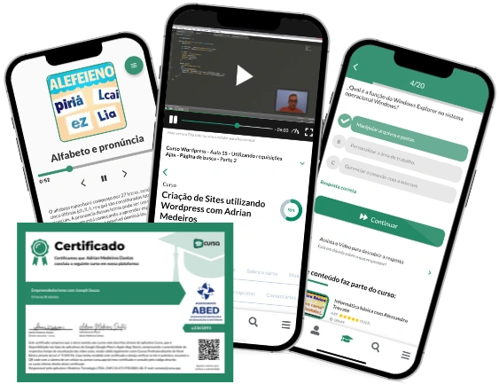
Carry knowledge in your pocket.
Download the Cursa app.
There are hundreds of free courses available, with a free certificate of completion that is saved in your mobile image gallery.
Download the app to access the Course Completion Certificate for Free.


+ 10 million
students

Free and Valid
Certificate

60 thousand free
exercises

4.8/5 rating in
app stores

Free courses in
video and ebooks