
Duration of the online course: 2 hours and 36 minutes
New
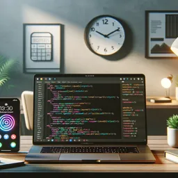
Flexbox is one of the most practical CSS layout systems for building interfaces that adapt cleanly to different screen sizes. In this free online course, you will learn how to think in axes, control spacing and alignment with confidence, and design responsive components without fighting floats, hacks, or overly complex positioning. Whether you are aiming for your first web development role or sharpening front-end skills for real projects, Flexbox is a foundation that makes everyday UI work quicker and more predictable.
You will start by understanding what happens when you turn an element into a flex container and how that decision immediately changes the behavior of its direct children. From there, you will develop intuition for direction, wrapping, and the difference between main-axis and cross-axis alignment. Instead of memorizing property names, the course helps you connect each setting to a visible result, so you can diagnose layout issues and fix them methodically.
As you progress, you will get comfortable reordering content for different breakpoints, creating navigation bars, centering elements vertically and horizontally, and solving common alignment challenges that show up in real designs. You will also learn how sizing works through the flex shorthand, including flex-grow, flex-shrink, and flex-basis, so your layouts remain stable even when content changes. Practical examples like pricing grids, equal-height columns, single-line forms, and app-like page structures reinforce how Flexbox is used in modern UI building.
Finally, the course addresses cross-browser workflow considerations with tooling that helps you ship reliable CSS. By the end, you will be able to translate a design into flexible, responsive layouts with cleaner markup and fewer workarounds, making your front-end code easier to maintain and scale.
2 hours and 36 minutes of online video course
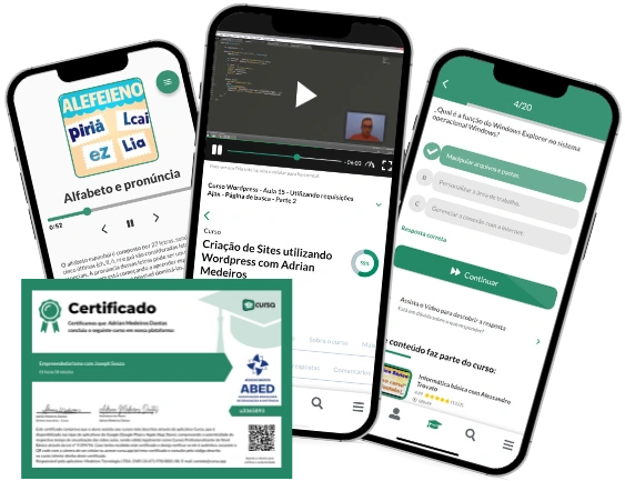
Digital certificate of course completion (Free)
Exercises to train your knowledge
100% free, from content to certificate
Ready to get started?Download the app and get started today.
Install the app now
to access the course
Over 5,000 free courses
Programming, English, Digital Marketing and much more! Learn whatever you want, for free.
Study plan with AI
Our app's Artificial Intelligence can create a study schedule for the course you choose.
From zero to professional success
Improve your resume with our free Certificate and then use our Artificial Intelligence to find your dream job.
You can also use the QR Code or the links below.


Free CourseLaravel
5

(1)

4h04m

20 exercises
Free CourseProgressive Web Application PWA for Beginners
5
(3)
3h24m
15 exercises

Free CoursePHP for Beginners: Learn PHP, MySQL, MVC, Routing, Authentication and Testing
5
(1)
10h45m
49 exercises

Free CourseJavaScript for beginners
4.88
(25)
1h40m
2 exercises

Free CourseUmbraco CMS
4.86
(22)
6h21m
19 exercises

Free CourseFull Stack Web Development
4.83
(18)
26h16m
48 exercises

Free CourseAngular 2 for Beginners
4.79
(29)
1h02m
9 exercises

Free CourseDesign and code a landing page
4.76
(34)
4h40m
15 exercises

Free CourseMySQL Database
4.75

(4)
3h53m
6 exercises

Free CourseJavascript
4.75
(106)
4h52m
46 exercises
Thousands of online courses in video, ebooks and audiobooks.
To test your knowledge during online courses
Generated directly from your cell phone's photo gallery and sent to your email
Download our app via QR Code or the links below::.
Carry knowledge in your pocket.
Download the Cursa app.
There are hundreds of free courses available, with a free certificate of completion that is saved in your mobile image gallery.
Download the app to access the Course Completion Certificate for Free.

+ 10 million
students
Free and Valid
Certificate
60 thousand free
exercises
4.8/5 rating in
app stores
Free courses in
video and ebooks