
What a Typography System Is (and What It Is Not)
A typography system is a set of repeatable, documented decisions that governs how text behaves across a brand’s products and communications. It includes typeface selection, but it goes further: it specifies roles (e.g., headline, body, caption), hierarchy rules, sizing behavior across breakpoints, spacing relationships, alignment and measure guidance, and rules for emphasis. The goal is consistency with enough flexibility to support many layouts without redesigning typography each time.
A typography system is not a single “style guide page” that lists a few font sizes. If you only define “H1 = 48px, H2 = 32px, Body = 16px,” you will quickly run into problems: different content densities, different devices, localization, accessibility requirements, and varied UI components. A system anticipates these realities by defining a hierarchy model and a method for scaling, not just a static list.
Core Components of a Typography System
1) Typeface Roles: Primary, Secondary, and Functional
Most modular brand systems use at least two typefaces (or two families within a superfamily) with clear responsibilities:
- Primary typeface: carries brand voice in headlines and key moments. Often used for marketing pages, hero areas, and major section headings.
- Secondary typeface: optimized for reading and dense information. Often used for body text, long-form content, and UI labels.
- Functional typeface (optional): used for code, data tables, or system UI where clarity is paramount (e.g., a monospaced font for code snippets or numeric alignment).
Document where each role is allowed. For example: “Primary is permitted for H1–H3 and pull quotes; secondary is required for body, captions, and UI; functional is required for code and tabular numerals.” This prevents “typeface drift,” where designers start using the primary font everywhere and readability suffers.
2) Hierarchy Levels: Roles, Not Just Sizes
Define hierarchy as semantic roles that can map to different sizes depending on context. A role-based approach makes the system scalable across products and channels. Typical roles include:
- Listen to the audio with the screen off.
- Earn a certificate upon completion.
- Over 5000 courses for you to explore!

Download the app
- Display (hero statements, campaign headlines)
- Heading levels (H1–H6 or equivalent)
- Subheading / lead
- Body (regular and small)
- Caption / helper text
- Overline / eyebrow (section label)
- Button / label
- Data / numeric (tabular, KPI)
Each role should specify: font family, weight, size behavior, line height, letter spacing, and default margins (or spacing guidance). Also specify where the role is used (marketing, editorial, UI, data visualization).
3) Typographic Metrics: Size, Line Height, Letter Spacing, Measure
Typography systems fail most often in the “in-between” details. The following metrics should be explicitly specified:
- Font size: defined as a base size and scaling rule (e.g., responsive clamp) rather than only fixed values.
- Line height: expressed as a unitless multiplier (e.g., 1.2, 1.4, 1.6) or as a paired value. Unitless is typically more robust across environments.
- Letter spacing (tracking): especially important for all-caps labels, small text, and large display sizes. Define when to tighten or loosen.
- Measure (line length): guidance like “45–75 characters per line for body text” and “avoid more than 90 characters.” Provide layout strategies to enforce measure (max-width, columns, or container constraints).
These metrics should be tuned per typeface. A geometric sans might need more line height in body; a serif might need slightly tighter tracking in headings. Avoid copying values from another brand system without testing.
Designing Hierarchy Specifications That Survive Real Content
Start with Content Scenarios, Not a Type Scale
Before choosing a scale, list the scenarios your typography must support. For example:
- Marketing hero with short headline and supporting line
- Product feature page with multiple sections and cards
- Blog article with headings, lists, quotes, and code
- Dashboard with dense tables, KPIs, and filters
- Transactional UI: forms, errors, helper text, confirmations
- Localization: longer German strings, CJK scripts, right-to-left layouts
For each scenario, identify the minimum set of text roles needed. This prevents overbuilding (too many styles) and underbuilding (missing a role like “helper text” that later gets improvised).
Define a Hierarchy Model: Levels and Relationships
A practical hierarchy model defines relationships: what should be most prominent, what should be scannable, and what should recede. A useful method is to define three bands:
- Attention band: Display, H1, H2 (used sparingly, high contrast, larger sizes)
- Structure band: H3–H5, overlines, section labels (scannability and navigation)
- Reading band: body, small body, captions (comfort and clarity)
Then specify how many levels are allowed per layout. Example rule: “A single screen should not use more than one Display style and two heading levels.” This reduces visual noise and makes templates easier to assemble.
Step-by-Step: Building a Practical Type Scale and Role Set
Step 1: Choose a Base Body Size and Reading Defaults
Pick a default body size based on your primary reading context. For web and product UI, 16px is common, but the right choice depends on typeface x-height, target audience, and density needs. Define:
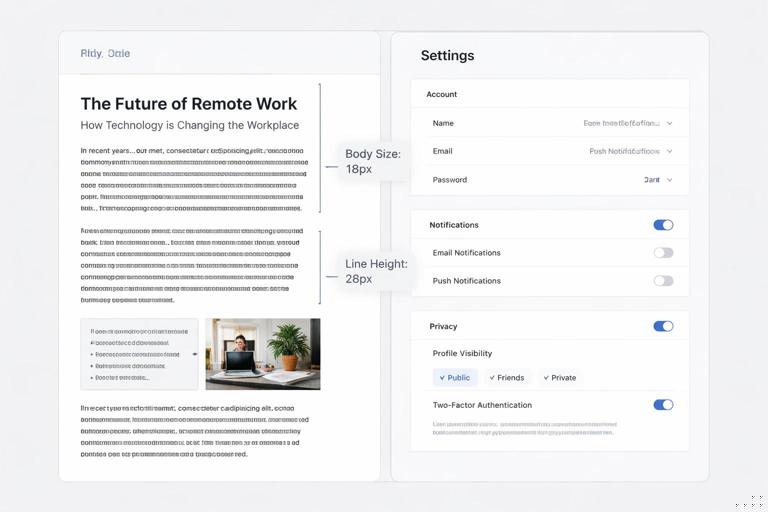
- Body size (e.g., 16px)
- Body line height (e.g., 1.5–1.7 for long-form; 1.4–1.6 for UI)
- Paragraph spacing strategy (e.g., space between paragraphs rather than indents)
Practical test: set a 600–1000 word article and a dense settings screen. If body feels cramped in the UI, consider a slightly smaller UI body role (e.g., 15px) while keeping editorial body at 16–18px.
Step 2: Define Small Text Roles with Accessibility in Mind
Small text is where systems break. Define at least one small role (e.g., “Body Small” or “Caption”) and specify constraints:
- Minimum size guidance (e.g., avoid below 12–13px for most Latin fonts in UI)
- Line height (often higher than you expect, e.g., 1.4–1.6)
- Letter spacing adjustments (small all-caps labels often need +2% to +6% tracking)
Also define when small text is allowed: captions under images, metadata, helper text; and when it is not allowed: critical instructions, legal consent checkboxes, or primary navigation.
Step 3: Build Heading Roles from Use Cases
Instead of generating a full mathematical scale first, define heading roles by what they need to do:
- H1: page title; must dominate but not overwhelm
- H2: section title; must be clearly distinct from body
- H3: subsection; often used in cards and modules
- H4/H5: optional; for dense documentation or complex UIs
Then choose sizes that create clear steps. A common failure is too-small differences between H2 and H3, making pages hard to scan. Another failure is too-large H1 that forces awkward line breaks on mobile. Solve this by specifying responsive behavior (see below) and by testing with long titles.
Step 4: Add “Special Purpose” Roles (Lead, Overline, Pull Quote, KPI)
Special roles reduce ad-hoc styling. Examples:
- Lead: a short intro paragraph under H1. Typically larger than body with slightly tighter line height.
- Overline/Eyebrow: a small label above headings to provide context. Often uppercase with increased letter spacing.
- Pull quote: editorial emphasis; may use primary typeface or italic; define margins and quotation styling.
- KPI/Data: large numerals with tabular or lining figures; define number formatting and alignment rules.
Each special role should have a clear “when to use” rule. For example: “Use Lead only once per page, directly under H1.”
Step 5: Specify Weights and Emphasis Rules
Define a limited set of weights (e.g., Regular, Medium, Bold) and map them to roles. Avoid letting every role choose any weight; that creates inconsistency. Also define emphasis rules:
- Bold: for emphasis within body, but limit to short phrases; avoid bolding entire paragraphs.
- Italic: for titles, subtle emphasis, or quotes; ensure the typeface has a true italic if you rely on it.
- Underline: reserved for links in body text (or specify an alternative link style with clear affordance).
Include rules for link styling in different contexts: in-body links, navigation links, and buttons should not all look identical unless you have a strong reason.
Responsive Typography: Hierarchy Across Breakpoints
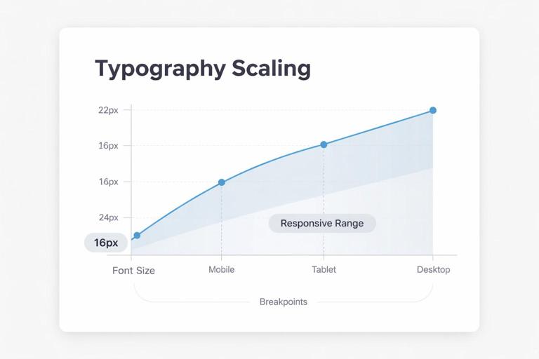
Use Responsive Ranges Instead of Fixed Sizes
Hierarchy must hold on small screens and large displays. A practical approach is to define each role with a minimum and maximum size and let it interpolate between them. In CSS, this is often done with clamp(). Example pattern:
/* Example: H1 scales between 28px and 44px depending on viewport width */
.h1 {
  font-size: clamp(1.75rem, 1.2rem + 2vw, 2.75rem);
  line-height: 1.1;
  letter-spacing: -0.02em;
}
Even if your system is not web-first, the principle applies: define how typography scales from small to large contexts. For native apps, specify sizes per platform category (compact, regular, expanded) rather than a single value.
Maintain Vertical Rhythm Without Over-Engineering
Vertical rhythm is the consistent spacing of text baselines and blocks. You do not need to force every line onto a strict baseline grid, but you should define predictable spacing rules:
- Headings have top margin larger than bottom margin (to “attach” to the content that follows).
- Paragraph spacing is consistent across components.
- Lists have consistent indentation and spacing between items.
Provide default spacing guidance per role. Example: “H2: margin-top 40, margin-bottom 16; H3: margin-top 32, margin-bottom 12; Body paragraphs: margin-bottom 16.” The exact numbers depend on your spacing system, but the relationships matter more than the absolute values.
Hierarchy Specifications for Common Components
Cards and Tiles
Cards often compress hierarchy. Define a card typography recipe:
- Card title: use H4 or a dedicated “Card Title” role
- Card metadata: caption role
- Card description: body small or body depending on density
Rule example: “Card titles must be maximum two lines; if longer, truncate or move to a detail view.” This is a typography rule because it preserves hierarchy and layout stability.
Navigation and UI Labels
Navigation needs clarity and consistency. Define:
- Primary nav label style (size, weight, letter spacing)
- Secondary nav style
- Active vs inactive states (weight changes, color changes, underline indicators)
Avoid using heading styles for navigation. Navigation is functional text; it should not compete with content headings.
Forms: Labels, Helper Text, Errors
Forms require a mini-hierarchy:
- Field label: typically medium weight, small-to-regular size
- Input text: body size for readability
- Helper text: caption or body small
- Error text: same size as helper but with stronger emphasis via color and/or icon; avoid relying on color alone
Specify spacing rules: label-to-input spacing, input-to-helper spacing, and how multi-line errors wrap. Also specify capitalization rules (sentence case is often more readable than all caps for labels).
Tables and Data Density
Data typography needs numeric alignment and scanning support:
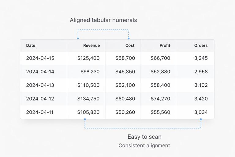
- Use tabular numerals where possible so columns align.
- Define header style distinct from cell text (weight and/or size).
- Define row height and line height to prevent cramped tables.
Example rule: “Table cell text uses Body Small at 14px/1.4; header uses 14px/1.2 Medium; numeric columns right-aligned; text columns left-aligned.”
Language, Localization, and Script Considerations
Plan for Text Expansion
Hierarchy specs should include guidance for longer strings. German, Finnish, and some Slavic languages can expand UI labels significantly. Practical rules:
- Prefer flexible containers over fixed widths for buttons and tabs.
- Set maximum line counts for headings and card titles; define truncation behavior.
- Avoid all-caps for long labels; it expands width and reduces legibility.
Non-Latin Scripts and Font Coverage
If your brand operates globally, specify fallback fonts and script-specific adjustments. A typeface that looks excellent in Latin may not have matching CJK or Arabic glyphs. Define:
- Approved font families per script (Latin, Cyrillic, Greek, Arabic, CJK)
- Whether weights map consistently (e.g., “Medium” may appear bolder in some scripts)
- Line height adjustments for scripts with taller glyphs
Also define punctuation and quotation mark conventions if you publish editorial content in multiple languages.
Practical Documentation: How to Write Hierarchy Specs People Actually Use
Create a Typography Matrix
A typography matrix is a table-like specification that lists each role and its properties. Even if you store values in a design system tool, include a human-readable matrix in documentation. For each role, include:
- Name (role-based, e.g., “Heading / H2”)
- Intended usage (where and how often)
- Typeface and weight
- Size behavior (fixed or responsive range)
- Line height
- Letter spacing
- Text transform (none, uppercase)
- Default margins/spacing guidance
Keep names consistent and avoid ambiguous labels like “Large” or “Medium” without context. “Body / Small” is clearer than “Small 2.”
Provide Do/Don’t Examples With Realistic Content
Hierarchy is easier to follow when people see it applied. Include examples such as:
- A page section showing H2 + body + list + caption
- A card grid showing title, metadata, and description
- A form showing label, helper, and error states
Use realistic text lengths: long headlines, multi-line helper text, and mixed-case product names. This reveals where your specs need constraints (max lines, truncation, or alternate roles).
Define “Escalation Paths” for Exceptions
Even strong systems encounter edge cases. Document what to do when the standard roles don’t work:
- If a heading is too long on mobile, use the next smaller heading role or apply a responsive range adjustment.
- If a card needs more text, move description to a detail view rather than shrinking type below minimums.
- If a table is too dense, allow horizontal scrolling or progressive disclosure rather than reducing font size excessively.
This prevents designers and developers from inventing new text styles for every exception.
Quality Checks: Testing Your Typography System
Hierarchy Clarity Tests
Run quick checks to ensure hierarchy works:
- Squint test: blur your view (or zoom out) and see if headings still separate sections clearly.
- Scan test: can someone find key information in 10 seconds using headings and labels?
- Density test: does the same system work on a marketing page and a settings screen without adding new styles?
Readability and Accessibility Checks
Typography specs should support accessibility goals:
- Ensure sufficient contrast for text in all roles, especially small text and disabled states.
- Confirm that line height and spacing remain readable when users increase text size.
- Avoid using only color to indicate links or errors; pair with underline, icons, or text cues.
Also test with real devices. A font that looks crisp on a desktop monitor may render differently on lower-density screens.
Example: A Compact Yet Scalable Role Set
The following example illustrates a role set that can cover marketing and product UI without exploding into dozens of styles. Values are illustrative; adjust to your typefaces and contexts.
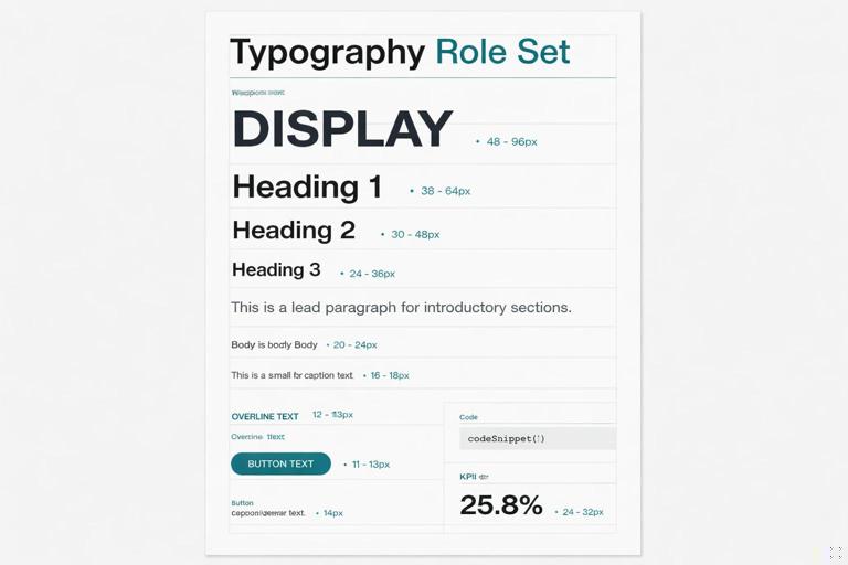
- Display: Primary, Bold, responsive 40–72, line-height 1.0–1.05, tracking -0.03em
- H1: Primary, Semibold, responsive 28–44, line-height 1.1, tracking -0.02em
- H2: Primary, Semibold, responsive 22–32, line-height 1.15, tracking -0.015em
- H3: Secondary, Semibold, responsive 18–24, line-height 1.2, tracking -0.01em
- Lead: Secondary, Regular, 18–20, line-height 1.5
- Body: Secondary, Regular, 16, line-height 1.6
- Body Small: Secondary, Regular, 14–15, line-height 1.5
- Caption: Secondary, Regular, 12–13, line-height 1.4, tracking +0.01em
- Overline: Secondary, Medium, 12–13, uppercase, tracking +0.08em
- Button/Label: Secondary, Medium, 14–16, line-height 1.1–1.2, tracking +0.02em
- Code: Monospace, Regular, 13–14, line-height 1.5
- KPI Number: Secondary or functional numeric font, Semibold, responsive 28–56, tabular numerals
Notice how the system limits weights, defines special roles, and uses responsive ranges for larger text. This is the kind of specification that can be implemented consistently across templates and components.


