
Why grid logic matters in a modular brand system
Grid logic is the set of rules that governs how content aligns, how space is distributed, and how layouts stay consistent across formats. In a modular brand system, grids are not just “nice alignment”; they are the underlying mechanism that lets different teams assemble pages, slides, ads, and product screens from shared parts without the result feeling improvised.
When grid logic is explicit, you can scale production because decisions become repeatable: where a headline sits, how wide a text column can be, how images crop, and how much breathing room components need. Without grid logic, spacing becomes subjective, layout patterns drift, and the brand starts to look like multiple brands.
Core terms: grid, columns, gutters, margins, baseline, and rhythm
Grid vs. layout pattern
A grid is the underlying structure (columns, rows, margins, gutters) that defines alignment and measurement. A layout pattern is a reusable arrangement of modules (for example, “hero + supporting cards” or “two-column editorial”). Patterns sit on top of grids.
Columns, gutters, and margins
- Columns define vertical slices of the canvas. Modules snap to column edges or span multiple columns.
- Gutters are the spaces between columns. Gutters prevent content from visually merging and provide a predictable separation rule.
- Margins are the outer safe areas. They protect content from edges and create a consistent frame.
Baseline and vertical rhythm
Vertical rhythm is the predictable spacing between lines of text and between stacked elements. A baseline grid is a set of horizontal lines that text baselines align to. You do not need to force every element to the baseline grid, but you should define when alignment is required (for example, long-form editorial pages) and when it is optional (for example, marketing hero sections with large type).
Spacing standards vs. “spacing tokens”
Spacing standards are the rules for how spacing values are used in context: which gaps apply between which types of elements, what the minimum and maximum are, and when exceptions are allowed. Even if your system already has spacing values defined, teams still need usage rules to avoid random combinations that technically “fit” but look inconsistent.
- Listen to the audio with the screen off.
- Earn a certificate upon completion.
- Over 5000 courses for you to explore!

Download the app
Choosing a grid strategy: fixed, fluid, and hybrid
Fixed grids
Fixed grids use a fixed canvas width (common in print, some presentation templates, and certain ad formats). They are easier to control and test because the number of breakpoints is small. The risk is that fixed grids can feel cramped or overly wide when viewed on unexpected screens.
Fluid grids
Fluid grids scale with the viewport. Columns and margins may be defined in relative units, while gutters and key component widths may have min/max constraints. Fluid grids are common in responsive web and product UI. The risk is that without constraints, line lengths become unreadable and modules stretch in unflattering ways.
Hybrid grids
Hybrid grids combine fluid behavior with fixed constraints: a max content width, responsive margins, and columns that reflow at defined breakpoints. This is often the most practical approach for a brand system that must cover web, product, and marketing pages.
Step-by-step: define a grid that can scale across formats
Step 1: list your primary canvases and their constraints
Do not start by picking “12 columns” because it is common. Start by listing the canvases you must support and what breaks them. Example list:
- Web marketing pages (responsive)
- Product UI screens (responsive, dense content)
- Blog/editorial templates (long-form readability)
- Slide decks (16:9, fixed)
- Social posts (1:1, 4:5, 9:16, fixed)
- Display ads (multiple fixed sizes)
For each canvas, note: typical content density, typical module types (cards, tables, forms, image blocks), and whether the layout must be responsive.
Step 2: pick a column count that supports your common module widths
Column count is a divisibility problem. You want common spans to be easy: halves, thirds, quarters, and sometimes sixths. Typical choices are 12 (very flexible), 8 (simpler), or 6 (minimal). For product UI, 12 can be helpful; for editorial, fewer columns can reduce complexity.
Practical heuristic: choose the smallest column count that supports your most common patterns without awkward fractions. If you frequently need 1/3 and 2/3 splits, 12 or 6 works well. If you mostly need halves and quarters, 8 can be enough.
Step 3: define margins and max content width (for responsive canvases)
To prevent overly long lines and stretched modules, define a max content width. Then define responsive margins that grow with the viewport. Example rule set:
- Max content width: 1200px (or a value appropriate to your typography and density)
- Minimum side margin on small screens: 16px
- Side margin scales up to 80px as viewport grows, until max content width is reached
This creates a stable reading area while still feeling spacious on large screens.
Step 4: set gutter rules that match your component density
Gutters should be large enough to separate modules but not so large that layouts look fragmented. Dense product UI often needs smaller gutters than marketing pages. If your system must serve both, define gutter sizes per layout context (for example, “marketing” vs. “product”) while keeping the underlying column logic consistent.
Example: marketing gutters 24px, product gutters 16px. The key is not the numbers; it is that the rule is explicit and tied to a context.
Step 5: define vertical rhythm rules for stacked modules
Vertical rhythm is where most inconsistency appears. Define a small set of stack gaps for common relationships, such as:
- Gap between headline and supporting text
- Gap between paragraph blocks
- Gap between section header and section content
- Gap between cards in a grid
- Gap between form fields
Then define which gaps are “tight,” “standard,” and “spacious” and when each is allowed. This prevents teams from picking arbitrary values that technically exist but do not match the intended rhythm.
Layout patterns: reusable compositions built on the grid
Layout patterns are pre-approved compositions that teams can reuse. They reduce decision fatigue and keep the brand consistent. Each pattern should specify: grid type, column spans, alignment rules, and spacing rules.

Pattern 1: Hero + supporting content
Use case: landing pages, campaign pages, product announcements.
- Hero area spans full content width.
- Primary message block spans 6–8 columns on desktop (depending on density).
- Supporting visual spans remaining columns, aligned to the same top baseline as the message block.
- Vertical spacing: larger gap between hero and next section than between internal hero elements.
Practical example: On a 12-column grid, set text to span 7 columns and image to span 5 columns. Keep the top edges aligned; keep the call-to-action aligned to the text block’s left edge, not centered under the whole hero.
Pattern 2: Two-column editorial
Use case: case studies, long-form pages with images and pull quotes.
- Main text column spans 7–8 columns for readable line length.
- Secondary column spans 4–5 columns for supporting content (quotes, stats, navigation).
- Baseline alignment is recommended for the main text column.
- Images align to column edges; captions align to the image edge, not the page edge.
Practical example: Keep the main text column consistent across all editorial pages, even if the secondary column content changes. This consistency is a brand signal.
Pattern 3: Card grid (2-up, 3-up, 4-up)
Use case: feature lists, resource libraries, product modules.
- Cards snap to columns; card width is defined by column span.
- Card internal padding is fixed per card size (small/medium/large).
- Card-to-card spacing uses a single standard gap per context (marketing vs. product).
- Card heights: either equal-height rows (for marketing polish) or natural height (for content flexibility). Decide and document.
Practical example: On desktop, use 3-up cards spanning 4 columns each. On tablet, switch to 2-up spanning 6 columns each. On mobile, 1-up spanning all columns. Keep the card internal padding constant; only the card width changes.
Pattern 4: Media + text split (image left/right)
Use case: feature highlights, onboarding screens, email modules.
- Media block spans 5–6 columns; text spans 6–7 columns.
- Alternate left/right placement by section, but keep alignment and spacing identical.
- Define a consistent media aspect ratio or cropping rule to avoid visual noise.
Practical example: If images vary, enforce a consistent crop window (for example, 4:3) so the layout rhythm remains stable even when content changes.
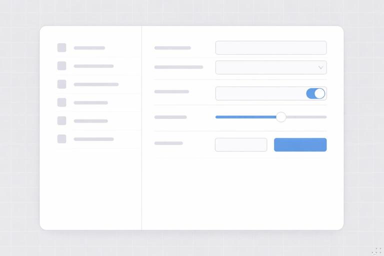
Pattern 5: Data-dense layouts (tables, dashboards, settings)
Use case: product screens where alignment and scanning matter.
- Use a tighter grid with smaller gutters and more frequent alignment points.
- Define a left alignment rail for labels and a separate rail for values/actions.
- Use consistent row heights and consistent spacing between groups.
Practical example: In a settings page, align all field labels to one column edge and all inputs to another. Group related fields with a larger gap, but keep within-group gaps smaller and consistent.
Spacing standards: turning “nice spacing” into enforceable rules
Define spacing by relationship, not by preference
Teams struggle when spacing guidance is just a list of values. Instead, define spacing standards as relationship rules. Examples of relationships:
- Text-to-text: paragraph spacing, list spacing, caption spacing.
- Text-to-component: headline to button group, label to input, card title to metadata.
- Component-to-component: card grid gaps, section stacking, sidebar separation.
- Component-to-edge: padding inside containers, safe areas near edges.
For each relationship, define the default spacing and allowable variants. This is what makes the system teachable and auditable.
Set minimums and maximums
Spacing standards should include guardrails:
- Minimum touch-friendly spacing for interactive elements in product UI.
- Minimum whitespace around key modules so layouts do not feel cramped.
- Maximum line length via column spans and max widths, so text remains readable.
- Maximum section width so hero content does not become too diffuse.
These guardrails reduce the number of “almost right” layouts that slip into production.
Use a small set of spacing modes
Instead of letting every page choose arbitrary density, define a few modes that map to real needs. Example:
- Compact: product settings, dense dashboards.
- Standard: most product pages, documentation pages.
- Spacious: marketing pages, campaign landers.
Each mode defines: section padding, grid gutters, card gaps, and typical vertical stack spacing. This keeps the system coherent while still flexible.
Step-by-step: document a spacing spec teams can actually follow
Step 1: inventory common stacks and clusters
Look at your real layouts and list repeated structures:
- Section header block (eyebrow/title/description)
- Button groups (primary + secondary)
- Form field stacks
- Card internals (title, meta, body, actions)
- Navigation groups
Each of these needs a spacing recipe.
Step 2: define default spacing recipes for each structure
Create a simple recipe format that can be applied in any tool:
- Internal spacing (between elements inside the module)
- External spacing (space around the module)
- Alignment rules (left edges, baseline alignment, center alignment)
Example recipe for a “section header block”:
- Eyebrow to title: tight
- Title to description: standard
- Description to CTA row: standard
- Block to next section: spacious
This avoids forcing designers to guess which spacing value to pick.
Step 3: define exception rules
Exceptions will happen; document them so they do not become random. Examples:
- If a section header has no description, reduce the gap between title and CTA row.
- If a card has no image, keep the top padding the same; do not “pull up” the title.
- If a layout switches from 3-up to 2-up, keep vertical spacing between rows unchanged.
Exception rules prevent “layout drift” when content varies.
Step 4: add measurement examples with annotated diagrams (in your system docs)
In written specs, include at least one annotated example per pattern: show column spans, margins, gutters, and the key vertical gaps. Even if teams use different tools, the logic transfers. The goal is to make the spacing feel inevitable, not subjective.
Grid behavior across breakpoints: reflow rules that preserve brand consistency
Define reflow as a rule set, not a redesign
Responsive behavior should be predictable. Document how patterns reflow:
- Which modules stack first
- Which elements can move (image below text, sidebar below main)
- Which elements must stay aligned (button groups, card actions)
- How spacing changes (often slightly tighter on small screens)
When reflow is treated as a rule set, teams stop reinventing mobile layouts for every page.
Example reflow rules for a hero split
- Desktop: text 7 columns, image 5 columns.
- Tablet: text 12 columns, image 12 columns below, maintain same internal spacing recipe.
- Mobile: reduce section padding, keep CTA row directly after supporting text, image below with consistent top margin.
The important part is that the relationships remain consistent even when the geometry changes.
Alignment standards: what must line up, always
Alignment is the visible evidence of a grid. Define non-negotiable alignment rails so layouts feel related even when content differs.
Common alignment rails to standardize
- Left edge rail: the primary alignment line for text blocks and components.
- Right edge rail: used for secondary alignment in two-column layouts or for aligning card grids.
- Center rail: used sparingly for symmetrical compositions; document when it is allowed.
- Action rail: consistent alignment for buttons/links across modules (for example, always align primary CTAs to the left edge of the text column).
Practical example: aligning mixed modules
Suppose a page has a hero, a 3-card grid, and a testimonial block. Even if each module has different internal structure, align their outer edges to the same content grid and keep their section padding consistent. This creates continuity without forcing identical designs.
Working with images and media: cropping, safe areas, and grid fit
Define aspect ratio families for predictable layout
In modular systems, images are a major source of inconsistency. Define a small set of aspect ratios that map to your patterns (for example, wide hero, standard card, portrait story). Then specify where each ratio is used.
Safe areas and focal points
When images are cropped responsively, important content can be cut off. Define safe area guidance: keep faces, logos, or key objects within a central region. Provide a rule for focal point anchoring (center, top, or rule-of-thirds) so crops remain consistent.
Media alignment rules
- Images align to column edges, not “optical” edges.
- Captions align to the image edge and follow the same vertical rhythm as body text blocks.
- In card grids, image height is consistent per card size to maintain row rhythm.
Quality control: how to audit grids and spacing in real work
Checklist for grid compliance
- Do all major modules snap to the same content grid?
- Are margins consistent across sections?
- Do multi-column layouts use documented column spans?
- Are gutters consistent within a page and within a context (marketing/product)?
Checklist for spacing compliance
- Do repeated structures use the same spacing recipe?
- Are section paddings consistent across the page?
- Are exceptions applied only when documented conditions occur?
- Is vertical rhythm consistent in long-form text sections?
Practical audit method: overlay and compare
To quickly spot drift, overlay a grid on screenshots of multiple pages or screens and compare: do headings land on similar rails, do card grids share the same gaps, do CTAs align consistently? This method is fast and does not require access to source files.

Implementation notes: making grids usable across tools
Design tools
In design files, provide grid presets (columns, margins, gutters) for each primary canvas and breakpoint. Provide layout pattern templates that already include the correct grid and spacing recipes. The goal is to make the correct choice the easiest choice.
Code and production
In production environments, implement grids as reusable layout primitives (containers, rows, columns) and implement spacing recipes as component-level rules (for example, consistent stack spacing inside a card). Document which patterns are allowed to deviate and how to request new patterns when needed.
Pattern documentation format (example)
Pattern: 3-up Card Grid (Marketing) Grid: 12 columns, max width 1200, gutters 24 Column spans: card = 4 columns Responsive: tablet = 6 columns (2-up), mobile = 12 columns (1-up) Spacing: card gap = standard, section padding = spacious Alignment: card top edges aligned, actions aligned to card left padding Exceptions: allow natural height, but keep image height fixed per card size


