
Why Motion and Interaction Need Their Own System Layer
In a modular brand system, motion and interaction are not decorative add-ons; they are behavioral rules that shape how the brand “feels” across touchpoints. A static layout can be consistent while the experience still feels fragmented if animations, transitions, and interaction feedback vary by channel. Motion cues (how things move) and interaction principles (how things respond) provide continuity when the same brand appears in a mobile app, a responsive website, an in-store kiosk, email, social video, and product onboarding.

This chapter focuses on how to define a cross-channel motion and interaction layer that is consistent, scalable, and implementable. It avoids rehashing token fundamentals and other system components already covered. Instead, it shows how to specify motion behavior, interaction feedback, and channel adaptations as reusable rules and patterns.
Core Concepts: Motion Cues vs. Interaction Principles
Motion cues
Motion cues are the visible changes over time that communicate structure and meaning: transitions between states, object movement, fades, scaling, parallax, and micro-animations. They help users understand cause and effect (what changed and why), hierarchy (what is primary), and continuity (where something came from).
Examples of motion cues that carry meaning:
- Spatial continuity: a card expands into a detail view from its original position, preserving context.
- Emphasis: a primary action button subtly scales or brightens on hover/press to confirm interactivity.
- Status: a progress indicator animates steadily to show ongoing work; a success checkmark draws quickly to signal completion.
- Hierarchy: a modal enters with a faster, more pronounced motion than a tooltip, reinforcing importance.
Interaction principles
Interaction principles are the rules that define how the interface behaves when users act: tap, click, hover, drag, scroll, keyboard navigation, voice commands, remote control focus, or gesture. They include feedback timing, affordances, error prevention, and state handling (default, hover, pressed, focused, disabled, loading, success, error).
- Listen to the audio with the screen off.
- Earn a certificate upon completion.
- Over 5000 courses for you to explore!

Download the app
Examples of interaction principles:
- Immediate feedback: every user action gets a response within a defined time window, even if it’s only a pressed state or skeleton loading.
- Predictable navigation: back behavior returns to the previous context; deep links open to a stable state.
- Accessible focus: keyboard focus is always visible and consistent in style and placement.
- Graceful interruption: animations pause or reduce when users prefer reduced motion; critical actions are confirmable and reversible.
The Consistency Problem Across Channels
Multi-channel consistency breaks when teams treat motion as “whatever the platform does by default” or “whatever looks cool in the moment.” Common failure modes include:
- Different meanings for the same motion: a slide-in might mean “new page” on web but “temporary panel” on mobile.
- Inconsistent timing: one channel uses slow, floaty transitions while another snaps instantly, making the brand feel like different products.
- Unaligned feedback: buttons show hover on web but no pressed state on mobile; loading indicators vary wildly.
- Accessibility gaps: motion reduction is supported in one channel but ignored in another.
- Performance mismatches: heavy animations in low-power environments cause jank, undermining perceived quality.
The goal is not identical motion everywhere. The goal is equivalent meaning and recognizable behavior across channels, adapted to each platform’s input methods and constraints.
Define a Motion & Interaction “Grammar”
Think of motion and interaction as a grammar: a limited set of verbs and rules that can generate many sentences. Your system should define:
- Motion roles: what motion is allowed to communicate (navigation, emphasis, feedback, status, delight).
- Interaction states: which states exist for each component category and how they look/behave.
- Timing and easing families: a small set of timing ranges and easing curves mapped to intent.
- Spatial rules: how elements move in relation to layout (directionality, origin points, anchoring).
- Continuity rules: how transitions preserve context (shared element transitions, crossfades, container transforms).
- Reduced motion behavior: what changes when motion is minimized (swap movement for fades, shorten durations, remove parallax).
Step-by-Step: Build a Cross-Channel Motion Spec
Step 1: Inventory motion moments by user journey
List the moments where motion and interaction feedback matter. Organize by journey rather than by screen, so you can reuse patterns across products.
- Navigation: open/close menus, page transitions, tab switching, drill-down, back.
- Content reveal: accordions, expand/collapse, progressive disclosure, tooltips.
- Feedback: hover/press, selection, drag-and-drop, form validation.
- Status: loading, syncing, uploading, saving, empty states.
- System overlays: modals, drawers, toasts, snackbars, banners.
For each moment, capture: intent, user action, expected feedback, and constraints (performance, accessibility, platform norms).
Step 2: Assign each moment a motion role and priority
Not all motion is equal. Assign a role and priority so teams know what must be consistent and what can be flexible.
- Role: Navigation continuity (high priority): transitions that help users understand location changes.
- Role: Interaction feedback (high priority): pressed/selected/loading states.
- Role: Status communication (medium-high): progress, success, error.
- Role: Emphasis and hierarchy (medium): drawing attention to primary actions.
- Role: Delight (low): celebratory moments, subtle flourishes.
This prioritization prevents over-animating everything and ensures the most meaningful cues remain stable across channels.
Step 3: Define timing bands and map them to intent
Create a small set of timing bands rather than one-off durations. Use intent-based labels so designers and engineers can choose correctly without memorizing numbers.
- Instant feedback: for pressed/hover/focus confirmation (very short).
- Quick transition: for small UI changes like toggles, chips, inline validation.
- Standard transition: for panels, drawers, modals, list filtering.
- Emphatic transition: for major navigation or high-importance reveals.
- Progress/loop: for indeterminate loading; must not feel frantic.
Then specify guardrails: maximum duration for feedback, recommended duration for overlays, and rules for chaining (e.g., staggered lists should not exceed a total window).
Step 4: Define easing families as “behavioral signatures”
Easing is often where brand feel is most recognizable. Instead of many curves, define a few families:
- Responsive: quick start, gentle settle (good for feedback and small transitions).
- Expressive: more pronounced acceleration/deceleration (good for navigation and emphasis).
- Linear/steady: for progress indicators and continuous motion.
Document where each easing family is allowed. For example: “Expressive easing is permitted for navigation transitions and hero moments, but not for form validation feedback.” This prevents inconsistent “bouncy” behavior in serious contexts.
Step 5: Establish directionality and spatial metaphors
Directionality should reinforce information architecture. Decide what movement directions mean:
- Forward navigation: content moves left-to-right or right-to-left depending on locale; choose a rule and stick to it.
- Temporary overlays: drawers slide from an edge; modals scale/fade from center; toasts rise from bottom.
- Hierarchy changes: expanding from the trigger element indicates “this came from here.”
Also define anchoring: a dropdown should originate from its trigger; a tooltip should track its target; a bottom sheet should anchor to the bottom edge. These rules create a consistent spatial logic across devices.
Step 6: Specify interaction state behavior for key component categories
Instead of documenting every component individually, define state behavior by category. For each category, specify required states, visual feedback, and motion behavior.
Buttons and clickable controls
- Required states: default, hover (where applicable), pressed, focused, disabled, loading.
- Feedback rule: pressed state appears immediately; release triggers action confirmation.
- Motion rule: subtle scale or shade shift; avoid large movement that changes layout.
Inputs and forms
- Required states: default, focused, filled, error, success, disabled.
- Validation rule: inline feedback appears after blur or submit depending on context; error motion should be minimal (avoid aggressive shaking).
- Motion rule: helper text fades/expands without pushing content unexpectedly; reserve space when possible to prevent layout jumps.
Navigation elements (tabs, menus, breadcrumbs)
- Required states: selected, hover/focus, disabled (if applicable).
- Motion rule: selection indicator moves with continuity; avoid reflowing labels.
Overlays (modal, drawer, tooltip, toast)
- Entry/exit rule: entry slightly slower than exit; exit should feel responsive.
- Focus rule: focus is trapped in modal; escape closes where appropriate.
- Motion rule: backdrop fades; container moves/scales according to overlay type.
Step 7: Define reduced-motion equivalents
Reduced motion is not “turn everything off.” It is a designed alternative that preserves meaning. Define substitutions:
- Replace movement with opacity: slide-in drawer becomes a fade-in with minimal positional change.
- Shorten durations: keep feedback but reduce time spent animating.
- Remove continuous motion: replace looping animations with static indicators or step-based progress.
- Keep essential cues: focus visibility, pressed states, and status changes remain.
Document these as explicit rules so each channel implements the same accessibility intent.
Step 8: Create a “motion pattern library” with examples
Turn the spec into reusable patterns that teams can apply. Each pattern should include: intent, when to use, when not to use, timing band, easing family, directionality, and reduced-motion behavior.
Example patterns to include:
- Shared element expand: card → detail view.
- Container transform: list item opens into a panel while preserving background context.
- Overlay entrance: modal scale+fade; drawer slide; toast rise+fade.
- Selection indicator glide: tabs/chips selection underline moves smoothly.
- Inline validation reveal: helper/error text expands with reserved space.
- Skeleton to content: crossfade from placeholder to loaded content.
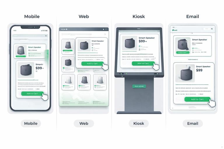
Practical Examples: Translating One Principle Across Channels
Example 1: “Cause-and-effect is always visible”
Principle: When a user triggers a change, the UI should show what changed and where it came from.
Mobile app: tapping a product card expands it into a detail screen using a shared element transition (image and title animate into place). Back collapses to the original card position.
Web: clicking the card opens a detail panel or navigates to a page; use a quick crossfade plus a shared hero image transition when feasible. If full shared transitions are not feasible, preserve continuity by keeping the card’s image position consistent above the fold on the destination.
Kiosk: large touch targets; use slightly slower, clearer transitions to accommodate distance viewing. Keep motion simple and avoid subtle micro-movements that are hard to perceive.
Email: no real motion; simulate cause-and-effect with layout continuity: the “selected” item is visually emphasized and the detail section appears directly below it (static progressive disclosure).
Example 2: “Feedback is immediate, confirmation is distinct”
Principle: Separate the instant acknowledgment of input from the later confirmation of completion.
Immediate feedback: pressed state, ripple/highlight, or tactile response (where available) happens instantly.
Confirmation: after the action completes, show a success toast, inline message, or state change.
Cross-channel mapping:
- Web: hover and pressed states + toast confirmation.
- Mobile: pressed state + haptic (if appropriate) + inline confirmation.
- TV/remote UI: focus state is primary; “pressed” is a brief focus intensification; confirmation is a banner.
Interaction Principles That Keep Brands Consistent
Principle: One primary feedback style per action type
Decide what feedback style corresponds to what action type, and keep it consistent:
- Selection: persistent indicator (checkmark, highlight, underline) with a quick transition.
- Navigation: container/page transition with continuity.
- System message: toast/banner with consistent placement and entry/exit behavior.
- Destructive action: confirmation step + distinct warning styling + no playful motion.
Principle: Focus is a first-class citizen
Multi-channel consistency includes keyboard and remote navigation. Define:
- Focus ring style and offset behavior (should not shift layout).
- Focus transition: quick, non-distracting, consistent easing.
- Focus order rules for complex components (modals, menus, carousels).
Even if a channel is primarily touch-based, consistent focus rules improve accessibility and support external keyboards.
Principle: Motion never blocks task completion
Motion should not delay interaction. Rules to enforce:
- Users can tap/click again even if a transition is running, unless it would cause errors.
- Critical controls remain available; avoid animating primary actions off-screen.
- Loading states appear quickly; long transitions should not mask slow operations.
Channel Adaptation Guidelines (Without Losing the Brand)
Web (mouse + keyboard)
- Hover is meaningful; define hover feedback as a consistent cue, not a decorative effect.
- Respect prefers-reduced-motion; provide reduced-motion equivalents.
- Avoid scroll-jacking; keep scroll behavior native and predictable.
Mobile (touch + gesture)
- Pressed states matter more than hover; ensure touch feedback is immediate.
- Gestures need clear affordances: if something is swipeable, provide a visual hint or partial reveal.
- Use platform navigation conventions but map them to your motion roles (e.g., back gesture still follows your continuity rules).
Kiosk / in-store (touch at distance, performance constraints)
- Favor larger, slower, clearer transitions; avoid subtle micro-animations.
- Ensure idle states don’t become distracting loops; use calm, low-frequency motion if needed.
- Design for interruptions: timeouts, resets, and re-entry should be smooth and predictable.
Email and static placements
- No reliance on motion; translate motion cues into static hierarchy and sequencing.
- Use consistent “interaction metaphors” visually: buttons look pressable, selected states are clear.
- Animated GIFs (if used) should follow the same easing feel conceptually: short, purposeful, non-flashy, and optional.
Operationalizing: How Teams Use the Spec Day-to-Day
Create a motion decision tree
Provide a simple decision flow designers can follow:
- Is this feedback, navigation, status, or delight?
- What is the user’s goal and what must be communicated?
- Which pattern matches this moment?
- Which timing band and easing family apply?
- What is the reduced-motion equivalent?
Define “motion acceptance criteria” for QA
To keep consistency across channels, write testable criteria. Examples:
- Pressed state appears within the immediate feedback window.
- Modal entry includes backdrop fade and focus trap; exit returns focus to the trigger.
- Reduced motion setting removes large positional movement while preserving state changes.
- Toast placement and entry/exit behavior match the pattern library.
Use reference implementations for high-impact patterns
Some patterns are too important to leave to interpretation (navigation transitions, overlays, selection indicators). Provide reference implementations per platform (e.g., web component, native snippet, or prototype) that encode the rules. The goal is not to lock teams into one framework, but to reduce drift in the most brand-defining behaviors.
Mini Pattern Specs (Templates You Can Reuse)
Pattern: Toast notification
Intent: confirm an action or communicate a non-blocking system message.
Placement: consistent edge (e.g., bottom) with safe-area awareness.
Entry: rise + fade using standard transition timing and responsive easing.
Exit: fade out slightly faster than entry.
Duration: long enough to read; dismissible where appropriate.
Reduced motion: fade only; no vertical movement.
Pattern: Drawer / side panel
Intent: temporary surface for navigation or secondary tasks.
Entry: slide from edge with backdrop fade; do not overshoot.
Interaction: click/tap outside closes (unless critical); escape closes on web.
Focus: focus moves into drawer; returns to trigger on close.
Reduced motion: fade + minimal offset; keep backdrop behavior.
Pattern: Tab selection indicator
Intent: show current section and reinforce navigation structure.
Motion cue: indicator glides to new tab; content crossfades or slides minimally.
Rule: indicator movement is the primary cue; avoid multiple competing animations.
Reduced motion: indicator jumps instantly; content crossfades.
Implementation Notes for Consistency (Design-to-Dev Handshake)
To avoid drift between design intent and shipped behavior, specify motion in ways engineers can implement reliably:
- Name patterns, not just values: “Use Overlay-Modal pattern” is clearer than “animate opacity to 0.9.”
- Define triggers and end states: what starts the animation, what state is interactive during the transition, and what completes it.
- Prevent layout shifts: prefer transforms and opacity for animation; avoid animating properties that cause reflow when possible.
- Performance budgets: identify where motion must remain smooth (navigation, primary actions) and where it can be simpler.
- Fallbacks: if a channel cannot support a pattern (e.g., shared element transitions), define an acceptable alternative that preserves meaning.
// Example: pattern contract (pseudo-spec for teams)\nPattern: Overlay-Modal\nTrigger: user activates primary action requiring interruption\nEntry: backdrop fade in + modal scale from 0.98 to 1.0\nInteractive during entry: no (except close)\nFocus: move to first focusable element; trap focus\nExit: modal fade out + slight scale down; backdrop fade out\nReduced motion: fade only; no scale\nFallback: if scale causes blur on low-end devices, use fade-only


