
Why modals and multi-step workflows are different in hypermedia UIs
Modals and wizards are “overlay” interactions: the user stays on the same page context while completing a focused task. In a hypermedia-driven app, that means you want to load dialog content as HTML fragments, submit steps as normal forms, and update only the overlay (and sometimes a small part of the underlying page) without turning the whole experience into a client-side router. The main design goal is to keep the modal’s lifecycle predictable: open, load content, submit, show errors, advance steps, confirm, optionally undo, then close and refresh the relevant parts of the page.
Two practical constraints shape the implementation. First, modals often need to coordinate multiple updates: the modal body changes as the user moves through steps, and the underlying page might need to reflect the new state (for example, a list item changes, a badge count updates, or a toast appears). Second, modals must remain accessible and resilient: if JavaScript fails, the user should still be able to complete the task via full-page navigation, and if a request fails, the UI should show a clear error state without losing the user’s progress.
Modal shell pattern: a stable container with swappable content
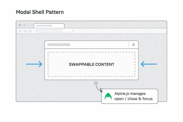
A reliable approach is to render a “modal shell” once (either in the base layout or injected on demand) and swap only the inner content. The shell contains the backdrop, dialog frame, close button, and a content region. HTMX targets the content region for swaps; Alpine manages open/close state, focus trapping, and escape key handling. This separation keeps your HTML fragments small: server endpoints return only the dialog content, not the entire modal chrome.
Base modal shell (layout)
<!-- Put this near the end of your base layout -->
<div x-data="modal()" x-cloak>
  <div class="backdrop" x-show="open" x-transition @click="close()"></div>

  <div class="dialog" x-show="open" x-transition
       role="dialog" aria-modal="true" :aria-labelledby="titleId"
       @keydown.escape.window="close()">

    <div class="dialog-frame" @click.stop>
      <button type="button" class="close" @click="close()" aria-label="Close">×</button>

      <div id="modal-content">
        <!-- HTMX swaps dialog content here -->
      </div>
    </div>
  </div>
</div>

<script>
  function modal() {
    return {
      open: false,
      titleId: 'modal-title',
      lastActive: null,
      show() {
        this.lastActive = document.activeElement;
        this.open = true;
        this.$nextTick(() => {
          const el = document.querySelector('#modal-content [autofocus]')
            || document.querySelector('#modal-content button, #modal-content input, #modal-content a');
          el && el.focus();
        });
      },
      close() {
        this.open = false;
        this.$nextTick(() => this.lastActive && this.lastActive.focus());
      }
    }
  }
</script>
This shell does not decide what content to show; it only provides a place to show it. The dialog content fragments should include a heading with id matching modal-title (or you can set titleId dynamically). The show() method captures the previously focused element and restores focus on close, which is important for keyboard users.
Opening a modal by loading dialog content
To open a modal, you typically click a button in the page that triggers an HTMX request to fetch the dialog fragment and swap it into #modal-content. Then you call Alpine’s show(). You can do this by listening to HTMX lifecycle events and opening the modal when the target is the modal content region.
- Listen to the audio with the screen off.
- Earn a certificate upon completion.
- Over 5000 courses for you to explore!

Download the app
Trigger button and event hook
<button class="btn"
  hx-get="/projects/42/rename"
  hx-target="#modal-content"
  hx-swap="innerHTML"
  @click="$root.__x.$data.show()">
  Rename project
</button>
This is the simplest approach: open immediately on click, then content arrives. If you prefer to open only after content loads (to avoid a blank modal on slow networks), you can instead open on htmx:afterSwap when the target is modal-content.
Open after swap (avoids empty modal)
<script>
  document.body.addEventListener('htmx:afterSwap', (e) => {
    if (e.detail.target && e.detail.target.id === 'modal-content') {
      const modalRoot = document.querySelector('[x-data="modal()"]');
      modalRoot && modalRoot.__x && modalRoot.__x.$data.show();
    }
  });
</script>
With this pattern, any HTMX swap into #modal-content automatically opens the modal. That means your triggers can be links or buttons anywhere on the page, and you don’t need to repeat Alpine calls on each trigger.
Dialog content fragments: keep them form-first
Dialog fragments should be valid, standalone HTML pieces that can render inside the modal. Prefer a form element even for simple actions, because it gives you keyboard-friendly submission and a consistent place to show validation errors. The fragment should include: a title, optional explanatory text, inputs, and action buttons. If the server returns validation errors, return the same fragment with error markup; HTMX swaps it in place, preserving the modal shell.
Example: rename dialog fragment
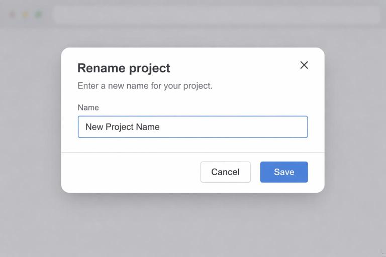
<h3 id="modal-title">Rename project</h3>
<p>Choose a new name. This updates the project title everywhere it appears.</p>

<form hx-post="/projects/42/rename"
      hx-target="#modal-content"
      hx-swap="innerHTML">
  <label>
    Name
    <input type="text" name="name" value="Acme Launch" autofocus>
  </label>

  <div class="actions">
    <button type="button" class="btn-secondary" onclick="document.querySelector('[x-data=\"modal()\"]').__x.$data.close()">Cancel</button>
    <button type="submit" class="btn">Save</button>
  </div>
</form>
Notice the form targets #modal-content so the response replaces the dialog content. On success, you often want to close the modal and refresh parts of the underlying page. You can do that with an out-of-band swap, a trigger, or a redirect-like response. A practical technique is to return a fragment that includes a success message and an instruction to close, or to return an empty body plus an HX-Trigger header that the client listens for.
Closing the modal after success and refreshing the page region
After a successful modal submission, you usually need two things: close the modal and update the underlying UI. You can update underlying UI by swapping a specific target (for example, the project title element) or by emitting a client-side event that causes a refresh request for a region. The cleanest approach is: the server returns (1) an out-of-band fragment updating the underlying page, and (2) a small modal body that indicates success and closes automatically, or (3) an HX-Trigger that the client uses to close and refresh.
Option A: HX-Trigger to close and refresh
<script>
  document.body.addEventListener('project:renamed', (e) => {
    const modalRoot = document.querySelector('[x-data="modal()"]');
    modalRoot && modalRoot.__x && modalRoot.__x.$data.close();

    // Refresh a region that shows the project header
    htmx.ajax('GET', `/projects/${e.detail.id}/header`, { target: '#project-header', swap: 'outerHTML' });
  });
</script>
On the server, respond to the rename POST with an HX-Trigger header like project:renamed and include JSON detail such as the project id. This keeps the modal response small and avoids embedding extra markup just to close the dialog.
Confirmation dialogs: destructive actions without fragile JS
Confirmations are a special case of modals: they are short, often destructive, and must be hard to mis-click. A good confirmation dialog includes: a clear statement of what will happen, the object name, and a primary destructive button that is visually distinct. In a hypermedia approach, the confirm dialog is just another fragment loaded into the modal. The destructive action is a form submission (often POST) that returns either an updated list fragment or triggers a refresh.
Step-by-step: delete confirmation flow
- Step 1: User clicks “Delete” on an item row; HTMX loads
/items/99/confirm-deleteinto#modal-content. - Step 2: Modal opens after swap; focus lands on the safest default (usually “Cancel”).
- Step 3: User confirms; form posts to
/items/99/delete. - Step 4: Server deletes and responds by updating the list region and triggering modal close.
Confirm delete fragment
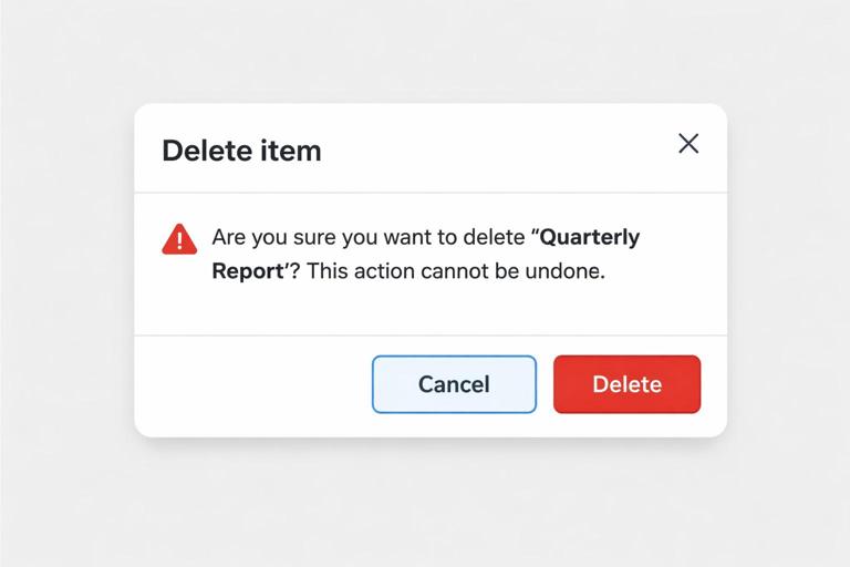
<h3 id="modal-title">Delete item</h3>
<p>You are about to delete <strong>Quarterly Report</strong>. This cannot be undone.</p>

<form hx-post="/items/99/delete" hx-target="#modal-content" hx-swap="innerHTML">
  <div class="actions">
    <button type="button" class="btn-secondary" autofocus
      onclick="document.querySelector('[x-data=\"modal()\"]').__x.$data.close()">
      Cancel
    </button>
    <button type="submit" class="btn-danger">Delete</button>
  </div>
</form>
Autofocus on “Cancel” reduces accidental confirmation when users press Enter. If you want an extra safety step, you can add a required text input (“type DELETE”) and validate server-side; the modal will re-render with an error message if the phrase doesn’t match.
Undo pattern: reversible actions with a short-lived recovery window
Undo is often a better UX than “Are you sure?” for non-destructive actions, and it can also complement confirmations for destructive actions by implementing soft-delete. The key is to treat undo as a first-class server capability: after an action, the server returns a UI update plus an “undo token” (or a resource id) that can be used to reverse the change within a time window. The UI shows a small message (often a toast or inline banner) with an Undo button that posts back to an undo endpoint.
In HTMX terms, the undo UI is just another fragment that can be swapped into a dedicated notification region. Alpine can manage auto-dismiss timers, but the undo action itself should be a normal form post so it works without custom JS.
Notification region and undo banner
<div id="notices"></div>

<!-- Example undo banner fragment returned by the server -->
<div class="notice" x-data="{ show: true }" x-show="show">
  <p>Item deleted. You can undo this for the next 30 seconds.</p>
  <form hx-post="/items/99/undo-delete" hx-target="#items-list" hx-swap="outerHTML">
    <button type="submit" class="btn">Undo</button>
  </form>
  <button type="button" class="close" @click="show=false" aria-label="Dismiss">×</button>
</div>
When the user clicks Undo, you typically update the list region (restore the item) and also update the notices region (remove the banner). You can do that with two swaps: one targeting the list, and one out-of-band swap for the notices, or by returning a combined fragment that includes both regions. The important part is that undo is not a client-only trick; the server must store enough information to reverse the action safely.
Multi-step workflows (wizards) inside a modal
A multi-step workflow is a sequence of small forms where each step depends on the previous one. In a modal, the workflow should feel continuous: the dialog stays open, the title and progress indicator update, and the user can go back. The server should own the step state, either via a workflow id stored in the session, a signed token, or a temporary draft resource. Each step endpoint returns the next step fragment, and the form posts back to advance.
A practical rule: each step should be idempotent to render (GET) and explicit to advance (POST). The modal content region is the only swap target for step transitions, which keeps the rest of the page stable.
Step-by-step: invite teammate wizard
- Step 1 (GET): Load
/teams/7/inviteinto the modal. Server creates or resumes a draft invite and returns Step 1 fragment (email). - Step 1 (POST): Submit email to
/teams/7/invite/step-1. On error, return Step 1 with inline errors. On success, return Step 2 fragment (role selection). - Step 2 (POST): Submit role to
/teams/7/invite/step-2. On success, return Step 3 fragment (review and send). - Step 3 (POST): Confirm send to
/teams/7/invite/send. Server sends invite, triggers modal close, and refreshes the members list.
Wizard fragment with progress and back button
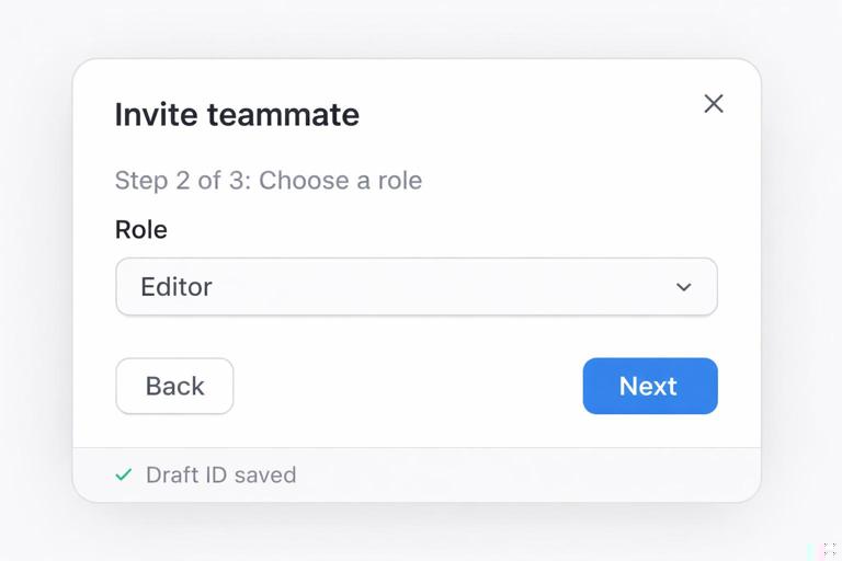
<h3 id="modal-title">Invite teammate</h3>
<p>Step 2 of 3: Choose a role</p>

<form hx-post="/teams/7/invite/step-2"
      hx-target="#modal-content" hx-swap="innerHTML">
  <input type="hidden" name="draft_id" value="inv_abc123">

  <label>
    Role
    <select name="role">
      <option value="viewer">Viewer</option>
      <option value="editor">Editor</option>
      <option value="admin">Admin</option>
    </select>
  </label>

  <div class="actions">
    <button type="button" class="btn-secondary"
      hx-get="/teams/7/invite/back?draft_id=inv_abc123&to=step-1"
      hx-target="#modal-content" hx-swap="innerHTML">
      Back
    </button>
    <button type="submit" class="btn">Next</button>
  </div>
</form>
The “Back” button uses hx-get to fetch the previous step fragment. This keeps navigation consistent: every step is just HTML returned from the server. The hidden draft_id ties the steps together. If you don’t want hidden fields, you can keep the draft id in the URL or session, but hidden fields make the fragment more portable and explicit.
Handling errors and network failures inside modals and wizards
When a request fails, you want the modal to remain open and show a clear message without losing what the user typed. For server-side validation errors, simply return the same step fragment with error markup; HTMX swaps it into the modal content region. For network errors (timeouts, 500s), consider rendering an error fragment into the modal content region that includes a “Try again” button. Alpine can also display a lightweight loading state while requests are in flight.
Loading and disabled states with Alpine + HTMX events
<div id="modal-content" x-data="{ busy: false }"
     @htmx:beforeRequest.window="if ($event.detail.target && $event.detail.target.id==='modal-content') busy=true"
     @htmx:afterRequest.window="if ($event.detail.target && $event.detail.target.id==='modal-content') busy=false">

  <div x-show="busy" class="loading">Loading…</div>
  <div x-show="!busy">
    <!-- swapped content lives here -->
  </div>
</div>
This pattern avoids sprinkling spinners into every fragment. The modal content region becomes responsible for showing a loading indicator whenever it is the request target. If you also want to disable buttons during submission, you can add :disabled="busy" bindings in the modal shell or in shared button components.
Coordinating multiple updates: modal content plus underlying page
Many modal actions affect the underlying page. For example, editing an item in a modal should update the item row in the list behind it. A practical approach is to give the underlying page stable ids for the regions you want to update (like #items-list, #project-header, or #member-count) and have the server return additional fragments intended for those targets. You can deliver those fragments either by making a follow-up request after success (trigger-based refresh) or by returning multiple fragments in one response and letting the client place them appropriately.
When you design these updates, keep the modal’s responsibility narrow: it should manage the workflow and show feedback. The underlying page should be updated in a targeted way, not by reloading everything. This keeps the UI fast and reduces the chance of losing user context (scroll position, expanded sections, or in-progress work elsewhere on the page).


