
Why “modular building blocks” is the right mental model
A modular brand system is easiest to design, govern, and scale when you treat it like a kit of parts. Instead of thinking in terms of finished deliverables (a poster, a landing page, a slide deck), you map the system into reusable building blocks that can be assembled into many outputs with predictable results. This mapping step translates brand intent into an operational structure: what pieces exist, what each piece is allowed to do, and how pieces combine without breaking consistency.
“Mapping” means creating an explicit inventory and architecture of components: tokens (smallest variables), components (reusable UI/graphic parts), patterns (compositions of components), and templates (near-final assemblies). The goal is not to create more rules; it is to create fewer, clearer decisions at production time. When the blocks are well-defined, teams can move faster because they are assembling, not reinventing.
Core principles for mapping a brand system into blocks
1) Separate “what it is” from “how it’s used”
Each block needs two layers of definition: (a) its intrinsic properties (structure, default styling, variants), and (b) its usage rules (where it can appear, what it can pair with, and what it must not do). For example, a “Callout Card” component might have intrinsic properties like padding, border radius, background options, and icon slot; usage rules might state it can appear in editorial pages and product pages but not inside dense tables, and it must not be used as a primary navigation element.
2) Design for recombination, not uniqueness
Blocks should be composable. If a component is always used in only one layout, it may be a template disguised as a component. Favor smaller blocks that can be recombined into multiple patterns. For instance, build “Badge,” “Icon + Label,” and “Card Container” as separate blocks rather than a single “Feature Card” that cannot adapt.
3) Encode decisions at the lowest sensible level
Repeated decisions should become parameters or tokens. If every designer repeatedly chooses the same shadow, spacing, or corner radius, encode it. But avoid over-tokenizing: not every micro-choice needs a token if it never repeats or if it is better handled as a component variant.
- Listen to the audio with the screen off.
- Earn a certificate upon completion.
- Over 5000 courses for you to explore!

Download the app
4) Make constraints visible as interfaces
Constraints work best when they are embedded in the block’s interface: variants, allowed combinations, and defaults. For example, a “Button” block might expose variants (primary/secondary/tertiary), sizes (S/M/L), and states (default/hover/disabled). If you find yourself writing long prose to explain how to use a block, it often means the block’s interface is unclear or too flexible.
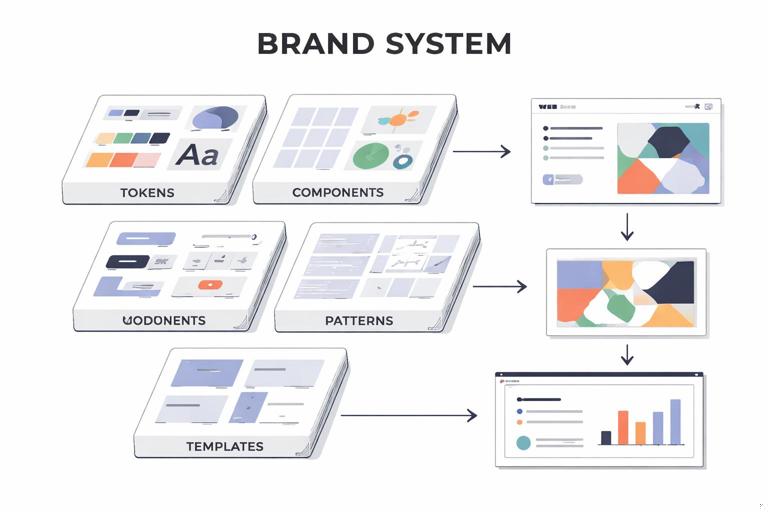
A practical taxonomy: tokens → components → patterns → templates
Mapping becomes manageable when you use a consistent taxonomy. The following levels are common in scalable systems; you can adapt names, but keep the hierarchy.
Level 1: Tokens (variables)
Tokens are the smallest reusable decisions: color roles, type scales, spacing steps, radii, elevation levels, motion durations, and so on. Tokens should be named by purpose (role) rather than by appearance. For example, “color.text.primary” is more durable than “color.gray900,” because the role remains even if the palette shifts.
In a brand system context, tokens are not only for UI. You can also define tokens for editorial layouts and marketing graphics, such as “grid.gutter.standard,” “photo.overlay.opacity,” or “illustration.stroke.weight.”
Level 2: Components (reusable parts)
Components are discrete, reusable objects with a defined structure and variants: buttons, input fields, logo lockups, headers, footers, quote blocks, image frames, data chips, social post headers, etc. Components should be buildable from tokens and should not hard-code context-specific layout decisions unless necessary.
Level 3: Patterns (compositions)
Patterns are repeatable arrangements of components that solve a common communication problem: a hero section, a feature list, a testimonial strip, a pricing table, a webinar promo module, a “press quote + logo” block, a product comparison row. Patterns define relationships: spacing between components, alignment rules, and responsive behavior.
Level 4: Templates (near-final assemblies)
Templates are pre-assembled structures for specific channels: a standard landing page, a case study page, a newsletter layout, a pitch deck master, a trade-show banner layout. Templates include placeholders and guidance for content density, but still allow content variation.
Step-by-step: mapping your brand system into modular blocks
Step 1: Collect real outputs and cluster them by intent
Start with artifacts your organization actually produces: web pages, ads, emails, decks, one-pagers, social posts, event signage, product UI screens, help center articles. Avoid aspirational examples at this stage; mapping should reflect reality.
Then cluster by communication intent, not by channel. Typical intent clusters include:
- Announce (news, launches, updates)
- Explain (education, guides, onboarding)
- Convert (pricing, trial, lead capture)
- Support (help articles, status updates)
- Recruit (job posts, culture pages)
- Reassure (trust, compliance, security)
This clustering reveals which modules must be robust because they appear everywhere (e.g., “Trust Signals”), and which can be lighter-weight.
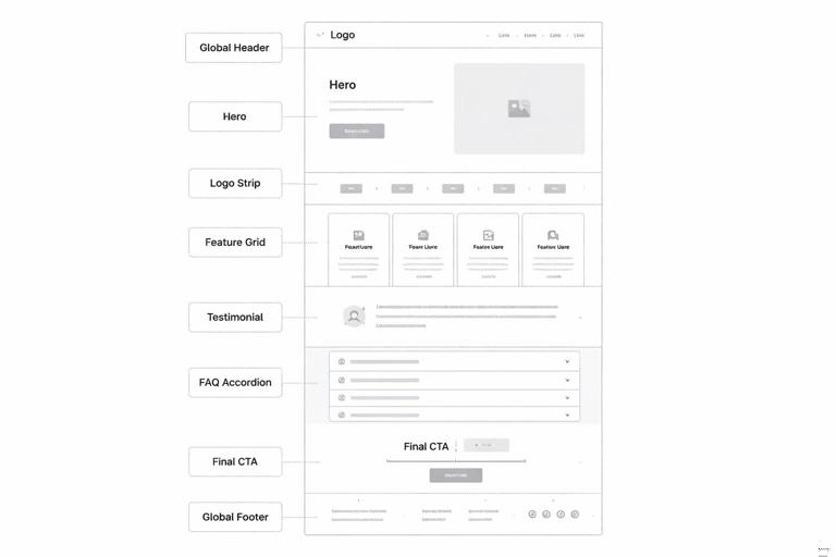
Step 2: Decompose each artifact into repeatable parts
For each artifact, break it down into parts and label them. A useful technique is “box and label”: draw boxes around elements and name them as if they were components in a library.
Example: a product landing page might decompose into:
- Global header (navigation)
- Hero (headline, subhead, primary CTA, supporting image)
- Logo strip (customer logos)
- Feature grid (cards with icon, title, description)
- Testimonial (quote, person, company)
- FAQ accordion
- Final CTA band
- Global footer
Now look across multiple pages: if “Testimonial” appears in five different shapes, you have a mapping opportunity. Either standardize it into one component with variants, or define two distinct components with clear usage rules (e.g., “Short Quote” vs “Case Study Pull Quote”).
Step 3: Identify the “atoms” that should become tokens
As you decompose, note which decisions repeat: spacing increments, corner radii, border widths, icon sizes, photo treatments, overlay gradients, and typographic pairings. These are candidates for tokens.
Practical heuristic: if a value appears in three or more places and changing it would be painful, it probably deserves a token. If it appears once, keep it local to the component.
// Example token roles (illustrative, not exhaustive) color.background.canvas color.background.surface color.text.primary color.text.muted color.border.subtle radius.sm radius.md radius.lg space.1 space.2 space.3 space.4 type.heading.lg type.body.md elevation.1 elevation.2Step 4: Define component boundaries and responsibilities
Write a one-sentence responsibility statement for each component. This prevents “component creep,” where a component slowly absorbs unrelated features.
Examples:
- Button: triggers an action or navigation; always contains a label; may include an icon; never contains multiple lines of text.
- Card Container: groups related content; provides surface styling and padding; does not define internal typography.
- Logo Lockup: displays the brand mark with approved spacing and color usage; does not include taglines unless using a specific lockup variant.
When two components overlap, decide which owns which responsibility. For instance, if both “Card” and “Feature Tile” define padding and typography, you will get inconsistency. A cleaner mapping is: “Card Container” owns surface and spacing; “Feature Tile” is a pattern that places “Icon + Label,” “Heading,” and “Body Text” inside a “Card Container.”
Step 5: Create variants that match real use cases
Variants are the controlled degrees of freedom. They should reflect recurring needs, not hypothetical ones. For each component, list the minimum set of variants required to cover 80–90% of usage.
Example: “Testimonial” component variants might include:
- Layout: inline / card / full-width band
- Length: short (1–2 lines) / medium (3–5 lines)
- Attribution: with headshot / without headshot
Define what is fixed across variants (e.g., quote mark style, typography hierarchy) and what changes (layout, presence of image). If a variant changes too many things, it might be a separate component.
Step 6: Map composition rules into patterns
Patterns capture how components combine. This is where you encode layout logic: spacing between blocks, alignment, responsive stacking, and content density limits.
Example pattern: “Feature Grid”
- Uses: Section Header + Grid + Feature Card components
- Grid rules: 3 columns desktop, 2 tablet, 1 mobile
- Card rules: icon optional; title required; description max 240 characters
- Spacing: section padding uses space.6 top/bottom; grid gap uses space.4
Patterns reduce the need for designers to decide “how far apart should these be?” every time. They also help non-designers assemble pages safely in CMS tools.
Step 7: Decide what becomes a template (and what should not)
Templates are powerful but can become rigid. Create templates only for high-volume, high-stakes outputs where speed and consistency matter most (e.g., campaign landing pages, case studies, webinar pages, sales one-pagers, pitch decks).
A template should specify:
- Which patterns appear and in what order
- Optional sections (with guidance on when to use them)
- Content limits (headline length, number of bullets, image aspect ratios)
- Accessibility and localization considerations (e.g., text expansion)
Avoid turning every page into a template. If a page type is rare or exploratory, keep it pattern-based rather than template-locked.
Step 8: Build a “block map” diagram and a library index
Once you have tokens, components, patterns, and templates, create two artifacts:
- Block map diagram: a visual hierarchy showing dependencies (templates use patterns; patterns use components; components use tokens).
- Library index: a navigable list of blocks with short descriptions, variant lists, and links to source files.
This mapping is as important as the blocks themselves because it becomes the shared mental model across design, marketing, and engineering.
How to choose the right granularity
Signs your blocks are too large
- Small changes require duplicating or detaching components.
- A component has many unrelated variants (e.g., 12 variants that feel like different things).
- Teams use the component incorrectly because it tries to do too much.
Signs your blocks are too small
- Designers spend time assembling tiny pieces for common needs.
- Outputs look inconsistent because composition is left to individual judgment.
- The library becomes hard to browse because there are too many micro-components.
A practical balance is to keep tokens small, components medium, patterns opinionated, and templates limited. If you are unsure, start slightly larger (fewer blocks), then split components only when real usage demands it.
Mapping beyond UI: modular blocks for marketing and editorial
Many brand systems fail to scale because they only map UI components and ignore marketing/editorial production. You can apply the same modular logic to non-UI assets.
Example: social post system as blocks
Instead of designing dozens of one-off social graphics, define:
- Tokens: background colors, text colors, type styles, safe margins, stroke weights
- Components: post header bar, logo bug, quote container, statistic highlight, image frame
- Patterns: quote post, announcement post, carousel slide layout
- Templates: 1080×1080 single, 1080×1350 portrait, 1920×1080 story
Usage rules might include: maximum characters per slide, minimum contrast ratios, and image treatment options (full-bleed photo vs tinted overlay).
Example: presentation system as blocks
For decks, map:
- Tokens: grid, margins, type scale, chart colors
- Components: title slide header, section divider, content column, callout, chart frame, footnote
- Patterns: problem-solution slide, 3-up feature slide, case study slide
- Templates: sales pitch deck, investor update, internal all-hands
This approach reduces slide-by-slide improvisation and improves consistency across teams.
Documenting each block: a practical spec format
To make blocks usable, document them in a consistent format. Keep it short but complete. A recommended per-block spec includes:
- Name (clear, role-based)
- Purpose (one sentence)
- Anatomy (slots/parts; what is required vs optional)
- Variants (and when to use each)
- States (if interactive: hover, focus, disabled)
- Content rules (character limits, image ratios)
- Do / Don’t (2–4 bullets each)
- Dependencies (tokens used; child components)
- Examples (at least one correct and one incorrect usage)
Example mini-spec for a “Callout” component:
Name: Callout Purpose: Highlight a key message within a page or article. Anatomy: Container (required), Title (optional), Body (required), Icon slot (optional), CTA link (optional). Variants: info / success / warning (changes icon and accent color). Content rules: Title max 60 characters; body max 240 characters; CTA label max 24 characters. Do: Use for single key point; keep copy concise. Don’t: Stack multiple callouts back-to-back; use as a replacement for headings. Dependencies: color.accent.*, radius.md, space.*, type.body.mdGovernance built into the map: ownership and change paths
A modular map is also a governance tool. Assign ownership at the right level:
- Tokens: owned by brand/design system core team; changes require review because they cascade widely.
- Components: owned by system maintainers with input from channel experts (web, marketing, product).
- Patterns: co-owned with channel teams because patterns encode real workflows.
- Templates: owned by the teams that use them daily (marketing ops, sales enablement), with system team oversight.
Define change paths: how a new block is proposed, how it is evaluated (does it duplicate existing blocks?), and how it is released. Mapping makes this process faster because you can immediately see where a proposed change fits in the hierarchy.
Common mapping pitfalls and how to avoid them
Pitfall: naming blocks by page or campaign
Names like “SpringCampaignCard” or “HomepageHero” lock the block to a context. Prefer role-based names like “Promo Card” or “Hero Section.” Context-specific assemblies belong at the template level, not the component level.
Pitfall: mixing brand expression with layout mechanics
If a component hard-codes both expressive styling and layout behavior, it becomes difficult to reuse. Keep expressive decisions in tokens and component styling, and keep layout decisions in patterns/templates. For example, a “Section Header” component can define typography and spacing within itself, but the distance between “Section Header” and the next pattern should be defined by the pattern, not the header component.
Pitfall: allowing unlimited customization
“You can change anything” is not a system. If users can arbitrarily change colors, type styles, and spacing, you will get drift. Provide a small set of sanctioned variants and enforce them through the component interface.
Pitfall: skipping content constraints
Many inconsistencies come from content, not visuals: overly long headlines, mismatched image ratios, dense paragraphs in small cards. Add content rules to the block spec so the system remains stable under real-world copywriting and localization.
Hands-on exercise: create a block map for one channel, then expand
If you are implementing this in a team, start with one channel where you can ship improvements quickly (for example, marketing landing pages or a help center). Build the token/component/pattern/template map for that channel, then expand to adjacent channels using the same taxonomy.
Exercise outline:
- Pick 10 representative pages/screens from the channel.
- Decompose them into parts and list candidate components.
- Consolidate duplicates into a smaller set of components with variants.
- Define 5–8 patterns that cover most layouts.
- Create 1–2 templates for the highest-volume output.
- Draw the dependency map and write mini-specs for the top 10 blocks.
This exercise produces a usable modular foundation and a repeatable method for mapping the rest of the brand system.


