
What design tokens are (and what they are not)
Design tokens are named, reusable variables that store the smallest pieces of a brand system in a technology-agnostic way. They capture decisions like “primary background color,” “body text size,” “default spacing between elements,” or “standard easing for UI transitions,” and make those decisions portable across design tools and codebases.
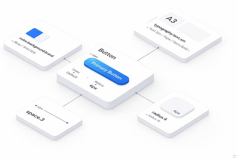
A useful mental model is: tokens are the source of truth for stylistic values, while components are the places those values get applied. A button component might reference color.background.brand and space.3; the token defines the value, the component defines the structure and behavior.
Tokens are not the same as “a style guide page,” and they are not a replacement for components. They also are not just “CSS variables.” CSS variables can be one output format, but tokens should be defined in a way that can be transformed into multiple formats (CSS, iOS, Android, design tool styles, documentation tables). Tokens also should not be a dumping ground for every one-off value; the goal is consistency and scalability.
Token anatomy: name, value, type, and metadata
At minimum, each token has a name and a value. In practice, scalable systems also include a token type and metadata that helps automation and governance.
Name: A stable identifier like
color.text.primaryortype.size.body. Names should describe intent, not raw appearance.Continue in our app.- Listen to the audio with the screen off.
- Earn a certificate upon completion.
- Over 5000 courses for you to explore!

Download the app
Value: The actual value, such as
#0B5FFF,16,24,cubic-bezier(0.2, 0, 0, 1).Type: Color, dimension, fontFamily, fontWeight, duration, easing, shadow, etc. Types enable validation and correct platform output.
Metadata: Description, usage notes, accessibility constraints, deprecation status, and links to examples. Metadata is what turns a token file into a maintainable system rather than a list of numbers.
Many teams also distinguish between base tokens (raw palette steps, spacing scale values) and semantic tokens (meaningful roles like “text on brand background”). Semantic tokens are what components should reference most of the time, because they allow theme changes without rewriting component styles.
How to structure token sets: base, semantic, and component-level
A practical structure that scales across products and themes is a three-layer model:
Base (primitive) tokens: Foundational values with minimal meaning, such as
color.blue.600orspace.4. These are stable building blocks.Semantic tokens: Map base values into roles, such as
color.text.primaryorcolor.background.surface. These encode intent and are themeable.Component tokens (optional): Component-specific aliases like
button.primary.background. Use these when a component needs a controlled contract that can vary by component variant without leaking complexity into global semantics.
In many systems, component tokens are derived from semantic tokens (e.g., button.primary.background references color.background.brand). This keeps the system coherent while still allowing component-level flexibility.
Design tokens for color
Color token categories
Color tokens typically fall into these groups:
Palette (base): A set of hue ramps or neutral ramps, e.g.,
color.gray.0throughcolor.gray.1000,color.blue.50throughcolor.blue.900.Semantic roles: Text, background, border, icon, focus ring, overlay, and state colors (success, warning, danger, info).
Interaction states: Hover, pressed, selected, disabled, and subtle variants (e.g., “danger background subtle”).
Data visualization: Distinct series colors and their accessible pairings, often separate from UI colors.
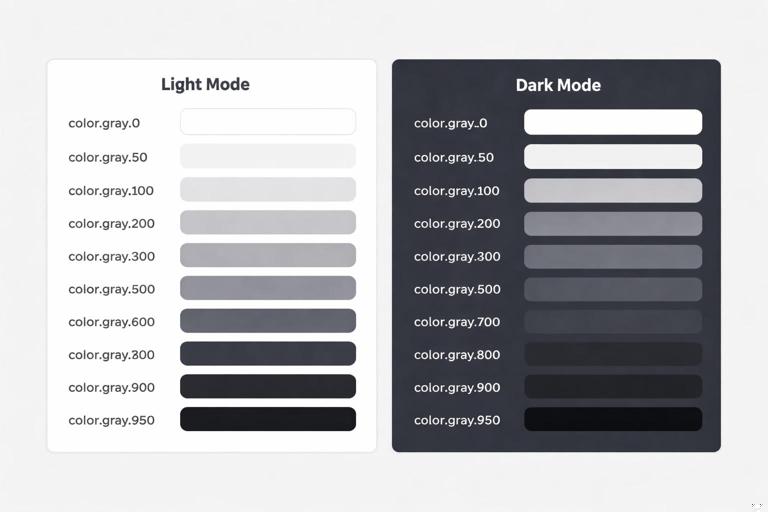
A key practice is to keep palette tokens stable and map semantics on top. That way, a dark theme can remap color.background.surface from color.gray.0 to color.gray.950 without changing component code.
Step-by-step: define a color token system
Step 1: Create neutral and brand ramps as base tokens. Start with neutrals (for surfaces and text) and one or more brand ramps (for accents). Use consistent steps (e.g., 50–900 or 0–1000). Example:
{"color":{ "gray":{ "0":"#FFFFFF","50":"#F7F7F8","100":"#EDEEF0","200":"#D9DCE1","300":"#C3C8D0","400":"#A7AFBA","500":"#8791A1","600":"#667085","700":"#475467","800":"#344054","900":"#1D2939","950":"#0B1220" }, "blue":{ "50":"#EFF8FF","100":"#D1E9FF","200":"#B2DDFF","300":"#84CAFF","400":"#53B1FD","500":"#2E90FA","600":"#1570EF","700":"#175CD3","800":"#1849A9","900":"#194185" } } }Step 2: Define semantic tokens for text, background, border, and icon. These should describe purpose. Example:
{"color":{ "text":{ "primary":"{color.gray.900}", "secondary":"{color.gray.700}", "disabled":"{color.gray.500}", "onBrand":"{color.gray.0}" }, "background":{ "canvas":"{color.gray.0}", "surface":"{color.gray.0}", "subtle":"{color.gray.50}", "brand":"{color.blue.600}", "overlay":"rgba(11,18,32,0.6)" }, "border":{ "default":"{color.gray.200}", "subtle":"{color.gray.100}", "focus":"{color.blue.600}" } } }Step 3: Add state tokens that can be reused across components. Avoid defining hover colors inside each component if the behavior is consistent. Example:
{"color":{ "state":{ "brandHover":"{color.blue.700}", "brandPressed":"{color.blue.800}", "danger":"#D92D20", "dangerHover":"#B42318", "success":"#12B76A" } } }Step 4: Validate accessibility at the semantic level. Instead of checking every component instance, verify that semantic pairings meet contrast requirements (e.g., color.text.primary on color.background.canvas, color.text.onBrand on color.background.brand). If a pairing fails, adjust the mapping (semantic to base) rather than introducing exceptions.
Step 5: Prepare theme overrides. For dark mode, keep the palette but remap semantics. Example:
{"themes":{ "dark":{ "color":{ "background":{ "canvas":"{color.gray.950}", "surface":"{color.gray.900}", "subtle":"{color.gray.800}" }, "text":{ "primary":"{color.gray.0}", "secondary":"{color.gray.200}" }, "border":{ "default":"{color.gray.700}" } } } } }Naming guidance for color tokens
Use semantic names for roles (
text.primary,background.surface) rather thantext.blackorsurface.white.Reserve hue names for base palette steps (
blue.600), not for UI roles.Include state in the name when it is a reusable concept (
state.brandHover), but avoid encoding component names unless necessary.
Design tokens for typography
What to tokenize in type
Typography tokens often include more than font size. A robust set usually covers:
Font families: brand sans, brand serif, mono.
Font weights: regular, medium, semibold, bold (mapped to numeric values per platform).
Font sizes: a scale for body and headings.
Line heights: often proportional or fixed per size.
Letter spacing: especially for caps or large display sizes.
Paragraph spacing: sometimes treated as spacing tokens, but can be part of text styles.
Many teams create text style tokens (sometimes called “typography composites”) that bundle size, line height, weight, and letter spacing into a single token like type.textStyle.body. This reduces errors and ensures consistent combinations.
Step-by-step: build typography tokens that scale
Step 1: Define font family and weight tokens. Example:
{"type":{ "fontFamily":{ "sans":"Inter, system-ui, -apple-system, Segoe UI, Roboto, Arial, sans-serif", "serif":"Georgia, Times, serif", "mono":"ui-monospace, SFMono-Regular, Menlo, Monaco, Consolas, monospace" }, "fontWeight":{ "regular":400, "medium":500, "semibold":600, "bold":700 } } }Step 2: Define a size and line-height scale. Keep the scale small enough to be learnable. Example:
{"type":{ "size":{ "xs":12, "sm":14, "md":16, "lg":18, "xl":20, "2xl":24, "3xl":30, "4xl":36 }, "lineHeight":{ "xs":16, "sm":20, "md":24, "lg":28, "xl":28, "2xl":32, "3xl":38, "4xl":44 } } }Step 3: Add letter spacing where it matters. Example:
{"type":{ "letterSpacing":{ "default":0, "tight":-0.2, "tighter":-0.4, "caps":1.2 } } }Step 4: Create composite text styles for common roles. This is where typography becomes easy to apply consistently. Example:
{"type":{ "textStyle":{ "body":{ "fontFamily":"{type.fontFamily.sans}", "fontWeight":"{type.fontWeight.regular}", "fontSize":"{type.size.md}", "lineHeight":"{type.lineHeight.md}", "letterSpacing":"{type.letterSpacing.default}" }, "bodyStrong":{ "fontFamily":"{type.fontFamily.sans}", "fontWeight":"{type.fontWeight.semibold}", "fontSize":"{type.size.md}", "lineHeight":"{type.lineHeight.md}", "letterSpacing":"{type.letterSpacing.default}" }, "caption":{ "fontFamily":"{type.fontFamily.sans}", "fontWeight":"{type.fontWeight.medium}", "fontSize":"{type.size.sm}", "lineHeight":"{type.lineHeight.sm}", "letterSpacing":"{type.letterSpacing.default}" }, "heading1":{ "fontFamily":"{type.fontFamily.sans}", "fontWeight":"{type.fontWeight.semibold}", "fontSize":"{type.size.4xl}", "lineHeight":"{type.lineHeight.4xl}", "letterSpacing":"{type.letterSpacing.tight}" } } } }Step 5: Define semantic typography roles. Similar to color semantics, map usage to a token so components can reference intent: type.role.body, type.role.heading, type.role.code. Example:
{"type":{ "role":{ "body":"{type.textStyle.body}", "bodyStrong":"{type.textStyle.bodyStrong}", "caption":"{type.textStyle.caption}", "pageTitle":"{type.textStyle.heading1}" } } }This extra layer helps when you need to adjust the system (e.g., increase body size for accessibility) without hunting through component styles.
Practical example: applying typography tokens in CSS
One output approach is to transform tokens into CSS custom properties and then define utility classes or component styles that reference them.
:root{ --type-font-sans: Inter, system-ui, -apple-system, Segoe UI, Roboto, Arial, sans-serif; --type-weight-regular: 400; --type-size-md: 16px; --type-line-md: 24px; --type-letter-default: 0px; } .text-body{ font-family: var(--type-font-sans); font-weight: var(--type-weight-regular); font-size: var(--type-size-md); line-height: var(--type-line-md); letter-spacing: var(--type-letter-default); }The key is that the CSS is generated from tokens, not manually curated. That keeps design and code aligned.
Design tokens for spacing
Why spacing tokens matter
Spacing is one of the fastest ways a system becomes inconsistent: margins drift, paddings become arbitrary, and layouts feel “almost” aligned. Spacing tokens enforce a limited set of increments so that layouts snap to a predictable rhythm.
Spacing tokens typically cover:
Space scale: padding/margin/gap increments.
Layout constraints: container widths, grid gutters, breakpoints (sometimes separate from spacing but often managed similarly).
Radii and borders: not spacing per se, but also “dimension” tokens that benefit from scale discipline.
Step-by-step: create a spacing scale and usage rules
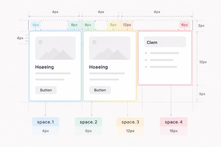
Step 1: Choose a base unit and scale pattern. Common choices are 4px or 8px bases. A 4px base often provides enough granularity for dense UI. Example scale:
{"space":{ "0":0, "1":4, "2":8, "3":12, "4":16, "5":20, "6":24, "8":32, "10":40, "12":48, "16":64 } }Step 2: Define semantic spacing aliases for common layout intents. This reduces the cognitive load of remembering numbers and supports future adjustments. Example:
{"space":{ "inset":{ "xs":"{space.2}", "sm":"{space.3}", "md":"{space.4}", "lg":"{space.6}" }, "stack":{ "xs":"{space.2}", "sm":"{space.3}", "md":"{space.4}", "lg":"{space.6}", "xl":"{space.8}" } } }Step 3: Establish component spacing contracts. For example, a card might always use space.inset.md for padding, while a form field group might use space.stack.md between fields. If you need component-level tokens, define them as aliases:
{"component":{ "card":{ "padding":"{space.inset.md}", "gap":"{space.stack.sm}" }, "form":{ "fieldGap":"{space.stack.md}" } } }Step 4: Add responsive spacing where necessary. Instead of inventing new values, remap semantic spacing at breakpoints. For example, space.inset.lg might be 24 on mobile and 32 on desktop. This can be handled by theme-like modes (e.g., density.compact, density.comfortable) or breakpoint transforms in your build pipeline.
Practical example: spacing tokens in a layout
Imagine a settings page with a header, a card list, and a sidebar. A token-driven approach might specify:
Page padding:
space.inset.lgGap between cards:
space.stack.mdCard padding:
component.card.padding
This makes it easy to adjust the entire product’s “airiness” by changing a small number of semantic mappings rather than editing dozens of screens.
Design tokens for motion
What to tokenize in motion
Motion tokens standardize how the interface animates: durations, easing curves, and sometimes distances. Without tokens, motion becomes inconsistent: some elements snap, others glide, and timing feels random. With tokens, motion becomes part of the brand’s interaction voice.
Motion tokens commonly include:
Duration: fast, medium, slow, plus specific durations for micro-interactions vs. page transitions.
Easing: standard curves for enter/exit, emphasized, linear, etc.
Delay: for staggered animations (use sparingly).
Distance: small translate values for slide/fade patterns (optional but useful).
Opacity levels: sometimes treated as color/alpha tokens, but can be referenced in motion patterns.
It is often helpful to define motion patterns (composites) such as “fade in,” “slide up,” or “scale in,” but keep them separate from raw tokens. Raw tokens should remain broadly reusable.
Step-by-step: define motion tokens and apply them consistently
Step 1: Define duration tokens. Use a small set that covers most needs. Example:
{"motion":{ "duration":{ "instant":0, "fast":120, "medium":200, "slow":320, "xslow":480 } } }Step 2: Define easing tokens. Include at least one standard, one emphasized, and one linear. Example:
{"motion":{ "easing":{ "standard":"cubic-bezier(0.2, 0, 0, 1)", "emphasized":"cubic-bezier(0.2, 0, 0, 1.2)", "decelerate":"cubic-bezier(0, 0, 0.2, 1)", "accelerate":"cubic-bezier(0.4, 0, 1, 1)", "linear":"linear" } } }Step 3: Define distance tokens for common micro-movements. Keep distances subtle. Example:
{"motion":{ "distance":{ "sm":4, "md":8, "lg":16 } } }Step 4: Create composite motion recipes for repeated patterns. These are not always called “tokens” in every organization, but they can be stored similarly as structured values. Example:
{"motion":{ "pattern":{ "fadeIn":{ "duration":"{motion.duration.medium}", "easing":"{motion.easing.decelerate}", "fromOpacity":0, "toOpacity":1 }, "drawerEnter":{ "duration":"{motion.duration.slow}", "easing":"{motion.easing.decelerate}", "fromTranslateY":"{motion.distance.lg}", "toTranslateY":0 } } } }Step 5: Add accessibility controls for reduced motion. Tokens can support a reduced-motion mode by remapping durations to near-zero and removing distances. Example:
{"modes":{ "reducedMotion":{ "motion":{ "duration":{ "fast":0, "medium":0, "slow":0 }, "distance":{ "sm":0, "md":0, "lg":0 } } } } }Components can then respect the mode without special-case logic scattered throughout the codebase.
Practical example: using motion tokens in CSS
:root{ --motion-fast: 120ms; --motion-medium: 200ms; --ease-standard: cubic-bezier(0.2, 0, 0, 1); --ease-decelerate: cubic-bezier(0, 0, 0.2, 1); } .button{ transition: background-color var(--motion-fast) var(--ease-standard), transform var(--motion-fast) var(--ease-standard); } .button:active{ transform: translateY(1px); } .modal{ animation: modal-enter var(--motion-medium) var(--ease-decelerate) both; } @keyframes modal-enter{ from{ opacity:0; transform: translateY(8px); } to{ opacity:1; transform: translateY(0); } }In a token-driven workflow, the 8px translate would also be generated from motion.distance.md rather than hard-coded.
Cross-cutting practices: governance, versioning, and quality checks
Token linting and validation
Because tokens are data, you can validate them automatically. Common checks include:
Type validation: colors must be valid hex/RGBA; durations must be numbers; dimensions must be non-negative.
Reference integrity: referenced tokens like
{color.gray.900}must exist.Contrast checks: enforce minimum contrast for defined semantic pairs (e.g., primary text on canvas, on-brand text on brand background).
Naming conventions: prevent accidental drift like
colourvscolor, or inconsistent casing.
These checks reduce regressions when multiple teams contribute to the token library.
Deprecation strategy
Tokens will change. A controlled deprecation approach prevents breaking products:
Mark tokens as deprecated in metadata (e.g.,
deprecated: true,replacedBy).Keep deprecated tokens for at least one release cycle while updating consumers.
Provide codemods or automated find/replace guidance when possible.
This is especially important for semantic tokens that components reference widely.
When to add a new token vs. reuse an existing one
Use these decision rules to avoid token sprawl:
Add a new semantic token when a new meaning appears repeatedly (e.g., a new surface type like “elevated” used across multiple components).
Reuse an existing token when the intent matches, even if the value is “close but not perfect.” Consistency usually beats micro-optimization.
Add a component token when a component needs a stable contract that may evolve independently (e.g., a complex data table with multiple density modes).
Avoid adding base tokens for one-off values. If a value is truly unique, reconsider whether it should exist or whether the design should align to the scale.
Putting it together: a minimal token file example
The following example shows a compact, coherent set spanning color, type, spacing, and motion, using references to keep the system maintainable:
{"color":{ "gray":{ "0":"#FFFFFF","50":"#F7F7F8","200":"#D9DCE1","700":"#475467","900":"#1D2939","950":"#0B1220" }, "blue":{ "600":"#1570EF","700":"#175CD3","800":"#1849A9" }, "text":{ "primary":"{color.gray.900}", "secondary":"{color.gray.700}", "onBrand":"{color.gray.0}" }, "background":{ "canvas":"{color.gray.0}", "surface":"{color.gray.0}", "brand":"{color.blue.600}" }, "border":{ "default":"{color.gray.200}", "focus":"{color.blue.600}" }, "state":{ "brandHover":"{color.blue.700}", "brandPressed":"{color.blue.800}" } }, "type":{ "fontFamily":{ "sans":"Inter, system-ui, -apple-system, Segoe UI, Roboto, Arial, sans-serif" }, "fontWeight":{ "regular":400,"semibold":600 }, "size":{ "sm":14,"md":16,"xl":20 }, "lineHeight":{ "sm":20,"md":24,"xl":28 }, "letterSpacing":{ "default":0,"tight":-0.2 }, "textStyle":{ "body":{ "fontFamily":"{type.fontFamily.sans}","fontWeight":"{type.fontWeight.regular}","fontSize":"{type.size.md}","lineHeight":"{type.lineHeight.md}","letterSpacing":"{type.letterSpacing.default}" }, "heading":{ "fontFamily":"{type.fontFamily.sans}","fontWeight":"{type.fontWeight.semibold}","fontSize":"{type.size.xl}","lineHeight":"{type.lineHeight.xl}","letterSpacing":"{type.letterSpacing.tight}" } } }, "space":{ "0":0,"1":4,"2":8,"3":12,"4":16,"6":24,"8":32, "inset":{ "sm":"{space.3}","md":"{space.4}","lg":"{space.6}" }, "stack":{ "sm":"{space.3}","md":"{space.4}","lg":"{space.6}" } }, "motion":{ "duration":{ "fast":120,"medium":200,"slow":320 }, "easing":{ "standard":"cubic-bezier(0.2, 0, 0, 1)","decelerate":"cubic-bezier(0, 0, 0.2, 1)" }, "distance":{ "sm":4,"md":8 } } }In implementation, components should primarily consume semantic tokens like color.text.primary, space.inset.md, and motion.duration.fast. Base tokens remain available for controlled extension, but they should not become the default choice in component styling.


