
What “Logo Families” Mean in a Modular Brand System
A logo family is a deliberately designed set of related logo versions that share the same visual logic but are optimized for different contexts: tiny app icons, narrow headers, social avatars, co-branded lockups, product sub-brands, and accessibility-driven scenarios. In a modular brand system, the logo is not a single static file; it is a governed set of assets with rules that specify when each version is used, how it scales, what it can sit next to, and what must never change.
Think of the logo family as a toolkit with a few “approved instruments,” not an infinite set of improvisations. The goal is consistency at scale: many teams can ship many touchpoints without inventing new logo variants or accidentally degrading recognition.
Common members of a logo family
- Primary logo: the default, most recognizable version, used when space allows.
- Secondary logo: a rearranged composition (often stacked vs. horizontal) for different aspect ratios.
- Wordmark: typography-only version for contexts where the symbol is redundant or where clarity of name is critical.
- Symbol/mark: icon-only version for small sizes, avatars, favicons, app icons, and UI chrome.
- Monogram: letter-based mark used when the symbol is too detailed or when a typographic shorthand is needed.
- One-color versions: for limited printing, embossing, engraving, or high-contrast UI states.
- Reversed versions: for dark backgrounds or photography.
- Co-brand lockups: governed pairings with partner logos, product lines, or endorsements.
Not every brand needs every member. The right family is the smallest set that covers your real use cases without forcing designers to “make it work” through unapproved edits.
Responsive Identity Rules: The Logic Behind Switching Logo Variants
Responsive identity rules define how the logo adapts to constraints such as size, aspect ratio, placement, background complexity, and production method. “Responsive” here is not only about screens; it includes packaging, signage, embroidery, and any environment where the logo must remain legible and recognizable.
Instead of leaving adaptation to individual judgment, you define explicit thresholds and decision criteria. This reduces inconsistency and speeds up production because teams can select the correct asset confidently.
- Listen to the audio with the screen off.
- Earn a certificate upon completion.
- Over 5000 courses for you to explore!

Download the app
Key constraint dimensions to govern
- Size thresholds: minimum pixel/mm sizes for each variant; when to switch from primary to simplified mark.
- Aspect ratio: rules for narrow vs. wide containers (e.g., header bars, social banners, vertical posters).
- Background complexity: when to use a solid container, outline, or one-color version to maintain contrast.
- Distance viewing: signage and wayfinding require different simplification than a website header.
- Production constraints: embroidery, laser etching, screen printing, and low-resolution printing often require fewer details.
- Localization: scripts, diacritics, and name length changes can require alternate wordmarks or lockups.
Responsive rules are most effective when they are measurable (numbers, ratios, and tests) rather than subjective (“use the small logo when it feels small”).
Designing a Logo Family: A Practical Step-by-Step Workflow
Step 1: Inventory real placements and rank them by frequency and risk
Collect where the logo appears today and where it will appear soon. Include digital and physical. For each placement, capture: container size, background type, and whether the logo is alone or near other marks.
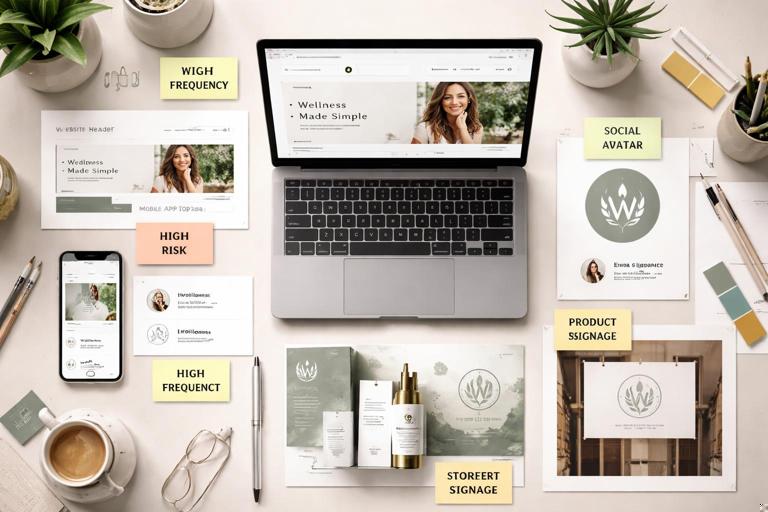
- High frequency: website header, app top bar, social avatar, email signature.
- High risk: tiny sizes (favicon), busy photography, co-branding, low-quality print.
- High impact: storefront signage, product packaging front panel.
Rank placements by how often they occur and how likely they are to break legibility. This ranking determines which variants you must design first.
Step 2: Define the “non-negotiables” for recognition
For each logo component (symbol, wordmark, tagline, descriptor), decide what must remain consistent across the family. Examples of non-negotiables:
- Core silhouette of the symbol (overall shape and negative space).
- Relative proportion between symbol and wordmark in the primary lockup.
- Key typographic features of the wordmark (custom letterforms, distinctive terminals).
- Angle, orientation, or baseline behavior (e.g., always upright; never italicized).
This is not a repeat of “visual DNA” work; it is a logo-specific translation: what makes the mark recognizable even when simplified.
Step 3: Create a simplification ladder (complexity levels)
A responsive logo family often works best as a ladder of simplification. Each rung removes detail while preserving the same underlying geometry.
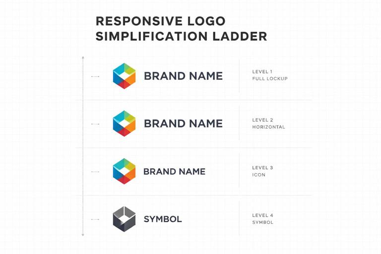
- Level 1: full primary logo (symbol + wordmark + optional descriptor).
- Level 2: symbol + wordmark (remove descriptor/tagline).
- Level 3: symbol only (or monogram only).
- Level 4: simplified symbol (fewer internal cuts, thicker strokes, fewer nodes).
Not all brands need Level 4, but it is common for very small sizes or harsh production methods. The key is that Level 4 is designed, not auto-simplified by exporting at small size.
Step 4: Establish measurable switch points
Define when each level is used. Use thresholds that teams can apply without debate. Example rule set (you will customize the numbers based on testing):
- Use Level 1 when logo width is ≥ 240 px (or ≥ 35 mm in print) and background is simple.
- Use Level 2 when width is 160–239 px (or 24–34 mm) or when the descriptor would be illegible.
- Use Level 3 when width is 48–159 px (or 8–23 mm) or when container is square (avatar).
- Use Level 4 when width is < 48 px (or < 8 mm) or when production requires simplification (embroidery, etching).
These thresholds should be validated by testing, not guessed. The next steps explain how to test.
Step 5: Test legibility and recognition under stress
Run quick, repeatable tests. You do not need a lab; you need consistency and documentation.
- Size ramp test: export each variant at a range of sizes (e.g., 16, 24, 32, 48, 64, 96, 128, 256 px). Check when counters fill in, strokes disappear, or letterforms blur.
- Blur test: apply a slight blur to simulate motion, low-quality screens, or distance. If the logo collapses into noise, simplify.
- Contrast test: place the logo on light/dark solids and on busy photos. Verify that the chosen reversed/one-color versions remain clear.
- One-second recognition test: show the logo briefly among competitors or similar marks. If the simplified version becomes generic, revisit the simplification ladder.
Document the results as “minimum sizes” and “do not use below” rules for each variant.
Step 6: Build co-brand and sub-brand lockups as part of the family
Co-branding is where inconsistency explodes: teams align logos by eye, invent spacing, or resize one brand to dominate. Treat lockups as first-class family members with strict rules.
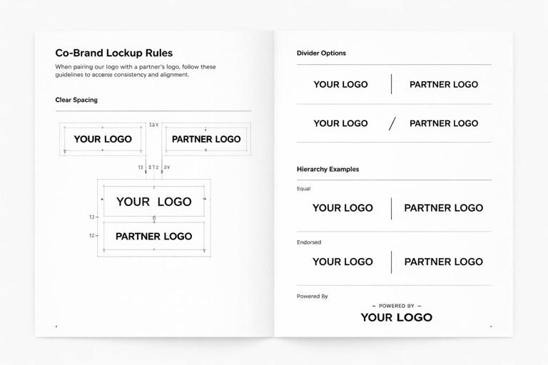
Define:
- Hierarchy: equal prominence vs. endorsed vs. “powered by.”
- Alignment: baseline alignment for wordmarks, optical centering for symbols.
- Divider: use of a line, dot, or spacing-only separation.
- Spacing: measured clear space between marks (relative to a stable measurement like symbol width).
- Minimum size: ensure both brands remain legible.
Also define what is not allowed: rotating partner marks, recoloring them, or squeezing them into a shared container unless explicitly approved.
Core Rule Types to Include in Your Responsive Identity Spec
1) Clear space rules (protective area)
Clear space prevents visual clutter from competing with the logo. In responsive systems, clear space often changes by variant: a symbol-only mark may need more breathing room than a full lockup because it relies on silhouette recognition.
Practical approach:
- Define a clear space unit X based on a stable feature (e.g., height of the symbol, width of a key stroke, or cap height of the wordmark).
- Set clear space per variant (e.g., Primary: 1X; Symbol-only: 1.5X; Co-brand lockup: 2X around the whole lockup).
Include examples showing acceptable and unacceptable placements: near edges, near headlines, near buttons, and near other logos.
2) Minimum size rules (digital and print)
Minimum size is not a single number; it depends on variant and medium. Provide separate minimums for:
- On-screen: in pixels, with notes about typical device densities.
- Print: in millimeters/inches, with notes about printing method.
- Special production: embroidery stitch limits, engraving line thickness.
Example spec language:
- Primary horizontal lockup: minimum 160 px wide (screen), 24 mm wide (print).
- Stacked lockup: minimum 120 px wide (screen), 18 mm wide (print).
- Symbol-only: minimum 24 px (screen) for UI; 6 mm (print) for labels.
Back these numbers with your size ramp test outputs, and keep the test files available for teams.
3) Background handling rules
Most logo failures happen on photography and gradients. Define a small set of background strategies rather than allowing ad hoc fixes.
- Direct placement: logo sits directly on solid brand-approved colors with sufficient contrast.
- Reversed placement: logo switches to a light version on dark backgrounds.
- Container placement: logo sits inside a solid shape (badge/plate) when background is busy.
- Outline/knockout: logo uses an outline or keyline to separate from background (use sparingly and specify thickness).
Provide a decision rule such as: “If the background has more than two dominant luminance zones behind the logo area, use the container version.” Teams can approximate this by sampling the placement area or using a quick blur-squint check.
4) Geometry and proportion rules (what cannot be altered)
Responsive identity does not mean “stretch and rearrange freely.” Specify invariants:
- No non-uniform scaling (no stretching horizontally/vertically).
- No re-kerning the wordmark (unless you provide a special condensed wordmark variant).
- No re-drawing the symbol (unless using the approved simplified symbol).
- No changing symbol/wordmark ratio outside defined variants.
When teams need a different proportion (e.g., extremely narrow spaces), provide an approved alternative (stacked, symbol-only, or a micro wordmark).
5) Alignment rules for UI placements
In product interfaces, the logo often sits in navigation bars, sidebars, and footers. Define alignment behavior so it feels consistent across screens.
- Baseline alignment: wordmark aligns to text baseline in headers when used near navigation links.
- Optical centering: symbol-only marks are centered by visual weight, not bounding box.
- Safe margins: minimum padding from container edges (e.g., 16 px or a relative unit tied to the logo height).
Include examples for common UI patterns: top-left placement, centered header, and collapsed sidebar where the logo switches to symbol-only.
Practical Example: Building a Responsive Logo Family for a Fictional Brand
Imagine a brand called “Northline Studio” with a symbol (a simplified compass) and a wordmark. The brand operates a website, a mobile app, printed workshop materials, and co-branded events.
Family assets
- Primary horizontal: compass symbol + “Northline Studio” wordmark.
- Secondary stacked: symbol above wordmark for narrow columns.
- Wordmark-only: “Northline Studio” for editorial layouts where the symbol is redundant.
- Symbol-only: compass for app icon, favicon, and social avatar.
- Simplified symbol: compass with fewer internal cuts for < 24 px and embroidery.
- One-color: black and white versions of each.
- Co-brand lockup: Northline Studio + Partner (equal prominence) with a divider.
Responsive rules (sample)
- If container is wider than 3:1, use primary horizontal.
- If container is between 1:1 and 3:1, use stacked.
- If container is square and ≤ 128 px, use symbol-only.
- If symbol-only is ≤ 24 px, use simplified symbol.
- If background is photographic and fails contrast check, use container placement with reversed logo.
These rules can be turned into a simple decision tree that non-designers can follow.
How to Document Responsive Identity Rules So Teams Actually Use Them
Create a “selection matrix” instead of long prose
People choose assets under time pressure. Provide a matrix that maps common contexts to the correct file.
Example matrix categories:
- Context: Website header, App top bar, Email signature, Social avatar, Presentation cover, Invoice PDF, Event banner, Embroidery.
- Background: Light solid, Dark solid, Photo/busy.
- Recommended asset: exact variant name.
- Minimum size: numeric threshold.
Use consistent naming conventions for files
File naming is part of governance. A practical convention encodes variant, color mode, and format. For example:
brand-logo_primary-horizontal_fullcolor.svg
brand-logo_primary-horizontal_black.svg
brand-logo_secondary-stacked_reverse.svg
brand-mark_symbol-only_fullcolor.svg
brand-mark_symbol-only_simplified_black.svg
brand-lockup_cobrand_equal_reverse.svg
This reduces accidental misuse and makes it easier to automate selection in templates.
Provide “do/don’t” examples that match real layouts
Avoid generic examples floating on white backgrounds. Show the logo inside actual UI headers, social avatars, slide templates, and print layouts. Include common failure modes:
- Using the primary lockup in a tiny space (wordmark becomes unreadable).
- Placing a reversed logo on a mid-tone photo without a container (contrast fails).
- Recoloring the partner logo in a co-brand lockup (brand violation).
- Adding effects (drop shadows, glows) to “fix” contrast instead of using the approved container version.
Advanced Considerations for Scalable Logo Families
Variable wordmarks for localization and long names
If your brand name changes length across languages, you may need a condensed wordmark or alternate lockup. Rather than letting teams squeeze the logo, design an approved localized set:
- Localized wordmarks with script-appropriate typography.
- Rules for when to use symbol-only to avoid cramped wordmarks.
- Baseline and x-height alignment guidance when mixing scripts.
Keep the number of localized variants controlled: prioritize the languages that appear in high-visibility contexts (app stores, packaging, signage).
Accessibility and clarity in UI
In product UI, the logo can compete with navigation and must remain clear at small sizes. Practical rules:
- Prefer symbol-only in tight nav bars to avoid illegible wordmarks.
- Avoid placing the logo inside interactive elements unless it is the home button; if it is interactive, define hover/focus states that do not distort the mark.
- Ensure sufficient contrast for the logo against the header background; if the header color changes by theme (light/dark mode), provide theme-specific logo assets.
Motion and responsive behavior in digital products
Even without revisiting motion token systems, you can define logo-specific motion rules that preserve identity:
- When collapsing a header on scroll, transition from primary to symbol-only at a defined breakpoint (e.g., header height < 56 px).
- Use a crossfade or scale-down that maintains proportions; do not morph the symbol into a different shape unless that morph is an approved animation asset.
- Define maximum animation duration and easing style for logo transitions so they feel intentional and not distracting.
Implementation Checklist: What to Ship in the Asset Library
To make logo families and responsive rules operational, ship both assets and instructions together.
Asset package contents
- Vector masters for each variant (e.g., SVG, PDF) and raster exports (PNG) for common sizes.
- One-color and reversed versions for each variant.
- Simplified symbol variant if needed for micro sizes and production constraints.
- Co-brand lockups with defined hierarchy options (equal, endorsed, powered-by) if applicable.
- Favicon/app icon set derived from the symbol-only mark, with tested pixel-hinting if necessary.
Rule documentation contents
- Selection matrix mapping contexts to variants.
- Minimum size table (screen/print/special production).
- Clear space diagrams per variant.
- Background handling decision rules with examples.
- Co-brand lockup rules (alignment, spacing, hierarchy, minimum sizes).
- Editable templates for common placements (slide cover, social avatar, email signature, UI header spec).

